You will re ne and build on skills gained in Level 4 to develop character designs through an historical overview of relevant literature, art, animation, games, lm and advertising. is will help to form a broad understanding of character design.You will then learn how to generate ideas for contemporary character design in uenced by social, political and cultural research for the development of the ‘back story’, through drawing and written work. You will create and present, character design sheets, including suggested movement, expressions, silhouette, negative space and bone structure, and create early prototypes of characters using found materials.You will learn to understand and execute the principles of 3D computer modelling and the principles of 3D texture mapping with a view to establishing an in-depth, practical knowledge of 3D modelling and texturing techniques (using Autodesk Maya), in support of the design and production of original content. You will also learn how to manage 3D CGI assets and realise character design ideas.
Don't wanna be here? Send us removal request.
Video
tumblr
ENVIRONMENT https://www.youtube.com/watch?v=GlTmDeJq23s
0 notes
Text
TEXTURING
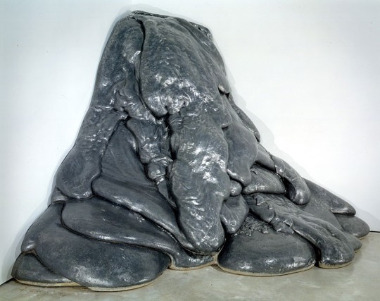
Lynda Benglis
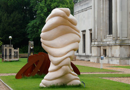
Nick Turvey
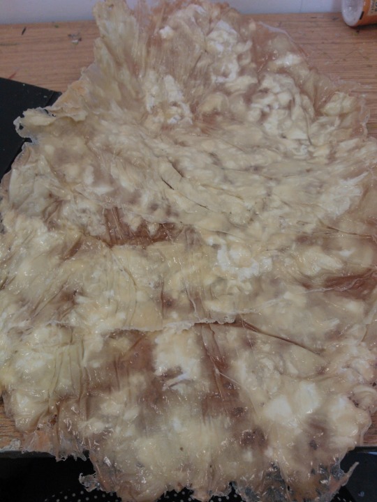
Tissue Dissolved in Liquid Latex

BUMPMAPPING GUMS

MAKING THE EYES GLOSSY, AND REFLECT LIGHT TO MATCH DESIGN BRIEF


STAGES BEFORE ADDING TAIL, AND ARMS - TO GET CORRECT SKIN TEXTURE - SUBTLE LINES AND MARKINGS AS SHOWN ABOVE TO MATCH THAT OF A REAL WORM
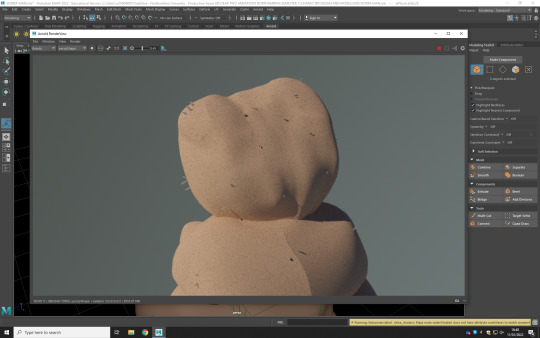
TINY HAIRS, TO ADD AN EXTRA LAYER TO THE CHARACTER’S DESIGN
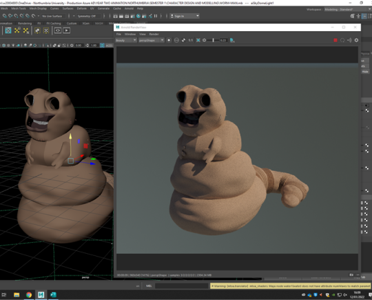
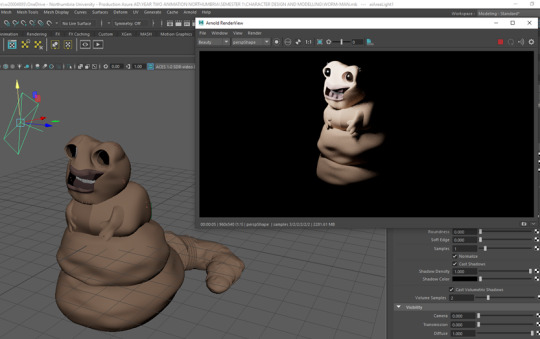
FINAL RENDER USING BOTH A FULL LIGHTING RIG, AND AN AESTHETIC LOW LIGHT
0 notes
Text
MODELLING OUR INTERPRETATION OF ‘THE PIPES PROTAGONIST’
after everything we’ve researched - it all accumulates to this. it’s time to put it all together to make believable characters that feel real.
BEGIN THE 3D DESIGN
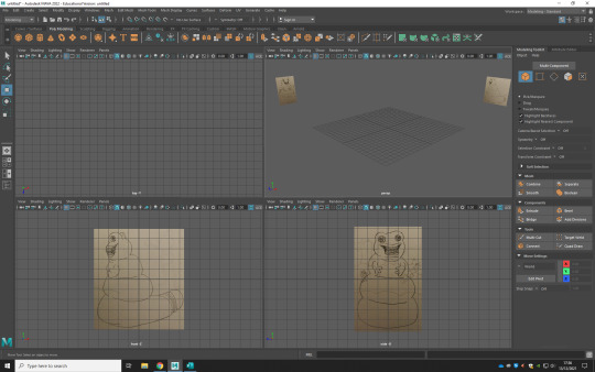
At this point, we have a reference library, have learned the basics of design theory, and studied the basics of sculpting, which means it’s time to grab our concept art.
Maya, as an industry standard tool is a great creation tool - allowing for the transformation, capturing your stylised characters, and turning them 3D.
as they describe it: “Maya's unique modelling pipeline allows artists to create whatever visuals they can think of!”
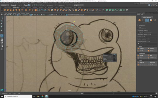


The process starts off, in the usual suspect manner;
the first thing to do, to begin creating an accurate model based on a photo, is to take your reference photos, it’s important to ensure that your references line up, with one another - otherwise you’re going to get the points wrong, and that will mess up the geometry of the model.
importing the image planes, and place them at equidistant, so they don't get in the way of your modelling, yet they’re still viewable in the view select
using both sides, you want to line up the points, against the front facing and side facing images - to create a sense of depth, and after a while you’ll begin to notice how the shape builds up.
from here, it’s just important to continue pushing through, until you’re finished - and that’s it.

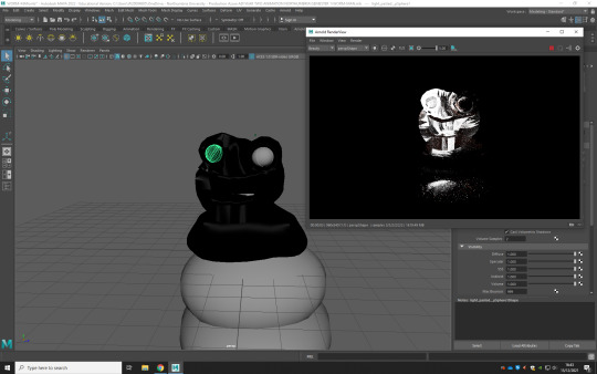

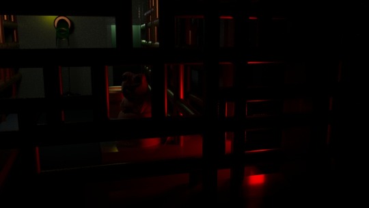
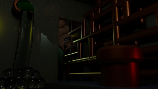
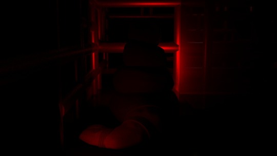
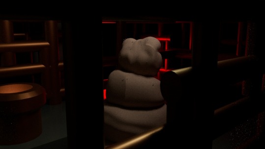
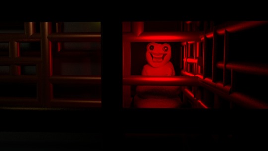
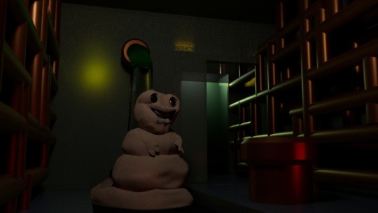
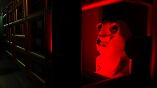
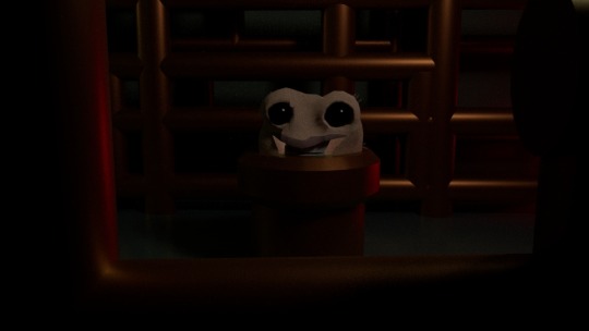
PLACING CHARACTER IN ENVIRONMENT - “WORM-MAN IS HOME”
0 notes
Text
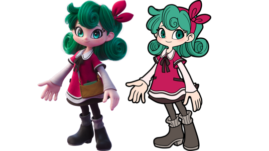
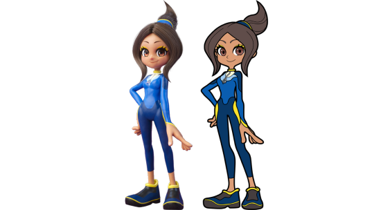
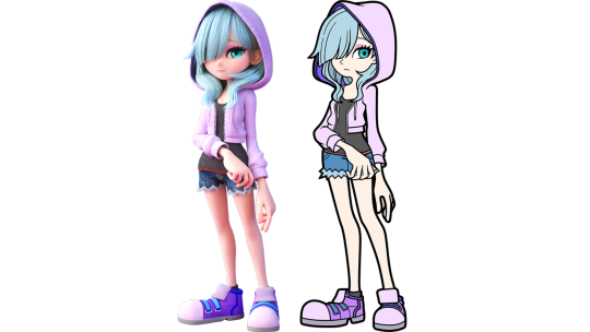
TURNING 2D TO 3D
ARE 2D AND 3D ANIMATION ACTUALLY ALL THAT DIFFERENT?
0 notes
Text
FUNDAMENTALS & BASICS OF CHARACTER DESIGN
This week I’ve made it a priority to go through this ‘Character Design & Modelling’ Tumblr Blog, spending hours upon hours reorganising and rewriting my work - so it reads better, is more up to date, and in line with the project’s current orientation, after all the research I’ve been doing, - (and you’ve been reading.)
I decided it was a little too confusing jumping about between all my design work - since it was periodically, yet sporadically, spaced about my blog - amongst the heaps of extra research I’ve been conducting.
So i figured that as a courtesy, to yourself for putting up with reading through this blog - i would put all my design work into this singular big blog post.
doing this compilation task was sort of a blessing in disguise; as it gave me a second chance on a lot of my work, to redesign a few aspects I was unhappy with originally, and go through the process of removing anything irrelevant - that didn't quite fit the project’s orientation, before.
INITIAL CHARACTER DESIGNING “BABY STEPS”
Character Design is an important stage in the animation process, as most (but not all) media is character lead, in some way or another.
the process of character design is essentially creating visual representations a given description, given by the director. These might include notes on a character's personality, as well as physical traits.
depending on the media the character is from, these visual queues can be interpreted from scripts, concept art, and of course any actual descriptions given to design characters.
when designing, based on a brief - it’s important to put yourself out of your comfort zone to create a range, that don't necessarily reflect accurately on the envisioned depictions, so that you can try different ideas and see what works best..
there’s multiple ways to do this, but a proven technique is to work in a manner akin to something like this :
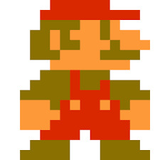
A Faithful Interpretation, accurate to the author’s depiction of the character - what you imagine the character to look like, from your initial reading of the story.
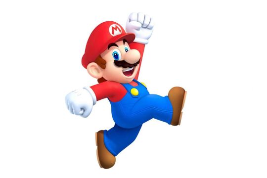
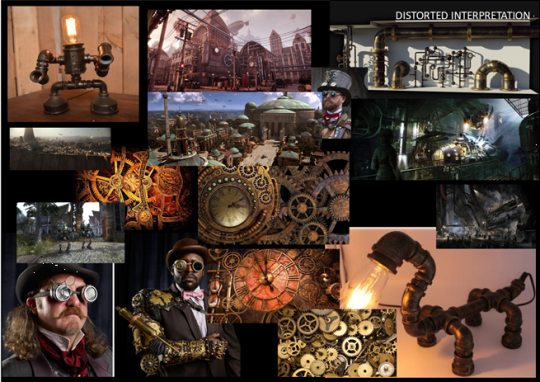
A Distorted Interpretation, similar to the author’s depiction / description of the character - but represented in some kind of an untrue way, such as with exaggerated features or a few misaligned traits with what the character was written with.
and finally:
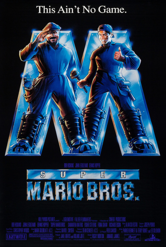
A Radical Interpretation, to create a Radical interpretation is not exactly to completely ignore the author’s interpretation of the character, but to attribute your own unrestricted spin on the description by putting your own meanings to their words, and in some cases just flat out ignoring them.
when starting to design, you need to look for influence.
influence is important, to improve the range of resources that might better what your outcome could possibly be. whether this is from the work of others, a place, a theme, or elsewhere - there is always benefit in expanding your own horizons, as the famous saying goes:
“there’s beauty in everything, but not everyone can see it.”
VISUAL INFLUENCE / MOODBOARDS - “DESIGNING, WITH HALF THE WORK; AND DOUBLE THE IMPACT”
Yesterday the third years presented ideas for their final films. one of the strongest aspects of the work shown was the care and attention to detail many of them had put into mood boards.
its such a powerful stage of the creative process, and if i can give any advice it’s that it’s really useful to dedicate time to their production - as it will pay off at the design stage of your work.
when imagining the protagonist for ‘pipes’ - I set out and created a few alternate takes on the original story, to allow producers a variety to choose from, so i’m not “putting all my eggs in one basket” - through the allowance of them to choose from one of many ideas: see what sticks, after all!
FAITHFUL INTERPRETATION: “AN EMBODIMENT OF DEPRESSION”
when reading ‘pipes’ on my initial run-through with it, one of my first thoughts when attempting to visualise the protagonist was imagining the impact that such feelings of inadequacy would have on an individual.
Our protagonist suffers under the belief that his diagnostic as having severe perceptual disorders decreases the value of his life, comparing himself to his boss, and due to his low self worth thinking that he is abnormal in comparison.
The protagonist finds little enjoyment, so far as being able to recall the last time he laughed being from his childhood...
all this resonates with my understanding that our protagonist, is not an individual with the healthiest of mental states..
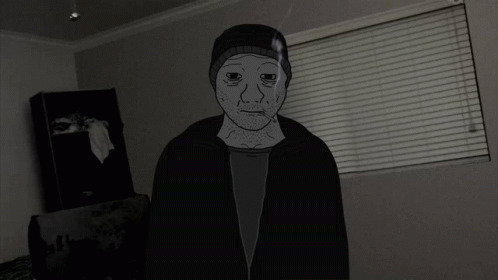
Character Profile - the Pipes Protagonist
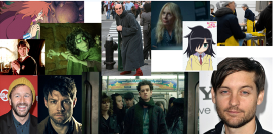
“every weed in the desert is still a flower” - The Zohan (2008)
The story dedicates only one paragraph to describing the early life of the protagonist, which highlights the way his life has to some degree passed him by since being diagnosed with difficulties. Whilst brevity is a necessary characteristic of the short story, it is significant that the narrator has reached his adult self by the end of the first paragraph of the story.
I imagine the intention was to have our protagonist be on his way to his thirties, with no particular friends, or family to speak of - living alone, in a dingy apartment, with enough resources to stay alive, and not much else more.
sounds like an insight into my future...

At the very end of this paragraph the protagonist makes a reference to his boss, “an engineer with a diploma from a top technical college.” Here is a reference to the life that the character could have lead if he hadn’t been so early on labelled as having “severe perceptual disorders.”
However, there is neither envy, admiration nor bitterness conveyed in the language that he uses to describe his boss, illustrating how little he is engaging with his world and his surroundings.
I think the protagonist’s disengagement is important to highlight here, as it makes the bittersweet ending feel much more happy - with him not being able to find purpose, or a sense of belonging in his previous world; and we’re hopeful that he gets a better start, in this one.
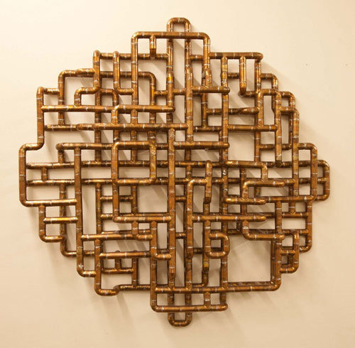
When he begins to create different shaped pipes in his free time, after the factory at which he works closes, and rolling marbles down them, he apologetically states that “it sounds like a dumb thing to do”, as though his life has been spent defending his own apparent weirdness, or perceived lack of ability.
He also admits that he “didn’t even enjoy it”, suggesting that he has no outlet for his creativity that he enjoys, and that he experiences very little joy from any aspect of his life, if he chooses to spend his free time at his place of work doing something he doesn’t even enjoy.
with all my analysis (highlighted deeper in previous blog entries), building up, I began to slowly piece together what I thought was the most accurate portrayal of Keret’s intended protagonist -
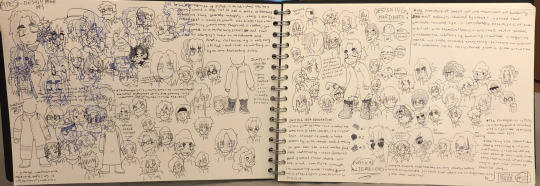
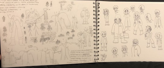
i began to notice that in my design work, i was running out of creative steam to make each design feel unique and serve a certain prowess - with my designs beginning to blend together: aspects from some, mixed with others to make this sort of amalgamation of my best ideas, out of interest for covering more potential.
referring back to my work on appeal of character designing, and contorting the human form - I came across the start of my next interpretation through focusing on exaggeration
individuals suffering from an overanxious mindset, can spiral to the extremity of refusal towards food, out of a loss of appetite. when coming into such a state, individuals suffer from loss of care for themselves, where there is a physical reaction through concern for the consumption making them feel physically ill - through this process - a lack of food will obviously result in the person in question appearing more and more skeletal - as the more you starve yourself the thinner you’re going to inevitably become..
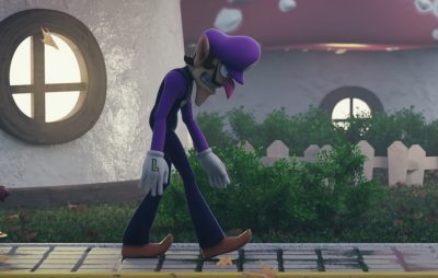
it was from this almost skeletal physique i found myself working with, i began contorting the bodies in my designs, more and more - until it resembled something akin to the June 2009 CreepyPasta legend; ‘slenderman’.
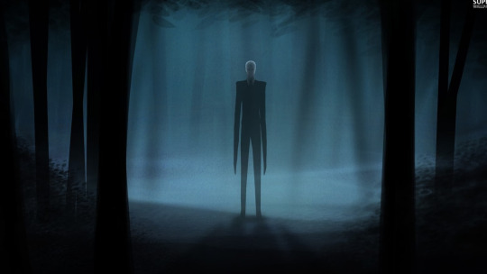
i found myself interested in seeing this long, thin body crawl through a pipe - into the ‘other world’
how would he do it?
i like to imagine this tall, thin individual - hunching themselves over, and bending their limbs in an almost spider-like fashion to get inside, and crawl creepily towards the light of the ‘other world
i think that, despite the interesting implications for this design, most of this interest comes from the movement capabilities, rather than the static figure; which is what makes me less keen to go forward with this concept for the final design, but still as a possibility.
but the mundane aspect of the individual i found very uninteresting, alone; and my original designs referenced this - so I started to tweak with the intent, little by little and that lead me to go from designing very hipster-esque characters - alone in the world, and struggling with their self preservation, into toying with the idea a step further..
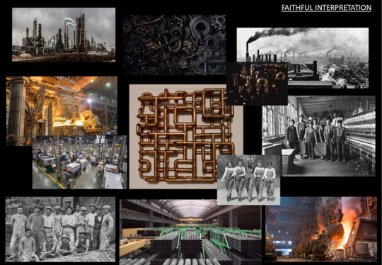
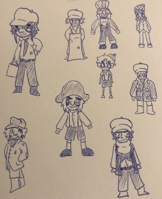
enter the concept of a Victorian, industrial revolution esque setting - where our protagonist is still in his adolescence, and rather than suffering through the times, as he had in our reality - he discovers the pipeline to heaven early on and misses all the trauma.
DISTORTED INTERPRETATION: “THE SLIM-MAN / THE ROBOTISED STEAMPUNK FUTURE”
when attempting to think of this distorted version of the story of this clearly depressed individual - my mind began to blank.
so i did what i do best when I'm in a designing rut: and began sketching some basic shapes - and work concept art, around it - creating some very robotic, and stiff figures..
usually - I hate drawing robots; they are the furthest thing from what I find myself comfortable with drawing, as their designs have to take the extremities of function over form..
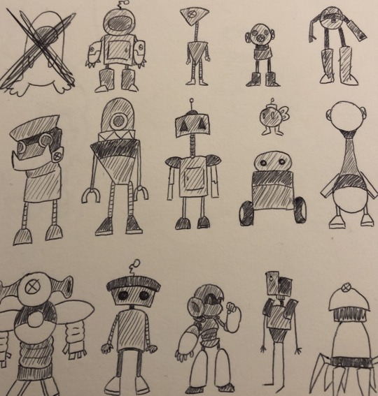
I decided to go against my gut feeling and play into this idea, a tad - figuring out how to combine robots, who are literally the most stereotypically unemotive characters in existence - with the complexities of human beings, who have to constantly suffer under a negative mindset...
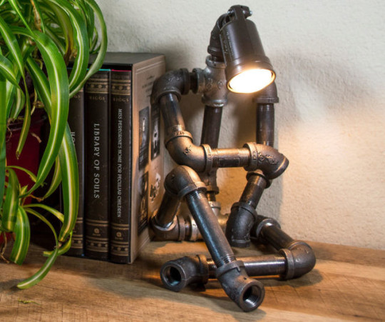
the slim man, with limbs of pipes: “his identity as ‘the nameless protagonist of pipes’ is consumed with him being literally MADE of pipes”
out of fear, that the ideas weren’t strong enough, conceptually to hold their own; I opted for combining the two, with the creation of humanoid figures - in robotic form.
since our character considers his diagnostic a disability, I wanted to design a concept around this - with the robot version of himself being “defective”.
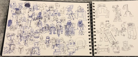
I felt I was getting close to something now - and wanted t thicken the idea, just a touch more - so I revived my previously failed Victorian interpretation; and thus began the creation of half-human, half-robot Steam-Punk-Cyborgs
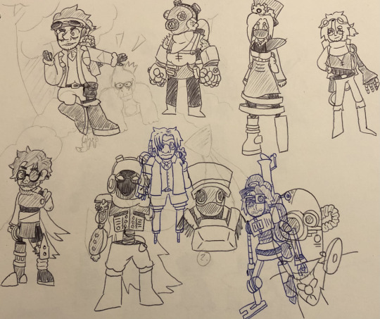
to take a once thought to be fully-fleshed-out-enough idea, and expand upon it further is what it means to be a designer.
But deep down, I knew this wasn’t what I wanted to do: I had the desire to make it even more abstract from the original...
RADICAL INTERPRETATION: “THE DISGUSTING WORLD OF THE WORM-MAN”
yes: you read that title correctly
I experimented for a while to get to this point - so strap in
what started with me taking the concept of not belonging ended with me attempting to give it context within all sorts of abominations living in a human world.
I tried aliens, I tried government conspiracy reptoids (lizard-people), heck - I even tried taking design aspects from circus acclaimed freak-shows
and yet - none of them felt quite right in the context of the story
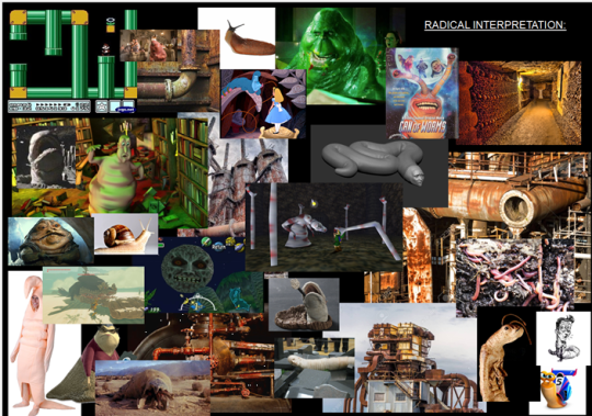
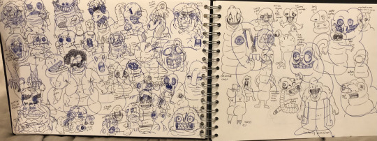
I was quite literally missing the “pipes” aspect from pipes; so i read through the story, again and honed in on the idea of the protagonist crawling through the pipe - and it got my mind racing with designs for monsters that would in essence crawl as their primary movement option
As you can see from my design work, i took a few different approaches - with different creatures that crawl but in the end - I couldn’t stop coming back to the idea of using a worm

I find worms to be completely disgusting. as a kid, i used to love bugs - but as I grew up, seeing other people hate them so much definitely influenced me to start to have a disdain for some of them along the way
in creating disturbing imagery, it’s important to express concept that encourage the feelings of your own disgust

so, by this point - I really got a ton of designs out - with a range of concepts that all went for the brief of “worm-man” - I ran wild when it came to designing this Radical Interpretation of the character: reversing my previously designed for idea of an extremely thin man, and went straight to contorting bodies to be as hefty as possible.
i originally went with a more muscular approach, out of the belief that it would be humouress to see a massive buff dude squeeze into a small pipe, but upon thinking of the way this would move in a three dimensional space, i instead opted for the idea of having a more paunchy body shape, instead.
to link this design choice to our character, I looked into how eating disorders work - as a coping mechanism for individuals who suffer internally; but in doing so create various health conditions, poor body image, and an overall quality of life decrease that come with being overweight.
my design process for this project, especially - was based specifically on the focus on the movement between the stout figure fitting into such a small passageway - as, through our collective research over the course of this blog - i have come to learn my own feelings on character design.
I think its important having a character that’s not only visually appealing but fun to watch
the way motion flows for a worm-man would be interesting to observe, from a viewer’s perspective, and fun to work on from an animator’s.
for these reasons, i think that going forward with the ‘worm-man’ as a possible character design would be in my best interest.
DECIDING ON THE ROUTE WE WANT TO TAKE
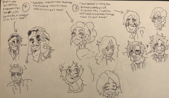
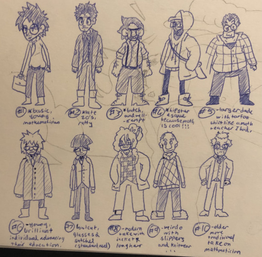
after doing a few designs for other characters from the story of Pipes, I was set upon the decision to move forward with worm man
Design the character
When it comes to designing a character's look, it's important to know who they are and how the audience should feel about them.
Traits
With traits, it’s useful for designers to write out 3 to 5 words that summarize up what attributes they want the audience to feel when they look at the character.
Showcasing Traits
Each aspect of your characters design should be considered and researched, ie don’t just make it up. From the shoes or boots on his/her feet – to the aftershave/perfume they wear (or don’t). look back at our discussions of backstory and character development. This is where you create the whole of the iceberg before the tip!
https://yesimadesigner.com/10-principles-of-character-illustration/
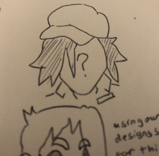
As with anything, there is more than one way to succeed - and hopefully in my modelling stages; my final design will reflect this sentiment.
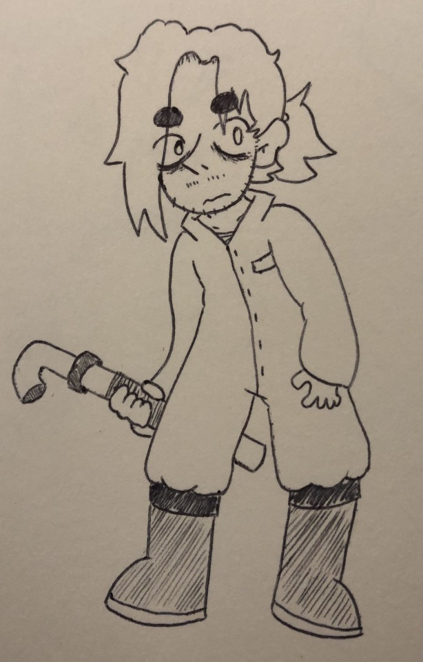
Step 1: Break down the drawing into simple shapes and lines.
using a sphere for the chest, cube for the hips, sphere for the head and a triangle for the chin, lines for each limb, triangles for feet and lines for each finger.
Step 2: Add in the anatomy.Next, it's time to create body landmarks into your sketch.
This step builds on the previous sketch layer, but still stays rough and explorative.
Step 3: Fill in the details of your character.Now is the time to add in the details of who the character is and explore the features within creative design.
0 notes
Text
The importance of Environment
Character design is an enormous contributor to how things feel. it provides visual feedback for our feedback and helps us, as outsiders, to intuit how things in the world works.
This investment also applies to the environment design, as the world in which characters inhabit is just as important as the characters themselves.
think of it as follows, what would Star Wars be without all the lore that exists within the expansive universe? Having all of those creatures and characters, without the mesmerising world/s around them, the movie would have faded into a galaxy far far away as just another story about humans with abilities...
Or what if you took “Hyrule” away from “The Legend of Zelda”, and instead set the events on earth as we know it? The list can go on and on for any character and world driven story.
Basically, the two need to be connected and drive the larger narrative together.
For these and many other reasons, you can not approach character design and world-building as a whim or just focus on the aesthetic. It has to be treated with the same amount of (if not more) dedication and attention to detail as any other important role in the overall experience.
Now the same goes for world-building, as I mentioned before: What would all of those characters be if you do not create a world that gives life to and fulfils their purpose?
The relationship between both character and the world is where things get very interesting and fun.
WHAT DOES THIS MEAN FOR PIPES
with our choice of worm-man - we need to build this little critter a home to inhabit.
I started with a basic spider diagram; and set out with possible themes and words that would associate with a world inhabiting such a beast, while still encapsulating the core ideas behind the original story.
I wanted to keep the dark tone; incorporated into the visual aesthetic of the story; with me thinking of designing some sort of gloomy enclosed area - maybe underground, since it’s a worm.. with a dreary, dingy, damp theme
I thought steel, and metal in general, was essential to relate back to the original factory setting, in an industrial sense. from that - I knew wherever I ended up, i was going to be using a lot of dull colours, and metal textures.
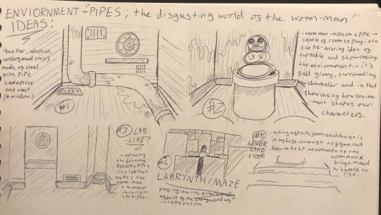
with all my parameters in place, I decided to challenge myself to create a few possible scenarios - with bunkers, labs, and labyrinths being some of my most common thoughts.
but in the end, i decided to combine aspects from all my final environment ideas, into a sewer scene.
for some reason, i thought a water feature was important to the scene’s overall composition - as well as keeping in line with the habitat of worms; as I only really see them after it rains, otherwise they’re concealed beneath the dirt.
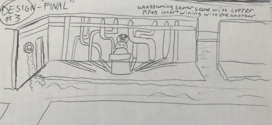
MODELLING THE WORM-MAN’S LAIR

beginning the 3D design part of this - i figured there wouldn’t be all that much to write about - since we’ve been through this process multiple times...
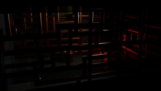
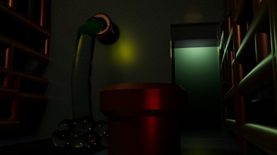
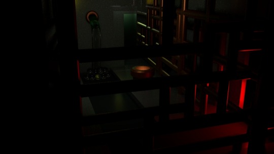
I decided to put a light inside the pipe, to present to the viewer that this is Worm-Man’s portal to heaven, and the multiple unnatural pipes surrounding the scene showcase his obsession with finding a place where he’ll belong - locking himself up in his own work.
I made the outside scenes of the sewer, unseeable from all angles to play into this theme further - and have the worm man encased within an environment, that has low lighting, representing his ever deteriorating mental state.
the red lighting in the rightmost tunnel was an attempt to create visual flair, and showcase that anything outside of this area is hostile for the Worm-Man; he doesn’t belong, out there - and the use of colour is a visual queue that it’s dangerous for him.
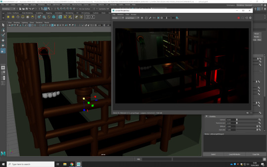
BEAUTY SHOTS
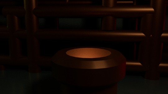
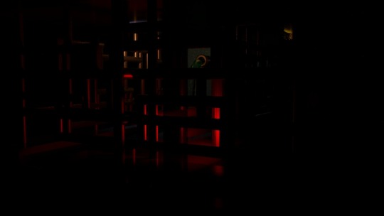
0 notes
Text
CONTROVERSY IN DESIGN - AND HOW TO AVOID IT
writing about sensitive topics is a minefield these days.
saying something that’s generally regarded as politically correct right now, could be used against you in ten years. and with the internet - everyone is given a voice, no matter how young and naive, or harshly inappropriate their views.
your online activity is recorded, and can n e v e r be fully deleted.
in a world where things are changing so rapidly - with newer generations becoming ‘ w o k e ’ - with a general awareness and sensitivity to forms of negativity, that were acceptable in the past.
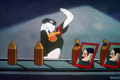
individuals, who are not necessarily deemed politically correct, becoming the victims of ‘cancel-culture’.
media from the past - that invoke the comedy, and views of the generation of the time are being blasted on social media platforms, such as twitter. playing into that old classic adage that: “people who have too much time on their hands will always go out of their way to be angry about something.”
stereotypes have always been a staple of certain genres of films - with exaggerated features of racism, played off as if truth and normality, to generate the illusion of narrative progression, or as a substitute for actual well-written comedy.
the point of comedy is to make someone laugh - and when the ‘joke’ ranges from lighthearted jabs to harmful and offensive, i have to agree with the masses. this on the same level as ‘fart-jokes’ - cheap.
This is only one way in which the movie and TV industry is attempting to do right by its audiences who criticise them for long ignoring racial insensitivities.
When HBO Max debuted earlier this year, it included Gone With the Wind, a film long decried for its racist themes. In response to these issues, the service now broadcasts the film with a disclaimer about the inaccuracies of its representations, though still makes the unaltered film available.
Other TV series have aimed to remove controversial elements entirely, as various episodes of Scrubs, 30 Rock, and Community have all been pulled from services due to their offensive qualities.
EXAMPLES
media changes because society changes, ergo characters change too. watch a film from 20 years ago and there's going to be elements that upset a modern audience.
Uzaki-Chan
- the anime character 'Uzaki-Chan' was almost cancelled - being put on blast for having unrealistic body expectations for women
https://unseenjapan.com/japanese-red-cross-uzaki-chan-poster/
The Japanese Red Cross released a poster with the character on it trying to drum up blood donations. Uzaki stands on the poster with her chest pushed out but covered, taunting passers-by with
センパイ!まだ献血未経験ナンスか?ひょっとして。。。。。注射が怖いんスか? (“Senpai! Have you still never donated blood? Perhaps…you’re scared of needles?”)
Needless to say, some people took umbrage with this claiming that the organisation should not have used what they claim is an over-sexualised character in this ad campaign. The controversy has only spread since then with one side saying that the fictional character has an unrealistic body type and perpetuates the objectification of women, and the other side saying that shes a fictional character so realism is not necessary and that they enjoy the character as written.
In Japan, a substantial portion of the artists drawing "oversexualised" women, are women who have no moral hangups about their work. And like artists anywhere, they do not want that work to be limited by values imposed upon them by others.
Honestly I wouldn't call that pose with her chest pushed out. It's just her leaned over a bit, she has a large chest, which is a thing women can have. She's the only one in the show with a large chest like that, so I wouldn't call it unrealistic since they're at least keeping it rare.
It's a current and decently popular anime, and the guy protagonist in it gets sexualised almost as much as her and both at a relatively low amount for anime. And for once they're college aged instead of high school students, which is nice.
Anyway point is I wouldn't call her body unrealistic, just a bit rare, and only people that haven't watched the show would say she just perpetuates the objectification of women without realising the guy gets objectified too.
Apu Nahasapeemapetilon
- Apu from ‘the Simpsons’ was considered a harmful stereotype of Indians.
Quests for proper representation in the world of animation have grown more passionate in recent years, thanks in large part to the 2017 documentary The Problem with Apu from comedian Hari Kondabolu.
The iconic Simpsons character has been featured on the series for 30 years, but much like how the characters themselves never age, Apu rarely elevated above being anything other than a convenience store cashier, a formerly popular stereotype for people of South Asian descent in pop culture. The documentary highlighted why it was so problematic for one of the most famous Indian characters to be reduced to such a stereotype, but also the problems of having Hank Azaria, who is not of Indian descent, voice the character.
youtube
however, this brilliant video by ‘hotdiggitydemon’ is an effective teaching that despite being based off of harmful stereotypes, Apu is a brilliant character, with many positive qualities. I’m not sure if it ended up happening (because i think the newer seasons of the Simpsons are almost unwatchable) but Apu was threatened to be written out from the show.
Azaria himself has previously stated that his plan for the character was to leave the role behind, though Simpsons creator Matt Groening confirmed that Apu is set to remain on the series.
Cleveland Brown
- Cleveland Brown from popular American, adult-animated series: ‘Family Guy received heavy backlash, and recasting due to a white voice-actor providing the character’s voice.
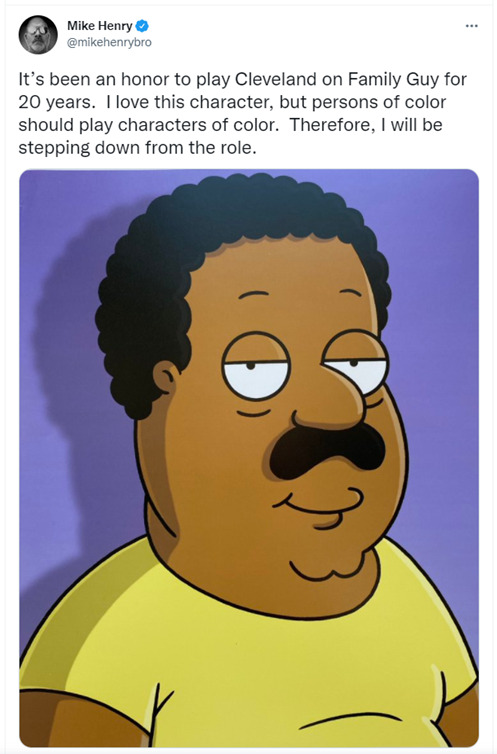
Voice actor Mike Henry announced he would leave the role of Cleveland Brown on 'Family Guy' to allow a black actor to play the character
YouTuber and voice actor Arif Zahir will take over the role for the Fox animated show's 19th season, three months after Family Guy star Mike Henry announced that he was stepping down as the voice of Cleveland Brown
Crazy Frog
Crazy Frog was originally designed by Swedish animator Erik Wernquist. His digital birth was to accompany a funny .mp3 file of student Daniel Malmedahl imitating a motorbike sound. This was, of course, in the days where people shared .mp3 files with each other, for fun.
youtube
Wernquist named the animation ‘The Annoying Thing’ and uploaded it to his website and an early CGI forum, where it was downloaded and shared across
But it wasn’t long before controversy struck...
Crazy Frog was never meant to be a kid-friendly icon. This might explain why his dick caused him so much trouble. As you may be aware, the Frog’s design includes a vest and no pants. In some appearances, his body appears to be bulbous and free of genitalia, but in his more common form he has a short, stumpy penis between his legs.While character art was often edited to remove it, it caused major problems for the music videos.His visible scrotum caused major complaints and while it led to censoring on some commercial TV stations (a blurred bar appeared across his midsection), the UK Advertising Standards Authority did rule in favour of Crazy Frog in 2005. Despite getting a free pass for showing his genitals on air, Jamba chose to censor all future Crazy Frog content to avoid backlash from concerned parents. Arguably, this controversy only buoyed his star. It made him infamous in the eyes of 2000s kids everywhere. the internet.
Jynx - Pokémon series
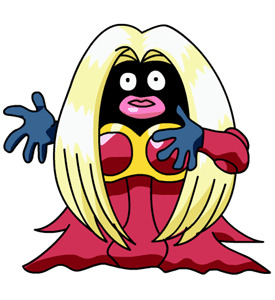
To Nintendo's credit, this is one that the company took seriously and attempted to fix. In the first generation of Pokémon games and several episodes of the anime, the psychic Pokémon called Jynx featured a very controversial design. Its pitch black skin and large red lips reminded many people of stereotypical, outdated "blackface" caricatures.
Rather than simply dropping the offending Pokémon entirely, Nintendo decided to change the look of the character going forward. Starting with the second generation, Jynx was recolored with purple skin. Also, as noted by Hypable, not only was Jynx recolored for the Pokémon anime episode "Holiday Hi-Jynx," but the episode in question was actually omitted from future reruns and DVD releases of the series.
In 2016, when the games that originally kicked off the franchise, Pokémon Red and Blue, received digital releases, Jynx's character sprite from those games had been updated to reflect the newer coloration. In this way, Nintendo not only addressed the concerns and criticism, but they went the extra mile and made corrections going forward.
Drawn Together - Terms of Endearment
youtube
Captain Hero gets caught using his X-Ray vision on the girls in the shower. Unlike Clara and Toot who are very angry at him, Foxxy likes what he's doing and allows him to do it to her all the time. However, all this X-Ray vision gives her a brain tumour which turns her into a racial stereotype.
When they get there, the housemates discover that Mickey Mouse (whose name is always partially bleeped) is leading a plot to eliminate all offensive cartoon characters in order to make the universe the "happiest place on Earth." To this end, he has all the housemates captured, and forces the mutated Foxxy to walk the plank into a pit with giant erasers
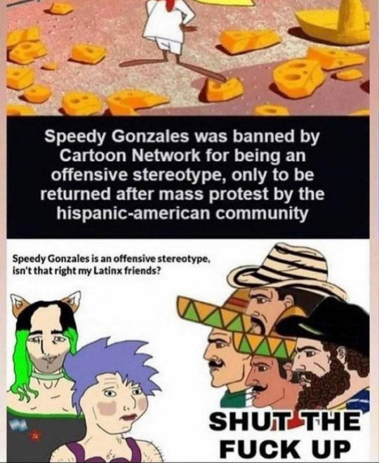
Speedy Gonzales
- there was a debate recently about a bunch of people being upset about Speedy Gonzales being a "harmful representation of Mexican groups" - only for the community to request the return of the character
1 note
·
View note
Text
CHARACTER PROFILE - “BUILDING UP THE PIPES PROTAGONIST”
One of the most important elements in a novel or short story is characterisation: making the characters seem vivid, real,
alive.
The purpose of a character profile is twofold: to assist the writer in creating a character that is as lifelike as possible and to help with continuity issues in the story.
Your character profile is a record of everything you know about your character, from their origins and backstory to their personality traits and physical appearance. You can also note their relationships, daily routines, hopes, fears, and motivations
REFERENCE MOODBOARD

CHARACTER PROFILE https://www.wikihow.com/Create-a-Detailed-Character-Profile
DEFINING CHARACTER
When it comes to designing a character, these questions help creators think about who their character is, and what personality their character will take on prior to drawing out a design.
Where is the character from?
A great place to start when designing a character is to think about what era or location the character is from. This is an important step because it sets the stage for the eventual environment and backdrop the character will traverse.
For example, a full armored knight would fit a renaissance castle. And a suited-up space marine would fit a futuristic space war. Think about the time period too—the 1980's style of clothing and personality is vastly different than what took place in the 1920's.
What’s the character’s name and what do they look like?
Once a time period and location have been chosen, it's time to create some baseline stats! The list below provides a starting point, but designers shouldn’t feel limited to just these differentiators. For instance, anyone who has ever played a role-playing tabletop game can think of the different stats they might need to define.
Name
Age
Height
Eye color
Hair color
Defining physical characteristics (scars, blemishes, moles, etc.)
Birth home/current residence
What’s the character’s redeeming characteristic?
Every character has a redeeming characteristic about them; a trait that is good and positive. It could be that the character is kind, passionate, charming, loyal, patient, or anything else that could be thought of as a “plus!”
What’s the character’s fundamental flaw?
All that said, every well-written character also has a fundamental flaw—something about them that is not so good, or even detrimental; something that they will struggle with throughout their story.
This is sometimes the main struggle that the character is trying to learn from or overcome on their quest, and can be anything from a personality that is rude or mean-spirited, to developed insecurities, impulsive stealing, etc.
What’s the character’s motivation?
The last thing to think about is the character's motivation. Why are they here? What journey are they wanting to go on, and why?
Maybe it’s a star-crossed lover who is traveling the world to save their partner. Or a knight who must slay the demon dragon to save their hometown. Perhaps it’s a space explorer who is trying to discover the next planet suitable for human life.
Basically, why is your character in this game?
Bring the character to life
After forming the character backstory, it’s time to move on to forming the actual character!
From anatomy to common physical poses, there are a few different considerations at this point in the character design process.
https://mi5014ikepearson.tumblr.com/post/668430147509207040/fundamentals-basics-of-character-design
1 note
·
View note
Text
SHAPE THEORY - “CIRCLES, SQUARES, AND TRIANGLES”
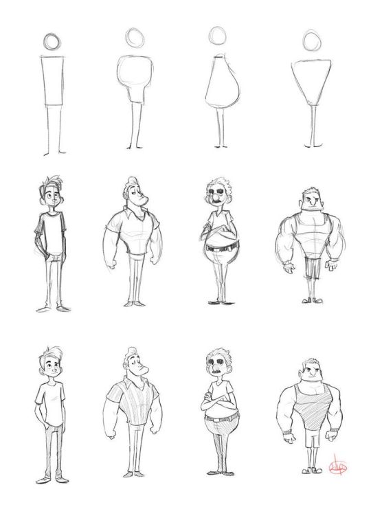
There are three basic shapes that can be used to draw characters: circles, squares and triangles.
Each shape means something to the subconscious mind. This shape language ties through the entire character, from the basic body shapes, to details like the shapes of their eyes or ears.
HOW DO GEOMETRIC SHAPES AFFECT THE PSYCHOLOGY OF THE CHARACTERS?
Basic shapes can change the overall feel of your character.
Let’s talk about three basic shapes, that are used in virtually every character’s design:
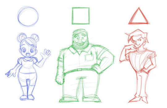
CIRCLES - “SOME ROUNDED SHAPE LANGUAGE”
You probably have seen some chubby faces and wondered: “Isn’t that cute?”
Well, there’s a reason for that! Circles and ovals are mostly used for friendly and outgoing faces. You can experiment with putting circular shapes in different parts of a character’s body, clothes, and hair to show the same warm feeling.
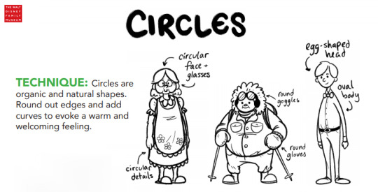
Circles make your character feel soft and friendly. If you want your character to be approachable and fun, circles are a good idea to go off of
SQUARE - “QUADRILATERALS, THE CORNERSTONE OF SHAPE LANGUAGE
Have you ever thought about the reason why square-faced people look more confident and inflexible?
That’s because square-like shapes relate to straight vertical and horizontal lines that communicate strength, stability, and confidence.
Squares can both be large and daunting or comforting and clumsy. They often depict steadfast characters who are dependable and are commonly used for superheroes.
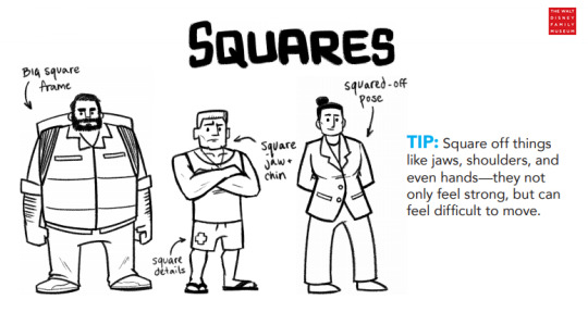
Squares make your character feel bulky and heavy - as squares and rectangular shapes are great for conveying a character’s strength and physical weight.
TRIANGLES - “THE POINTS OF SHAPE LANGUAGE”
And finally, the evil shape! Triangles are the most dynamic of the three shapes we have mentioned so far.
Bad guys and villains are often based upon dominant triangular concepts, as they appear malicious, sinister, and communicate with the most aggression. It is the circle’s most opposing shape and is often used for antagonists.
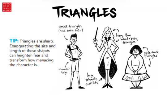
Spikes = pain, right?
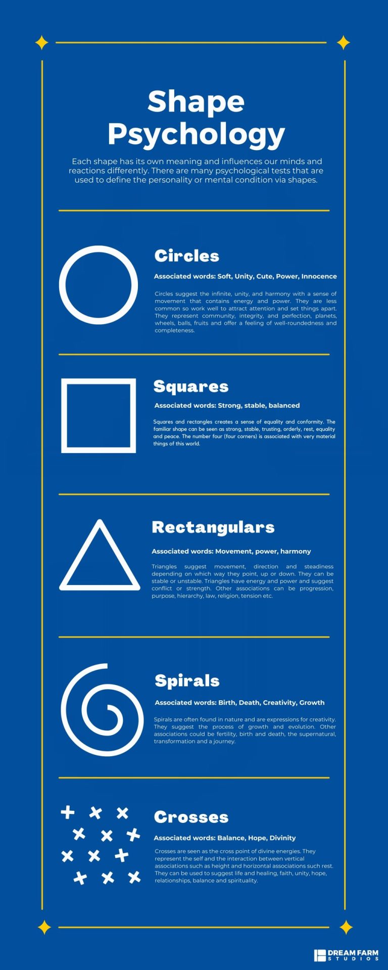
Basically, there are 3 types of shapes that are usually used in mainstream design:
Organic shapes: think about all the free-flowing and non-symmetrical shapes in nature; clouds, planets, earth, they’re all randomly formed and we call them organic.
Abstract shapes: when you combine the two other types of shapes without any specific goal or structure, you got yourself an abstract shape.
Geometric shapes: these are all the shapes that you learned to draw as a kid like squares, rectangular, and circles. They are often symmetrical and structured shapes with sharp edges.
Now, it's time to think about and find ways of expressing who the character is through their visuals.
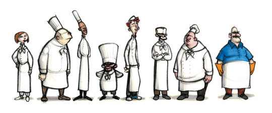
FACES
Eyes: The saying goes that "eyes are the gateway to the soul," and even how a person's eyes are shaped can say a lot about them. A furrowed brow alludes to an angry soul, while strong laugh lines mirror a happy spirit. Eyebrow shapes can easily tell something special about the character.
Jawline: Strong jawlines could tell the audience that a character is bold, tough, and confident. Meanwhile softer jawlines emote feelings of youth and kindness.
Nose shape: There are many different styles of noses for characters. A hooked or crooked nose showcases mysterious past or perhaps a nefarious schemer. Small button noses are good for cute, young, and innocent characters. Strong angular noses are great for confident or tough characters.
Ears: Ears can describe certain mystical characters like elves or orcs, but they can also be adorned with jewelry that will speak about the person. Someone with elegant traditional earrings may come from royalty. Stark metalwork earrings on the other hand could be used for harsher, more misunderstood characters.
Body language and overall posture of the character has more weight of emotion compared to facial expressions (eyes, eyebrows, lips and so on)
BODIES
1 note
·
View note
Text
THE BALANCE BETWEEN AN OVERLY-COMPLICATED AND UNDERDEVELOPED CHARACTER
lets start with a question, to get your mind going; Which of the two is better?
1. a completely flat character being absolutely one dimensional, does not have an arc throughout the story.
2.
Complexity is a spectrum, at the end of the day; with characters being no different, in that regard.
as the adage goes:
Less is more, and simple is easier to remember. but layering on complexity makes it infinitely more interesting.
DIMENSION
The characters that appear in stories are sometimes described as 'two dimensional' or 'three-dimensional' (2D or 3D).
The metaphor is that of reality, that a three-dimensional character is somehow more realistic, whilst a two-dimensional person is flat and relatively lifeless.
SIMPLICITY
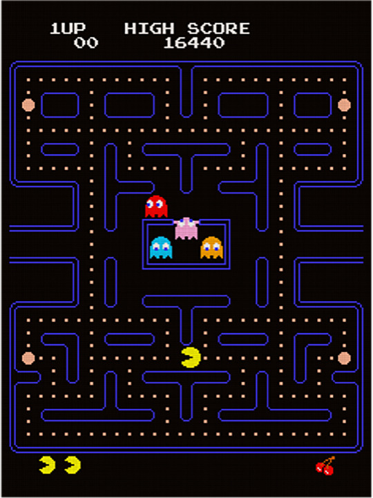
COMPLEXITY
Complexity will never truly hinder a Character, but the execution of the depiction is important to this statement, as there needs to be a cap on making sure they won’t seem ‘overly complicated.’
To put it concisely, we’re looking at a fine line, one that separates complexity and convolution from another ‘C’ word, at the other end of the spectrum: coherence.
The character’s coherence is the difference between the audiences experiencing an ‘Ah Ha!’ moment or a ‘Huh?!’ moment.
Let’s take The ‘Metal Gear Solid’ Series as an example. It’s a story with many wheels in motion, all of them turning simultaneously at different paces.
youtube
It is a prime candidate for being labeled ‘overly complicated.’ Or at least, it would have been if the execution wasn’t as precise as it is...
the studio ensures the wheels are well greased, and the events that transpire, as ‘complicated’ as they may seem, are held together with firm narrative coherence.
this would make it complicated; yes. but convoluted? Not in my estimation.
And that’s because it’s coherent.
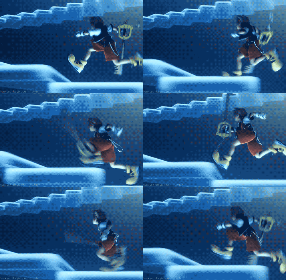
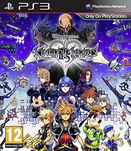
but when it comes to something akin to Kingdom Hearts. in particular, it is so ridiculously written it’s practically a joke - and definitely falls into the convoluted area.
I must reiterate, though, that all of this is profoundly subjective. What is ‘complicated’ to some might appear ‘convoluted’ to others, or vice versa.
Also, you should be able to tell what’s going on in your design by looking at it.
If you look at your character and can’t even tell what it is anymore, it is time to simplify.
Clothing styles and hairstyles should be generally simple when broken down, and should not have too many pieces/parts/elements to avoid confusion. Being able to make your character’s overall design in as few strokes as possible is a great way to challenge yourself to break down your character.
0 notes
Text
FACELESS PROTAGONISTS - LAZY FROM A DESIGN PERSPECTIVE?
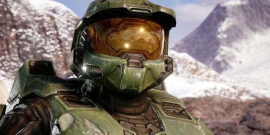
although a feature almost used exclusively in video-games, I wanted to discuss the implications of the featureless protagonist, from a character design perspective.
most early games went out of their way to avoid applying any characterisation to the player character - as an attempt to reinforce the notion that the audience "is" the main character. However, this is less common in it’s extreme form today, as it makes the compelling storytelling that most games attempt, highly problematic.
faceless protagonists are much easier to achieve in Interactive Fiction, and to this day, many text games still take this approach, and enthusiasts have been known to be disappointed if forced to play a character who does not reflect their gender or sexual orientation.
Beyond adventures, most games at least need to graphically present the player, so some amount of customization is required. The result is often an extended form of Purely Aesthetic Gender, with little additional influence on the story.
A weaker form of this attempt results in the Heroic Mime. Often used in conjunction with Second-Person Narration Media which try to put a definite name and face on the protagonist result in Canon Name.
In most Real-Time Strategy games, the player is either a Featureless Protagonist or just a Non-Entity General who directs the action but doesn't even have a character. This tends to cause problems when the work gets adapted to other media. One solution is to give the character in question as generic and bland a personality as possible.
The other is to remove them completely.
PROJECTION IS THE ANSWER
Our brain hates the unknown.
We hate the unknown so much that we often fill in the narrative gaps based on our limited knowledge.
The more we know about a persona, the less connected we feel. The narrative distance is further away from the action, and we become an outsider to the overall narrative.
The absence of facial expressions can produce the opposite effect as well. We often view enemies like storm troopers, droids, or other abominations void of eyes and mouths as non-human. This dehumanizing effect can lead to a more comfortable time destroying enemies.
It is much easier for me to wipe out a squad of Stormtroopers than a team of real people.
in games where fear is involved, having the hero wear a mask often projects their fear onto you. Games like Dead Space and Bioshock (the Big Daddy) come to mind. There is a heightened sense of awareness and the environment when you can’t read the hero’s thoughts.
It’s not to say that their faces didn’t exist. Most of them had quite familiar-looking faces once exposed, but developers intentionally hid their expressions from us. These archetypes found themselves mysterious and featured obscure backstories designed to keep us in the dark.
We loved their stoic posture. We searched far and wide for more information about their origins and when none came up, we were even more intrigued.
We just had to know who these mysteriously dark characters were. Our minds raced at the possibilities.
Gaming is a unique medium that allows us to integrate with an experience. Having faceless characters only enhances this already immersive experience. Done right, we can all believe that we are Master Chief or Boba Fett. At least, for a time.
0 notes
Text
THE LINK BETWEEN A FACE AND IT’S VOICE - “IKE WEASELS VOICEWORK INTO THE CHARACTER DESIGN MODULE”
as an amateur voice actor; I’ve always tried expanding my range, in every way I can - with vocal exercises, gargling honey, salt mixes, everything I can - and yet; biology is a factor that limits how far you can actually go.
one morning, recently - while prepping myself for an audition - I pondered whether your face has anything to do with the way your voice sounds... so I decided to research it:
`PUTTING THE FACE TO THE VOICE - “MATCHING IDENTITY ACROSS MODALITY”
it turns out that facial motion during speech is a direct consequence of vocal-tract motion - which shapes the acoustics of your voice. This fact suggests that the acoustics of speech can be used to estimate face motion, and vice versa.
A recent study done to test this obtained promising results; https://www.sciencedirect.com/science/article/pii/S0960982203006638
the study was based on simultaneous measurements of face deformation, head motion and speech acoustics collected for two subjects during production of naturalistic sentences and spontaneous speech.
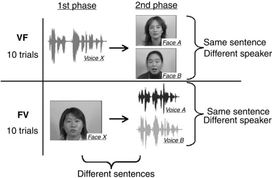
in essence this means that the procedure followed using markers on the different subject’s faces and using said markers to estimate how the face motions through speech relates to the outputted wave.
“the inputs are line spectrum frequency pair coefficients and whose outputs are marker positions on the face.”
using the measured and estimated face and head motion data the scientists animated a naturalistic talking head; where the outputted speech perception provided compelling examples of a strong link between auditory and visual modalities.
This link originates in the mechanics of speech production, which, in shaping the vocal tract, determine the movement of the face as well as the sound of the voice
The facial motion and acoustics associated with speech production are both constrained by structure and time-varying configuration of the vocal tract.
The resulting link between auditory and visual speech information allows us to match the identity of faces and voices as well as allows us to speech read.
0 notes
Text
UNCANNY VALLEY - “WHEN HYPERREALISM FAILS TO BE REALISTIC”
https://alanwarburton.co.uk/goodbye-uncanny-valley
uncanny valley is a term that most people have never heard, but upon consuming media throughout the early 2000′s have most definitely experienced in some capacity.
the term is used to describe the relationship between the human-like appearance of a robotic object and the emotional response it evokes. In this phenomenon, people feel a sense of unease or even revulsion in response to humanoid robots that are highly realistic
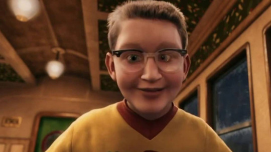
The term was first coined and described by the Japanese roboticist Masahiro Mori in an article published in 1970. In his work, Mori noted that people found his robots more appealing if they look more human.
While people found his robots more appealing the more human they appeared, this only worked up to a certain point.
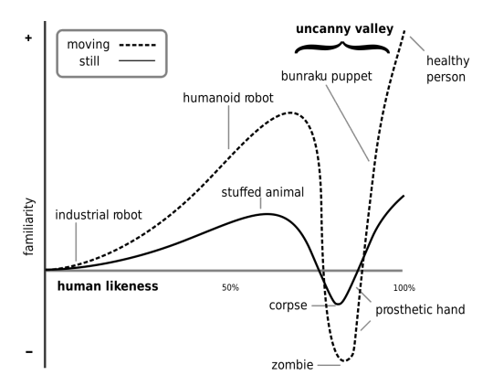
When robots appear close but not quite human, people tend to feel uncomfortable or even disgusted. Once the uncanny valley has been reached, people start to feel uneasy, disturbed, and sometimes afraid.
“I have noticed that, in climbing toward the goal of making robots appear human, our affinity for them increases until we come to a valley, which I call the uncanny valley,”
Mori used a number of examples to clarify this idea. An industrial robot has little human likeness and therefore generates little affinity in observers. A toy robot, on the other hand, has a more human likeness and tends to be more appealing. A prosthetic hand, he noted, tends to lie in this uncanny valley — it can be highly lifelike yet generates feelings of unease.
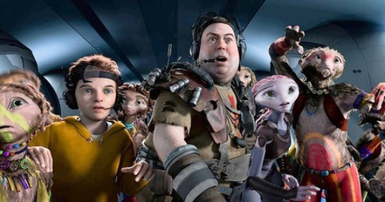
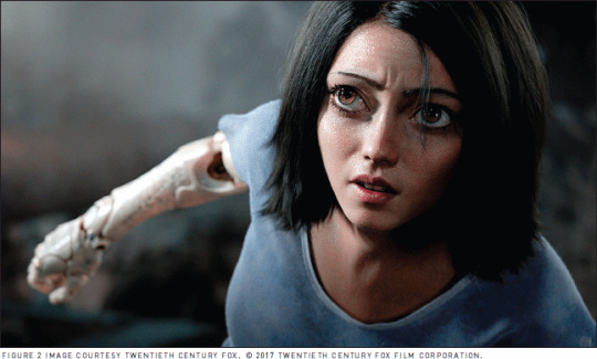
avoiding Uncanny Valley in Virtual Design https://interactions.acm.org/archive/view/september-october-2018/avoiding-the-uncanny-valley-in-virtual-character-design
0 notes
Text
READING - “TAKING ADVANTAGE OF LIBRARIES”
long before the age of the internet, and we had devices with limitless power and knowledge at the tips of our fingers before we could google anything and everything: libraries used to be more than just places for the homeless to loiter about
...i truly miss it
and to get that feeling back - there’s no better place to start, than with a good book!
unfortunately, due to the current situation - I figured it’d be best to stay away from communal areas such as the library, so instead of checking out hard copies of the books, so I could read comfortably, whenever I caught a spare second to myself..
I went to the library to browse, and downloaded an electronic book to my laptop, to read as I typed up blog posts...
Prepare to board!: creating story and characters for animated features and shorts by Nancy Beiman
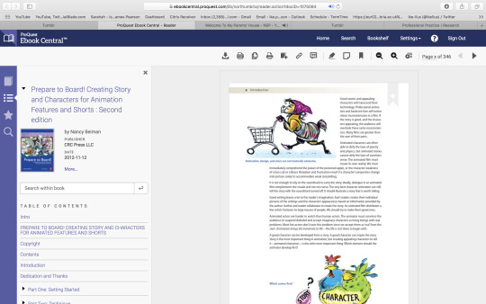
“Successful storyboards and poignant characters have the power to make elusive thoughts and emotions tangible for audiences.”
I found my reading to be especially pleasant, as the pages are packed to the brim with illustrations that further the text’s attempts to not only entertains but obviously educate and inform.
Beiman, focuses on pre-production, story development and character design.
this is one of the only books I picked up that explored the intersection of creative character design and storyboard development, making it an invaluable resource for artists of any skill level.
there were plenty of tips for animators to be able to spot potential problems before they cost time and money, as well as informing us of the ways in which the animation storyboard differs from live action boards and how characters must be developed simultaneously with the story.
Positive and negative examples of storyboard and character design are presented and analyzed to demonstrate successful problem-solving techniques, applicable to a variety of animation projects.
I was especially intrigued with the featured interviews - as picking up a few tricks from animators and storyboard artists, who have been in the business for a while now is never going to not be something valuable.
Character design today by Ami Miyazaki; Megumi Suzuki
“Today, a character serves as one of the most powerful communication tools with which to convey a clear message from a company to its target audience, and differentiate its product from the competitors.”
This collection presents over 200 recent characters used in posters, catalogs, packages, in-store designs, T-shirts, key holders, and more.
The book follows design concept, how a character is created according to the company’s marketing plan, each character’s statistics, such as place of birth, family, characteristics, hobby, etc., and is also described in the text so that readers can see how a character is defined and positioned for a particular promotion of a product or service.
In addition, there are three brief case studies where the process of creating a character from scratch is featured, showing "brief idea," "rejected design," and the "adopted design" of a character as well as its application in the end.
About 90% of the characters in the book are created in Japan, the most character-rich country in the world.
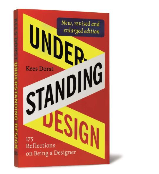
Understanding Design: 175 reflections on being a designer by Kees Dorst
What does it mean to be a designer, and what does it take to be a good designer? Understanding Design stimulates designers to think about what they do, how they do it, and why they aim for a certain effect.
“One hundred seventy precisely formulated mini-essays give insight into the design process and encourage reflection.”
This is a book every designer would wish to have had in design school. And it's such a good read that it will appeal to designers from all disciplines in every stage of their career.
Professor Kees Dorst presents 175 provoking essays to stimulate designers to think about what they do, how they do it, why and to what effect.
the enjoyable essays in this book provide a panoramic view over the subject of design. The essays are written to encourage designers and students of design to reflect upon their field.
Fundamental questions are raised about the nature of design, about designers themselves, and about the role of design within the broader contexts of business and society. There are no definitive answers in this book: the readers are challenged to construct their own solutions by considering their own experiences as a designer or design student.
The essays are clear, inspirational stepping stones on the path towards becoming a truly conscious professional in the field of design.
0 notes
Text
ARE HUMAN BEINGS REALLY AS UNIQUE IN APPEARANCE AS YOU THINK
we all have our pals, in the world - we can identify them from a crowd when we see them for the most part; and thats great and all
but with all human beings consisting of the same basic elements; there’s going to be a pretty high chance that somewhere out there will be a person who looks somewhat similar to yourself - as there’s only so many possibilities for your facial structure, hair, etc. - theres bound to be some crossover. or is there..?
[ * insert “audience_exclaim.mp3″ here]
how likely is it for people to look the same? well rather unsurprisingly considering my confidence in making this post - you are surprisingly likely to have a living doppelgänger.
this means the same can be said for characters, so you better get designing quick, or all the good options will be taken!
FACES & BODIES - “INFINITE COMBINATIONS... O R I S T H E R E ? ”
when we design characters - we tend to be afraid of making them unappealing look at; unless that is the intention - so designers stick to a few very basic body, and face shapes - with aspects and features that differ very minimally from character to character.
* Overwatch Female Face Templates https://imgur.com/a/HQFeIvI
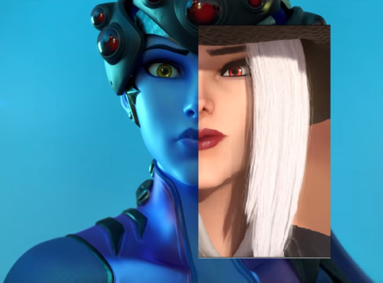
a quote from a 3D Character Artist, here: “Base mesh creation takes a long time - you have to get the anatomy, proportions, and fit the style perfectly before you can move onto clothing and accessories.” .. “Having an existing base mesh means the anatomy is already there and you can tweak minor features and sculpt out anything that needs to be re-sculpted to make the character different enough from the base that you don’t have to start from scratch, but also look relatively unique.”
with this knowledge, in hand - it’s hopeful that using characters as bases for designing is common practice, especially in 3D animation, to cut down on resources.
does this open up the possibility that there are an infinite number character designs, or does this create the idea that there truly is a finite amount, with minimal alterations, to make them unique? that - is a question best left for you to think about~
AI-PROCEDURALLY GENERATED FACES
https://thispersondoesnotexist.com/
Phillip Wang is the 33-year-old software engineer responsible for creating the artificial-intelligence powered website “This Person Does Not Exist”
Each time the page is refreshed, an algorithm known as a generative adversarial network (GAN) (originally coded by Nvidia) renders hyper-realistic portraits of completely fake people.
The stunt was designed to call attention to A.I.’s ever-increasing power to present as real images that are completely artificial.
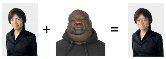
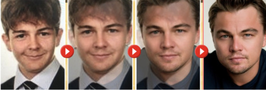
the tech works in a manner akin to this; taking aspects of pre-existing photos from a database, and taking pieces of the merged frames and placing them with other snippets to create a believable result.
https://www.inverse.com/article/53414-this-person-does-not-exist-creator-interview
https://futurism.com/these-people-never-existed-they-were-made-by-an-ai
0 notes
Text
CONTORTING AND REDESIGNING THE HUMAN FORM
I’m not a religious person, by any means: but prepared to be scriptured, by an agnostic...
people like to believe humans were made in god’s own image - as stated in Genesis 1:27, wherein "God created man in his own image. . ."
This scriptural passage does not mean that God is in human form, but rather, that humans are in the image of God in their moral, spiritual, and intellectual nature.
now: I’m sure you read the title of this blog post, (at least I’d hope so - otherwise that would be very rude!) before passing along and are starting to piece together parts of what exactly I’ve got up my sleeve this time..
who be I to spit in the face of millions of years of evolution?
I’m Ike: and I'm here to mess with our anatomy.
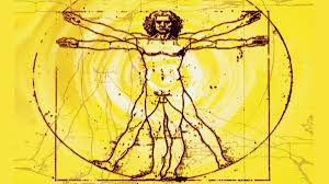
It may sound like a given, but fully understanding human anatomy is a must for anyone wanting to create an accurate 3D model.
of course, assuming the main character is human - although using animals or other objects as characters, the same care should be exercised: and you should make it a primary objective to understand the anatomy of your design!
anatomy is simple in principle, but can be tricky to work with; in terms of design. it’s always important, especially in 3D design to ensure an understanding of a basic bone structure, no matter the size or shape of the design in question.
Character designers should be familiar with the main pieces, including:
Head: Forehead, eyes, nose, ears, lips, mouth, and jaw.
Torso: Ribcage, hips, and soft “twistable” area of stomach, etc.
Arms: Shoulders, upper arm, elbow, and lower arm
Hands: Wrist bone, palm, fingers, and thumb
Legs: Upper leg, knee, and lower leg
Feet: Heel, midfoot, and toes.
Once there is an understanding of these basic components, we can begin to work on”
POSING - “HOW BREAKING THE BOUNDARIES OF STRUCTURE CAN RESULT IN MOVEMENT CHANGES”
When practicing drawing a character, designers may want to explore different physical poses their character might find themselves in.
Trying out different facial expressions, action shots, fighting stances, etc. is a great way to explore and define who the character is and how they carry themselves.
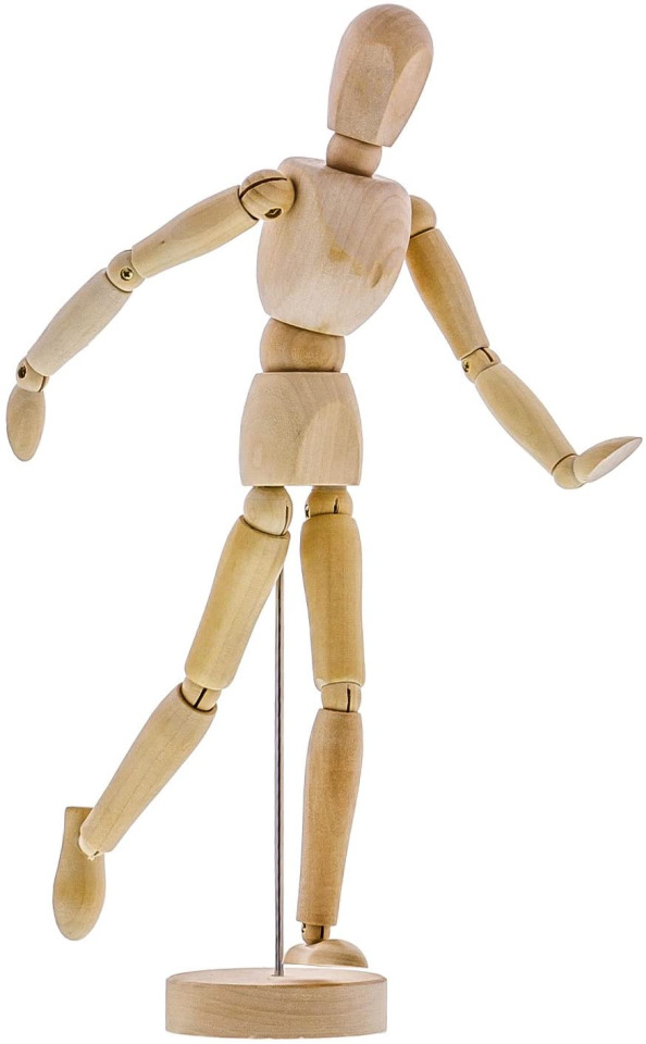
Drawing poses is all about breaking the drawing down into basic shapes. Think of it as deconstructing those anatomical landmarks that were covered earlier.
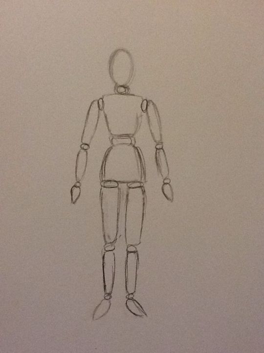
but when you change the overall shape of a character - that also means in doing so, you’re creating a variety of physical limitations, which can severely restrict the possibility of your character, if anatomy is not considered.
when you design something to be the way you design it - it’s important to consider function, as well as form.
sometimes it’s not always as easy as all that; with limitations in movement and possibility adding to potential design aspects - however, like I keep repeating over and over again:
planning those things is necessary; because as often as accidents occur, they’re not all going to work in your favour!
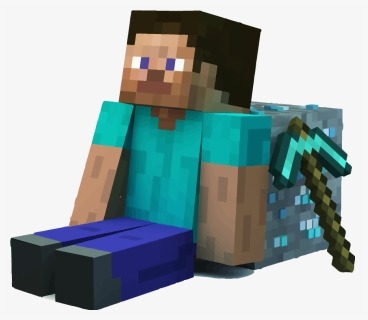
now we got onto the fun part...
CONTORTION - “DECONSTRUCTING HUMAN FORM, AND PUTTING IT BACK WRONG”
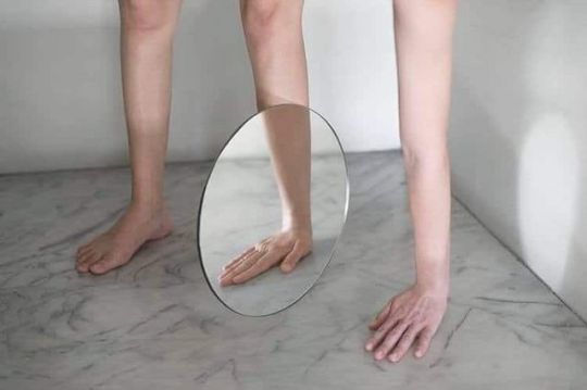
Lin Yung Cheng (3cm) - “Strategically Placed Mirrors Transform the Human Body Into Surreal Contortions”
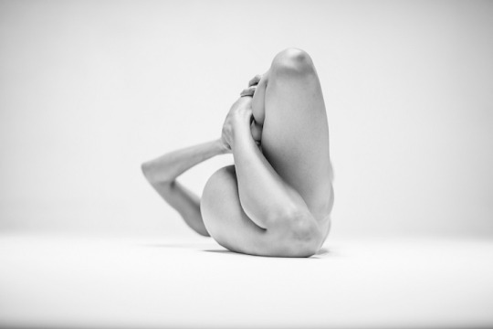
Lovis Ostenrik - “Black & White Pictures of Contorted Human Forms”
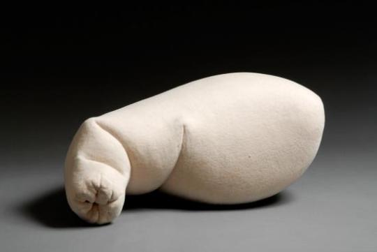
Nick Turvey
taking the work of three artists, I think it’s important to note some of the different ways that people have tackled redesigning bodies, and see what we can learn from their interpretations.
1. mish-matching body parts
I started with this one, as I feel it’s the most basic of the three types of contortion; and there isn't all that much to say about it, because of that.
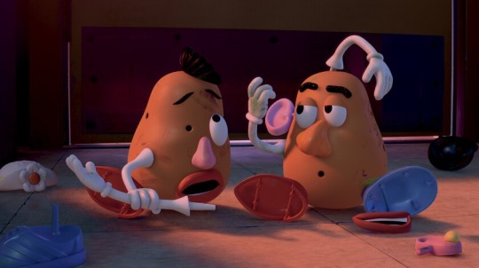
think of a ‘potato head’ toy - you can take the basic aspects of the human form, and put them in place of other holes that fit alternate body parts.
in concept: that’s pretty much exactly how bodily contortion works, in this aspect - you put things where they aren’t supposed to be, anatomically - and it creates an interesting visual.
2. contort in unnatural shapes
a lot of eeriness surrounds the supernatural; and as someone who can’t stomach horror movies, I find the sort of unnatural forms Ostenrik explores in her work to be extremely unnerving..
when the known is altered in such a way that it becomes unknown it borders on such an idea - with the contortion of human form inducing such a sickly feeling, as it’s unusual to see something akin to yourself positioned in such a way
and for that, I love the idea.
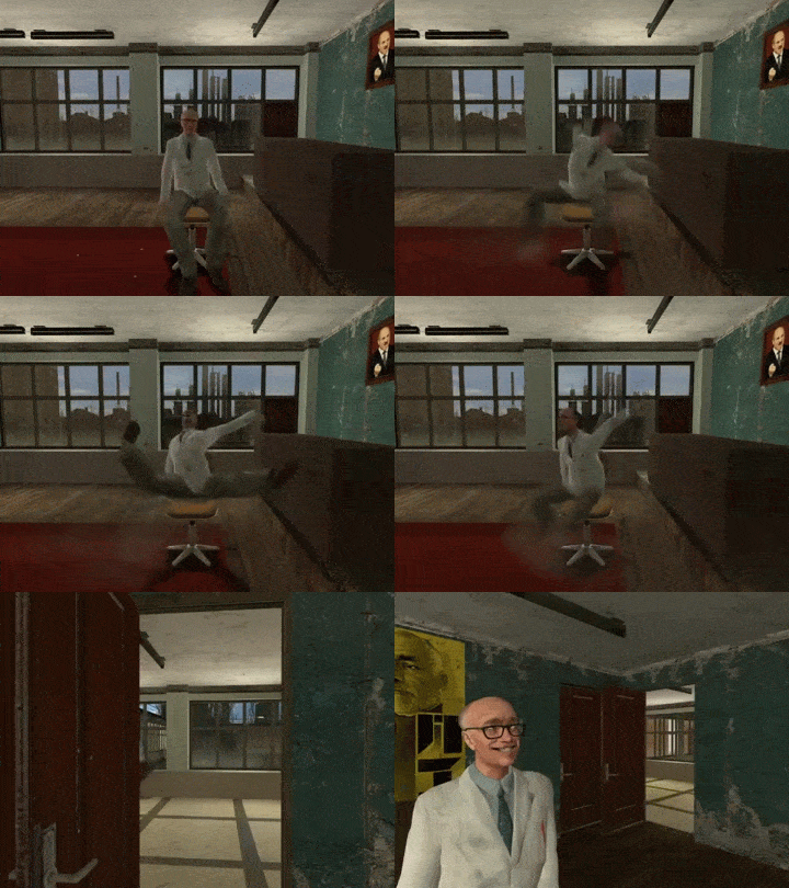
akin to glitchy-ragdoll, in Gary’sMod; I find the idea something I might like to potentially try myself, at some point
but in terms of this blog post - it’s an effective way to gather visual research for design work.
3. altering the form
here’s where things get a little more complicated...
Turvey’s work is a lot more surreal - breaking down the conventions of natural form, yet maintaining subtle aspects of which we can still identify what the intent of his work is.
taking something so complex, and making it so... well - I can’t even think of a word to describe it? it’s such a skill
using basic shape, to build up some type of structure, while still maintaining the original envisionment - truly inspired.
0 notes