PC Gamer / Artist & Illustrator / Growing Creative Technologist & Digital Media Designer
Don't wanna be here? Send us removal request.
Text
Template examples for web/tablet
After creating the Zapp template for mobile, it was important to also make the tablet and website versions of a web app. If you were to view the mobile version on a website or tablet, everything would look out of proportion, so it was important for me to design a structure for different devices.
For the sake of an example, I used the Tom Myers DJ profile content to make the other device templates.
Tablet:


Web:

The device layouts all follow a similar structure and use the same assets seen in the original mobile version, but design decisions were made to change the look and feel for the comfortabity of the user.
The tablet version still uses a navigation bar, but instead of consuming a strip of precious screen space at the bottom of the screen, I kept the navigation small and to the side where the users finger/thumb would be placed for comfortability. The navigation bar can be minimized at any time to prevent further screen disruption.
The web version looks very much like a website as it should. As we are working with web apps, so exceptions can be made with the design to suit the device being used. Even though the design looks similar to the app version, it is more web friendly. I removed the mobile style navigation bar, and brought in navigation at the top of the screen (a familiar design most websites follow).
This shows how the layout can be used cross-platform, specific to the device the user is using. No matter what you’re using to view a Zapp app, the experience will be comfortable and accessible for the user.
0 notes
Text
Preparing Zapp for Presentation/Showcase
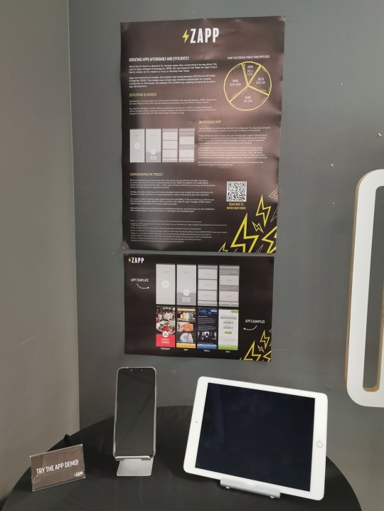
Everything is quickly coming to an end, so the pressure is on. Bligh and I worked together on creating a poster that summaries the concepts of our project. We drafted the content together in a google doc, which I then put together in Adobe indesign:

We had some extra ideas come to mind about presenting ourself at the showcase to give us some identity and point of contact. We decided to make some business cards, and lanyards which I designed:
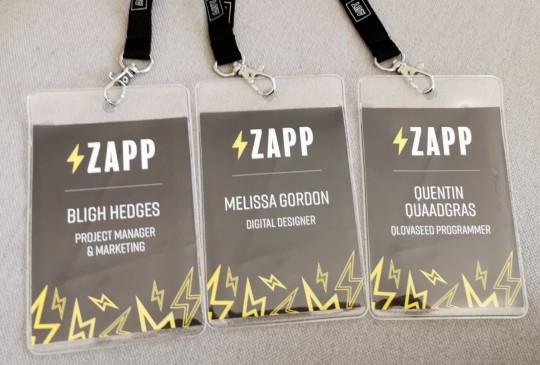
After Bligh and I set up our presentation space this morning, we felt we needed some extra information regarding the Zapp app Adobe XD demos I made. So I quickly put together a mini poster with QR codes/URL’s to the demos for the public to try out on their own devices - scan them yourself! give it a try:

Our final set up:
1 note
·
View note
Text
Feedback on the Zapp template
I created an interactive Adobe XD prototype of one of the Zapp examples to test with the general public. We wanted to gather some feedback on what people thought of the apps functionality and design aesthetics.
I made a quick Google form that had a link to the prototype, and some brief questions about the experience of using it. The form can be found Here.
Results Feedback showed that 8 out of 9 participants felt the app was easy to navigate and understand. They appreciated the simplistic design approach. One person said: “Easy to use with simple and layout of the navigation bar”.
This gives me more confidence in the Zapp template - that it can be a user-friendly structure to quickly apply content to.
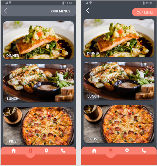
One critique to mention was that some people felt the tab at the top of the screen looked pressable or interactive. To make it look less like a button, I have altered the design to look more like a header that extends across the width of the screen:
(Revised design - Left, Orginal design - Right):
0 notes
Text
Zapp template examples
I created further examples using the Zapp template in Adobe XD to help other businesses and individuals envision themselves in an app, give inspiration and show what's possible.
We broke our target-users down into three groups:
Shops: for businesses or individuals that want store functions in their apps such as a shopping cart and a search bar.
Services: for businesses or individuals such as building/construction, plumbing/drainage, cleaning, doctor clinics, food delivery and childcare that want to advertise their services. They would want a booking system function to arrange times, take orders and book appointments/jobs for them.
Static/content: For businesses or individuals wanting a content-based app that doesn't include anything but static information/images. This could be useful for recipes/cookbooks, blogging, portfolios/profiles, events, restaurants and large projects.
An example of a profile/portfolio style app: Tom Myers - Professional Event DJ

An example of a booking system for a hotel - Fernz Hotel group

To understand the idea of using a template to build apps, I created a blank greyscale version of the template to help visualise the structure and components in its layout:

0 notes
Text
CTEC709 - Zapp
Introduction to Qlovaseed & forming a team. Link Here
Raw data collection 1 - feedback on IOS/Android UI. Link Here
Informing my practice - Visual communication. Link Here
Qlovaseed brand development. Link Here
UI/UX design trends. Link Here
Informing my practice - Contextual Design Evolved. By Karen Holtzblatt & Hugh Beyer. Link Here
Introducing Zapp app templates. Link Here
Template examples. Link Here
Raw data collection 2 - feedback on Zapp template. Link Here
Template examples for web/tablet. Link Here
Preparing Zapp for presentation/showcase. Link Here
0 notes
Text
Creative Convo’s design process
Interaction and Play - CTEC703
Understanding the brief, getting into a team & coming up with ideas: Link Here
Playtesting a concept based on the discovery of Elizabeth Sander’s “Generative Tools for CoDesigning“. Link Here
The lack of emotion - realising our components needed to convey more accurately. Link Here
The potential idea of using an app. Link Here
Discussing our revised concept - Communication with clay. Link Here
The formation of the Creative Convo’s toolkit, including our slides: Link Here
Creative Convo’s class playtest, including a video of the experience: Link Here
Additional posts that overlap into my Interaction and Play practice throughout the semester:
Design that lacks social value: Link Here
Design thinking, and visual communication: Link Here
0 notes
Text
The Zapp App template
Building app assets and template designs for Qlovaseed was becoming a challenge for me. Our design concept was too broad, and I didn’t know how to start creating a template without context from our project. To help us, I decided to create an app around a small pretend business - Fake Kitchen. This allowed me to create a basic app template for a business, and add extra features that are relevant to the services they offer. This sparked the idea to create apps for small businesses in general.

I suggested this idea to the team, and we felt that this would be a good direction for Qlovaseed to take as it would allow us to showcase the web-app framework. The idea is not limited to cafes or restaurant-style apps, it is just an example of what could be done with the framework. I went on to create another example for a different business, the shop-style app - Craftie Creations:

By seeing the second example, you can begin to visualise the app-template and imagine your own business within it. It is only a matter of changing content and features to suit the users business, but the layout roughly stays the same.
We decided to give the template a name - Zapp, the app template for Qlovaseed. The idea is the process will be an easy and fast experience for the user or small business, allowing them to get their information online and start getting business. And because it uses the Qlovaseed web-app framework, it will be suitable for mobile, tablet and web.
It can be a challenge to create a friendly design that follows good UX/UI practice, especially if you’ve never made an app before, which are some of the characteristics of our target user. This is why an app template is a useful tool to build into for small businesses, or for personal use.

2 notes
·
View notes
Text
Feedback on Creative Convo’s
youtube
(Video: Recored by Quentin, edited by Bligh)
Above is footage from our playtest of Creative Convo’s with our class. Feedback from the playtest identified that people were able to grasp the activity easily, and enjoyed the tactile task of being able to create something out of clay alone. Sometimes it is the simple things in life that bring us joy, something as simple and playing with clay between your fingers, and having the ability to manipulate its form so so satisfying.
Some creations made by our participants during the playtest:


Mostly everyone was able visualise their emotions regarding the BCT space using clay, for some people it was an abstract shape with layers and multiple colours, and for others, it was a more literal shape or symbol that summarised the entirety of the space.
0 notes
Text
Creative Convo’s
See our presentation Here.
Bligh started on our slides for our IP playtest with Creative Convo’s - I did some minor tweaks, but the overall information was articulated perfectly.

For our playtest we will be using our Creative Convo’s toolkit in the classroom, using our classmates as participants to give feedback on a space they are familiar with - the BCT studio workspace. We will give them the guiding question: “What do you think of this space?”, and the rest will be up to them to give their visual feedback using the clay, and a brief explanation.
(Image: the last slide from our class presentation, instructing our participants)

My expectations for this playtest will be that some people will find the activity easy, and others may find it difficult. Not everyone finds it easy to use a tactile medium such as clay, especially for those that dont come from deep artistic roots. But it will be a great experience to put the toolkit to the test, and get a response as to how ot could work in a real-life environment.
0 notes
Text
Informing my practice - Communication with clay
Our morning class today made us think more about the two core elements of our project: location based extraction through the use of an app and symbol/emoji based expression. The real focus of our project however is the symbol based expression or how we can visualise communication with symbols instead of words, not so much the development of a good app. The app would only support the interactive and playful way to communicate visually.
So far we’ve looked at “Generative Tools for CoDesigning” (Sanders, 2000) which influenced us to develop our own version of his toolkit by printing a map of Aotea Square and using Android Material Design iconography to act out how we feel about certain areas in Aotea Square by placing an icon on the map as one method to visualise how we felt. Another method we have looked at from this experience was the use of open-source emojis instead of the Material Design icons to convey a deeper more personal meaning of how we felt about Aotea Square.
For our next milestone in week 9 we are to prepare something to playtest with the class that demonstrates visualising communication. Bligh had a great idea to further test our understanding and the concept of visualising communication by using coloured clay - and depending on the result of this experience, we could use this as our class playtest. The idea is that we would visualise the answers to some personal questions using clay to build our answer.
We spent the rest of the morning hypothesizing how we thought the use of using clay to communicate would go, and then created some questions to help get our conversation started.
Our Hypothesis:
“Using a physical method is better to explain feelings than the use of words”
“A physical medium is more personal than words”
“You can just use a physical medium to convey feelings”
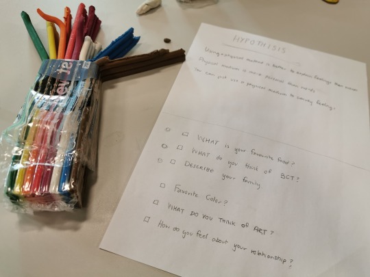
Our first phase of questions included:
What is your favourite food? (something straight forward and easy to get us started)
What do you think of the BCT? (something a bit more personal and required a bit more thinking to answer)
Describe your family (something more abstract with a lot more thinking required)
The process: We would answer the questions (Bligh and I), and get eachother to interpret our visual clay answers. This way we could see if our hypothesis was true.
The outcome of phase one: The first question was very straight forward which made it super easy to interpret and required no explanation. We just had to make our favourite food. The second question had a bit more of a complex answer that couldnt be understood without a bit of explanation. The third question got a much more thoughtful and personal to answer but needed the most explanation to understand. I found that my clay creations were almost diagram-like or a scene rather than one object that explains all.
in all, we found that the more personal the questions became the more explanation was needed to understand how abstract the visualisation was.
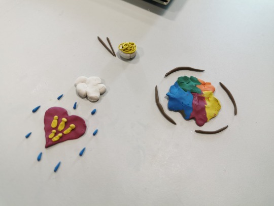
Our phase two questions:
What is your favourite colour?
What do you think of art?
How do you feel about your personal relationship?
The outcome of phase two: We did the process again but with a new set of questions that became more and more personal and emotional. However this time we answered the questions with words first, and then made our answers again using clay. By doing this we found that our written answers changed and became more meaningful when we could visualise it with clay. For example, when we answered the favourite colour question I wrote Purple. But when I had do visually construct my answer, I could be more accurate and show the exact shade of purple that I like, and shape the purple clay into a shape that I relate with the colour purple that has value to me. Whereas if I were only to write “purple”, the person reading it would invision the shade they associate with the colour purple, not what I envision. In other words, I was able to convey a more thoughtful and accurate explanation of my answer using the clay than with words.
The same result occurred with each of the questions, we were able to give more emotion and accuracy to our answers by using clay, and create context with our answers, rather than feeling limited to using one or two words to describe a personal feeling.
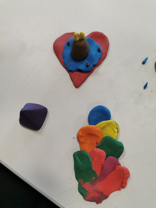
Summary This was a really useful exercise for us to truly understand the power of visual communication, and how much more fun and meaningful the experience felt rather than writing the answers to questions or filling our a survey. To answer our first and second statement in the hypothesis I would say yes from this experience - Using a physical method is better to explain feelings than the use of words and a physical medium is more personal than words. However, I feel that communicating in this way could also be too abstract and could also be misinterpreted. So I’m not sure in regards to the third hypothesis statement - You can just use a physical medium to convey feelings. I feel as though we need to do further iterations of this test to develop better questions which are worded differently, this could help make the clay results easier to understand.
REFERENCES:
Sanders, E. (2000). Generative Tools for CoDesigning. Retrieved from: http://u.osu.edu/sanders.82/files/2015/02/GenerativeToolsforCoDesiging_Sanders_00-15u9m90.pdf
1 note
·
View note
Text
Informing my practice - Contextual Design Evolved. By Karen Holtzblatt & Hugh Beyer
I came across contextual design co-authored by Karen Holtzblatt & Hugh Beyer. This is their revised edition from their original book, which takes into consideration design for our current modern world, and the introduction of touch screen technologies, and applications into peoples lives. “The iPhone, Android, and tablets taught us that access to our world—our friends, shops, books, news, and pictures, the things we’ve created and the things we need for work—is always just a touch away.” (Holtzblatt & Beyer, 2015).
Design for Life They encourage designers to consider design practice as “Designing for life” - since the integration of technologies in our lives, we now need to consider more than ever the details of how the technology works so it fits into all the situations of everyday life. This calls for more consideration to the context of what and who we are designing for.
Data collection and interpretation The first phase of contextual design is to collect data. This captures user’s unique and individual experience with the product (or app in our case) to get a better understanding of their needs and expectations. This process is not only a matter of asking a user questions and getting answers, it's about observing their behaviour and comments.
Detailed design - designing apps for mobile This design process covers three main points of creating a coherent design for mobile UI.
Practice design This is about understanding how the user interacts the app. The right functionality and information needs to be accessible at every point in the users' journey. “It’s where the life of the user meets funtionality” - it is about keeping things simple and minimal as possible. “Everything necessary and nothing extra”.
Interaction design This is about how the user will interact with the app - this is where the design of screens and navigation come into play. At this point, we aren't worrying about aesthetics like font and colour, this is about framing the content only, the structuring of text. The interaction design clearly identifies the purpose of all elements on the UI. It is about using techniques and symbolism that is familiar to pre-existing interfaces “As the user travels from screen to screen”.
Visual design This is the graphical treatment of colours, branding, fonts and images. Visual design structures the user's experience by what it emphasises to us. It is about the consideration of white space and the placement of images for contrast and balance, It ensures consistency of the look and experience across the entirety of the application.
In summary, this process helps me to understand that design is a layered activity and understanding how users approach systems (understanding the context of your design). This process I will apply to our Zapp project and the formation of its template. I will go back and do more investigation into my target user to achieve a better understanding of the context of my design.
Beyer, H. & Holtzblatt, K. (2015). Context design. [PDF Report] Retrieved from wtf.tw/ref/holtzblatt.pdf
0 notes
Text
Informing my practice: Design that lacks social value
I had a read of the article: To Really ‘Disrupt’, Teach Needs To Listen To Actual Researchers from Wired.com which highlights “the Silicon Valley culture we live in that celebrates the technical over the social” (Irani, L. & Chowdhury, R. June, 2019.).
This is in response to a tweet made by Tristan Harris - co-founder of the Center for Humane Technologies who proposed a whole new field of study: "Society & Technology Interaction.". However ee don't need a new discipline. We need to respect, sustain, and strengthen the ones we already have (Irani, L. & Chowdhury, R. June, 2019.).

(Image: Tristan Harris - CASEY CHIN; ROMAIN GAILLARD/REDUX )
This article identifies that “entrepreneurs and engineers are making technologies and decisions without properly considering the group that it’s for” (Irani, L. & Chowdhury, R. June, 2019.). We need to emphasise to everyone - not just upcoming designers and engineers - the importance of being socially-wise, having a sense of history and society that goes beyond just design or behavioral-knowledge and traits. As a designer it is apart of our role to understand the societies we are designing for, to understand the importance of social/cultural values in general, and especially when creating new technologies and when used in visual communication.
This article reminds me of my blog post I wrote not long ago regarding the three Models of Communication - The Shannon and Weaver model, The Emmert/Donaghy model - based on the Shannon and Weaver model, and The David Berlo SMCR model - based on both of the other models. These three together emphasise that designers/artists view the world differently than those in which we are designing for. We cannot assume our own perceptions and ideas will “match” or agree with our audience. Therefore we must consider the messages we convey through design in general and design for new technologies, and consider their context, how they are structured, and how to treat (style or aestheticise) these messages.

The ideas from these models and the highlights from this Wired.com article acknowledge the need for everyone - not just designers and engineers to consider the society we live amongst in everything that we do. When we make new technologies there needs to be more thought towards the social values and critical thinking that we bring into our practice.
In terms of my own practice, these ideas fit well into Emerging Practices CTEC702 and Interaction and Play CTEC703 - In both of these papers I will be exploring technologies and their value and place in society, recognnising how they are made, the context they will fit into, and using methods of CX - Collective, Customer or Community experience - a term not often talked about compared to UI and UX. CX expands on collective group or community experience with technology.The usability and impact of a product across a collection of people within a society.
References:
Szóstek, A. (July, 2018). Where is the difference between UX, CX and Service Design?. Retrieved August, 2019 from: https://uxdesign.cc/where-is-the-difference-between-ux-cx-and-service-design-8ce0b8654a43
L. & Chowdhury, R. (June, 2019). To Really ‘Disrupt’, Teach Needs To Listen To Actual Researchers. Retrieved August, 2019 from: https://www.wired.com/story/tech-needs-to-listen-to-actual-researchers/
Ludwig, K. (n.d). Davis communication models. Retrieved July 2019 from: http://kellyludwig.com/kcai-embeds/act-05davis-communication_models.pdf
Communication Theory. (n.d). Berlo’s SMCR Model of Communication. Retrieved July 2019 from: https://www.communicationtheory.org/berlos-smcr-model-of-communication/
Businesstopia in Communication. (2018). Shannon and Weaver Model Of Communication. Retrieved July 2019 from: https://www.businesstopia.net/communication/shannon-and-weaver-model-communication
Kristen Design. (April, 2015). Emmert Donaghy Final Model of Communication. Retrieved July 2019 from: http://www.kristen.design/process/2015/04/emmert-donaghy-final-model-of.html
1 note
·
View note
Text
Using an app
Through our idea of using emojis as mentioned in my previous blog post , sparked the idea to integrate our toolkit into a mobile app. Removing the use of a physical map, and bringing it inside the convenience of an app. The reasoning behind this is to make the process of giving feedback an easier experience, using emojis/comments to precisely give feedback on how the user feels, in conjunction with location tracking allowing users to wander around the square, and leave feedback on the exact area they’re standing in.
(Image: Blighs concept of how an app could look on mobile. See Blighs orginal blog post Here)

0 notes
Text
Emerging Practices - Analysing Lumi.. again
In my previous blog post regarding Lumi (a fully illuminated keyboard that allows you to play the piano) I realised that my previous analysis was quite conceptual in some parts, and I want to now expand on what I said previously and refine questions for the evaluation stage of EP.

Impressions Whilst re-watching Lumi’s campaign video from Kickstarter I annotated my impressions and identified some key points in the video that I didn’t recognise in my initial analysis, such as:
The creators spoke of Lumi as “A learning tool for everyone” and “The first truly smart way for anyone to play and learn music in minutes”.
There was a lot of emphasis on the product being “For everyone”, and being able to “Start in minutes” - after you’ve first bought a tablet to use it with, downloaded the app and charged the Lumi of course.
The product is said not to just be for musicians, but for beginners, young people and children - all ages and genders are shown using the product, giving the idea they are being inclusive.
They spoke of being the “re-inventors of music making” - they basically took a existing Garage Band app feature, cut a traditional keyboard in half and smacked on some RGB lighting and called it a revolutionary device.
You have to purchase a second Lumi and connect them to have more keys available to play at one time - “Simply put two Lumi’s together to expan your play”, “a product that grows with you”.
You must use the app (and therefore own an iPad) or use it with another pre-owned software to be able to use the product at all.
It’s portable, small, and lightweight - “You can play it in your house, at a cafe, or during your lunch break!” - a scene then shows a man playing the Lumi in a forest ......
“Just follow the lights - no need to learn or understand sheet music” - Um.. so we aren’t really learning how to play the piano then?
“Each colour represents a note” - I don’t know if traditional pianos have RGB lighting these days, how do I take what I’ve learned into the real world?
Not once in the video are we shown the creators using or enjoying their product, all we see is them explaining what it is and that we should buy it - is this another example of “technical” people deciding what people should do?
“Everything we’ve learned at Roli from hardware, software, design and more to deliver a brighter and more vibrant way to learn” “musicians love our products” therefore we must love it too.. and moreeee.

This product claims to be an quick and initiative way to create and learn music from home or on the go, however there were a few hidden details that aren’t made obvious in their video that I want expand on.
One thing i noticed was use of Apple devices. Only Apple iPads are shown in the campaign video and other videos I previously watched of users testing the product. After investigating, I found that the Lumi app can only run on supported Apple devices. Therefore the claims of Lumi being “For everyone” aren’t completely true. The every day user who wants to play music (which is whom this product is targeted for) may or may not have an iPad on hand. They might have a Samsung Galaxy tablet like me, and that automatically disqualifies us from being able to use their app with their product. If I want to use the Lumi app I have to buy a special device. So in short, their device is not for everyone.
The compatibility of the app isn’t emphasised in their campaign video, all that is mentioned over and over is that “It’s for everyone!” so the viewers presume “This product is for me” (like I did). However it’s not, they didn’t make it obvious anywhere that it’s app is only usable with Apple iPads. I found this piece of information in the very last section of their KickStarter campaign right down the bottom. How funny. Well I suppose they would contradict themselves immediately if they said “It’s for everyone - Only compatible with Apple products”.
However the video does mention that Lumi is usable with their Roli Studio Player software, and other leading softwares such as FL Studio which is great for music producers like my partner who use those softwares to produce music and DJ.

After looking at that information, it dawned on me was that Lumi cannot work without the app or a software such as FL Studio. Lumi is a MIDI controller rather than a standalone synthesiser. The product is nothing without a secondary input that you have to purchase. So if I refer back to my previous blog post where I emphasised the amount of extra work Lumi creates for the user to play the piano, this product has just created more work for me as I must have a secondary input to use the product (whether it be the app or a software). I cannot simply sit down and play like I would when using a real piano. So this begs me to ask the question, What makes this product worthwhile?
Lumi does offer some handy things for old and growing musicians such as the product being portable and light weight. Though this does mean extra work like having to charge it and plug it in (they never show you how to power Lumi in the video - you could be in for a lot of batteries and cables!), it also means you can take it with you should you have a performance or want to practice away from home or take it with you into a forest.. yup that’s what they showed us. From watching their videos and of users testing out the product, it looks easy enough to grasp/learn in terms of being able to make music with the product as they say, “Just follow the lights”. Though it makes me wonder if this is the best device to use to learn the piano. This is because it doesn’t offer the same experience as a traditional piano/keyboard due to the lack of keys available at any one time. Should you want more keys/notes, you have to then purchase a second Lumi to be able to play the piano realistically. And again I ask the question is this worthwhile?

These additional observations have helped me to see what is under the first layer or watching the advertisement for the first time. The more I watched it, the more I noticed what they weren’t acknowledging - some big decision makers they didn’t talk about, which would help me decide whether I want or need the product. It’s helped me to see how much companies sugar-coat their products, and put the best of the best on display in their campaigns - constantly showing us the enticing rainbow keys which I’m sure would appeal to children more than anything. It looks nice, it looks modern, but it lacks elements that make it worthwhile.
0 notes
Text
Lack of emotion
From our Sanders experiment in my previous blog post, we found that the components (the visual assets uses to convey our emotions and feelings) lacked true emotional value so we introduced the idea of emojis as they are familiar and are designed to convey emotion.

(Image: Blighs example of adding open source twitter emojis to a map of Aotea Square - see Blighs original blog post Here)
Emojis are our second language when it comes to texting nowadays. They help convey the context of our messages and help to identify more accurately how someone is feeling. Text use alone can be misinterpreted without the insight of being there in person and actually speaking to someone face to face. Talking on the phone can be more precise as you can hear the tones in peoples voice which can indicate the type of emotion they’re feeling. But with only text, your mind is left to “make up” what someone is actually feeling.
This can impact the type of data received when completing any survey or giving any feedback using only text. This is why with our project, our focus is to create the most meaningful experience as possible using the visual components we use.
0 notes
Text
UX/UI design and trends to consider
As a digital designer and a person who enjoys visual communication and design, I am already aware of some existing conventions used in UX/UI (User Experience/Interface) design, however, I want to grow my knowledge by investigating trending UX/UI design material and techniques from other sources to have a better understanding of the field I am designing in, and introduce these techniques into my practice and the QlovaSeed design guidelines.
Using white space Every year mobile UX/UI design develops and changes, and one aspect that is slowly becoming consumed is screen space. The placement and layout of the design is important, where things are placed and where things arent are critical as it restricts where the user interacts with the app. Including more white space is a simple and fresh technique that is being more embraced compared to over-crowded and cluttered design. It allows the user to only see what is important, and other conventions can be used in place of the lack of icons and containers such as with gestures.

(Image sourced from Pradita, G. (June, 2015).)
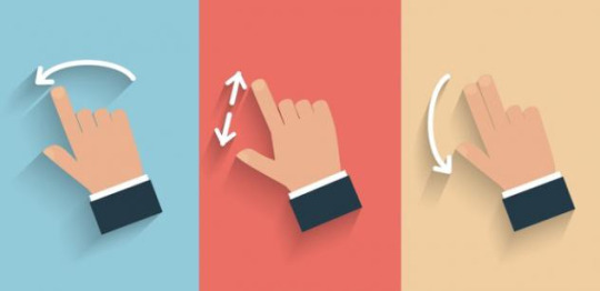
Gestures Gestures allow users to navigate through the app/device, perform actions and transform objects. “Hidden” gestures are a great way to simplify the UI and keep it minimal, and allows the users to interact with the space when they’re ready. For example, instead of having a persistent arrow icon in the top left hand corner of an interface to allow the user to go back a page, the user can use a swipe gesture instead to move in the direction they please. The removal of the button allows more room for white space and a less cluttered interface.
Navigation gestures show how to move through the product, such as: swiping, tapping, dragging, pinching and scrolling.
Action gestures indicate how to perform actions such as: Tapping an icon, long pressing/long hold, and swiping.
Transformation gestures allow the user to manipulate elements and control their size, position, and rotation. This is done with a double tap, pinching, compound gestures and pickup/move.
However it is important to understand that users may not have prior knowledge of all or any gestures. The users will only try to use gestures if they have used the techniques before. A good tip is to use animated hints which give an example of the gestures available and show what is possible, or by using intuitive design techniques.
(Image sourced from Babich, N. (March, 2016).)
Dark mode/theme Every software, platform and company at the moment has jumped on the dark mode bandwagon, which allows the UI to be low-lit and inverted to arguably be easier on the users eyes. It is said that long periods of screen time encourages eye fatigue, and that it is easier on the eyes to look at lighter text on a dark background, which is why applications are offering the option of dark mode for their users. Personally I use dark mode on my mobile, and on websites/apps that offer it such as YouTube and Twitter. I have discovered that after long periods of screen time I get headaches and bloodshot/tired eyes, which is why I have also invested in a blue light tint for my prescription glasses for when I’m working at home.
However, not everyone can enjoy dark mode. For some users with visual eye impairments (such as astigmatisms - a common condition that most people are born with) dark mode can make things worse (Cole, S. June, 2019.). So it is important to be aware that forcing people into a dark mode/theme may not always be best, and having options available for the user is far more accommodating and enables positive UX.

(Image sourced from adddictedtomacintosh,(June, 2018).)
Colour From darkness there is light; from the dark inverted trend there is also a dominant usage of colour. Colour can be used in meaningful ways to indicate information to users. It helps to create a distinction between elements (such as containers and iconography), and visualises where relationships and hierarchy are within the UI such as in the use of tabs. It can also be used to identify the layout of the UI, and indicate where the top and bottom of the page start and end.
When creating a colour story or palette for any UI you need to consider a balance between neutral and bright colours. Having primary and complementary/secondary colours that work well together all of the time, not just in specific situations. A common trend is using variations of one tone to distinguish UI elements rather then introducing secondary colours from a different hue.
References:
Apple. (n.d). Human Interface Design Guidelines. Dark Mode. Retrieved August, 2019, from https://developer.apple.com/design/human-interface-guidelines/macos/visual-design/dark-mode/
Babich, N. (March, 2016). In-app Gestures and Mobile App Usability. UX Planet. Retrieved August, 2019, from https://uxplanet.org/in-app-gestures-and-mobile-app-usability-d2e737bd5250
Cole. S. (June, 2019). Dark Mode Isn’t ‘Easier on the Eyes’ for Everybody. Tech by Vice. Retrieved August, 2019, from https://www.vice.com/en_us/article/ywyqxw/apple-dark-mode-eye-strain-battery-life
Dagar, S. (December, 2018). Mobile App Design In 2019. UX Collective. Retrieved August, 2019, from https://uxdesign.cc/ux-trends-2019-3ddadf853ca
Fireart. (May, 2019). How to Design Gesture-Driven UI. Retrieved August, 2019, from https://fireart.studio/how-to-design-gesture-driven-ui/
Google Material Design. (n.d). Material Foundation. Interaction Gestures. Retrieved August, 2019, from https://material.io/design/interaction/gestures.html#types-of-gestures
Google Material Design. (n.d). Material Foundation. Dark theme. Retrieved August, 2019, from https://material.io/design/color/dark-theme.html#
Pradita, G. (June, 2015). Mondo Inbox and Conversation Interface. Retrieved August, 2019, from https://dribbble.com/shots/2340112-Mondo-Inbox-and-Conversation-Interface
Tubik Studio. (January, 2019). Big Review of UI Design Trends We Start 2019 With. UX Planet. Retrieved August, 2019, from https://uxplanet.org/review-of-ui-design-trends-we-start-2019-with-68f128151215
Wiesemborski, M. (May, 2019). State of mobile app design 2019. UX Collective. Retrieved August, 2019, from https://uxdesign.cc/state-of-mobile-app-design-2019-48bb843890f7
2 notes
·
View notes
Text
Generative tools for Codesigning - Elizabeth Sanders
“Generative tools for Codesigning” Sanders, E. B. -N (2000) was a great find to get us started on our project for interaction and play. We want to focus on making Aotea Square a more meaningful place to visit by reshaping it into what the public would actually like. This data could be collected through a Codesign method.
Generative toolkits
Sanders discusses the idea of generative toolkits - a combination of components used to create “artefacts” that express peoples emotions, thoughts, feedback or ideas. There is usually a background, which people can use to express how they feel about something in particular. They can be very literal or abstract. Such as photos, symbols, cut up pieces of paper, newspaper trimmings etc. other components include the use of drawing, using words or phrases but are treated visually as well.
This method of using different visual components to express yourself and your thoughts allows for a more accurate response as to how the person feels. They have to visually describe literally or more abstract how they feel using only visuals.
“Visual toolkits allow people the time and space to listen to each other’s ideas and dreams, thereby facilitating more effective collaboration” (Sanders, E. B. -N, 2000).
A playtest
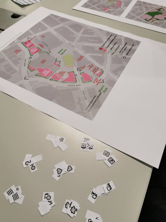
We took her idea of a generative toolkit and made it our own. Bligh printed a map of Aotea Square for us, and some iconography from Android's Material design for us to playtest the ideas behind Sanders toolkits.
We chose some of the icons that represented how we feel about a specific area in Aotea Square and placed it on the map. We found through this process that the icons weren’t enough alone to convey our correct feelings and thoughts. We felt the need to briefly explain what we meant by choosing those specific icons.
However, this was a very valuable activity to get us thinking about what is necessary when it comes to codesigning a space, and how important it is to use the correct method to obtain the most accurate data possible.
References Sanders, E. B. -N. (2000). Generative Tools for CoDesigning. Retrieved from: tiny.cc/t1mvez
0 notes