
Believer | Illustrator | Doer | UUB Graphic Design & Illustration Student
Don't wanna be here? Send us removal request.
Statistics
We looked inside some of the posts by meganturtlee-blog and here's what we found interesting.
Average Info
Notes Per Post
497K
Likes Per Post
224K
Reblog Per Post
272K
Reply Per Post
186
Time Between Posts
10 days
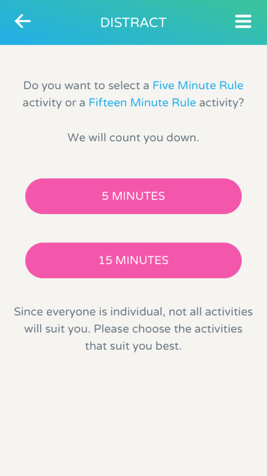
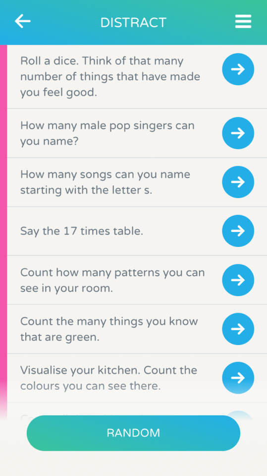
Number of Posts By Type
Text
17
Last Seen Tumblr Blogs


Fun Fact
Tumblr is available in 18 languages.
Text
The great hack-Netflix film
Notes whilst watching;
Where does the internet go wrong?
Cambridge analytica/SCL
5,000 data point on every American voter
The question is how do you make the invisible visible?
It encapsulates how data rights should be fundamental rights
An environment of great innovation
Ted Cruz went from lowest candidate to the highest because of Cambridge work
Big data and psychographics
100,000 Americans took surveys that predicted the personality of everyone in America, that predicts their behaviour and their behaviour predicts who they’re going to vote for
These sort of technologies can make a huge difference
They believed they were on top of the world when they won the trump campaign
Cambridge analytica’s ties in the brexit leave campaign
Technology and campaigning
Nigel’s friends with Steve Bannon, the head of analytica
Cambridge analytica, an all service propaganda service
Steve Bannon editor of Brieybart
If you want to change society you have to break it and mould it into your version of society
An unethical experiment of the psychology of an entire nation
No longer threatening to do things, they were actually doing things
David Carroll, demands full disclosure in his own data, does he have the option to opt out??
When they see the extent of The sir alien eyes they’re going to be shocked
People don’t want to admit that propaganda works, but it does as we depend on tech forms that ruins our democracies
They refer to it as cheating in our election campaigns, and wanted to speak out against it as the impact of what they have created has cause him to become remorseful
Brittany Kaiser
Casts herself as a whistle blower
Brexit and trump campaign have been conducted illegally
For her own safety she’s been avoiding geotags
The reason why tech company’s are so rich is that data has became more valuable than oil, the most expensive thing on earth
Political technologist-looks at how data is being used and abused (mad that that’s a job)
They had research on who was voting on the brevity campaign, asking why they were why they didn’t vote, what scared them about it? And twisted that data to make them vote to leave
The idea of a company doing a large scale analysis of a population, makes us question our freedom and large scale democracy
Brittany remains adamant that it’s their free will to vote, not the fact they’ve been led to vote due to the propaganda thrown at them through social media, swaying them towards a certain side
She invented the way social media communicated with voters, through the Obama campaign
December 2014, she works for CA
Moving from human rights campaigning to election campaigns
drafts questions for a senator to ask Mark Zukerberg (as you do)
The bulk of their resources went into the voters that they believed their minds were going to change, in states which were referred to as swing states, such as Michigan
The creative team created personalised adverts, banners anything that would great they to see the world they way CA wanted them to
It was like a boomerang you sent the data out, it gets analysed and it comes back at you to change your behaviour
In the referendum of brexit many people had their decisions made but the ones that didn’t were the persuadables, and it was those ones they wanted to find and bombarded with advertisements
youtube
Facebook should pay their users for their data
“The data wars have begun”
Facebook team was present in the trump campaign
All PR crisis companies didn’t want to work or be associated with CA
CA knowingly twist the representation of the truth
“We are a behaviour change agency”
Trinidad
They created the do-so campaign, encouraging the youth not to vote, that means the Afro-Caribbean kids that were in the do-so campaign did not vote and so the Indian group, that CA was working for won, because the Indian youth were doing what their parents told them to do and voted, gaining 7% which was all they needed
What should we do to protect our data? People need to posses data like our property
SCL started out as a military defence research to persuade hostile individuals
Communication ware-fare working in Iraq
How to suppress turn out, how to increase turn out
Harvested 86 million Facebook users data
Because if the way our technology is moving so fast and so often we don’t understand it there will always be a Cambridge analytica
A big shift away from tech being good to asking questions and what it actually is
Our personal data is out there and being used against us in ways we don’t understand
British election laws are not fit for purpose, they can not have a fair vote because of Facebook, because of a utilitarian government raising through Facebook
These platforms that were created to connect us now weaponise
Nothing is what it seems
David Carroll is still waiting on his own data
Data rights should be human rights
youtube
#ownyourdata
1 note
·
View note
Text
Norwegian Wood // Book Review
Murakimi is the most successful author to come out of japan. Published in 1987 in Japanese, turning him into a national star. He left the country for several years to avoid the fame
A Bildungsroman-a genre of literature that begins with the story’s protagonist experiencing an emotional loss and then achieving gradual maturity or growth as an individual
Norwegian Wood emphasizes the painful inevitability of growing up and how it is tied to the ceaseless march of time: almost every event that happens in the novel is given a date, so that the reader can feel the passage of particular lengths of time along with Toru, who often remarks about how another month or another year has passed.
A slice of life book. Nostalgic, innocent, sensitive, and simple
Toru tries to search for a meaning in life. Naoko tries to overcome her worsening mental health. Midori tries to find someone who will love her. All three try to overcome loneliness, move past painful memories, and grow up.
While on an airplane descending to Hamburg Airport, Toru Watanabe (a 37 year old, graduated drama student, who considers himself a very ordinary person), hears the Beatles song "Norwegian Wood" played over the speakers and is overcome by painful memories of his past. He remembers a meadow where he and Naoko, the girl he loved, walked 18 years ago when he was still 19.
Toru grew up in Kobe with Kizuki as his best and only friend. Along with Naoko, who was Kizuki's girlfriend and childhood friend, Toru and Kizuki formed an inseparable small group. However, their lives were torn apart in their second year of high school when Kizuki inexplicably committed suicide. Naoko becomes very quiet, has trouble finding words sometimes, and has incredibly clear, bottomless eyes. Independent of each other, both Toru and Naoko decide to leave their hometown for Tokyo to attend university, where they run into each other in 1968 in their first year. The two end up going on dates every Sunday, simply walking extensively throughout the city; meanwhile, Toru deals with his stuttering and eccentrically neat roommate, nicknamed "Storm Trooper," and gets to know Nagasawa, a charismatic and egoistic upperclassman in the dorm. Nagasawa begins to take him out some nights to find random girls to sleep with.
On Naoko's 20th birthday, Toru comes over to her apartment, and when she breaks down into tears he comforts her and then has sex with her. The next day he tries to contact her again, but later finds that she has moved. Concerned, he sends her a letter. Meanwhile, Toru meets Midori Kobayashi, an underclassman in his drama class with a vibrant and quirky personality who seems to have taken an interest in him. A few weeks later Midori invites him over to her house, and while watching a house fire from her balcony they kiss.
Toru receives a letter from Naoko explaining that she has gone to Ami Hostel, a special kind of sanatorium, to recover from psychological problems she has been having. Toru visits her there and meets Reiko Ishida, a woman in her late thirties who is Naoko's roommate. Reiko explains that at the sanatorium, located in the middle of a remote forest, people do not try to cure but rather adapt to their individual deformities. That night Toru sees Naoko in the moonlight by his bed, and mysteriously she reveals her naked body to Toru, astounding him with its perfection.
During Toru's stay, Reiko and Naoko separately tell him their life stories. Reiko was an aspiring concert pianist until a nervous breakdown derailed her career; and then her mental problems made it difficult for her to have a normal life until a man married her and promised to take care of her. However, due to an incident in which a young piano student of hers manipulated her, she had another nervous breakdown, after which she came to the sanatorium. Naoko tells Toru about how she witnessed her older sister's suicide.
Upon returning to Tokyo, Toru feels disoriented, as though he left part of himself in the quiet world of Ami Hostel. However, Midori revitalizes him by taking him drinking. Later she takes him to the hospital where her father is dying of brain cancer, and Toru bonds with the man, who dies within a week. Around this time, Nagasawa invites Toru to a dinner with his girlfriend Hatsumi; at the dinner, the couple falls out over Nagasawa's inability to consider Hatsumi's feelings.
Toru makes another visit to Ami Hostel to see Naoko and then moves from the dorm into a house. Due to his ignoring her, Midori angrily refuses to speak with Toru, and this combined with news from Reiko that Naoko's condition is worsening sends Toru into a depression. However, he manages to pull himself out of it. He and Midori come to realize that they love each other, but they agree to wait while Toru tries to understand his relationship with Naoko.
Out of nowhere, Toru receives news that Naoko has killed herself; grief-stricken, he spends a month traveling alone aimlessly away from Tokyo. However, he feels compelled to return and restart his life. Reiko leaves the sanatorium to visit, and together the two hold a small funeral for Naoko involving Reiko playing every song she knows on the guitar. Afterwards, Reiko sleeps with Toru, and then the next day she leaves for a new life in Hokkaido. Some time later from some unknown place, Toru calls Midori telling her that he needs her.
Norwegian Wood Themes
Life and Death
In a way the central problem of the novel is the existential question of staying alive—put bluntly, this comes to something like, "Why not commit suicide?" All the characters face this question, but especially those who are one relation away from death, so to speak, due to a family member (Naoko, Midori) or loved one (Naoko, Toru) who has died or even taken their own life. Toru realizes early on in his relationship with Naoko that the two of them are seeking for something absent and lost, namely Kizuki, and because of this their love seems to pull them away from life into the other world that is death. However, Midori acts as a counterbalance for Toru, pulling him back into life just as Reiko does for Naoko—and for Toru, following Naoko’s death.
Communication/Expression
One shouldn't forget that the novel itself is framed within the elder Toru's attempt to write about his memories. At the end of the first chapter he writes of how the painful clarity of his memories of Naoko prevented him from writing of her, but how the passage of time, a double-edged sword, blurred those memories and enabled him to write. Similarly, Toru writes a great deal of letters, mostly to Naoko but also to Reiko and Midori, over the course of the novel, and he also has a great many conversations; as he realizes during an intense spell of depression when he is unable to see anyone, his letter writing is the last thing holding his life together, regardless of his not receiving any replies. Although Toru usually finds a way to express himself due to his honesty and straightforward sincerity, Naoko has trouble translating her feelings into words to share with others, and this serves as the essence of her pain. The way that characters speak in the novel often tells us more than explicit descriptions of their personalities or emotional states.
Norwegian Wood Quotes
The dead will always be dead, but we have to go on living.
Naoko, p. 111
Because we would have had to pay the world back what we owed it…the pain of growing up.
Naoko, p. 128
Hey, there, Kizuki, I thought. Unlike you, I've chosen to live—and to live the best I know…I'm going to mature. I'm going to be an adult. Because that's what I have to do. I always used to think I'd like to stay seventeen or eighteen if I could. But not anymore. I'm not a teenager any more. I've got a sense of responsibility now. I'm not the same guy I was when we used to hang out together. I'm twenty now. And I have to pay the price to go on living.
Toru, p. 248-9
We were alive, she and I. And all we had to think about was continuing to live.
Toru, p. 293
Norwegian Wood Imagery
The firefly Toru releases from the dormitory roof (symbol)
The symbolic significance of the firefly that Storm Trooper gives to Toru is immediately established by Storm Trooper's suggestion that Toru give it to his "girlfriend," i.e. Naoko. Toru sees the firefly somewhat as he sees Naoko: a creature once bright and free that has lost much of its life and become caged. Looking at its pale glow in the dark night, he thinks not of the present but is instead flung back into memories of a past with brighter fireflies. When he frees it on the rooftop, it is still for such a long time that Toru begins to doubt whether it is still alive; but he waits, as any true lover waits, and finally the little bug takes flight, tracing an arc in the air that seems to reclaim a lost past, and then flying off into the night. Although this image is very positive for the firefly, Toru is left grasping in vain at the trail of light it left behind in his mind.
Rain (motif)
Perhaps the weather condition that occurs the most frequently in the story, rain is a crucial figure to the novel. From the very beginning of the novel when Toru's plane lands in Hamburg in the rain to such climactic scenes as the night Toru sleeps with Naoko, rain creates a presence of the supernatural, or at least an emotional charge that far exceeds that of everyday life. In fact, even when there is no rain, such as the fair day when Toru and Naoko walk through the meadows near Ami Hostel, rain makes itself felt through its absence.
Letter writing (allegory)
If we want to identify Toru's first letter, it would either be the note that he left with Naoko the morning after he slept with her or the letter he sent to her home after he found that she had moved from Tokyo. It contains the crucial theme sustained through their correspondence: the desire for understanding and dealing with pain. Apart from Toru's two visits to Ami Hostel, the letters that he exchanges with Naoko remain his one link with her, and during the month that he is cut off from all people, including Midori, his letter writing becomes the only thing connecting him to the world outside himself at all, just as letter writing was for Naoko.
More links about Norwegian Wood
http://www.harukimurakami.com/
https://www.theparisreview.org/interviews/2/haruki-murakami-the-art-of-fiction-no-182-haruki-murakami
https://www.nytimes.com/2000/09/24/books/rubber-souls.html
1 note
·
View note
Text
Coffee shop menu design // Winnie’s 1975
From initial sketch to final PNG


I just wanted to share a bit of the behind the scenes, as to how I begin most of my work in Winnie’s
Starting on paper I create a pretty rough sketch and then, I start drawing with a bit more detail (shown in yeh top photo ft my kitchen table)
As we had decided on a chalkboard theme at the beginning, I followed this through by ensuring my pencil marks mimicked that of chalk. Resulting in these less messy sketches.
I then took my wee drawings, scanned them into the printer, onto photoshop and worked a lil magic (the invert button, smudge tool and layers), producing these 🖍🔆
7 notes
·
View notes
Text
Listen up. There is literally an app that can help you avoid self harm and I don’t know why we aren’t talking about it.
Calm Harm can be tailored to your needs and will provide strategies to help you get past those crucial moments of wanting to harm.
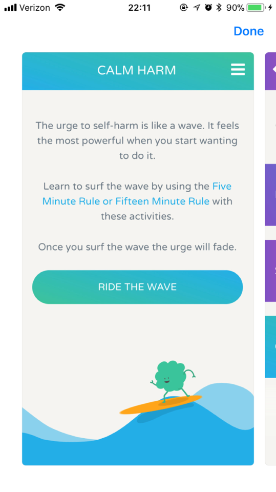
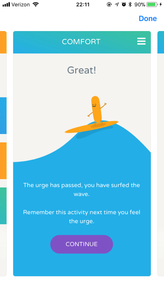
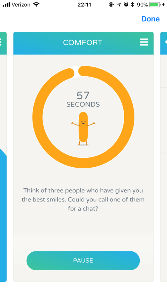
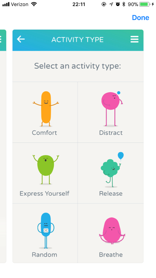
It’s also totally FREE.
once again, it’s called CALM HARM
497K notes
·
View notes
Text
Illustration inspo // Ulster Museum shop


11 notes
·
View notes
Text
Packaging (& branding) appreciation pt. 2


3 notes
·
View notes
Text
Packaging appreciation
Just a quick lil post of a couple of products and brands that I really liked the colour and/or the typography of and/or the shape of


2 notes
·
View notes
Text
True Colours Exhibition || Leonardo DaVinci || Ulster Museum
Today I visited the Ulster museum to see the Leonardo Exhibition and was pleasantly surprised to find the True colours exhibition running at the same time. This exhibition showcases some of the best alevel, as level and gcse work. I discovered some new illustration styles I’d like to explore but I was purely blown away by the talent showcased (not just because two of friends had their work up)


0 notes
Text
Master-Apprentice 02
Continuing on my quest in becoming better at creating icons, I copied this set of icons from UI8. During this process I can safely say I have improved my patience around illustrator and my skills overall
UI8’s work:

My work:

0 notes
Text
Wireframe examples & Icon locations
I decided to strip apart some of my most used daily apps (Instagram and Snapchat) to see how they were laid out, practicing my wireframe sketches, whilst looking at how the icons were set out for easy access in each app (through good UI)


0 notes
Text
Icon Research || Illustrated

Kotryna Zukauskaite
These Illustrated icons were created by Kotryna Zukauskaite, an editorial illustrator working worldwide from Vilnius, Lithuania. Within her description of her work she discusses how these icons were created for HERO Marketing Agency and that they were a far from typical project for her, but after a few stages, repeats and retries (much like me) she was happy with the final outcomes

Francesca Arena
These hand drawn icons are created by Francesca Arena, a graphic designer from Milan, Italy. I love how these are such a contrast to the high fidelity, polished and slick backed icons, which are currently being created in mass due to the popularity of that style trending. These icons work well large scaled, and as illustrations, but when placed on smaller screens such as instagram and illustrator they wouldn't be as effective

DFT//Differantly
A french creative duo working in a range of practices from art direction to one line illustrations, product design, wall art and installation, customising Adidas headquarters and collaborating with Nike to create special edition jerseys for the Lebron James World Tour 2018
“During our process, we go through phases that are visually rich and complex before removing what's not substantive. It's a maturation process that can be painful as it consists of letting go, giving up. But, it’s also very demanding as minimalism requests a certain level of perfection. Every element must have its sense, its utility, its intrinsic beauty.”
vimeo
Their style of drawing and constraining themselves to using one continuous line is inspiring, and much like that of Pablo Picassos single line drawings. Within an icon concept however, their work is interesting and quirky but would only suit a certain type of app or website, due to the audience its trying to reach, which I will have to remember and cater for when creating my own app
0 notes
Text
Burnt Toast Creative || Icon Research
“Burnt Toast Creative is the working alias for Scott Martin, a Canadian–based freelance illustrator, with a roster of clients that includes Red Bull, Facebook, Dropbox and Google”
Martins work, especially the colour palette he uses in each design creates a visual aesthetic that is instantaneously recognisable as his work, which is something I would love to aspire to within my own work


These icons designs grabbed my attention due to the muted colour palette and his flat designs. I love how each of them nearly have their own personality and his use of harsh outlines

0 notes
Text


Jessica Hische || Research continued
0 notes
Text
Jessica Hische || Lettering Artist


“For over ten years I’ve had the pleasure of collaborating with amazing clients—creating custom lettering artwork for established brands, classic books, postage stamps, and so much more. I've travelled the world speaking at creative conferences and colleges, and I've befriend innumerable internet strangers while navigating the depths of social media. I cut my creative teeth in Philadelphia and Brooklyn, but I'm currently based in California where I share a studio with fellow lettering artist Erik Marinovich in San Francisco’s Mission neighborhood. When I’m not drafting letterforms, manipulating beziers, writing kids books, or letterpressing on my Vandercook, I’m doing my best to help others find the same happiness and fulfillment that I’ve found in my work.”
Hische is a letterer, illustrator, and self-described “avid internetter”.
After graduating with a degree in Graphic and Interactive Design from Tyler School of Art (Temple University) in 2006, she worked for Headcase Design in Philadelphia before taking a position as senior designer at Louise Fili Ltd. While working for Fili, she learned most of her skills as a letterer and spent upwards of 16 hours every day working (9 for Louise, 7+ for freelance clients)
Hische left after two-and-a-half years to further her freelance career and embark on several fun personal projects. She started Daily Drop Cap, a project in which she created a new illustrative letter every day, working through the alphabet a total of twelve times. At its peak, the site had more than 100,000 visitors each month. It culminated in a thirteenth alphabet, each letter crafted by a guest contributor
Subsequently Hische has become as well known for her side projects as she has for her client work. While she doesn’t consider herself a web designer, many of her personal projects are web-centric. She has created several educational micro-sites including Mom This is How Twitter Works, Should I Work for Free? and Don’t Fear the Internet (with Russ Maschmeyer), each as entertaining as they are helpful. Hische coined the term “procrastiworking” to describe her tendency to procrastinate on client work by working on personal projects
Hische’s clients include Wes Anderson, Tiffany & Co., The New York Times, Penguin Books, Target, Leo Burnett, American Express, and Wired Magazine. She has also released several commercial typefaces, which are available in her store
Hische has been named a Print Magazine New Visual Artist (20 under 30), one of Forbes’ 30 under 30 in Art and Design, an ADC Young Gun, a “Person to Watch” by GD USA, and one of 25 Emerging Artists by STEP Magazine. She’s been personally profiled in many magazines, including Eye Magazine (UK), Communication Arts, Grafik Magazine (UK), and Novum (Germany)
She currently serves on the Type Directors Club Board of Directors and divides her time fairly evenly between San Francisco, Brooklyn, and airports en route to design and illustration conferences. She also runs a lettertyping course on skillshare (which hopefully, when I get some free time I will partake in)
A FAQ from Jessica Hische’s site:
4. What advice would you give to a young designer?
“Be nice to people. Being a nice and genuine person will get you so much farther than your portfolio will. When you’re applying for a job, the first thing an employer thinks is “Would I mind spending nine hours a day with this person?”. If you try in whatever ways you can to brighten someone’s day, to be fair and respectful to everyone, and to grow your network without being “networky”, you will be a rockstar. Have a plan, but be willing to deviate from it if awesome opportunities arise. While it’s important to think about your future and what you want to be doing in 5 years, don’t let that plan be so concrete that you ignore opportunities around you. Practice, practice, practice—it takes an incredible amount of training to be a great designer. You have to first train your eye to see your own mistakes and the mistakes of others, then train your hand to be able to correct those mistakes. If you don’t feel like you have the opportunity to learn and practice at your day job, do personal work and side projects. Side projects can do so much for your career and you can make something you actually care about.”
0 notes
Text
Marks of Excellence || Monogram and logo research


“The original Greek meaning of the term monogram is ‘single line’, understood as something written or drawn in outline. Today the word is normally used to indicate a design made up of the initials of a person’s name
As early as the first century AD, the Greek philosopher Plutarch, refers to mongrams. The emperor of the Eastern Roman Empire, Justin I, who could neither nor write, signed his name with a monogram; they were often used instead of a real signature to compensate for illiteracy.
The Frankish kings Thierry III signed their names with a cross. In the Middle Ages, ordinary people in France would also sign with a cross; a single document might have a long row of crosses, each representing one signature. It was customary for some notaries to prepare for the subscription of a document by drawing a horizontal line, across which the signatories could draw their personal vertical lines. French monarchs signed with mongrams. Charlemagne and most other monarchs signed with a monogram constructed as a cross with a lozenge in the intersection. As early as the fourth century, the Roman orator and consul, Symmacus , suggested that monograms should be recognised rather than read.
There is a parallel between early monograms and contemporary letter trademarks that are recognised rather than read in parts of the world where literacy is not widespread. More people can recognise the Coca-Cola name mark than spell the name. Very few can explain what the name literally stands for”
0 notes
Text
The field guide to supergraphics-Sean Graham || more graphic design research


Focusing more on colour, contrast and typography used
0 notes
Text
Please make this look nice || Graphic design research


0 notes