Don't wanna be here? Send us removal request.
Photo

www.rbnjb.com?a=13580751
glasses anniversary, only this day!
0 notes
Photo


A lot of you have been asking how I go about making my graphics, i.e. how I do graphic design, so I thought I’d make a guide - or perhaps a series of guides if you would like - on how to design graphics! First off, I’d like to introduce you to the fundamental elements of graphic design, and hopefully this will help you gain a new perspective. and improve your own design skills.

Lines are structures that connect two points. They make up everything that we see, even the letters and characters we read every day. But more often than not, we take them for granted. In reality, lines are one of the most rudimentary components of graphic design, and they serve to channel ideas and emotion.
Lines can:
Organize pieces of information or elements on a page
Serve as guidelines to lead the viewer’s eye
Provide movement such as using wavy lines to represent moving water
Emphasize certain parts of the page
Set a mood, such as how straight lines evoke order and neatness while zig-zags convey excitement and tension

A shape is any two-dimensional area with a recognizable boundary. They can add interest to designs (such as in backgrounds), organize visual content, and be used to make illustrations.
Shapes exist in three categories:
Geometric shapes are regular shapes like circles and squares
Organic shapes are more freeform, such as a blob or a leaf
Abstract shapes have a recognizable form but are not exactly natural shapes, such as alphabet glyphs, spirals, and stick figures
When brought together, these shapes can form helpful illustrations that will help convey meaning to your work or add some decoration to it.
The effects achieved by the shapes are determined by its form, color, size, and other characteristics. For example, triangles often show excitement and risk, while circles are seen as eternal and often feminine.
In the example illustration below, which is one of my January wallpapers, I use triangles to convey a feeling of vivacity and excitement.

Different shapes may also be used to structure content or create a layout, making it easier for the user’s eyes to find information. This is often the case in blogs and websites.

Color can be used to make an image stand out, convey information, enhance meaning, or group things together, but how do you know what colors ‘fit’ together? When you’re starting out, you might find it easier to look for color schemes from pinterest or wherever you can find inspiration. It also helps to look for images or photographs that evoke the same vibe you’re going for, and then using a similar color scheme.
But what if you want to make a palette yourself? Learn color theory!
Before I elaborate, here’s some terminology for you:
Hue is the color itself
Value is how dark or light the color is
Saturation is the intensity of the color
Now, how do you go about making a color scheme? Here are some types of color schemes you should know about:
Monochromatic color schemes only use one hue but vary in value and saturation.
Analogous color schemes use colors adjacent to each other on the color wheel, such as red, orange, and yellow, or blues and greens.
Complementary color schemes use colors opposite each other on the color wheel. To add complexity, play with the value and saturation of these colors.
Split complementary color schemes use colors on either side of the complement.
Triadic color schemes use three colors that form an equilateral triangle on the color wheel. These are often very stark and in-your-face, so you might want to use this type of color scheme in moderation.
Tetradic color schemes use four colors that form a rectangle on the color wheel. These are more effective if one color serves as the main color and the other three colors are just accents.
When choosing a color scheme, the main thing you should keep in mind is balance. Using fewer colors means it’ll be easier to balance and thus it is less likely that the piece will appear messy and discordant.
Color has the power of evoking emotions and moods, and each hue and shade has certain connotations associated with it.
In the illustration below - which is part of my April wallpaper set - I use the color green to convey the safety and familiarity of the comfort zone. The color red, on the other hand, shows risk and danger, but it also represents the courage required to get out of the comfort zone.

So the next time you’re thinking of what colors to use in your project, think of what kind of message you want the audience to receive.

Like the other elements we’ve discussed so far, type conveys meaning beyond what is written. Type can communicate a mood, style, vibe, or feeling. A curly or script font might appear fancy and extravagant, while a handwritten font may seem raw and playful.
Different types of fonts are also suitable for different contexts. For example, sans-serif fonts are more readable on screen while serif fonts are more readable in print. Display fonts, on the other hand, tend to be fancy and decorative, and thus should only be used for small amounts of text, like titles.
Audience and purpose also serve a role in deciding what fonts to use. Large, bubbly text is suitable for a children’s birthday party invitation but probably not for a business card.
In graphic design, different fonts are often used in tandem with each other. The main principle or rule behind this is that you should choose fonts that complement each other. Large, bold fonts should be paired with small, subtle fonts. Oftentimes, you’ll have to rely on your instincts, and that’s okay.
Remember, though, that you wouldn’t want to overwhelm your readers by using too many fonts. Stick to one or two per project. To add variation, change the weight or style of the existing fonts.
Finally, your text would be more effective if you establish some sort of visual hierarchy. This essentially means sorting out your text in order of importance, using different typefaces and fonts. This includes adding a certain weight (or boldness) or increasing the size of texts that are more significant.
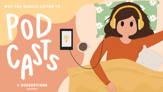
In the title graphic below, the word “podcasts” is handwritten and larger than the rest of the title because that’s what I want to draw attention to, so that readers know what the post is about. My name, on the other hand, is smaller than the other texts.


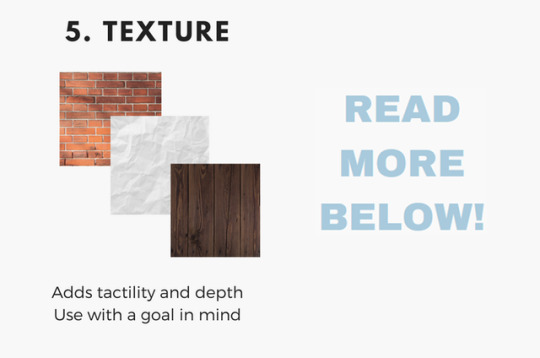
Texture adds tactility and depth and can also be used to evoke a certain feel. In this graphic from my March desktop wallpaper, I used a tape texture and a paint texture to achieve a scrapbook-y vibe.

Some other common textures used in designs are foil, watercolor, and paper textures. Although there are many textures to experiment with and choose from, you should also be careful not to overwhelm your viewers with too many textures in one piece.
Lines, shapes, color, text, and texture are the five basic elements of graphic design, and by understanding how these elements work together, you’ll be able to make more effective designs.
Now, the question is, do I think deeply about all of this when I make my designs? To be honest, not really. A lot of my designs are instinctual, but knowing the theory behind what I’m doing has helped me improve those instincts, and you can do the same!
That’s all for now. Hope this helps, and let me know if you would like me to continue the series or if this brief blog post is enough. Happy designing :)
Disclaimer: I’m not a graphic designer, just a stressed-out senior who sometimes likes to design and stuff.
9K notes
·
View notes
Text
How do you tell the X chromosome from the Y chromosome?
You pull down the genes. ;)))))
1K notes
·
View notes
Note
How to do long jump without failing?
Hello!
Long jump (in my opinion) is one of the easiest events! All you have to do is run fast at the board, then jump once you reach it! :DHah, just kidding! There’s a lot that goes into long jump! There’s the approach, the take-off, the mid-air stuff, then the landing! It’s really something you need a coach for, but there are helpful online tools too! Here’s a link to a few! (Also scour youtube for inspirational videos… There are a ton!)
http://www.brianmac.co.uk/longjump/ (this one is super scientific)http://trackandfield.about.com/od/longjump/p/powelljumptips.htm (this one is from mike powell, a super super good long jumper!)Let us know if we can help a little more!
21 notes
·
View notes
Photo
OMG

Why is no one talking about this?!
4 notes
·
View notes
Text
oh my god ted is doing pot
0 notes
Text
Cane me hard before you go
Sumnertime sadness
491 notes
·
View notes
Text
Random fact of the day
「Blood is thicker than water」, when used in the context of family over friends, is in fact a wildly incorrect bastardisation.
The true, full quote is 「The blood of the covenant is thicker than the water of the womb,」 and refers to relationships forged by choice holding deeper meaning than those of mere biology.
349K notes
·
View notes
Text
don’t compare yourself to others, but to your past self. be the best you can, don’t measure your worth based on completely different people.
5K notes
·
View notes
Conversation
Me: my dog just had his birthday
Her: you don't HAVE a dog
Me: ON SIMS
2 notes
·
View notes
Conversation
Thomas Jefferson: Looking at the rolling fields I can't believe that we are free
All of Thomas Jefferson's slaves: (look into the camera like they're on The Office)
This gets all the thumbs up.
21K notes
·
View notes
Quote
Chinese Dynasty song (Tune Frere Jacques/ Are You Sleeping/ Where is Thumbkin) Shang, Zhou (“Joe”) Qin (“Chin”) Han Shang, Zhou, Qin, Han Sui (“Sway”), Tang, Song Sui, Tang, Song Yuan, Ming, Qing (“Ching”) Republic Yuan, Ming, Qing, Republic Mao Zedong, Mao Zedong.
AP World History Quotes (referenced here)
344 notes
·
View notes
Text
HOW TO: AP WORLD HISTORY
Why should you listen to me ?? Because I got a 5 on my AP world exam !!!!! (≧▼≦;) However, I didn’t get a 5 based on “pure luck” but I got it because I worked hard in my AP class (although I still got a B in that class as my final grade) and outside of class as well. I self studied a lot starting April and I regret starting late because I was panicking on how to write the essays and how would I retain everything from the 8000 BCE to the present !!! You’re probably having the same thoughts as I did since you’re probably a sophomore taking WHAP as your first AP class !! But anyway, I’ll stop talking and tell you how I got a 5.
General Tips:
Get a review book!! I got 5 steps in the beginning of the school year to use as a supplement for the class and it sorta helped me!! 5 steps is really concise and it also has a change over continuity chart after every unit and compare and contrast charts for you to see the trend (REMEMBER THAT WHAP IS ALWAYS ABOUT TRENDS)!! The only bad thing about it is that their quizzes and practice exams (besides the frqs and dbq part) are not exactly like the ap exam so i’d give a 3/5.
I also borrowed princeton review from the library to use for my self studying!!!! Princeton review is also 3/5 because some of the content is great and can be easily understood, however, it sometimes has too much useless information and it sometimes explains things really bad!! The practice exams are also too specific unlike the actual ap exam!!
In conclusion, I don’t recommend getting 5 steps or Princeton I mentioned!! Get Barron!! Although I never used Barron for AP World, a lot of my classmates did very well on the exam because of Barron!! Besides, the golden rule is to get Barron for almost every ap class especially history because they’re really comprehensive yet succinct, explains things thoroughly, and the practice exams are close to what the actual ap exam is!! I regret not getting Barron but I got the Barron flashcards, which are very useful in studying too so I highly recommend those too !!!
Start studying early!!! Start studying at January!! Before the ap exam week starts, begin doing all of your work for all of your non-ap classes because when ap exam week starts, you’re going to put more time and effort in studying for the ap exam rather than doing some other hw for your other classes!! Put your AP classes on top priority!!
Exam Tips:
For all your essays, skip the introduction!! Go straight to the thesis!! Be direct with your prompt!!!! Clearly state what you’re trying to say!!
DBQ essay format: thesis > group 1 (topic sentence should say “In Doc 1,2, and 3, they all ………..” > group 2 > group 3 (optional) > additional documents
For dbqs, when grouping them, have at least two or three groups with two or three documents in those groups!! Write at least 3 to 5 pov’s!! I wrote 5 pov’s in my ap exam just to be cautious!!
Always support your thesis using all documents!!! Always first explain what is the document about and how does it relate to your thesis!!
For additional documents, state that in your end and state why do we need that additional documents.
COT essay format: thesis (should include the time period and state what are the changes and continuities were) > changes > continuities > conclusion (which is revised thesis in case you messed up)
Compare and Contrast format: thesis (should include the similarities and differences between the two things) > similarities > differences > conclusion (again, revised thesis)
For multiple choice questions, use process of elimination!!!! Don’t use answers with strong words like “never,” “none,” or “all”!! History is never “all”!!! Remember that!!
Remember the rubrics!!!
Practice writing essays!!
Don’t care about your grammar, your spelling or handwriting!! Just write history!! (tbh the reason why people run out of time is that it’s because they spend too much time whiting out or figuring out what fancy word should they use but the essay graders don’t really care anything about this)
Dates!!!! Remember the dates of important events!! How to determine if an event is important?? If the event has a significant impact on the world or the world that is known (eurasia back in 600 ce), then the event is important or if the event is emphasized throughout your ap world course. For instance, wwi, wwii, the han empire, the roman empire, meiji era, and atlantic slave trade are all examples of important events!! Catholic reformations, independence movements, the middle kingdom of egypt are examples of not so important events!!
I have ton of resources and a big binder full of ap world history things so if you want anything, please don’t be afraid to ask!!!! Also, if you have any questions regarding the AP exam or just how to study for it in general, come ask me too !!!!
Resources:
sukistudies’s guide to AP world (this is what helped me in my self-studying!! Very useful tips!!)
Mr. Farshey (very awesome too!!)
studyign’s guide to AP world (helpful !!)
John Green’s Crash Course Videos !!
83 notes
·
View notes
Text
One of the funniest things that has happened at a bible study was when my friend (who is dyslexic) said genitals instead of Gentiles.
0 notes
Text
I just tweeted it and I figure I should also post it here.
This website literally GRADES YOUR ESSAYS. You can choose your grade level, if you’re using American or British english, what type of paper it is (essay, short story, biography…), and it even checks for plagiarism. THEN once it’s grading your essay, it shows you grammatical errors, suggestions for better sentence structure, and a lot of other things. Reblog to save a life.
397K notes
·
View notes
Text
ewwwwwwwwwwwwwwwwwwwwwwwwwwwwwwwwwwwwwwwwwww
writing adult emails is awful
its like
hi [name of person],
this formatting is making me uncomfortable but I have to tell you something / ask you something that is vital to my career as a student.
I re-read and edited that sentence for an hour, but you’ll probably just glance over it for half a second.
thanks!
- [name]
721K notes
·
View notes
Text
This is important!
Hemingway is a writing checker that is absolutely brilliant.
checks all spellings for you
checks if you’re over-using adverbs
picks out over-complicated sentences
suggests replacements for over-complicated phrases
picks out the passive voice
tells you how readable your text is (Grades/College level/etc)
calculates reading time
USE IT. USE IT FOR YOUR FANFICS. USE IT FOR YOUR PAPERS. IT WILL SAVE. YOUR. LIFE.
463K notes
·
View notes