
Statistics
We looked inside some of the posts by mattauclair and here's what we found interesting.
Average Info
Notes Per Post
40
Likes Per Post
33
Reblog Per Post
7
Reply Per Post
0
Time Between Posts
2 months
Number of Posts By Type
Text
3
Last Seen Tumblr Blogs


Fun Fact
Users from the US are the majority of Tumblr visitors.
Text
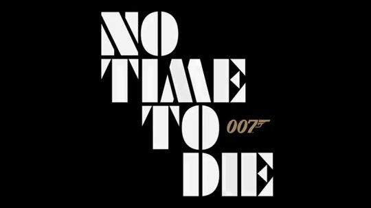
“No Time To Die” fan poster contest submission creation
“The next Bond movie is coming out and we are looking for the brightest and the best artist, illustrator, to come up with a poster design for 007. We’re looking for bold, brave options that capture the essence of James Bond. We cannot wait to see what you come up with.”- Daniel Craig.
Film name Analysis:
Two words pop up immediately: “Time” and “Die”. Both evoke a sense of impending doom. The inevitability of human existence. But the word “No” is in opposition of that fate.
Type of film:
“No Time To Die” is the 25th film in the long running James Bond franchise. It is also the 5th and final film for lead actor “Daniel Craig”. It’s an espionage/action film that already has a strong brand recognised the world over.
Genre caracteristics:
“No Time To Die” will not only be a Bond film. But also a Spy film. A genre with it’s own conventions. By design Spy films have a political component to them. There is intrigue, violence as well as twists and turns to the narrative. Characters have to rely on their skills, intelligence and courage in order to either achieve or fail at their mission. Incertitude, treason, mystery are classic plot elements of the genre.
Film characteristics:
It’s the final film for star Daniel Craig. According to the synopsis for the film James Bond will be dragged out of retirement and face a new villain armed with dangerous new technology. It is also the first 007 to be directed by an american; Cary Fukunaga. The film features an amazing cast from franchise veterans; Léa Seydoux, Ben Whishaw, Naomie Harris, Jeffrey Wright, Christoph Waltz
& Ralph Fiennes as well as newcomers to the series: Rami Malek, Lashana Lynch, Ana de Armas.

Synopsis:
In “No Time To Die”, Bond has left active service and is enjoying a tranquil life in Jamaica. His peace is short-lived when his old friend Felix Leiter from the CIA turns up asking for help. The mission to rescue a kidnapped scientist turns out to be far more treacherous than expected, leading Bond onto the trail of a mysterious villain armed with dangerous new technology.

Spy Film poster analysis:
Color and estetism: Most posters feature read hue images. More comical efforts feature alot of red. For the more serious films blue and green hue dominate. Actors and and actress features are often augmented to lookas attractive and sexy as possible.
Pose and Themes:
Every poster is dominated by the lead actor. Sometimes featuring just one actor. Most posters feature guns and sometimes explosions. Some action, people running, jumping looking concerned or angry are also recurring visual elements.
Font:
Film titles are usually strong and almost always sans serif and evoke the military . Sometimes the font is a bit slanted.
Composition: The bigger the character on the poster. The more importance he/she has to the narrative. The posters often feature a moment or moments in the story. There are some black and white high contrast elements to break the composition.

The Bond franchise has been around for over 50 years. The posters have featured similar elements. An analysis of every poster by decade will help us decode the essential elements and Identify the ones we’ll need on the “No Time To Die”.

Poster design:
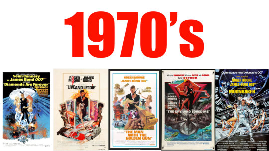
The first decade of Bond. Most posters hand white background with very colorful illustrations that feature scantily dressed women. Plenty of explosions. All of them have taglines that are integrated in the artwork.
Recurring elements:
James Bond is almost always dressed in a black tuxedo or dark clothes. Bond himself is central in the artwork and takes center stage. Set pieces and action moments are represented on the posters. The world is augmented. Everything is a little bit bigger, crazier and more subjective than what’s in the film. The poster is meant to titillate and excite the viewer. It’s screaming: Come see this cool film!
Poster design:
Posters in the 70’s progressively got rid of their white background. Most of the elements from the previous decade remain. The artwork tends to go for a more realistic look. Still augmented.Eventually the lead actor playing Bond is no longer the only recognizable figure. Bond girls, villains and henchmen can be identified. Locations become more and more important in the presentation. These posters scream: Come look at these crazy set pieces and amazing sets.
Recurring elements:
James Bond is still the central figure. But the Bond girls character take more and more space almost being as central as 007. Bond is still mostly dressed in a tuxedo. The artist tend to present him in the same pose. left hand hooked to the right elbow. Right hand, holding a walther ppk with a silencer close to his face. I’ll call this de double-o pose.

Poster design:
This decade saw the introduction of photo-based montage posters. The illustrated artwork was used though most of the decade. The Bond girls keep being featured with the Bond character Locations and explosions and characters are more essential elements.
Recurring elements:
James Bond was tuxedoed throughout most of the decade. only in the later film did they try to put him in different clothes. Bond is identified by black and white. There’s a new pose here:007 ready. Bond as legs wide apart. Gun hand pointing towards the viewer. Left hand up and almost balancing 007.

Poster design:
This decade saw the use of photoshop to create the posters. Bond is still center stage. But the focus is more on the actor. His clothing and accoutrement are not as dominant on the image. Lots of guns, explosions. The entire cast is on the poster. The 007 logo is a imposing design element. There are a lot of screens or electronic readouts
Recurring elements:
The actor’s face looking at the viewer. They use modern image editing software to recreate the feel of the illustrated posters. The colors seem to explode from the poster!

Poster design:
The first decade of a new century started with a look similar to the late 90’s But slowly a more muted. toned down, desaturated look dominated the Bond films of this decade. Colors becoming muted. characters looking anguished and concerned. The focus is squarely on the actor playing James Bond.
Recurring elements:
James Bond is dressed in a tuxedo.His bowtie is undone. Backgrounds are of one tone. the 007 logo is merged with the films logo.
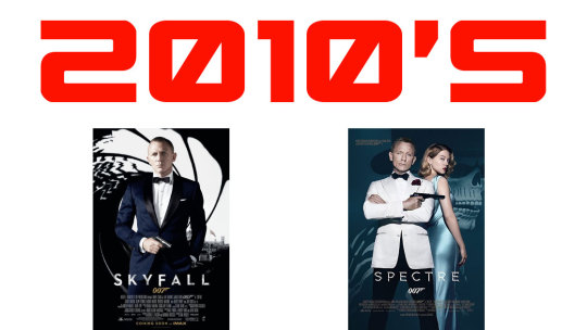
Poster design:
Again, the focus is squarely on Bond. The rest is unimportant. The logo. the films title. These posters are no longer illustrations. They look like magazine pictorials.
Recurring elements:
The actor playing Bond looking angsty facing the audience.
Final analysis:
These are the essential elements through all the decades.
Illustrated/painterly look
James Bond in either the double-o pose or the 007 ready pose.
Bond in a tuxedo with a gun.
the gun-barrel logo
beautiful scantily clad women
explosions
locations
vehicles
Daniel Craig
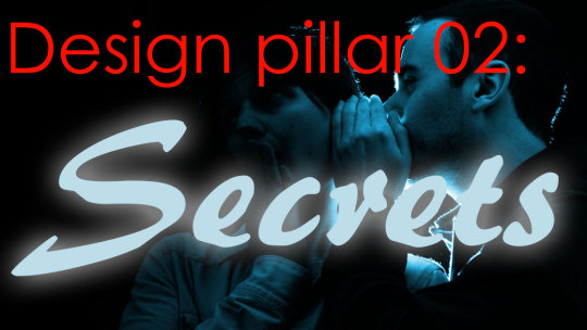
Many times during the trailer. Secrets and the power of their revelation being strong enough to kill are mentioned.
Visualize it!
Elements
shadows. shadows andanxiety ridden characters.
Colors
Purple is associated with wisdom, dignity, independence, creativity, mystery, and magic

“No Time To Die” is in essence an action adventure film. good vs evil. Bond, MI6 V Blofeld, Spectre and it’s agents fit that paradigm.
Visualize it!
Separating the good from the bad characters. putting the bad characters atop the good characters.
colours
Blue is associated with heroes. Red with evil


The first sketch featured strong Bondian elements. But lacks distinctive elements of the other design pillars.

The second attempt features strong elements of all three pillars. It could use some elements of other sketches and some restructuring.

The third sketch has a generic quality. The Secret and Good versus Evil pillars take more importance than the Essence of James Bond.
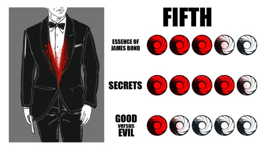
This design was inspired by the fact that this is the fifth time Daniel Craig will play 007. It’s a bit too uninspired.

The villains loom large on this concept. But you lose the Good vs Evil design pillar.

Inspired the poster of “Thunderball” It does have a striking Bondness. But lacks in other design pillars.
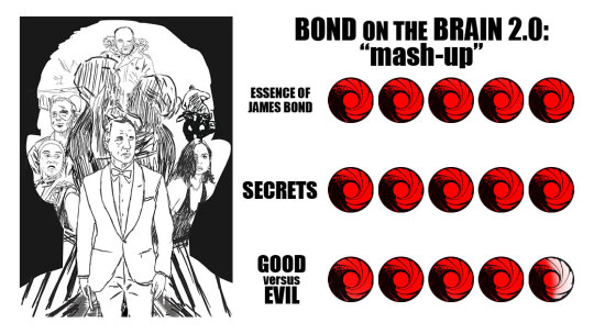
After studying the Bond on the brain design. A “Mash-up” featuring elements of the other posters. Other elements will be added to enhance the visual composition.
Final Design:
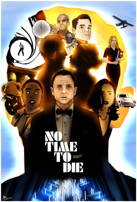
The final submission....
Not perfect. I wish I had more time, a better computer. Access to more reference material. But this was my submission. Obviously I didn’t win. I don’t even think my submission made it on the talenthouse website.
There are elements I like. I hid five images of Daniel Craig as a reminder that this is his fifth time playing 007. I like the kiss between Bond and Swann.
I had a good time creating this image. I hope you enjoy it.
#james bond#no time to die#poster#poster contest#daniel craig#lea seydoux#lashana lynch#ana de armas#rami malek#christoph waltz#spectre#blofeld#art#artwork#concept#design
38 notes
·
View notes
Text
Poster Creation: Operation Gatherall
When David Zaritsky, host of the youtube channel “The Bond Experience” announced he was hosting an event for every 007. Altough I wouldn’t be able to attend. As a Bond fan and fellow “Bond Influencer” (altough the podcast I co-host “The James Bond Complex” has a micro fraction that David’s youtube channel has). I wanted to help to promote “Operation: Gatheral” as I feel. With that in mind I offered my services to David to create a poster. David accepted and I went to work...
Poster design
Description:
This is the BIG ONE....an open invite event for ANYONE who wants to connect with other Bond fans, discuss the movies, the books,the lifestyle, or to simply enjoy the camaraderie. There will be trivia, prizes, discussions on Bond skills, and maybe a surprise or two. You will also be able to meet some of the bloggers and vloggers you may have been following on social media! The location is an artisanal distillery that uses local ingredients to create spirits and cocktails that are worthy of any Bond moment! Cash bar and food available to order will make the afternoon and evening a personalized experience. We also will be holding the Gatherall Games, the ultimate competition of Bond skill and trivia for some fantastic prizes from some of our favorite Bond brands! Stay tuned!
Activity name Analysis:
Operation is a military term. It fits with the spy/military of the 007 character.
Gatherall is the combination of two words. “Gather” and “All”. It evokes a sense of community, positivity and unity.
Type of activity:
Operation: Gatherall is a social event. It is meant to connect other Bond fans, have fun and rejoice in the world of 007.
Activity characteristic: There will be trivia games, custom drinks, vloggers, bloggers and prizes.
Analysis of other images:
text heavy
information clear and simple
event date, social media cards and event address
simple single image
not much color variation
Logo Creation
The event will require the creation of a logo that evokes the world of 007, past and present. It will need to be pleasant to look at and easy to read.
Font Study
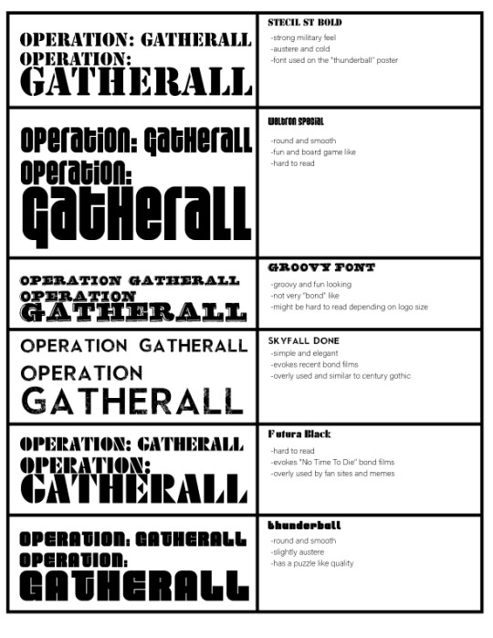
To achieve the merging of both current and classic James Bond a combinaison of the fonts used in the 1965 film “Thunderball” and the one used for “Skyfall” will be used.
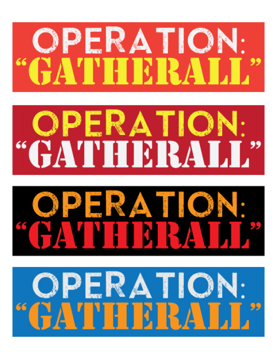
After some tests, the best option is the darker shade of Red background. It makes the letters of the logo “pop” more. Since the activity is for all. The word Gatherall will be in white as it makes the word slightly more intense.
The red and yellow colours are warm, friendly and evoke passion. All elements that are important for fan event.

Poster composition:
For the posters to be vocative and powerful we need to limit our design concepts/pillars. Three keeps all the elements in a tight, simple and elegant package. The pillars will be: Sense Of Community, Spy Chic/James Bond & Fun/Entertaining.
Sense Of Community:
The poster should evoke a sense of friendliness and make the event feel accessible to all. Colors and a visual elements will give the poster a sense that this event is for Mr. and Miss Joe Public and this event is for everyone who shares a similar passion no matter their social background.
Poster will include:
a non-threatening image composition
indications that make it clear the event is for everyone
faces of the members of the bond community that will be at the event
Spy Chic/James Bond:
Suave, sexy and a bit dangerous. The poster has to include these elements in a way that feel fresh but easily recognizable for a neophyte or non-initiate.
Poster will include:
a few elements that evoke the James Bond (tuxedo, beautiful people, drinks a bit of danger)
shadows and smoke for an air of mystery
some elements of gaming
sexiness
Fun/ Entertaining:
This is meant to be a fun event. and the poster has to give that vibe instantly. It must be light and dynamic.
Poster will include:
dynamic fonts
exciting statements
warm colors
exclamation points
clear information
Sketches:

Sketch analysis:

The Thunderball
This concept as a strong James Bond feel. But it’s not evocative of he fun aspect and with the images featuring three strips it seperate each member of the community.

The Gun Barrel
The people inside the gun barrel are smiling and having fun but the sense of community is missing almost entirely. The viewer being inside the gun barrel and aiming at people might not be ideal to create a sense of fun.
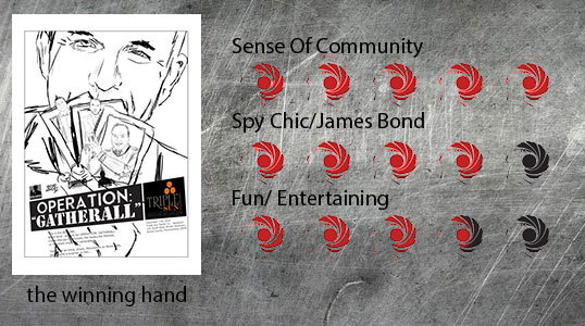
The Winning Hand
This feels fun, exciting and inviting. It is not austere, violent or sexist. It features all the Bond influencers together. Thus highlighting a sense of community.

The Corporate
A simpler take. It does feature a strong sense of community. But it lacks any fun and excitement.
After proposing these images to David. He ended picking the image I consider the most ideal; The Winning Hand .

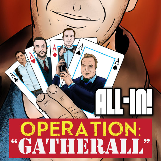
Now for social media platforms A tagline was added. It is meant to reflect the fun and excitement that guests will expect from the evening. But also remind people that this is an inclusive event.
“All-In!”
It’s simple, very Bondian and ideal!

#poster#image concept#illustration#promotion#event#graphic design#james bond#the bond experience#david zaritsky
0 notes
Text
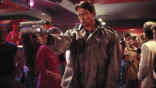
Terminator: Dark Fate (Spoilers ahead)
Synopsis :
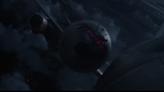
27 years after the events of Terminator 2: Judgment Day, a new, modified liquid metal Terminator is sent from the future by Skynet in order to terminate Dani Ramos, a hybrid cyborg human, and her friends.

Now before going through a proper review. I have to give my thoughts on the Terminator franchise. The first and second one are great. Classic sci-fiction / action films that have changed films forever. They are untouchable, exciting and still all these years later fresh and unique.
Everything else ( Rise Of The Machines, Salvation and Genisys, tv show, comic books, video game and yes even this new film) feels empty of meaning, ideas and creativity. But some of them can be fun and doesn’t mean that they are terrible. They are just a unoriginal and only exist because a film studio estimates that people’s nostalgia for the first two films can be used to make some money. With that in mind I decided to give this most recent opus a chance.
This is as close as we are ever going to get to a proper third movie as original creator; James Cameron is back as a producer. With him, Cameron brought back Arnold. (It probably wasn’t hard as he was in 2 of the 3 non James Cameron sequels. Most surprisingly is Linda Hamilton returning as Sarah Connor. “Dark Fate” is ostensibly a soft reboot. It means that it tells virtually the same story but with new characters. We Have Natalia Reyes as Dani Ramos, a young woman targeted for Termination by Rev-9, played by Gabriel Luna, A new cybernetic assassin that’s able to split itself into two entities. To counter this threat an cybernetic augmented resistance fighter; Grace, played by Mackenzie Davis, has been sent to protect Dani.
Does this sound familiar? It should. This is a retelling of both the Terminator as well as Terminator 2. But unlike previous films. This introduces a new myth. You see the film acknowledges that Judgment Day ( August 29th 1997) never happened. The film theorizes that technological advancement makes it likely that an evil A.I. will eventually attack humanity. It just won’t be called Skynet.
!!!!!!!!!!!!!!!!!!!major spoilers warning!!!!!!!!!!!!!!!!!
Ok here is the shocker of the film. If you’ve seen the trailer you’re probably asking yourself “Where is John Connor?” Well a year after Judgment Day had come and gone. Sarah Connor, living with John in Mexico, gets a visit from one of Skynet’s Terminator that was still hunting them down according to it’s programming even if Judgment Day had not happened. John in a particulary shocking twist is shot and killed.
This is the Dark Fate the film alludes to.
But Terminators keep coming to the present. Sarah starts getting messages giving her the coordinates of these machines. That’s how she comes across Dani & Grace.
Look I won’t spoil everything. But It’ll give you a feel for the good, meh and the bad.

The good
The cast.
Mackenzie Davis is a well, graceful as Grace. She obviously spent a lot of time in the gym and it shows. The brutality of the fights she gets into are very exciting.
Arnold Schwarzenegger is at his best. He doesn’t rely on his physique as he did back in the first two films. He’s still imposing. But his charisma, sense of humor and dare I say acting talent shows that he is more than a aging body-builder turned actor.
Linda Hamilton is back and she isn’t playing a impotent granny. She’s great in her action sequences. Yet I feel her character could have been fleshed out a bit more at times.
Natalia Reyes and Grabriel Luna are okay. Reyes having some character evolution her arc is the exact same as the Sarah Connor of the first film. Luna isn’t as imposing as Arnold or as intense as Robert Patrick (who played the T-1000 in Terminator 2) Thankfully he’s helped by a creative new concept of the Terminator.
The meh
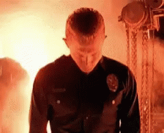
Cinematography & Action
The film often takes place at night. But unfortunately the picture is muddy at times. The kinetic endless action sequence. (The ending is an assault on the senses worthy of a Micheal Bay film) Instead of creating suspense and drama. The focus is (again) on spectacular action. This hurts the film. The Rev-9 never feels that he’s a superior foe that can’t be stopped. No He comes across as a cartoon that can take a comical amount of damage.

The Bad
Story
Everything old is, well old again. The film is a soft reboot and as such never tries to do something new with the material. ‘Salvation’ tried to tell the “future war” story without much success. ‘Genisys’ was an insane time travel plot that ended up being about nothing and felt like a bid budget fan fiction. ‘Dark Fate’ has a few ideas that it ultimately feels like they we’re left in a writer’s room. There are so many call-backs to previous films. Dialogue that is taken word for word from the previous films. That in the end. As good as it is. Terminator: Dark Fate wasn’t made to continue a story. No it was made to make money.
Should you see it?
This a 6th film in a franchise that has now more bad than good in it’s lineage. But this one tries it’s best to redeem itself. If you want to see robot battles, a fantastic bad-ass cyborg (forget the T-X). Lots and lots of action and Arnold doing some of best work in years. “ Terminator: Dark Fate” feels like a remake of a much better film. But it isn’t bad.
Recommended
#terminator#dark fate#arnold schwarzenegger#arnold#linda hamilton#mackenzie davis#terminator dark fate
2 notes
·
View notes