
Don't wanna be here? Send us removal request.
Statistics
We looked inside some of the posts by matt-saabye and here's what we found interesting.
Average Info
Notes Per Post
1
Likes Per Post
1
Reblog Per Post
0
Reply Per Post
0
Time Between Posts
19 days
Number of Posts By Type
Text
4
Last Seen Tumblr Blogs


Fun Fact
Kazakhstan’s Minister of Communications and Informatics has blocked the Tumblr site because it contained 60 sites of terrorism, extremism, and pornography in 2015.
Text
Movie Review Assignment
For my review, I chose to see Russian Ark. The one-shot take and the costumes were quite entertaining.
2019's 1917 was one of the best one-shots I've ever seen. Inspired in part by tales his paternal grandfather Alfred told the director about his World War I service, the movie is set during Operation Alberich, right after the Germans have retreated to the Hindenburg Line, and it centers on the mission of two British soldiers, Will Schofield, and Tom Blake, to deliver a crucial message that will avert a disastrous offensive attack. Amazing film, you should definitely watch it if you haven't.
The Russian Ark has amazing visuals as well. It took place in St. Petersburg's Hermitage Museum, and even more astounding is the fact that it was captured in a single take. Following a dark screen and the lines "I open my eyes and I see nothing," the camera's eye opens up to reveal the Hermitage. Following the Marquis, a French aristocrat, we shall follow him as he explores the artwork and the museum's history. The voice we heard is that of the never-before-seen Sokurov, and it serves as a counterpoint to the Marquis' continuous comments. The opening-up shows a formal state ball as the camera enters a huge hall. A symphony orchestra plays as hundreds of dancers in ornate costumes and jewelry perform. Afterward, the camera appears to glide through the air to the orchestra's stage and moves among the members. The camera team had to carefully maneuver an unseen ramp beneath the camera frame in order to ascent. Seeing the movie is an amazing experience, in part because you get to grasp the approach and realize how much each scene counts. Five minutes before the finale, how awful it would be if an actor had misplaced a cue or stammered! The duration and continuity of the action are more important than the action itself. I really felt as though I was in the museum, experiencing everything firsthand, thanks to this one continuous shot technique. Like I was at a party and walking around with a group of people. The cameras move fluidly throughout the whole movie thanks to excellent cinematography, even making it a one-shot. The movie's composition and framing techniques are expertly used to arrange people and things in the frame to highlight particular aspects and focus points. I found that the movie had a lot of symmetry and balance, which also served to highlight the museum's exquisite architecture. As the camera moved from room to room and across the stairs, the composition and framing overall contributed to the film's seamlessness and sense of immersion. Since there was no artificial lighting in the movie, just natural light was used, which I thought beautifully emphasized the museum, art, and artifacts. It was extremely intriguing how the sun would stream in, casting these gold hues against the gloomy interiors of the museum. I was always pleased with the colors throughout the movie, and I really enjoyed how gold was used throughout the museum. The costumes were adorned with jewels of every hue to serve as a constant reminder of the enormous wealth. I was initially perplexed by the voice-over, especially with it being all in Russian. Due to the use of classical music, the music also serves as a representation of the era in which it is set. The picture is visually compelling overall because of its effective use of lighting, symbolism, color, composition, music, and depth.
0 notes
Text
Visual Comm Assignment 3
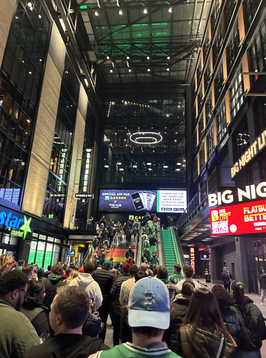
The COVID-19 pandemic was hard for everyone, being quarantined inside for such a long period of time, a deadly virus sweeping the world. So it made it that much sweeter once the ban was lifted and people were able to leave their homes and try to get back to a semi-normal life. Some of the things I've always liked to do have been spending time with friends and watching sports. For this assignment, I decided to choose this image of my friend Nick in the blue Red Sox Marathon hat that I captured as he and I were heading into TD Garden for a Celtics game.
The image itself is from behind Nick in the foreground, looking up at the crowded entrance of TD Garden. The Celtics were playing the 76ers that night, so a big-time matchup definitely drew out a ton of basketball fans, be it Boston or Philadelphia fans. I was able to sort of see things through these people's eyes as if we were still living in the COVID-19 era, even though the COVID-19 pandemic has passed. The folks in the photo are circulating outside the Garden, either on their way to supper, at their friends' houses, or inside for the big game. The individuals in the photo appeared to be having a good time strolling around; it was obvious that they were happy and content to be outside. Simple tasks like strolling around a public space became difficult during the COVID-19 pandemic, and many individuals were afraid to even attempt them. The sense that these individuals were feeling independence from their houses and clean air.
Now that COVID-19 is officially ended, people including Nick and I, were out having fun and could stroll around any public space we chose. Boston is a fantastic city to come and explore. There's always so much to see, do, and eat—in this instance, a lot of seeing. The stories that people are telling each other as they go past, the various walks they take, whether they are in Boston alone or with friends, etc. Particularly for these folks ascending the escalator or steps in the background, everyone is outside to take advantage of the remaining sunshine and get into the Garden for a Celtics game. Nick and the strangers that I was able to take a picture of appeared to be relieved that the pandemic is now ended and that they can go back to living their regular lives and doing whatever they like. In our case, watching the Celtics beat the 76ers.
0 notes
Text
Assignment two
While I wouldn't classify propaganda and persuasion as the same thing, they do have many similarities and often overlap. Whether it takes the kind of audio or visuals with symbolic meaning, propaganda is a tool used to persuade someone to follow a particular path or achieve a goal. Propaganda is more of a haughty attempt to influence people to believe or act a particular way than it is an attempt to persuade someone to do anything via discussion. Another argument against propaganda is because it just uses visual cues and emotional appeals, while normal persuasion also emphasizes factual facts. Check out these two images.
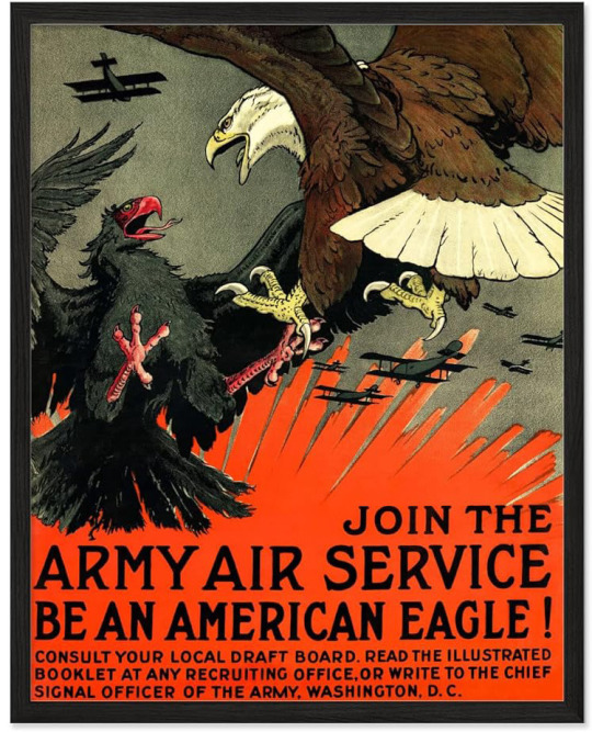
This one's a good blend to show that propaganda and persuasion are similar. Professor said that in order to incite people to battle, one must present the opponent as menacing or terrible and use shock tactics to persuade people to fight. The first poster uses the majestic bald eagle as a symbol to present America as the “good guys” in the fight. It is prepared to battle for our freedom and defend its land. Are you in agreement? This enemy is represented by another eagle, which is equally fierce and large in size, but is positioned lower in the image to indicate its inferiority. Its monstrous appearance is emphasized by the use of the colors black and red. A fierce combat between airplanes is taking place in the background. Writing "Be an American Eagle" is a great way to inspire bravery in the reader and in a way encourage them to go to battle.
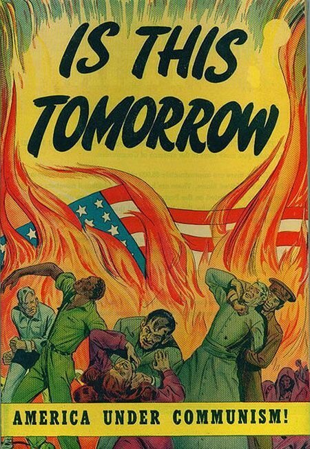
The enemy in the second image is not so much a nation or person as it is a concept—Communism. In the image, our beloved American flag is on fire, burning in the background while people are being choked, strangeld, and punched in the foreground. A woman with billowing red hair in the foreground was the first thing to grab my attention. Across the bottom of the image reads "America Under Communism!", putting communism into a bad light. Invoking young men to sign up for the war, to save our freedom so we don't slip into communism.
These next two pictures show the differences between propaganda and persuasion
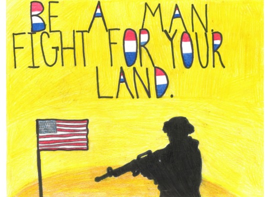
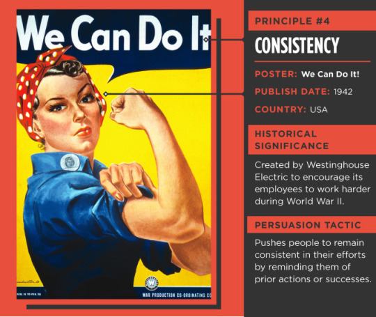
The first picture is a drawing, of a soldier looking at our American flag while armed with an assault rifle, with the words "Be a man. Fight for our land." above the soldier. The little spaces in the written caption that have a "hole" in them are filled with red white and blue coloring. The intentional, methodical effort to influence perceptions, sway thoughts, and influence behavior in order to elicit a response that advances the propagandist's intended outcome is known as propaganda. The goal of persuasive communication is to meet the requirements of the persuader and the persuaded. This is a good example of propaganda because it's a straight forward message that doesn't try to persuade, but state what you need to do. The second image is one of the more popular images when look into propaganda and persuasion, the image of a woman flexing her bicep and pulling up her sleeve, ready to get to work. It's supposed to emphasize woman to work harder while their husbands and sons were fighting overseas in World War II. It's a good example of persuasion because it's trying to make sure people stay consistent. In its initial setting in the 1940s, the poster struck a chord with women, and it remains an emblem of feminism to this day. When the poster was initially made, it encouraged women to work harder and maintain their motivation while also reminding them of the value of commitment to their manufacturing jobs through the usage of the consistency principle. Rosie the Riveter's appearance is still endearing, and the poster has turned into a call to action for equality.
0 notes
Text
mc escher analysis
For this analysis, I am going to be looking into the piece Relativity by M.C. Escher. I have attached it on the 2nd page. He uses lines, depth, and perspective to construct this artwork. This piece specifically is really cool. If you rotate the picture, even 90 degrees, it creates a totally different image. I think this is due to the triangle in the middle kinda being the main focus point. The staircases are drawn and constructed around a triangle, rather than a square. This gives you the ability to turn the image and have a completely different image; whereas if it was constructed around a square in the middle, and you rotated it, you would only see the images just turned and not a different image entirely. The guy holding the sack and climbing vertically up the wall is the initial point of concentration, in my opinion at least, roughly in the center. Afterward, the sharp contrast curve above him starts to guide our gaze across the image as it should, allowing it to focus on the contradicting elements.
According to Scott McDaniel, an avid artist and art blogger, Escher does cool things with this piece. McDaniel writes, “Escher uses three-point perspective for Relativity. That’s not too unusual. When you’ve got three vanishing points they form a triangle. Usually when we use a three-point perspective two of the vanishing points are on the horizon and the third is either above (the zenith) or below (the nadir). In Relativity Escher played with this concept. Because he set up the vanishing points as an equilateral triangle, it meant he could build a structure in perspective that didn’t look distorted if you changed the horizon from one side of the triangle to the other” (McDaniel, 2010). I’m not huge into art myself, as I really can’t draw for anything. But this image is still fascinating to me. Just picking out a small spot to look at, for a minute or two, I can find something that I never would have seen 10 minutes ago. Escher’s use of shapes, depth, and perspective in Relativity is just amazing.

1 note
·
View note