A person with a Writing hobby that they somehow manage to get payed for sometimes. He/They
Last active 60 minutes ago
Don't wanna be here? Send us removal request.
Statistics
We looked inside some of the posts by marvelousmop and here's what we found interesting.
Average Info
Notes Per Post
889K
Likes Per Post
465K
Reblog Per Post
424K
Reply Per Post
834
Time Between Posts
2 hours ago
Number of Posts By Type
Text
17
Last Seen Tumblr Blogs


Fun Fact
There are dozens of funny blogs to kill time on Tumblr.

Text
Babe r u on, you're flaskposting again
0 notes
Text

I told myself that if I ever need anything to paint I should pick the first photo I see on my dash and paint it and this was the first one so I committed.
123 notes
·
View notes
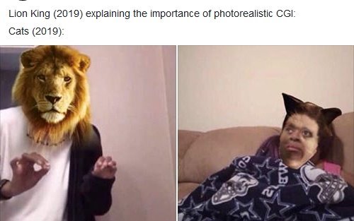
Text

hey. does anyone know what the fuck is going on
27K notes
·
View notes
Text
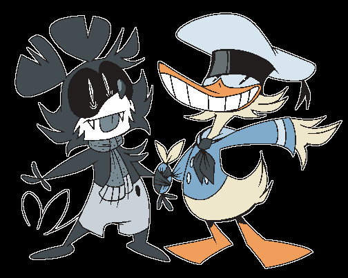
Flippy & Donnie!
this is what 1 year does to a fella

(oldie from January of 2024)
18 notes
·
View notes

Text

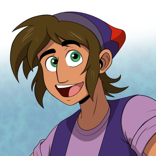
Princess Ozma and her male alter-ego, Tip.
Art Commissions done by Kris Dobbins.
I've done many artworks featuring my versions of Ozma and Tip in the past, but it's fun and important for me to see how other artists interpret and draw them too. Mainly because it helps me see which character features stand out and which aspects need work.
Tip was the first one commissioned out of the artist's choice (I gave them the option between the two), and their reasoning is that they like the hat. Can't blame them. The hat really gives that street urchin, mischievous aura to Tip. Sort of like Aladdin or Artful Dodger. But I'm glad they choose Tip first because a design philosophy I had with making Tip and Ozma is that Tip is the baseline design for both character (as Tip is introduced first before Ozma). Tip has to look like a boy first and foremost, and Ozma has to look like Tip even with a royal princess dress, crown, and long hair. They are the same character, after all. Two sides of the same coin.
For Ozma, you may notice that her pendant on her neck is no longer an Oz emblem, but rather a circular cross with five shiny gems. Well that's because when I saw the commission early sketch, I found the two Oz logos (one on the head, one on the neck) to be too close to each other and it's rather distracting. Previous artists did these two Oz emblems, and they didn't distract me before. But then I realize it's because they drew the full body of Ozma and as a result, the Oz emblems were relatively tiny and didn't register as distracting. Here, this headshot makes the redundant details a lot more visible.
The circular cross is actually based on Ozma's pendant illustrated in the books, which I had initially tried to draw on my Ozma's design in the past... but it never turned out the way I like, which was why I went for the Oz emblem for a long time. But Kris Dobbins did a sketch of the novel pendant and not only did they made it work, but it gave me an idea of what the pendant is. Four circles with a jewel in the center? That's like a compass: North, East, West, South. And what is the Land of Oz famous for? So pendant has five gems that represent a land of Oz. Blue for East, Purple for North, Yellow for West, Red for South, and Emerald for Emerald City. And for the record, West and East are deliberately flipped.
What both designs share in common is how lively they are. They feel like cartoon characters come to life (and this shouldn't be surprising since Kris Dobbins is a professional artist who worked on cartoons and comics). And this honestly inspires me to keep going on my little Oz project. Already, I've begun making more Dorzma artwork for the coming month of June.
18 notes
·
View notes


Text

Skekok best skeksis . After this I fed him a saltine but unfortunately he died.
35 notes
·
View notes

Text

My boy Department Store
Hes going to sell you something
47 notes
·
View notes
Text
I cannot relate to people who dislike female characters for “being manipulative.” She’s literally creative problem solving before your eyes. She’s literally just using her words. Maybe the other blorbos should be less pawn-like for her beautiful hands hmm
42K notes
·
View notes