Text
Final Drawing from Reference


Instructed to not only draw the references but also to apply armour and weaponry.
0 notes
Text
The M.A.R.S Poster
So here we are, the end of M.A.R.S is dawning on us, and the Final Major Project is just over the hill.
Today was the poster creation, which was certainly a very tough one for me, for many reasons which I shall be getting into.
Being someone who strives to stay ahead of the curve, I had already began planning on what I would be including in my poster, as the template was that we'd have three research panels, three developments and three outcomes.
Seems simple enough.
Haha, WRONG.
This template absolutely sucked, because it had to fit a specific format, and it looks ugly, and it completely limits my creativity, and it was so difficult to format properly.
So, as mentioned before, I had a plan.
Initially, I wanted to include three different outcomes of three different mediums, which would be my rendition of BELLONA, the Split plushie and some kind of digital outcome, likely being on MAYA.
However, this came with the issue that all of my MAYA outcomes suck.
So, I went on to then write out every individual outcome I've created as part of this project, and delve into the issues regarding each one given the prompt.


And if you're unable to read my handwriting, I don't blame you, but I just delve into the fact that most outcomes are either bad, lack variety or in the specific instance of the Book Cover, it'd be hard to include the spaceship in the poster because there wouldn't be any context into the inclusion for MAYA.
Incase I sound like I'm speaking a different language, I just mean that if I were to include the spaceship as part of the development prompt (which it would be, as the cover was traced from said spaceship), the average audience would possibly think "woah, what's that? It's 3D, where did that come from?" without any elaboration added.
But you'll see soon how I'd combat this.
So, after a bit more consideration, I figured that I'd want to actually save Split for the FMP (which, this might not work, but we'll see what happens), and Kyrstie had advised me that it'd be better if the prompts had actually fit the overall theme of Space, so I'd changed things around.
Still keeping BELLONA as one of my prompts, I'd instead added the book cover and the Adobe Illustrator Spaceship design, despite it not being finished, but eh.

You can still notice my inhibitions about including two drawings in the same poster, but I mostly disregarded that.
So then it was onto actually making the poster, and it was at this point where my brain had started to go into a sort of trauma response, as we were instructed to use the godforsaken Google Slides.
This is where the photoshop template being garbage comes in, because you're only able to paste one image into the base, so to combat this, we were told to compile our outcomes and photos into a google slide and then screenshot it to paste into the format, seems simple.
But Google Slides is absolutely awful when it comes to any kind of decoration.
So I had to get creative.


Just two examples being the BELLONA Research Image and the Illustrator Spaceship Process. I'd decorated them with some shapes to fill the space, because I felt as though they were certainly lacking.
And I'm so glad I did this or I might have actually lost all sanity.
However, this was where another problem had reared its ugly head. Due to the nature of the screenshots, most of them weren't exactly the best quality, as they had to be ripped directly from the blog and cropped down.
I'd tried to cut down on this by actually downloading the images before cropping them, as opposed to screenshotting them, but they do still somewhat suffer the pixelation.
But hey, if you don't look too closely, they're fine.
So then the poster was done.

I did also have a version with a pastel purple background just to make it look more tolerable, but I'm not sure what version they'd accept for the format.
But for the most part, I think it's alright, it showcases my process and outcomes pretty well, along with the ways I'd adapted to the parameters of this god-awful format (no offence Derek), and I think it has a pretty fair chance of being in the running, even though it likely won't win.
0 notes
Text
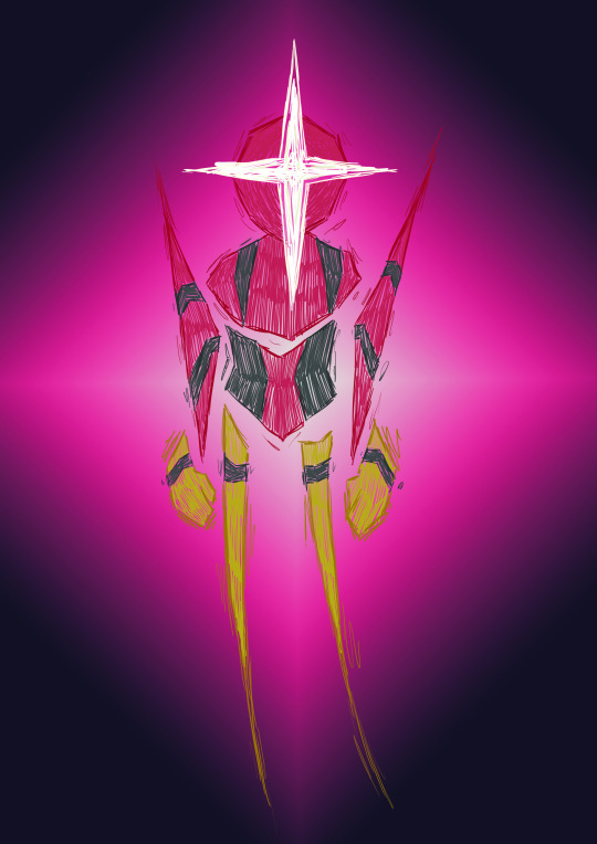
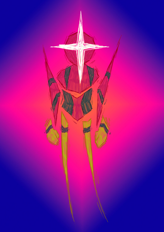
BELLONA Final Drawing
Using the previously sketches outcomes of my BELLONA rendition, I had decided to create a digital outcome too, using a sketchy aesthetic that I felt would match the geometric design.
Along with using the gradient tool for the background with different colour variants, which (because colour theory) actually almost warp the appearance of the drawing itself, which I find really cool.
0 notes
Text
The Book Cover
Heading into the end of our journey to M.A.R.S, we're going to be tasked with creating posters of three of our outcomes to enter into a competition (more info will be provided when I post about it).
So for this session, we were tasked with creating book covers featuring our spaceship designs as a way to test the waters in composition and such.
I'm honestly not sure.
A good starting point was the main inspiration, this rendition of the cover art for Krieg Der Welten by H.G. Wells, which, to my understanding, is about the protagonist having to escape Southern England with their brother as aliens would begin to invade England.
The book name also translates to 'The War of the Worlds'.

Starting out by going into the Image setting, we started experimenting with the 'Threshold' adjustment, which essentially super-highlights the white parts of the image and super-shadows the dark parts.
See below.


Though, I will admit, I didn't actually end up using this.
So here we move on to the actual cover, wherein we start by using the website COOLERS, which is a website that creates a custom colour palette for you to use, with the features being locking a specific colour to create other matches or removing or adding one (as the default is 5 colours).
So I'd randomised and locked a few until landing upon this palette, which I was quite happy with.

So I had started out by planting the spaceship onto the canvas and began tracing over it with my colours, starting specifically with the window and then adding the base (which I've forgotten to get a picture of).
So the next step to the plan was adding a hand to almost give the appearance of the saucer flying out of someones hand, so I'd found this simple lineart on google and had began tracing over it.

Now, it could just be because I hadn't actually filled the hand with colour, or it just looked off in the placement, but this would end up being scrapped, even as I had tried applying a colour overlay (see below).


So my next thought was "how am I going to fill the space now?" So that had led me to creating a simple trail and adding a purple underlay, which I'd also repeat for the spaceship.

But I still felt like something was missing, so I returned to my hand idea, this time utilising a different base, which instead of seeming like the spaceship was flying out of the hands, it was as if it had been tossed into the air in a sort of "be free!" notion.

So I decided to trace it fully in white and add the underlay, which I do think looks pretty nice.

So, being supplied what was described to us as a 'fake mockup', we had to copy and paste (or alternatively edit directly onto the canvas of) the layers, so when returning to the mockup, the drawing would be magically pasted onto the book.

Along with that, I'd also had to create a spine for the book, with the only issue being that I had to rotate the canvas to actually draw on it, and having to ensure it was rotated backwards, lest it be warped.

And the final cover was done, with a name and everything, and I'm actually pretty happy with how it looks.
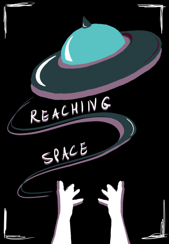
And here's me just altering the background colour.


And the mockup was done.
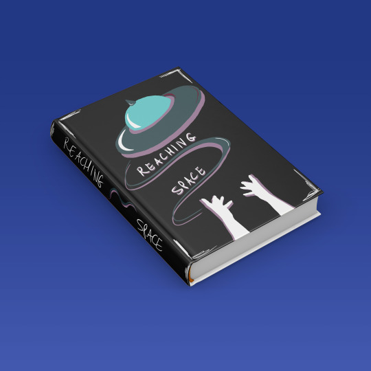
You can tell it's fake, of course, but it almost does look like it could actually be a real book.
With an issue I'm only noticing now is the corner accents being squished into the spine fold of the book, which wouldn't look too nice realistically but.. Live and learn.
0 notes
Text
Wooden Doll
Some sketches for the wooden doll designs I'd planned to potentially create (though I doubt I'd have the time to ever get around to them).
With the original Split Doll, as part of his design timeline in his universe (see below - not up to date with how I plan to change it),

To, of course, the Bellona statue I planned.
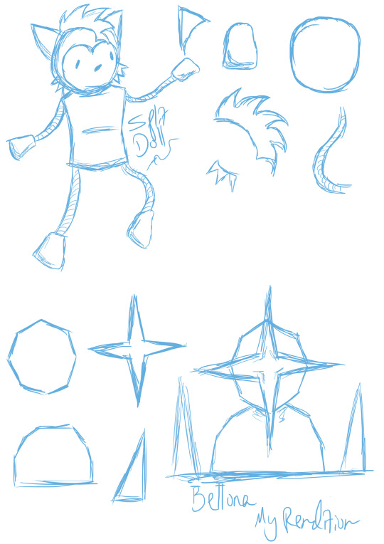
Who knows, but I do like the way Split looks, and it'd be nice to use this design more in future.
0 notes
Text
Split Photographs
Getting photographs of Split in more natural environments to really drive home the idea that he's a toy that could be real in a Toy Shop or Home.


Very professional setup.


0 notes
Text
Giving Split Accessories
Just for fun, I had decided it'd be nice for me to spend my time making some mini accessories for Split, being a fedora, bowtie, suitcase and of course a handgun.

PERRY THE PLATYPUS!?


And as an after-result I'd decided to draw him in his cartoonish style.

0 notes
Text
Plushie Finalising
A recreated template (not to scale) for the plushie and each of its elements for stitching together, along with the instructions of the process to follow to get the desired outcome.


And beginning on the headboard for the plushie, with the idea in mind being that Split is strewn up to a board and displayed as if in a toy-shop setting.

This process.. Wasn't simple, as it required measuring on my part to properly align the holes in Adobe Illustrator, which thankfully has an installed ruler.
Then it was just a case of adding the text and logo, which as you might notice in the final product, looks different to its original - as the top of the L in 'Split' is also meant to be stitched, along with 'TOY FACTORY' having a line above it, which may have been removed when attempting to copy the text from a CMYK canvas to an RGB one, which is done purely so the Laser-Cutter doesn't have a seizure.

And then the cutter had begun engraving the text, which took the most time because during said engraving, the air tube (for lack of better term) had came detached and I was worried I'd broken the machine, to which Kyrstie informed me I was overreacting.

Huzzah.
With the frame finished, I'd decided to create a makeshift hook out of wire (looking back I have no idea why I did this, because the frame already has a hole in it), and I'd taken it home and tea-stained it.


And he was finally done.
I'm so proud of my son.
0 notes
Text
Creating the Full Plushie
So starting out the project, I had actually realised that I only had a plushie character on the back burner, so this seemed like the perfect opportunity.
With the template then printed, I'd ensured that they would each actually line up properly, and thankfully they had, very beautifully infact.
And it was also convenient that the pieces of felt sheet I'd gotten were roughly A4 too, so I would be able to print the template onto A4 sheets and have it fit.

So it was easy to begin tracing the template and start cutting out the body parts required.


So I had started out with the head, as it seemed like the simplest step, and I had to ensure the ears and face would be on the INSIDE when stitching it, so I'd then be able to turn it inside out.


The same with the hair and eyes, done before I'd stitched the head pieces together just for convenience.
Now this is the part where I see that I had a bit of an unfair advantage over everyone else, in the sense that.
I have a sewing machine.
So I was able to relatively easily stitch together the arms and legs before then turning them inside out.


And I'd applied the same to the head, but, you may notice a slight issue, being that the whiskers are on the inside.
This is definitely an oversight on my half, as I'd never considered the whiskers also being turned inside out, so we'd see later how I attempted to combat this.
Also an oversight on my half, I'd forgotten to get pictures of me having created the body, along with stitching the limbs to it, which was done using a stitch (that I do not know the name of) where I'd pushed the needle through the limb and pulled it back through the fabric.

And then I was able to stuff him at college, along with attaching the head (which sort of had its own issues as the stitch was pulled a bit tight, causing Split to have a narrow neck and subsequently have holes in his shoulders, which I'd later on fix).

And similarly to the mini, he has a seam in his back, which isn't a reference to THE SUBSTANCE, just the fact that I had to add more stuffing to his body and that was the only place a seam seemed natural.
0 notes
Text
More Research
Brian McCarty
is an Artist and Photographer known for his usage of children's toys as part of his photography projects, and especially his series titled 'War Toys'.

His method is often posing and rigging children's into an environment (be it natural or made by him) to portray a sort of real life scenario, for example a teddy bear with a chainsaw.

The series 'War Toys' particularly jumps out to me, as it applies these toys to the real life political situation of the wars currently ongoing in Palestine and Ukraine.

It's a very real issue, and having a set of children's toys be applied to it gives a sort of satirical but also grounding appearance to it, because it's a very real issue that should be tackled, and it does involve children being put in danger.

Along with recreating children's own depictions of the wars going on around them and how they respond to this.
Tonal whiplash.
Mitchel Wu
is also a photographer based in Los Angeles, and he also uses a variety of posed toys in his works.

In some instances, he'd actually create backgrounds for his works, using a variety of methods.

His works are a lot more wholesome, though I can't help but feel as through they seem almost artificial, as most of the backgrounds would have been created either in his home or some kind of studio.
But they look good regardless.

Or in some instances he'll actually have live sequences as he'd photographs, like throwing confetti into the shot or disturbing one of the objects for the final shot.
0 notes
Text
Drawing from Reference
Just a trial run of having to draw from real-life references of people to improve our skills.
Along with also using charcoal and graphite as our mediums, possibly just to see how we would manage with dealing with the change? I'm not sure.


Charcoal

Graphite

Not overly proud of my outcomes, but I suppose I was sort of rushing with how I was doing things, and I've never been good with drawing real people from reference, more just applying my own style.
Maybe a point to work on in future?
0 notes
Text
The Cereal Box Trial Pt2
And why it went wrong.
So, in MAYA we were tasked with creating a trial cereal box (with an alien mascot) so we would be able to understand how applying textures and images to models would work, and I'm sure this could have been done in an easier way but we like life being harder.
So we had to design a cereal box in Photoshop.
I initially had the idea to create 'Spaghetti O.. o nos" as a sort of jokey brand but.. That just kinda failed because it felt a bit lacklustre.
Along with this image of the squid (which I'd drawn using the boxes template) as you could see in my previous post, thankfully, as I think I might've deleted the file.
So I'd decided to start over, and I'd created Octo's, which is.. Not really much better, honestly.

The sketch is alright, I think I did well for it, but again I just feel as though the overall concept for the cereal just drags it down.
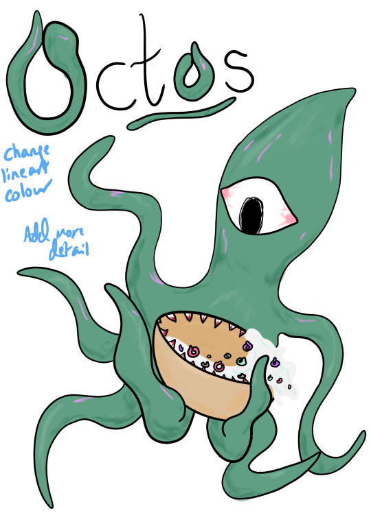
So I had eventually gotten to this point (just ignore the notes I'd left for myself) with the colour and shading, which I'm still just not too thrilled about.
I guess it's just because I felt drained doing this entire thing (because it was kinda useless) or I just wasn't happy with my overall concept, but I just feel as though this whole thing fell onto its face, and I don't see myself ever picking up this concept or general work again unless literally obligated to.
0 notes
Text
my humour has peaked
I'm not even sure how to describe this, but having fully rendered the spaceship, it was time to add it to a real life background.
For some reason, my brain had went to that image of the cat crowdsurfing, but I could not find it anywhere, probably because I saved it exclusively on Instagram.
So I had to recreate the image myself using spot-healing and some filters, just so I could provide context if needed.

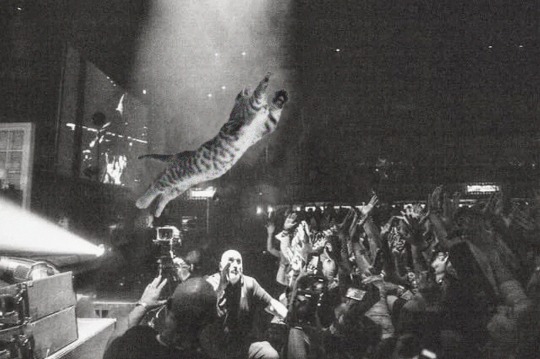
So then I had to edit out the cat, as I'd already merged it, and apply the spaceship.
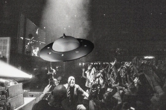
I honestly have no idea why I did this but Josh had encouraged my creativity so, let's go with it.
0 notes
Text
Spaceship Research
// Spoilers and I based my opinions purely off Synopsis and Trailers
Returnal
Returnal is a game released in 2021 First Person Shooter game created by Housemarque and Sony Interactive Entertainment, following the story of Selene Vassos as she searches for a mysterious 'white shadow', finding that she's been stuck inside of a time loop.
Landing upon the planet Atropos, despite the orders of ASTRA, Selene searches the climate as she attempts to search for what she perceived to be a familiar signal, but during her investigation, she soon discovers the corpse of herself.
This is where she discovers that each time she dies, she relives the same life of her landing on Atropos but with the same memories from the previous life.
As she continues her journey, she soon discovers a mirage of her childhood home, which floods her mind with memories of her own self having shot down her own ship through a paradox, meaning she was responsible for her desertion.
Further through the game, she would eventually discover the white shadow, and ASTRA is then able to contact her and send a rescue ship, bringing her back to earth where she lives a full life and dies of old age.
Only to then be brought back into the time-loop back on Atropos.
(There is more to the game and the ending, but I'd honestly just advise playing it and forming your own interpretation).
Returnal was in development for more than four years, and it utilises the PS5's DualSense Controller Mechanics to create a more immersive game experience, using haptic feedback and 3D Spatial Sound.
Along with the Tempest Engine providing real-time raytracing and the PS5 being able to provide better graphics and optimisation for the game to run smoothly and efficiently.

The cover art for Returnal.
The settings seen in the game do look interesting, if not what would typically be expected from a game set in space, and they almost seem akin to something seen in The Last Of Us.

Along with the UI having a very technologic appearance, as if you're actually piloting an astronaut suit.
Chorus

Chorus was also released in 2021, developed by Fishlabs and published by Deep Silver, with said development starting in 2017 and the game having been announced in 2020.
Following Nara, a pilot who flies a sentient starfighter named Forsaken, as they work to bring down a cult, led by The Prophet, known as The Circle in their attempt to rein the universe.

The game, of course, being set in space has a very scientific and ethereal appearance to it, which is seen in the settings of the inhabited areas (spaceships, for lack of a better word), along with the backgrounds and skyboxes overall just having immaculate detail and overall looking very appealing.


Cowboys & Aliens

Released in 2011, Cowboys & Aliens stars Daniel Craig (of James Bond) and Harrison Ford (of too many movies to count).
I'm going to come out and say that (based on the trailer alone) this movie doesn't look good, it just looks kinda boring.
Ironic given it was directed by Jon Favreau and produced by Steven Spielburg.
It follows Daniel Craig as he is marooned in New Mexico with a mysterious, electronic bracelet around his arm and no memory of what'd previously happened to him.
After encountering some cowboys who attempt to tangle him, he would be able to take them down and head to a nearby civilisation, wherein he wanders into a tavern and meets obligatory opposite-sex love interest.
This is where he would then be detained by the sheriff, but then his inmate's father would arrive and demand his release, which is quickly interrupted as alien spaceships would begin to attack the streets, having been signalled by James Bond's bracelet.
The townsfolk would then gather and begin to hunt an alien that had abandoned their shipwrecked UFO, meanwhile Daniel Craig would go off on his own and begin to collect memories of his time on the ship, before returning to the posse formed.
Having set up camp for the night, most of the townsfolk had abandoned the quest, and the aliens would then attack the crew and attempt to kidnap obligatory opposite-sex love interest, wherein James Bond would jump aboard and take down the ship, resulting in girl character being fatally wounded.
The rest of the crew is then captured by Chiricahua Apache Native Americans, who blame them for the alien attacks and dump girl's body into a fire, wherein she is then resurrected and claims she is actually from the alien species, and her motivation was to resist the invaders who had actually destroyed her own planet.
After being given medicine, James Bond is able to recover his memories and find the whereabouts of the aliens, and the posse regroups and breaches the alien ship and take revenge on the alien that killed Alice, who I honestly have no idea who that is.
Obligatory opposite-sex love interest then sacrifices herself to destroy the ship, as James Bond's bracelet was turned into a bomb capable of wiping out the ship.
Then the townsfolk are able to rebuild their town using the gold that was taken by the alien race.
I honestly don't know what I read, and making any sense of the wikipedia plot was extremely difficult, so props to them for managing.
District 9

District 9, directed by Neill Blomkamp and cowritten by Terri Tatchell, is a 2009 film depicting the isolation and entrapment of an alien species that had been marooned on Earth, known (by derogatorily humans) as 'Prawn'.
The movie is cited as being an adaptation of Blokamp's 2006 short film, being named Alive in Joburg, which alludes to the real life event of District Six.
District Six was an inner-city built in Cape-Town, South Africa, and the apartheid government at the time had announced it to be a colonised city of "whites only", with over 60,000 of its residents being forcibly evicted from the premises and it was soon renamed Zonnebloem, directly referencing an 18th Century Colonial Farm.
The movie follows Wikus Van de Merwe, a company field-agent as he assists in managing the district in their containment of the species.
While working for Multi-Nation United - which is a foundation that is inherently apathetic towards the wellbeing of the species, as they attempt to exploit the species' race and weaponry, despite their inhibitions - Wikus would contract a virus from the containment, which would begin to adjust and warp his DNA tract, turning him into one of the 'prawn' species.
As a result of this, Wikus is able to manage and operate the species' weaponry, which makes him vulnerable to the exploitation of the foundation, which is shown as Piet Smit attempts to have Wikus contained so they could extract his DNA, which Wikus manages to escape from and seek refuge in District 9.
During which, he would then meet Christopher, another of the 'prawn' species, and they subsequently attack the Nigerian crime lord, Obesandjo, in the search for the fuel source for the ship, which would then grant them enough power to return to the mothership of their species.
This would soon result in their attempted escape, but Venter would then shoot down the ship, attempting to capture the pair, but Obesandjo's gang would then ambush them.
The result of this fight would then be Christopher being able to escape onto the shop, with Wikus deciding to stay behind on earth, and Christopher had promised he'd return in three years and be able to cure him of his mutation.
The neglect of the foundation is soon exposed to the public, and the aliens are subsequently moved to another district, being District 10, and Wikus (now fully transformed) would hide away in a trash yard, crafting metal flowers to send to his wife.
0 notes
Text
Attack the Block (2011)
// Spoilers for a movie that came out over 10 years ago.

Directed by Joe Cornish, Attack the Block is a British Sci-Fi, Comedy, Horror movie, following a gang (literal gang) of young boys as they have to seek refuge in a council estate from a band of aliens invading the planet.
Starting off by following our support character, Samantha, she attempts to make her way home before she is then assaulted and mugged by the group of boys, specifically their leader Moses (the other names really don't matter).
During which, what is presumed to be a meteorite crashes into a car beside them, resulting in Samantha running away and Moses examining the wreckage, in which he is then attacked by an alien creature.


Preceding their attack, Moses would order his gang to go and hunt down the creature as it attempts to run from them, and they would then be able to kill it.
Believing they'd be able to exploit their discovery, they would bring the alien to the apartment of a weed dealer, known as Hi-Hatz.
Preceding this, more of the alien species would begin to fall from the sky, and the gang believe they would also be able to kill more of the creatures, however upon meeting one of the aliens, they realise it's more formidable than the creature they'd faced previously.
During their escape, they would have a run-in with two police officers who were accompanying Samantha, as they were attempting to find her assaulters, but during Moses' attempted arrest, the two officers would then fall to the hands of the alien creature, resulting in Moses and Samantha being trapped within the van.
As the pair would soon be rescued by one of the gang members, they'd hijack the police van and attempt to escape, with the rest of the gang following behind with their bikes.
During this escapade, they would crash their van into Hi-Hatz car, resulting in a standoff between the two which would only result in an alien interrupting them and killing Hatz' henchman, with Hatz being able to kill the alien with a gun as the group had escaped.
The gang (minus one, as one of the members had gotten trapped in a dumpster, only later saved by two children who pour gasoline and flame up the alien, which could tie into Moses' later on plan, as the aliens are flammable) would then flee to a council estate, wherein they would run into Samantha yet again and plead with her to treat one of the gang members' wounds (which they'd gotten during the alien run-in).
As an alien had followed them and broken into the apartment, Moses was then able to kill it with a katana and better analyse its appearance.

Call me crazy, but does anyone else want to pet this creature.
As more of the aliens would begin to swarm the apartment, Moses and the gang would continue up to the top floor to Tia's apartment (which I can only assume is Moses' cousin) for added security, as she has a gate for her door.
However this would prove futile as the aliens would instead advance through the window, as they had vaulted the side of the complex.
As the gang would attempt another escape, they would run into Hi-Hatz who attempts to shoot them, only to be confronted by another alien who he falsely assumes he'd be able to kill, only to be chased into an elevator with his other crewmates, with only him able to make it out alive.
With the gang seeking refuge back in Hi-Hatz' apartment, wherein they discover (in the blacklight of the weed room) that Moses' coat is covered in the alien blood from his first kill, which is acting as a pheromone and tracker for all the male aliens (as they're blind and deaf).
Also somewhere in this, Hi-Hatz was actually killed by all of the aliens as they'd swarmed him in a very graphic, almost unnecessary scene, I honestly lost track.
Using this, Moses devises a plan that he would lure all of the swarming aliens down into his apartment, lighting the gas oven with a firework (which would be previously turned on by Samantha) and sacrifice himself by exploding the apartment.
This plan would bode well, in a very aesthetically pleasing scene of Moses running through the hallways in slow motion as the aliens would chase him down.

Preceding the explosion, Moses would then jump from the window of his apartment, holding onto the ledge by a flag before he was able to then hoist himself back up, much to the shock and awe of the crowd that'd formed outside the apartment (due to the police being called).
Following the aftermath, Moses and his gang would subsequently get detained by police, and as they interrogate Samantha, she would inform the police that the gang was actually her neighbours and had nothing to do with the mugging or explosion.
The movie would close as the crowd chants for Moses saving London.
This movie is really weird, and I also feel like it almost has a sort of racial undertone, especially when it comes to gang and police culture, especially considering the fact that Moses is always at the forefront of this movie, and the aliens are almost always targeting him.
Maybe I'm just reaching.
Starting out the movie, I was a bit concerned about the way the protagonists would be used, as they were portrayed as typical British hard-boys who throw slang and such, but I actually did grow more warm to the idea, finding it somewhat charming with the way they developed with eachother and Samantha.
The alien design is also unique, as they're mostly just void-black spiky blobs with razor white teeth, and as mentioned before, they look extremely pettable.


silly little creatures
Good movie, would recommend.
0 notes
Text
Plushie Research Pt2
loveandasandwich
Chelsea Bloxsom, alternatively known as loveandasandwich, is an artist who specialises in a variety of hand-based methods, ranging from drawings and embroidery to sewing and plush making.
Their works and products are found on Etsy and BigCartel, with their work being very seamless and professionally made, and their prices seem reasonable for a freelance artist.

For example, custom cat plushies, sold at £43, which would have to cover time, resources etc. And they are adorable.

Or this ditto hand-stitched sticker (or alternatively a magnet), sold at £6.40.
She also seems to have very good reviews, which is certainly a testament to the mark of quality she shows in her creations.
Or a set of mystery monsters, wherein you pay for the product with no idea what you're going to get.

Her creations are just all very professionally made and cute, and dare I say I would actually order some given the chance.
YouTooz
YouTooz is a company that sells a series of collectible items, often vinyl figurines and plushies, as based off popular characters and even real life people, mostly being famous YouTubers.
One of which being Kwite, who is a commentary/gaming YouTuber infamous for his style of wearing a green hoodie, facemask and sunglasses to maintain anomimity.


(Which is unfortunately sold out).
Their vinyl figurines are the most popular and common seen on the website and promoted by YouTubers, likely due to the simplicity of creating them, as a fullsized plushie might require a lot more resources and effort.
A popular series being Five Nights and Freddy's - which, if you don't know what that is, I have nothing to say to you.

Montgomery Gator from the Security Breach game.
The figurines are also really nicely made, and they actually look so smooth and like they'd feel really nice to touch.
Most (cheap) figurines are often seen with visible seams and sprew left everywhere from when they've been joined, but the YouTooz figurines just look so nice.
And for such a low price too.
The Monty figurine seen above was only listed at 29.99USD, (£24.57), which is really cheap for a figurine of this calibre, along with it being a limited edition figure? You can't beat that.
They also have an extreme variety of series', going from TV Shows to Indie Series' to YouTubers and so on, along with also sometimes creating pinbadges too, if a figurine or plushie is too much.
Great gift ideas.
0 notes
