Text
Evaluation
For my final major project, I chose the flipside words of artificial/natural and originally, I had a concept of looking into the artificial side, the social medias impact on beauty standards, but I felt it was very vague and I wanted to push myself out of my comfort zone researching something I know very little in but find fascinating. This is where I started looking into the topic technology, the futuristic side that had an artificial element like a dystopian world. I read into the book ‘1984’ that has an interesting perspective on a dystopian world controlled by powerful people, this is what sparked the idea of war. I feel like when powerful people have control over people’s thoughts that when people fight back, war starts. You can argue protests are a type of war usually a war that is fought by average people against powerful people, there are many types of this but commonly peaceful protest, or violent protest. Either or people can get hurt.
About my outcomes:
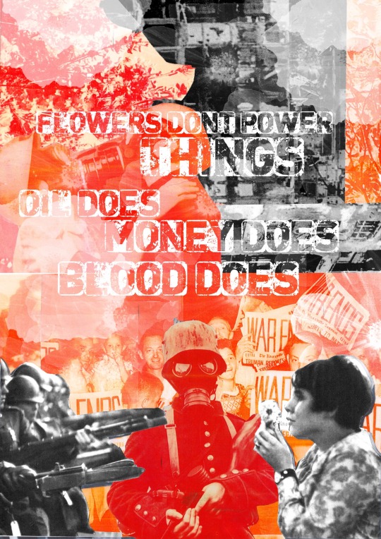
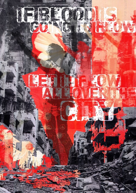
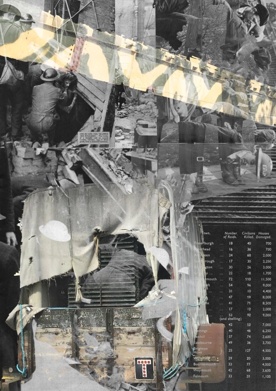
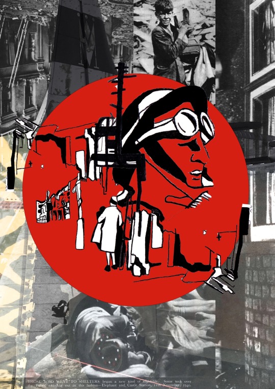
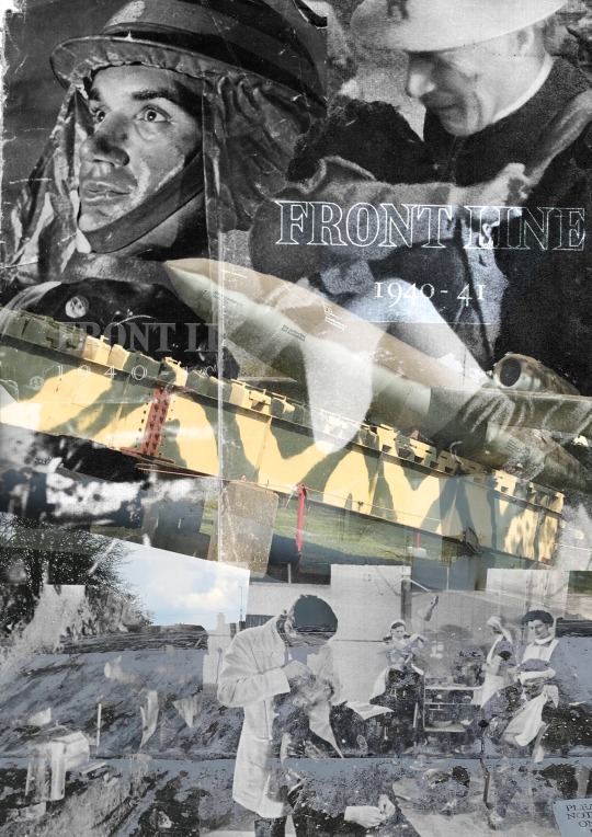
I created five a4 posters and four animations to go with. The official message is to show a combination of love and peace with the protesting against anti war but also a contrast of stress, pain, and conflict that people do not see or history that we do not accept. The quotes on the protest posters were from the film ‘the trail of Chicago 7’ as I felt there is such a big message behind the quotes, that came directly from Abbie Hoffman and Tom Hayden; they hold a big inspiration behind the artwork. For the other three posters I wanted a more simplistic element but impactful with combination of many layers of own photography as well as vintage war photos. To link to the theme natural, I wanted to show the natural components when distress is caused mentally and physically. War has an impact on many things, things we do not think of, even the land ruined, homes destroyed, and poverty created. The protest is a natural movement when the people fight back and try to stop and spread as much awareness about being against something we should have a say over and not be discriminated.
Three artists that have inspired me throughout my project were Robert Rauschenberg, ben Giles and peter Kennard. Reason being at the very start of the project I was very interested in Roberts work as I feel like he has a very strong message that is portrayed a had spoke out about his ideas and thought processes when creating his work that I really took in for consideration. As much as his art pieces are very abstract the meanings and colours expressed say a lot and hold much symbolism, as you look carefully into certain sections. The many layers stand out, this is something I did in my project layering my work covering parts so when you look closely you pay attention to the small detail.
Instantly when looking at Ben Giles’ work is all collage work but has this common theme of flowers that are integrated into all pieces. With my message of showing the violence, destroyed buildings and landscapes, having flowers here and there would symbolise the peace that holds massively when thinking of the death of soldiers, using flowers as a remembrance for the fallen soldiers in the war. Also, in the Vietnam protest they would give out flowers or use flowers as a symbol of peace. With bens work he uses very vintage imagery of people or places, I took this into my own hands to do a similar thing when doing my final outcome collages. I had bought a vintage war book showing all original photographs of the front-line demolishment. There was even small journal diary entry about what they saw with images to support it, this brought out the old imagery that ben uses.
Peter Kennard is a graphic design artist who uses ‘the concept of history’ bodying current political events going on over the 50 years but also linking it to the future and how things have an impact on the future to come. Peter is also someone who uses vintage imagery but a colour pallet of black and white but likes to use the same type of imagery in most art pieces, so his work is easily noticed. The process I feel drawn to the most with Kennard is the importance of linking quote text to his work or a small statistic. This could be a current movement or past information; this is important because it feels informative and gives the artwork context.
Two pieces of wider world research that has helped with my project was watching an insightful film called ‘the trail of Chicago 7’ which shows the flipside of the people fighting for peace but ironically it was supposed to be peaceful, but a few events triggered it to go the wrong way. People argue it was the police enforcement that turned it violent others blamed the 7 men that organised the meet: Abbie Hoffman, Jerry Rubin, Tom Hayden, Rennie Davis, David Dellinger, Lee Weiner, John Froines, and Bobby Seale that prepared the protest ‘Democratic National Convention’ in Chicago. This is one of the sides I wanted to show, a few protest art pieces representing the peace and community coming for anti-war in hope for things to change.
The other side of the wider world research was visiting Duxford imperial war museum which shows the stories behind the people who fought in the war and what they had to go through. Also, there was a showcase of loads of different aircraft and machinery, that I would have never found very interesting until I found out the history behind everything it gave a insightful look into the past and how things were. These are shown in my final outcomes of the old transport and weapons.
For the weeks I was creating final outcomes it consisted of creating collages, experimenting with photoshop, making drawing sketches and finding photography. The main skill I have got out of this project is not only learning about the history of war but found something I really enjoyed is the process of making hand-based collages and creating them digitally. I love this technique as it is a helpful process to use and gets so many ideas flowing. I’m glad that I kept to my project proposal and made the outcomes I wanted to create, hopefully giving the message I wanted expressed by my art pieces.
0 notes
Text
Week 11
This week was the final week to finish my outcomes that I’m really proud of as it fits my project proposal that I’ve been working towards. For next week I’m doing my evaluation and printing off my prints to be presented on here.
0 notes
Text
Thursday 6th May
Creating gifs
Neasden control centre

Stephen Smith is an Illustrator and Artist working under the studio name of Neasden Control Centre. His is known for its multi-disciplined hand drawn approach often combining lettering, drawing and collage within graphic compositions. I am most drawn to this style due to the bold colour to separate from a small less detailed sketch with much to say in my eyes! the best thing about this type of style it that you can contribute a lot of ideas and imagery, just combining them together.
The outlook of this is to demonstrate someone’s life being taken over by war showing the fallen apart home that I took inspiration from in my book I grabbed at the store at duxford museum that talks a lot about what happen when your life is put at danger when you least aspect it.
here are all gifs made, these are the gif versions of the original artwork, this is to give a good variety on my photoshop skills. these are also demonstrated on my google site next to the work itself.


0 notes
Text
Tuesday 4th May
Collages using own photography


Like i do i started with a background i was happy with, but this time all didnt have colour and was just black and white. Then on top I used my own photography from my visit from duxford these had colour that worked well with the black and white background.For all three posters I wanted a insightful outlook, showing the misery from the soldiers and the war setting, when you look closely you can see the combination of many layers of own photography as well as vintage war photos that are ues in the book “front line” that i picked up at duxdord. To get them to come together I used the same image in all 3 posters of the camo missile that add that pop of colour.
0 notes
Text
Monday 3rd May
Visiting Duxford War museums
Imperial War Museum Duxford is a branch of the Imperial War Museum near Duxford in Cambridgeshire. it is Britain's largest aviation museum, it includes nearly 200 aircraft, military vehicles, artillery. The site also provides storage space for the museum's other collections of material such as film, art, photographs, documents, books and artefacts.
The site was originally operated by the Royal Air Force during the First World War. During the Second World War Duxford played a important role during the Battle of Britain and was later used by United States Army Air Forces fighter units in support of the daylight bombing of Germany.


Here are photographs I took at Duxford that I will use in my digital collage as they are good examples of original war machinery.
i also found out a lot of information about some war artists, here are the notes i made. Edith Birkin née Hofmann was a Jewish artist and writer. Born in Prague, she spent her later years in Britain and was a survivor of the Holocaust. She described her work as expressing the "sense of loneliness or isolation experienced by so many. Shmuel Dresner was another survivor of the holocaust who turned to art to express his experience. he was born in Warsaw in 1928 and was only 12 years old when he and Warsaw’s other Jewish residents were forced into the ghetto.


0 notes
Text
Week 10
This whole week was Photoshop lessons and pushing for final outcomes as I completed two main posters for the final project that are going to help inspire my next 3 posters.
Hopefully for next week I’m going to start doing the gifs to go with the final outcomes to be presented professionally on my google site.
0 notes
Text
Thursday 29th April
photography paper
exposed paper to light
gloss photographic paper with masking tape
developer then fixe
water


0 notes
Text
Tuesday 27th April
Experimenting with type and the meanings
I read a book based around the S.L.A. Marshall's studies from World War II, which projected that, contrary to popular opinion that majority of soldiers in war do not ever fire their weapons because of an innate resistance to killing. Based on Marshall's studies, the military instituted training measures to break down this resistance, raising soldiers' firing rates to over 90 percent during the Vietnam War, this is a massive proception that should show that war was really setting normal people to kill when their human instincts were telling them not to. After being found soldiers were not actually killing, they had trained them to.
Here are more collages inspired by Ben Giles showing emotion of people, with the protester’s vs the soldiers or soldiers’ impact. this time I used different colour as show redder than the orange of the other collages, as said before the colour really does bring out the danger and violence.
To add with these two collages, I feel as if they contrast against each other as one solider is showing the proud act that many soldiers had to put up but the other one is the reality of how they felt going back to the physiological impact. With also the destroyed life and terror in the background constantly.


then onto the black and white photos over the top that are of buildings, then gone into with the magic rubber to take apart some of the image so you can see the red images behind


“if blood is going to flow, let it flow all over the city” is a powerful statement Tom Hayden was accused of saying, as these strong words turned the crowd very violent after seeing a young boy be beat by the police when protesting. This represents how just a sentence can change a view of something.
0 notes
Text
Monday 26th April
Photoshop collages
Like I did with my other posters and collages I put red and orange tones as the background, layering loads of imagery. Once I was happy with the background I layered on top black and white images as seen before to create that intercut style of making all the images behind stand out when being blended.
The thought process behind the meaning of this artwork was to do a similar piece to my other poster and make this a protest art duo. linking theses together was quite easy I just had to use same colour palette, lettering, imagery, and concept. the concept was to keep it simple but chaotic using as much empowering symbolism for this work.
“Flowers don't power things: oil does, money does, blood does” this is another quote used in the Chicago 7 trail that stood out to me as it understands that peaceful, calm things like flowers we wish could help denotates what we wish a idealistic world to live it but actually harmful things like oil, money and blood does that people cant change.


0 notes
Text
week 9
visting weeting castle
On my day off I visited meeting castle looking at the natural effects of old buildings, I took photos of the castle to possible use in future work. reason doing this I know its not related to war but there is something about the deteriorating buildings that have a intresting textured look. Weeting castle also has a lot of war herritage and behind the behind the castle holds a lot of history.

For the days at college consisted of working on hand based art work and experimenting on Photoshop before starting final outcomes.


0 notes
Text
Thursday 22nd April
More collages

I read a book based around the S.L.A. Marshall's studies from World War II, which projected that, contrary to popular opinion that majority of soldiers in war do not ever fire their weapons because of an innate resistance to killing. Based on Marshall's studies, the military instituted training measures to break down this resistance, raising soldiers' firing rates to over 90 percent during the Vietnam War, this is a massive proception that should show that war was really setting normal people to kill when their human instincts were telling them not to. After being found soldiers were not actually killing, they trained them to.
Here are more collages inspired by Ben Giles showing emotion of people, with the protester’s vs the soldiers or soldiers’ impact. this time I used different colour as show redder than the orange of the other collages, as said before the colour really does bring out the danger and violence.
To add with these two collages, I feel as if they contrast against each other as one solider is showing the proud act that many soldiers had to put up but the other one is the reality of how they felt going back to the physiological impact. With also the destroyed life and terror in the background constantly


0 notes
Text
Tuesday 20th April
For today’s idea I wanted to use work previously made, making it a development. First, I photocopied the previously made collages and turned them into drawings, doing so I used the technique of using carbon paper and layered them how I wanted. once I got the base of the sketch down, I went in with fine liner to make the lines bolder and filling bolder lines and colour. as you can see, I also used bits of text on top that gives it that newspaper print look, I did not go in with thicker lines for this as I like the original copy made.
I did not have any plan coming into these drawings, apart from knowing exactly what images I was going to use to carbon paper. I just went straight in and that was basically the best thought process I like to just go in with an idea and finalising the outcome. these drawings will defiantly be used in my final outcomes as I like the style of sketchy drawings, the continuous line work. To do with why I used the imagery is because I wanted to show a variety of consequences like buildings and homes being destroyed (natural affects) with a selection of people taking on the setting they live in.


0 notes
Text
Monday 19th April
Experiment on Photoshop
sketchbook painting


This lesson was a combination of getting used to different edits and blends, the work used was work from a previous acrylic painting to also a sample of a watercolour and acrylic painting I did. I used the technique of scrapping painting onto my sketchbook to get that textured painting then with watercolour I dripped painting onto the page.
I used many layers to create this artwork and just combining the work together and messing about with the colours and blends. I mainly liked how the screen blend and light blend look as it creates a good effect, bringing out the block colours or mainly the whites. This works well on images to make that screen print look, this is what I did on destroyed building.
0 notes
Text
Week 8
this week I wanted to do some experiments with collage for being handmade and three being digital outcomes from the handmade collages. it was mainly inspired by Martha rosler and Ben Giles who both create amazing collages, using imagery from the 70s. A key moment in the 70s with the Vietnam war protests that happened in Chicago, this is where I used the phrase the whole world is watching from the film that I recently watched.from then I wanted to use the colours red and orange orange symbolises excitement and red symbolises danger. these are very two different opponents but I found that they both had things in common. when you think of protests you want peace and happiness that you are trying to make a change but however in these protests there was resentment and violence
0 notes
Text
Monday 12th April: collage designs
Martha rosler

Some of Rosler's best-known works are collected under the title House Beautiful: Bringing the War Home (c. 1967–72). This is a series of photomontages that juxtapose aspirational scenes of middle-class homes, mostly interiors, with documentary photos from the Vietnam war. These images were primarily distributed as photocopied fliers in and around antiwar marches and occasionally in "underground" newspapers.While Rosler's primary impetus for her solo exhibition at the Dia Center for the Arts was to expose the invisibility of homelessness and urban policies that conspire to conceal the socially underprivileged, one of the few critiques of the show was that it did little to actually lessen the homelessness problem in America.
Her work is seen as what you would call an oxymoron when there is negative background with happy imagery. That can contradict each piece and can show that you can be distracted by the happy that you forget about the violent background, this is relatable to war and how we can all be distracted behind the affects of war.


Before starting class I printed a range of imagery of war and protest that I felt related well. I then photocopied all of the print outs changing the colour to red to symbolise the violence caused. Using the colour theory the colour red attracts the most attention and is associated with strong emotions such as love and anger, most representing danger. The contrast of red with the black and white works really well and for my final outcome I will use these types of colours.
I set the coloured print outs as the background for each piece and then layered the black and white cut outs on top, trying to create a story giving it as much meaning. In general I wanted to show the effects of war on people like young children who don’t know any difference when being brought up with guns that lead to hun violence. To the soldiers forced to fight in a war they don’t know the meaning, but even further to the buildings and homes destroyed. The architecture also adds a nice part to each collage.
1 note
·
View note
Text
Tuesday 13th April:digital collage outcomes “the whole world is watching”


Finally came to my Photoshop lesson where I wanted to give a flip effect to the digital work for all figuring out what collages worked better and experimenting what text looked good; changing colour and blends. The phrase “the whole world is watching” is the phrase used in the riots of Chicago that was full of protesters chanting this. A pithy warning that an incident was testing America's commitment to its values, before an international audience that would hold it accountable—was first used as part of the civil-rights movement in the 1950s. Reason being I used this type of text as it reminds me of a type print that fits well with newspaper article on the topic of protesting.
Again I kept the same colours for the outcomes and when creating the digital collages I liked using the image of a child holding a gun with a butterfly wing costume as it holds so much symbolism and is an example of the artist who uses similar imagery of negative and positive work. But also the similar work of Ben Giles who used imagery in the same era and has a powerful symbolism of peace.
0 notes


