My opinion of MTG art through time, looking at cards chronologically and all of their later printings. Currently I'm just making a ton of posts, but I probably should be queueing them.
Last active 60 minutes ago
Don't wanna be here? Send us removal request.
Text
Demonic Tutor
Demonic Tutor is arguably one of Magic’s most powerful spells. If you want to play you have to turn to Vintage or EDH, despite that it isn’t on the reserve list I can pretty much guarantee It’s never coming back. An entire type of effect, searching your library for a specific card or tutoring, has been named after it. Diabolic Tutor a spell printed later with the same effect costs twice as much mana. The question is, has Demonic Tutor consistently been given the art it deserves?
Original art by Douglas Schuler:
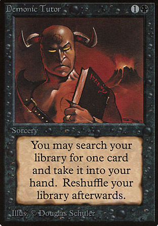
Is this art fitting on sitting on one of the greatest cards of all time? Wel regardless of the answer to that question it certainly has become iconic because of it I mean just take a look at this:
Judge foil art by Daarken:

This is a homage if I’ve ever seen one. It’s also art I like more than the original though it has��“Daarken Lighting” something that isn’t bad really, it just confuses me. It also more aptly captures the idea of a tutor. Schuler’s demon is certainly prepared to impart some eldritch knowledge, but Darrken’s demon is already in the act. I think Schuler’s art is good in the sense that he gave us something interesting to focus on, something that could be iconic in the demon. However the rest of the card is sort of boring and seems a little out of place at times. Daarken gave us a scene that evokes Schuler’s original art while also displaying actual action and place. What else could this iconic card possibly need? Flavor of course.
Divine Vs. Demonic art by Scot Chou:

Here we again have a demon and we have a student, but here part of Magic’s current Storyline is present. Here we see Lilanna and Kothoped. Kothoped here basically had the planeswalker in his control until he sent her off to find the Chain Veil, which didn’t end very well for him. So of course the knowledge that was given to Lilianna is representative of the effect of the card. I also like the mood of this art a lot more. It’s much more dire. In the other arts there really isn’t any implication of the consequences one could face for seeking demonic power. The distress that Lilianna is in here along with her entire storyline gets that idea across.
#mtg#magic the gathering#Demonic Tutor#Daarken#scott chou#Douglas schuler#limited edition#judge foil#duel deck
4 notes
·
View notes
Text
Deathgrip
Original art by Anson Maddocks:
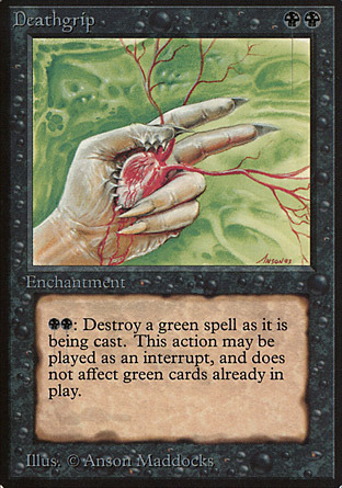
You know how some old magic art is still iconic? How there is art that makes people discontent with the current mtg style? I would put Anson Maddocks’s art for Animate Dead in that camp. I would put this art for Deathgrip in the list of reasons MTG needed to more strictly style its art. It looks like so much nothing. It’s communicating none of the flavor or effect of the card to me. I am of course aware that artists were given far less to work with at the time, so I don’t blame Maddocks at all. However I still think this is one of his worse arts. It doesn’t reach the levels of creepiness that something like Sengir Vampire does nor does it have the stark contrast of Animate Dead. I’m going to talk more later about how I feel about backgrounds like this when we reach one from Dan Frazier. Just know I’m not a fan.
0 notes
Text
Darkpact
Here we have our second ante card but our first of something else we’ll see a lot of. Yes this is our first card from Iconic MTG artist Quinton Hoover.
Original art by Quinton Hoover:
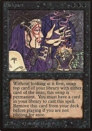
One of the most consistently noticeable things about Quinton Hoover’s art to me is his clear and defined line work paired with colors that really stand out. While some early MTG art seems like it’s trying to emulate medieval art or Dungeons and Dragons art of the era, this seems more like it belongs in a comic book. A prime example of this is the brazier on the right side of the piece, in particular the thick black lines that form the flames.
1 note
·
View note
Text
Change of plan
My initial plan was to go through Magic in order, however after writing about Deathgrip (coming up) and facing the prospect of writing up Deathlace, I’ve decided to focus on iconic or interesting card art and its place in Magic. I find it way more interesting so I’ll likely have more to write. First up for that is Demonic Tutor.
0 notes
Text
Dark Ritual Part 4
And finally we reach the end of the Dark Rituals.
Mercadian Masques art by Rebecca Guay:
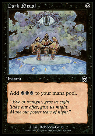
Here we see what I would call the definitive version of this art. It has a ritual, it’s truly dark and creepy looking, and the art is real good. Placing the people doing the ritual in the center of the card in a tight triangle has a similar effect to the hand in the last piece. They are clearly important, but we are more able to focus on other things, like the giant cloud eye and the fact that they exist in some sort of void. I’m no expert on media, but I believe this is in watercolor which of course shows off beautiful deep color variation in the hands of Rebecca Guay. Guay is one of the most beloved MTG artists and it really isn’t hard to tell why. She will definitely come up again.
Judge Foil art by Mark Hyzer:
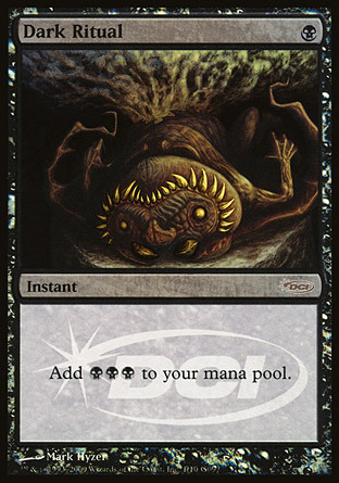
This is the eighth Dark Ritual we’ve covered and to be fair I’m really bored of looking at them. This piece doesn’t really revitalize my interest. It reminds me of the Urza’s art as it again shows a creature that has been sacrificed, but this artist chose to show the whole thing. If you didn’t notice the fact that the artist took the opposite approach was what i liked about the Urza’s piece. So I’m not a huge fan of this one.
5 notes
·
View notes
Text
Dark Ritual Part 3
Tempest art by Ken Meyer, Jr.:
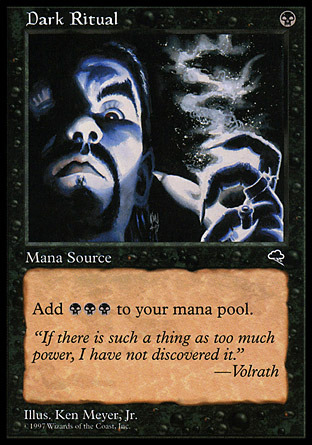
So again I’m not really getting the impression that this is a ritual. This art is great though. Light and shadow playing on a face is in a void is a cool idea and its executed pretty well here. Also the choice to use blue instead of gray really gives this piece depth and allows the artist to really accentuate the features of the person in this piece
Urza’s Saga art by Tom Fleming:
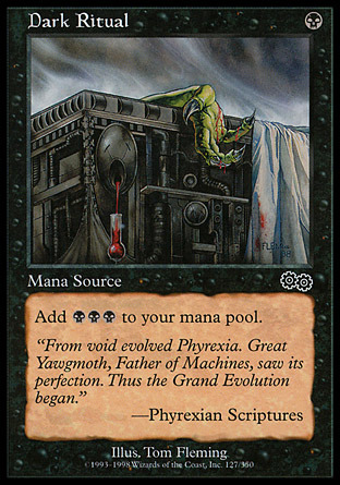
Unlike the other art we saw for this card that actually portrayed rituals showed them in progress, this shows only the aftermath. The most interesting piece of this art to me is that the sacrificed creature is only a small part of this art the artist instead choosing to focus on the elaborate altar upon which it was sacrificed. This gives the card a much darker creepier feel. It is the centerpiece of the art, but it occupies only that space, no more.
5 notes
·
View notes
Text
Dark Ritual Part 2
Mirage art by John Coulthart:
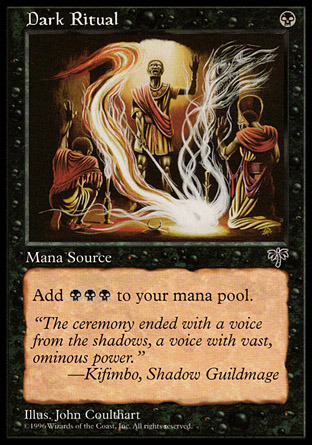
Full disclosure: this is the art on my play set of this card. Here like the last art we see a ritual being performed, in fact again by three men. But here we also have a great use of light, color and shading. I adore the lights and forms coming out of the smoke as well as the ceremonial garb worn by this pieces subjects. Unlike the breastplate in the last piece it makes sense. Lastly I want to give special attention to the light feeding in from behind in this piece. I feel like the contrast it creates behind the lead figure is important to the appeal of this card. It accents him in the center of the card and gives a powerful focus.
Fifth Edition art by Clint Langley:
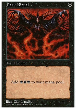
Like the original art for this card the spell caster pictured certainly seems evil, but I don’t really get the ritual flavor. I do like the overall composition though and the orange/black contrast is pretty good. All the black strands coming off of the main subject give this piece a cool “creepy” feel as well.
0 notes
Text
Dark ritual correction
In the first post I say there are nine of them but there are only 8. All 4 posts coming today by the way.
0 notes
Text
Dark Ritual Part 1
9 of these to get through so I’m instituting a new policy I’m going to start breaking multiple card posts up into groups of two or three at my discretion.
Original art by Sandra Everingham:
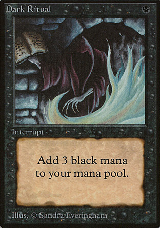
This certainly looks like some sort of evil wizard casting a spell. I’m a big fan of this art, though I feel like later versions capture the idea of a ritual much better. This again is I feel a piece that evokes Dungeons and Dragons more than Magic the Gathering, though that’s fair because at the time MTG wasn’t really anything yet. The use of shadow is great in this one and like some other pieces this art has a very thick heavy feel that is gone from current MTG.
Ice Age art by Justin Hampton:
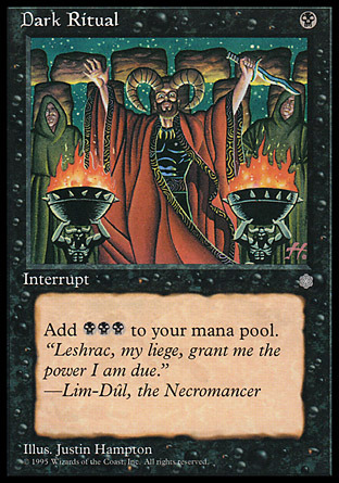
This is the first time I’m going to just come out and say that something is painted really badly. I know I’ve said some mean things about Jesper Myrfors but this is something else. Myrfors’s art just seemed lazy to me, this actually seems bad. There is very little shading of any kind and that breastplate the main figure is wearing seems odd. That is of course nothing compared to his horns. and his face. and those guys in the back. and that knife. and stonehenge. ugh. I think there’s at least one good piece of art by this guy. We’ll see though.
3 notes
·
View notes
Text
Cursed Land
Original art by Jesper Myrfors:
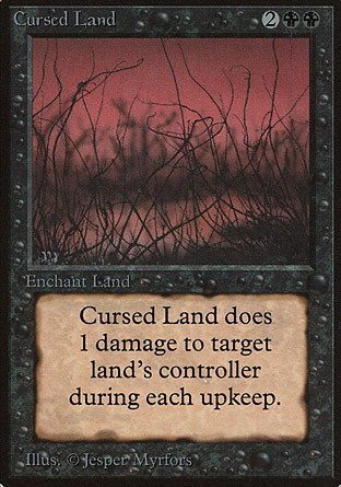
Oh Jesper you’ve really outdone yourself this time. This art is hideous and super boring. This is just generic brush on a red background. While I have some issues with the current MTG art direction, at least it prevents this sort of thing from happening.
0 notes
Text
Contract From Below
Here’s a fun one: A card banned in every format including vintage. Yes that’s right out first ante card. Also arguably one of the most powerful Magic cards ever printed.
Original art by Douglas Schuler:
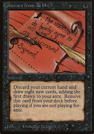
So Schuler is a guy we’re going to see again so I’m going to take a moment to point out something about his art. Sometimes he uses really weird textures noticable here mainly on the contract itself. It doesn’t quite look like paper does it? To me it look a little like rubber. I’d also like to point out the text of this contract. it’s simply the final agreement, indicating there are other pages of this specific contract. All in all I’m not a huge fan of this piece. The colors are weird and its composition is super obvious. The card is certainly powerful though.
0 notes
Text
Bog Wraith
The only interesting thing I can think to say about Bog Wraith is the fact that it was one of the first MTG cards that one of my friends ever saw and that stuck with them. Lets dive right in because we have 4 arts to get through.
Original art by Jeff A. Menges:
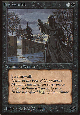
Another black Menges piece that really highlights why I like his art. Even though the wraith is painted all in gray in Black there is still clear contrast present. Also, just look at the light coming through the opening in that wall, as well as the light in the clouds right above the fence. The light in the sky, on the ground and hitting the wraith on the left side creates a great contrast.
Portal art by Ted Naifeh:
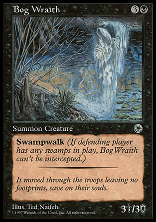
The largest improvement here over the last piece? This time the wraith is actually in a bog. While I greatly enjoy the art in the last piece this captures the idea of a Bog Wraith much more. The details in the foreground in the background very aptly place us somewhere that makes sense. This is very clearly a bog. Also out wraith looks ghostly, which I’m a fan of. Previously our wraith did not seem all that spectral but here we have quite a grim specter.
Seventh Edition art by Dave Doorman:
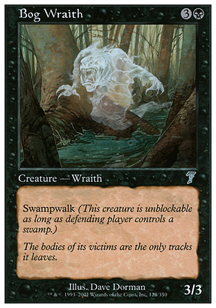
Again we have a bog and we have a spectral wraith, but this more monstrous wraith doesn’t really appear to me. I much preferred the cloaked specter of the previous art. Also the brush much better captures a bog for me than the trees in this piece.
Tenth Edition art by Daarken:
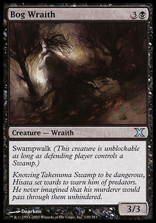
This is going to be the first appearance of what will eventually become a theme of this project-me being split on the work of Daarken. On the one hand I love this composition. On the other it’s really dark and parts of it are a little too smooth. The lighting also doesn’t make a ton of sense as the trees and wraith are lit in opposition to each other as far as I can tell. I still enjoy the contrast and the appearance of the wraith, but something about the whole piece just seems off to me.
#mtg#magic the gathering#Bog wraith#Jeff menges#Ted Naifeh#Dave Dorman#Daarken#limited edition#portal#seventh edition#tenth edition
0 notes
Text
Black Knight
Black Knight is the first of a few specifically constructed knights in Magic as long as we’re going by collector number (his counterpart White Knight also appeared in the Limited Edition release).
Original art by Jeff A. Menges:
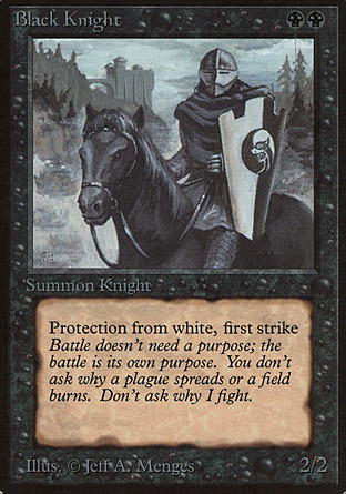
Jeff Menges has a style of painting that I adore which i will get to in a second. First I’m going to explain why unlike Bad Moon I won’t be complaining about the grays and blacks in this piece. While the knight himself is painted mostly in grays the background has a detail and depth simply not found in the last piece. Onto why I like Menges. It’s hard exactly to quantify but I’m a big fan of his brushstrokes I guess. If you look at the knight’s mantle you can clearly see the lighter strokes used for shading. Unlike Myrfors on the last card he doesn’t mess about with gradients. You can also see this in the background with the was that he has constructed the landscape. The piece looks like an oil painting of a knight that would have been produced as a piece of portraiture.
Fifth Edition art by Adrian Smith:
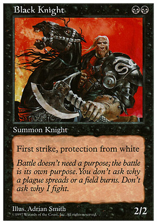
I don’t really want to dwell on this art for to long. I greatly dislike it. While the composition of the piece is very interesting and the background goes well with the supposed ruthlessness of this knight there’s one huge problem. The knight himself. His proportions could best be described as grotesque. Either his head is way out of proportion with the rest of his body or he is wearing the most ill-fitting armor of all time. This is sort of a step before MTG settling in to the sort of style it’s in now. Alright I’m done talking about this now.
Magic 2010 art by Christopher Moeller:

Here is what the knight looks like in MTG’s current art style. While I personally enjoy it less then the original I will not argue against the proposition that it seems more “Magic” than Menges’s piece. The elaborate fantasy armor on both the knight and his horse place this piece in a much more magical world. A world much more fitting for MTG. Placing the Knight in a swamp and giving him a zombie horse also helps root him in black. While it isn’t necessarily in the scope of what I’m doing here, I am sad he lost his old flavor text here.
#mtg#magic the gathering#black knight#jeff menges#adrian smith#christopher moeller#limited edition#fifth edition#M10
5 notes
·
View notes
Text
Bad Moon
Continuing through Beta (because Alpha is missing cards) our second card is Bad Moon. Bad Moon is more of a White effect than a Black one these days, but a lot of color pie stuff was different when it was printed.
Original art by Jesper Myrfors:
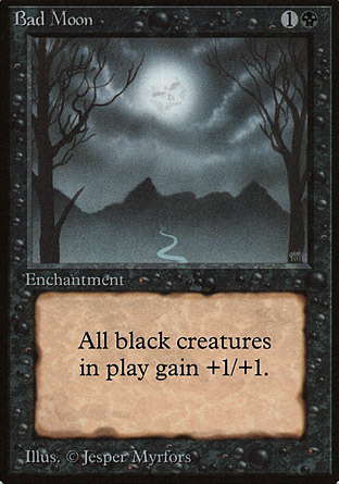
Jesper Myrfors was a quite prolific artist at the beginning of the game, perhaps influenced by the fact that he was art director at the time. I would not be counted among his fans, but I do enjoy some of his art. I wouldn’t say I love this piece mostly because it’s so dull. The fact that almost everything is gray certainly doesn’t help with that. Making the moon a skull like face is interesting, but lost in the overall dullness of the card.
Fifth Edition art by Gary Leach:
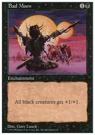
I’m a much bigger fan of this art, mostly because it looks like something is happening in it. This art seems more like an anthem type card as there are actually creatures on it to be strengthened. The old art captured only the name, while this art also captured the effect. I would also mention that I believe that the pair of large imposing moons better evokes the name as well.
0 notes
Text
Animate Dead
Looking at the sets Chronologically and sorting the by color and alphabetically the first card we see is Animate Dead. This card appeared in every core set up to 5th edition, but the art was only changed when it was printed in Premium Deck Series: Graveborn.
Original Art by Anson Maddocks:
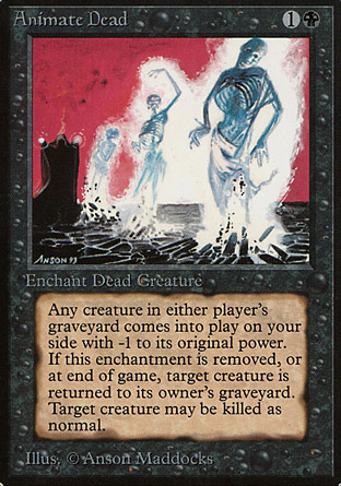
Anson Maddocks was quite a prolific artist in the early days of Magic and I feel like here he perfectly captured the feel of necromancy as it appeared in fantasy games like Dungeons and Dragons. The necromancer raising a group of skeletons captures the idea of a villainous spellcaster, which is quite a black feel. I quite enjoy the sparse background in this piece that highlights the action of the reanimation. In addition choosing red and black for the background and highlighting the skeletons in white adds a nice contrast to the piece that really makes it pop.
Graveborn art by Anthony Jones:
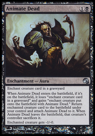
While the orginal art captured the feel of necromancy in RPG’s this captures what players actually use this card for-reanimating big powerful creatures. That is of course a Sun Titan in the art, another card that was included with the Graveborn deck. I personally enjoy this art much less. Again there is a sparse background, but this art far lacks the original’s contrast. This art is fairly muted and while that adds a grim feel, to me it’s sort of dull. However, I am very much behind the choice to put Sun Titan in this art.
#mtg#magic#magic the gathering#animate dead#limited edition#premium deck series: graveborn#anson maddocks#anthony jones
0 notes