A collective of ideas, research and practical bodies of workMA Fine Art // Artist & Photographer // London
Don't wanna be here? Send us removal request.
Text
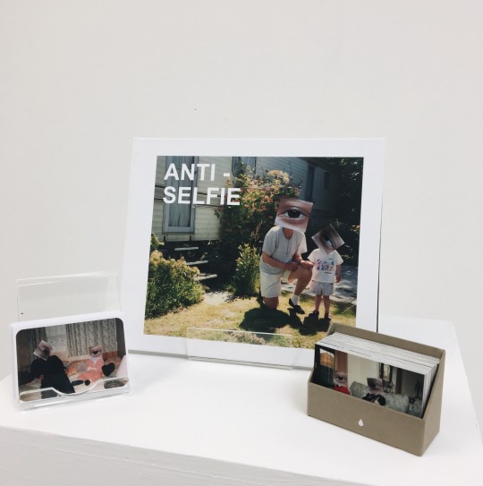
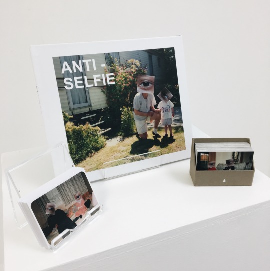
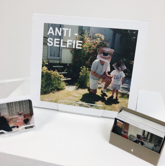
FINAL OUTCOME : Anti-selfie - The Exhibition / Hand-in
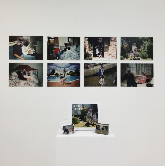
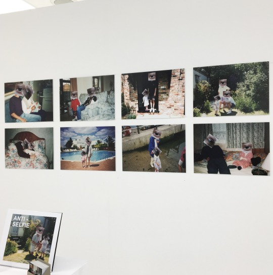
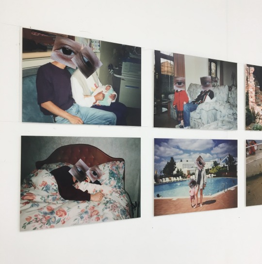
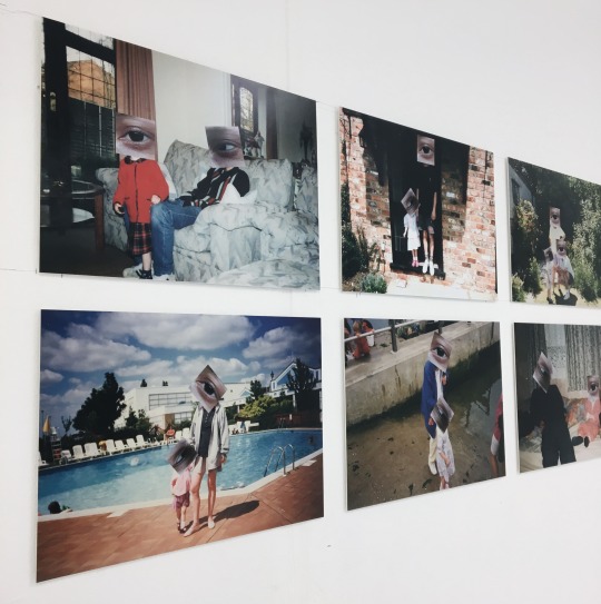
0 notes
Text
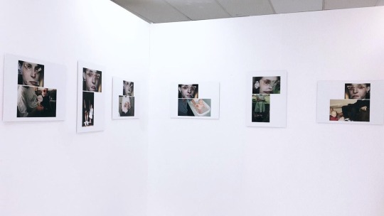
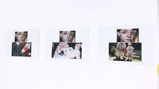
FMP Development: New layout for Exhibition / Hand-in 29th August 2018: A2 Mounted Prints
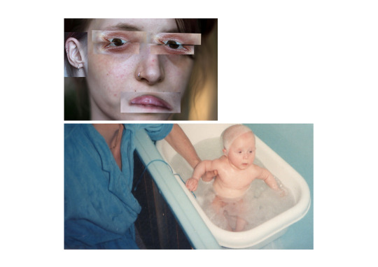
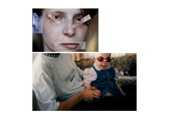
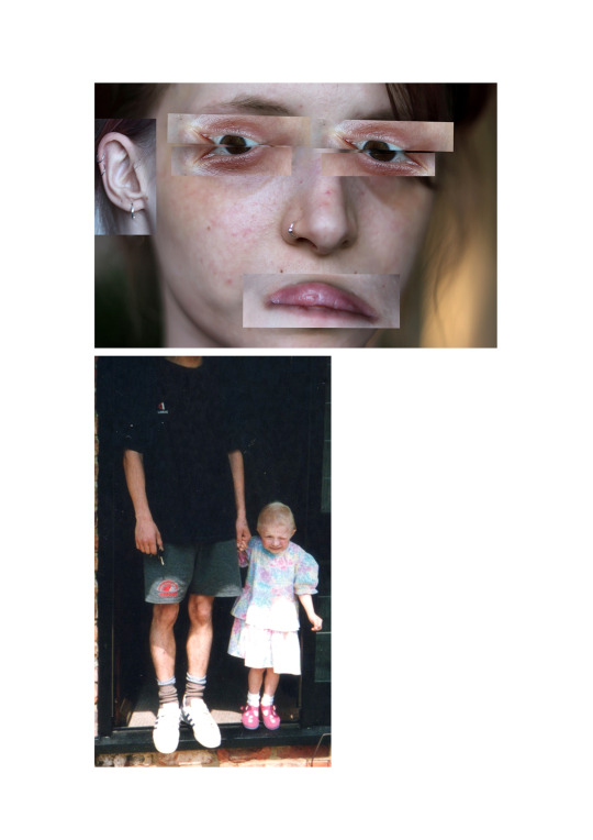
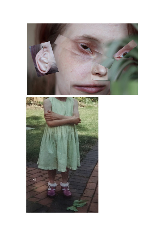
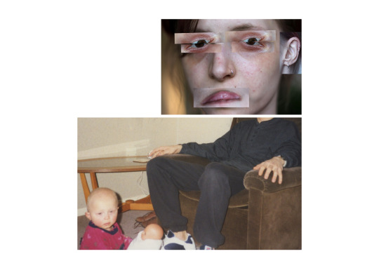
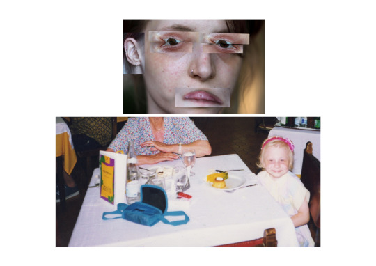
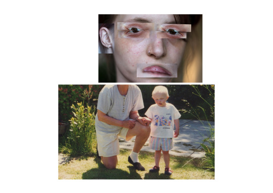
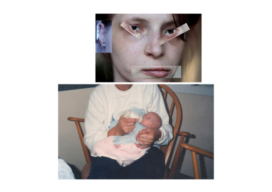
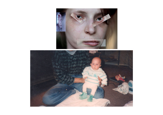
THOUGHTS:
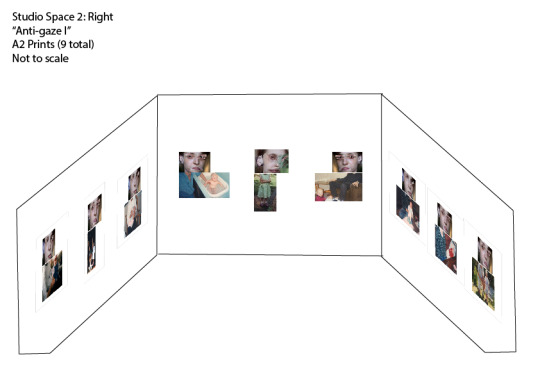
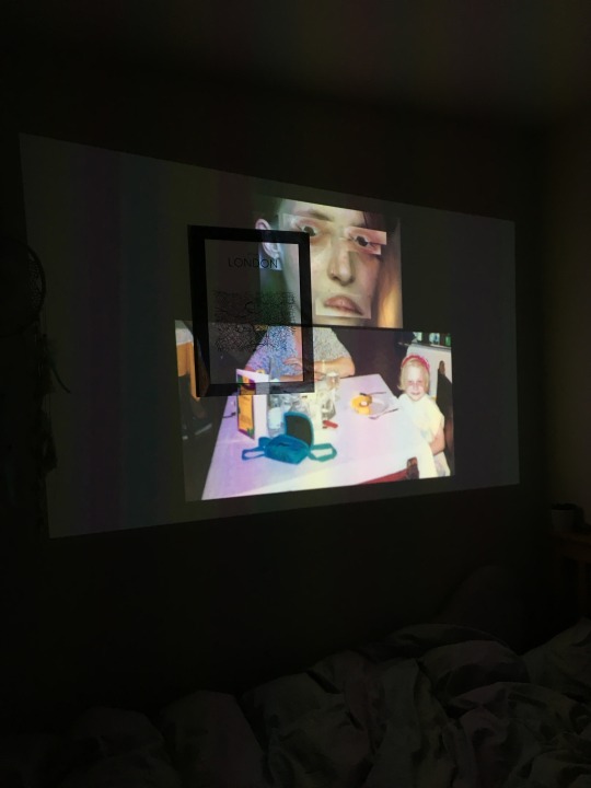
In light of the projection test in which the clarity, quality and scaling of the images was comprised and did not achieve the final result I wanted and was prepared for to show for the final hand-in / final exhibition, in order to fulfil the final result that could show the images in their best light and potential I decided to show the images as A2 mounted Lustre prints in order of 3 around the space, as this is what I originally had in mind when creating the series at the start of the process. Although I am disappointed with the idea of not being able to show these as a projection due to the quality of the projector, I would still at some point like to show these as a projection as another element and format to the conceptual basis of the work. Coinciding with the prints, in order to compromise and come up with another solution, I will still be presenting the larger selection of images as a slide show on a screen as you walk into the studios, although this will be on a smaller scale, the clarity of the images as screen in print and on screen will be achieved and more as a presentation of images. The idea with having these as prints changes the presentation slightly, in thinking about laying out the images in a way that still is strong and delivers the same message and power to the work, above I have created a mock exhibition space and curated the space, and images that work well as 3 sets across each wall, however this could change when actually seeing the prints physically and with playing around with composition. The only hesitation I had with the images, is the white space around the images, however I have scaled up the images and thought about changing some images from landscape to portrait and vice versa, which I feel with counteract the white space as overwhelming and distracting.
When it comes to the final exhibition in the gallery space, it will be something I need to challenge again in re thinking the space and presentation in order to coincide with the other Part II series so that they work well and effectively in the space. In light of the situation, it is quite possible the prints could work just as well as the projection, and will not take away from the quality and conceptual basis of the work. I feel as an artist the challenge is work around things, and not everything turns out as expected when it comes to presenting your body of work, however it for me, it is about coming up with alternative solutions, and I feel with this body of work, it is flexible and able to be shown in others way making the work more powerful.
PROJECTOR TEST: (below)
0 notes
Text
FMP Development: Projection / Installation Plan (New)
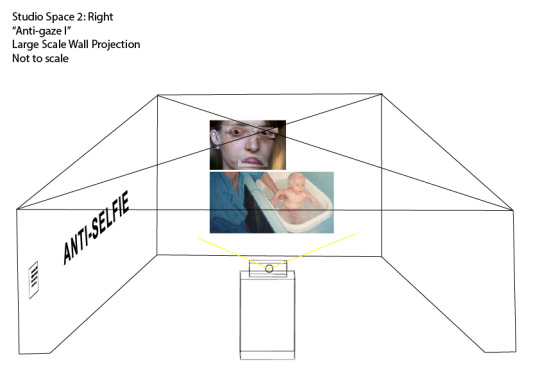
THOUGHTS:
In thinking realistically about how I can present the projection in the effective and best way in order to give the image the best clarity and diversity, in rethinking the space in terms of lighting in order to project the slide show onto the back wall in a white space that is well lit and bright as turning off the lights will result in effecting others work, I have to come up with an alternate option that will dim and darken the space, and from taking part in the Interdisciplinary Project back in February of this year in which I development and constructed a large scale installation space for a animated projection, using a small projector in a similar way as my idea, the use of fireproof black cloth was laid and fixed to the top of the instillation in order to accommodate a dark space. This isn’t something I originally wanted to do with my space as a preferred the idea of having a purely white open space and thought the black cloth would distract and enclose the work, however this is the only effective option and could possibly work and add to the unsettlingly nature of the work, in order to have enter a darker space and be physically intimate and unclose with the work.
In order to know this, I will have to experiment and the projector in the space, however the only hurdle with be near access to a plug socket and be able to secure down the wires. My other alternative if this unsuccessful is to try the projection in another space or have the work printed as images, however the projection is what I would ideally like to show my work as it will add to the conceptual basis and subject of the work, it will also allow me to show the images on a much larger bodily scale, and a larger selection of images. The other possibly hurdle and worry is the images not coming out with a translucent background, which in iMovie it shows as a background which is something I have attempted to change however it has been an impossible struggle, although a dimmed black space around the images could work and present the images more boldly and with more clarity.
0 notes
Text
FMP Development: Making the slide show / film on iMovie with translucent backgrounds
(READS: ANTI-SELFIE PART I - TITLE PAGE)
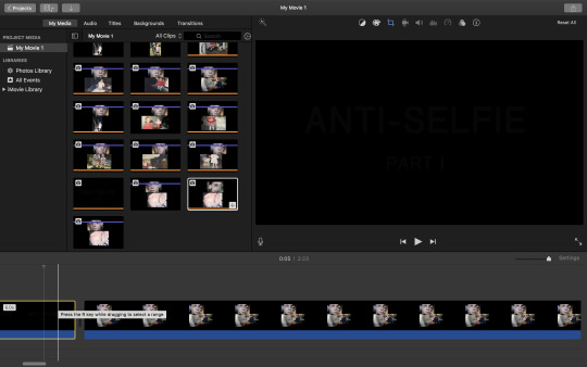
(CREATING SLIDESHOW IN IMOVIE)
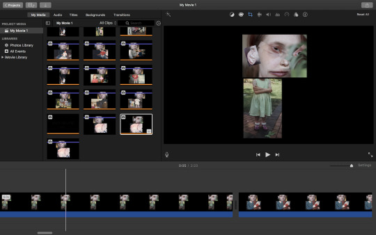
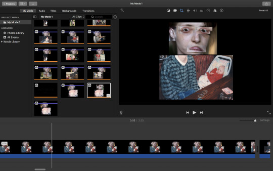
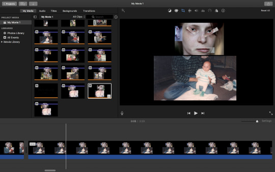
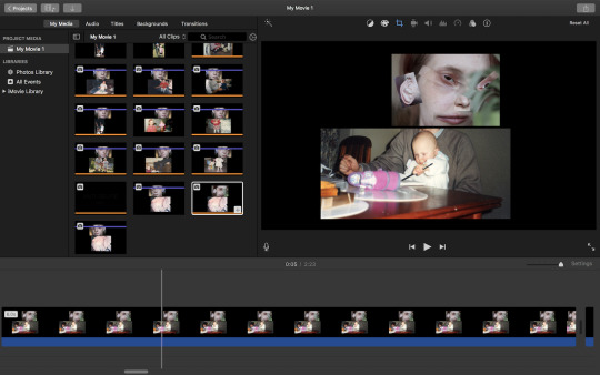
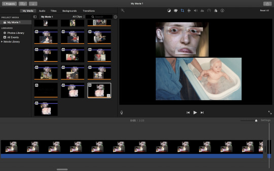
(SLIDE SHOW / MOVIE FORMAT)
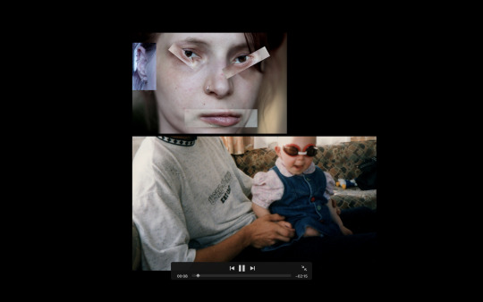
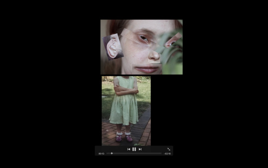
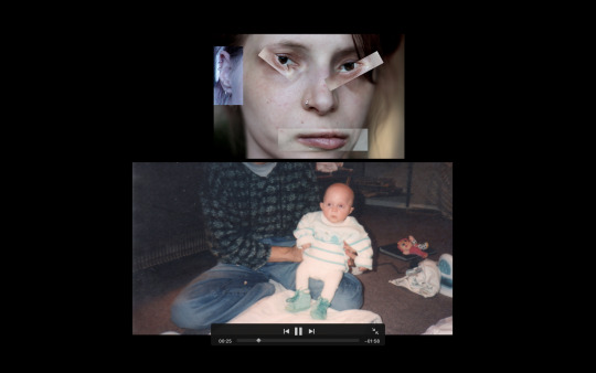
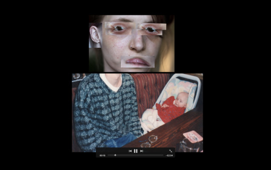
THOUGHTS:
In compiling and creating my slideshow of images for the final projection I decided to use iMovie as the foundation for creating the final presentation, it is also a software I am familiar with, I also felt it was more effective to create a video format, as well as for allowing for a seamless transition of images, and ability to be able to loop the video for the show. In order to prepare this, it required me to re-edit the images on Photoshop to allow for a translucent background (below) so when the final images are projected it will be purely the collage itself without the original white trim / background, this would also allow for the images to be the sole focus and for the wall space to act as the background. In selecting the images for the slide show, it was a long and detailed process in which I selected the images that were most powerful and diverse, and would glide seamless as a slide show in which the head would stay in place and just the bottom half would shift in line with each other, in order to achieve this I was able to crop the images in iMovie, however it proved difficult to line up the images exactly as the programme did not have guideline rulers, and this is something I will later be improving for the final show. The timing and transiting of the images also something I need to improve, as originally the images were only up for a period of 6 seconds and then switched, so as a result was too choppy and didn't show off the power and detail of the images. As well as this for an unknown reason the images have come up onto a black ground, with is something I am currently trying to work on removing.
In further developing the slide show, I will be further editing the resolution and sizing of the images in order so they can be projected on a larger scale, as well as working on a seamless transition between each other which will an interesting and powerful factor to the conceptual basis of the work.
0 notes
Text
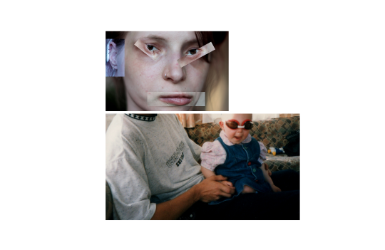
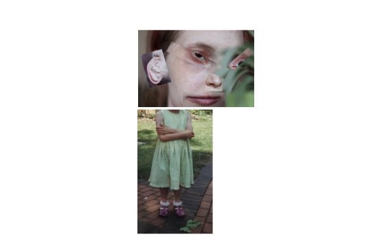
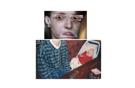
FMP Development: Anti-selfie Part I: Projection / Slideshow process: Selected Final Images (in order of slide show)
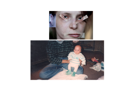
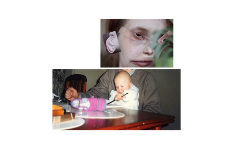
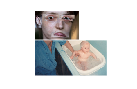
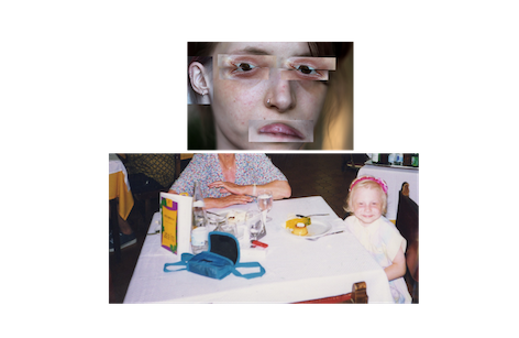
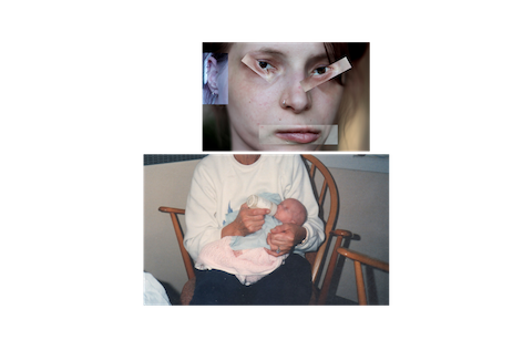
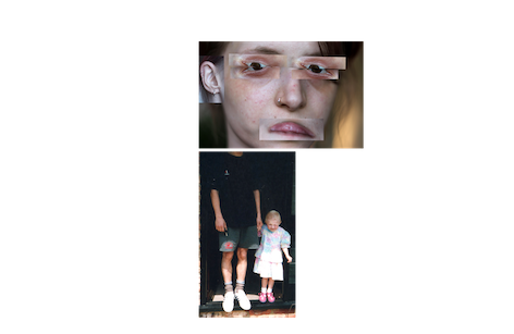
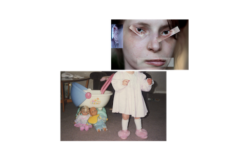
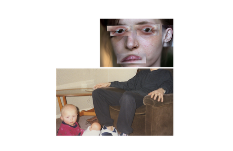
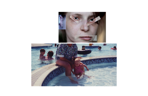
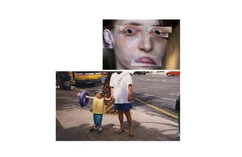
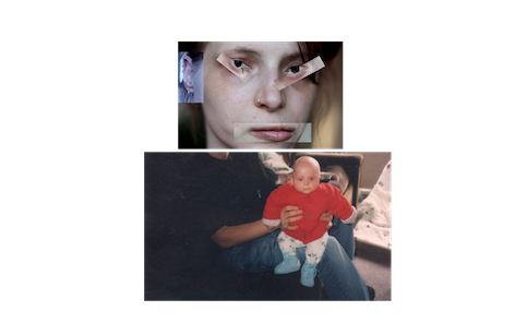
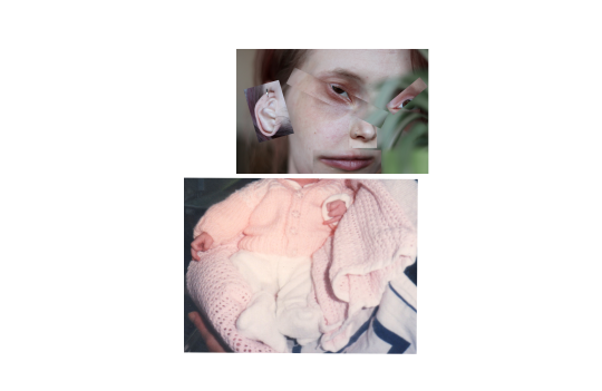
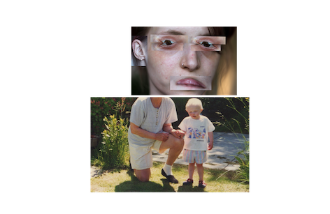
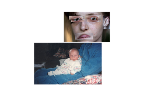
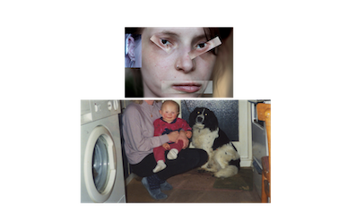
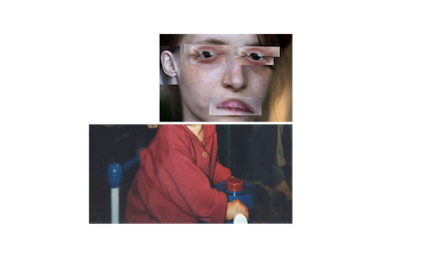
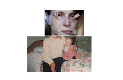
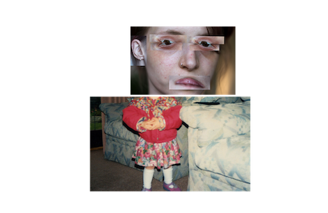
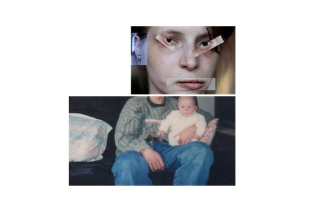

THOUGHTS:
After much development, changes and editing the series, which has been a long and detailed process which acquired a lot of myself being critical and brutal with the selecting process, as the series I created was so massively large, consisting of over a hundred edits, different compositions and sizes, it was quite hard in selecting a handful of images that were the strongest and that worked coherently as a series, it will also a case of receiving other peoples feedback and opinion that was also a vital factor in the decision process, however the final selection of images (above) was selected by myself as the artist, and I knew exactly from the start of creating this series what it was I wanted to portray and present as the final outcome. The reasons for choosing these final images out of hundreds already made was due to the most effective its composition, as well as the surrealist and illusionary aspect in the joining both images together, specifically through the neck of the body of each image, as well as this was also which of the images was most powerful in delivering the most unsettling and grotesque nature, I wanted the images to appear as seamless as possible, and in the editing process which started from Sem A, it took a lot of refining and understanding the context of the work, which is now Anti-selfie, so in the final selection of these images, I had to ask myself as an artist and creator the work, which images really do act as the Anti-selfie? Which images will be most effective in conveying this? Which images will people to respond to and which will be rememberable and coherent as a set?
Although a painful task, and some images left behind, I feel that I have finally made the right creative decision in selecting these images as well as acknowledging others opinions and critiques, I feel ultimately this series really does act as the Anti-selfie, completely alienated from social and cultural constructions of the self-portrait as seen social media, completely absurd yet mildly humorous in delivery, but also personal, intimate and the alternative autobiography of an artist.
0 notes
Text
FMP Development: Anti-selfie Part II: New exhibition mock up with Book: 29th August 2018 Hand-in:
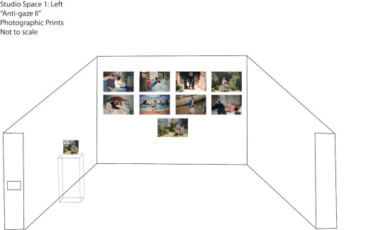
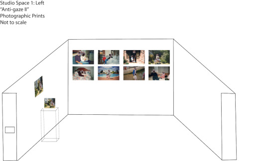

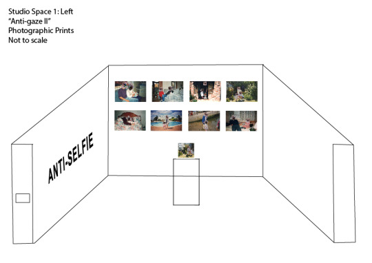
THOUGHTS:
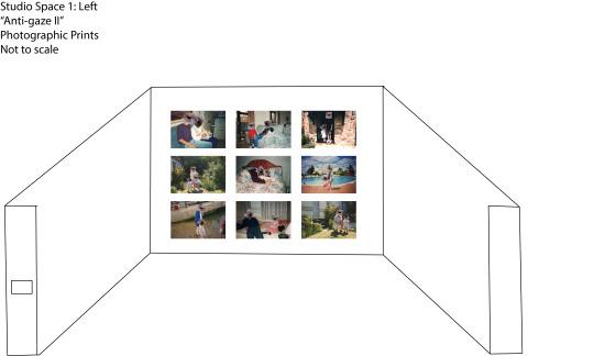
In rethinking Anti-selfie Part II and how I wanted the final outcome of the A3 prints, the book format and additional mini prints (business cards / stickers) to look I have decided to create a variation of alternative exhibition layouts that would be highlight and effective towards the subject of the work, originally my idea was to present 6 A1 large scale prints however when sending of the image as a test, the image came back blurry and did not achieve the final result I wanted (see image below), as part of the images were taken from larger images and blown up, as well as the scanned snapshots, the images unfortunately are unable to be blown up past A3, however in response to this I decided to select a larger selection of images, and to work with A3 images to be their ability.
So my thoughts (above) as shown in the diagram, show 8 images across the back wall 4 images on top, and 4 on the bottom, as the images are smaller, I wanted to arrange the images so that they filled up the whole wall and emulated family photos found hanging on a wall in a domestic setting, it will also invite the viewer to take a closer intimate look at the work. Coinciding with this is the idea of having a plinth which present the book on a stand, followed by additional mini prints, it will also add context to the prints and be coherent as a whole show, as well as this the viewer will be able to walk around the plinth in order to look at the images, therefore not the blocking the view of the prints.
0 notes
Text
FMP Development: Professional Business Cards / Mini take-away prints
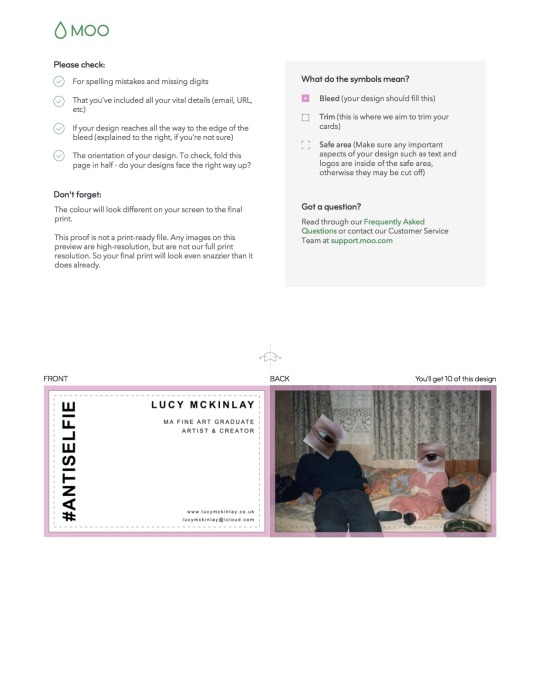
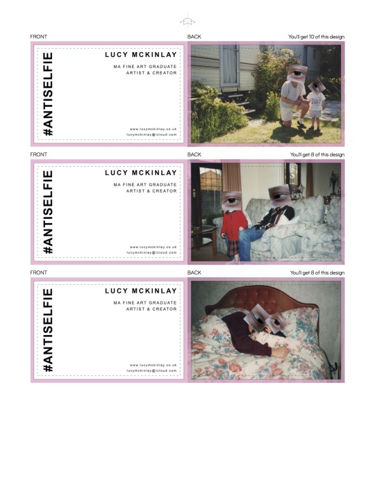
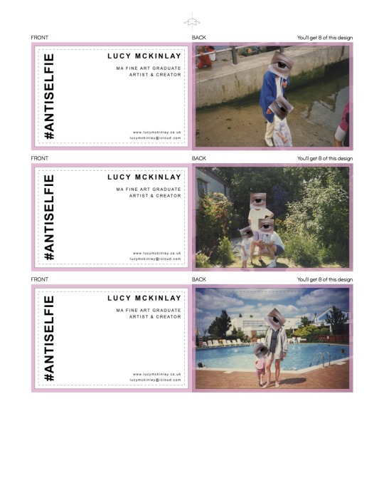
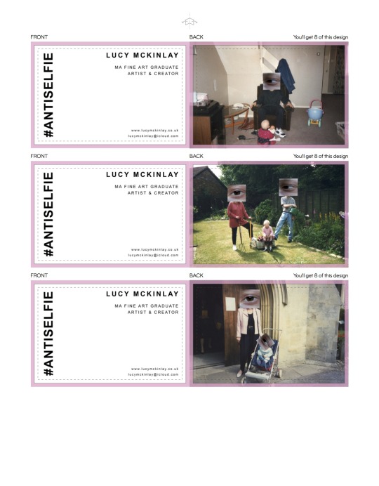
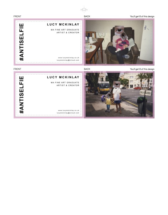
THOUGHTS:
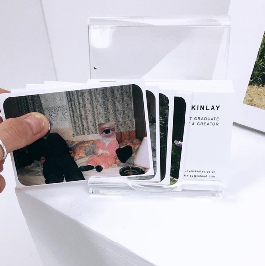
As an additional extra to the exhibition and the work, and something I did for my undergraduate show, I wanted to have business cards that also acted as mini take-away prints which will also act as advertisement and as a branding strategy, like for example the Tate Modern gallery shop that offers mini postcards and prints of artists work, it is something extra that adds a contemporary and modern aspect to the series, and also something a lot of younger artists of my genre offer as a part of their practice it also invites the audience to a piece of the series away with them, something in which make the work memorable and collectable in the future if ever to take off. In designing the business cards I wanted simple, clean and bold design that was coherent with the Anti-selfie book as well as the theme of series, all designed on Indesign and created using Moo.com software.
0 notes
Text
FMP Development: Anti-selfie - The Book: Exhibition Presentation / Mock Design
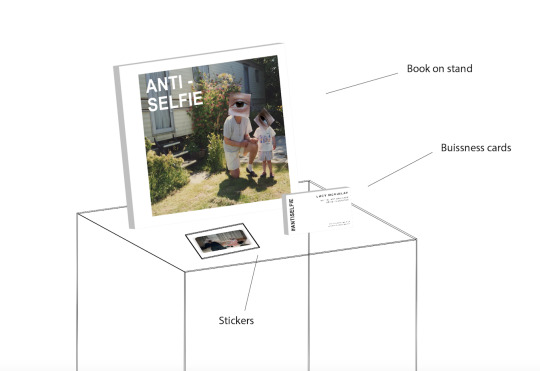

THOUGHTS:
In presenting Anti-selfie - The Book I wanted it to be presented and highlighted in the most professional way possible and be coherent with the prints on the back wall, is the idea is that it a show case and for me that means curating the space in its most powerful and effective format in navigating the audience through the series, and that each component of the work speaks of each other and works as a set as opposed to a disconnection and alienation. Coming from a photography back ground, and having curated and designed my own degree shows, my approach although primarily fine art, is still indicative of the professional, seamless and clean approach of presenting the photograph image, as an artist who works with the images and print formats, for me it is important to really show off the work that allows the images to speak for themselves without over distracting chaotic elements, so in terms of presenting specifically the book as well as the additional parts I wanted to have it on a bookstand on a plinth which show the book as a main part just as much as the prints in the space, this also a method and presentation I have shown in before as this is my fourth photo book. In creating mock spaces like these it really helps me to imagine and play with the space and presentation of the work before hand in order to get as much of a feel for the work in its final form.
0 notes
Text
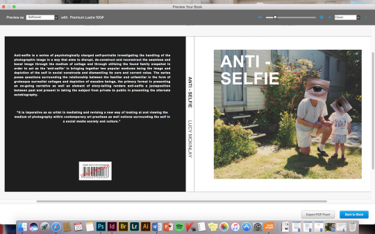
FMP Development: Anti-selfie Part II: Anti-selfie - The book Cover Development:


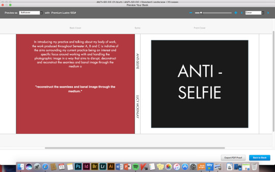
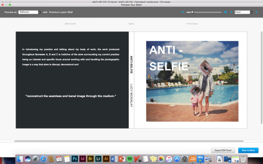
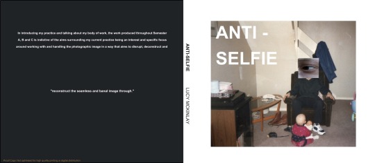
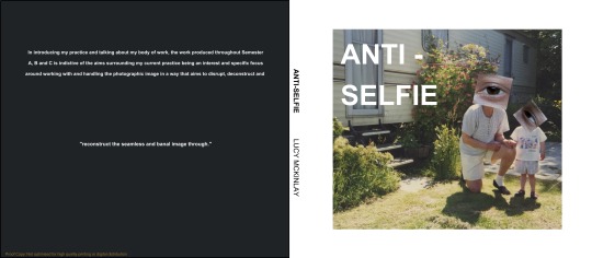

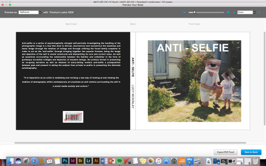

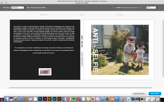
FINAL BACK / FRONT COVER
0 notes
Text
FMP Development: Anti-selfie Part II: Anti-selfie - The book Final Result: Book Development / Process
http://www.blurb.co.uk
http://www.blurb.co.uk/bookstore/invited/7723493/c9a00a4531a9b4e1abbda50453387f1b5f4ba54f
http://www.blurb.co.uk/b/8893487-anti-selfie
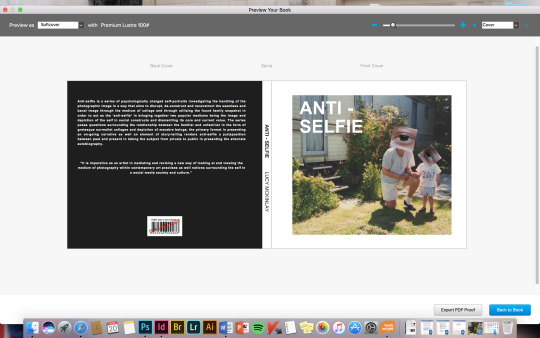
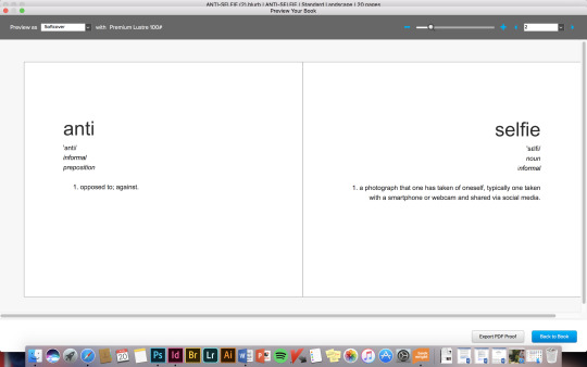
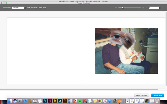
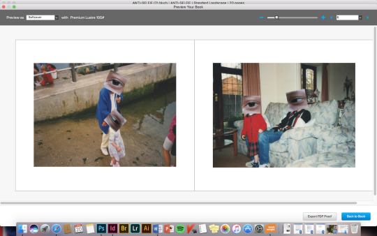
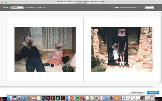
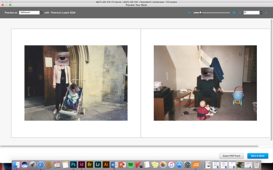
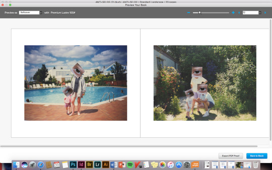
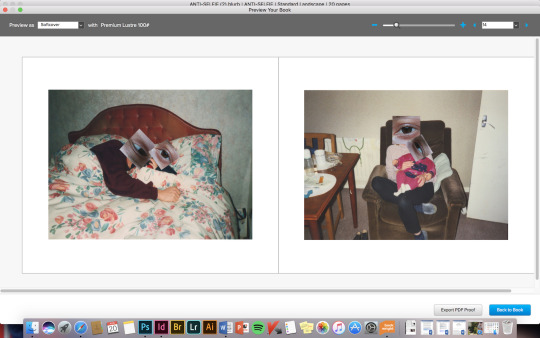
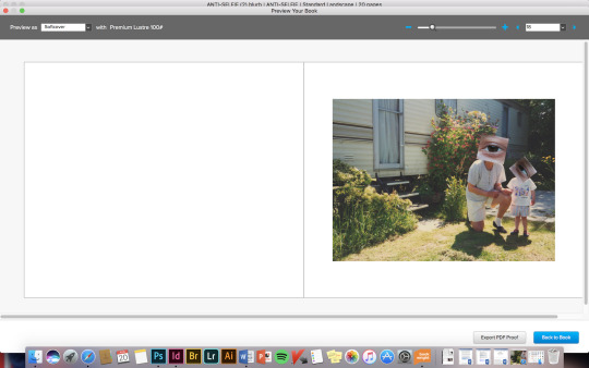
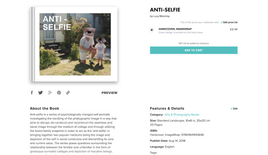
ONLINE BOOK FOR SALE ON BLURB.COM
THOUGHTS:
The idea for a book format for Anti-selfie Part II came quite late in the process of developing and thinking about showing the series, and was idea I hadn’t considered early on in the process, however when looking back at my artist research it is quite clear a correlation between the way in which some of the artists had presented their work in a book format, some of which include text, some of which is purely imagery and captions, it is always a format I have been drawn to, especially when looking at artists work myself, or browsing art gallery shops, or being in the art and photography section of a book store, for it is something about the intimacy and physically handling of a book and being able to see the work close, and flick from page to page and see the on-going narrative of the work play out, it also something as the viewer I enjoy being able to have a copy of an artist work as a book to keep and look back on. This is idea and though that made me think about my own series, how could I further push the conceptual aspect of it even further? What is it I want to say with this work? Can it be even better and even more powerful in its message?.
In bringing together all these aspects, and having already on my undergraduate course produced 3 photo books / portfolios it made sense to think of my work as powerful and an element of contextualising my work, especially having a photographic background, I feel images especially work really effectively as a book format, which I why I chose to take the direction to work intensively on designing my own photo book. In correlation to this was adding to the conceptual basis of the work, being snapshots taken from the family album, which made me create a connection to create my own absurd and alternative family album, it would also allow me to show a larger selection of images in really showing all the work I have produced over the semester. In designing the actual pages itself, I used the software BookWright through the website blurb which allowed me to have ultimate creative control, it was also a fairly easy software to use, however did present some challenges in uploading the book, the design I wanted for the book was to be simplistic and to allow the quality of the images to speak for themselves, I also spent a large amount of time in deciding the layout for the pages, as I wanted to show two images per page, and was important in making the images flow from one to another that each image worked well together, and different distract or create a conflicting with the other. In designing the front and back cover for the book I wanted to be eye catching and indicative of what the series actually was inside the book, and after much playing around with different back and front covers that was most effective in delivering the message, I finally decided on the one above in the images. As well as this I felt it was important to add a blurb to the back of the book, highlighting and explaining the message and context of the series, which would allow the viewer to understand exactly what the images are trying to convey. With the inside first pages, I wanted to create a play on the term ‘anti-selfie’ which a term I have created for my series, and in doing this came up with the idea of copying the actual definitions of each word from the dictionary, again adding to the conceptual basis of the work.
Overall I am really happy with the result, and after a lot of shifting about and a painstaking creative process and decision making, I feel the book version is really strong in showing the work in another format, as well as this the website also allows you to put your book up for sale, which is something exciting as the beginning of starting my journey as a independent artist in showing my work.
0 notes
Text
FMP Development: Anti-selfie Part II: New exhibition mock up: 29th August 2018 Hand-in: A3 Prints
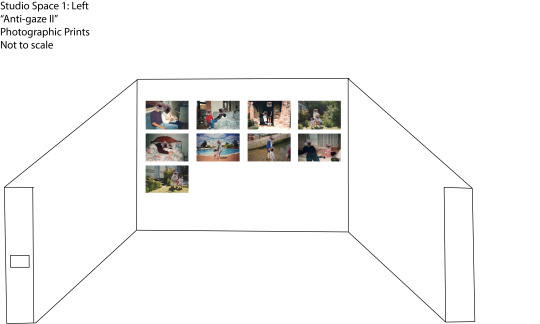
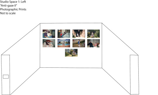
THOUGHTS:
My original idea for the presentation of the images (seen previously) was to have the series printed A1 in order to create a boldly and impactful element to the work in its final format, however when receiving the A1 print (see below) the quality and clarity of the print was not what I expected or wanted, due to the blowing up of the image on such a large scale it resulted in the image being blurry and out of focus in parts, although the image was set to a high resolution and size, this is partly due to the background image being a scanned old snapshot, and the eye being cropped and taken from a larger image, so when blown caused a pixilation. Although this is disappointing result as ideally I feel it would of worked really effectively in the same and been really powerful as a final outcome, I had to come up with a solution that will still create powerful and add context to the work, so in order to do this I sent off two test prints, in the sizes A4 and A3 (see below) to see which gave the image a higher quality in print, in making the decision I also had to consider the space and layout, which (above) I have created another mock exhibition space playing around with layouts and composition. Overall I feel the outcome is still successful and still gives the images the same strong outcome.
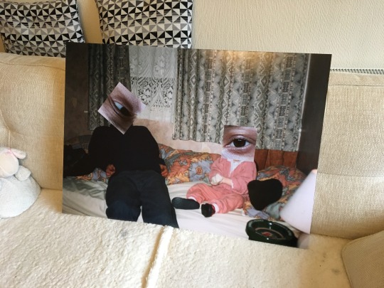
A1 Print
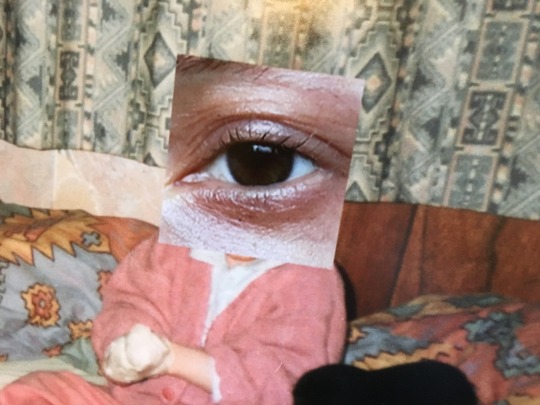
0 notes
Text
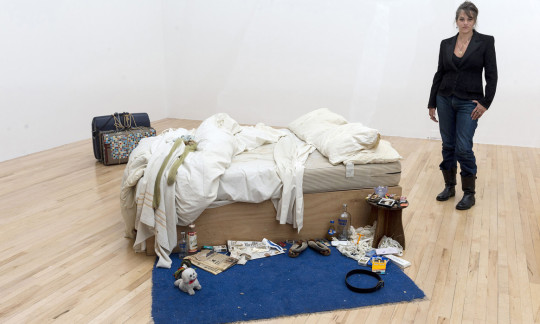
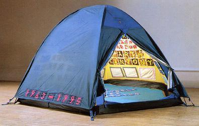
Tracey Emin: Love is What You Want: Found object / image
Autobiographical works:
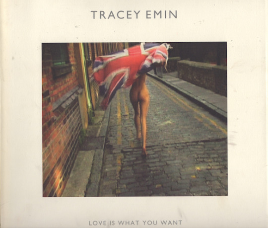
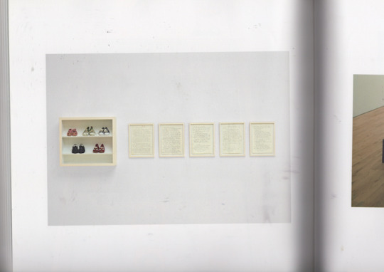
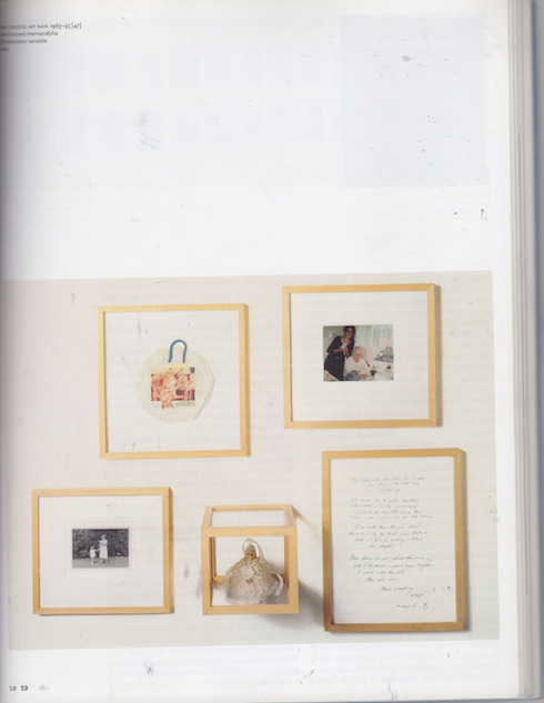
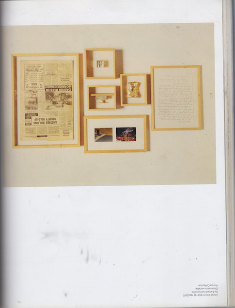
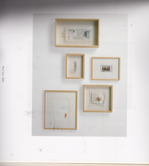
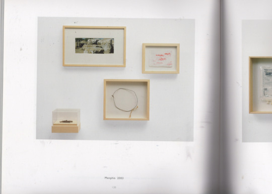
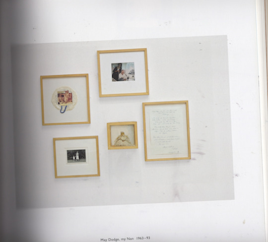
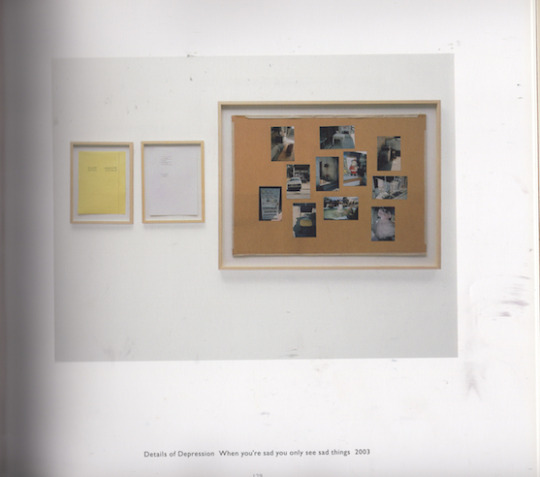
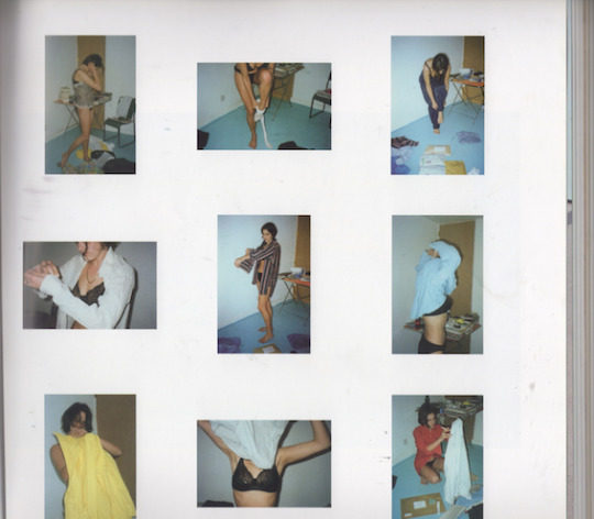
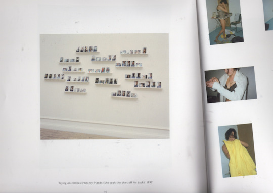
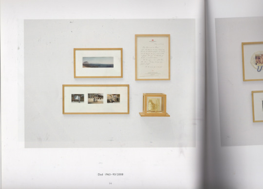
THOUGHTS:
Taken from Practitioner’s Statement:
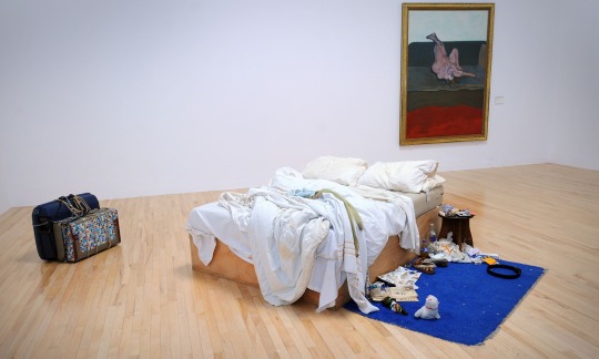
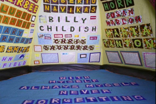
One of the primary influences behind my interest and subject of my work being autobiographical, confessional and self-focused began early on in my practise starting with the work of Tracey Emin as well the agendas and issues her work takes on, although her work is primarily sculpture based, which includes elements of the found object, familiar materials, some elements of film and photography, the basis of the work and how she uses these materials to foreground life events, specifically relating to herself in response to trauma and memory, which renders her work towards the movement of a confessional art that uses the autobiography to become accessible through actively and unapologetically inviting the viewer to become a participant, which is where my work I feel builds upon this idea within Anti-selfie although I feel this series is more suggestive as opposed to the directness and explicit nature of Emin’s work, and different in output being the image, it holds this same idea of a movement that Emin is a part of being this private to public within art self-exposure, more specifically contemporary art (Gibbons, 2007, p.19-24).
Anti-selfie and the basis of a lot of my work is specifically self-portraiture, directly using imagery and the collage, however the work like Emin I feel raises critical questions about how we portray, mediate and control our self-image and story socially as well as issues surrounding identity within art, and raises questions for why is it that artists choose themselves as the subject, which is still an element of my practice I question at times when making the work. EveryoneI Have Ever Slept With (1963-95) and My Bed specifically are two works that I have always been drawn to and inspired by due to the archival aspect and approach given to the works, exorcising memory however using an element of iconography and shock factor to some degree due to nature of the work, although I do not intend for my work to be purposely shocking, the output of my work can be received as this due to the surrealist and unsettlingly depictions, both works retain a level of ownership over the self and its own distributor of a life story which is how I can create another link between myself and Emin, as well as creating a mediation life and art (Merck and Townsend, 2002, p.23-112).
0 notes
Text
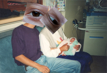
FMP Development: Final Selecting Process: Anti-selfie Part II
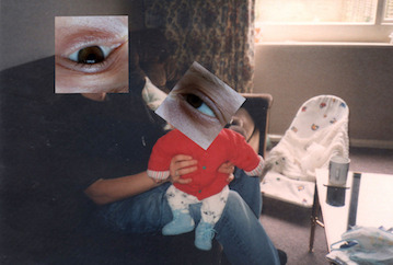
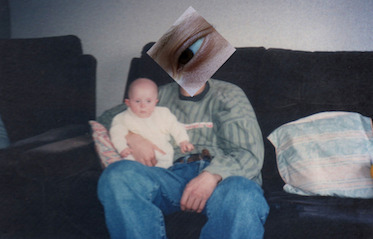
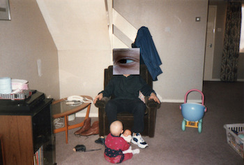

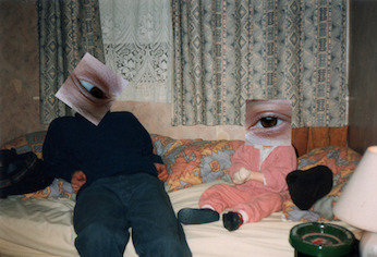
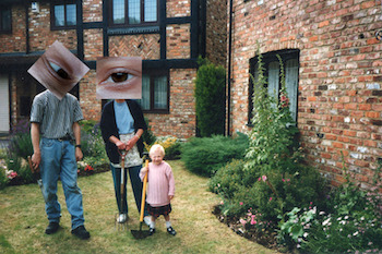
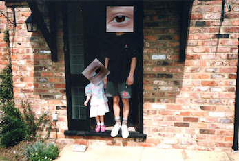
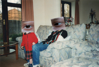
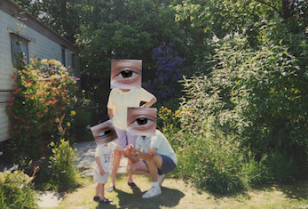
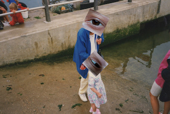
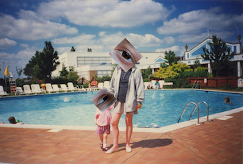
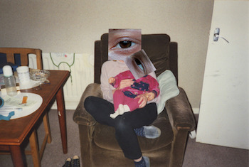
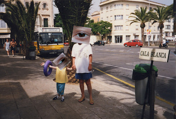
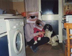
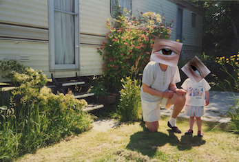
THOUGHTS:
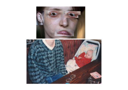
In determining which images to select as the final and most strongest in terms of narrative, composition and aesthetic quality (most successful as a collage) I had to be fairly critical of my work in process, although there was other images I felt were strong, they didn’t have the same strength and clarity in working as part of the series. These images in particular I feel really deliver the message of the anti-selfie, and are the most absurd and unsettlingly to look at, they also worked well in terms of being able to layer the image of eye over the heads of the people in the snapshot without being too over crowded and disjointed, therefore were the most successful as a collage that is seamless.
I feel these images are also successful due to being able to create a interaction between both ‘eyes’ or to look at is as both ‘beings’ that created and presented the most effective illusion and play on perception to the human eye, in doing this for some of the images I took into consideration the direction the head was facing and actual interaction taking place in the snapshot, and doing this simulated and copied this in the direction I faced the eye image in conjunction with each other. At the moment these are my final selected images to work with, however this could change as the process continues, it may be a case of these images when printed don’t actually worked as a set or may need editing, this is a journey and process I will be continuing.
0 notes
Text
Kodak and the Rise of Amateur Photography: The Snapshot as Art

Album of 131 Views of a French Family & Their Travels
Artist: Unknown (French)
Date: 1880s–1900s
Medium: Gelatin silver prints and cyanotypes
Dimensions: 22 x 31 cm (8 11/16 x 12 3/16 in.)
Classification: Albums
Credit Line: Anonymous Gift, in honor of Barbara Billingham, 1990
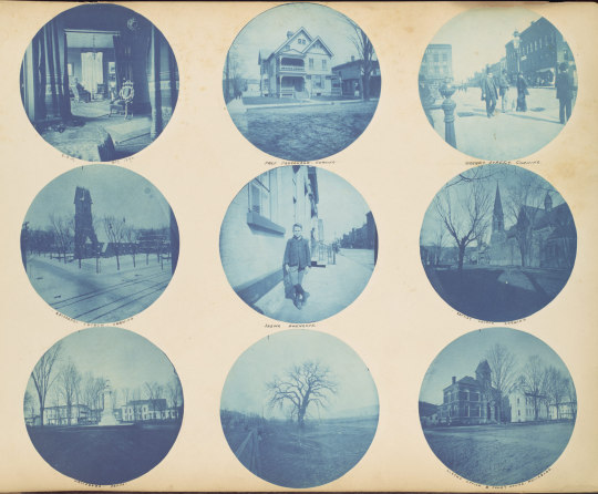
Amateur Snapshot Album
Artist: Unknown (American)
Date: 1890–92
Medium: Cyanotypes; gelatin silver prints
Dimensions: 28.3 x 36.8 x 2.8 cm (11 1/8 x 14 1/2 x 1 1/8 in.)
Classification: Albums
Credit Line: Funds from various donors, 1997
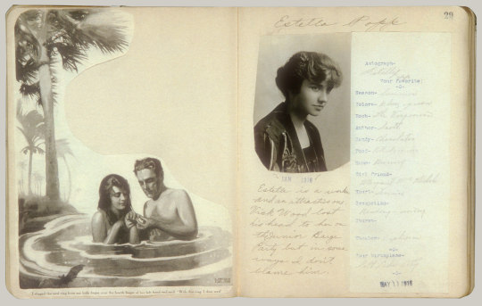
Girls I Have Known
Artist: Daniel Rochford (American, Minneapolis 1900–1996)
Date: 1916–17
Medium: Gelatin silver print; photomechanical prints
Dimensions: 24.1 x 19.1 cm (9 1/2 x 7 1/2 in. )
Classifications: Albums, Prints
Credit Line: Joyce F. Menschel Photography Library Fund, 1998
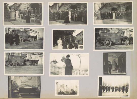
Personal Travel Album Made by the Dowager Empress Maria Feoderovna Showing Events in the Daily Life of the Russian Imperial Family
Artist: Dowager Empress Maria Feodorovna (Russian, born Denmark, Copenhagen 1847–1928 Copenhagen)
Date: 1916
Medium: Gelatin silver prints; photomechanical prints
Dimensions: 29.5 x 42.2 x 5.7cm (11 5/8 x 16 5/8 x 2 1/4in.) each
Classifications: Albums, Prints
Credit Line: Gift of Prince and Princess Alexander Romanoff, 1996
https://www.metmuseum.org/toah/hd/kodk/hd_kodk.htm
THOUGHTS:
Although fairly different in context and relation to my own work being the found image or the appropriated image of the snapshot taken from the family album in correlation with present day digital imagery, therefore making the outcome immaterial and digital overall in value, I found this essay and research interesting in terms of speaking about the fascination with the snapshot, and the vernacular image, both in the past at its most traditional and in the present. I, myself have always had an interest in the snapshot, owning a polaroid, Kodak camera, and SLR film camera, although I work primarily with the digital image until now, it is an aesthetic that I resonate it, it is something about the materiality and the unknowingness of it, as well as it being more archival and nostalgic to feel and look at. For me, I feel this is the image at its most authentic which can be seen as contradictory as a photographer who has always used DSLRs, which is why with the series Anti-selfie and from the start of my MA, I found such an interest in anti-art as a movement as well as Dada, a lot of these works featured the snapshot, or vintage dark room prints, which made me think about me own work, in how I could include both, while also being contemporary and including the digital image. I feel there is something about the aesthetic quality of the snapshot that has the ability to take the viewer back in time, however can be used today, which there is almost this clashing of time and space which interests me.
Mia Fineman in this essay describes the snapshot as a medium for the purpose of being a personal documentation to memorialise and commemorate specific events such as the typical wedding, party, or family photo, indicative of the traditional and authentic images we see today, what is also interesting is that she states the original Kodak print was actually in a circular format, and then later modified to be a smaller rectangular print, as well this snapshot produced throughout the 1890′s - 1950′s were typically shown within the family album, as a vernacular expression, as well this the images would have a narrative and a chronological sequence to them, as well small captions describing the event taking place in the image, as well in some cases collages containing a mixture of cut and pasted snapshots along side commercial photographs taken from newspaper or magazines. Fineman also goes onto describe the movement of the snapshot into the realm of fine arts, as well its use as the appropriated and found image in the context of art, which is most relatable to my practice, in speaking about John Szarkowski in 1966 The Photographer’s Eye exhibition and book which included re-contextulized snapshots discovered and recovered from various newspapers, police files, portrait studios as well as anonymous snapshots from flea markets and auctions, in which he creates his own narrative and purpose for the images. In relation to this, and the rise of the snapshot, in the 1990′s Fineman describes its place within the arts becoming more contemporary, especially within American art galleries, The Photography of Everyday Life, 1888 to the Present, and in 2000 the Metropolitan Museum presented Other Pictures: Anonymous Photographs from the Thomas Walther Collection was presented in which featured a vast collection of snapshots that had an odd and visual power to them, again being removed from their original context and form, the exhibition highlighted the snapshot be removed the family album into a new presentness, to take on new meanings and invite the audience to create their own narrative and interpretation of the images (Fineman, 2014).
Fineman, Mia. (2004). “Kodak and the Rise of Amateur Photography.” In Heilbrunn Timeline of Art History. New York: The Metropolitan Museum of Art, 2000–. http://www.metmuseum.org/toah/hd/kodk/hd_kodk.htm. [Last Accessed] 23rd August 2018.
0 notes
Text
Robert Rauschenberg: Collages using the found photograph
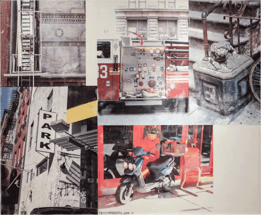
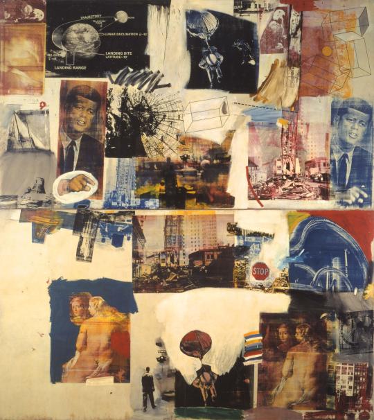
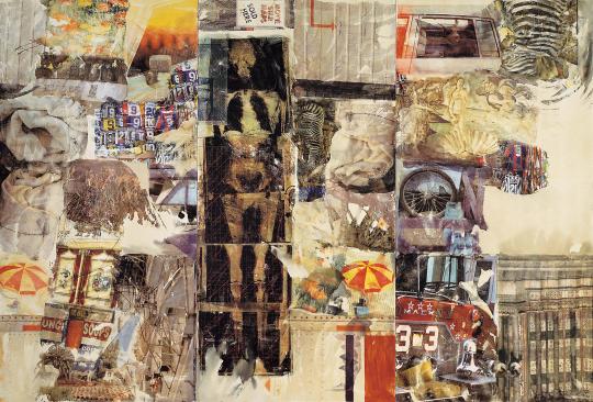
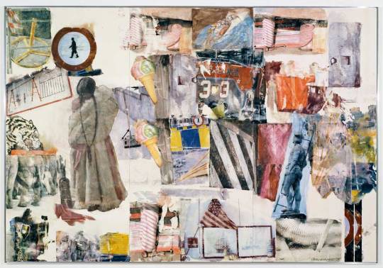
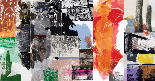
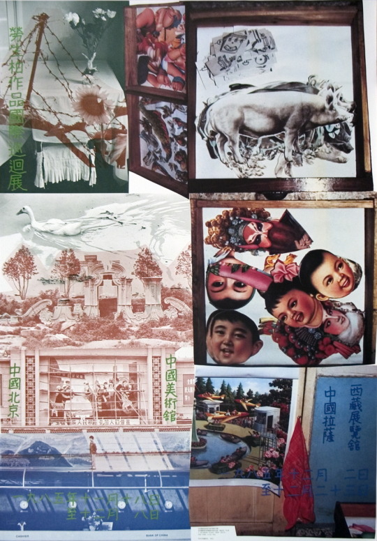
https://www.theartstory.org/artist-rauschenberg-robert.htm
THOUGHTS:
Having looked at Rauschenberg briefly during a seminar, the artist himself had slipped my mind completely when looking at Dada and Anti-art, specifically collage and the found image, however it wasn’t until investigating and researching for my FMP, I stumbled across his work, however different from how I had seen and remembered before, the images I have presented above struck me and inspired me the most due to their saturated and bold colour palette, as well the collection of found images, bizarre and almost disjointed, however creating a clear narrative as if something from a scrap book. As well as this, in some of the works it is includes what looks like snapshot images, again appearing something something from the family album and also with an element of documentation and reportable. There seems to be a clear visual language happening however mainly through image, almost like a map, a chaotic yet calm at the same time. There is also an unsettlingly, absurd and grotesque nature to the work, at times what looks like an element iconography.
Considered by many to be one of the most influential American artists due to his radical blending of materials and methods, Robert Rauschenberg was a crucial figure in the transition from Abstract Expressionism to later modern movements. One of the key Neo-Dada movementartists, his experimental approach expanded the traditional boundaries of art, opening up avenues of exploration for future artists. Although Rauschenberg was the enfant terrible of the art world in the 1950s, he was deeply respected and admired by his predecessors. Despite this admiration, he disagreed with many of their convictions and literally erased their precedent to move forward into new aesthetic territory that reiterated the earlier Dada inquiry into the definition of art.
Key Facts:
Engaged in questioning the definition of a work of art and the role of the artist, Rauschenberg shifted from a conceptual outlook where the authentic mark of the brushstroke described the artist's inner world towards a reflection on the contemporary world, where an interaction with popular media and mass-produced goods reflected a unique artistic vision. Rauschenberg merged the realms of kitsch and fine art, employing both traditional media and found objects within his "combines" by inserting appropriated photographs and urban detritus amidst standard wall paintings.Rauschenberg believed that painting related to "both art and life. Neither can be made." Following from this belief, he created artworks that move between these realms in constant dialogue with the viewers and the surrounding world, as well as with art history. Preferring to leave the interpretation of the works to his viewers, Rauschenberg allowed chance to determine the placement and combination of the different found images and objects in his artwork such that there were no predetermined arrangements or meanings embedded within the works.
0 notes
Text
Gerhard Richter: On the found image, family snapshot and the photograph
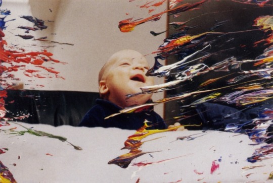
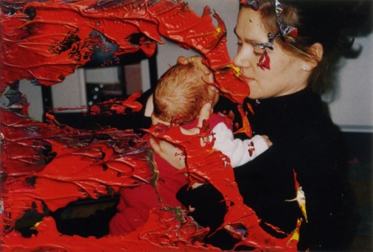
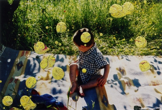
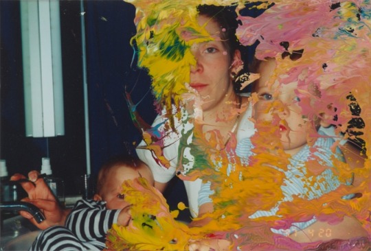
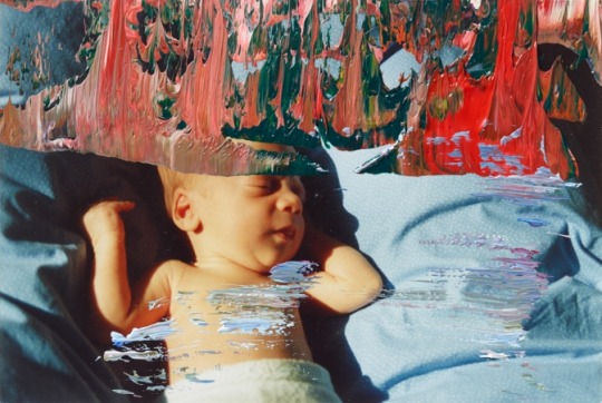
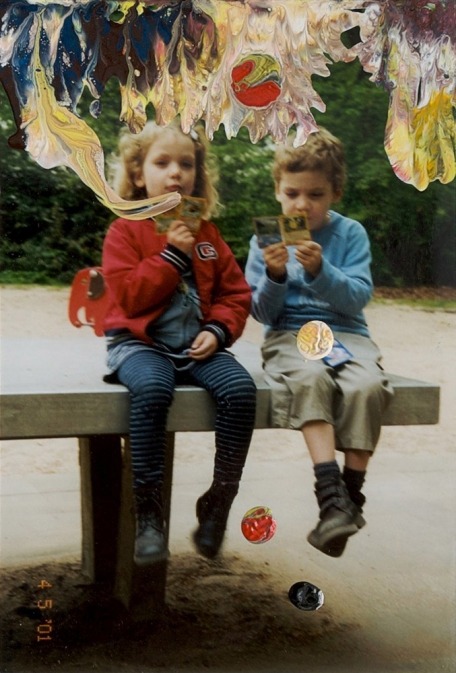
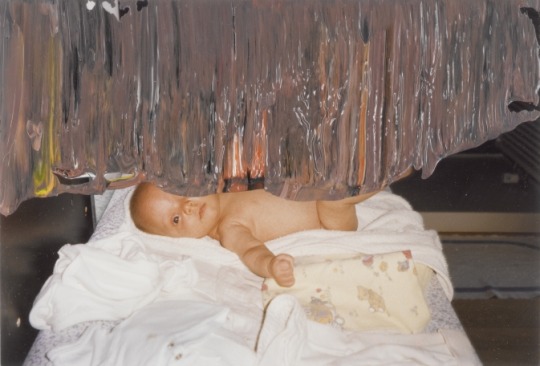
THOUGHTS:
In speaking about Gerhard Richter, he definitely a massive influence when it comes to my practice, and especially the series Anti-selfie in incorporating the found image and the family album like snapshot to my recent body on this masters which is an element I always wanted to introduce however never had the opportunity whilst one my photography undergraduate course, I discovered Richter a number of years ago when I introduced mixed media and painting onto the photographic image into my practice, which for me was extremely liberating as a photographer that wanted to branch out with my work at the time. For me his work has a really nostalgic element to it, and to some degree completely separates itself in terms of commercial and portrait photography, as well as digital imagery, the work also has a real narrative to it, and in the application of paint to the imagery, it become hybrid between abstract expression indicative of expressing and symbolic of emotion, with the flatness and immateriality of the image depicting the vernacular image taken straight from the family album, it also makes you question as the viewer who the individuals are in the image, and why these images and format and subject were chosen.
Taken from https://researchandenquiry1.tumblr.com
In regards to discussing Richter’s Panaroma 2012, it is imperative that I discuss, dissect and enquire into his body of work as a whole, and more importantly inherent movements in which he falls into and divulges in order to give a foundation to discuss select works.
Richter, a German born visual artist, inherently known for his movement within Capitalist Realism, however you could argue that his work falls under the movements of Surrealism, Abstract Expressionism, Pop Art, Photorealism, Anti-Art, Dada and Neo-Dada (Storr and Richter, 2002). However it is imperative to note that Richter himself, argues that he is surrealist concerned with the sole idea of the object. The choice of subject within his body of work, is also imperative to Richter’s work. There is also this concern within Richter’s work, that of itself is never that of art, however what art itself can be used for. (Richter, G and Obrist, H 1995). This notion constitutes the idea of functionally within art itself, can art, is it capable of having a form of functionally whether this is physically, mentally or emotionally within contemporary art to the viewer.
Richter also concerned with the notion of not claiming or expecting to make the invisible visible, the unknown known or the unthinkable thinkable. He argues that as a collective, we derive conclusions based upon the invisible, that we in fact presuppose its existence with corresponding certainty. However us as individuals, can serve as a metaphor, which stands for the invisible but is not directly it (Richter, G and Obrist, H 1995).
Within Richter’s Panorama 2012, 8 over painted photographs are presented, which informs both the medium of the photograph and painting, however it is imperative to look at this work as nor photograph or painting, rather as objects greatly concerned with ideas that address larger issues than themselves (Colberg, 2011). In greater relation to this, Richter also describes the photograph as the most perfect image, the idea that it does not change with time, that is in fact absolute, autonomous and unconditional. The notion that the image informs and what it inform of in relation, is the source of his subject. (Richter and Obrist,1995). It is also important to note, these 8 works are noticeably smaller than most of his other works, which are larger in comparison, spanning only 6 x 4 inches, these 8 images mirror that of the traditional family album, presenting the notion of nostalgia and the essence of autobiographical and confessional art. These works also has a likeness to the early work of Nan Goldin, in which present the spontaneity of the family snapshot, unconstructed and candid in nature. Although hidden by layered coats of oil paint, the images themselves depict an intimate family set up.
It is imperative to discuss that the images themselves hold a transferability and recognisable relation to the shared occasion of that of humanity. Furthermore the autobiographical, confessional and diaristic nature in which signifies a profound change for all parties in involved, which presents the image as one of its most translatable forms. However, it is vital that as the viewer, we draw upon the images as fragmented and concealed in parts, by thickly applied oil paint, as something more much and as almost layers of language being spoken by Richter. The flatness of each image, is disturbed and defaced in a way that speaks of Richter’s gestures in response to roused memories in photographic instance. Much like the handwriting on the edges of the images, furthermore appear to be gestural only addressing Richter himself. This notion speaks very much of the personal emotionalism of abstract expressionism. What separates this work as just image depicting confessionals, is that we as viewer have to work harder in order to examine in the hope of absorbing as much fine detail as we can. As we peer through waves of paint, it urges us to work harder to look a photograph in a way that we never would normally. (Colberg, 2011).
The more I look the work itself and prior work of Richter’s, I am finding a distinctive relation to the movement of Dada, Anti-Art and Abstract Expressionism, more in the sense of aesthetics and physicality. I feel that this is a good foundation to work upon and research in more depth. I find there is also a strong correlation between Richter’s ideas and my own practise.
Sources:
Colberg, J. (2011). A Letter from London: Gerhard Richter and his Overpainted Photographs. Available: http://jmcolberg.com/weblog/2011/10/a_letter_from_london_gerhard_richter_and_his_overpainted_photographs/#.Last accessed 13th Oct 2017.
Richter, G and Obrist, H (1995). Gerhard Richter: The Daily Practice of Painting - Writings and interviews 1962-1993. London: Thames & Hudson Ltd . p37.
Storr, R, Richter, G and The Museum of Modern Art (N.Y.) (2002). Gerhard Richter: Forty Years of Painting. New York: The Museum of Modern Art. p.
0 notes
Text
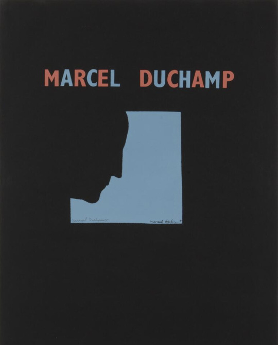
Marcel Duchamp: Self-Portrait in Profile (1957-9)
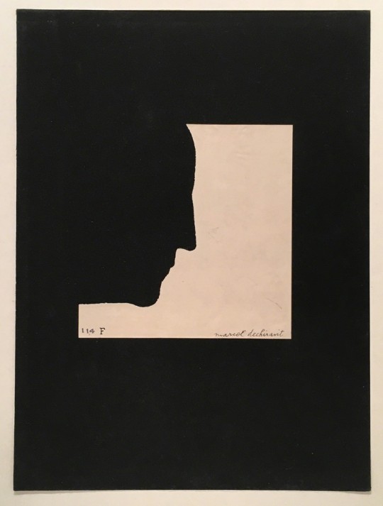
https://www.artsy.net/artwork/marcel-duchamp-self-portrait-in-profile
Torn paper on velvet13 1/8 × 9 27/40 in; 33.3 × 24.6 cm
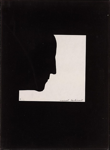
https://www.metmuseum.org/art/collection/search/492560
Torn and pasted paper on velvet covered paperboard
https://www.nortonsimon.org/art/detail/P.1969.074
THOUGHTS
I haven’t been able to find anything detailed about this specific work, however Duchamp is a massive part of the Dadaist’s and Anti-art movement, in a sense creating the physical collage in a lot of his work using the found object, object taken from the everyday domesticated world, therefore creating a mediation between art and life, in presenting the pragmatic object in the context of art, a lot of these conceptualisations I have researched quite deeply through out practice 1 and 2, however I wanted to take a look at a different element of his work which is indicative in the progression of my work.
With Self-portrait In Profile, I wanted to look at how other artists present the self in their work in relation to mine, and with this series what fascinated me is it works in a very different way as a portrait of the self, its almost acts as a trace and imprint of the individual, and as a negative space silhouette, although as a the viewer we can’t visually see the artist, the world profile becomes indicative and symbolic of the profile as something in identifying an individual by distinct features, therefore acting as profiling. There is also a Matisse feel to the world, with a cut-and-paste degree of block colour shape, however what separates this work is the context and symbolism. I think the work is extremely clever, as simple and minimalist as it is, has inspired me greatly in looking at the self-portrait different, as opposed to the front view of a person, with all facial features visible, that in fact the profile of a person is as much indicative of a person as a clear image.
0 notes