Don't wanna be here? Send us removal request.
Photo


Project five has been a long, but fun and rewarding journey. Getting to tie everything together that we have learned throughout this semester has been fun. Although this was an enjoyable project, this is probably the one that I have struggled with the most. I think I have tried to cover too many ideas with this journal and need to bring it back a bit. By doing that, the journal should come out much cleaner in the end. I look forward to seeing how it will turn out in the end once I solidify my color range and mess around with my item arrangement once more. As for my thoughts of the class as a whole, I have thoroughly enjoyed learning about these applications and their potential. The logo project has still been the most fun to me so far because it gave me the most creative freedom without being such a large project as this final one has been. Having not studied much digital design or artistic possibilities, I am glad that I am now more well-equipped to create my own digital work in the future whenever I need it. Thank you for teaching me Professor Chi.
0 notes
Photo


This post includes the finalized syntax and semantics submission as well as the start of the process journal. Learning more about syntax and semantics was a fun experience and I think the critique enabled me to fix the prior errors in my design choices. In terms of the final project, I am excited to display all of my work in a creative fashion which compliments each piece. This is the front cover so the idea is important to draw the viewer in for more. While I am confident in this design, I do believe that I could refine the text arrangement further. I still have quite a bit left to work on for this project, but I have solid ideas as a result of planning the spacing from the examples and creating the mood board to guide me. Using these, I plan to create a process journal to showcase all elements of each project in ways that are easy to read and learn about. I am looking forward to seeing how the next few weeks turn out on this project since we have quite a bit of time to work on this as a result of its scale.
0 notes
Photo

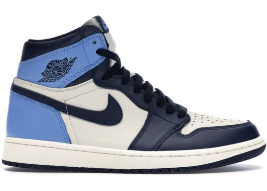
During these few weeks, learning about syntax and semantics has been interesting. I chose shoes as my objects because I think they have many uses, unique shapes, and different purposes. They vary in shape, size, color, and purpose. Learning about spacing details has helped me understand composition of objects better. I went with four column rows for this project as I feel they best reflect the wide shoe shapes. Using a variation of PT Serif fonts, I am able to add variation to the text which naturally draws the eye in the proper order. I still need to work on the spacing of the white space, the size and font color of some of the text, as well as the spacing of each break in category to make it all more cohesive. I also need to make the background clear on one image as the white background can be seen. I look forward to the finished composition which should come quite soon after these tweaks.
0 notes
Photo


It has been a fun journey with this logo assignment. These pictures are from what I saved during my progress in class. The initial designs have changed in certain areas and it has been fun to watch them develop into something better than before. Currently, there is still some areas for improvement in both of these logos. Mainly, figuring out a solid font and composition for the text will be what I focus on first. After that, I want to revisit the alignment on the star logo to make it more even. For the sword, I want to tweak the design slightly and add back in a secondary shade of green that was initially there. I will continue to play around with color choices for both of these with the adobe website in order to get the best looking combination. By making these changes I think I will be very close to completing these projects. I believe that these both have a strong theme and are visually easy to understand at a glance. I look forward to seeing how they both turn out soon.
0 notes
Photo

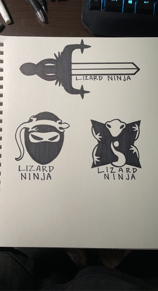
During these past few weeks, getting to explore the idea of creating our own logo even further has been a fun adventure. Creating the refine marks helped me with the sword logo the most. I was able to mostly trace the design in Illustrator for that design. I chose the colors from the Adobe color picker website, but I still want to change them slightly to get a better image. Both of these logos have some work that needs to be done on them. I learned during the critique reflection that I can work on three main areas of these designs. These changes involve shape changes, outline editing, and making the text fit with the logo once it is added. By playing with the design on the sword, the shape of the lizard will stick out more. Editing the outlines on the throwing star as well as the lizard head will allow negative space to define the shape better than the outline could. Lastly, playing around with alternative text positions or implementations will be my last endeavor on these before they are finished most likely. I look forward to how they will come out.
0 notes
Photo
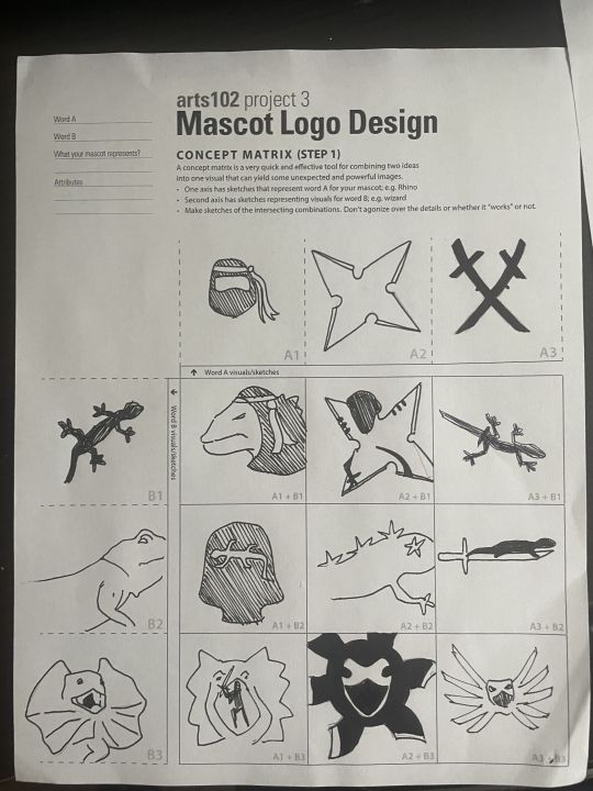
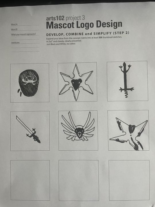
For these past two weeks, it has been exciting to learn about the reasoning and principles surrounding good logo design. I am looking forward to developing a clean logo and this is probably the most exciting project yet. The combination that I drew included a lizard and a ninja. This brought up some interesting ideas for how to creatively combine the two distinct elements into one. At first, I thought of some ideas quite quickly, but effectively translating them into reality proved to be more difficult. In these photos, I refined some examples of the logos, but currently they all need to be pushed further to be as clean and meaningful as possible. I believe that playing in photoshop for this project will help me to smooth out the process instead of attempting to create these logos by drawing them first. Once I can use clean lines, bold colored areas, and duplicating replication in the design, I should be able to make my logos more accurately.
0 notes
Photo
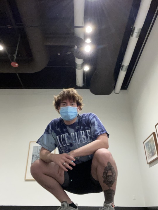
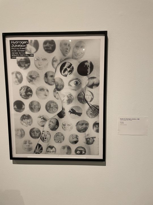
The piece that I chose in the exhibit was Gil Shuler’s piece, Poster for Hydrogen Jukebox. This poster, made in 1990, was created to advertise that Hydrogen Jukebox, a chamber opera, would be playing at the Spoleto Festival held in Charleston, South Carolina. Gil Shuler is a Charleston based artist who now primarily focuses on creating logos for events and businesses with his company Gil Shuler Graphic Design Inc.
The reason that I chose this piece is because it stuck out to me in the exhibit the most from all the rest. Without understanding what the Spoleto Festival was or who Hydrogen Jukebox was, I was drawn in by this design by its use of many different iconic scenes or images from pop culture and history. As far as the specific design elements go, the text is small yet legible which allows the design to speak for itself rather than relying on the significance of any name. The lack of color using a greyscale effect creates a strong sense of contrast throughout the poster. There is good use of negative space in the piece by having blips of scenes captured in spheres while leaving the rest of the poster blank. The spacing of the objects or people in the circles has an intentional element that is meant to draw your eye to specific locations section by section. For example, the eye at face height on the human silhouette, the singular dark face at the top of the poster surrounded by light faces, and the dark eye or marijuana leaf on the bottom. All these design elements combine to form a piece that draws in viewers and manages to keep them searching for more after the initial observation.
I believe that this work is more oriented toward design rather than a fine art piece. This, by nature of being a poster for a band, has the purpose of advertising for Hydrogen Jukebox as well as Spoleto Festival. Since this was made for that purpose, it does not seem to have many similar elements to fine art. As for the purpose, this group’s music had a heavy focus on historical events or controversial events, and this is reflected by what was chosen to fill the circles. For all of these reasons, this was my favorite piece in the exhibit and it has inspired me to push my own pieces further.
0 notes
Photo
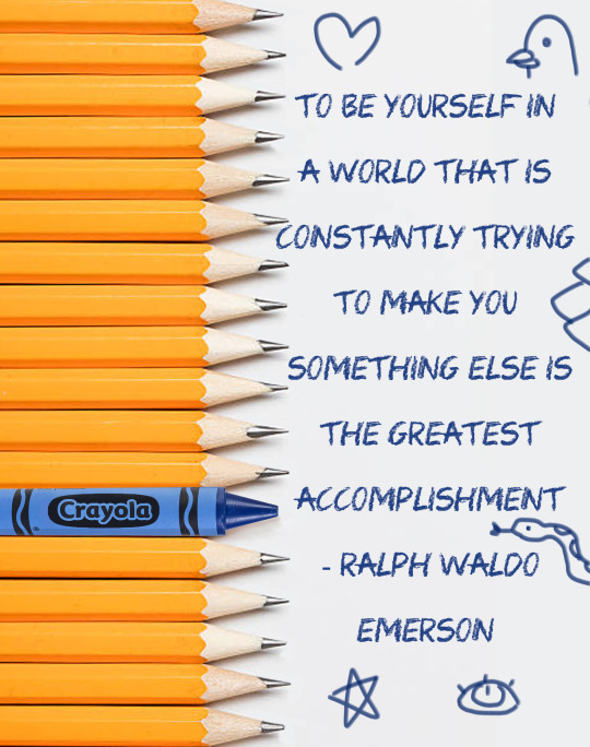
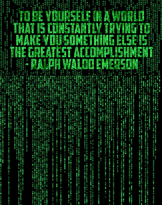
Now that a month has passed in this class, it has been interesting to see the progress I have made so far. This poster project has pushed me to focus more on the composition and spacing elements when designing a piece. I chose the quote spoken by Ralph Waldo Emerson stating, “To be yourself in a world that is constantly trying to make you something else is the greatest accomplishment”. I took two approaches to this message. The pencil and crayon version is a bit more direct and a child-friendly version of the quote while the matrix style is less direct and requires you to think more about it. I think both have appealing design aspects, yet they both need improvements before the critique. I plan on fixing the spacing, adding green highlights, and adjusting the quote sizes on the matrix poster. For the pencil poster, I plan on adding a better background, reducing the size of the pencils to add greater negative space, and resizing the quote to match that. Looking forward to seeing how these will turn out when they are finished.
0 notes
Photo
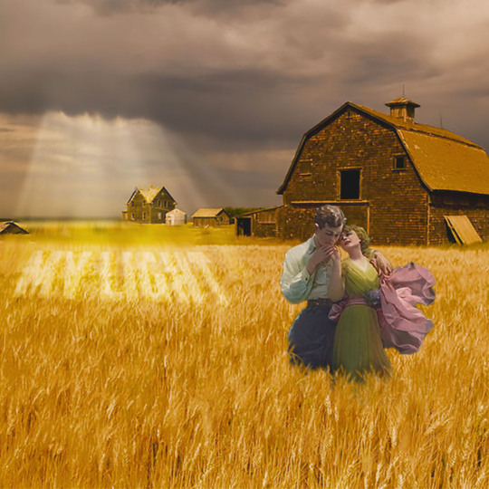
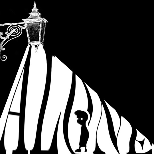
During these past two weeks, it has been fun to explore photoshop and all its possibilities. Throughout this project, I had some shifting ideas on what themes I wanted to explore. Initially after first hearing about the project, my immediate reaction was to focus each snippet on some type of emotion. There would be joy, sorrow, and anger with the corresponding colors of yellow, blue, and red (the primary emotions leading to or creating any other secondary emotions). The problem that I faced with this is that I created too specific of an idea in my head before actually attempting to create any of these pieces. This caused the original idea to shift, but the main elements still exist. With the light photo, I feel that I captured the warm, joyfulness of the romantic couple. The dark “Alone” snippet does not exactly represent a primary emotion, but I feel like this one played more with artistic elements such as negative space and contrast rather than needing to focus on its theme for it to be successful. I would still make some changes to it if I had the time since I’m not completely satisfied with it, but overall I enjoyed the result of these three snippets.
1 note
·
View note