Text
Feedback, Level Design and Gameplay
Over the past week, I have been exploring the idea of making a First Person Shooter. I have made a weapon model, rigged it, animated it, now I have completed some small particles to give payer feedback and built a quick greybox level. As this is an exploratory exercise I am doing all of this to try and decipher what kind of FPS I want to make and how the gameplay will work and what it will be centered around.
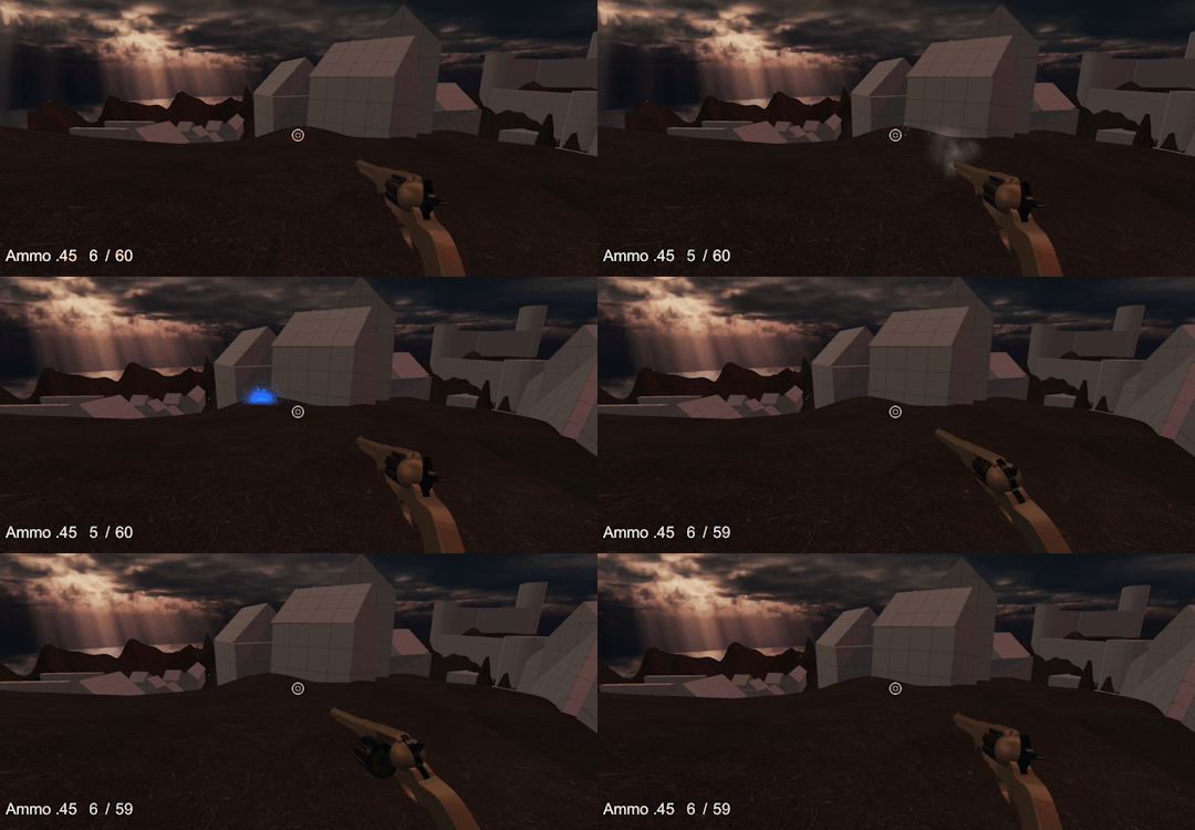
I made some quick particles such as a muzzle flash, smoke from firing and a hit impact. Considering that these are placeholder they improve player feedback immensely. After seeing how such small things can make, literally standing still and shooting feel good, for the actual product I want to have lots of moving parts animate within the guns I feel this will add immersion.
Also to support that I want to have lots of guns that behave differently and uniquely.
At this point I also have added a Very basic UI system, however, for the actual game, I think I prefer in-game UI only. I.e having the necessary information on the weapons and items and the world.

I have also knocked up a very, very quick level to run around. I wanted it to be fantasy inspired, this led me to what I think the theme of the game will be..........western / fantasy.
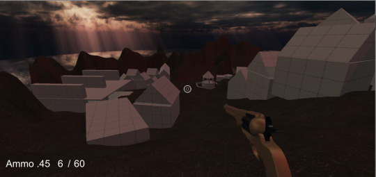
This level is very basic and works on a circle shape, it seems to be closer to a multi-player map rather than single player but as this is all just idea exploration it doesn't matter, you can cross through the center, jump over buildings because of the verticality and it is still non-grid like.
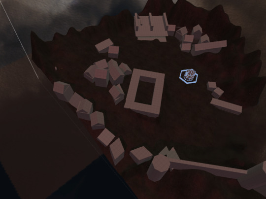
When building this level and thinking of all the fantasy games I have played over the years it brought me to Dark Souls. This link gave me the base idea for the actual gameplay and what the focus of the game will be.
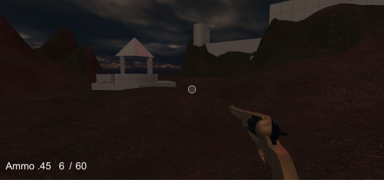
The core function of the gameplay will be the focus on boss battles. It will be a FPS dungeon crawler that has a raid like bosses to overcome in a specific way each dungeon. There will be specific ways to defeat each boss and the player must use tactics learned from enemies leading up each boss to be able to defeat them.
At this stage, it is very preliminary and young. I am going to start fleshing out some details of the coming weeks, but I am excited to make a loot driven, western/fantasy themed FPS dungeon crawler. hahaha sounds ridiculous
#unity3d#level design#game design#first person shooter#western#shooting#video games#game dev#animation#pc gaming#pc games
22 notes
·
View notes
Text
Rigging, Animations and Code
Today I have been working getting some parts of my FPS Prototype down and working in Unity. I had the completed model from the other day and added some animations to it for Idle, Shooting, and reloading.
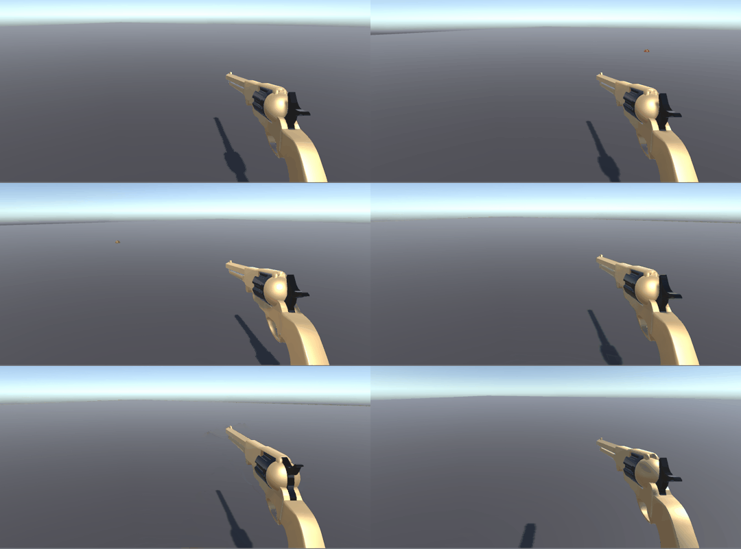
This was quite hard, taking a month off definitely sets you back a few paces, I had to go through some old code, re-assemble some others and basically quickly re-learn a few things. Mainly on the code side but also in Unity and how some of the editors work.
As you can see I have smashed together a few quick animations not amazing, but I did want to do these in Maya so I could build on my knowledge of the interface and the program in general. I Rigged the gun as well, I had never done that before so that was a good learning process for me. I am going to strip it all back once the stuff is working and redo them get them feeling much better but as a base, I think its a good start.
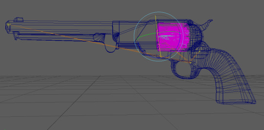
Next is to add some particles and build a little level, I don't like taking breaks it really makes things so much harder hahaha. I don't think I'm going to do it again ever.......
22 notes
·
View notes
Text
New Year, New Projects, New Inspiration
It’s been a good break, I took a month off to enjoy myself go out, explore the world (Not really just a bit of Victoria), decompress before I get stuck into an awesome huge, exciting game filled 2018.
The break was what I needed after a big busy 2017 and I am going to kick 2018 off with a bang by starting my own small first-person shooter. Over the beginning of 2018, I really want to work on my modeling skills and level design. I will be getting stuck into this by making a number of weapons like the navy revolver I began to make towards the end of last year.
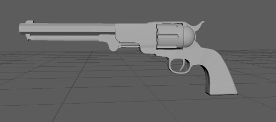
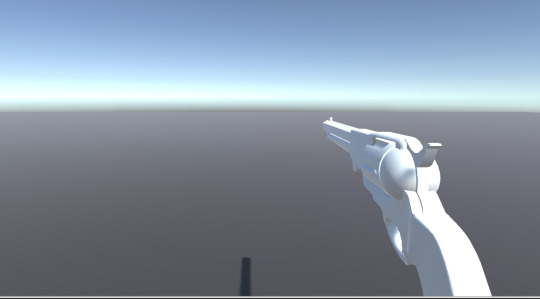
Today I completed this model and over the remaining week, I am going to animate it shooting make some particle effects and add some sounds.
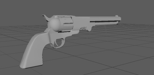
I really want to focus on making walking around an empty room shooting things fun, that's my main focus with this little project. I have already thrown it into unity quickly, I am getting excited it's going to be awesome.
Also throughout this week, I am going to get back into my dioramas.
My dioramas are where I take concept art and re-create them in grey box form as 3D levels, to re-imagine them and build on level design skills. Following this week is where I want to start creating a small level for my FPS game mainly sticking to greyboxing but also filling it with quick environment assets, to again, build on my modeling skills.
I am so happy to be back being productive and getting some games made, the latter of this week is going to be jam-packed and busy cant wait to produce some fun wacky stuff for you all to see.
#2018#pc games#first person shooter#shooting#modeling#3d model#art#pc gaming#game development#game design
12 notes
·
View notes
Text
Year Finished......onto new things!!!!
So today was the end of a great year of game design, game development, film studies everything pop culture galore it was amazing and at the same time very busy and tiring. Going into the holidays I am going to work on skills I didn't necessarily have the time for throughout the year or didn't want to at the time.
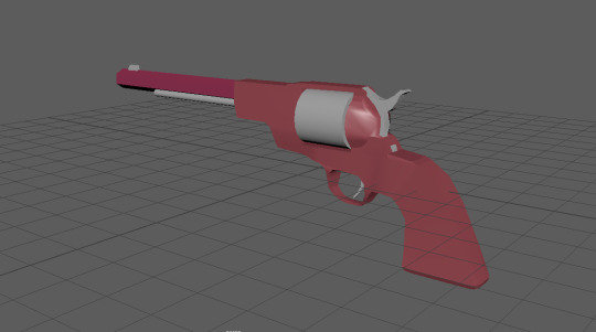
So I am going to work on Modelling and animation. I'm going to do this through an FPS game that I am going to make over the next 12 weeks or so. Above is my first attempt at making an old 1851 colt revolver (it’s in the block out stage). With this, I want to animate the shooting, kick back with the hammer. The reload with the cylinder coming out and a new one getting thrown in.
Secondly, to that I want to have some enemies that drop weapons like they do in Borderlands so you can see the stats and everything, then also animate how the player picks up the weapons, which will be a lean down grab the gun throw the pistol away and ready the other weapon.
This is probably way to much work over 12 weeks hahaha. I will most likely get the shoot and reload in plus the model finalized, but ow well let's aim high aye.
The game will be super simple, basically, kill waves of enemies but I want that to feel amazing especially with the revolver, I want to have endless enjoyment running around an empty room shooting things with the same gun hahaha
More to come......
44 notes
·
View notes
Text
The futuristic journey into an Egyptian abyss.......complete!!
The last six and a half weeks have been filled with a lot of work diligently performed by a small group of people. I am of course talking about, Neon Odyssey, the Egyptian-Cyberpunk themed 2D sidescroller that I have had the pleasure of working on for that time.
youtube
Neon Odyssey Trailer
Game is playable here: https://lockylab.itch.io/neon-odyssey
This process has taught me a lot about the highs and lows of working on a video game project even one that is relatively small. The team worked extremely well together we didn't have any major personality clashes, which was great and when looking back I feel that we were quite lucky in that regard. It enabled easy team organization and job prioritization.
Oddly enough we had more problems with the game production throughout the final weeks relating to UI than any other part of the project, which again I think is very common.
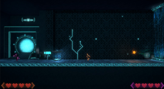
We as a team took on a lot when doing this project we aimed really high, achieved very close to our goal and within a six week period which personally, I think is pretty awesome.

Now that this is finished there will be a small break from all this very heavy and chaotic game dev and start working on little fun stuff to keep me going until the year kicks back around. Neon Odyssey will continue to be worked on, our goal is to have a full game rather than a small one. We are going to push for three levels and a dedicated boss level. This timeline is going to be stretched over three to six months, possibly longer.
However, Before that starts..............
I am going to get back into modeling and animations and make a small first-person shooter with some cool reloading animations and weapon variety. This won't be a complicated game as such but I want to run around holding some cool weapons and shooting stuff hahaha
#pc games#pc gaming#unity3d#gamedev#level design#game design#madewithunity#cyberpunk#video games#game development#indiedev
14 notes
·
View notes
Text
The Stanley Parable: An uncommon perspective on a common assumption
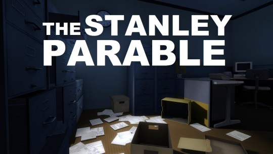
The Stanley Parable is a walking simulation game that poses many questions, many, many questions about video games, about stories, the purposes of each of them both together and separately.
The player assumes the role of Stanley, an office worker living a somewhat meaningless life of repetition and mundane activities. The player is fed instructions and therefore the ongoing story through the means of the narrator. Initially, this follows a fairly linear structure seeming as though there is a specific path to take for the desired outcome, until, choices start to arise.
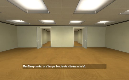
The core system within The Stanley Parable is the story and the function of player choices. Throughout the game, the player is given constant left or right, up or down and yes or no based choices to make. This, in turn, affects the narrator and thus the story. However, these choices are essentially illusions as they all turn towards a similar goal and outcome. This use of these kinds of choice based systems makes the player feel a variety of emotions and feelings, they can range from frustration to joy even anger, it takes the player on a rollercoaster ride.
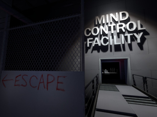
Supporting the choice based system is the superb narrator, who is an integral character in The Stanley Parable story. The quirky writing and interesting thought provoking topics of discussion make the player feel a sense of intrigue and curiosity regarding what is really happening in this office building. At the same time makes the player feel apart of something, like the narrator is with them, together along for the adventure, this makes the overt storytelling much more interesting and quite fun. When it feels like you are living the story rather than being told it is much more effective and enjoyable.
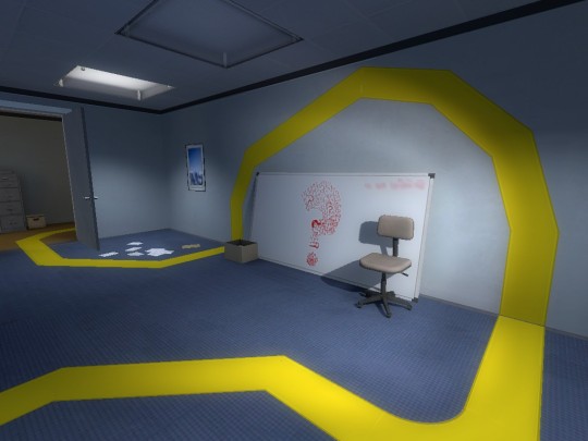
The Stanley Parable feels like it has a purpose and that is to talk about what is purpose, or what is normal, why do you do what you do or are we even alive, there are so many ways that players can look at the massive amount of metaphorical content within this story, and that feels like the true purpose.
With some amazing writing, superb game design / Level design and an interesting message The Stanley Parable gives players a way to look at things differently and craft an individual and unique experience for themselves. While at the same time asking a question like does a game have to be beaten?
419 notes
·
View notes
Text
Making a game look pretty and the little things that make a big difference.
The past couple of weeks have been very time consuming, locked into making Neon Odyssey, the 2d sidescrolling game I’m working on refined and polished. Something that has had its challenges and, I imagine will continue to do so as we proceed to work on this project.
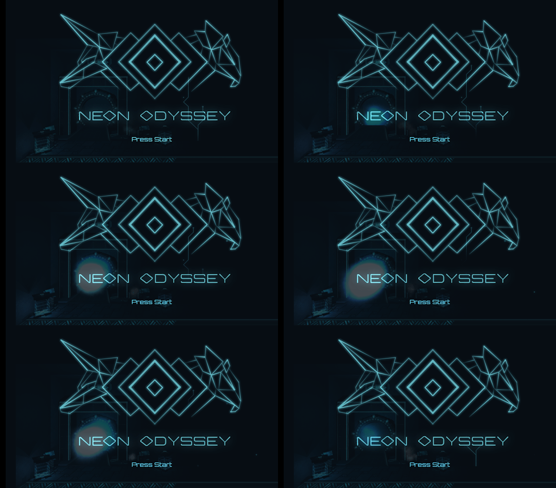
We have been focusing on screens, i.e start screen, Pause screen, splash screen. There is so much that goes into a good screen and to really nail UX in relation to that is another task altogether.
Above is what our start screen is currently, it isn't complete yet but once the player selects to start playing the camera will slowly pan towards the portal and move into it from their the camera will then start to retract from the portal as it players again towards the camera and the two players Anubis and Horus will jump out, landing on the level.
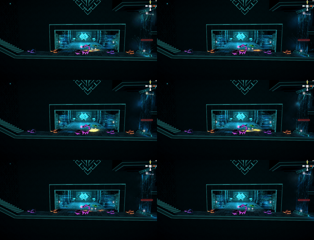
Set dressing is so important making the level or environment feel lived in, real or that is had history something that we are focusing on heavily, over the next week. Particles are always effective in creating an atmosphere or things feel real especially in a sci-fi setting.
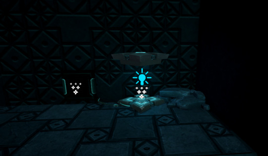
We have also started focusing on lights, refining textures, re-doing animations and effects within the game. Once we started to focus more seriously on lighting and post effects we really saw the potential of what our game could look like.

The level is still quite dark however there are much more lighting passes still to do and we are far off complete.
More soon!!! Not much longer now........
#pc gaming#game design#level design#gamedev#game development#video games#2d sidescroller#2d shooter#egyptian#madewithunity#unity3d
32 notes
·
View notes
Text
Papers, Please: a thorough test of scrutiny and morality.
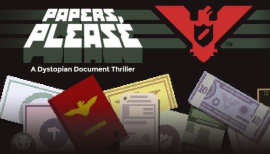
Papers, Please is a point and click management game where you assume the role of a border security officer and have the testing job of screening people and judging whether they will be suitable to enter the country.
As it stands it doesn't sound all that flashy or interesting however Papers, Please introduces systems at a steady pace that keeps the player busy but at the same time suspicious of everyone. The game's core system relies on the player looking through documents and comparing them to look for discrepancies. These discrepancies can then be acted on if you wish.
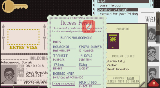
Initially, Paper, Please starts with a simple rule of only letting nationals through, this gives the players and easy understanding of the game's core mechanic but also immediately ties the player to the country. As the days tick over (game time) and the game progresses the player is given more and more reasons people can and are allowed to enter the country, this can range from entry tickets required to work visas and many more. These systems are all built up extremely slowly which is easy for the player to understand, however when combined together which equates to the player looking through, audio logs, passport, work permit, entry ticket and some others all at once the notion of being thorough does get interesting and complicated. This is the detailed part of the game, another great appeal of Papers, Please is the moral choices it proposes to the player.
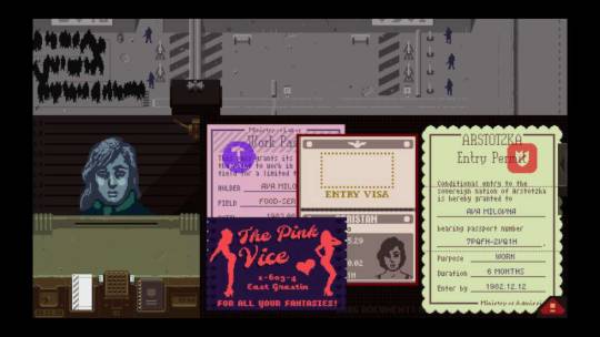
At the end of each day of work, your progress is tracked and analyzed, how effective you were at your job and all the ensuing costs that come with living a life and having people that depend on you. As this is your job and you must provide for your family certain moral choices can arise within the game to allow or not allow people to enter, you may receive certain benefits to allow someone to enter, or you may be able to help someone in a difficult situation. This adds a great level of depth to the game and makes the player think quite hard about the decision they are about to make and who they will affect.
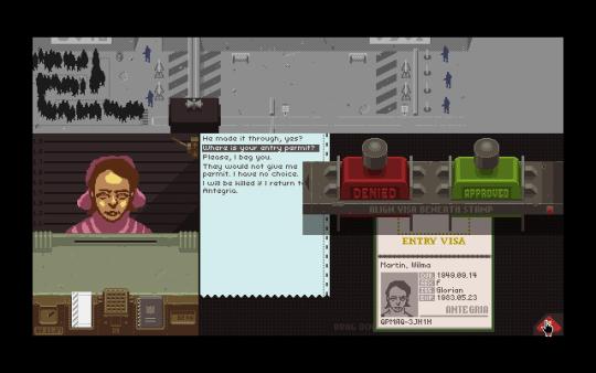
With such a strong moral system within a game that is focused on control and power, I found myself looking at every person as a criminal or person of interest, my level of paranoia and suspicion went through the roof. This was amazing I was making emotional decisions about a country that wasn't my own or that I had any connection to. The slow drip effect of power that is fed to the player is done so well that it engulfs you.
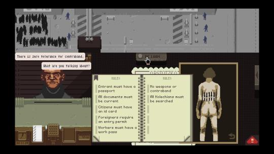
For a game that is purely about analyzing paperwork, I quickly became quite focused on seeing if people were being dodgy, even speaking to myself saying things like “ah, uhhhhh this does not match buddy” which was fairly interesting. I sadly focused more on catching people then I did my own family which made for an interesting result and one that was fitting for the theme and games aesthetic.
Papers, Please is a game that uses very strong game design to empower the player to make moral or immoral choices about people who may be depending on them. It gets people to look beyond what's in front of them and possibly explore their own morality.
14 notes
·
View notes
Text
More improvements to level design and player feel.
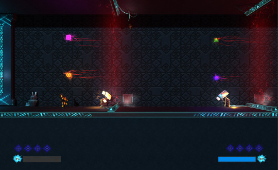
Over the past 5 weeks, I've been working on a project with a small team called Neon Odyssey. It's a 2d sidescroller based in an Egyptian themed cyberpunk world, you play as Horus and Anubis and your mission is to retrieve your immortal souls from the depths of the underworld.
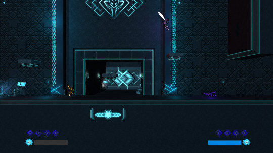
Creating depth within a 2D sidescroller helps to show the world we are trying to create, it helps to give life to the game as though this place is much larger and more significant than what is currently being shown.
This week’s focus is to finalize level design changes based on feedback following our second round of testing and create a bigger notion of player feel and game juice. Initially, we were going to create a few levels however it will better serve us based on time and some other constraints to build one larger more polished level. With that in mind today we did the first part of the lengthening our level so that we could incorporate all the aspect of the game we wanted to.
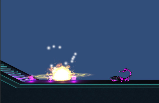
Creating the player death particle really sells the feeling that something important has been destroyed.
The main purpose of this was to give players more to do a majority of our feedback from players was saying that the level as it stood was too easy. Secondly was to bring more wall jumping and maneuverability to the level as through testing it was one of the parts most enjoyed by players. And thirdly was to add the final enemies we had originally planned to have in the second level, the scorpion, and the Sphinx.
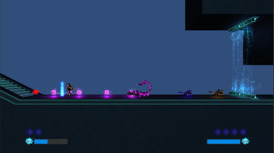
The scorpion is significantly bigger and more powerful than the standard beetle enemies.
After doing all of this and running a few playtests ourselves, the level feels more challenging and complete. Linked with adding continual player feel components such as more engaging art aspects, animation, and particles the game is really starting to feel whole. Two more days before feature lock then we need to focus heavily on performance optimization. It’s becoming a scary time.
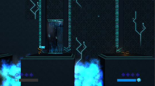
To sell the theme I've been exploring different ways to show and live up to an Egyptian underworld and what better way then gapping holes of blue searing fire.
Can't wait for more!!!
If anyone would like to play the game its currently here at https://lockylab.itch.io/neon-odyssey
**This is an Alpha build and a newer one will be posted every week, which will be in two days.**
#gamedev#level design#pc gaming#unity3d#pc games#game design#game development#video games#egypt#madewithunity#2d sidescroller#games
7 notes
·
View notes
Text
Hotline Miami: A retro exploration of violence and memory.

Hotline Miami is a top-down shooter that throws violence in your face and makes you fall in love with it, for its snappy fast gameplay, quirky 80’s retro setting and weird yet intriguing story.
The game has a steep learning curve due to its unforgiving gameplay however that slowly becomes the appeal as you try to link up combo kills of all the crazy goons that flooded the streets of Miami in the 80’s.
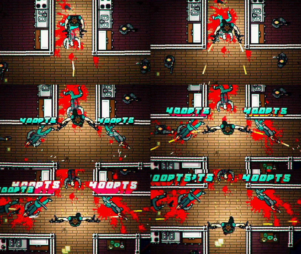
At its core Hotline Miami is a combat heavy, very, very fast-paced top-down shooter, each weapon that you can use to kill your enemies are one shot kill and that goes both ways, enemy thugs can just as easily take you down as you can dispose of them. This forces players to become a bit more tactical and clever with the way in which they dispatch their would be dispatchers. Running into a room of three guys holding shotguns might work in call of duty but here, with that, you're not going to get very far.
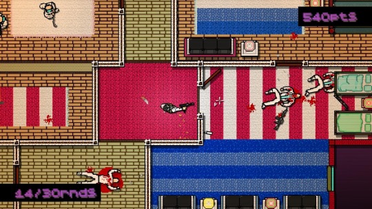
Timing is everything.
Because timing is everything it can make you feel so frustrated, as you approach the last enemy before a stage is completed you might attack too early and get countered quickly…...your dead, or forget to change weapon and realize you have run out of bullets…. And bang you're dead. It creates a very defeatist feeling in the player however this quickly becomes overshadowed by joy and excitement when that stage/chapter is completed. The notion of high risk/reward is ever prevalent in Hotline Miami.
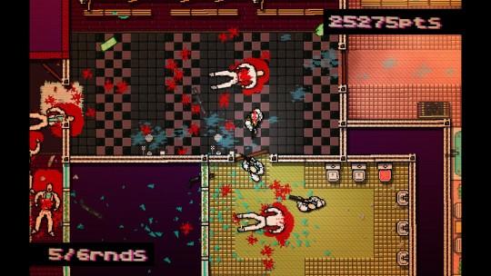
Being so fast paced it’s no surprise that the movement system is extremely tight and responsive. It has to be, otherwise, you wouldn't be able to string together 15 kills in a row in 20 seconds. With such responsive movement controls and relentless one hit kill combat the core of Hotline Miami sings so strongly by empowering the player to keep going through the game, as it quickly becomes so satisfying to shoot an enemy in the face with a shotgun or run around with a samurai sword spraying blood everywhere. Even after dying multiple times and being stuck on a chapter for a while I would still play again and again out of pure joy to watch guys splatter all over the level.
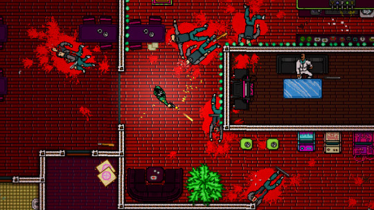
Hotline Miami is centered around a small story taking what you want from it, possibly seeing it as a dream/ fantasy or taking it quite literally as though you are an assassin or hitman taking out the competition. This narrative mechanic is shown to the player through simple uses of worded cutscenes and can become a little dry however the interesting nature of the stories’ content itself does leave you wanting to know what happens next and figure it all out for yourself, whilst filling the player with intrigue and curiosity.
Hotline Miami's extreme combat and tight movement system mixed with an interesting narrative and awesome aesthetic create a continual desire to play, kill and maim more while at the same time not feeling so bad about it.
59 notes
·
View notes
Text
Trailers, Animations and New particles
Finished off the player animation got them into the 2d sidescroller Egyptian/Cyberpunk themed game I am currently working on. Added some cool environment particles like sparks and sparkly lights. It's all coming together. Here’s a very quick trailer
youtube
For anyone who wants to play the game it is available on itch.io, https://lockylab.itch.io/neon-odyssey
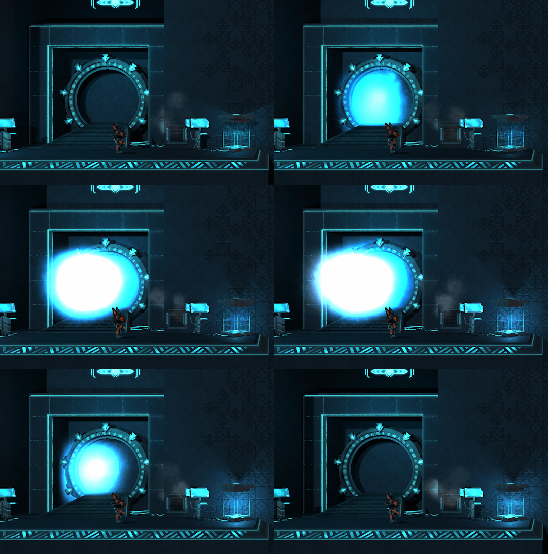
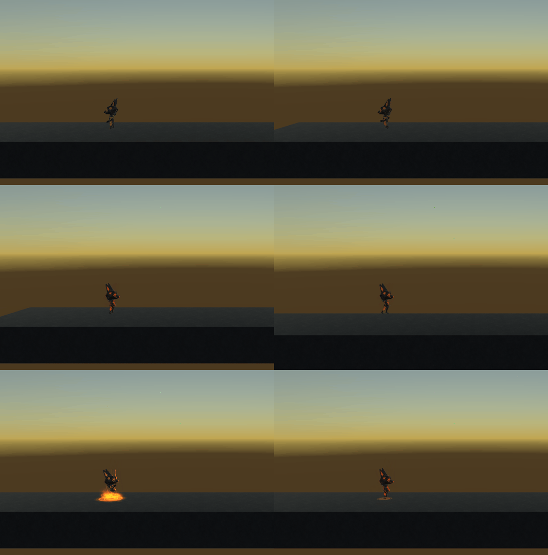
Stargate throwback is nearly complete, just need the water at the end. Got a nice little idle there as well as walking animation
11 notes
·
View notes
Text
Designing something NEW, 2D level design!!!
I am currently building a 2D sidescrolling game based in an ancient Egyptian cyberpunk world. This is something I haven't done before, not so much the sci-fi ancient cross over more the 2D sidescrolling part.
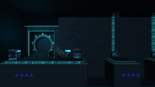
Creating a level that is fun but also teaches the player the mechanics does present itself with some issues that have been extremely fun to explore.
In an attempt to teach eh player the switching mechanics early and safely I decided to use a very simple puzzle-like challenge that they must overcome co-operatively.
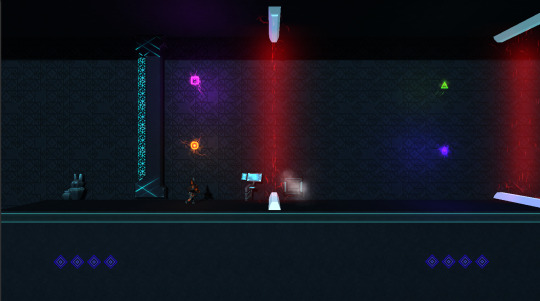
The players must shoot these colours in order to shut down the doors, and therefore progress further into the level.
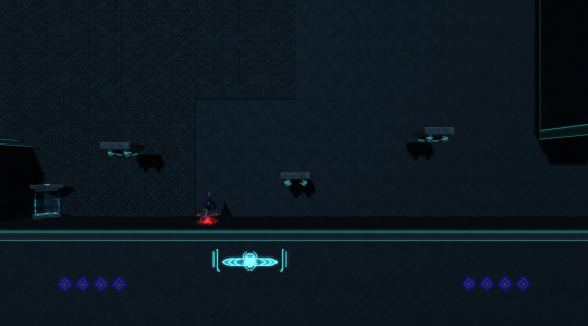
Being true to a platformer there must be platforms, right? however, the difference with our game is that it is primarily focused on combat rather than platforming and puzzles. With that in mind placement of platforms isn’t as critical, however, that doesn't mean they don't need some thought. They must be basic enough and easy enough to traverse without getting in the way, but at the same time not being useless.
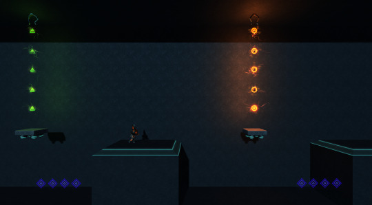
Here is a one example of one of the obstacles in the game, the trap system will create for the players, these traps will shoot constantly forcing the players to work together, one shielding while the other passes and so forth, again trying to show the shielding system in a safe and controlled manner, the player cant die from falling and to run into so many bullets would seem silly.
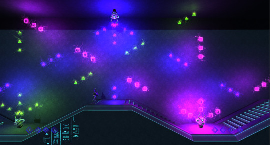
This does, however, get a little more chaotic as the level progresses but that is in a way to ramp up the challenge, well at least give the impression of doing that. This is still extremely basic and the players must use previous skills of co-operation and patience to get through.
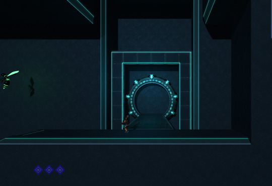
Every level needs an end and what better way to end a futuristic/cyberpunk Egyptian game than a homage to Stargate. These portals will serve as the entrance and exit to each level. (Gotta love stargate!!!)
Over the past couple of days, I have also finalized an introduction level. This level is designed to safely show the player all the mechanics in the game at intervals that don't seem to fast and are easy to understand really taking into account readability.
I went through multiple sketches and Ideas with this level and I feel it’s a good basic beginning to the game.
Level Design has been an interesting task with this game I haven't had much experience designing a 2D game or side-scrollers for that matter. Reference has been strong fall back here looking at games like Super Mario, Megaman, Metal Slug, and Outland. Testing starts on Monday for the level and a few other aspects of the game which will be good to get some kind of feedback. It is difficult because I want to dress the level and add all the props and decals that our artists have been working on so hard on, but it must wait for no point doing all that if the level does not feel fun.
More to come soon!!!!
Much more!!!!
45 notes
·
View notes
Text
Particle heaven, Level building and project momentum.
After the intense week that was MIGW and being very inspired to make amazing games, I got right back into the driving seat of Neon Odyssey. Here is the opening part of the first level of Neon Odyssey
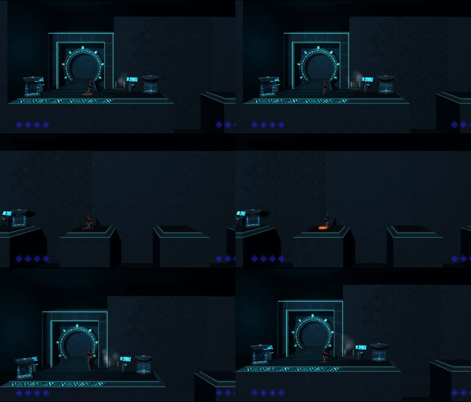
There is a lot of props still not in the scene as we are still in alpha but it's coming together quite nicely.
Today I spent a decent amount of time on some particle systems that accurately reflect the cyberpunk sci-fi setting of our game. Making particles has always been something that I have enjoyed greatly. They carry so much power within them you can make anything pop and feel and a certain way with some good particle systems.
I implemented a jump particle both when you land and jump, a health pick up particle that also surrounds the player on pick-up (One of my favorites), a damage marker and also some prop ones like the healing tank in the background of the above gif.
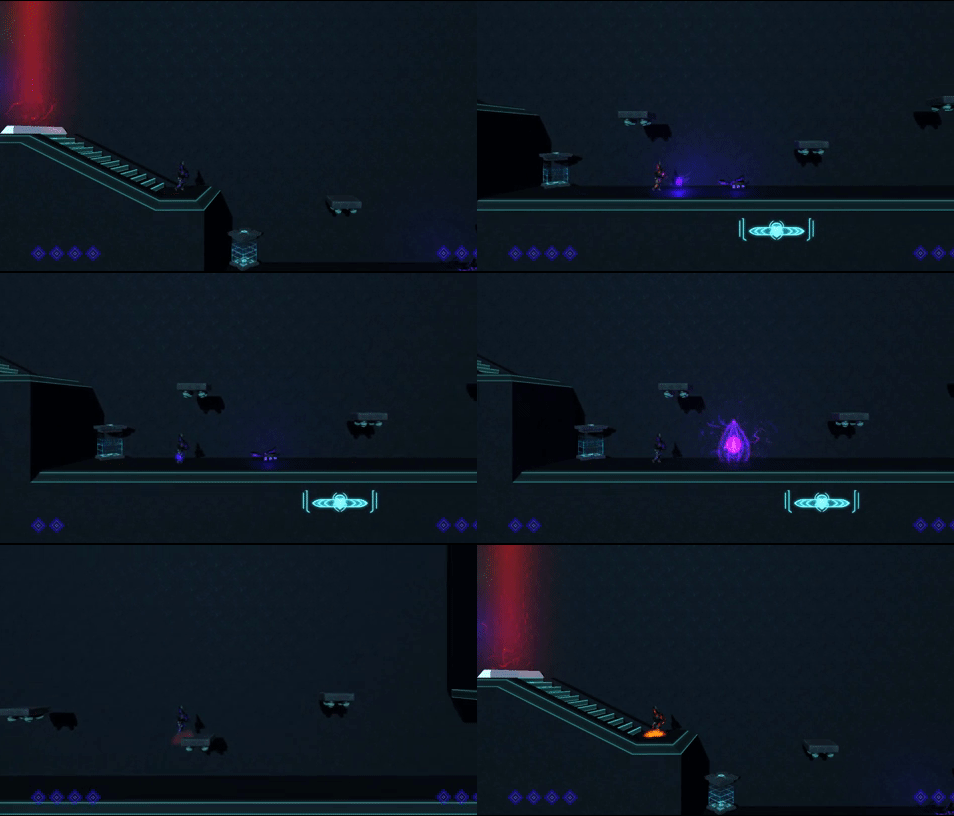
We also got some of the animations for both the players and enemies in today, one of them is the player walking animation which is far from finished but serves as a good base block out animation to work from. The one that is more finished is the wasp enemy movement/idle animation it looks great moving.
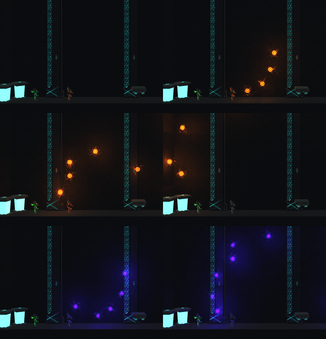
There still requires a shooting animation which will be implemented over the next few days. Here is an example of some of the traps that will be used in Neon Odyssey they create a simple puzzle like system for the players to overcome, normally there will be two players and one can shield the other from the colour they aren't, it enables some enjoyable co-op gameplay.
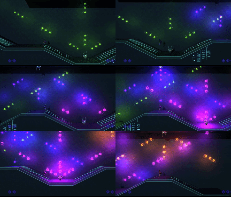
It's so hard to show......so many lights.
The project has had a bit of a rocky middle what with games week smack bang in the middle of it, but we are a strong team and we will recover stronger than ever.
24 notes
·
View notes
Text
Game loop locked in, testing ahead
Today we did the final touches on our alpha to lock in the parts to create a complete game loop. There is a beginning and an end to the level with all of our core mechanics in place. The players can switch colors, kill enemies and traverse the level.
We have even got some art in place, which is great considering we are only at our alpha milestone.
However, Beta is only around the corner, but we have already started prepping for that and having added some cool things already such as enemy death particles.
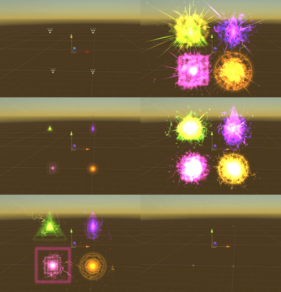
These are the four shapes associated with the four colors we have chosen, even when the enemies die they if they are one of these colors they will also explode in the corresponding shape.
So far it is fun to play, the teamwork that is required to complete challenges and survive the game is thoroughly enjoyed by all, which is directly reflected from some of our initial testing Data. Considering that this was a core goal of the game it feels good to have something even at its most basic stage on track to be a rewarding and enjoyable game.
This week I will be spending some time going through and creating some proper gameplay footage, so much more to come. Yay!!!!
#gamedev#madewithunity#pc gam#unity3d#pc gaming#particles#2d sidescroller#egyptian#game design#video games
13 notes
·
View notes
Text
Player readability and combat
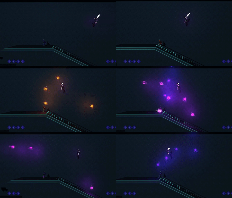
The progress for Neon Odyssey is going steady and quite constant. Having said that making sure everything is clear to the player is the most important goal here. We have added a death particle for an enemy as well as player bullets to see how the vibrant neon lights will fair in a darker environment.
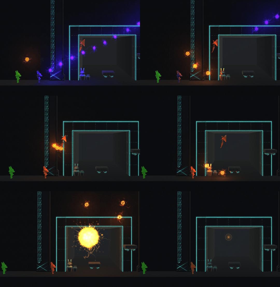
The death particle looks great and is very satisfying to watch and feel. Once sounds are in the shooting should feel quite powerful, if it doesn't already.
Here we are also testing the shapes of the player bullets and whether or not they are legible, the circle works great and is clearly a circle so is the square. The purple year drop, however, is a bit difficult and looks a touch too similar to the circle.
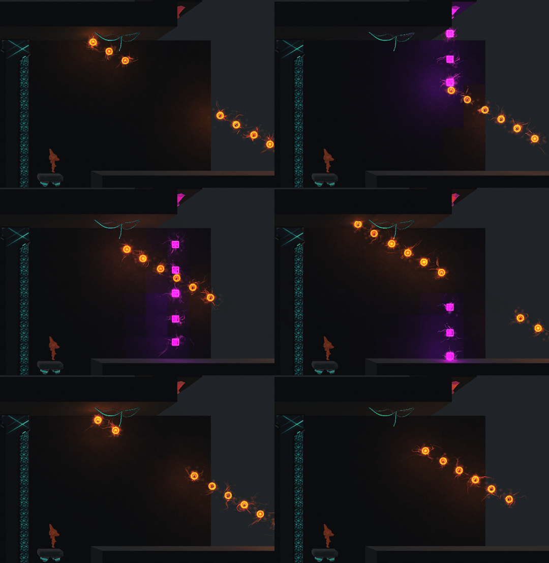
To answer a few of these questions we will be undertaking some user testing, starting this week. The purpose of these tests will be to see if the combat system is fun and if players understand what to do in the game at these early stages.
If players know:
- To switch colors to not get hurt
- To match their colors to destroy enemies
- Can traverse the level easily
Then our first goal has been partially achieved and then we can further build on the systems we already have in place. I am looking forward to testing, it will be our first perspective of the game outside of the little bubble that all of us making it are in.
16 notes
·
View notes
Text
Particle fun and colourful game.
Made one of my particles smaller and got the player to fire it. It creates a small amount of insight into what the game is going to look like with colors and lights galore.
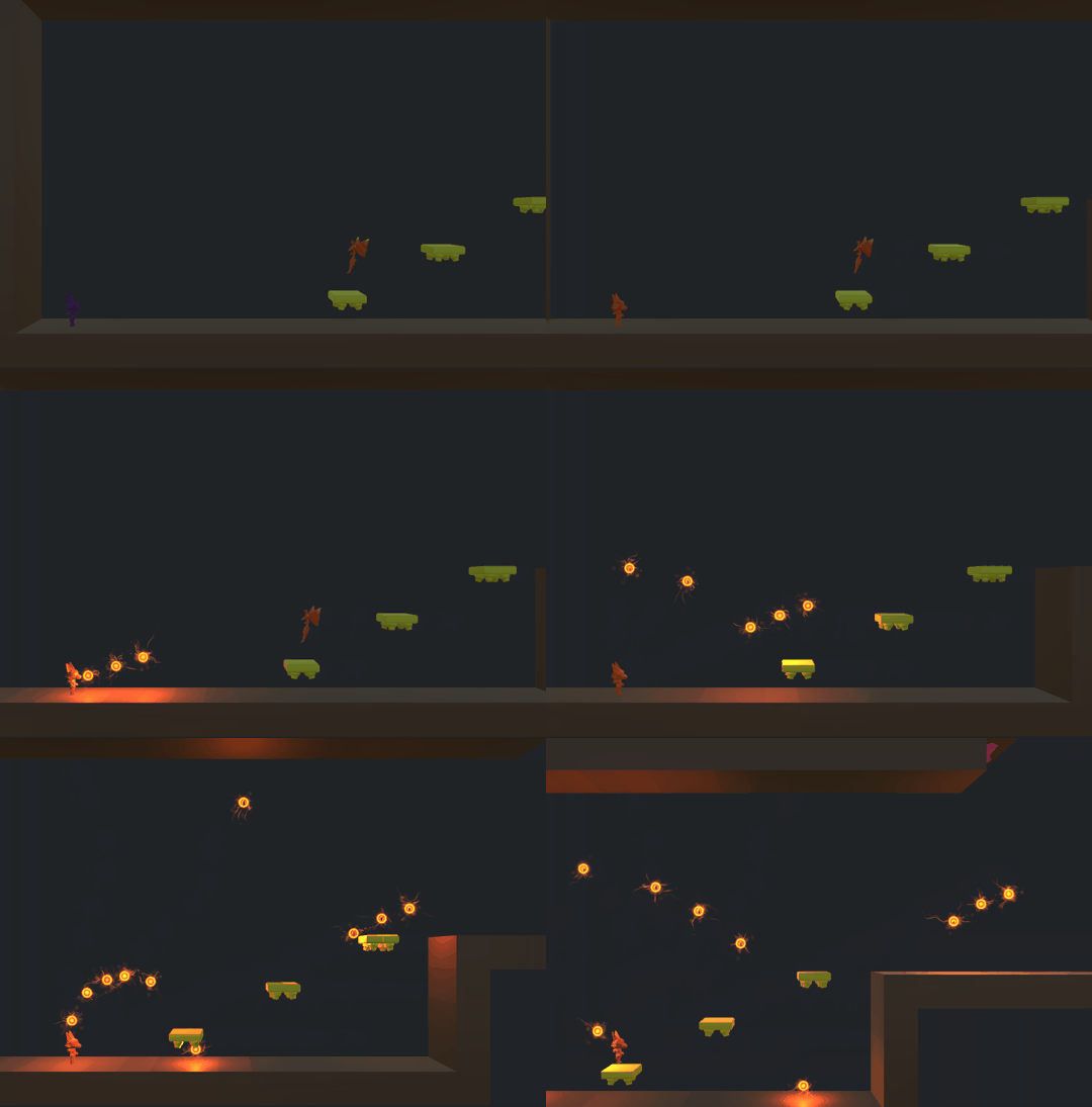
Tonight I also worked on a death particle and made it into two sections an implosion and explosion particle. The explosion is intense I can't wait to implement it into enemies dying.
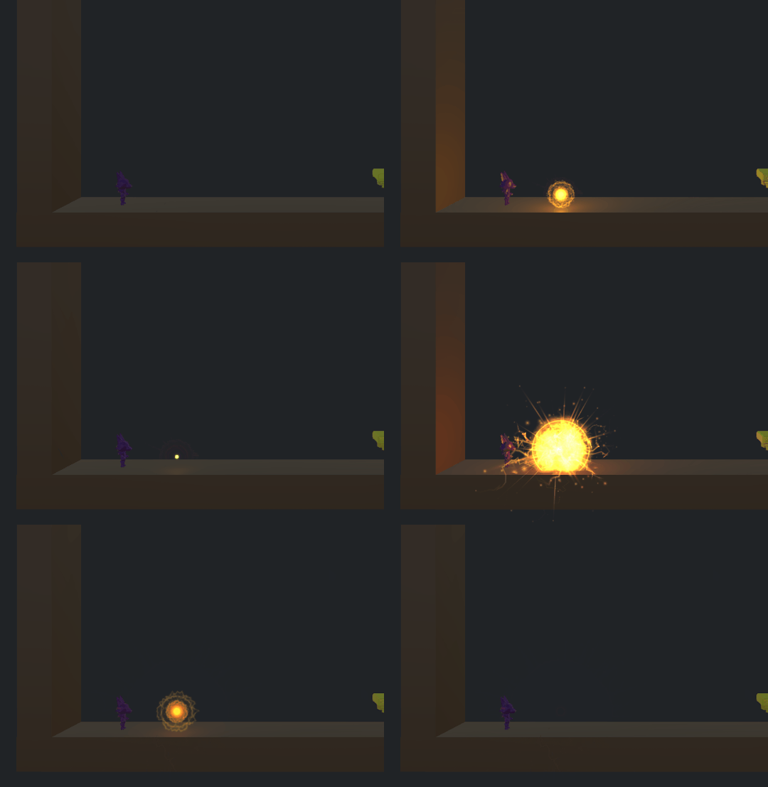
Every time an enemy is hit by the player shooting this will happen, it may be too much and I may have to dial it back a bit but we will have to see it testing.
12 notes
·
View notes
Text
Sell Sheets and Core mechanics
Pre-production so close to being complete one more presentation to go, and then its just dev time. I can't wait I am so excited. Below are the front and back of the sell sheet done by our artist Jessica Murphy. Along with some details on the game's systemss.
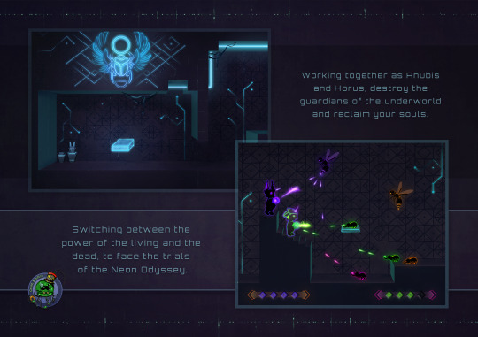
We have also got all of our core mechanics in place. Nearly, you can switch move around quickly, shoot and its going to get pretty crazy I think, quite quickly too.
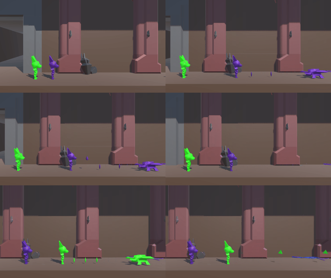
Basic Use of the player with two colors, your friend helping whilst being a shield wooo go teamwork.
Switching colors and fighting four enemies becomes a bit of a greater challenge and requires a bit more teamwork.
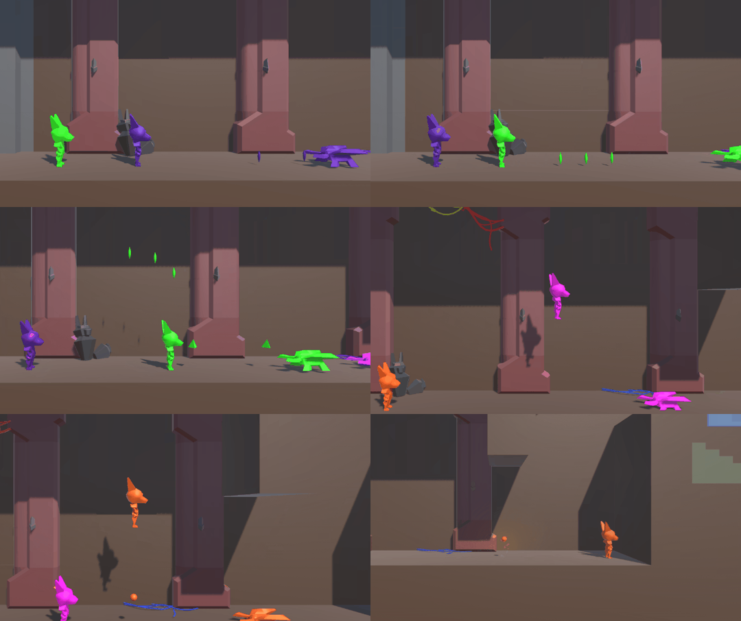
Traps become a danger for all in Neon Odyssey they sometimes create a wall of bullets you must navigate through. But also fun to learn

This game is slowly coming together we are doing really well as a team and am really keen to get my teeth into the level design over the next week and start building some levels. wooo Game Dev.
#gamedev#madewithunity#cyberpunk#pc gaming#2d sidescroller#unity3d#indiedev#pc games#neon odyssey#game design#game development#video games
63 notes
·
View notes