
lizathexplorer
19 posts
Marketing student & wannabe blogger!
Don't wanna be here? Send us removal request.
Statistics
We looked inside some of the posts by lizathexplorer and here's what we found interesting.
Average Info
Notes Per Post
2
Likes Per Post
1
Reblog Per Post
1
Reply Per Post
0
Time Between Posts
26 days
Number of Posts By Type
Video
5
Text
11
Photo
1
Last Seen Tumblr Blogs


Fun Fact
Tumblr.com is the 103rd most visited website in the world.
Video
youtube
The Store of the Future!
Wondered what the future holds for retail stores?
Press play to take a look into the future. Where brick and mortal meets digital technology to create an unique and customized experience. This stores will Allow customers to dynamically engage with the products and have a hassle free check out experience. You will see a bit of everything in this video from face detection to augmented technology.
Enjoy!
0 notes
Text
How to build a killer loyalty program!
Creating the right loyalty program that makes both your customer’s happy and don’t break your Bank is not an easy piece of cake. Here are a few tips to help you break through the clutter and benefit from your loyalty program.
Integrate loyalty into the full experience by integrating payments and mobile technology with the shopping experience to make the transaction more enjoyable. For example adding functionality to your website or app to facilitate the check out or notify clients about promotions.
Use a SIMPLE Points System. This is the most traditional and most popular method. Where frequent customers earn points, which translate into some type of reward. But the key is to keep the reward program simple to avoid headaches. Many companies falter in this method by creating complex point rewards structure by making the relationship between points and tangible rewards complex and confusing. If you opt for a points-based loyalty program, keep the conversions simple and intuitive. Although a points system is perhaps the most common form of loyalty programs, it isn't applicable to all business types -- this type of loyalty program is most appropriate for businesses that encourage frequent, short-term purchases.
Use the data: to target the highest value consumers and build products and promotion customized to your client’s needs. Ex: new moms can get 5% discounts on formulas.
Use a Tier System to Reward Initial Loyalty and Encourage More Purchases. Finding a balance between attainable and desirable rewards is a challenge for most companies designing loyalty programs. One way to combat this is to implement a tiered system. Offer small rewards as a base offering for being a part of the program, and encourage repeat customers by increasing the value of the rewards as the customer moves up the loyalty ladder. This helps solve the problem of members forgetting about their points and never redeeming them because the time between purchase and gratification is too long. Ex: AMEX gold card offers more benefits than the silver card members. The key is to offer benefits in the early stages to hook the customer into coming back. Once they do, they’ll realize that "gold" status isn’t unattainable, and offers really cool benefits. The difference between points and tiered systems is that customers extract short-term versus long-term value from the loyalty program. You may find tiered programs work better for high commitment, higher price-point businesses like airlines, hospitality businesses, or insurance companies.
Build partnerships to provide exclusive offers: Strategic partnerships for customer loyalty, also known as coalition programs, can be extremely effective for customer retention and company growth. Fully understanding your customers every-day lives and their purchase process will help determine which company is a good fit as a partner. For example, if you’re a hair salon you can partner with a hair care product line to offer co-branded deals for mutual benefits for your company and your customer. Any services that hair care will require offer added value for your company. Providing customers with value beyond even what your company can offer will show that you understand them, and grow your network to reach your partners’ customers, as well.

Solve customer and industry pain points: Amazon’s largest success in loyalty is built around solving one of online shoppers’ primary pain points: delivery. For $79 a year, members of the online retailer’s “Prime” program get free two-day shipping, plus free digital content. Prime not only integrates tightly with Amazon’s customer and convenience-focused brand, it also creates a loyalty program for suppliers, who rely on Fulfillment By Amazon for access to Prime customers. While Prime’s stand-alone profitability is a closely guarded secret, it is estimated that members spend over four times more with Amazon than non-members.
Charge an Upfront Fee. Loyalty programs are meant to break down barriers between customers and your business. In some circumstances, a one-time (or annual) fee that lets customers bypass common purchase blockers is actually quite beneficial for business and customer alike. By identifying the factors that may cause customers to leave, you can customize a fee-based loyalty program to address those specific barriers.
e-Commerce shopping cart abandonment rate tend to be high because of the "sticker shock" after tax and shipping prices have been applied. Amazon found a way to combat this issue in their loyalty program called Prime. For $79 annually, Prime users get free 2-day shipping on millions of products with no minimum purchase, among other benefits. This program is innovative because it charges loyal customers while providing enough in return for those frequent shoppers to realize the benefits. This system is most applicable to businesses that thrive on frequent, repeat purchases. For an upfront fee, your customers are relieved of inconveniences that could impede future purchases.

Structure Non-Monetary Programs Around Your Customer's Values- Really understanding your customer means understanding their values and sense of worth. And depending on your industry, your customers may find more value in non-monetary or discounted rewards. Every company can offer promotional coupons and discount codes, but businesses that can provide value to the customer in ways other than dollars and cents have an opportunity to really connect with their audience. Patagonia, an eco-friendly outdoor apparel company, realized that their customer needed more than just points and discounts from a loyalty program. Late last year, the company implemented its Common Threads Initiative. In it, they partnered with eBay to help customers to resell their highly durable Patagonia clothing online through the company website. This program builds on their brand of sustainability and creating a high-quality product, and it matches perfectly with the company’s customer persona by providing a value that they really care about. So before implementing a loyalty program of this nature, be sure you’ve researched and designed an in-depth customer persona!
Use Gamification. Turning your loyalty program into a game is fun ways to encourage repeat customers and depending on the type of game you choose, help solidify your brand's image. Ex: McDonald’s Monopoly. This type of loyalty program has potential to backfire if customers feel like your company’s jerking them around to win business. Executed properly, however, this type of program could work for almost any type of company, even an off-the-beaten-path B2B Company. If your audience enjoys having a little fun and purchases frequently, this type of program can make the buying process fun and engaging.
Scratch the 'Program' Completely- one innovative idea is to nix the idea all together. Build loyalty by providing first-time users awesome benefits, hooking them, and offering those benefits with every purchase. The concept sounds simple, but one of the most innovative companies on the planet implements this strategy: Apple. Even the most loyal Apple customers don’t get special rewards or discounts ... because they don’t offer them to anybody. Apple "enchants" customers by delighting them with a product or service the first time. The loyalty is voluntary and long lasting. For them, loyalty happens organically. This minimalist approach works best for companies whose products or services are unlike any other because they are pioneers or because there are very few other options and the value of your product is communicated to your customer as a reward. This works well for original/ unique products and luxury brands.
One last tip- what ever method you decide to adopt make sure to frequently evaluate and re-evaluate to ensure you meet your business goals and satisfy your customer’s needs.
0 notes
Text
4 e-commerce trends to watch out!
1- More Video: According to Cisco, by 2017, video will account for 69 percent of all consumer internet traffic. As shoppers grow more responsive to visual presentation and seek responsive layouts, video will become a front-and-center asset to convey product details.

2- Regulations: The internet is highly deregulated and legislation are looking for ways to catch up and capitalize on it. For example: The Marketplace Fairness Act (MFA), also known as the “Internet Sales Tax” recently passed the internet senate and is waiting to pass to the house.If the bill becomes a law consumers purchasing on e-commerse site with no brick or mortar will have to pay an internet sales tax.

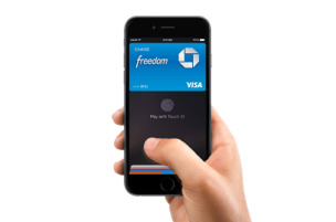
3- New Methods of Payment: Apple Pay is still strictly an in-store payment solution. If Apple Pay were to enter the e-commerce space at scale, it would be a true game changer. For e-commerce merchants, this means facilitating easier payments, reducing costs like credit card processing fees.
4- ROI of social media and content sites: Social media sites are looking for ways to facilitate the shopping experience. ex: Twitter added the buy button and Instagram is adding links. More e-commerce sites will couple content and commerce to create rich lifestyle-oriented destinations that keep shoppers engaged and coming back.

1 note
·
View note
Video
youtube
5 reasons Google Hates your E-commerce site…watch and learn!
Today i was browsing youtube in search of tips and tools on how to build a great e-commerce site and I came across this interesting you tube page called Volusion. They do a pretty cool job posting 2 min long educational videos for a wide range of topics that help you build a better e-commerce site.
Just by watching this Video you get to learn some basic SEO or how they say “make google hate you less”.
Here is the list of the 5 reasons mentioned on the video:
#1 Broken links.
#2 Anchor text (text links) without keywords
#3 manufacturer description: Create an unique productdescription
#4 Use bad alt text- text you answer behand an picture so googlecan’t read images
#5 Keyword cannibalization- optimizing for the same keyword on several of pages.
for more info https://www.youtube.com/channel/UC0RtcDOPgoFo9cwzWEtiG_Q
0 notes
Text
A stink free“guarantee”website!
When it comes to creating a unique user experience http://www.poopourri.com nailed it. Poopourri is more than just a deodorizing toilet spray. It recreated a whole new experience on a not so good topic. Not only they were able to come up with a solution to our bathroom problem but also break through as an e-commerce site.
How?
By Creating a very funny viral video” girls don’t poop” to drive traffic to the site and using a simple and very goal oriented website.
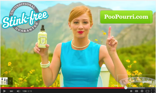
After watching this pretty funny commercial myself I ended up clicking on the link of the YouTube commercial to find out more about the Brand.
Once on the homepage it was pretty easy to find my next step. Poopourri.com only has two different category tabs on the top asking you to either shop or follow. The middle left side helps you gain users trust by highlighting the views of the video and giving the option to read user reviews. On the right middle side it encourages you to start ordering and sign up for the newsletter with the oversized blue button.
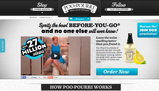
Finally at the bottom of the page it gives you the option to scroll down and obtain more information/ education on how the product works. Overall their home page did a pretty good job laying down all the options the website has to offer.
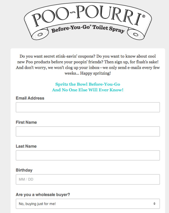
I decided to go with the 2 big buttons on the home page, the News letter and order now. When clicking on the news letter your browser didn’t take you away from the original page it simply opened a new tab for you to fill out the information. Leaving the main page available and easy for you to go back.
Once I filled out the information I was able to simple click on my homepage tab and go to my Order now button. Which brought me down to a product-listing page for new clients and giving me an incentive to buy the product by offering a free samples. The packages went from $9.95 to $44.95.
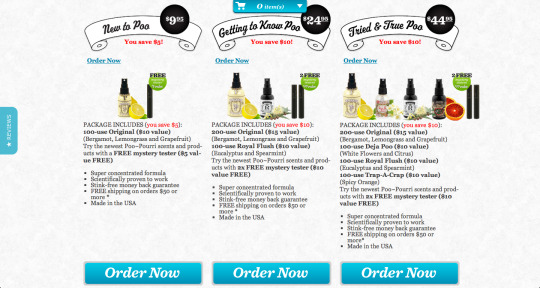
Since I was just buying for myself I opted in to go for the $9.95 bottle and clicked on the order now button after quickly comparing each packages and reading the details.
It immediately gave me a graphic lay out of the next steps to follow.
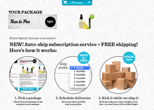
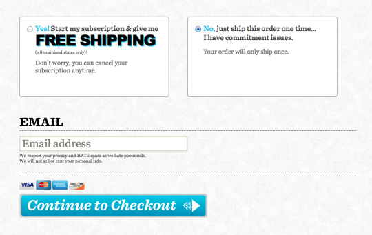
After selecting my delivery options I immediately proceeded to the check out process.
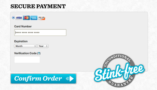
And went to entering my personal information, mailing/ billing address, method of payment (generic check out e-bureaucracy).
After clicking on the confirm order it sent me to the confirmation page that my order was placed (for certain reason I was expecting to see a review order page prior to purchasing the product). Nevertheless it gave me the option to adjust my mailing address if it was inaccurate.
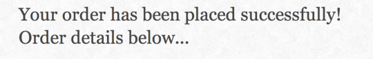
Poopourri doesn’t give you a chance to repent!
For certain reason I didn’t see a Thank you page for placing my order or sign up or like or share on social media page to learn more about additional products. Instead I was sent to the search for your “subscription” page.
I did get an order status email with a thank you note but I didn’t check it out after the next day. Bummer!
Overall the check out process was quick. Poopourri does a great job moving potential customers down the funnel. It’s pretty clear that the goal is to have you click on the order now button, the blue button is in almost every page. The Shopping card is right on the middle on the page (basically on your face) so there is no way for you to forget about it. Despite its effective strategy to convert I do have a few recommendations for the website. Poopourii could:
Allow viewing more of the other products when clicking on the initial order now on the homepage versus sending us over to purchase a package. Maybe adding a see more products or see full collection button will allow to give more options to the buyers and potentially buy more. When going through the check out process they were no intend to upsell and offer additional products or scents I may have also been interested in trying. Faster check out, for example Allow you to use your amazon account information to check out so the information does need to be entered again. (I think this is a general struggle most e-commerce site have.)- Its always a turn off to have to enter so much information to check out. Have a Thank you Page immediately after checking out with the opportunity to help users to immediately link with the social media sites or sign up for the newsletter or maybe look for future purchase ideas (ex: buy a gift for a friend, pet, significant other). Maybe coming up with a cute Video for post purchasers to bring them to a social page and make it easy to click follow or share Overall Poopourri does a great job acquiring new customers but probably faces a challenge on driving repeat users or increasing the AOV. I personally don’t recall being asked to sign in so I will probably have to input my information all over again or being expose to other products more than once prior to the check. This is where the stink free story stinks!
0 notes
Video
youtube
Viral Marketing done right!….what color is the dress? easy! ask the Salvation Army
This controversial picture of the dress sparked a huge debate all over social media last week after it was posted by its owner. The reason? People couldn’t seem to agree on the colors of the dress. Most people saw the dress white&gold others black & blue.
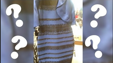
The Salvation army took advantage of the buzz to launch a viral campaign to fight domestic violence with a title of why is it so hard to see black and blue?
To be honest i don't think anyone saw this one coming. It was right on point with today's international woman day. This strategy was a great way to evolve a social media trend into a social cause.
The Salvation Army is definitely making a strike with such a great digital propaganda!

0 notes
Text
A swimsuit is more fun than a snowsuit!
3 more weeks until Winter 2015 is over!
My hibernating brainkeeps marveling for summer vacations, beach days and less layers of clothing.To help feed my impatience I have been surfing the web in search of stuffs to bringsummer sooner.
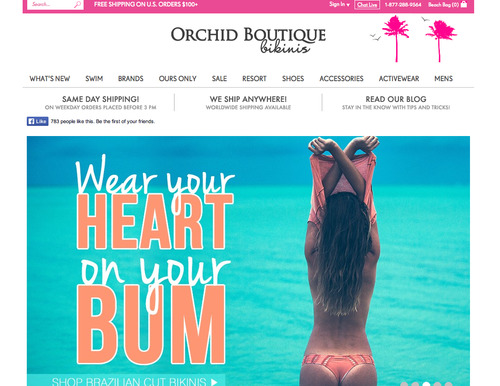
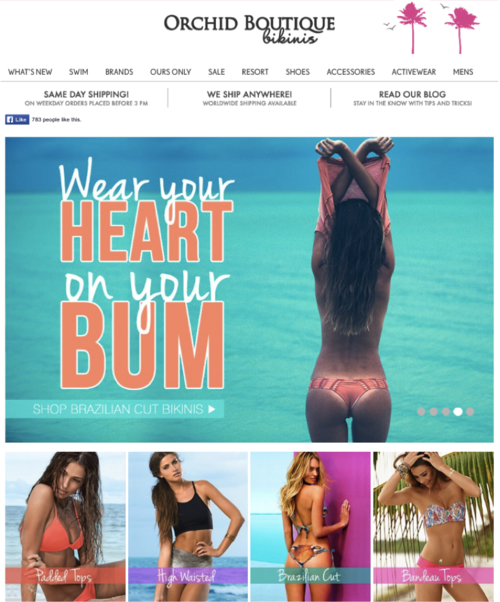
I resulted to E-Shopping as therapy and it works! My favorite website to helps take my mind away of these gray days is The orchid boutique. The website is so colorful and cheerful. It takes you back to the beach in just a few clicks.
The orchid boutique does an amazing job creating a jaunty experience for users looking to buy Bikinis and other beach wears online.
The mobile site is an exact copy of the website.
Website:
Mobile site:
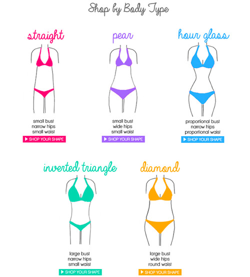
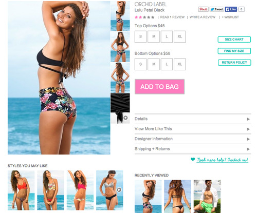
Buying cloth online can be challenging due to the inability to feel the fabric and try the item on. The Orchid boutique does a good Job overcoming this challenging by giving different options to users to find the perfect bathing suit.
One of my favorite options is to shop by body type. Based on your body type it will recommend bikinis that will best fit and flatter your figure.
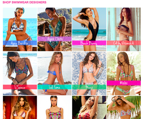
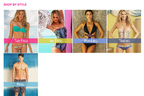
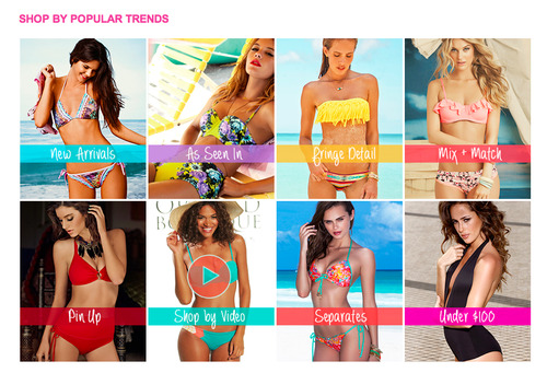
You can also shop by designer, style, and trends:
Or even customize it to your own criteria by using the side filters.
Despite of its great ability to help you find the best suit The orchid boutique has several areas they could make the site even more user friendly and facilitate in the check out process. Here are a few suggestions:
1. The website has no information on the Company. No option to learn more about them. I am sure they have an amazing story to tell this can help connect its user and build heritage to the site.
2. The website can take a long time to load each page. Maybe looking for a website that doesn’t require a page to load every time we click on it can facilitate the speed.
3. Adding a Favorite bottom or add to wish list button on the product photo can save the users some time by not having to search for products they like again and facilitate the process of building a shopping card or even customize suggestions to offers users based on their likes.
4. Adding new viewing features for pictures like a quick view button so we can go to seamlessly from the product page to the product-listing page. Also adding more pictures or 360 views of the product.
5. Add reviews stars on the product-listing page. Currently some pages have reviews others don’t. They also need to better manage reviews – currently anyone can post a review on the page and this can lead to misusage.
6. The side can make comparing bathing suits easier. If you are going to make an investment and pay over $100 on a bathing suit you want to make sure you pick the best one for you. Having the ability to pick several styles and compare them side by side- can make the decision process easier.
7. In addition when adding product to bag it doesn’t ask you to check out or if you want to continue shopping. The product automatically disappears in the shopping cart. Which is barely visible on the top right corner of the page. Someone with bad vision may struggle finding the way out to purchase the product.
8. At the Check out point It requires you to create an account. Creating an account can be daunting and time consuming. My recommendation will be to also give the option to check out as a guest. Not everyone needs to create an account to just buy a bikini.
9. Having an outline of the steps of the check out process will help us know what’s going and what is coming next. Helps the impatient customers like me get some sense of direction and fulfillment.
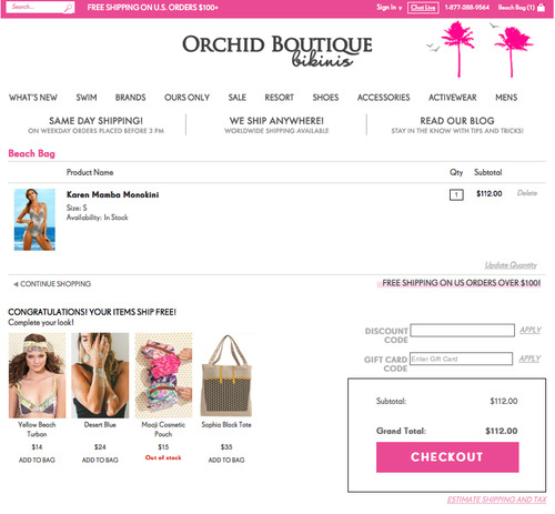
Buying a bathing suit is not only a seasonal thing. The desire to enjoy the warm weather, sun and sand is a yearlong aspiration to some people. The orchid boutique gives great ideas of what to look for in a bathing suits but has several obstacles they need to overcome to facilitate customer in their selection, decision and purchase process!
0 notes
Text
Fun Facts about E-Commerce sites!

Nothing better than scrolling the web on a Sunday night for fun facts while watching TV on your Sofa. This is a small example of how the Web has inovated the way we do things. The internet is a giant fun play ground for companies and users to connect at any time and place. As many e-commerce sites are joining the game big players are settling and building History in this new digital era.
Here is a look at 7 fun facts you probably didn't know about some of it players!
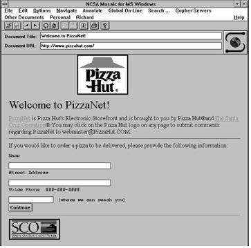
1-Pizza Hut was one of the first major brands to experiment with online commerce, starting in 1994.
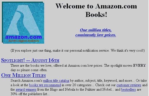
2- When Amazon launched its website in 1994 it used to sell only books- Who knew that a decade later it will become the largest Internet-based retailer to sale A to Z items in the United States.
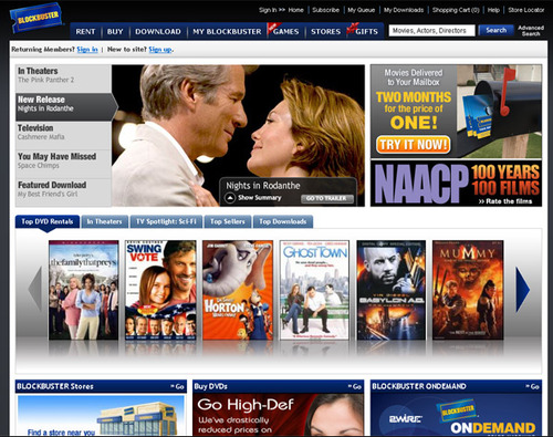
3- Netflix wasn't the first online DVD subscription service — Blockbuster announced Blockbuster.com in 2004.
4- An earlier version of YouTube was a dating site called "Tune In Hook Up," influenced by the site "Hot or Not," which let users rate the attractiveness of potential partners. But the idea of a video version of Hot or Not failed to catch on after a couple of months.- We all have to start somewhere!
5-Al Pacino's Face Was on the Original Facebook Homepage. No one seems to know why. -The face was quickly removed just like the "the" on the title.
6-The bird in the twitter logo is called Larry. His official name is Larry Bird. The iconic bird and face of twitter everywhere was named after Boston Celtics hero Larry Bird.

7. The Google Logo Was Not Centered Until 2001. - I bet you thought it was always there.
In addition the word google was added as a verb in 2006 to the Merriam-Webster and Oxford English Dictionary.
This is no Joke! Google it if you don't believe me!
0 notes
Text
SWOT Analysis of Red Mango
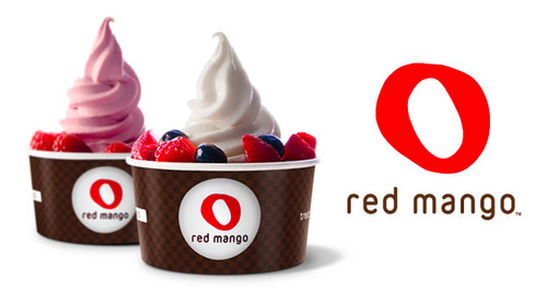
Let's look into the strengths, weaknesses, opportunities and threats of the frozen yogurt giant!
Strengths:
Strong management- Daniel J Kim its CEO, is young and driven- He won many awards, he was recognized as one of the "Outstanding 50 Asian Americans in Business for 2010" and was named “40 Under Forty” list of top business leaders.
Red Mango provides great quality products & customer service: it was ranked #1 Zagat brand of Frozen Yogurt and smoothies.
They do a really good job engaging with their Customers via social media They have their own Red mango’s app andLoyalty’s card “Club Mango” and are constantly hosting promotions and contests. ex: in Instagram they invite invite their customers to share picture of their favorite red mango yogurt.
Red mango can be a Healthier option for snacking: Yogurts are low fat and made with all natural/fresh ingredients.
Price is Affordable- you pay by weight, in av. $0.45/oz.

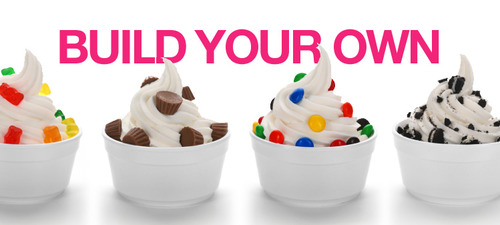
Weaknesses:
The frozen yogurt industry is very attractive and competitive.
Red mango has a limited product line and offers. Also only cold refreshments (ex: no hot chocolate, tea or coffee) making it less lucrative during cold seasons.
Most stores are franchises; as a result its business model is very standardized and doesn’t adapt or respond effectively with local demand. Business units have very little control over corporate decisions.

Opportunities:
Red Mango can Increase advertising to gain more brand exposure.
Diversify its product line and its distribution (Ex: can create grab and go frozen yogurts/ smoothies to be carried in supermarkets).
Improve mobility such as having a Red Mango truck to go around and sell in major cities.
GO global! Red mango only operates in the US.
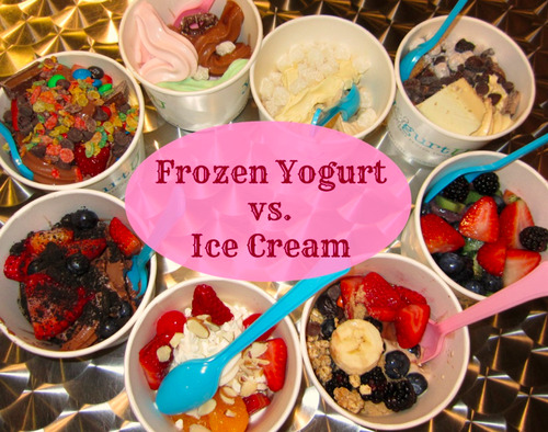
Treats:
High competition. Red mango has two direct competitors 16 handles and Pinkberry, which use similar business model.
Frozen yogurt can be substituted by low fat ice-cream. Which can sometimes be more tasty and readily available.
Governmental Regulation on sweets and sugary refreshments.
0 notes
Text
Are responsive websites good for everyone?
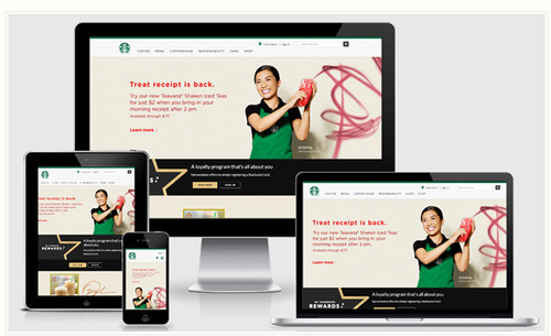
Surely, a responsive website has many perks, like:
Having to handle a single website and URL.
Easier SEO because there is no need for different content.
Easier marketing- It consolidates your analytics and promotions.
Save time and cost on mobile development.
However having just one website for all devices may be easy for you, but not always for your users. Responsive website may take longer to load and users may not be able to enjoy the full functionalities of the site on their mobile. This can overthrow the convenience of not having to download and install an app.
Knowing this fact- can any other platform do a better job with user experience?
To help answer this question let's take a look at the pros and cons of Mobile websites and Native Apps. Both alternatives to responsive web designs.
Mobile Websites:
A mobile website is designed specifically for mobile devices. Here is the list of Pros & Cons:
Pros:
You have a website that is specifically optimized for mobile devices.
Speed. Your website will load fast and easily on mobile platforms.
Moderate Cost. Building a mobile website is not a cheap option as compared to responsive web design, but still you can get a very reasonable price for the value.
Immediately accessible. Users don't have to pass through downloads and installation processes of an app.
Cons:
Multiple URLs. You will need remember at least two URLs, or otherwise be redirected to the mobile website.
Not Universally Compatible. A single mobile website won’t look and work the same way across all device types
The mobile website will need additional SEO work as well.
You will have to maintain two websites.
Native Apps:
A native app is a software specifically developed for mobile devices. Here is the list of Pros and Cons:
Pros:
Most optimized mobile experience.
Applications can operate even without internet connection making all your information available at any time.
Allows to think out of the box and get creative. Mobile platform, especially with touch screen navigation, gives you mass of features to work and provide an ultimate user experience.
Visibility. Once a user has installed your app on a mobile device, it stays there, showing up with its unique icon in apps menu.
Cons:
Not accessible on all devices. Your app is built only for a particular operating system and will not work on other OS.
All application updates will have to be submitted and approved by the app store and not every user will be happy with frequent updates.
Costly. Native mobile app development is the most expensive solution.
Marketing and SEO. A completely different marketing strategy must be applied for your mobile app promotion.
CONCLUSION:

To answer our question: it really depends! its up to finding the best platform to meet your business needs.
When making your final decision you should consider your business goals, budget, industry features and customers need. If you have the budget to allocate for the project you can have a mix of platforms. You may choose to have a responsive website for desktop and tablets, a mobile website for mobile phones and also be presented with a native mobile app in app stores. Be strategic!
All these solutions can very well work together and complement each other. But one thing is clear: The best solution is the one that works best to satisfy your customers!
0 notes
Text
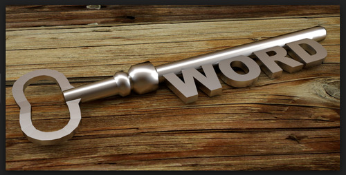
SEO 101

Did you know that 70-80% of users ignore paid ads? And 75% of users never scroll down to the 2nd page? Knowing these facts don’t make you think twice about adopting SEO!
Small changes can make a big difference on how you rank on a search engine and SEO is one of the best options to gain online exposure.
Here are a few basic tips to get your SEO right:
1-Search for less competitive and popular keywords.
You can use a website like www.wordtracker.com or Google keyword planner to look up keywords and see what user are searching for.
2- Plug in keywords on Meta tag title, Meta tag description, website URL, website. Make sure to include in many places as possible!
3- Have several Links to your website: The more links to your website will make search bots assume you have great content. Good ways to create links are to make your website Social media friendly. Give the ability to share, like, use hash tags.
4- Low webpage loading time: keep it under 5 seconds. If it takes too long people will navigate away and it will hurt your bounce rate.

5- Making website user-friendly and engaging. This way visitors will spend more time on your website. For example: you can add videos to break down information.
Surely there are tricks and tweaks to improve your SEO ranking, but one of the most important tips is:
6- Create great content! Making your content relevant and interesting will attract consumer’s attention naturally. J

Remember at the end of the day search engine are only working for the benefit of its users and their goal is to provide them with the information they are looking for!
Enjoy and Good luck!

0 notes
Video
youtube
Ignorance at it's finest!
The current Venezuelan president, Nicolas Maduro is indeed a very eloquent presenter. Maybe one of the best persuader in the world ! He uses a strong body postures, firm hand gestures and steady and clear tone… Every steps are carefully calculated ….HOWEVER, he lacks two of the most important component in public speaking … General knowledge and proof reading skills!
In this video president Maduro rediculize himself by confusing SOS (the morse code distress signal) used for the SOS venezuelan movement for the word Sos (to be in spanish). … SMH…a total public speaking failure!
0 notes
Text
Is Augmented Reality the next big thing?
Surely Augmented technology enhances user experience by adding virtual aspects to real life elements. But is it strong enough to go mainstream and set new trends???

AR has a strong potential to be revolutionary! However, it also faces many challenges that will need to be overcome in order to innovate the way we use technology. Here are a few pros and cons good looking at:
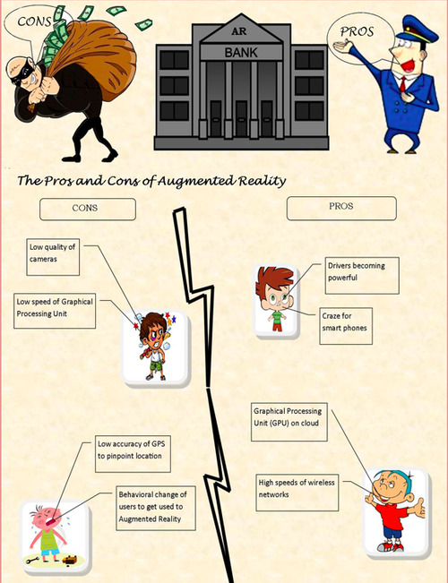
PROS:
AR is user friendly. Anyone with Internet can use it.
It can be used in different fields, such as medical, education or simply for entertainment.
Can be used to simulate real life situations without being expose to its risks.
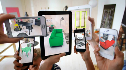
Can save million of dollars by testing situations (like new buildings or furniture) to verify proper fit. Ex: Ikea 's magazine.
Knowledge, information increments are possible.
Experiences are shared between people in real time.
Video Games provide an even more “real” experience by using real life elements.
Mobile usability is improved by AR acting as the primary interface.
CONS:
Spam & Security. Using AR grants access to your device and information.
Complexity of usage and need of special hardware. You may need a printer & camera or download software.
Virtual addiction. Increase in the dilemma of Social and Real-Time vs. Solitary and Cached.
User Experience: Socially, using AR may be inappropriate in some situations. As seen on the Youtube video.
Openness and no control over content: Content can be developed by consumers for display.
Current speed levels on today’s iPhone or similar touch screen devices will take some generations to make Augmented Reality feasible as a general interface technique accessible to the public.
Content may obscure and/or narrow a user’s interests or tastes. For example, people may want a local places and not KFCs or McDonalds.
Privacy control will become a big issue. Walking up to a stranger or a group of people might reveal status, Tweets, and information that may cause breaches of privacy.
Despite all the drwbacks. In good hands AR is an amazing tool. It brings a new hype and improves user experience via the use of their mobile devices. Yet developers are going to need to be very careful in the way this technology is implemented in order to stay relevant and not lose their momentum. Focusing on user's experience over its gimmick is going to be crucial for its success!
0 notes
Text
Gamification: Where business meets fun!

Based on Gamesutra.com Gamification is a unique concept where game like elements are built in to better the engagement and motivate clients to exert certain behavior. The primary benefit is to make your customers are happy in order to archive business goals in a more effective way. Sounds easy and Fun!
Gamification is not the answer to everything but it surely help if used adequately. Here are several elements to keep in mind when implementing it:
-1st: (why)Define your Goal. why do you want to use gamification? For example Gamification can be use to improve better results, going viral or increase time spent and engagement. The more specific your goal is better the results.
- 2nd: (what) Actions: Desire target behavior.what are you looking to obtain from your consumer? ...Buy more? give information? share?
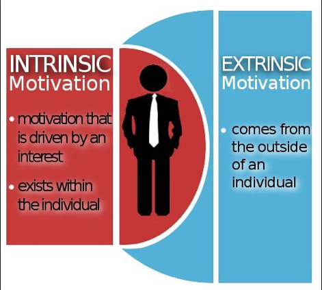
- 3rd: (Who) know your players. Who is your target market? there is different types of players and motivations. For example they can either be intrinsic (personal growth) or extrinsic (earn a reward) motivated players.
- 4th: (How) Design system & tools. How will your implement your gamification process? what game alike elements will you include or use? what are the rules of your game?
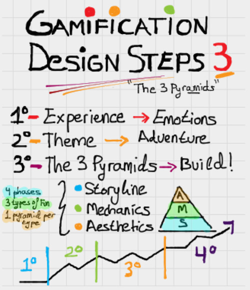
Now the flipside is how to make a good game? Games have so many drawbacks and yet people love it! Why??? When playing a game you are inflicted by so many rules, challenges and at the end they can only be one winner! …. Nerve-wracking! are we sickos?
the answer is: The Self-determination theory!
Games provide:
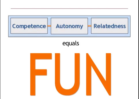
Competence: problem solving skills, feedback
Autonomy: Player- centered (empowering), less fear of failure.
Relatedness: creates meaning, social interaction.
These 3 components are all part of Gaming and are also creators of FUN!
{ahhhh!!!! I am having an epiphany!}
so…a good Game design should have the following elements in order to meets the SD theory:
-challenges (learning)
- progression
-Social
- Feedback
Remember a Game is all about the experience :)!!! Game on & Good luck!

0 notes
Text
Apps: To pay or not to pay!

As more and more free apps are made available, we are less likely to pay for an app and even get to the point of asking ourselves if it even makes sense to pay for an app? Specially when you can get a lite version for free or find a competitor with a free version. This blog will give us a better insight on how to make a paid app successful.
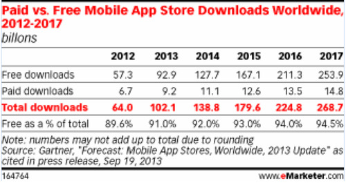
According to the graph below the amount of purchased apps have nearly doubled in 3 years. However, the gap between the percent of free apps to the total app purchase has also increased since apps downloads has more than doubled in 3 years. The App world is very competitive but I believe paid apps still earn a niche market as more people download apps.
According to Branding brand CEO, Chris Mason featuring the app in the apple store is one of the biggest drivers to acquire paid app users since not everyone makes it to the app store and building a functionality that improves and adds to the user’s experience is key and more important than just giving discount to persuade people to download the app. [1]
Another way to analyze apps downloads is to look at organic vs. paid advertising. Per vice president of Garnett Digital, Matt de Gannon the quality of user varied based on how they were acquired usually good user comes from organic searches but not so bad users can come from paid advertising placed on sited were people with similar interest can be found. [2]
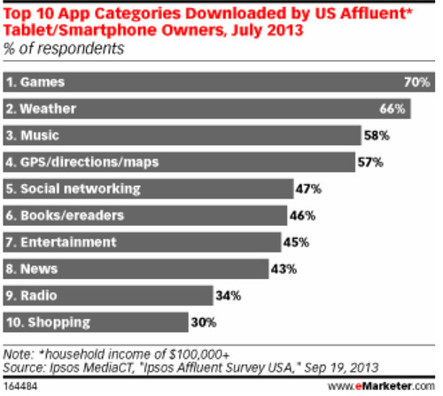
Here is the break of the top downloaded apps in the US. Games are the # 1 apps to be downloaded. A survey from game development studio Arkadium found that more than half of adult US gamers played more than three Facebook games per week, and just fewer than half played at least that many mobile games. Giving a large opportunity for growth in this area. [3]
Capitalization of these apps has been challenging as most of these apps are free but in app purchase has increased to over 50%. In app advertising or in app purchases are great ways to generate the extra income.
[1]http://ezproxy.library.nyu.edu:2380/Interview.aspx?R=6001292&dsNav=Ntk:basic%7cpaid+apps%7c1%7c,Ro:4
[2]http://ezproxy.library.nyu.edu:3088/Interview.aspx?R=6001298&dsNav=Ntk:basic%7cpaid+apps%7c1%7c,Ro:3
[3]http://ezproxy.library.nyu.edu:3088/Article.aspx?R=1010271&dsNav=Ntk:basic%7cIn+app+purchase+for+facebook+gamers+%7c1%7c,Ro:-1
0 notes
Photo
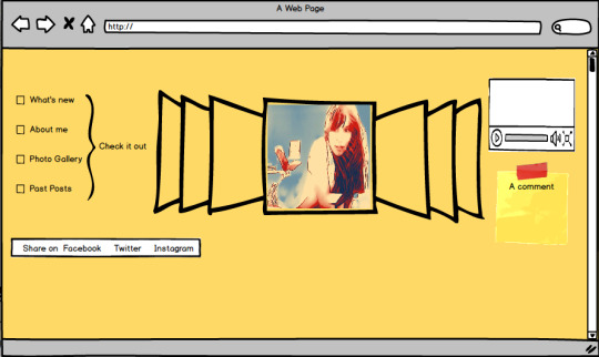
How to create your own website wireframe!
Building your own website can feel very tedious and high tech but in reality anyone can do it. You just need the right tool and an hint of creativity.
Using www.balsamiq.com I was able to quickly create a blue print for my website without sacrificing style over practicality.
As shown on the picture I used a yellow background because its one of my favorite color and its stimulates creativity. I decided to keep my content simple and avoid crowding it to make it user friendly and focus all eyes on my blog posts.
On the right side: I added a simple menu list. Easy buttons to click on and learn more about what's new, about me, see more pics and review old posts.
Center page: I added an accordion in the center where users can slide through my blog entries. Each blog will have a display picture to give a sneak pic of what each blog will be about. Users will have to click on the picture to read the full blog.
On the left side: I wanted to diversify my graphics and add sound effects to my blog so I decided to include a video. The video will updated frequently and could be a video blog I made or simple my favorite youtube video of the week. Making my website a bit more alive.
At the button of the page I added a space for comments and options for people to like or share my blog on their favorite social media pages. Making my page a bit more interactive and engaging for my readers.
And voila! You have a blue print!
0 notes
Video
youtube
Finally an Axe commercial I can stand!
Axe's super bowl commercial completely took me off guard! This year axe took a different approach and decided to partner with Peace One Day to rally for a good cause, World Peace!
Axe strangely Discarded their usual approach of having a bunch of half naked supermodels obsessing over a man wearing their body spray to focus more on what their target audience really care about.(Thanks god!)
As Matthew McCarthy, senior Director of Axe stated: “Young people care about their future”… “This generation is socially conscious and more digitally connected than ever”. The concept of this campaign is to be more relevant and captivating by supporting their audience ideals. In conjunction with the commercial Axe also launched their #kissforpeace campaign. Giving the opportunity for their followers to snap a picture kissing with their loved one and sharing it via twitter or Instagram. Pictures shared prior to feb9th get the opportunity to appear on the Axe electronic billboards in times square NY.
The campaign's call to action is to follow Axe's Facebook and twitter page to see how you can change the world. Axe Also donated $250,000 to Peace One Day and is promoting them on their website (axepeace.com) and social media pages.
Axe Facebook page has been filled with peaceful message of peace. here are examples of recent posts on Facebook:
Kisses instead of shots
Combs instead of knifs
Lipsticks instead of bullets
Peace Soldiers
Axe initiative really shows Marketers that not only sex and humor sells but also Love and positive messages can have a big impact!!
This campaign comes right at the perfect time before Valentine's day! One of the biggest day to celebrate love!
1 note
·
View note