
Statistics
We looked inside some of the posts by liamblogc-blog and here's what we found interesting.
Average Info
Notes Per Post
2
Likes Per Post
2
Reblog Per Post
0
Reply Per Post
0
Time Between Posts
2 days ago
Number of Posts By Type
Text
17
Last Seen Tumblr Blogs


Fun Fact
Tumblr has been providing a Korean-language service since 2013.
Text
Reference List - Survive/Thrive
A-
ALAN BECKER. 2017. Animator vs. Animation | ALAN BECKER. [ONLINE] Available at: http://www.alanbecker.net/portfolio/animator-vs-animation/. [Accessed 18 May 2017].
animating a walk cycle - Google Search. 2017. animating a walk cycle - Google Search. [ONLINE] Available at: https://goo.gl/dPVylA. [Accessed 10 May 2017].
B-
C-
cave - Google Search. 2017. cave - Google Search. [ONLINE] Available at: https://goo.gl/vvy6jB. [Accessed 22 May 2017].
cave clipart - Google Search. 2017. cave clipart - Google Search. [ONLINE] Available at: https://goo.gl/LWc4h2. [Accessed 16 May 2017].
D-
E-
Explore Free Animation Tips, eBooks, Podcasts & More. 2017. Explore Free Animation Tips, eBooks, Podcasts & More. [ONLINE] Available at: http://www.animationmentor.com/resources/ebooks/. [Accessed 8 May 2017].
ENTROPY. 2017. Short Film of the Week: Animator vs Animation IV by Alan Becker | ENTROPY. [ONLINE] Available at: https://entropymag.org/short-film-of-the-week-animator-vs-animation-iv-by-alan-becker/. [Accessed 16 May 2017].
F-
File:ResidentEvil4GC.jpg - Dolphin Emulator Wiki. 2017. File:ResidentEvil4GC.jpg - Dolphin Emulator Wiki. [ONLINE] Available at: https://wiki.dolphin-emu.org/index.php?title=File:ResidentEvil4GC.jpg. [Accessed 25 April 2017].
G-
H-
I-
J-
K-
L-
M-
MobyGames. 2017. Rayman 3: Hoodlum Havoc for GameCube (2003) - MobyGames. [ONLINE] Available at: http://www.mobygames.com/game/rayman-3-hoodlum-havoc. [Accessed 16 May 2017].
N-
newfound gap - Google Search. 2017. newfound gap - Google Search. [ONLINE] Available at: https://goo.gl/l135hp. [Accessed 10 May 2017].
O-
P-
Q-
R-
S-
T-
THM Magazine. 2017. Test Dark Souls 3 : le retour du RPG exigeant – THM Magazine. [ONLINE] Available at: http://www.thmmagazine.fr/jeux-video/test-dark-souls-3-ps4-xbox-one.htm. [Accessed 09 May 2017].
The Big Lez Show Wiki. 2017. Image - 963805 363375787095562 1187010698 o.png | The Big Lez Show Wiki | Fandom powered by Wikia. [ONLINE] Available at: http://biglezshow.wikia.com/wiki/File:963805_363375787095562_1187010698_o.png. [Accessed 18 May 2017].
U-
V-
W-
www.japanbullet.com. 2017. No page title. [ONLINE] Available at: http://www.japanbullet.com/technology/mario-kart-8-deluxe-coming-to-the-nintendo-switch-in-april. [Accessed 23 May 2017].
X-
Y-
YouTube. 2017. Shock 1, 2, 3 (by Terkoiz) - YouTube. [ONLINE] Available at: https://www.youtube.com/watch?v=MoDGzRa1LW0. [Accessed 03 May 2017].
YouTube. 2017. Animator vs. Animation (original) - YouTube. [ONLINE] Available at: https://www.youtube.com/watch?v=npTC6b5-yvM. [Accessed 03 May 2017].
YouTube. 2017. Stickman Animation - The Surprise - YouTube. [ONLINE] Available at: https://www.youtube.com/watch?v=u708Pu_SUFw. [Accessed 03 May 2017].
Z-
0 notes
Text
Evaluation
Animation Review
My target audience was originally 13+ and I feel like my final product half suits it and half doesn’t. I didn’t have time to make my fight scenes so in that sense I feel like the target audience could have been lower. On the other hand If I had finished my product then I still would have used social media to build an audience. This means that the target audience would need to remain 13+ as anyone younger than that shouldn’t be accessing social media. In terms of existing products that my target audience would be consuming I would be thinking about an animated series. An example of this could be The Simpsons or Family Guy. These are two series that I feel like 13 year old’s are very interested in. Both of these shows have a crude humour element to them which I would not be able to match with in my own animation. I didn’t have any talking in my animation so it would be hard to get a sense of humour. In terms of style I think those shows are more attractive to my target audience as they present a more 3D element. My animation is a 2D stick animation which I think is definitely suitable to my target audience, but I don’t think that I could compete with the interest of larger shows. I think if someone from my target audience were to watch my animation then they would not think that it is suitable. This is because someone of that age would see that there is no violence or humour and would lose interest. My animation definitely could be improved and could be more suited to my target audience with more time in development. I asked Tom, Jordan, Ryan and Oscar to review my animation. There was mixed feedback. I first asked if it suits my target audience. Ryan and Jordan said that it does suit the audience because the art style of the backgrounds is appropriate. Oscar and Tom said that it does not suit the audience because there is nothing that makes it more mature. I asked if a fight scene would make it suit the target audience and they both said yes. I only had the opportunity to do a focus group at the end of my production time so I didn’t have the opportunity to make changes and present the audience with a different product. This could have been key to the progress of my game because I could use the feedback that I received to improve on target areas.
Original Ideas Review
I had originally planned to create a 2D side-scrolling stick animation. This would include fight scenes and lots of action. Because of time constraints I could not complete my project to the standard that I would have liked to. I was unable to create the fight scenes and there was no action. Despite this, I am still pleased with what I made. The art style was perfect and exactly what I had initially planned for. The backgrounds were based off of copyright-free images that I then traced in Flash and filled with colour. I find that creating concept art and backgrounds like this is much easier for me to do because I don’t have the creativity to make up an image in my head and transfer that to paper or into Flash. I also managed to make the character exactly how I had imagined it. I created the character using the line tool and then filled the shapes with the gradient tool. I had to use the gradient adjust tool to change the strength, position and rotation of the gradient. I kept the gradient at the same rotation the whole way through, which makes it slightly unrealistic but it keeps it simple so that I don't have to change orientation every frame. I was not able to add any audio to my animation which is a shame because it definitely would have upped the quality of it. Ability had nothing to do with this, I just left in until too late and then didn't have time to incorporate it. I decided against putting any interactivity in the animation. At first I thought that each project had to have a level of interactivity to it, which is why I planned to add the video player aspect. I recently discovered that this wasn't necessary so I decided to cut the idea to save time.
Technical and Aesthetic, Style and Content
Although some negative changes had to be made to my original ideas, I also did a few things that added to what I had originally planned for. I added a sense of depth to the animation using a simple floor bock for the character to walk on. In the early stages of the animation this has little effect because the floor is just black. In the cave it makes a big difference. I decided to go for a background which included a floor to it so it makes it look more 3 dimensional. I think that the biggest change to my animation is the title scene. I hadn't planned to do a title scene because I didn't think about the effect that it would have. Now that I have done one, I am very happy that I decided for it. It makes a big difference because it means that the animation doesn't just randomly start. It has an introduction that ends with a glare of light which leads into the first scene. I am happy with this. I had originally wanted to use multiple tools which would make animating an easier process. Some of these tools and mechanics ended up confusing me and making it harder. I experimented with using the bone tool to draw my character out, but because of the odd rotation around each axis I decided to just use the line tool. Another thing I decided against was using movie clips to repeat the walk cycle rather than individual key-framing tweens. The problem with this was that the movie clip would repeat more detailed than the key frame tweens. Although this sounds like a good thing, it wasn't. The low frame rate that I was using meant that the movie clip looked really out of place. I was also unable to control the repeat rate of the clips, so I would have had to alter each clip anyway. For this reason I decided to just copy and paste key-frames instead.
Strengths and Weaknesses
I feel confident in my skill progression throughout this project. Although I was unable to complete my project, I got a lot of practice doing things that I wasn't too good at before. My skills in Adobe Flash have developed well. I can now use key binds to change to all of the basic tools which makes my animating much more efficient. These skills might be useful in the second year. The biggest problem that I faced came when I was animating the walk cycle. I had planned to use repeated movie clips. As previously stated I ran into complications with this so I overcame the issue by simply using single frame animation. Obviously another problem that I ran into is the fact that I couldn't finish the animation. I don't think there's anything more that I could have done about this. I spent a long time on pre-production and research and I wanted the written work to be as good as possible. If I would have given myself more time then I would have been able to do more, but I would rather my written work be a high quality and the animation not be finished. Thanks to my knowledge of Adobe Flash, I was able to solve some of these problems. Some of my weaknesses showed through at certain points during the project. My time management was definitely off, with not giving myself enough time to complete the project, possibly spending time doing things that didn’t need to be done etc.
0 notes
Text
Focus Group Results
Today I did a focus group with some individuals who suit my target audience. My target audience is teenage males and my focus group consisted of Ryan, Jordan, Tom and Oscar who are all 16/17.
First I showed them each the animation at full length. Then I asked for some initial thoughts. This response was slightly negative. Everyone made roughly the same points so I will just sum up the results. Overall they enjoyed what I had created. They approved of the design and thought that it was very smooth and not too clunky. They all raised the point that the walk cycle went on for too long compared to the rest of the animation. They also all said that they would have liked to see more as it ended abruptly. This is exactly the response that I thought I would receive so I’m not disappointed.
I wanted to go more in depth with some of the key focuses so I asked some more specific questions. The first of which was what they thought about the art style of the backgrounds. Ryan said that they were very impressive and that the lighting particularly in the outside ones was very impressive. Jordan said that he liked how they looked cartoon-ish. Oscar and Tom had very similar responses as they both said that they looked very good and combined a good amount of realistic art with animated art.
The next question that I asked was what they thought of the intro scene. This received a good overall response. Ryan was impressed with the flare effect, but he took notice of the fact that the glare did not mould around the sun but instead grew with it. This is an issue that I addressed in my final evaluation. Jordan thought quite the opposite. He said that it seemed tacky and didn’t really think that it suited the rest of the animation. I appreciate the honest feedback and I can see why he thinks this. Oscar really liked it and highlighted the fade into the next scene. Tom liked it but didn’t really have anything else to say about it.
Most of the initial questions that I had planned to ask were answered in the initial response, so I was trying to think of other questions but I was struggling to think of other things to ask on the spot. I would have liked to learn more from my audience but unfortunately I just couldn’t think of a way to gain more information. In the future I think that planning ahead for a focus group would be a good idea so that I can ask more questions.
0 notes
Text
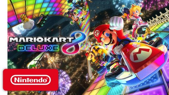
Mario Kart 8 Deluxe
In today’s lesson with Rachel we had the opportunity to play Mario Kart 8 Deluxe on the Nintendo Switch. I haven’t played much Mario Kart before and I have never played a Switch so this was pretty much a completely new experience. The game itself felt good. It looked very good visually and seeing as it was ported from the Wii U i thought it played very well. It has 3+ rating and I can definitely see that it fits it’s target audience. It is very bright and the colours are vibrant so i can see it appealing to kids. The control layout felt correct and due to the tiny Switch Joy-Con it was very easy to press the buttons. The game-play itself was fun, exciting and intense. My only complaint would be that it felt to me like RNG played a big factor. Picking up the power-ups was very luck-based as you could get a star which would make you invincible and would bounce other players off of you. I just ended up getting coins which in the short game were completely useless. Some of the power ups definitely felt more overpowered than others, but i believe that this is done by design because it makes the game more exciting.
0 notes
Text
Production Diary #5
I realized today that I had not gone into detail about how I create my background in Flash. I start off with a background that I take from Google images. To show my process I will use the production of my cave background. I used this image as a template (https://goo.gl/vvy6jB). Before I started to draw, I wanted to make the background slightly bigger. You can see that the image is repeated slightly so I used the existing repetition outlines to do the same thing another time.

As you can see I have 3 layers. The outline is the outline of the stage so that I know how large the image needs to be. This prevents me from doing excess work that doesn't need to be done. The over layer is the actual drawing itself. On this layer I outline the basic features of the image, then fill them with the appropriate colour. Sometimes when the key shapes are more consistent I will use another layer for colour that mean I can use the fill tool. When this isn't done I have to use the pen tool which is nowhere near as precise as the fill bucket tool. The fade layer is specific to this background. I needed to use a gradient and it is so much easier to apply a gradient to a square shape so I put the layer behind the others, then filled the missing space with a gradient.

You can see the gradient from a slightly yellow to a pink. I then combine the layers and export it ready for use in production.
0 notes
Text
Animation Comparison
The Big Lez Show (2012)
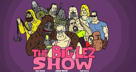
The Big Lez Show is an animated short television show which contains crude Australian humour. It was made in Microsoft Paint and has a very original art style. It could be compared to Family Guy or American Dad but there is much more profanity and drugs. It's characters make the show much stranger than any other comparative products.
Animator vs Animation (2007)
Animator vs Animation is an animation created and uploaded by YouTube user Alan Becker. This animation is more an animation than TV show like The Big Lez Show. I like how the stick men are just stick men but they have human-like characteristics. It's a very original animation because it uses the program that the animation is made in (Adobe Flash) to fight the stick characters.
0 notes
Text
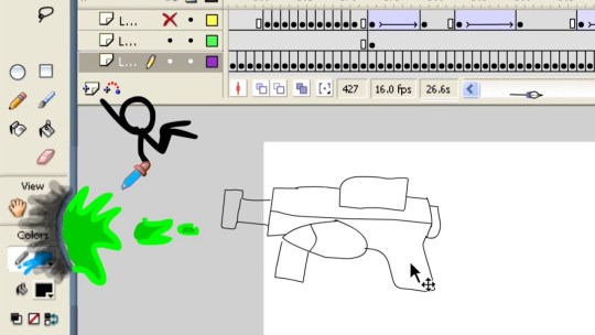
Production Diary #4
Today I got quite a lot of animation done. I only did 1 more scene, but I put a lot of work into getting it perfect. I started out by using the same background as the last scene. I didn't feel the need to create another background as in the scene the character would continue to walk to the same background so adding in another background really wouldn't make sense. I kept this scene the same scale as the last so that I wouldn't have to scale anything up or down. In this scene my aim was to have the character walking into the cave. I needed a picture of a cave from the side but for some reason I couldn't find anything that was close to what I wanted. I ended up finding a clipart that someone had already done so I didn't have any choice but to redraw what they had done. This (https://goo.gl/LWc4h2) was the clipart that I used. After I had drawn this in I implemented it into my production. I copied the cycle and pasted it enough to get to the end of the stage. I moved the cave to the edge of the stage and tested the animation. I realized that I would have to be clever with the cave in order to make it look like the character was actually walking into the cave. I went back to my original design and cut the outer parts of the cave out. I pasted the remaining parts above the existing cave and tested again. This time the character actually walked into the cave. I extended the timeline a bit to give the effect that the character had walked deeper into the cave. This is because when I thought about the next scene I did not want to have to draw the light from the outside so I just made it look like he was deeper in the cave.

0 notes
Text
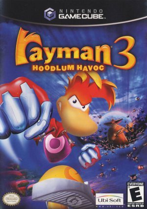
Rayman 3
Today in Rachel’s lesson we played Rayman 3 on the Gamecube. I thought the game looked very good. Both visually and in terms of gameplay. The level design was clearly thought out in depth. The lighting was really good considering how diverse the level design was. The water effect was particularly fantastic considering the time period of when the game was made. The game was very assisted. By this I mean it instructed the player on how to do everything. It told you where to go which is good because if it didn’t I would most likely just wander around the level like a headless chicken. It tells you the controls and gives you a clear objective too. The mechanics seem very assisted too. The player doesn’t have much control in their rotation as the character pivots every 15 degrees or so. Another negative is that the lip sync was terrible. The speech was probably more than a second out of sync and the animation for lip sync itself was pretty bad. The audio was very good. The ambient sounds and music combination was great and really added depth. The game had a dynamic HUD which i thought was pretty advanced. Some of the mechanics were pretty cool too, such as the curved throw ability and the first person camera.
0 notes
Text
Audience Research - Using existing products to develop my ideas.
I have had a look into a few existing animations to see what people find appealing about them. I looked through the comments of 'Animator vs Animation' by Alan Becker, but I couldn't find anything constructive. I found a review (https://entropymag.org/short-film-of-the-week-animator-vs-animation-iv-by-alan-becker/) which gives some very good feedback. This review is very story-based which isn't something that I was focused on but it interests me to learn of the audiences experience of story. The author compares the animation to events such as the creation of Adam. This shows me that the audience will not solely focus on the animation itself and might actually think about the story more. I may need to focus more on story than I initially thought. So far my story is very basic and has no progression because I wanted to focus on showing my animation ability.
0 notes
Text
Production Diary #3
Today I did another scene of my animation. I didn't get as much done because I also wrote up some research, but that's alright because all I had to do was basically zoom out and repeat the previous scene. To do this I had to change the sizing of the character from 302x67.5 to 175x61. I continued the tween of the background into the next scene to add some depth. I also made the bottom tile smaller to match the size difference of the rest of the shot. Because the character was made smaller I had to paste more cycles in which meant that I again had to edit the head movement. This took up the rest of the lesson.

0 notes
Text
Production Diary #2
Today I managed to get the next shot done. This Is a basic walk cycle with parallax scrolling for the background. First I wanted to get the basic walk cycle done. I decided that 5 frames was enough for 1 cycle of each leg. I drew the stickman in first. Then I did a test to make sure that I could get the gradient onto the body. This was successful so I started animating. It didn't take me too long to do but getting all to fit together was hard. I had to put in a base line so that I could line the body up, and then I put in a top line so that I could line up the head. I copy and pasted this a few times to test that the start frame lines up with the end frames. After doing this I realized that It didn't look right. (https://goo.gl/dPVylA) I used this tutorial for the basics and while looking at It I realized that the head bobs up and down while walking and so I decided to do this on my own animation. This was quite hard to do because I made the mistake of doing this for every frame so I spent way longer doing this than I should have. Now I know that in future I can just apply one action to multiple frames. I added in a black tile to the floor just to fill space because I didn't want to have the character walking on the bottom of the frame. I also had to create another background. I did basically the same thing that I did for the first background but I used this: (https://goo.gl/l135hp).


0 notes
Text
Story Board - "The Orb"
These are the pages of my story board. The pages are the wrong way around so should be read from the bottom up. I will paste the text from each so that it is clearer:
Page 1)
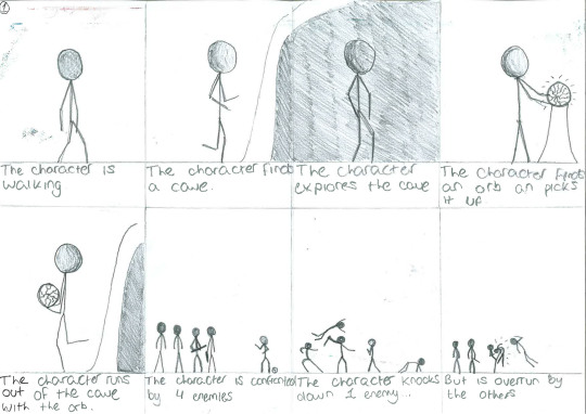
- The character is walking.
- The character finds a cave.
- The character explores the cave.
- The character finds and orb and picks it up.
- The character runs out of the cave with the orb.
- The character is confronted by 2 enemies.
- The character knocks down 1 enemy...
- ... but is overrun by the others.
Page 2)
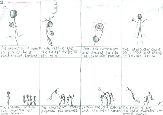
- The character is forced to run as he is broken and bruised.
- While resting, the character inspects the orb.
- The orb activates and starts to rise. The character holds on.
- The character starts to float and change colour. The orb shrinks.
- The enemies catch up. The character has also grown.
- The character launches, surprises the enemies.
- Throws one, one attacks and the others cower.
- The force of the character landing launches the enemies away.
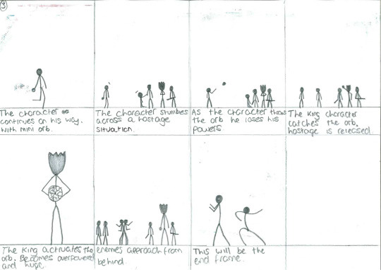
Page 3
- The character continues on his way with the mini orb.
- The character stumbles across a hostage situation.
- As the character throws the orb he loses his powers.
- The king character catches the orb. Hostage is released.
- The king activates the orb. Becomes overpowered and huge.
- Enemies approach from behind.
- This will be the end frame.
0 notes
Text
Animation Outline - "The Orb"
“The Orb” is going to be a side-scrolling stick figure animation. The main character will have no background or introduction. It will be clear that he is the main character because the animation will follow him the whole way through. The character will walk into a cave and find the orb. The Orb will not be introduced or given a background, the character will just pick up the orb and walk out of the cave. There will be 4 other stick figures outside of the cave and they will clearly be the antagonists. The characters will fight and the main character will narrowly escape, badly beaten. When he is in the clear he will sit down and examine The Orb. The Orb will ‘activate’ and the character will go from being cold colours to warm colours and will appear more powerful. The 4 other characters will then catch up and try to fight him again. This time though the character will beat them with ease. The character will continue his adventure and will come across a group of enemies. The enemies will have another character held hostage. The character will hand over the orb and lose his powers, but in return he will set free the hostage. The enemies will turn on the two and try to attack them and then the animation will end on a shot of the two characters back to back.
0 notes
Text
Dark Souls 3
Today we played Dark Souls 3. We only played a little bit so i definitely didn’t get the full experience but for what we played i didnt really enjoy it. The first few moments of the game seemed very repetitive. I understand that they want the player to get used to the controls and the mechanics of the game but I think it was just too much. The constant low level enemies who would struggle to hit you and die in one hit were very underwhelming. Within a few minutes we were already at a mini-boss, although this ‘mini-boss’ was actually huge and very powerful. This was a complete contrast to the other enemies that we ad faced. This actually felt like too much. They want to get the player used to the game and then instantly throw them into a battle which would compare in difficulty to the final boss battle of many current AAA games. The game looked stunning. The rendering distance was fantastic and there was a moment where we stood on the edge of a cliff and looked out in to the distance and you could see off far into the distance. The detail was great and they clearly put a lot into the design of the levels.
0 notes
Text
Production Diary #1
Today I started the production of my animation. I managed to get the first shot done where the sun rises over the hills and then glares across the Logo. This wasn't very hard to do and took me less than 3 hours. First I had to draw the background. To get some inspiration for my background I decided to look on Google images for some pictures of mountains. I found this picture (goo.gl/vi1xIN) which I thought was perfect for use. I made it slightly larger by duplicating it and reversing one of them so that they lined up and it just looked like a larger picture.

I then went and inserted the image into flash using the snip tool. This is because I used flash to create the image so I couldn't just copy and paste it because it would not make it a whole image. I could have made It a symbol but it would just be a larger file than necessary. I inserted some text from flash using the 'Vladimir Script' font.

I wanted to add some animation to this so I decided to insert an animation of the sun rising from behind a mountain and shining onto the logo. To do this I inserted a yellow circle (the sun) and tweened it to move from below the mountain peak to up in the sky. This is when I realized that in order to animate this I needed to make the background dynamic so I just ended up copying and pasting it in from the window which I made it in. This meant that I could make it look like the sun is coming from behind the mountain. Then I slightly enlarged it as it emerged in order to give it a sense of depth. The shine was very hard to do. I could not figure out how to add individual rays of sun so I had to do it as a grouping. I had to make it a graphic so that I could tween the shine up with the sun. This created further problems as I could not skew or distort the graphic. I needed to do this so that I could curve the shine around the sun. Unless I have time to find a fix for this in the future, it will stay as it is. I then added a simple glare animation in so that I could transition into the next shot.


0 notes
Text
Book Research - Animation Tips & Tricks, Volume II
Today I found a book online called Animation Tips & Tricks, Volume II. This book has a lot of information which can be useful for beginners or experts. The book is very large (70 pages) so I decided to just look for 1 section which could potentially help me. The section I chose to look at was called “What Determines the Duration of a Scene?” This question was answered by Shawn Kelly, an animator at Industrial Light & Magic. He basically said that the length on the scene is determined by a combination of the storytelling demands of that scene and the style of the project. He says that the length of a scene is determined by the director. They should make the scene long enough to show the whole story but should keep it short enough so that it doesn’t get boring. In an animation sense, the animator usually tends to be given a time frame to work to. However sometimes if the animator can create a shot that fits with the scene then the director may sway on their original ideas. For my project I am both the director and the animator, so I will be giving myself a time to work to.
1 note
·
View note
Text
Gantt Chart Scheduling.
I am currently not on schedule for my Gantt chart. I originally had the dates messed up so I have now had to correct them. Not too much has changed I just have to do things slightly quicker than I would have before. I have done the majority of the written blog posts and other pre-production things, but I have to storyboard but that shouldn't take too long. I have got a week and a half and I am confident that I can catch up on the things that I fell behind on.
1 note
·
View note