Don't wanna be here? Send us removal request.
Text
wk13 - Overall Course Reflection
What went well / what did I have difficulty with?
I think for me the orthographic drawing and the rendering were the two parts that really went quite well, I felt I got it under controlled. especially the orthographic drawing, before the course I had no idea for the drawing. At the beginning of the course, I remember feeling completely lost. Yet as we did more practices for it, my confidence level went up.
I had difficulty with the perspective drawing we did for week 11. I felt I didn't get the concept in the first place, therefore as I moved on to the practice I had a lot of difficulties for the drawing.
What did I enjoy/dislike?
I did enjoy the course throughout the semester, I liked the rendering and orthographic drawing a lot as I was confident in doing it. I enjoy the photography exercise the most. I think it allows us to explore the beauty of life around campus, and by editing these photo to maximize those features.
I didn't enjoy project three as much as i enjoy the rest of the course. It was very time-consuming when it comes to measuring the objects.
What would I do differently if I had my time again?
Time management skill
If I had my time again, I would make plans for project two and project three, also manage my time more effectively to maximize my ability to work on them. Because in project one, I did manage my time effectively that I did not find myself rushing for the project. however, for both project two and three, I was always rushing to finish it.
What were some of the key things I learnt, or insights which I developed?
There were many skills I learned in this course:
The ability to produce a properly labeled orthographic drawing.
The skill of incorporate conceptual thinking into rendering existing product.
The basic understanding of perspective points.
The ability to reflect each week's work, and evaluating information from each studio class.
The ability to provide feedback for peers and reflecting on it.
What led to those experiences or insights?
Those experiences are created by evaluation and analysis from each blog post, which allows me to reflect on my strength and weakness from each tutorial. At the same time, each tutorial has helped me to shape my experiences. As I am attempting to overcome the problems during each practice, I have some gained the ability of problem-solving skills.
3 notes
·
View notes
Text
WK11 - Week 11 Wassily Chair Perspective Drawing
This week, we were introduced to something new- perspective drawing, Earlier in the course, we did the orthographic drawing which has helped me a lot in shaping the way I think in 3D space.
During the lecture, Rob demonstrated perspective drawing in AutoCAD, it provided a brief understanding of perspectives and acted as a foundation for the studio practice.
Problems:
I spent a lot of time during the studio to figure out the way the perspective work.
I didn't get how it works first, so I used some additional source to help me get a better understanding.
Additional resource:

By watching the demonstration on youtube, I finally got a bit understanding of 2 point perspective.
During the lecture, the tutor told us before we attempt to do the drawing, we should make grids for the chair. The grid can be seen drawn on the different views and later on we can apply it to the cube drawn on the page.
However, I had problems understanding the system of using the grid, so I attempted a different approach, by directly using the two vanishing points and picture the structure of the chair based on its front, side and top views.
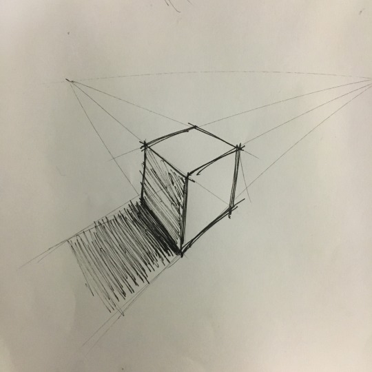
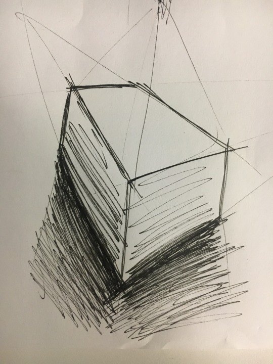
Before I attempt to do the actual drawing, I did blocks which can help me to understand the structure, then I moved to the orthographic views and predicted the position of each component.
During this process, I found myself was largly depending on the orthographic views, by analyzing the dimension of each component in each view have helped me in completing the final perspective drawing, however, it was very time-consuming and sometimes I had to go back and forth for certain parts.
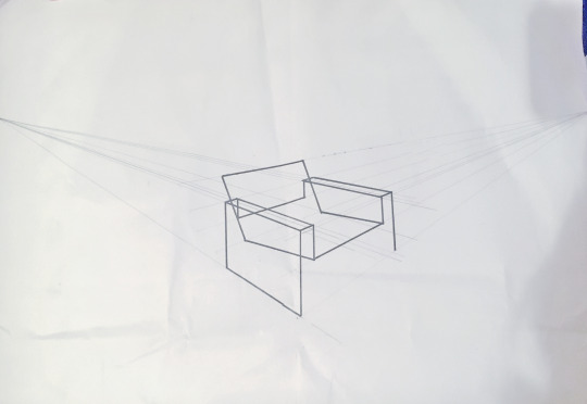
The final drawing turned out surprisingly good, although it was not very accurate as if I use the other method of using the grid. Still, I am quite satisfied with the result.
What went well / what did I have difficulty with? Why?
I really had some problems with understanding the perspectives, therefore I had a lot of troubles to figure out the chair.
What did I enjoy / dislike? Why?
Even though I had lots of trouble in figuring out the prospectives I still enjoy the process of working it out. it was very challenging but a fun practice overall.
What would I do differently if I had my time again? Why?
If I had my time again, I would do the drawing by using the method of the grid, I think that way I can understand the perspective drawing completely, not based on assumptions.
What were some of the key things I learnt, or insights which I developed?
The key thing I learned is how the perspective works in general. as well as picturing the drawing in a 3d space based on the front, side and top views, I think it is a quite important skill to have for design.
6 notes
·
View notes
Text
WK 10 - Project 3 Measurement & Model Making
Measuring Techniques
This week we were focusing on measuring the object chose for project three. During the lecture, Rob demonstrated a technique for us which I found it quite useful.
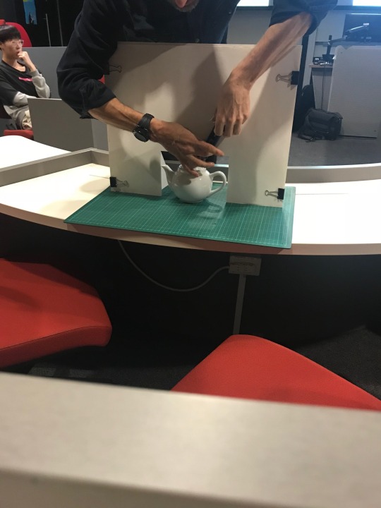
Using foam board set up for Tracing.
By using this technique with some additional equipment - bamboo will get the measurement for the overall shape. I did try it at home with bamboo, to get the overall outline for my item, which is a drill.
Problem:
- Accuracy
However, it will not be as accurate and the detail of the drill such as the curves around the handle and the connecting point between the head and the handle will not be captured as the actual measurement.
It was very difficult to get total control over the bamboo sticks, I tried to tape it down using master tape, but as I was transferring the measurement, the bamboo sticks were falling apart as well. As a result, the measurements are not reliable.
2. Profile gauge
The Profile gauge allows us to Measure object and draw the contour of the object on paper.
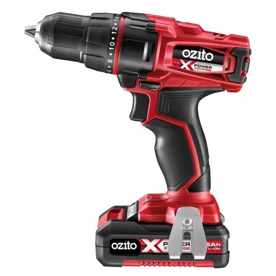
Advantage
( Considering the first method) It saves a lot of time as the process was not as complicated as using the Bamboo sticks.
It was quite accurate, as it can attach to the outline of the object.
Problems:
Profile gauge wasn’t big enough for the drill. Not able to capture the entire object.
3. Masking tape
As the previous methods did not work for my object, I found out that by using masking tape to stick on the object and then distance them by moving up 10mm apart. Then write down the measurement for each section.
Advantage
It was the most accurate method out of three methods, the detail measurements of the drill were captured too.
Problem
It was very time-consuming. I have to measure every part with a ruler.
The final Cad Drawing
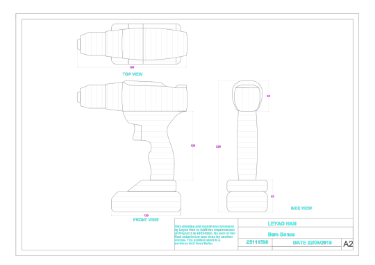
What went well / what did I have difficulty with? Why?
The actual process of measuring the object was not as difficult, it went well, however, the process of working out which method to use for the project was difficult.
What did I enjoy/dislike? Why?
I enjoyed the actual model making process, however, I did not like the process of measuring the object, it was very time consuming
What would I do differently if I had my time again? Why?
I started my foam cutting at a very late stage, if I had my time to do it again I will start earlier so that I will have more time allowed for the foam cutting.
What were some of the key things I learnt, or insights which I developed?
I learned the methods of measuring an object with a quite high level of accuracy, at the same time I learned how important it was to manage your time efficiently.
4 notes
·
View notes
Text
Wk12 Sudio Tutorial - Photo Essay
Part 2
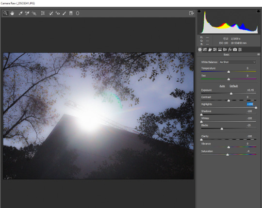
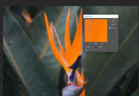
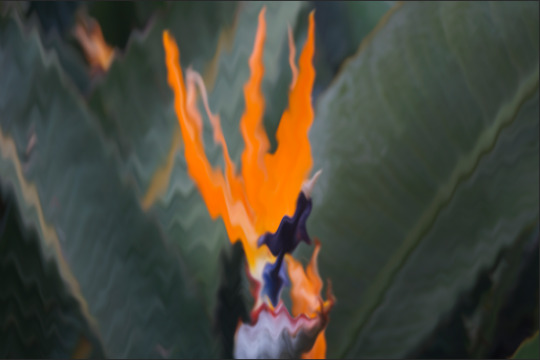
- By editing with the contrast and lighting, as well as adding noise to the image to highlight the sunlight in the center of the photography.
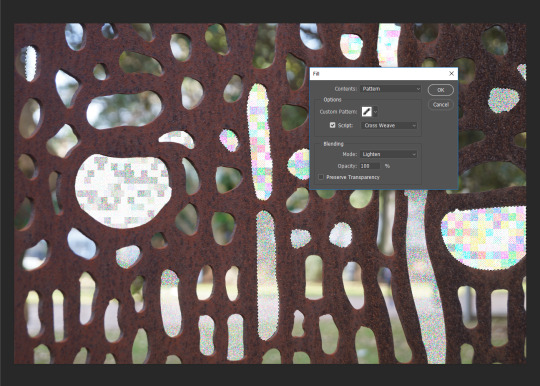
- By filling the gaps to emphasis each organic shapes. ( Bring focus to the details)
4 notes
·
View notes
Text
Wk12 Sudio Tutorial - Photo Essay
Part1
Six photographs taken:
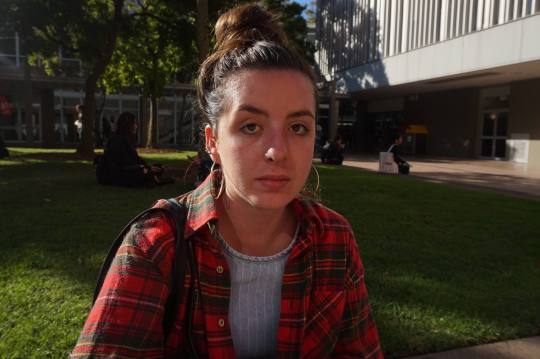
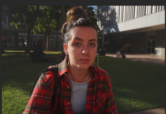
- A direct photo of a female student on campus, the sunlight is directly reflected on her face. It created an interesting silhouette that follows her facial structure. With the direct eye contact through the image, the emotions of this student are highlighted.
- By editing the image that blur the background and focus on the character in the photo can draw out the emotional feeling that created by the direct eye contact with the viewer.’
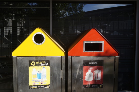
- The colors in this image, the yellow and red created a strong contrast where the yellow juxtapose the red, at the same time both colors also juxtaposed the background color.
- If more contrast applies to the background color and two bins, the juxtaposition within the color scheme can be stronger.
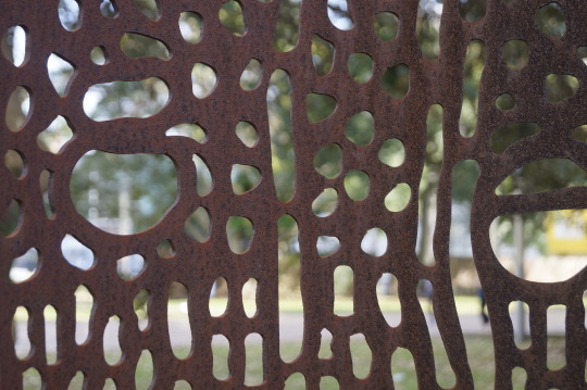
- This photo have very interesting organic forms.
- The forms can be emphasized by editing the colors within the photo.
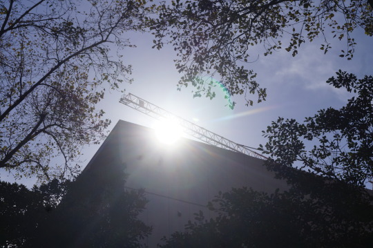
- The exposure of sunlight has a strong impact of the atmosphere of this particular image that applyies to the focal point.
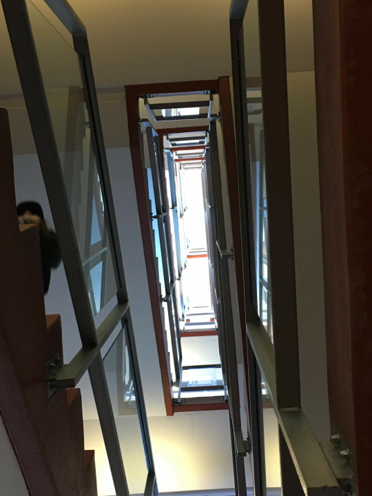
- This image used the principles and elements of design by using the repetition of the stairs to create rhythm.

- This image capture the natural flower, and its contrast with the green leaf in the background.
These photos were the original one that taken on the day.
Four the criteria of this assignment are met:
• A portrait (preferably of a complete stranger)
• Something from the built environment
• Something from the natural environment
• An interesting detail
1 note
·
View note
Text
Week 9 - Presentation
As I completed the progress of analyzing the brief and selecting the final consumer product for the project, I started on the actual rendering of the final product, which is the food mixer.
The online tutorials and lecture note are great aids in helping me to complete this process.
There are few very helpful tips that I came up with:
1. Label all your layers
As the process went on, I found myself keep adding more and more layers. As in the screenshot shown below, I did not label every layer as I should, therefore, later on, I had to turn on and off every layer in order to find the one that I was looking for.
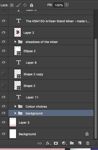
2. Group your layers
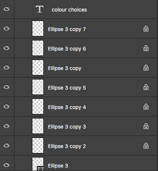
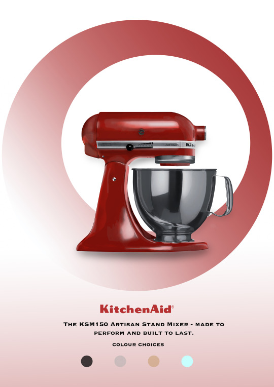
Due to the material and texture of this food mixer, I had to add an excess amount of shades and highlights to achieve the final gloss look, therefore there were many layers for me to work on. As well as the final presentation board, I created few ellipses to show the varieties of colors that are available for the product. I found that by creating groups for the layer that has the same purpose have really helped me to have a more organized page to work on, Also save me time in looking for that specific layer.
3. The Gaussian Blur
This tool was very useful in achieving the gloss texture of stainless steel for the food mixer.

The Final Presentation Board
The Presentation
For my presentation, I did not panic too much about it. I had a structure of how I was going to introduce the board and the process of achieving the fianl presentation of the board. But I did feel a little panic in the middle of the presentation because I had a moment of blackout and I did not know what to say next. However, The overall presentation was not far from what I planned.
Conclusion
I found one of my classmate’s presentation very interesting, as she did her board in a very conceptual way. As Robert mentioned, this approach is very valuable in design, this ‘unfinished’ board has really delivered the ideas and styles behind the actual product. For the next board, I would use the same conceptual approach present the final product.
5 notes
·
View notes
Text
Week 8 - Working with Photoshop Continued
Due to the holiday, we miss our lecture and studio tutorial this week, which is good and bad. I had time to work on my project as it requires a huge amount of time, however at the same time not be able to ask any question that I have on the project.
During this week, the project 2 takes place as the ‘studio tutorial’. I have to mention that how important the worksheet on photoshop in week 6 was in helping me complete this assignment.
Before I start working on the actual project, I would always analyze the project brief and the marking criteria first. By doing this, it will give me a generalized guiding direction for the whats required for the project and where should I start first.
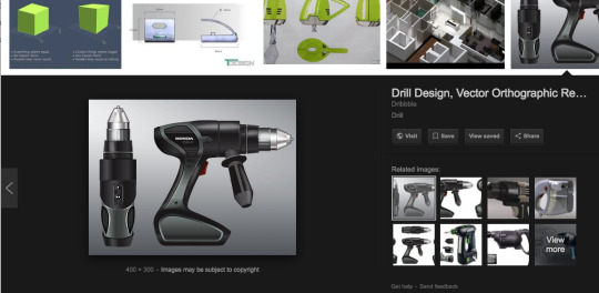
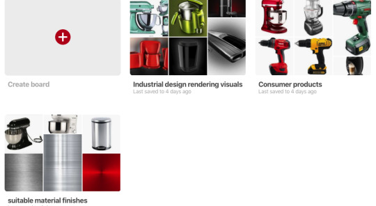
After a close analysis of the brief, I moved on to selecting the product for my rendering. I wanted to do the drill, however, later on, found out that the level of complexity is more than I can handle in such a limited time. Therefore I decided to do the food mixer.
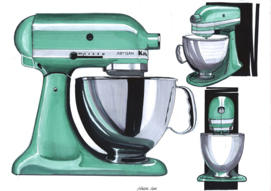
I found this image of a finished food mixer rendering online. After I decided to do the food mixer produced by KitchenAid, I started on researching its material and how it looks under different lighting condition. I created three boards on Pinterest to record my research process.
Then I started my actual project on rendering, I decided to render the product in a separate sheet rather than the board. I wanted to get the finished render first and then design the presentation board.
Besides the help of the tutorials on Lynda and demonstration videos online, I also found that the user guide in photoshop very helpful in terms of understanding the tools in photoshop.
0 notes
Text
Week 6 & 7 - Working with Photoshop
As we moved on to Photoshop, this week’s tutorial was the most time-consuming out of all the previous ones. however, I find myself enjoying using photoshop in comparison to AutoCAD.
This week we were asked to creating a 2-D photoshop rendering, I used photoshop before, however never come close to rendering. I was bit panicked (as always) from the beginning.
The practice was breaking down into small sections, from the first step of the linework until the last stage of finishing touches. It was quite an amount of works, however, what I really liked about this week’s practice was that the instructions that provided to us by the tutors on the handout. Therefore most of the problems occurred during my attempts I was able to solve it by analyzing what was provided on the instructions sheet.
The linework
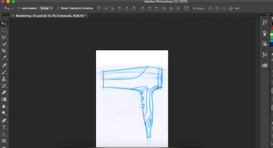
I made a mistake straight from the beginning in laying out my page, I used portrait instead of landscape, however since the tutor said it does not affect the actual work, I moved on to the next step. ( because when I realized that, I already did quite an amount of work)
Colour Tone & Reflection
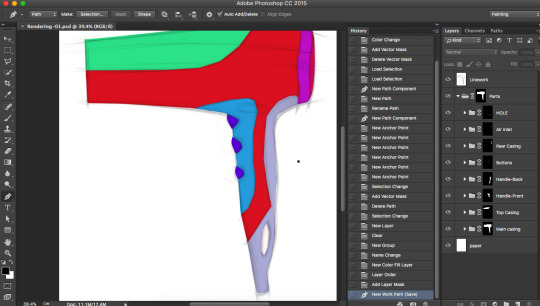
I spent most of my time attempting this step, it was a challenge for me, because I made a mistake in creating the selection paths. when I was selecting the path for each part of the hand dryer, I was not aware of the creating a new path once the previous one is finished. Therefore I put all paths in the outline and was not able to subtract all parts from the outline path as the instruction required to, so I had to retrace the whole selection by using the pen tool and put them into different paths.
After this tragedy, I finally figured “READ THE INSTRUCTION CAREFULLY”
There were not many problems after the tracing. However, I do find something really useful besides the links provided in the handouts - YOUTUBE. Compare to just searching online for instructions, I found myself gaining more knowledge in video instructions. Those demonstrations online were very useful and were quite easy to follow as they recording it step by step.
Detailing
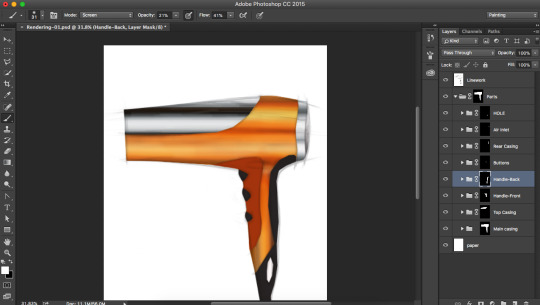
I found that in order to do a good job in photoshop, whats required the most is PATIENCE. Because when it comes to adding shades and highlights, you need to go back and forth in getting the best reflections to demonstrate the materials and the lighting.
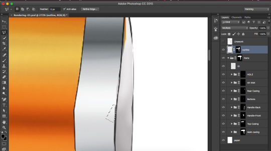
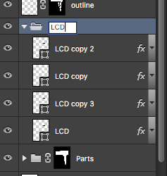
Grouping
Grouping your layers is really usefully, sometimes when there are too many layers people will get confused in which one is which, therefore by using layer group can really help in managing and organizing each layer strategically.
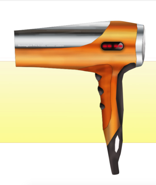
I used yellow as my background color, and I add some gradients to it to create the finish touches.
Overall, I found this week’s tutorial is very helpful for our next project 2, which is rendering as well. I will now start to look up more demonstrations on youtube for a better understanding of the tools in photoshop.
6 notes
·
View notes
Text
WK5- Studio Tutorial - More Drwaing with CAD
Overall this week's practice is easier than last week as I have gained more skills of using the tools in AutoCAD from last week’s experience.
However the first of all that I want to mention is ‘Always Save Your Work’. I remember tutor Will says that all the time, somehow I failed to manage to save my work, so I had to restart from the beginning. It was not very a pleasant experience, however, I learned one most critical about using AutoCAD, that is ‘ALWAYS SAVE YOUR WORK’.
As always, before I start the actual drawing I would draw each of the view on paper first, and work out the dimensions first. I found that by doing this, it helps to prevent some unexpected situation from happening, for example, if I have made a mistake in calculating the dimension, I do not need to redo the whole thing.
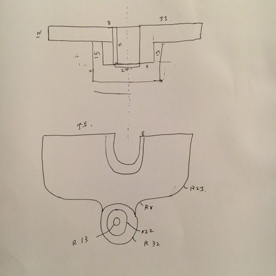
Projection lines
I tried to do each of the views with projection lines first, I thought by using the same method on paper it will ensure the views to be aligned properly.
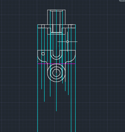
However the more lines I put on the screen, I started to get confused about it. Then Tutor Robert told me about one feature in AutoCAD that does the alignment automatically, it was much more helpful in terms of the alignment.
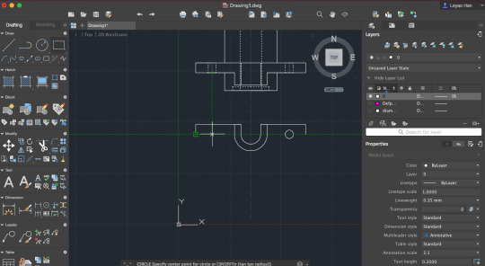
Although I planed a rough sketch of the views, I still miscalculated the length of the object. After few attempts, I worked out the correct dimension.
I tried to use the Mirror function during class time, however as I was still not very confident about to align them in the correct position, so I decided to take the slower way of doing it. If I can do this practice again, I would use this function, as it is very time-saving.
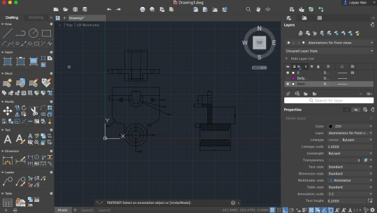
During class time, tutor Will showed us about the hatching function, which was quite straightforward. He also showed us about using various hatching lines and how to angle the lines at a certain angle.
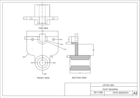
The tutor will also point out that it is better to convert it into PDF file first before printing. so that you can check first before printing it out.
Overall along with the help of friends and tutors, the tutorials on Lynda provided me with a sufficient amount of information that I need to know for operating AutoCAD, I found they are critical for completing the practice.
4 notes
·
View notes
Text
Week 4 - Drawing with CAD
First of all, this week’s practice is different from all the others we have done. this week we utilize AutoCAD as another approach to construct engineering drawing, which is far more precise and accurate, however, followed by its level of accuracy, it is very complex too.
In AutoCAD the approach that we applied in hand drawing - ‘constructing is better than measurement’ is not that important as in hand drawing. because once you get the line and you type the measurement in, the computer does all the measurement for you. However, compare with hand-drawing, using Auto CAD is far more complex when I constructing my views. I still need to plan first, and work out the top view first and then according to existing view to get the front view and right side view. ( I found that really useful, as I can get the correct views first, then drawing them by using AutoCAD).
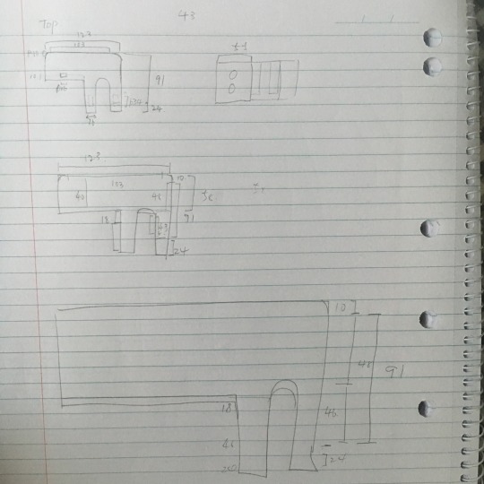
Then by using the views is constructed on paper, I use AutoCAD to draw the actual views. I found it really hard to use it. The toolbars are very unfamiliar to use for me, even though I did watch the tutorial on Lynda, still, it is very different when I actually operating AutoCAD.
At first, I had struggled with how filet the edge of the front views, with help of fellow classmate and few attempts. I finally realized how to construct it correctly.
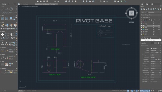
I also confused the dimensions of the front views, I forgot to include the round edge as part of the measurement, which turned out to have an unequal length for the parts that were meant to be equally aligned.
when I was doing the front view, it was quite easy compared to the top view, as I already had the top view as a reference for some of my measurements.
Then it was the Right side view, which I struggled the most, I had trouble in use constructing the circle and the straight line, but with the help of the tutors and fellow classmate, I understand how to manipulate the tool ‘tangent’ to connect the circle and the line with a correct angle.

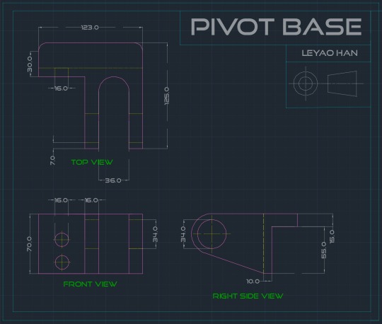
Overall, after this week’s practice, I found that by using AutoCAD the orthographic drawing is much more accurate in the measurements. I have gained a new understanding of the application, how it operates and how to manipulate the tool, most importantly by typing the commands to get the tool without searching it in the tools bar (I found that very helpful).
Several practices are still required to build a more solid understanding of the tools in AutoCAD and the tutorial videos are very helpful too.
6 notes
·
View notes
Text
Week 3 - Cross Section & Dimensions
This weeks drawing is mostly focused on the section view, which I found quite difficult to construct, however after the attempt to finish the top, bottom, and right side views, it has become much easier.
I did the front view as well, although it was not required, I think it was necessary for a better interpretation of the section view.
what I really liked about this week’s practice is that the challenge of imagining the section view inside my mind, it was quite fun yet frustrating too.
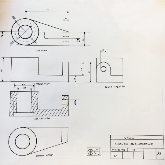
Problem:
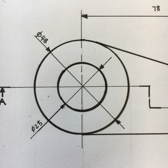
The first error I made was quite critical, however, I did not realize it until when I was outlining the drawing. I didn't draw the hidden part of the object in the top view. Therefore when I was doing my section view there were no instruction lines for the circle inside, I had to spend a lot of time in figuring out the position of the inner circle, it has made the section view more complex for me.
(There was no hidden line drawn in the dash lines.)
problem:
I had some trouble when I started to draw my bottom view, I was confused about the direction of the object, as it supposed to be upside down from the top view.
I noticed a lot of fellow classmates had to redo their drawing, due to the insufficient space to construct the bottom view. although there was some space for my bottom view, it was still quite crowded. I learned that you should always construct the position for each view first before you attempt to start, this way not only to prevent the same situation that happened to my classmate, it will also give the entire drawing a neat manner.
when I got home, I watched the videos that provided on the class blog. In one of the video, it showed a way of aligning each part of view correctly, which I think is useful. As the picture shown below, by adding a reflective plane at 45-degree angle any vertex can be projected up and vice versa without distortion. I when I look at my drawing again, I noticed that I spent to much time on trying to figure out ‘where should this part be?’ instead, if I use this technique it will be much quicker and more accurate at the same time. It happened because I did not read this week’s blog before I went to class, therefore, always read the blog and go through the information provided before you go to class.
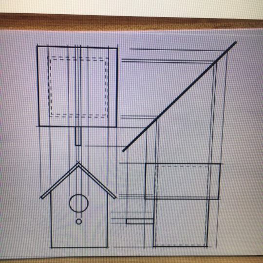
Few tips for next class:
- when you outlining the drawing, always turn the equipment upside down to prevent the ink marks, and most importantly!! make sure you know exactly which line you are outlining before you start, don’t confuse it with the instruction lines.
- A much accurate way to draw the chain lines in the section view is to place the set-square at a 45-degree angle with the assistance of T-Square, then moving it down or up by following the marks on the set- square.
- whenever you start to do the drawing, always spend some time on constructing your paper space for each view, make sure it fits every view and it is aligned properly.
- Use the textbook as a reference as always!!! It is very important!!
4 notes
·
View notes
Text
Week 2 Multi View Orthoganla Projection
Part 1:
the three sketches selected were the Top, Front, and Left Hand Side view.
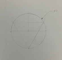
# Top View
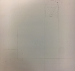
Problems: when I was drawing the top and left-hand side view, I did not align each part of the object together.
Solution: when constructing the orthogonal drawing, each view should be the imposition of its actual place, for an instant, the top view should be drawn on the top of the page, the front view should be underneath the top view. at the same time, each part of the object is to be aligned with each other.
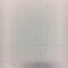
Problem: when I was constructing the left-hand view, I made a mistake in the measurement of the connection of the glass part and metal base.
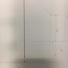
problem: when outlining the drawing, I once again made the mistake that I've made in week one’s drawing. I overlooked the line across the metal base, where it should not be outlined, as a result to that I used whiteout to get rid of the mistake that I have made.
Solution: never use a whiteout any engineering drawing.
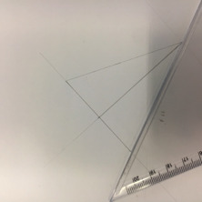
The auxiliary view was a big obstacle in my drawing process, firstly I thought it was something that similar to a section view until I referred back to page 190 in the textbook, which provides me with a precise detail of the view. it helps me in understanding what auxiliary view is about and its purpose of showing the true dimension of the specific part of the object.
however I still faced some problem when I was drawing the auxiliary view, I made a wrong consumption of the dimension, therefore led me into the wrong direction of the drawing.
Few facts about the orthogonal drawing:
Only label the dimension once, as each part of the object is aligned with each other.
The auxiliary view is reflected with the right-hand side or left-hand side view.
Outline the lines of object with a thick outlining pen, and the dimension with a thinner pen.
The dimension must be labeled correctly, which have the arrow to indicate the line.
Part 2 My chosen object was a phone charger. I did the front view and the top view of this object. Overall it was not very difficult to complete, as the object itself is in a rectangle shape. However the edges of each corner were a bit of a challenge, it was difficult to get the circle in the right place, as the lines and circle sometimes do not connect properly. More practice of using the tools are required.
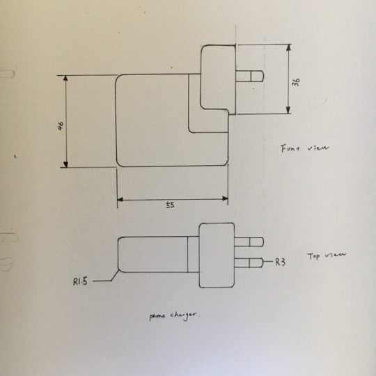
2 notes
·
View notes
Text
Week1: Drawing Instrument Exercise
Week1 Blog: Drawing Instrument Exercise (Reflection)
Overall, those three drawings, I gained few technical skills in design drawing in this course, such as:
1. The use of T square for a guiding instrument to draw horizontal and vertical lines.
2. The use of tape to latch the paper on the table to prevent any movement of the paper that might cause inaccuracy in the drawing.
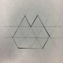
However the time that I spent on constructing guiding were too long, that had directly led to an insufficient time left for constructing the actual figure.
Figure #1:
problem: I drew too many guiding lines for the figure which later on had caused some confusions for constructing the actual figure, at the same time although I tried to make the measurement as accurate as possible however it still happened to have a millimeter difference.
outcome: only make one center point a few necessary guiding lines for constructing, focus mostly on constructing the figure rather than measure it. ‘constucting is more accurate than measurement’
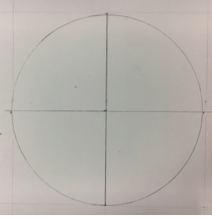
Problem: When outlining the figure, I overlooked the details in the figure, I outlined on the part where it should not be outlined. (later on, the lecturer indicated there should not have an outline.)
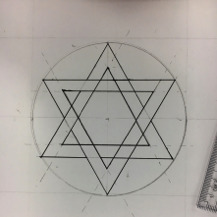
Figure #2:
Problem: I made a wrong consumption of the radius and the diameter. I made a mistake in drawing the circle, instead of having a radius of 3 which is equal to a diameter of 6, I only used a radius of 3.
Outcome: The lecture pointed out this mistake, also suggested to hold the circle template in a downside position to draw a more accurate circle. At the same time holding the pen in a straight line to gain more accuracy.
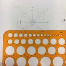

Figure #3:
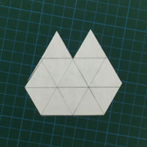
Problem: Due the problems occurred in the previous drawing, I did not have sufficient time to constructing this figure properly. so I had to rush to construct this figure, the following problems had occurred as a result of this:
The measurement was not accurate, there is space between each triangle, that failed to connect properly.
when I was cutting this figure out of paper, I placed the ruler outside the shape and used the knife from the other side, which caused the knife was out of its place and cut the inner part of the figure.
Outcome: The lecturer suggested that I could draw lines that intersect with each other, which is much more time-saving. (Creative thinking should also be applied when doing a design drawing)
For the circle template, 1 sharp pen and message the template into the right place
2 notes
·
View notes
Text
leyao Han
hey there! My name is Leyao Han, people usually call me Ley. Guess that I have the Same reason with everybodyelse who’s In this course, that is to be part of the worlds that we living in. Also to be able to design the objects that help every single person to have a better experience for their everyday living.
0 notes


