Video
tumblr
This video is a video i made in class for a project me and my classmates had to do individually based on inspiration. my video is based on my friends and my mum mainly because they inspire me the most. for the first minute of the video i quickly explained why they inspire me with pieces of papers, and for the rest of the video its just clips of me, my friends and my mum, played over a song to show the support they've give me and to show how much they mean to me. my hand writing is not the clearest, but i hope its understandable.
1 note
·
View note
Photo


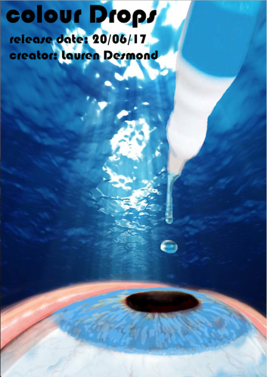
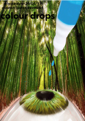
These are pieces I've made based on a project in photoshop. The project was to make a product thats never been made before, and to create a poster, logo, bill board, or something to show of your product to others. i decided to create a poster for my product, and step by step i improved it, for example different backgrounds, different colours, different layouts, different typefaces. my product was eyedrops that you use and it changes the colour of your eyes for 24hours, and once the colour fades away you just keep putting more on. i made two posters, one for green coloured eyedrops, and one for blue coloured eyedrops. For the blue one i got a water based background, and edited it slightly, then for the eye i got it off google and because it was originally brown i edited it by using the paint brush tool and smudger tool to get the colour blue. for the bottle, i got it off google cut around it, and smudged around the edges, its not as good as it can be, but its still good, then for the drop of water coming out the bottle, i also got that off google and edited it so that it comes out of the bottle and looks like its squirting into the eye. then for the text i got a bold but simple typeface which was bow-house typeface, and i place the text all in one corner at the top so its clear, but also so the main focus is the image. for my green poster i done the exact same thing as the blue one, just got a nature background, just to show all the ingredients used to make my product are natural, and because it fits in good. The background is lots of green trees, and i edited it by drawing branches coming out of the eye blended into all the other branches and trees. All together i believe my product could of been done better if i had more time, but we had a deadline to reach.
0 notes
Photo


This is a piece i sketched, and i made this piece based on a project we done which was to create a logo for a client based on 5 things they like, so their favorite shape, favorite colour, favorite animal, favorite number and words that describe them. my clients favorite colour was red, he’s favorite animal was a wolf, he’s favorite shape was a circle which explains the main logo shape and the circles around the wolfs eyes, he’s favorite number was 5 but i didn’t include it in number form, but i made 5 z shape details, two coloured in red, and the remaining 3 in black, and i decided to do Z’s as the word that described him was lazy. the other word that also described him was confused, so thats why i did a funky line going all the way around the circle logo shape. It wasn't as neat as it could be mainly because we had a strict deadline, and we had to the many other things to get to the “creating logo” step.
0 notes