
This blog is for the research and documentation of my BA (Hons) Photography degree project.
Don't wanna be here? Send us removal request.
Statistics
We looked inside some of the posts by laradegreeproject and here's what we found interesting.
Average Info
Notes Per Post
0
Likes Per Post
0
Reblog Per Post
0
Reply Per Post
0
Time Between Posts
14 hours ago
Number of Posts By Type
Photo
13
Text
4
Last Seen Tumblr Blogs


Fun Fact
1,644 Tumblr posts in 1 second.
Photo


Final Piece
When my book arrived I was overjoyed with the outcome and the overall appearance of it due to the way it was printed and how essentially everything looked the way it did online, even the majority of the colours. There are a few images slightly darker that I had hoped but it is only slightly, like the image of Zak I included in my book, which is unfortunate but I was not to know I guess and I do not have enough time to get the book re-printed. I do not think it looks awful, just slightly darker than it did on my screen but, apart from that, overall the book seems the way I wanted it to look which makes myself happy. I also decided to use a picture of Dawid in the book in the end from his contact sheet as, after looking through my shoots and the contact sheet again for this ex-classmate, I realised I actually liked the composition of this shot and included it within my book. His stance and the way he is looking into the camera comes across as confident within the shot which I find interesting and shows a lack of discomfort in the shot. I am also hoping to do a print from he book on the wall in this exhibition as, although I am pleased with my book, I feel by putting a portrait from the book may encourage more people to actually pick it up and read it. It will more than likely be frames and printed on gloss paper, like the paper that is within the book.
0 notes
Text
Evaluation
This year has been turbulent for myself as a photographer as for this degree project, you have to be very independent, more so than the past two years in university prior to this. Managing your time is an essential pivotal moment as there are not many lectures that occur throughout semester 2 and you are required to follow through your own idea for your project independently. Doing this, it allows you to find and expand on the style of photographic work you want to continue to produce throughout your career. Guidance is given but, ultimately, you are creating a body of work that you want to create and be proud of, which can create quite a large amount of stress in order to decipher which form of photography, context, theme etc. you would like to go down.
At the beginning of this project I was on similar lines as to what I am on now as I began by creating portraits of people i was in primary school with and photographing them in their living rooms with a digital camera but with not a huge amount of depth behind the reasons why. After tutorials and discussions, the idea was said to be better if i photographed just my friends instead of people I went to school with. At this point, I feel as though I became lost and unsure of what work I really wanted to produce as I knew I wanted to create portraits of people within some form of community that ties all of these people together. I was shooting because I had to, not because I wanted to, which looking back now, is very visible within the pictures I took of my friends - they look dull and boring, in my opinion. As time moved on and I felt my work was just leading nowhere, I began photographing people who I went to secondary school to see if it made sense to myself and, with a result, I enjoyed doing and it made much more sense to me as a photographer regarding the depth and context of the work. Although I began creating my final work in the last third of this project I had left, I was headstrong and knew what type of work I wanted to create and who to photograph.
Leading me to this point practitioners such as Gareth McConnell, Larry Sultan, Alec Soth, Hans Holbein The Younger and Doug Dubois have strongly influence my photographic works throughout this year. Through their work ethic and approach to their stylistic features in images, they have had a positive impact on the way I have shot portraits and the way I have thought about this project on a whole. Also by looking at some of these photographers books in the library, it has given myself guidance into how to layout my book and the exterior design that I wanted to have upon the cover.
This project has had a lot of positive and negative moments throughout it but, overall I am happy with my final piece that I have chosen to present in the exhibition. The book brings all of the work I have created together and makes me feel that all of the stress and rushing around for the shoots has paid off. The project is finished for now, which I may try to continue on after university and get in touch with other people but in regards to the book, it is finished. I am pleased with the majority of the shoots I did throughout this project as, not only was I able to capture my old classmates 5 years on from secondary schools within their current homes, I was able to reconnect with them on a personal level and gain a form of confidence that I never would have had without doing this project. I also feel like I have found a style of work that I enjoy and want to continue using on wards from university.
The amount of time had I spent trying to figure out what I wanted to do my project on was unhelpful to my situation at the time and if I was able to go back in time, I would have stayed headstrong about photographing those who I went to primary school with rather than listening to opposing voices. I feel like if I had spent all of the empty time producing no work continuing with this project, I would have ended up getting to secondary school a lot easier and quicker than I did in reality. This would have allowed me to contact more people and possibly have done more shoots for this project, allowing me to have a larger selection of images to include within my book and to back up the context of my work. I also encountered some technical difficulties regarding camera settings nearer the beginning of the year which were later rectified and I managed to improve on.
Ultimately, I am happy with my book however, I wish I did ask my tutor for more help with the order of the pictures and for him to proof read the introduction before sending it off to have been printed. Doing this may have given me a more confident overview on the book before handing it in. Nevertheless, I feel that the concept behind the work of looking at the different paths in life people have taken in their lives five years on from secondary school and how peoples appearances can alter in this time too. The technology aspect that affects peoples reconnecting in the current day and age is also prevalent in this work due to the way I got in contact with my ex classmates on social media and the pictures included in the thumbnails. I feel as though my book and the synopsis/introduction match each other and make sense which, before hand in previous modules has been an issue, the text saying one thing and the images showing another but, I honestly feel like this body of work actually makes sense with the context and depth. I have put a lot of thought and time into my project, even if it really only took off in March time, I managed to get a large quantity of shoots, research and work into creating my final piece, which I am happy with.
0 notes
Photo


Thumbnails
In my tutorial with Steve Macleod, he mentioned that using thumbnails of my old classmates whilst they were in secondary in the formation of 4-5 thumbnails per page with a sentence or two explaining what they are doing in the current day or about their hopes or dreams compared to where they are now. I got some of the images by messaging those I had photographed in which some sent me pictures through social media and others said for me to take one they are tagged in on their Facebook in which I did. Some people however did not respond to my messages which led to me not using a picture of them or not being able to find one of a somewhat okay quality at a thumbnail size thus, having to leave their picture blank on these pages. It does look odd with there being blank spaces next to some peoples names/descriptions however, I did not want to leave them out of this part due to not having a picture to use. Doing this also leaves the audience open to connotations as to whether they didn’t have any school pictures or did not respond back to me with these pictures, which could be an interesting aspect to this part of the book.
Some of the pictures are of a worse quality than others, which is made visible through the thumbnails as some are obviously professional images whilst others have been taken on mobile phones in 2008 which would have had a camera of a very poor quality. All of the images are from secondary school and show these individuals at some point during their time at The Gilberd School due to being in the desired uniform. These thumbnails show my old class mates’ appearances at some point between 2008-2013 and the differentiation in the way they looked, even if it is only slight, to the current day. It allows the audience to get a grasp on how myself as a person remembers these people during secondary school whom I have not seen for a period of time and how time has altered the way they look.
Linking back to some of the images being of a poor quality, this shows the technological advancements in the current day and how most people in secondary school probably have Iphones or something similar with a camera of good quality whereas, back in 2008-2013, Blackberries was the phone everyone had. The camera quality was not the best which explains why many of these pictures are pixelated and blurry. Including these pictures for this reason was not purposeful but it does show how far phone cameras have changed since being in school to the current day with school kids growing up in the ‘selfie generation’. If it had been 10 years before hand, 1998, images would have been with film cameras as phones with cameras were not a big part of the market during this time.
When trying to figure out what to write next to the thumbnails, I struggled quite a lot, especially for those who I did not reconnect as well with as I had hoped so did not know a large amount about their lives or their aspirations in life. I tried to keep it to more of a phrase style rather than having a paragraph next to each icon. I left it quite lighthearted in places with slight humour for example ‘gamer’ or ‘full time music listener’, as I did not want to solely focus on everyone’s current 9-5 jobs and include elements of their personality and who they are as people, or the version of them that I met. I chose to use their whole names for this part when mentioning them as it is also classed as an acknowledgements page due to me writing ‘With Thanks To:’ at the bottom as, these people are not models and willingly helped me with this project when they did not need to. Having a full name in this part of the book seemed more suited rather than having it with their portrait in the book, which is not how I wanted to present it. I also chose to bold their names to set it apart from their description in the thumbnail section and make their names more distinctive to see within this section of the book, along with making the ‘with thanks to:’ bold too.
0 notes
Photo


The Sequence of Pictures in Book
Deciding on a sequence by myself was a very difficult long process as I was trying to link up what pictures would look best after or before one another and whether there should be some sort of chronological order to the way I choose to place them in the book. The main pictures I was stuck on was the opening and closing ones within the book as these would be the first and last pictures the audience will see from this series of work. I wanted to make sure they were strong images that would stand out and allow the audience to really gain a insight as to who these people are 5 years on from secondary school and the reconnecting process that occurred between the subject and myself as the photographer.
I chose to use the image of Elise for the first opening image in the book after the title pages and introduction as I have known her throughout primary school, so there was a stronger connection that had disappeared between us after secondary school. Her stare in the picture is also very serious and menacing which I feel really pulls the audience into the book by seeing her face and her surroundings. Technically I feel like this picture is strong and a good opening picture to use for the book. Throughout the duration of the book, I tried several different orders with the portraits and tried to evenly spread out ex-classmates due to wealth, gender and ethnicity that is presented in pictures to show the best amount of differentiation between people five years on from school in these pictures. This way the audience are hopefully able to see a stronger distinction to the lives these people lead and the paths they have taken since secondary school, which is the main aim for this book.
For the last photo, I always had a strong feeling I would want the picture of Liam to be the last picture the audience sees portrait-wise in my book before getting onto the thumbnails section nearer the back. This is my favourite picture from the body of work due to the composition and I love the colour of the wallpaper behind him in the image and feel it depicts a strong sense of him as a person. I wanted the last picture they see to stand out and make an impact on them, plus, if I decide to create a print for this body of work it will more than likely be the image of Liam as I feel it is a strong stand alone picture.
0 notes
Photo


Layout and Picture Size
From the beginning, I have always been certain about what type of layout I wanted to have for the double spread pages with a portrait on the right hand side of the book with their name on the left hand side. I felt that it is a simplistic style but, it works with what my project is and what Steve said I should do with my book and that was to keep it ‘simple’ and not over complicate it. At first I wrote peoples first and last names but, after a while, I decided that I wanted to make it so it had just their first names rather than last names too on the double spreads. I felt that having their full name out in the open on these particular pages would creating a lack of intimacy that was created through the reconnecting that occurred between myself and others in the process. Putting their last names out in the open on a blank page may also make them slightly uncomfortable for any of the public to see, next to the way they current look.
Choosing the size of the picture was a difficult decision to make as I had to re-adjust the picture often which would crop out elements of the picture like the surroundings or the top of their heads so it included a lot of adjusting and moving. I felt that the first picture size on the page had too large of a border around it than I would have liked and created a lot of space around the picture which I felt it did not need, especially with the page next to it being blank too. This then left me with either having a slight border of roughly 2/3 cm all around or having no border whatsoever with my portraits.
When having a tutorial and speaking about my book, I remember it being said that having the pictures full on the page would be far too much and overwhelming, not giving the pictures enough space to breathe. With this thought in mind, although I did feel some of the pictures may have looked better without a border altogether personally, I chose to go with a small border to use for the layout of each picture in the book. If I had more time and perhaps change the layout around and not keep it in one set layout with the portraits one side and the name on the other, I would have had them different sizes and different sides of the pages but, it is best kept simple which is what I have chosen to do.
0 notes
Photo

Introduction
Blurb is the website I am using to create my book upon and it provides several different layouts, text size’s and styles for one to present their work which I personally liked the look of in order to create the type of book I would like. For the beginning of the book I left a blank white page, a page with just ‘Becoming Strangers’ upon it then another with ‘Becoming Strangers By Lara Doran’ written upon it. I have seen a few different books that have opened this way when researching and personally wanted to use it in my own book, giving the audience ease and breathing space before being shown several portraits of my ex-classmates.
Writing the introduction was quite difficult for myself to do as, although there are several different elements of my project and I had managed to whittle down the words to a 120 word synopsis, to include a more lengthy paragraph explaining my work was quite challenging. I tried to grasp the key areas within the introduction of my work through explaining the different paths taken in life, how ethnicity, class and wealth has had an impact upon these paths and how this is shown through the individuals appearance and their surroundings in the portraits. It also marks a statement towards technology and the advancements made which has led to reconnecting with these ex-classmates, which I wanted to include, aswell as a brief element about the school itself, what years we were there and where it was situated. I did not want to waffle on however or include unnecessary information that is not needed so I tried a process of constantly re-reading and sending it over to a peer a few times to double check. Unfortunately, due to printing deadlines, I was unable to check with a tutor that my introduction in the book was okay due to lack of communication aswell but thankfully I had a peer re-reading it to check for spelling/grammar mistakes.
I feel happy with what I have written and felt that it was quite a vital thing to include in my book as, without it, the series of work would not necessarily make sense and the audience may not grasp who all these people are or what ties them altogether. The information I have given the audience in the introduction gives them an insight as to what my project is about, why I have photographed them and what ties this whole series of portraits together, which is what I intended to make the introduction explain. It was unfortunate however that the piece I wrote did not cover some of the second page on this double spread as it appears quite empty and as though something should be there. Doing this however, allows the text to always be presented on the left page and the images always being on the right, which is the layout I intend to have for the rest of my book.
0 notes
Photo


Front and back cover of the book
The exterior appearance of the book is a strong factor that needs to be thought through in regards to how much information you want it to give away, the layout, colour, whether you want images upon it or left blank and whether you want it to be hardcover, soft cover or have a dust jacket. Looking on blurbs options, I chose hardcover as it is a personal preference and I do not like the way a dust jacket looks upon some books and did not think it would suit my particular project.
For the front cover, I wanted the layout to be quite plain and not give away too much about the book nor did I want to include a picture which would include choosing a specific person out of those I have photographed to be on the front cover which i did not want to do. The book is a unity of people, not singling one individual I know the best or reconnected with on the best terms to be on the front cover, which I felt like it would be if I had done this. I wanted my name and the title to have a similar amount of space either side of the text which is what I tried to do. On the spine, I kept it simple and left it as ‘Becoming Strangers’ then further down ‘By Lara Doran’.
On the back I was quite indecisive of what to put on it if I am honest, I was thinking about leaving it blank but, I felt like it would have looked too plain if I had done this. I toyed with the idea of putting ‘Class of 2008 - 2013′ on the back but, I felt it seemed slightly cringey and did not make a huge amount of sense due to the book not actually including the whole class. I tried putting an image on the back aswell but I just felt with the light blue colour of the book itself and the image upon it, it just did not suit the back and as previously mentioned I did not want to show much about the images on the book as I wanted people to physically open the book and look inside at the portraits. I came up with the text that is now on the back of the book through writing an introduction to my body of work and the text is from the last paragraph, which describes how I came up with the title for this body of work Becoming Strangers. I was slightly unsure of what to use and whether or not it would be okay to use due to lack of communication between tutors and urgently needing to send my book off, I chose to use this. Now looking back on it the line spacing is not the way I would have liked and perhaps I rushed this part a bit too much due to the printing deadline but, I am happy I chose to put the text on there rather than keeping it blank.
I chose the colour of the book as a light blue due to how it is quite a neutral colour in general but it was also one of our school colours whilst we were there, which has since been changed to just black and red. Light blue was a colour within the uniform at The Gilberd School for the first years of us being there before it was changed, which I felt was important to use as a colour to reflect upon the context of the book. Light blue is also a symbol of sadness and, although the book overall was not sad, I felt that the subject of growing away with people and the paths people take in their lives thus, losing communication due to this is quite a melancholy element seen through this project. It is not completely sad however as there are positive re connections made between myself and the subjects.
0 notes
Photo


Alec Soth Niagra book
Alec Soth’s work has been enjoyable by myself and the stance he has towards creating his images I find interesting and the bonds he creates with this people he photographs. His book for Niagra is leather bound and presented in such a beautiful and meaningful way through the presentation of it. The front cover has ‘NIAGRA’ engraved/embossed within it, so it is not of a contrasting colour and is a more subtle way of putting the title on the book. He has also used this design on the back of the book which shows a heart wrenching quote from a letter Soth scanned in from this series. Why he chose the particular phrase or wording is unknown but it is definitely meaningful and is referring to someones true feelings and thoughts.
Throughout the book there are different landscapes aswell as portrait pictures of those in Niagra depicting love, irony and comparing this to Niagra Falls itself. There are numerous different quotes included throughout the book on stand alone blank pages which i find interesting but, although I absolutely love his work, I know my project and book needs to remain simple. Including quotes throughout the book would not make much sense nor would if I engraved the front cover, as I am looking into the digital age and how technology has affected societies ability to reconnect with old classmates or friends. Creating a book online through a website fits the theme much more and I am happy in doing so.
0 notes
Photo


Doug Dubois My Last Day at Seventeen book
This book is one of my favourites due to the style of it, context behind the work and how Dubois actually came across the title for this whole body of work. I researched it earlier during the year on this blog also. The front cover is fabric however, it does not show a photograph he has taken from the series and instead is a sketch from one of the comic’s Dubois included within his book, which all tell stories about those he has photographed. By using comics, not only does it add to the narrative as he has been photographing children so it adds a childish element towards the book itself aswell as allowing the audience to be absorbed by stories about the individuals. Having them in a comic book formation also makes them seem less serious and more so that they are lighthearted and breaks up the seriousness of the several portraits he has included throughout the book.
The first page instantly plunges the reader into the work by saying ‘MY LAST DAY’ on the book inner with an image on the right hand side. Alot of books have a blank page then a title page with a picture before plunging the audience into seeing the images straight away but, Dubois chose the alternative in this situation. The bottom attached image with the portrait on the right with a small border of 2-3cm with a blank page on the left is what I aspire my finished book to look like. I would also like their name to however be on the left hand side of the blank page but, apart from that, this is the idealistic way of how I want the portraits to Iook throughout my photography book .
0 notes
Photo


Petra Collins Babe Book
Babe was quite a renowned book when it came out due to its strong message’s surrounding girlhood and growing up by showing some images that controversially would not be shown within the media e.g. the portrait of a girl reading a book whilst bleeding through her underwear. The book itself links to the topic well and suits a theme of ‘girl power’ due to using the colour of pink but, not making it extremely feminine throughout like girls are stereo-typically portrayed as. The book is a collective of different works by different people so at the bottom of the first page of the artists work, they include a signature or a name to show the differentiation between works.
The book has an introduction to it, quite a lengthily one also, which is important for a book of this topic and style, to introduce it in a way to make people understand what it is about and why it has been created etc. I would like to include a introduction to my book, maybe not of this size or length but, definitely a few paragraphs defining what my project is about and why I have created this work. The size of the book itself sort of resembles a diary, like an elements of a woman’s life where she writes all important details which could be true or just a observation by myself.
The portraits within the book are of different sizes with different borders and space around each others, sometimes due to different works by different people and being presented differently to one another and other times it is probably the way the artist intended it to look. Although my project does not link to the context of this book, I still feel that the way the book is presented in regards to layout and the portraits itself can help give me an indication as to whether or not I would like my book to look this way. I do like the size and I definitely will in-corporate a form of introduction into my book.
0 notes
Photo


Rineke Dijkstra, Portraits
I have always loved Rineke Dijkstra’s portrait work due to the style and concepts behind the series’ of work that she creates which made me feel obligated to look into her book before creating my own. This book is titled Portraits and includes all of her portraiture works throughout her career as a photographer, which is of a essentially A3 size which is vertical. The book being of such a large size allows her images to be of a larger size and make more details to become visible within those images, possibly more than those of an A4 portrait size.
Her book is hardcover with a dust jacket on and the front shows an image from the series Beach Portraits covering the whole of the cover with her name and the title of the book written in a small text size with a light white/grey colour to not be bold or take attention away from the image on the front. The border sizes does differ upon each series of work along with some images, mainly those of a larger size, getting a double spread to themselves, so one blank page to the left/right of them whereas others of a smaller size are placed next to one another on a double spread. Her portraits are quite powerful, in my opinion, and it makes sense as to why some of them are printed big on a double spread in order to give them breathing space and let the audience take every detail of the picture in.
Although I like how it looks for Dijkstra, I feel like A3 would be much too large for my portraits to be printed at and an A4 size, 20 x 25cm or so, would be more suited to my work as it is a very intimate project. I know I want to have some form of border on my images in the book as I feel each portrait taking up a whole page would be overwhelming and the images need space to breathe. The way Dijkstra’s book references each image and it is in the centre of the left hand page, which is otherwise blank apart from this piece of writing I like and would definitely like to use within my book.
0 notes
Text
Writing a Synopsis
For my book and for our degree show catalogue, I will need a synopsis in order to let the viewers know what my work is about, the concepts behind it and reasons that led me to create this piece of work. To do this, I have co-alated a list of several aspects of my project in the list below to try and narrow down the main narratives behind it.
Reconnecting with people I have lost communication with since secondary school and finding out what they are up to in the current day through the act of going to their houses and photographing them within certain rooms in their home.
The use of technology advancements allowing reconnecting with ex-classmates easier compared to those graduating 10 years before we had. Social media sites have ‘recommended friends’ and allow you to keep in touch with people that you once knew through seeing their posts or messages. This allowed me to get in touch with ex-classmates from The Gilberd School who I had not necessarily spoken to for a period of time.
The underlying bond of trust that remains between two people after school through them allowing one into their room and house, trusting that one would not make a mockery of them in the images or judge them for where they live. This being in mind, whether the individual will feel a sense of discomfort in front of the camera regarding clothes, make up, the room they feel most comfortable being photographed within.
The different paths people have taken throughout their lives since finishing secondary school whether it is working full time, being a student or a parent. Through their ethnicities, social class and wealth, their surroundings help to present the paths in which their lives have gone down since finishing school.
Baring these points in mind, I need to narrow these aspects down into a paragraph of roughly 120-150 words altogether that sums up my project to someone who has never seen or heard of Becoming Strangers before. I want to include all these points as I feel these all are part of the project as a collective but, after discussing with my tutor/peers and re-reading over what I had originally written, the chosen final synopsis is:
“Becoming Strangers is a series of portraits taken of those I went to secondary school with five years after graduating. Through the portraits and information given within the book, the differentiation in class, economic status and ethnicity becomes clear through their surroundings and paths these individuals have taken in life since leaving The Gilberd School. The work acts as a statement towards technological advancements within society where the ease of reconnecting with people is enabled by social media in contrast to those leaving school 15 years before we had.”
This synopsis I feel makes sense in regards to photographing people I went to school with, the different paths they have gone down in regards to their background within society and the impact modern day technology has had upon the ease of reconnecting with people. I feel happy with this synopsis as it is a concise explanation regarding my work and what the portraits of the people mean, the work has more depth towards it than just portraits of people I went to school with.
0 notes
Photo


Gareth McConnell’s Book
Gareth McConnell has been a huge inspiration for myself regarding style of portrait in this series and my approach to creating photographs, so I felt it would be important to be aware of the way he presents his work within a book. Throughout this self-titled book, it includes a collective work of McConnell’s work in the duration of his career from Institutionalised to his renowned Ibiza portraits. Each series throughout the book is presented in a different format to the other, to perhaps show the differentiation between each works and the importance of it for example: Ibiza portraits are shown on double spreads without any borders upon them, creating a overwhelming sense to the audience whereas, the Institutionalised portraits are shown in a grid formation. This may also have been due to lack of room in the book and wanting to include these specific images and this was the only possible way or creating a narrative of unity between these images of people.
The book itself is a hardcover with a dust jacket upon it and the front shows a image that is not a portrait and is instead an old overgrown swimming pool littered with weeds and decay. This image is desaturated with a hint of sepia which creates sorrowful connotations towards the book and perhaps the series’ within it present which could arguably be true as he does look at drugs and those who are segregated from society. Nevertheless, he creates images of people with this in an intimate and non-judgemental way - without the context he gives, one would not be able to presume what the work is replicating as such.
McConnell includes a large amount of text throughout his book giving details about each series, who the people are and how he approached creating the work for example, in Ibiza he covertly joined the rave scene in order to build up trust for those he wanted to photograph. Including the text he does, which ranges from 1-2 pages for each series is quite vital so the audience reading the book will understand the meaning behind the work and how the portraits of each person tie together.
At the back of the book, McConnell had also put a ‘Acknowledgements’ page naming every person that was within a portrait as a simple thanks to them. I really like the idea of this and would like to use this in my book and name those I have photographed for my book and included within it, they did not have to take part or help me out with it but, they did and I am very appreciative of that.
0 notes
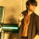
Photo

Joel Final Shot
This is the image of Joel I have chosen out of all of the contact sheet, I have Photo-shopped the Curves slightly to make it look more evenly exposed and I have edited out a hanger in the background of the image which I felt was distracting to the viewer. Joel is wearing all black so he contrasts with the background tones of white and blue, which also matches the luminous white colour of the image on his hooded jumper. His expression looks slightly dazed whilst he is facing a diagonal on his bed with both legs crossed whilst having dark red socks on his feet. The position he is sat in gives off slight awkward connotations from his part however, I feel that I should have gotten him to move back or right slightly so I did not cut off his feet but, there is nothing I can do to rectify that. Part of it is due to the amount of room within there and through using a 50mm lens - there is only so much moving back you can do.Although there is not a lot of elements in the surrounds that refers to his identity or who he is as a person, through the mac in the right hand side of the shot, you are able to note he has enough money to afford one and that he spends alot of time using it, as it is on his bed and not on a desk.
I feel as though I will use this in my book as although it does not technically involve much indications towards his personality or his identity, the re-connection between myself and him was one of the strongest I have experienced from this project. The fact it perhaps is not one of the best images I have taken from this series of work, I feel that the fact I managed to miss half of his foot within the shot due to reconnecting with him shows a positive light on the project. Reconnecting with ex classmates is not always necessarily an uncomfortable experience and can be shown to be a positive situation, which is seen through myself and Joel, even though the picture itself is not technically 100% strong, the re-connection was which is what led to this.
0 notes
Photo

Joel Contact Sheet
I have decided due to the time frame given in order to create a book and be prepared for my exhibition, that this shoot would be my final one in regards to my book. After the book however, I plan to continue this project onward and photograph more people I am able to get in contact with but for now, I feel like it is time to put shooting to a pause and focus on the book. This shoot was with Joel, someone who I often would speak to in secondary school due to being in my maths and statistics classes. We both had a love for music and were in a band together for a brief moment during secondary school but, as the way my project seems to have gone, we both went down separate paths, making different friends and leaving those memories behind. I always remembered him having extremely long hair and teachers consistently telling him to get his hair cut shorter etc. which looking back on, was pretty harsh.
After secondary school, I believe Joel went on to do a music b-tech at Colchester Institute and I know he has a girlfriend who lives in Canada who he regularly flies over to go and visit. In the current day he works full time, although he did not say where he actually works but, he is in three bands local to Colchester, in which he drums/sings in. He is also a music producer and recorder, able to create music for bands to use on EP’s or albums, showing music is his true passion.
Joel was very welcoming and even offered me a drink when I walked into his house, which was comforting for both of us, whilst I opted for water he had a pint of beer. This allowed myself to see a strong element of trust between us that he would be willing to drink alcohol around myself whilst I am taking photographs of him shows he knows I would not make him look bad within the portraits. He was a lot more talkative than I actually remember from school and he definitely seemed much happier as a person, which I was glad to see. He gave me a quick tour, including showing me his recording room with his drums in the garage, which shows a strong element of trust between us still, as it had tickets and other momentos from his life upon the walls. I did not want to photograph him in there due to 1. there was no natural lighting and barely any room and 2. he had trusted me to see it and I wanted that to remain between us and the bond that remains between ex-classmates, I did not want to present it to the world in a photograph.
The photos were taken in his bedroom which had my preferred natural lighting, however still fairly dark and the surroundings were quite plain. In the pictures I feel as though he overly look comfortable with a serious set of facial expressions looking into the camera. I feel like I should have perhaps experimented a bit more with positions and where he was sat for this shoot but, I feel like because we connected on a positive note, we were both focusing on catching up and upon common grounds more than focusing on the images. I do quite like the pictures with the door in the background but, I feel that I should have paid more attention to the way he was posing and where he was facing in the shots.
0 notes
Text
Tutorial
In this final singular tutorial, it was discussed that my book should be a size between A3 - A4, if that is possible and, if not, go for A4 with vertical way up rather than landscape. This way it would be a portrait way up and allow my images to be seen the way I intended. We looked at different books and the way a picture is presented within a book is much more different to prints upon a wall as, print wise, I try to go a large size but, seeing the images within a book, it depends on border and writing that you plan on including within the book.
It was originally discussed to get my book binded by a proper book binders rather than design and get it printed online. However, after thinking about time and money, it would be more effective to design the book online with a template and get it printed then sent over to myself. If I was to get it binded, I would need to buy double sided gloss/matte paper and print all the pictures off on the Epson printer at university and more than likely have assistance whilst doing so. So with this in mind, I have decided to use an online book making website like Blurb or Mixam and begin designing it.
0 notes
Text
Places to order a book from
Creating a book is a lengthy process that takes alot of thought in regards to design, size, look, sequence and elements included within it. The original plan was to print the book at university on a printer and then take the prints to a book binders in order to get it bound, to make it much more intimate and to make sure the work was in the right order bound the way I would like. After thinking about the practicality of this, if it was time effective and whether it made sense with my project, it was decided to get the book done online on a book website. It will mark the technological advances as to which anyone is able to get a book printed over the internet which would not have been possible perhaps 10/15 years ago. It would also be easier to design and for me to make the book look the way I would like through templates on the websites. Places to get a book made:
Mixam - This website was used for my degree show catalogues and I know the print quality is of a good standard and delivery is quick. The website allows you to select different sizes, different paper types, paper weight and the finishing on the front cover. The layout I wanted to create for my book however, I do not think was possible if I was to use Mixam although I know the print quality is of a good standard.
Blurb - On this website, there are several different layouts I am able to use in order to change and alter the layout to which I would like the book pages to look like. This enables myself to design the book the way I would like it to look and also have it at an A4 portrait size aswell. I would like to have the pictures at a 20x25cm size with a slight border around it which I think will look like the right size for myself.
Snapfish - This looks like more of a photo album style of book rather than creating an actual photographic book of a a4 portrait size.
0 notes