Text
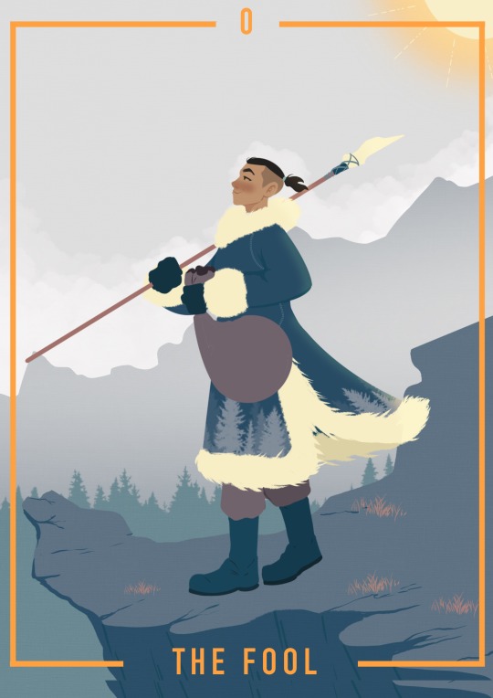
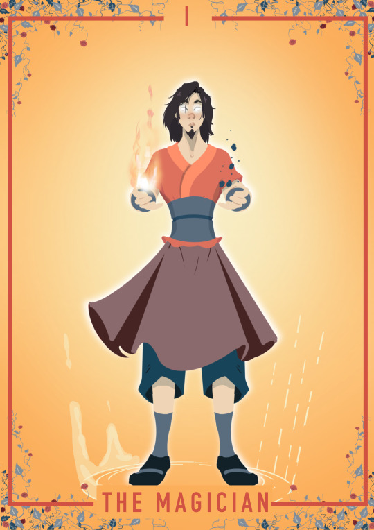
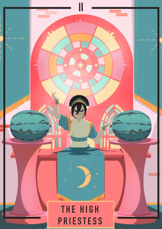
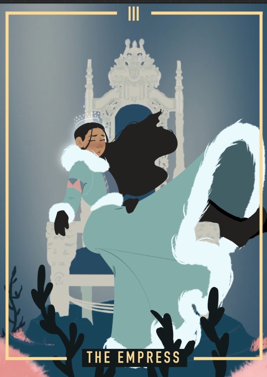
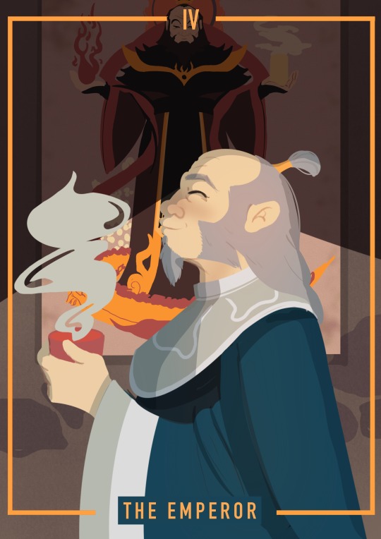
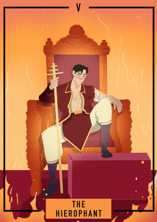
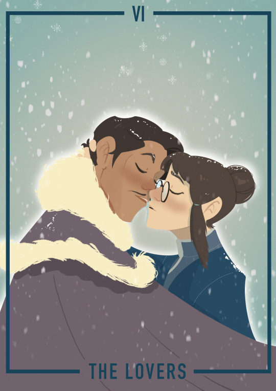

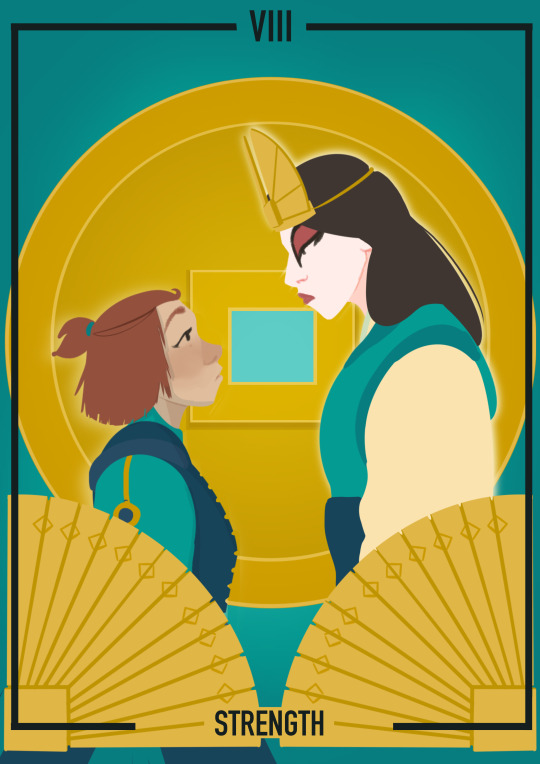
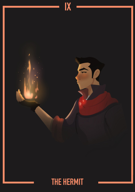


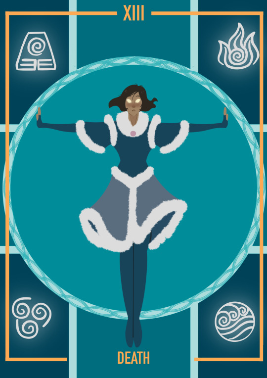
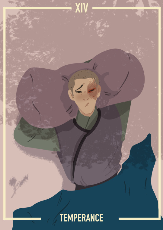

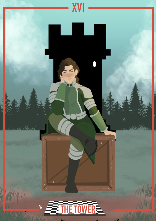
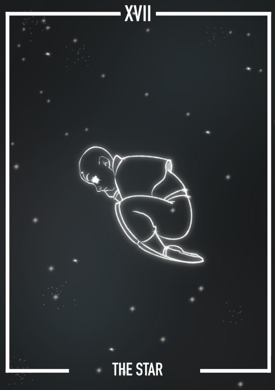
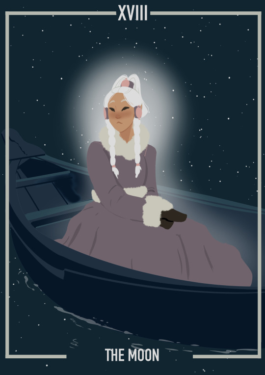
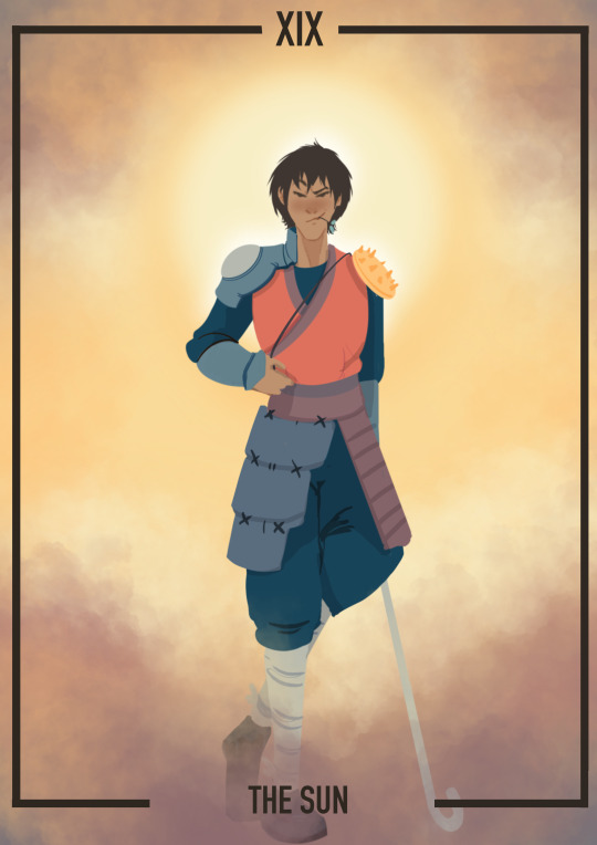
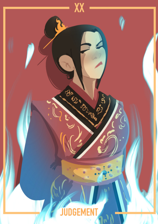
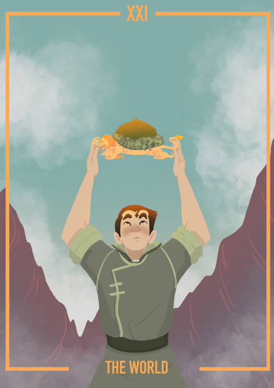
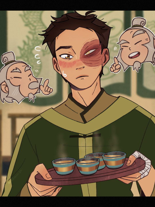
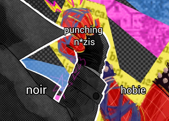
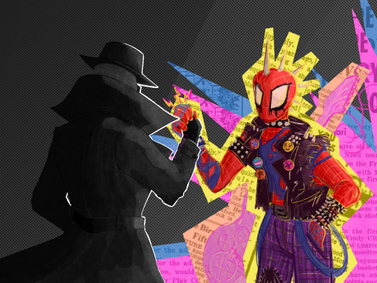
The major arcana is finished!!!!!!!
I'm thinking of getting this printed in a mini zine. If you're interested please let me know since I'm looking for distributers for a copy for myself at least.
Commissions are open and info can be found here
My ko-fi is here
4K notes
·
View notes
Text
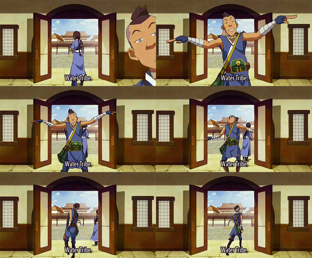
I love how despite not being a bender, Sokka is the biggest embodiment of everything the Water Tribe values in the show, both good and bad.
Change. Sokka who humbled himself when the Kyoshi warriors proved him wrong and took their teachings to heart. Sokka who always had a plan, a few hundred backup plans, and could still get out of a sticky situation on the fly. Sokka whose friends became bored and aimless without his quick wit and initiative.
Kindness. Sokka who went to save Aang before Katara even had to ask him to. Sokka who saw the humanity in an old man from the fire nation. Sokka who gave Jet a second chance despite being the first one to be suspicious of him. Sokka who showed Zuko to his room and held no resentment against him. Sokka who shielded Toph from falling debris with his body.
Ingenuity. Sokka who invented airships and submarines. Sokka who took down the drill. Sokka who broke into a Fire Nation prison rig and out of the highest security prison in the country. Sokka who levelled Ozai’s entire sky fleet in one tactical manoeuvre.
Love. Sokka who couldn’t remember his mother’s face but carries the grief of her death so deeply that he protects every woman he meets with the same unhealthy hypervigilance. Sokka who instinctually jumps to defend his sister despite their constant bickering.
Community. Sokka who gave up his childhood to become the sole protector of his village and dedicated his time to training the younger boys in combat. Sokka who learned to let go of his hypervigilance and put his trust in the people he’a afraid of losing so they can protect him like he protects them. Sokka who stood alone guarding the gates of his home as Zuko’s ship towered over them.
6K notes
·
View notes
Text
aang haters are so insane cause you’re literally hating on happiness personified????????


he is literally just a guy
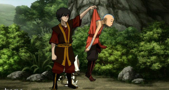
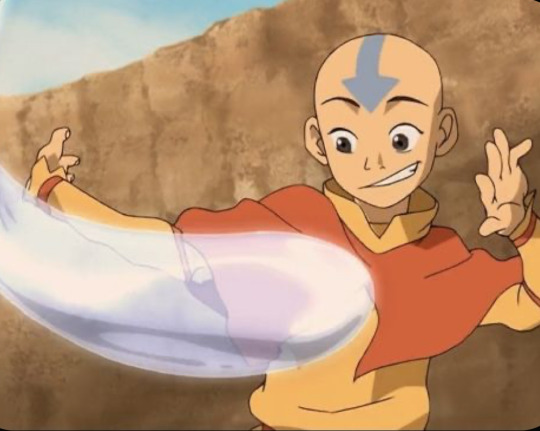


who is five apples tall


and needs his sleep


9K notes
·
View notes
Text
i'm AWARE this is a stupid hill to die on, but like. trope vs theme vs cliché vs motif vs archetype MATTERS. it matters to Me and i will die on this hill no matter how much others decide it's pointless. words mean things
90K notes
·
View notes
Text
Red, White & Royal Blue Rebind


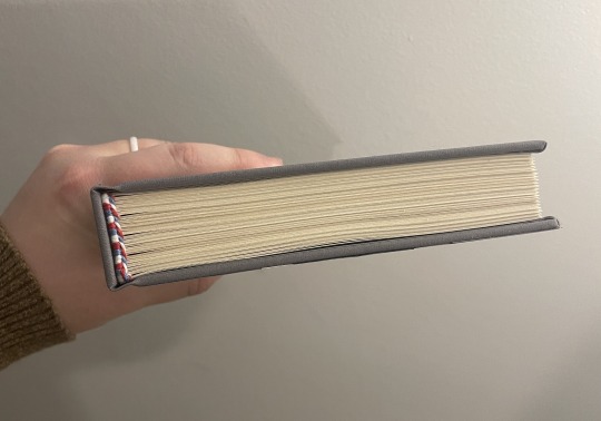
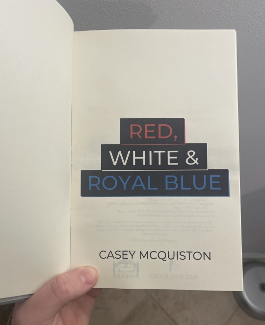


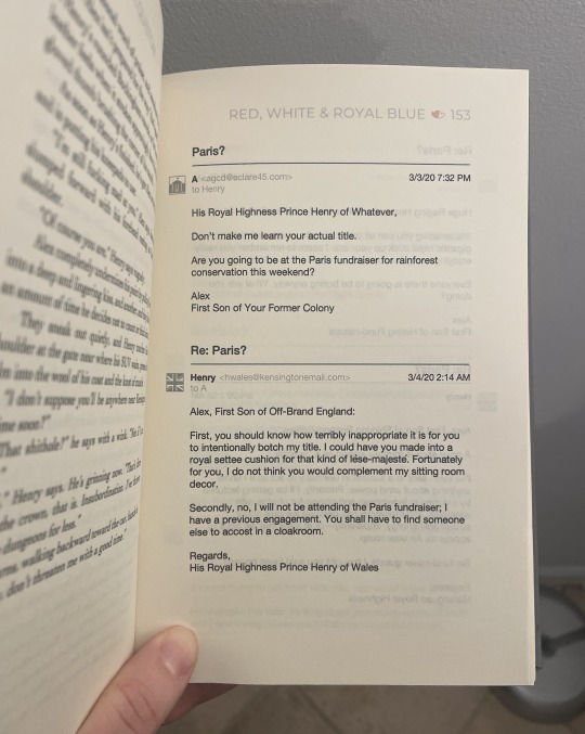

[ID: Eight pictures of a hand-bound rebind of the book "Red, White & Royal Blue." The first shows the cover, which has been bound in light gray bookcloth and is decorated to look like a suit with a union jack tie. There are two cardstock buttons, one that says "Vote Claremont" and the other that says "History, huh?" On the right side, the title "Red, White and Royal Blue" is painted on in red, white, and blue paint respectively. On the left side, the author name "Casey McQuiston" is painted on in white paint. The second shows the spine, covered also in gray bookcloth. It has the title "Red, White and Royal Blue" painted on in red, white, and blue paint respectively and the author name "Casey McQuiston" painted on in white paint. The third shows the book from the top so the headbands, sewn with red, white, and blue thread, can be seen. The fourth shows the title page of the book, which has the title "Red, White and Royal Blue" in red, white, and blue ink respectively, as well as the author name "Casey McQuiston" beneath it. The fifth shows the colophon page (left) and dedication page (right). The colophon has details about the book, as well as the binder logo for Blue Skies Books (a bluejay) and the logo for Renegade Publishing (a bookpress). The dedication page says, "For the weirdos and the dreamers" in a sans serif font above a black and white drawing of a reflective lake with pine trees around it. The sixth shows a chapter header page, which has a gray skyline that merges the skylines of DC and London across the top of it. The word "One" is in all caps in white on the lefthand side of the skyline, and body text is beneath it in a serif font. The seventh shows the inside of the book, drawing attention to the formatting of the emails throughout the book. The emails include icons for both Henry and Alex, email addresses, timestamps, and subjects. The eighth shows the inside of the book, drawing attention to the red, white, and blue heart page divider and the handwriting fonts used within the regular body text for certain words. /End ID]
When the Red, White and Royal Blue movie came out last year, I rediscovered my love for this book and these characters and just had to do a rebind of it! This is a full rebind, so I've done the typeset myself as well as the cover. I had a delightful time coming up with the cover design (I imagine this is modeled after a theoretical Alex suit, though it could be Henry's as well!), and I had an especially fun time doing the typeset. There are so many fun formatting elements in this story, and it was great getting to put my own spin on them.
Logistics-wise, this bind uses Lumeiere fabric paint and a Silhouette-cut stencil for the words, Silhouette-cut cardstock for the decorative elements, handmade cotton bookcloth for the cover, cotton embroidery thread for the endbands, and regular Hammermill cream paper for the textblock. (Once I've saved up for it, I'm looking forward to getting some short-grain textblock paper! This is still long grain.) The body font is Cochin and the title font is Montserrat.
And finally: my bind versus my trade paperback copy!
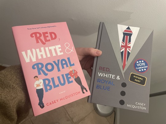
[ID: A picture of the hand-bound version of "Red, White and Royal Blue" from above held next to the mass-produced paperback version of the same book. They are made in different styles with different color schemes, but both have a fun and slightly whimsical appearance to them. /End ID]
181 notes
·
View notes


