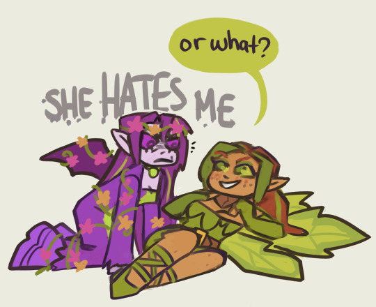
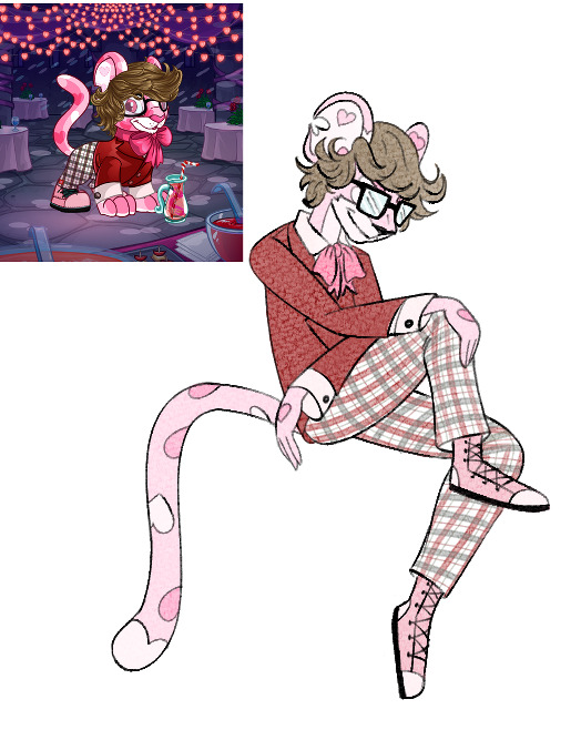
🍏🚫 kyriis are objectively the coolest pets dont @ me 💜 add me on neopets.com my username is acedemiro 🌈 they/he 💎 ⚧️⚢☿️
Don't wanna be here? Send us removal request.
Text
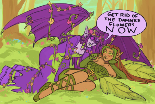
Neovember Day 6: Design a Paintbrush idea that you would love for TNT to implement
i've had this idea for over a year now and never got around to drawing it- the Sweet Dreams Paint Brush! I feel like including the moon and clouds makes it feel a little more like a shopkeeper, but i thought they were cute enough to be worth it
493 notes
·
View notes
Text
i am being bullied (affectionate) into posting some of my tdf/altador art
some close ups
253 notes
·
View notes
Text
ok guys its time for hot or not neopets edition. i am going to give you my definitive best and worst of every neopets color. or at least all of the ones where the pets look meaningfully different. i’m committed to unproductivity today.
Keep reading
#i mostly agree but i think royalgirl kyrii is objectively the best royalgirl design#i understand i am biased though also most royalgirl pets are good in general
1K notes
·
View notes
Text
my neopets ocs! i am so completely normal about them. and yes theyre all lesbians
-----
jartsa the fire skeith | omppu-neiti the christmas kau
mimmi the darigan ixi | nakki the halloween kyrii
269 notes
·
View notes
Text
🎉 anniversary pet styles! 🥳
(via jellyneo)
which one is your favorite?
352 notes
·
View notes
Text
721 notes
·
View notes
Text
🤎 🤎 🤎 | 🤎 🤎 🤎 | 🤎 🤎 🤎
chocolate acara stimboard
45 notes
·
View notes
Note
since u reviewed the other three dragon neopets, maybe you could review the draik next? it's one of my favorite neopets!
Draiks are one of four (4) dragon Neopets, which is entirely too many. Despite coming last however, it does feel like they're one of the more memorable dragon designs on the site.
Part of the reason for this is that Draiks are restricted Neopets, which is a fancy way of saying that you can't make them through Create-A-Pet the way you can almost every other species. Instead, you have to either use a morphing potion or get a Draik egg item and bring it to the Draiks' Nest page. Thankfully TNT has made Draiks much easier to get over the years due to wide releases of morphing potions among other things, reducing them from an elite status symbol to just a somewhat less common pet with a neat gimmick.
The other reason is that Draiks have an usually slim and detailed design for Neopets. There's no hard rules for Neopets, but they generally skew towards thicker and almost chibi-ish in terms of proportions—think like the Scorchio. The Draik's slender body stands out amongst the more standard dragon designs, as does details like the subtle speckling. It also helps that they have a lot of really good colour options.
Base colour wise, the light grey accents work well as they blend with any given color and don't overpower the design. The color distribution is also very good, with the large swaths of grey used on both the underbelly and on the wings and ear fins. Meanwhile, the eyes pop due to a combo of red and yellow.
Visually, I also really like how the little whiskers by the mouth are matched by ones on the head (which are missing from some colours?) and the ear fins, and how the fins mimic the shape of the wings. It feels very well thought-out and cohesive.
Draiks were improved greatly by customization and I am prepared to die on this hill. The old art had such a weird expression, like it just accidentally dropped your iPhone into the pool and is trying to figure out how to gently break the news to you. The way everything is cluttered towards the center of the body also makes the silhouette very hard to read, and the red head hairs ruin the cohesion thing I mentioned earlier. The tail standing is sort of neat, but unlike Meercas I don't think think they've really ever done this outside of the original pet art.
Favorite Colours:
Maraquan: A particularly pretty design, the Maraquan Draik looks a bit like a lionfish crossed with an eel. The whit base with the orange and magenta accents looks really nice, and the subtle changes to the design—one back fin instead of two wings, fins around the tail, long whiskers—feel appropriately aquatic but keep the species recognizable.
The converted version is very similar to the UC/styled version, just flipped. However, it always felt subtly off to me, and after some investigation I've figured out that it's because, in addition to shorter whiskers and a slightly smaller head, the head isn't turned enough relative to the body so it doesn't quite connect right. It's a minor thing but it low-key drives me nuts.
Chocolate: The chocolate Draik, while not necessarily unusual for the color, looks really nice. I love the use of wafers for the wings and fins and the subtle cracks. The white chocolate parts add nice contrast and the chocolate topping and whipped cream add some nice finishing touches.
Mutant: The mutant Draik has much more realistic dragon-like proportions than usual, which makes it look particularly different compared to the usual delicate design. I do think it looks more zombie-like than mutant-like due to the exposed brain and ragged wings (plus the base anatomy remains unchanged), but it's still a good design regardless.
Both versions are fine, but the UC/styled one is just a superior take overall; better shading and beefier proportions in things like the tail and arms, plus the cool tongue. I honestly don't know why they changed it, seeing as mutants can't wear clothes and nothing significant changed; it's like they didn't have vector files so they redid the entire thing instead of properly redrawing over it.
BONUS: Speaking of Draik colors that got butchered in conversion, the Tyrannian Draik is a travesty. The UC/styled design has a triceratops-like head crest, which works because the head is incredibly flat. I get that there was no good way to convert it, but maybe just... don't, then? Regardless, the original design is great. I really details like the banding on the feet, hands, and nose horn, the subtle speckling, and the nice brown/greenish-grey contrast.
31 notes
·
View notes