For understanding of the type of technologies available for producing, publishing, promoting and communicating art and design work
Don't wanna be here? Send us removal request.
Text
Assessment Task 2 : Computer Networks
How complex is the technology required for use? How is the accessibility?
For this unit, I decided to use Tumblr to publish my research and practical work, through-out. Tumblr is widely used and can be easily navigated, edited and customized.
The quality of design and layout
All assessment tasks will be neatly organized and linked towards each post, so it will allow the user to access it’s contents.
How you plan and communicate your work
I plan to communicate by text, screenshots and diagrams.
0 notes
Text
COMPUTER ARTS AND DESIGN: THEORY AND PRACTICE
ASSESSMENT TASK 1
ASSESSMENT TASK 2
ASSESSMENT TASK 3
ASSESSMENT TASK 4
ASSESSMENT TASK 5
ASSESSMENT TASK 6
ASSESSMENT TASK 7
ASSESSMENT TASK 8
ASSESSMENT TASK 9
0 notes
Text
COMPUTER ARTS AND DESIGN: TECHNOLOGY
ASSESSMENT TASK 1
ASSESSMENT TASK 2
ASSESSMENT TASK 3
ASSESSMENT TASK 4
ASSESSMENT TASK 5
ASSESSMENT TASK 6
FADING BLOCK
X AND Y
DRAG AND DROP
A TO B
RANDOM SHAPES AND COLOURS
COLOUR PALLET
ASSESSMENT TASK 7
ASSESSMENT TASK 8
0 notes
Text
Assessment Task 7 (Outcome 1) Managing Files

There are many graphic file types that the user and computer can use, such as .jpg, .png, .gif and .bmp. They can be used in many programs that can allow to view, edit or adjust. Examples of programs like Photoshop or PDF Reader

Lossless and lossy compression are terms that describe whether or not, in the compression of a file, all original data can be recovered when the file is uncompressed. With lossless compression, every single bit of data that was originally in the file remains after the file is uncompressed, but high amount of data is still high.
On the other hand, lossy compression reduces a file by permanently eliminating certain information, especially redundant information, but quality is at fault a little.

A Metafile is a file format that can be stored in multiple types of data. This is commonly used for graphics file formats. These graphics files can contain raster, vector, and type data. A common use for these files is to provide support for an operating system's computer graphics; e.g., Microsoft Windows uses Windows Metafile

A type of File Naming Conventions are commonly used for separating what type of file that version of a same file that was used multiple times, like save spots in video games or edits for pictures.

The importance of file management and file locations will allow the user to understand what or where the file is stored at. It will use directories and folders to pinpoint what exactly the file will be in.
0 notes
Text
Assessment Task 6 (Outcome 2) Display Systems (6)

https://www.openprocessing.org/sketch/558101
0 notes
Text
Assessment Task 6 (Outcome 2) Display Systems (5)

https://www.openprocessing.org/sketch/558094
0 notes
Text
Task 9 (Outcome 1) Navigation
This will allow us to understand how a range of both computer and non-computer navigation systems work.
Examples of computer-based navigation systems.


Many popular user interfaces (MacOS, Windows, Linux Ubuntu)
Examples of real world navigation systems.


Commonalities between computer based and real world navigation systems.
These systems allow all users to figure out where and what they want to do/go around, either in real life or in a computer. They allow directions or shortcuts to a highlighted objective that can be an program or either a building/room.
0 notes
Text
Assessment Task 5 (Outcome 1) Engagement - Theory and Practice
Whist films gives most of the viewers the attention within the time frame by getting to the point as quickly as possible, and given a connection to the characters.
For websites, it will allow the user to grabs their attention with minimal layouts, editable colours or banners/notifications, it has to give the user some interactivity or the ability to edit behind it. Allowing the user to make a profile and edit it will attract other users inside the site.

https://twitter.com/Twitter
In Film, many opening sequences allow the audience to be orientated such as Blade Runner in 1982, gives the viewer that the perspective of the future and details in title cards. Then after that, it jumps towards the view of a dystopian LA, and the close up of an eye.


https://www.youtube.com/watch?v=-fu7jN2_2pE
For key information, Akira in 1988 gives the viewers what would happen if another “explosion” in Tokyo, would spark an different and unreal change of a new “NEO TOKYO” in 2019. The viewers might think it was unexpected at all, a large white boom right in to their faces, after that, big red text displaying the title and the change of the the landscape.

Narrative structures also gives the users engagement towards many things like film. They allow certain points of change and acts.
An Dramatic Structure allows an ending to have an sudden ending or “cliffhanger” Its way more different than your normal narrative structure because it does not have your straight to the point ending.
An Three Act Structure allows the viewer to understand the situation whist giving key plot points towards an climax. This structure has a way more understandable and heads to the ending.
A Hero’s Journey is an study in narratology which gives an template, allows the viewer broaden the tasks, items and people along the paths the character takes. This is way popular structure in Hero Films. Its way different than your normal structure because this can be repeated more times than usual.

Cause and Effect can be easily be implemented in many media, but highly towards an Role Playing Game because of the interaction of an user. The user would decide on what he/she would do, such as a selection of speech/person to trust or not to. Later on, they would serve a consequence or a positive effect on the story along the end.

0 notes
Text
Assessment Task 6 (Outcome 2) Display Systems (3)

https://www.openprocessing.org/sketch/556516
0 notes
Text
Assessment Task 3 (Outcome1) Interactivity
History of Human Computer Interactivity
Humans were capable enough to create computers and have interactivity during the beginnings at the 1970s, when personal computing were realised for the general market, but at a price. This is when we figure out what we could do with these machines and then produce the same devices that have the same program, OS, etc. Old computers uses old interactivity such as switches, lights or buttons that couldn't show anything that helpful for a user in the general market. Then later on...

EAI 180 Hybrid Computer
Open Form of Interactivity
Physical
Around the middle of the 70s, IBM and Apples in such created an far more easier interface for the users to operative on such as a screen, text-based or early graphic UI, keyboards and other improvements.

Boot Screen
Closed Form of Interactivity
Internal and Cognitive

IBM PC (1981)
Open Form of Interactivity
Physical
Simulation Computer
Simulations were you create an system that "simulates" a reality or an interactive program, such as a flight simulator. This allows the user to pay attention to their surroundings, act in such way or use correct moves with interaction. The interactivity can be physical, cognitive and internal in some way depending on the simulation.

Hypertext
The use of hypertext is to link up a document, files of others that you can interact with by clicking on it directly with a cursor. This can be a closed form of interaction because you interact with it within the website.
Video Games / Computer Games
Video games are a form of many interactivity as you can play it with a controller, which can move of respond something to your inputs. For example, Pong allows the users to move around the paddle to bounce a square/ball around the screen.

Time-based
An Time-based interaction is worked by pressing something to stop or play like videos would. This can be a cognitive and internal interaction.

Task orientated
Programs like Photoshop or iMovie allows users to interact with their work with many options or tools. Users can even input with different equipment like a drawing pad. This interaction is cognitive, internal and physical.

0 notes
Text
Assessment Task 6 (Outcome2) Display Systems (2)

https://www.openprocessing.org/sketch/554101#
I think it works perfectly because it displays the coordinates that are needed for me to know where I am at on the screen. (x = 0) (Also fixed to display the both x and y in website)
0 notes
Text
Assessment Task 6 (Outcome2) Display Systems (1)

https://www.openprocessing.org/sketch/554096
0 notes
Text
Assessment Task 8 (Outcome2) Information Structures and Managing Files


0 notes
Text
Task 5 (Outcome 1) - Display Systems
This will allow to understand how digital graphic files are displayed and stored on a computer.
Raster Files and Pixel Grids
Raster files or Pixel grids are files that are made up of lots of pixels to make up one image. The files consists of .jpg, .gif, .png and .tif

Bit Depth
Bit depth can be used to determine the quality of the image or sound and the likely the size of it.

Resolution
Resolution is made up of how many pixels or dots per inch towards a screen. For example, an standard flat screen HD monitor would consists of 1920 x 1080. 1920 will be horizontal pixels and 1080 will be vertical, these can make up how high the resolution the display can project.

Vector Files
Vector files such as .ai, .pdf or .svg would allow the user to have more smooth images that you can edit. It retains far more better image quality because of its points and paths.

X, Y and Z Coordinate Systems
The Coordinate System can allow to make up an 3 dimensional image. The X and Y being horizontal and vertical, whist the Z being the location of the object will be.

Anti- Alias
Anti-Aliasing is used to create the images to smooth out the roughness of the edges, giving them a less jaggy appearance and more fuzzy.

Aspect-Ratio
The use of Aspect-ratio gives how big of the width to the height of an image or screen.

Colour Pallets
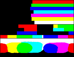
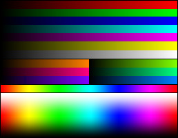
These are used to make up how the colours are displayed on the screen, this was widely used for older technology (like composite video) so they can tell what colour they needed. As of today such with RGB with around 24bits or more, we can obtain more colours than the old technology could.

Example with colour chart on Teletext

Example with RGB 24bit colour chart
0 notes
Photo


Colour Task 3 Processing
https://drive.google.com/open?id=1QMucqJkSVN61gZIVvvwD8rk2HPTqLRVd
0 notes
Text
Assessment Task 7 (Outcome1) Task 7 - Information Structures
Examples of visual metaphors used: -
· in film for the passage of time


Steins;Gate Anime (2011) (Time Travel)
· in real life for direction and movement

· on the computer for processes/tasks in software programs

These examples like loading can allow the users to understand the key aspect of the visual representation of what is going on/ about to go. It will show what exactly it is with less meaning but with understandable information.
“We are told to believe that this is a “metaphor” for a ‘desktop’. But I personally have never seen a desktop where pointing at a lower piece of paper makes it jump to the top, or where placing a sheet of paper on top of a file folder causes the folder to gobble it up. I don’t believe such desks exist, and I don’t think I want one if it did.”
Nelson, The Art of Human-Computer Interface Design, (1990: 237)
Nelson gave a clear but also deniable and comedic explanation of how computer desktops can use a metaphoric visual that explains what is going on, like dragging a file to a bin with a quirky or minimal way. I think these things can exist if the user points out the fact that it shows it.
Icons: Examples of icons used in software and websites that I find unhelpful or confusing.

These can be confusing when it is minimised, couldn't tell the difference.
Screen Space: Examples of the effective use of off-screen space in both film and on the computer.


Ghost in the Shell (1995)
Same posture and the same backdrop, it can allow the viewer to focus the main character but understanding the setting change too.

Launchpad on Mac
Tidy and Minimal interface
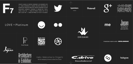
Modular Systems: Example of the use of a grid in laying out a web page.


http://f7th.com
I think this type of grid layout is surprisingly minimal and tidy, including the icons that are universal to understand. Visuals are also a good point too.
0 notes
