Don't wanna be here? Send us removal request.
Photo
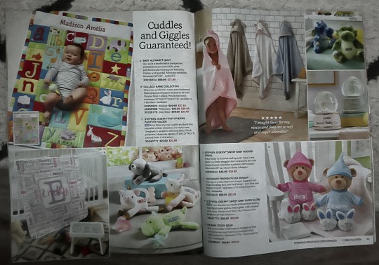
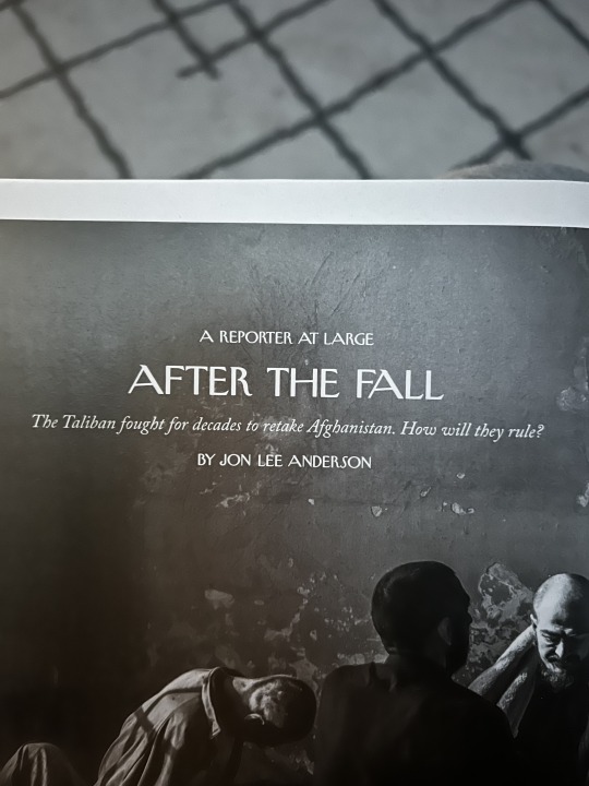
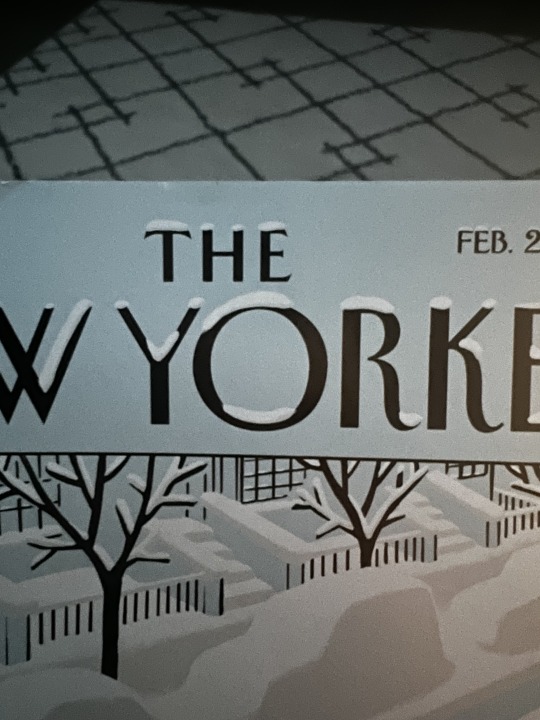
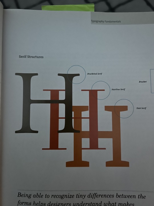
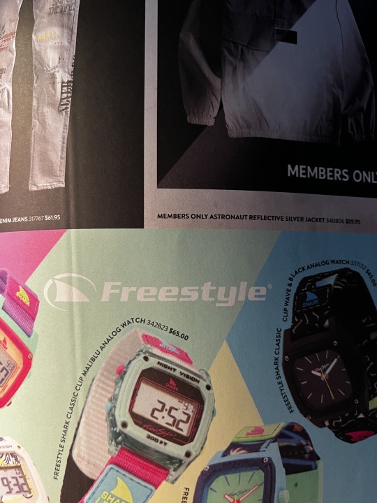
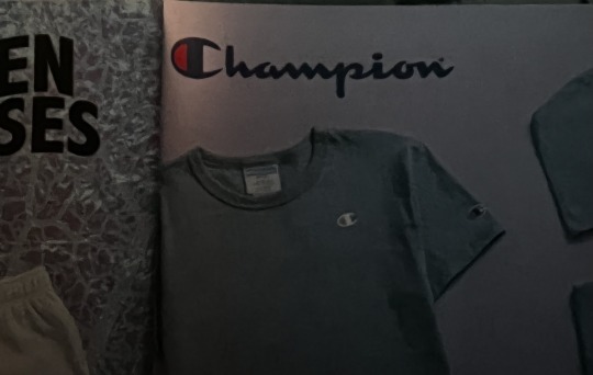
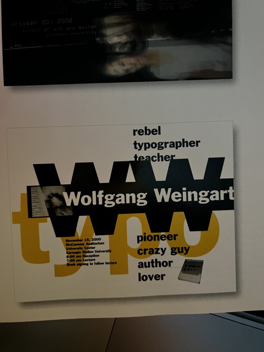
1)Rhythm in a publication design. Your eyes follow the text on the left and smoothly transition to the other side where the text is continuing. After that you are watching the pictures.
2)Typographic hierarchy. Larger and more text is read first, than the top line, than the bottom and than only the italic
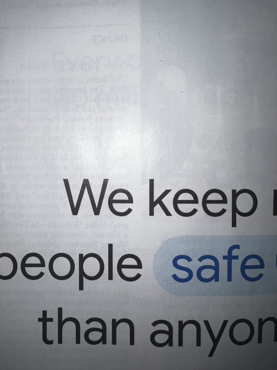
3)A letter with an ascender. W is the letter with the ascender here. The ascender in the W is the room from the top to where the x-height finishes.
4)A letter with a descender. Y is the letter with a descender. The room from the bottom line of x-height until the end of the letter y.
5)A letter with a counter. The space in the letter O.
6)A letter with a crossbar. The line in the H is what makes it a crossbar letter.
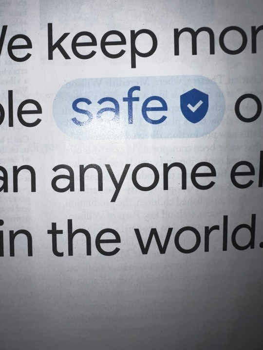
7)A font (in use) that has a large x-height. F and R are really close in size.
8)A font (in use) with a small x-height. C is way bigger than A.
9)A piece of design that appears to be “Modernist” based on your understanding of the term from watching Helvetica. Here is a modernist design that I found.
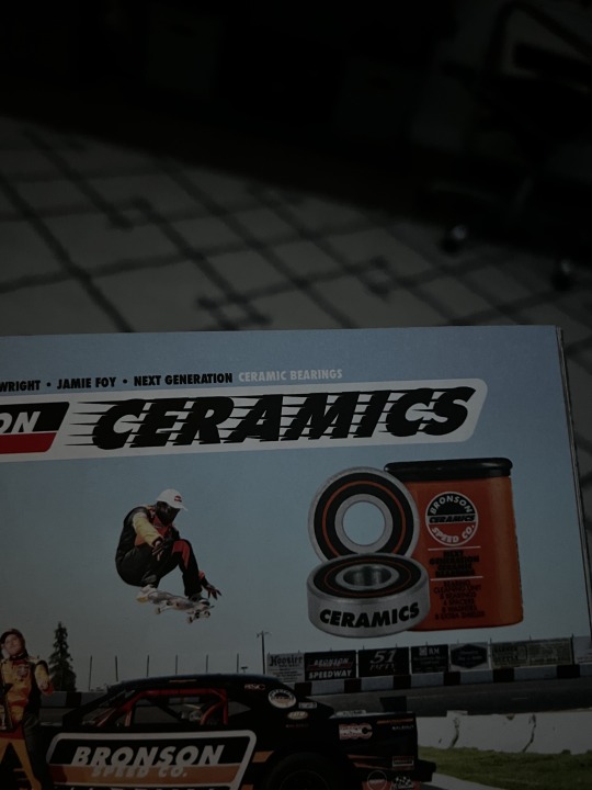
10)An example of a font being used that is trying to connote something more than just the text typed in that font. Ceramics font shows speed with the way that the font is created, which is intentional.
#module4
0 notes
Photo

I think this might be one of the worst data visualizations that I have ever seen in my entire life. The whole agenda of this visualization is to confuse the viewer. It is way too complicated and mostly does not make sense. It just doesn’t work. There are many ways this could be improved and make so much more sense and easy to read. I think the lies in this data visualization is that it shows that countries like France are struggling the most, it just is not the right type of graphic for the thing they are trying to communicate.
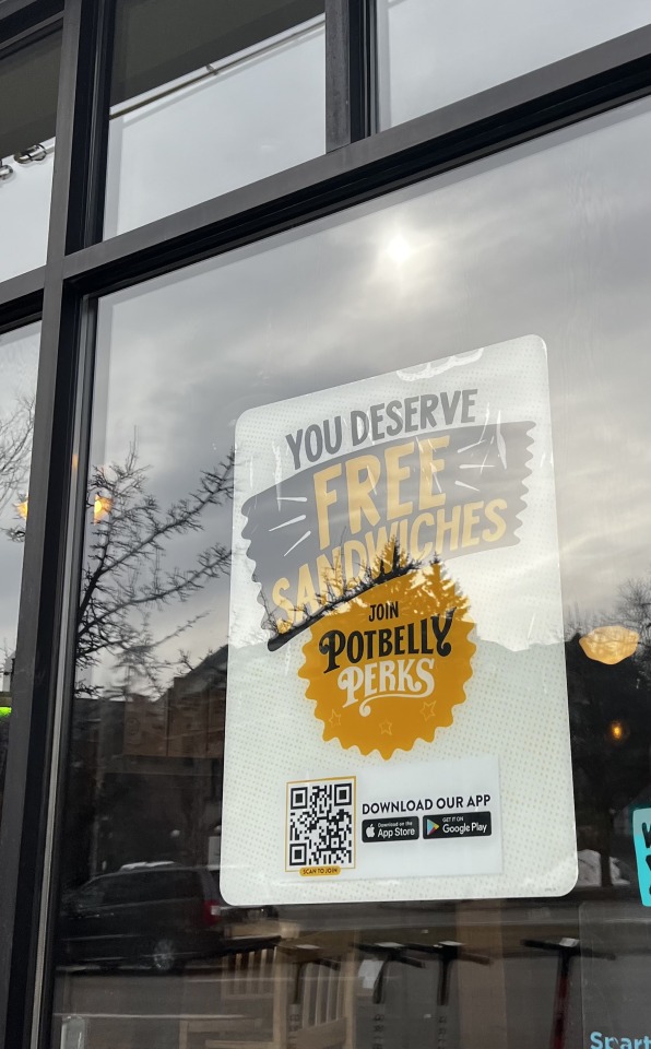
The advertising I picked is from a company called potbelly. Which is a big restaurant chain that is known for their sandwiches. Their main colors are balck and Yellow, and all the advertisements, including this one, have those two colors. They also have a font that they always use, which you can see the word Potbelly is written with. This is a really minimalistic ad, which asks people to join their points program. There isn’t much. It's a cohesive ads, that successfully catches attention and says whatever it has to say without further complications. Alignment of this text is following the artwork as well as perfectly centered on the middle of the page. The dots on the background also add a nice touch to adding more texture
#module 6
0 notes
Photo
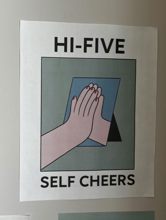
Denotative meaning. This is my example for the denotative and connotative meaning. The picture shows the hand, high-fiving a hand in the mirror and there is a text “Hi-five Self cheers. The denotative meaning of the text is that it shows exactly what the illustration is. It doesn’t add specifically more meaning, but just egnologes the meaning. Denotation is used widely in design, and there are many different examples of it. It carries the literal meaning of the piece, so if you see a picture of a green grass and right on top of the grass there is written “green grass” it is another really straight forward, but an example of denotation.
Connotative meaning. Now let's take a look at the same picture but with Connotative meaning. This is a totally different concept. The connotation is more about the feeling underlying behind a word. Of course, many times there are connotations and denotations happening at the same time, which is a totally normal thing. The Connotative meaning of the same piece that we have looked at as an example of denotation is that the words show that one has to be proud of themselves. That you should be supportive of yourself and even the smallest thing, it is good to give yourself a “hi-five” for achieving even the smallest things.
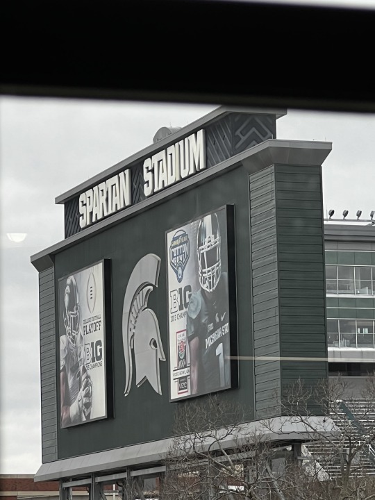
Iconic function. Iconic function is one of the three signs in graphic design. As my professor said “a good example of an icon is a photograph and a passport”. It was a perfect example, so it was a little hard to find something in real life which is not that. In this picture we can see an advertisement of Michigan State football, which is located right on the stadium. On the Ad we can see one of the football players who is a part of the MSU team. So by showing this picture he literally represents the MSU football team. It is an iconic function.
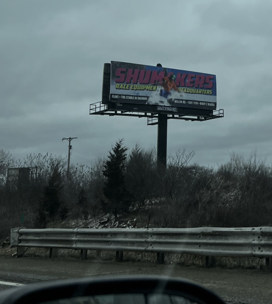
Indexical function. In this advertising we can see the snowboarder riding through the text and snow, so it shows the wind pulling back the snow. This is an example of indexication. “Someone’s hair is blowing in the wind while they drive in a convertible” -this is the example our professor said about the index. The same way as the women in the car, the snowboarder shows the gear and quality of the things that allowed him to go fast through the snow, which creates the ad.
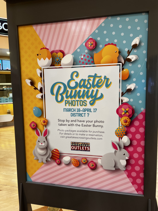
Symbolic function. Rose as a symbol for love, the same way bunnies, eggs, bright colors and flowers are the symbol for spring and more of Easter! This is why this ad is a perfect example of symbolic function.
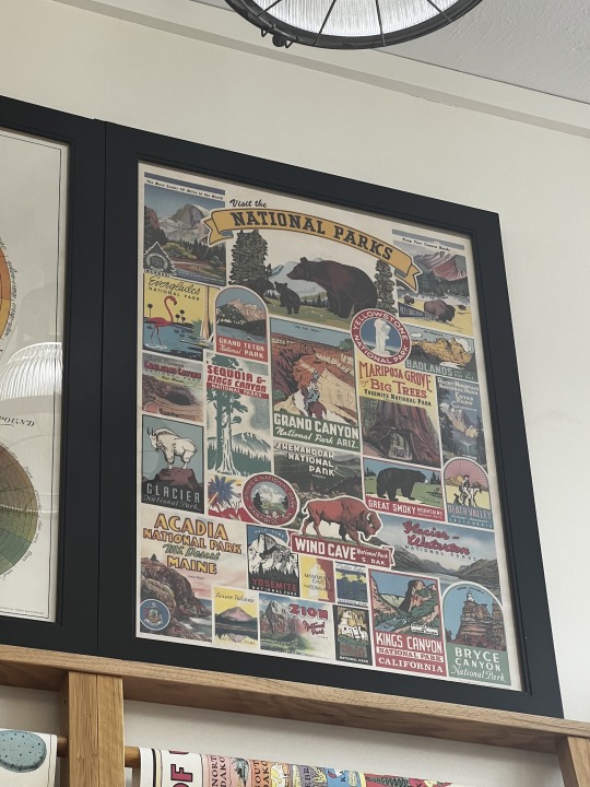
Past “style” Past style was probably the most difficult for me to find an example for, but this poster has the texture and colors that were specifically made to look more older, like it was under the sun for a long amount of time. It shows many different parks in the US, and it truly shows the more past “style” in the design. Also the illustrations are more like something that would have been drawn years ago, which I personally find absolutely beautiful. The typefaces and the use of them show us more “past” trends too.
#Module5
0 notes
Photo
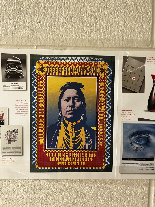
Complementary Colors. In this poster we can see the use of yellow and blue, which are two complementary colors. I think it brings up the interest in the poster and makes it stand out, considering that those two colors are used to color the skin of a person too. I also think that the use specifically of this two colors makes things stand out more, like the jewelry which is yellow definitely catches attention on a blue background. Overall I think it was smart to use those colors and they were implemented very well.
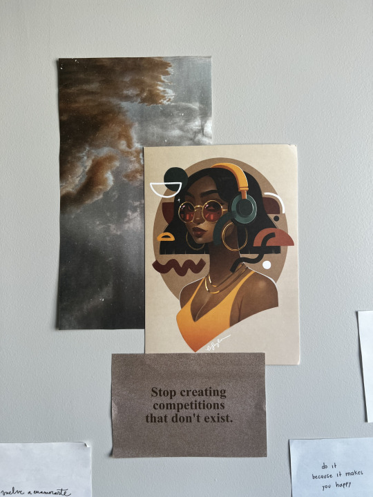
Analogous Colors. Here we can see a poster, with a woman in headphones. Orange, brown and yellow are analogous colors. I think the use of them in this poster is well made and it makes the work seem aesthetic and cohesive. Other than green headphones, colors still stand out from each other and further complement the composition and itself. There is a feeling of connection throughout all the elements. The colors make a great job at making this piece look amazing and textured.
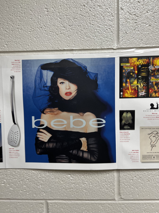
Cool Colors. BeBe. Here we can see the work using predominantly cool colors such as blue background and “blue tint’ to the whole thing itself. I am not quite sure what the colors try to communicate but for me I personally see the cold atmosphere and the woman holding herself, showing that she is serious and powerful. The feeling of strength is also seen in this piece.
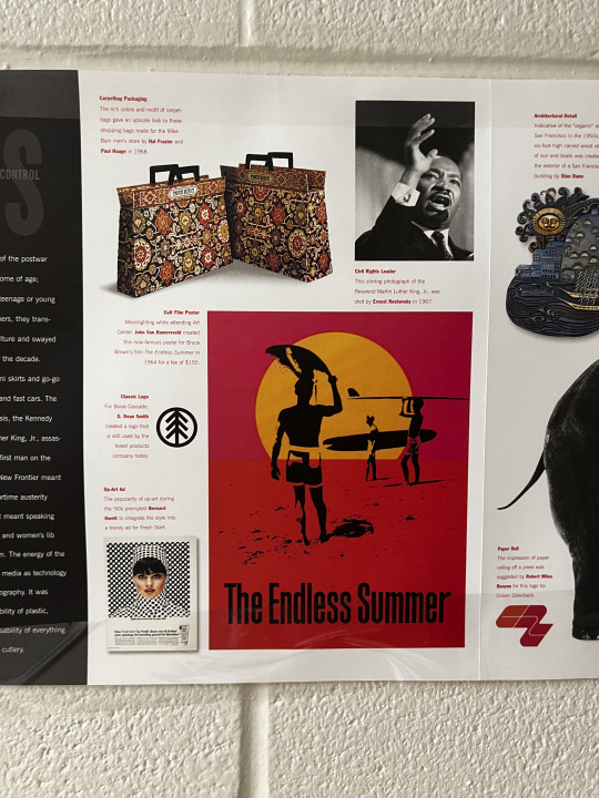
Warm Colors. The Endless Summer. Here we can see the use of warm colors, such as red, orange and warm pinkish red. The use of the warm colors show us in combination with the beach scene a warm day, great for surfing. It feels like the middle of the summer, and one of the hottest days of the season.
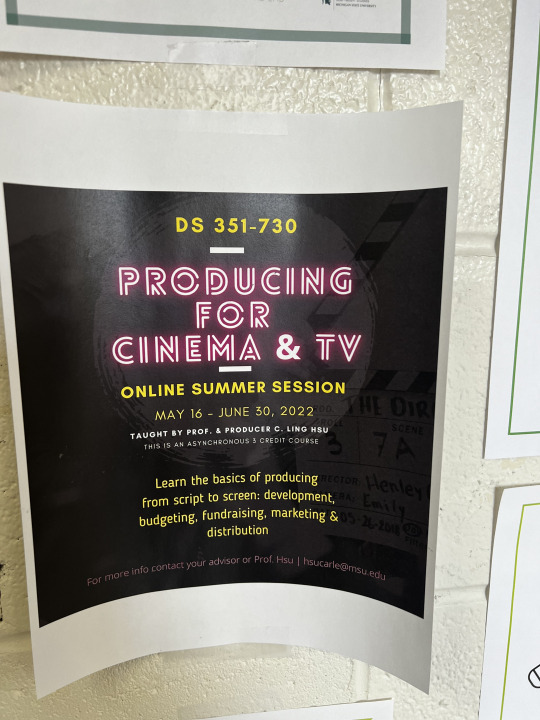
Contrast. Here we can see the use of bright pink and yellow text on a blackish background. It catches one's attention and stands out, so you know where to look first and what information is most important. The meaning behind this contrast is specifically to bring attention to the text.
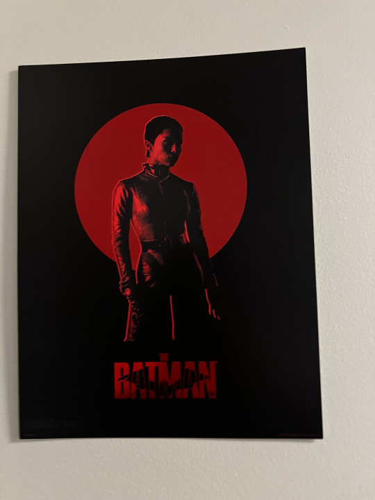
Gestalt principles of grouping- Closure. Here we can see a Batman poster and in this poster we can see the use of gestalt closure principle in the circle, the woman’s pants, hands, which our brain draws the end of, The batman logo in text that shows the Bat.
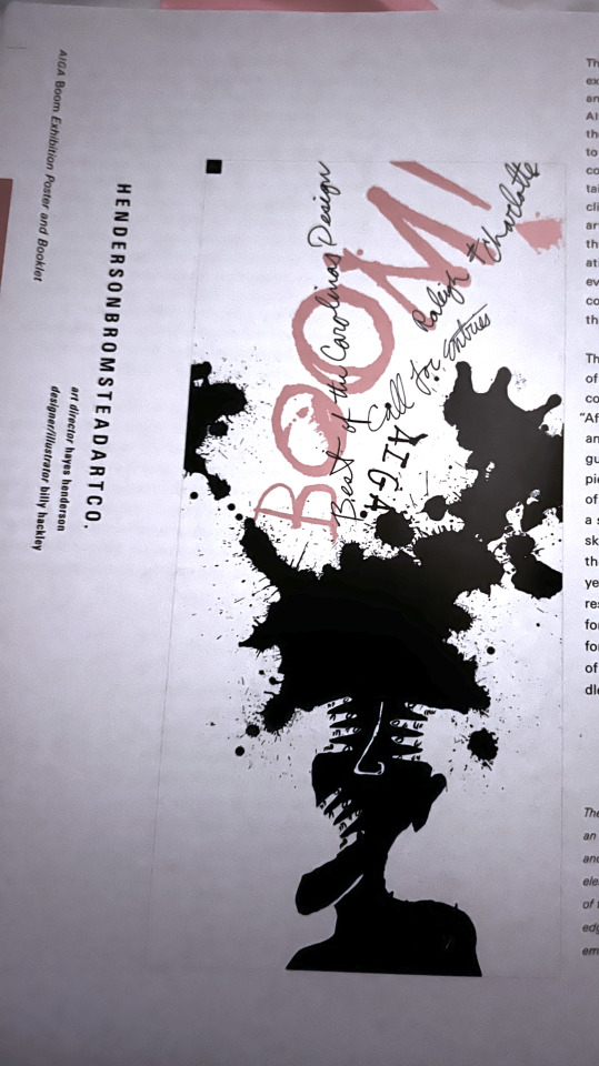
Active figure-ground relationship. Here we can see the background is sort of blending in with a black slash, creating different pieces such as we can find hands, human type of figure etc.. This drawing reminds me of one of the psychology cards that ask one to tell what they are seeing.
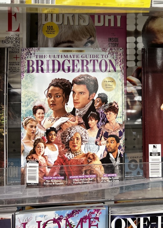
Historical. Here is my historical example. People are wearing the clothes from way before and they are advertising a new popular Netflix show.
#module3
0 notes
Photo
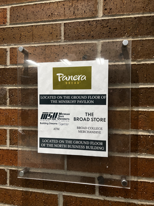

Photograph #1: In this example we can see the use of whitespace, which I personally think is passive in this case. Why passive? Well, it doesn't look like there was a specific meaning to it, more like it was all just put on the page. The contrast in this piece is created by small fonts versus large fonts, white space vs. heavy black rectangles. The logo, the only colorful thing in the announcement/ad definitely catches the eye. The repetition here is of the big logo, then a rectangle then the same size as the logo texts then a rectangle again. Overall this is a pretty straight forward ad for Panera Bread. The spacing between all the elements are the same.
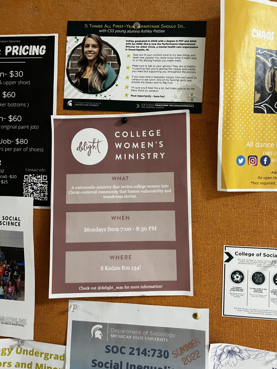
Photograph #2: Here we can see an ad which has pretty heavy weight, which is photograph, text and the two see-through rectangles. I think some may consider this ad a little cluttered. Overall the contrast is made by different values such as dark and light in this piece. The contrast between the fonts.
Photograph #3: Here we can see another ad, where repetition is greatly presented, as there is 3 rectangles that are the same shape, color, and weight beneath each other. I think there is an active space considering that elements are put in specific spots. The contrast here is made by different shapes, the only circle, which is the logo, catches one’s attention and we further look at a heavy, big font “college women’s ministry’ and further the other content beneath.
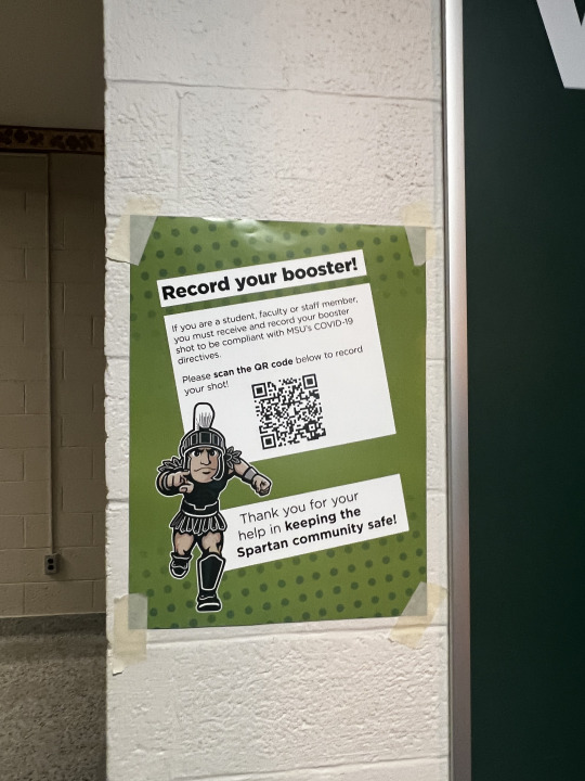
Photograph #4: The small darker spots in the top and bottom of the page show repetition. The contrast is made by a bright rectangle on top of the background. Also the difference between heavy and bold font vs. smaller and non bold shows contrast too. The don't on the background gives this piece some ‘texture’. The active space is used beautifully, and the composition seems cohesive. Rotation of the rectangle gives this ad a feeling of movement, which in correlation with sparty makes this piece look interesting and almost asks you to look at it.
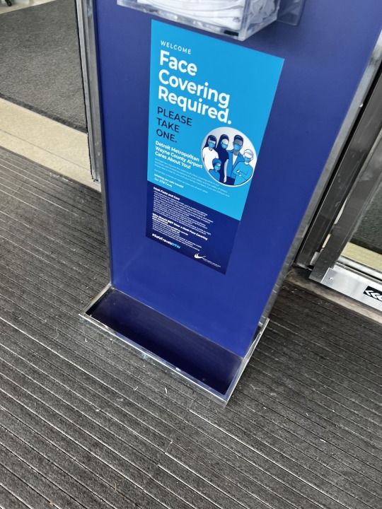
Photograph #5: The last piece gives us an active space, in my opinion. Someone made those elements be in the specific spots they are, which makes it an interesting composition. The contrast in this piece is created by different weights of the fonts. Personally I think it is an interesting composition and spacing makes me wonder what was the idea of why things are in the spots they are. This ad seems to be minimalistic with colors, but the scale of texts is what it makes it quite interesting
0 notes
Photo
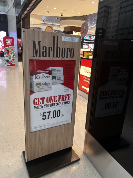
Photograph #1: This pictures show Marlboro advertising found in Detroit's airport. The advertisement uses a lot of typography to show the and address the meaning of the ad itself. Red and white are two main colors used to create the ad.
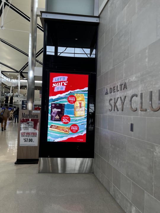
Photograph #2: Here is another ad from Detroit's airport. Here we can see the deals that are one of the stores, straight forward expressing the meaning and the saving that you can have. The meaning behind the background is not quite understandable from the quick glance but they use red and blue as their main color. There is a complicated composition, and there is a lot going on with the amount of items that are draw into this ad.
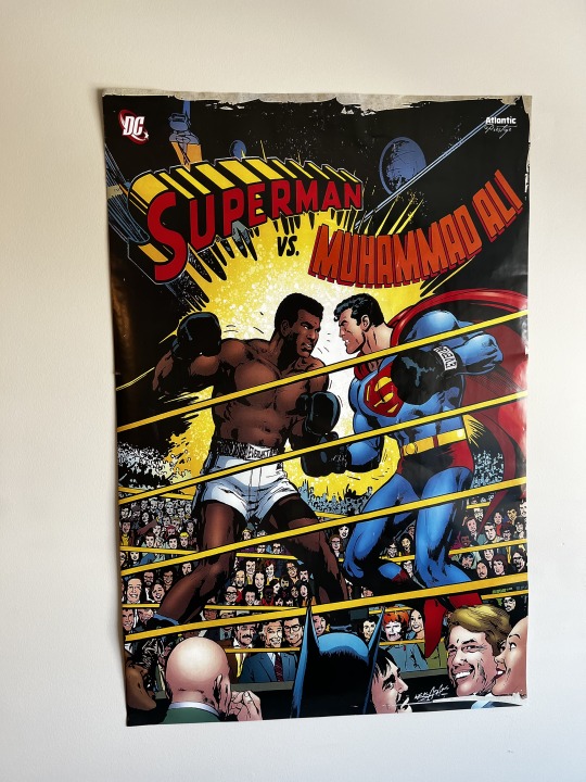
Photograph #3: This is a poster that I found in one of my friends apartments. I personally love the color use and contrast between al the colors in this work. I also love the font they used, it goes well with the background and helps to push the meaning behind the work further.
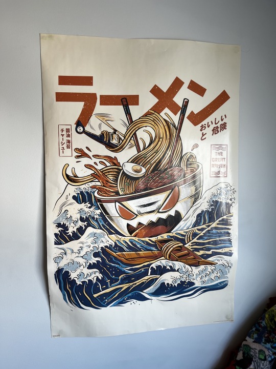
Photograph #4: On this photograph it is another graphic design example i found. I love the more subtle colors and beautiful artwork in this piece. The typography also plays a huge role even if a viewer (like me) does not understand what it says.
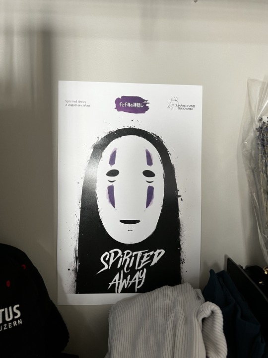
Photograph #5: The last picture is a movie poster, I am not quite sure what is the movie. But I can see how minimalistic this graphic design work is. The use of typography is cleverly used. Our eyes go straight to the Spirited Away sign than to the monster and than we can see the small writings on top. Overall it has a easy but plesand composition and the contrast between the white background and the monster is catching one’s eye
1 note
·
View note