Don't wanna be here? Send us removal request.
Text
Remember this joke?

Well, I am going to do something similar only with photography. This is a photo someone took for an Amazon review of their Clinique products.
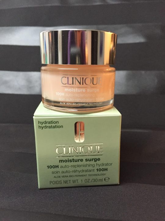
Honestly, it is not a terrible photo. They did some staging. They have an interesting background. All of the labels are legible. It is properly exposed. This would be a perfectly acceptable product photo for an Etsy page.
I've been taking these advanced photography courses in preparation for whenever I am able to create a new studio in the house. And my teacher is a photography badass. I just watched a 6 hour class on how to recreate a professional Clinique ad. And at first glance it looks deceptively simple. It's just some skin care products being splashed with a little water.
Which is why I wanted you to see an average person for reference.
This is what Karl Taylor came up with.
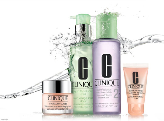
And I don't think I've learned so much about photography in one tutorial before.
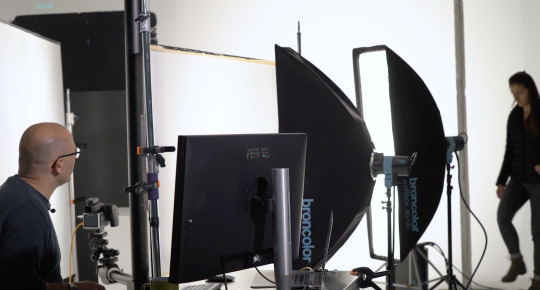
Product photography is just loads and loads of problem solving. You have to light the chrome caps with a gradient. Which requires giant diffusion scrims.
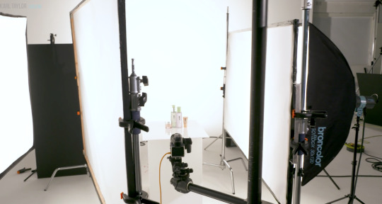
Those big white panels are literally only there for the two chrome caps.
You need a pure white background, but you can't let light spill all over the studio, so you put up giant black light blockers.
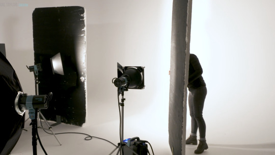
And you have to add another light just for the orange bottle on the right.
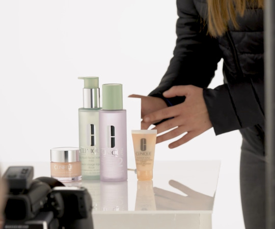
Oh, and if you want the bottles to glow, well, you have to hide a silver reflector behind them.
But you still want the edges of the bottles to be darker so they have some contrast. So you add some black tape to the sides.
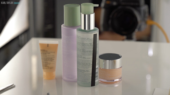
And in order for the reflective labels to have bold black lettering, you have to reflect black cards into them.
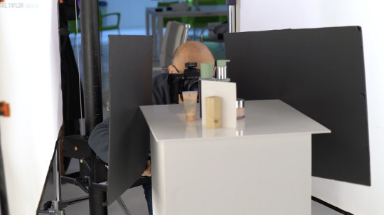
Ack! Karl's beautiful bald head is showing up in the chrome caps! He must put on the naughty blanket.
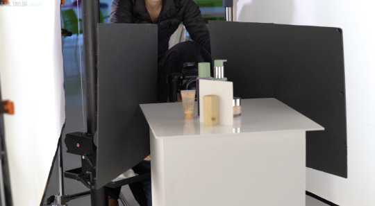
And once you get every aspect of every bottle perfectly lit, you finally get to yeet some water at it all.

I don't love product photography because I have a weird obsession to help greedy corporations make their wares look more beautiful. I love it because it is a complicated and challenging new puzzle every time. Every product is a different shape and requires a different technique to make it look its best.
I don't know if I will be able to live up to Karl's standards.
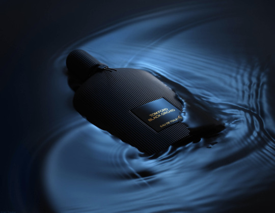
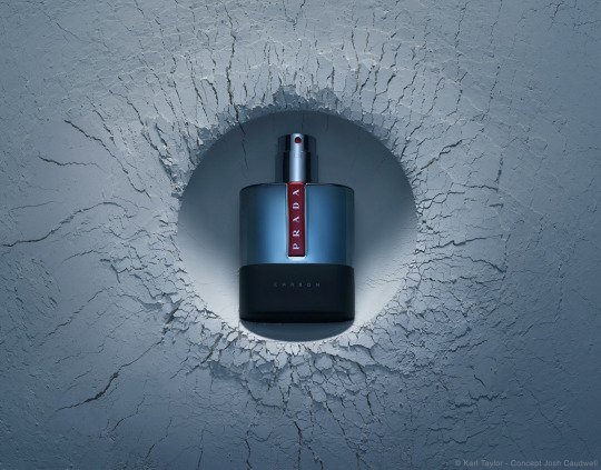
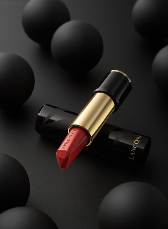


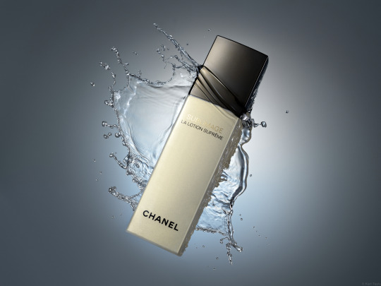

This is about the level I was at in 2017 before I quit photography.
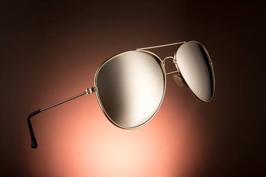
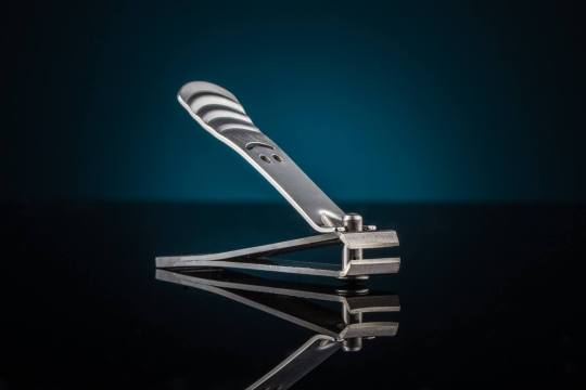
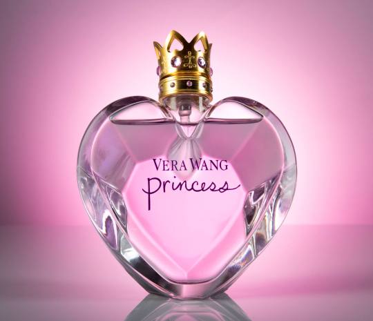
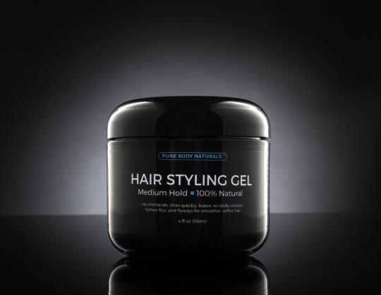
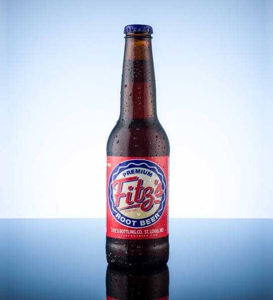
I have so much more knowledge in my brain now. I'm really hoping I can surpass that.
18K notes
·
View notes
Text
This blog is no longer a thing. Please go to @evangelimes17 for all content regarding art or other dumb stuff. Thank you.
1 note
·
View note