I doodle and stuff. knifewr3nch.deviantart.com | aminoapps.com/p/07vjx | twitter.com/KnifeWr3nch
Don't wanna be here? Send us removal request.
Photo
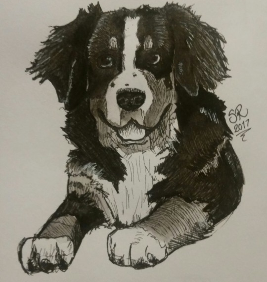
My Bernese, Marty.
3 notes
·
View notes
Note
Hi! First off, your art is literally eye candy. Love your various styles and vibrant colours. Second, speaking of colour, I've always stuck to classic black-and-white but recently began experimenting with colour on Photoshop. The outcome of my works however, generally end up flat & boring. I understand colour theory & such, but the issue is applying colours. So my question, how do you get colours to 'harmonize' with/without lineart, and just how to colour really haha. Thank you!
First: shucks. Thank you ^_^
Second: COLORRRR
OKAY. okay. I’m not nervous, who’s nervous? Talking about color is easy. You’re nervous.I’ve had this question a few times and each time I get tied in knots trying to think of how to explain color. More than almost anything it’s the sort of thing you have to show, and the sort of thing you have to practice over time yourself. But there are a few tips I think I can offer.First off, you’re working in black and white, great! That’s the first and most important step to good color. Pretty color is another matter, but good color relies on the structure of a piece or design and contributes to its clarity- it tells parts of the story that only color can. But it serves a goal- and more often than not that goal is clarity- and clarity comes from value structure. Setting up strong black and white contrast- learning to direct the eye with light and shadow, figuring out how to use greys to emphasize or wash out portions of your composition- all of those are the key foundation of good color. Always keep the focus in your mind, especially when using bright and exciting colors- otherwise you’ll combine colors that fight the structure and the viewer won’t be able to make sense of what they’re looking at or where the important parts are.
If you know about color theory, you know that the most important principle is complimentary color contrast- it’s the most basic building block. Practice using basic pairings like blue/orange, red/green, and yellow/purple to understand how to direct the eye with color, the same way you already do with black and white. Try exercises where you limit your palette with swatches or you mix actual paint to try and get the colors you want from only a few limited tubes. Trying to paint from life like this will teach you an enormous amount about the underlying structure of color before you move on to wild neon.
Commit to a period of time where you avoid pure black- look for dark, saturated complimentary colors to create shadows that won’t deaden the sense of volume the way adding pure black or grey will. Keep value structure in mind. When I want to create a glowing warm orange light, I use blue and blue-purples in the shadows of the piece to create color contrast that punches the lights I eventually add.
Work dark to light (and try working light to dark as well, with a medium like watercolor). With dark to light you spend time first creating a “mud”- a value structure reliant first layer of the painting where you focus on the colors of the shadows, the fluctuations between warm and cold shadow- the local colors as they appear when they are outside of the light- make your mud interesting but not eye catching or very saturated. You are setting the table, here. Build from that point- create bright points of focus with saturated and complimentary highlights on top of the “mud” (if the mud is a purple mud, mix yellows and golds into the highlights). This way of painting is really satisfying- putting controlled highlights on at the end can be the most fun part. We used to joke about it all the time in art school- it’s dinner time; the ecstatic moment you put the little bitty white shine on at the very end and everyone goes “ooOooh”The satisfaction of that “ooOooh” moment will depend proportionally on how well you set the table with your complex, nuanced “mud” beforehand!
Most of my process revolves around paying attention first to the mud of a design- trying to pick colors that are harmonious (which is largely practiced intuition- but also has to do with grouping similar saturation levels and popping with calculated moments of complimentary contrast where I want to draw attention)- still, at the start nothing stands out especially- I’m putting down dishes before I serve up the turkey ;) Then I build in brightness and saturation to the areas of emphasis in the piece or on the character.
With my brighter, more candy-colored work, the process is different but the principles are similar- the “mud” of the piece is brighter, more saturated- the shadows often grouped in a low-ish saturation range of purples, blues and pinks- the highlights often coming in with warm golds. These pieces usually rely more on pure color contrast and slightly less on value structure for their oomph- but it’s all still there, under the surface. After a while you’ll move past the simple complimentary color pairings and on to more subtle relationships of color, cooler light courses, bounce light and ambient occlusion, you’ll tell different stories with color based on insights you’ve gleaned from observation. Sometimes it comes down to simply “I like that photo/painting/feeling/obscure memory from my childhood, and I’m going to try to copy it until I get it right.” You learn a lot along the way through copying- and there’s a huge complicated world of color out there with masterful luminaries and great fun to be had.
You can learn from the outside-in by copying and color picking from the masters, or from the inside-out by practicing exercises that will help build your skill. My advice?
Do both.
The biggest trick is just practice and time- if you set your mind to it, you will improve and eventually it will be second nature. I super duper hope this is helpful to you and to anyone else struggling (as I did, and I do) with color in their art! Be well :)
-n
417 notes
·
View notes
Photo
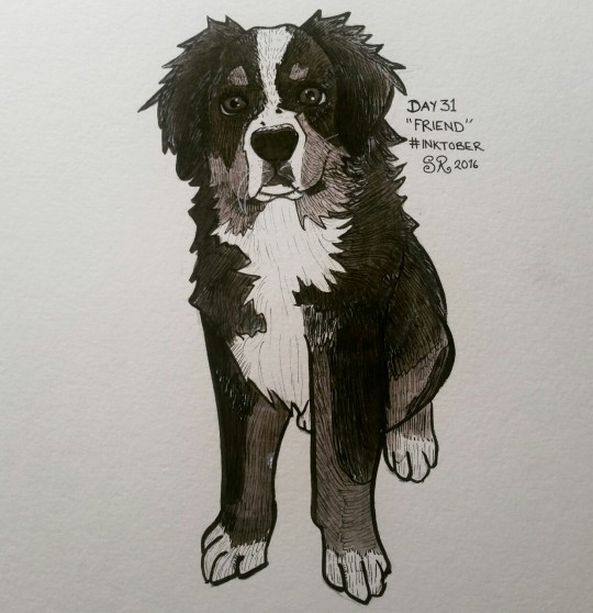
Day 31 "Friend"
3 notes
·
View notes
Photo
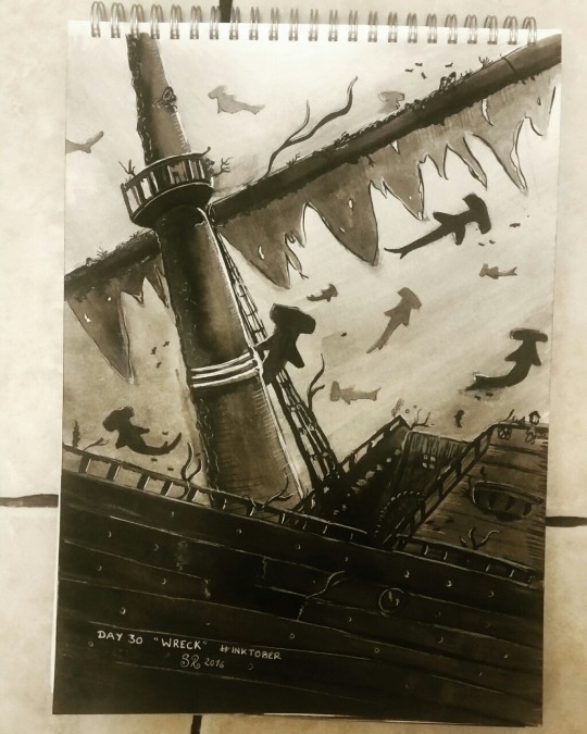
Day 30 "Wreck"
0 notes
Photo
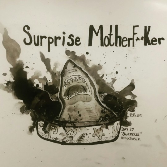
Day 29 "Surprise"
2 notes
·
View notes
Photo
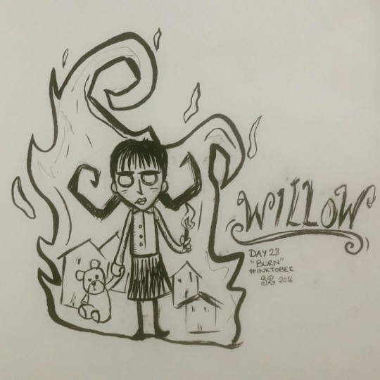
Quick one today as I'm still poorly and feeling sorry for myself. Day 28 "Burn" with Willow, the little pyromancer from Don't Starve.
1 note
·
View note
Photo
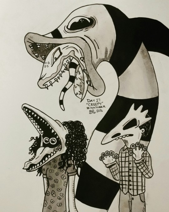
Day 27 "Creepy"
20 notes
·
View notes
Photo
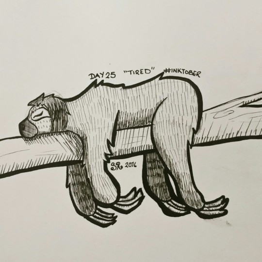
Day 25 "Tired"
0 notes
Photo
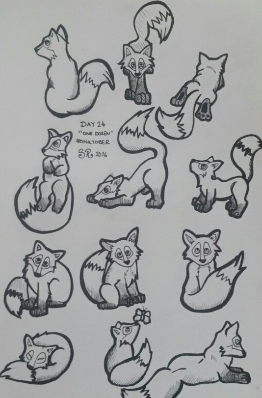
Day 23 "One dozen"
1 note
·
View note
Photo
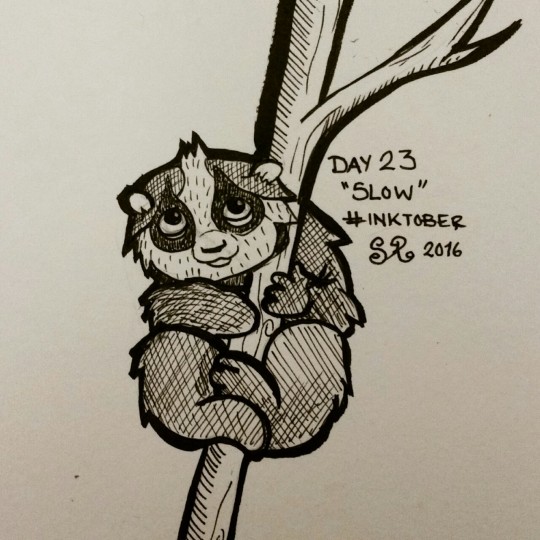
Day 23 "Slow"
0 notes
Photo
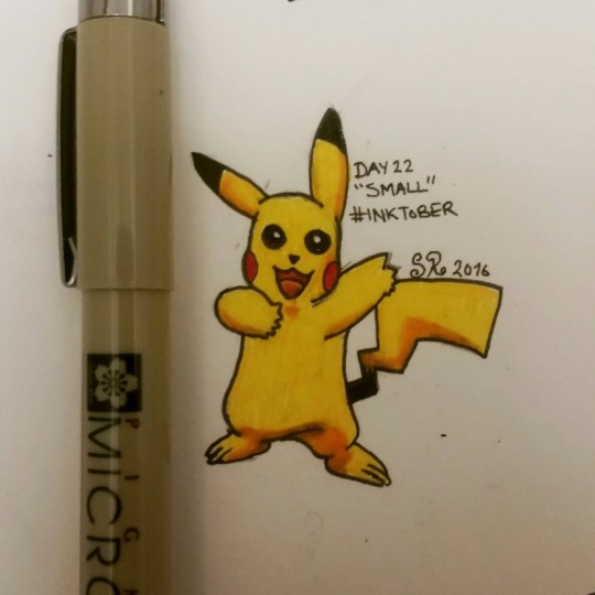
Day 22 "Small"
0 notes
Photo
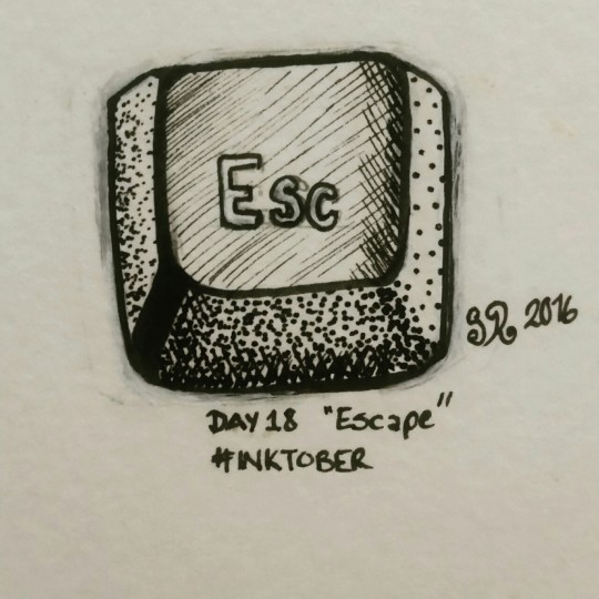
Being as lazy as possible after yesterdays drawing. Day 18 "Escape"
0 notes
Photo
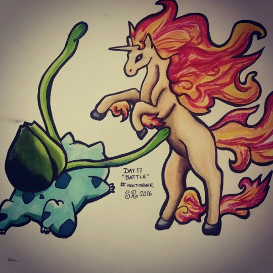
Day 17 "Battle"
0 notes


