
Don't wanna be here? Send us removal request.
Statistics
We looked inside some of the posts by kiroxkenshin and here's what we found interesting.
Average Info
Notes Per Post
6
Likes Per Post
6
Reblog Per Post
0
Reply Per Post
0
Time Between Posts
19 days ago
Number of Posts By Type
Text
4
Last Seen Tumblr Blogs


Fun Fact
In 2020, Tumblr had 29.4 million users in the US.
Text

The subject matter here is the Lincoln Memorial created in and now currently present on the National Mall in Washington D.C United States.Created in 1914-1922 and unveiled in 1922.This statue was sculpted by Daniel Chester French and carved by the Piccirilly Brothers.Whats being portrayed is the former president of the united states,the 16th president to be exact.The 170-ton statue is composed of 28 blocks of white Georgia marble and rises 30 feet from the floor, including the 19-foot seated figure upon an 11-foot high pedestal.In the sculpture he's wearing an unbuttoned frock coat and a large United States flag is draped over the chair back and sides.The work follows in the Beaux Arts and American Renaissance style traditions.
The Lincoln Memorial is primarily analogical and literal in its representation. It is not a mere street sign or a literal depiction but carries a deeper meaning..For the literal part the Lincoln Memorial is indeed a physical structure. It is a real place that people can visit, and its existence is interactable and concrete. In this sense, its representation is somewhat literal as it physically exists as a memorial to Abraham Lincoln.For the analogical part the memorial becomes analogical when you consider its design and architectural elements. The use of columns, for example, is not a direct representation of Abraham Lincoln but rather an analogical choice. Columns traditionally symbolize strength and endurance, characteristics associated with Lincoln's leadership during a challenging period in American history
Like I mentioned in the previous paragraph,the columns represent/symbolize strength and endurance just like Licoln was during his reign as president.But there is also the American flag that sits in the sculpture.The flag itself can be interpreted in many ways but more specifically it symbolized the freedom of african americans.Licoln during his presidency fought long and hard during the Civil war to fight against slavery and succeeded at abolishing slavery.This was to me a very important “sign” in the sculpture because he was very known for this exact act.
The signifier is the physical structure itself,the columns, the statue of Abraham Lincoln, and the architectural design.The signified is the conceptual or symbolic meaning associated with the Lincoln Memorial. It encompasses the historical and cultural significance tied to Abraham Lincoln, his leadership during the Civil War, and his role in the abolition of slavery. The signified also includes broader ideas such as democracy, unity, and the enduring principles of the United States.The sign is the combination of the signifier and the signified. In the case of the Lincoln Memorial, it is the physical structure (columns, statue) representing the symbolic meaning (Lincoln's legacy, principles of democracy).
I do believe ,if people know their history, the sculpture does convey its message properly.Its not too complicated to know its representation and its past.I find its a good message as well,to fight for what's right.
1 note
·
View note
Text

The picture was taken outside in a crevasse-like area with a sort of lake/pond in the middle that contained a broken down bridge or cheaply made bridge that went from one side to the other.The sky’s color is pretty depressing with a gray dead tone to it.There was a few people that crowded this picture who either used the bridge to get to their jobs or just travelers.The picture itself had lots of orange in it from the air itself, to the trees and even the water.The person that created this artwork or took the picture is Anush Babajanyan born in Armenia in 1983.The subject matter in the photo is climate change.The style present in the photo is landscape and nature.My initial view of this picture was just amazement and curiosity, but I soon realized that the situation and what was happening in the photo was more devastating that what I had originally thought.
The picture is very warm and contains many tones of orange red and beige/yellow.It turns out that the little bit of water that is present in the picture is actually red.The reason behind why the little pond was almost red like wine was because the water levels in that region/area had decreasing water levels, diminishing the water and giving it more of a red tone since its high concentration of salt/dirt and other elements present in the water.Im guessing the photographer was trying to raise awareness like most of her other pictures but more specifically how the lack of water can harm nearby villages and town people.I guess it has a national importance the people there get to feel represented somewhat maybe even a sort of cry for help through the form of photography.I think this picture really says a lot because not only is it a beautiful photograph but it also brings with it a dark reasoning for its beauty.
I personally think this picture is really well took.It contains multiple details and a very big eye grabber with that bridge and red water.I don't believe it communicating the message behind it effectively because I myself never thought of climate change as the reason behind why the picture is so pretty.I had to research it in order to find out.I guess the target audience is us the people who live in stable countries and environments.My personal reaction to this was just pure curiosity and amazement from the very warm colors.
1 note
·
View note
Text
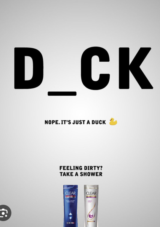
So whats basically going on in the ad is we have a giant word in bold that spells out D,C and K.Theres a gap between the D and C for the viewer to fill in.Right under the bold letters there is a small line saying”Nope.Its just a duck.”The people or the company that made this ad is a hygiene/Cleaning company called clear,in this specific ad they are trying to sell a shampoo bottle.There really isnt that much artsy aspects to this ad.It is very plain as it is.The only bright thing that brings it to life is the colors on the shampoo and the big bold letters.But its the whole point of this ad to draw you in with those letters.
The reason behind why the letters are so bold is to draw the eyes of people.The ideology behind it is explosif attention.Your walking by and you see something like this in the streets,itll catch you off guard.There are only so many words that have that composition of D_CK.If your clean or non dirty minded youll get on with your day guessing duck, dock or deck but for the high majority youll be guessin the genetalia of a male.
I find this ad to be really smart because nowadays ads are everywhere and they all look the same.There isnt really diversity.Some overdo it and some underdo it.But this ad did just enough to get that common Joe’s attention.The target audience is people who either saw this ad because their mind got the best of them or just people who want to be clean and keep up with their hygiene.My personnal reaction when first seeing this ad was just hilarious.I was searching and this one out of all of them just made me laugh and caught my attention so it shows that it works.
1 note
·
View note
Text

One of my favorite pieces.
1-The painting is called the "Fallen Angel" by Alexandre Cabane.In this painting we see Lucifer who is a popular biblical character,otherwise known as "Satan"or the big bad “Devil”. The painting was done in 1847. What the painting represents is said in its title,a fallen angel,this is what people called Lucifer after his fall.The style presented in the painting is renaissance/biblical.He was one of god's greatest angels the role model to all.Always stuck by god's side.But one day greed and power took over his mind trying to overcome god.So he was banished from the heavens whereas this painting was created.
2-In the painting you see multiple angels in the background surrounded with clouds and and a beautiful sky.It then has as the “main dish” Lucifer slouching with his beautiful wings on his back on what appears to be some sort of a rock, with a beautiful detailed body his arm covering a part of his face.His arms and his curly hair are covering everything but his eyes.What truly makes the painting mesmerizing is the eyes.For its time,having eyes giving you that much words is amazing and even today it's still amazes many people.Many people have tried to pin a specific emotion to his eyes.I personally find that the producer of this art was trying to give a friendlier image to something so monstreous.Whats also amazing about this painting is the immense detail put into his body and the shading that feels natural and less dark and gloomy.There is a lot of space between Lucifer and the angels in the background.There's also movement, you spot the attention grabbing lucifer then your eyes slowly puts its attention on the action in the back.
3-My personal reaction to this painting is more intrigue and admiration.I like art that is deeper than it seems.If your a christian like me and you've read the bible or heard stories of lucifer,then you get more of a feel for the painting.Understanding the context and emotions circulating in the piece.I believe that the producer was trying to give the people who viewed his painting a different perspective on this fallen angel.People seem to connect lucifer with negativity all the time,when he was once the greatest of angels.Kind of showing that no matter how good you are you always have a little “devil” in you.I also love the controversy this painting got when it came to the eyes.It just shows how much more work was put into the creation of this masterpiece.
3 notes
·
View notes