Don't wanna be here? Send us removal request.
Text
Developing planning of my narrative:
Using a Storyboard
In my short film, I have decided to use a standardised storyboard as a base for which I can develop my film further in narrative, my next step will be to develop each of the key scenes that combine to make my narrative being: the opening of my film that so far is a montage in London, a “kitchen scene” where both my main antagonist and protagonist meet, the discovery scene where my main protagonist finds his daughters handwriting in the illegal books, and finally the dining room scene where my main protagonist is reported by his wife (antagonist) to the Party.
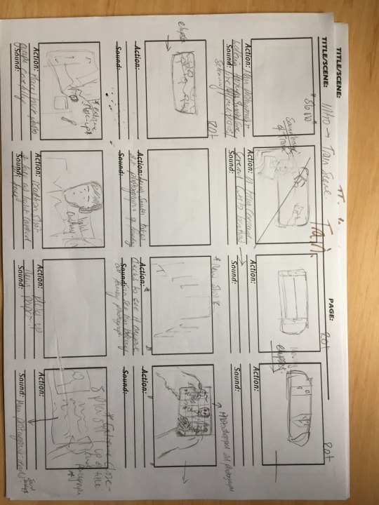
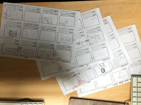
Why have I decided to use paper and pencil?
So far in my short film I have noticed that my visualisation has changed constantly in an almost organic manner, as each time i further my narrative (or any other aspect) my core ideals change, it is this fluidity in my work that I find that using something such pencil and paper useful as I am able to change my narrative as I progress, unlike if I would have done this in pen or in an online presentation.
0 notes
Text
How did I implement digital technology in my first year of media studies?
The technology I had included for my research in my opening sequence would include...
For several of my media blog posts I had used the screenshots of images and or photos taken from my mobile (technological convergence). The screenshots can be seen in my exploration of the micro and macro elements of film language such as: genre, narrative, editing, representation and my ‘GRAIN’ analysis. In the following I had incorporated both graphs seen from websites on the internet. Additionally, for my ‘textual analysis’ blogposts, I had used similar technology of taking direct screenshots from the media (i.e. Django, Spectre, American Sniper, The Matrix), and placed direct commentary, and in some cases used an online picture editor named https://www.picmonkey.comin order to highlight and emphasise aspects in the shot, for my textual analysis of the film ‘Inception’ however; I had cropped the film and annotated the footage on the youtube native video editor and linked the analysis to my blog. For my preliminary task the I had decided to use the Video editing application ‘Final cut express’ alongside a consumer grade camcorder at 1080p quality. For the diegetic sound I had used the built-in microphone and for non-diegetic sound I had implemented from a royalty free website stereotypical and conventional heartbeat loop. This was then uploaded to my blog via the use of the online multimedia service ‘Vimeo’ and was hyperlinked to my blog.
0 notes
Text
My Animatic - consolidating narrative and establishing tone.
The reasoning for why I have decided to make an animatic for my short film is to consolidate and hopefully then develop my narrative. The way in which this accomplishes this is that I am able to now take my concepts and take from a visualisation to physical, organic object, that I can physically mould into what I desire and has given me more scope and has helped my creativity. Moreover, the use of sound has also helped me set the tone for others and myself for the film, enabling me to grasp the direction of my film.
youtube
I have decided to follow in my use of Shostakovich as my inspiration for the music in my film, as his eulogy I find dark enough for my visualisation of dystopia for my short film.
“Once the screenplay is finished, I'd just as soon not make the film at all ... I have a strongly visual mind. I visualise a picture right down to the final cuts. I write all this out in the greatest detail in the script, and then I don't look at the script while I'm shooting. I know it off by heart, just as an orchestra conductor needs not look at the score ... When you finish the script, the film is perfect. But in shooting it you lose perhaps 40 percent of your original conception” ― Alfred Hitchcock
0 notes
Text
“how did you use media technologies in the construction and research, planning and evaluation stages”
Research and Planning: September
youtube
Planning - (post planning phase), Construction Editing and evaluation: April
youtube
Media Green Screen Script:
Technology has played a vital role in all aspects of the construction of my short film and ancillary tasks, being my film poster and magazine review page. Throughout the researching, planning, construction, editing and evaluation of my media coursework pieces I have used technology and has played a quintessential role in everything that I do in media. This year I have improved in all aspects in using technology, both becoming much more knowledgeable, efficient, to a more professional standard and using more varied tech.
Construction:
While filming I have used several online cloud based solutions when storing my raw footage and creating rough edits when filming. The cloud storage that I settled with was iCloud, as I was able to store everything seamlessly by simply saving my work to my desktop on either my laptop for on the move, or on my home computer where I would do a majority of my editing later on. The main reason for why I had decided to use Icloud was because of the efficiency and ease of use – being able to use multiple computers and having a synchronised workspace I found fantastic when organising my narrative. This year I have use predominantly all my own technology – such as my own DSLR this one here. I decided to purchase and use the canon 700d as the camera had a large sensor and better low light filming with less noise than the Nikon camcorders at my school. Most importantly, I was able to make full use of the tilting and adjustable screen on my DSLR that allowed me to use a wider range of shots – such as low angle shots, extreme close ups and much more with ease. Additionally, I was able to inject a mod of the canon firmware called “Magic Lantern” that allowed me to have full access to every setting of the camera – from a histogram display to forced higher bitrate recording and fps “overclocking”. All of which I have used in the construction of my film. Additionally, I have used my camera to recreate certain scenes in front of my improvised green screen – taking photographs specifically for my film poster and magazine review page. The use of the histogram I found extremely helpful, as I was able to see if I was overexposed in my shots when filming location shots throughout London as it was an extremely bright day – and conversely when filming in my house at night I was able to identify if I was underexposed and if the shots would be too noisy as a result. Although did have a new camcorder, I still found that I was using my phone to record some of my film – as I could not reach a high enough fps (120 fps to be exact) on my DSLR to be able to film slow motion, something that I used in my introductory shot that enacted as my “hook”. This very much proved to me that we are all prosumers and that technology is almost certainly in the hands off all (democratisation of tech) furthermore – I have found that only to a certain extent does technology seem to be rewarding in that you will only be paying for incremental improvements for an extremely more expensive product. This means that the most expensive might not always be the best, so narrative and purpose is the most important factors to consider when making a film – not what expensive things you are using to create the media. In the words of one of the most successful examples of this, the filmmaker Casey Neistat who stated: “I am not bothered with technology. The pros for using new technology is only 60/40, only providing a 10% improvement to my work, but the 10% is worth it to me”.
With regards to the audio of my short film – I used the music and audio editing software Logic pro 10 to capture my voiceover, using studio microphones to capture my voice for my main protagonist. Moreover, I had used my laptop to present to my voice actor with his lines, characterisation and showing my film its self so that the process was swift and effective. I had also used my iPad to show my actors on set coincidentally my redrafting’s of my current script, shot lists and other extracts that I have already posted on my Tumblr on the move.
There are numerous ways that I have improved from my previous year in the construction of my film. Firstly, I had used all the school’s camcorders, all on automatic settings (point and shoots camera). I had used premiere pro, however was not confident in the software and additionally did not move or back up any of my data in the process of making or editing my film. Last year I had recorded my voiceover in my dining room that gave a bad echo, and was not of a high standard/quality. When filming the outside shots in Spirit Quay, I had also experiences severe wind muffling and this year compensated for this with an external microphone with windscreen muff. I had also Printed all of my scripting drafts, and sketched my storyboard and and shot lists previously, that made my planning hard to understand and easily misplaced unlike this year.
Photoshop – took photo of the white-millers and doctored the photo, making the image look old.
Editing:
In the editing process of editing my media coursework, I used two main editing softwares: Adobe Premiere Pro and Final Cut Pro. I had used premier pro for editing my my short film, as I have the most knowledge in the adobe ecosphere. I used Final Cut for the more modular elements of my coursework such as montages and other shorts that could be constructed quicker, as the software is much more simplistic and offers less options but is much faster and intuitive to use. However, I did find it useful in adding my titles for the final parts of my film, as I could place simple titles over my already rendered film – and because of this, could be done on my laptop which was really convenient and therefore an efficient process.
I have use the adobe ecosphere extensively in my second year – using almost all adobe applications in my film and ancillary tasks. There are several instances where I have furthered my competency with technology with the application. This including the overdubbing of diegetic sounds, as one scene shown somewhere around me is constructed completely of post production sound, from the creaking of the steps to the television is all placed after the footage had been shot. The way in which I was able to do this was through several layers of sound that I had modified from gain, panning of the television and so on. One thing I found extremely useful within the Adobe ecosphere was the harmony between other adobe applications. I was able to directly open and edit audio sources from Adobe Audition and export them back into wherever they were exactly in the premiere pro timeline. One example of where I had done this was my “kitchen scene” where I had to overdub my main protagonist with a voice actor, but had to account for real life elements such as echo and the effect of the room. I managed to use adobe audition to increase the bass in my actor’s voice and adjust dynamically the reverb from when he is speaking in the room to when he is speaking with his head inside a fridge – all in order to create a more believable overdub. Overall, I believe I have improved my competency in editing, as I have used much more complex post production techniques in my film. Examples of this range from the use of montage in the opening of my film, compiling differing scenes between each other to create a thick texture to what is happening in the narrative, giving a strong introduction to my short film. The use of an external adobe plugin called the “neatvideo” noise removing application, that I used in scenes where my film was rather dark and as a result produced noise. Other advanced techniques such as the use of ellipsis, timelapse and synchronicity in my shots.
Throughout the year I have also become more acquainted with adobe photoshop, illustrator and adobe lightroom for my photographs that I had taken for my film poster and magazine review page. In Photoshop I have been able to: Manipulate with several effects such as saturation vibrance, and cut out my main protagonist to place in my film poster and magazine review page using the magic wand tool. I also used feathering, the use of an inner stroke to match my desired colour of my background all to create the most professional looking product as possible. Of course make the poster and magazine review page its self
I had also made use of a second monitor this year to edit my short film and media products, as being able to see my products as an audience would next to me I found extremely helpful.
Whereas previously last year I had only used one post production technique of using a “three-way colour corrector” to under saturate my image in order to give an eerie atmosphere, I had also done this this year but have improved in my use of the technique, using only in moderation so that I didn’t lose both verisimilitude and video quality. Last year I had a very simple narrative and timeline and therefore did not need to do as many post production techniques such as the manipulating sound and so on. I had also taken royalty free music and inserted the sound into my film, whereas this year I had researched and composed the music myself on Sibelius using a virtual romantic orchestra in the style of Stravinsky and Shostakovich.
0 notes
Text
Post-production sound techniques for my short film: Noise gate
In an attempt to quieten the amount of static noise in my film (mostly in the kitchen scene) I decided to research what I could do...
The first thing I decided to do was to take a look on Youtube and other websites with a Google search .

I decided to take a look around to see the varying options available to me, however the only alternative I found to premiere pro that I am already using was audacity, but I didnt find this necessary as learning the program would just slow down the process and does not match the industry standard that Premiere pro provides. The only other option i could have used would be adobe audition.
I finally decided to use both premiere pro and adobe audition, as both had their pros and cons but together I have used them rather well. For the shots that have little white noice I could use the noise gate built into Premiere pro and adjust the threshold gain release/hold to remove the problem.


However, some other parts such as when my main protagonist talks while looking into a fridge, I need to use adobe audition in order to manually take out the bass tone and white noise that both drown out the sound in the shot.
The way I did this was by “analysing” the sound and selecting a point on the sound graph as a sample for which the rest of the sound wave would be scrutinised by the computer - using the “remove white noise” option and removing any unwanted sound.
0 notes
Text
What have I learned from audience feedback?
youtube
(A quick short I made to show rather quickly some of the feedback that I received in my coursework this year)
For my A2 media coursework I have been given formative, summative, formal and informal feedback, and all of which has helped me to construct my final three products in various ways: creating a stronger brand image, creating a more professional looking and more interesting group of products. At the beginning of the year I had used three differing focus groups. One of younger teens. Another a group of girls and another a mix of both males and females. All three were used in order to fully represent my target audience up to the planning and partly of my construction of my film poster, magazine review page and short film. However, along the line in the construction of said focus groups, I had decided to use only two focus groups. This is because as my products further developed I had marketed to a more mature audience of older teens and adults. Nevertheless, the use of focus groups has helped me greatly, as where in my AS coursework I had only gained feedback from my teachers and peers and not to the same standard nor amount.
Use of Focus Groups in my Short Film:
At the beginning of my academic year I had compiled three different focus groups of the likely audience for my final products. Using a focus group has allowed me to keep focused when making my film to market to my audience. I found that the further I had gained i
Formative Feedback:
With the understanding of the following, I will demonstrate how I have improved my learning from others during the process of researching planning constructing and editing my film – and more so improved my products.
I had provided the material in many forms, with pictures, gifs, scripts, annotated video and talking through my other sources to give as much detail and be as coherent as possible for the greatest possible quality of feedback. Most importantly I have used formative feedback consistently and effectively, taking on board all interpretations compliments and criticisms, throughout the year. And has helped me significantly in shaping my products as seen below:
Developing an art style for my Magazine review page:
When Originally attempting to construct my review page, I had asked whenever generating any new material on how I could improve in the development of replicating a professional product, while keeping an appropriate brand identity. This became the hardest challenge personally, as I seemed to generate various differing magazine blueprints that would conflict with the the design of my short film, or would not be representative of a film magazine.
Examples of this include the developing the symbol and separate brand identity of the magazine, as I had originally modified and developed a vector of a microphone jack with the phrase “unplugged film” as the Idea for my short film. However, when asking for advice it was noted that it would be more appropriate to use another symbol to represent my magazine as there would be confusion generated. This being as a microphone could be interpreted as a semiotic code representing music rather than just an interview.
After receiving this information, I decided to redraft my review page that would finally become my final draft.
Although there are instances along the line where I would find formative feedback extremely helpful, such as when implementing a “pull quote”, where I had used an unconventional or impractical method of using a pull quote of increasing the font size in the original placement of the quotation. It was suggested by Mr Coleman that I should take a look at Empire Magazines, as they pull quotes are constructed by copying an excerpt from the text and enlarging the text in a larger font and placing a coloured panel behind the text, all of which is embedded amongst the smaller text surrounding it. After in a sense being given this external source of information I was able to amend this.
Finally, when I was writing the review for my page, I was using a word processor to type my review, then copying and pasting the paragraphs into Photoshop to be placed in my review page. I had not considered the spacing of the text onto the page, as the words were not justified and therefore not conventional to real magazine review pages. This in its self was rectified in when Mr Coleman had also after requesting to review my work so far that the formatting of the paragraphs needed changing.
Film Poster conventions
When planning, constructing and editing my poster, I requested several times help regarding the progress of my efforts, and how I could improve my product in its current state.
Within the planning of my short film poster I was given feedback with my design ideas, that I should Ideally use a green screen in order to achieve the effect I wanted to create. As this was not possible with my actor being unable to come to the school grounds, I had to replicate my own…
Formative feedback in my short film:
Short film choices and reshaping/adapting all
A continuous set of “test shots” and “drafts” of filming after every filming session feedback was provided.
Summative feedback:
The Eberly Centre at the Carnegie Mellon University defines summative feedback as:

With this in mind, there are numerous times for which I have received a form of summative feedback with regards to my media products.
Examples of this include:
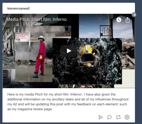
The pitch to the media department on my ideas for a short film.
A formal presentation of my progress to the media department of 1 minute of my first footage to my film.
several one to one sessions looking at my progress with regards to all three of my media products.
My media Pitch:
youtube
My pitch consisted of a premiere pro video file, modelled from a powerpoint presentation that I made, and layered with visual examples that complimented my argument for the narrative of my short film.
The feedback I received was mostly positive. Mostly to keep the distinctive visual style and at the time to focus on what I was already doing at the time in making a strong identity for my newfound dystopian narrative.
the main points that I received at the time were that I should...
Further develop my narrative with the specifics - make a detailed plan in terms of shot list, animatic, and to plan an easier way to explain my narrative.
Find a suitable name for my short film
Following this I used the given advice on my shortcomings and placed more of my efforts on what I had previously neglected shown below:

(My script for my short film)

(Detailed planning before shooting scenes with a birds-eye-view location plan around the house).

(an excel spreadsheet of a plan of what I needed to do)

(production schedule sheet that I used for all of my days shooting)

(redraft of one of my shot lists)
In terms of planning I had achieved this over the year with specific production schedules a detailed script and storyboard, with a matching short list.

(storyboard for my short film)
A formal presentation of my progress to the media department 1 minute of my first footage to my film.
youtube
The feedback that I received for my presentation went rather well, but highlighted my weakness in cinematography in the piece as highlighted by the media department.
My teachers stated that they liked the film noir style for my film, as seen in the “bedroom scene”, but not so much in the following final kitchen scene.
Some of the problems that featured were that my lighting was too dark and generated noise and was not overall very clear. Additionally, the colour distribution of my shots drowned out the characters in my film. Additionally, The mise en scene was not well planned, with garden features that ruin the verisimilitude.
How has the feedback I have been given help me improve my short film?

Firstly, I had changed the setting of my film in order to accommodate for the setting of my film and the corresponding genre. I was avoidant in the scene, filming around the offending features of the room.
This included filming at a later time, as to avoid any more noise in my shots.
informal feedback:
A majority of informal feedback I had received had been formative, and was highly effective in helping me generate the best possible products. I have found that though in general feedback received is in small quantities, there is usually a high volume and has has been really valuable. A majority of informal feedback I generally received from my fellow classmates and is more direct and honest.
formal feedback:
On the other, hand formal feedback I have found less frequent in the past year, but has been highly significant in the developments of my media products. Examples for which are mostly summative shown in the above examples. Almost all formal feedback i had received was from the teachers, giving me a higher quality of feedback and therefore allowing me to reach higher levels of professionalism in my working.
How has social media contributed to my feedback:
At the beginning of the year I had used various forms of social media in order to help me understand what my target audience would want from a short film.

(twitter poll post- before)

(twitter poll post- after)
Using twitter as a form for which to gain information I found moderately successful, as the short responses allowed people to be concise and to the point, thus allowing me to gain precise feedback with a larger sample size.

(Yahoo answers question)

(facebook poll post)
Both Yahoo and Facebook I found to be unsuccessful in that i did not receive enough responses to gain a valid conclusion.
Overall the use of social media has help, but not so much as more formalised arrangements or gatherings, as the less interactive the form of communication the less effort is placed back from the audience.
Audience feedback has helped me identify my own shortcomings in my work, and also help me identify what makes a professional and and entertaining/successful product. Using feedback from both the wider public, several focus groups and my teachers/fellow students.
So... What Have I LEARNED from audience feedback
Firstly, feedback when making any media product, and especially when making a film, needs to be persistent and regular throughout all stages of the film-making process (research, planning, construction, post-production). This is absolutely necessary as when in the process of nurturing and constructing something that you are passionate about, usually you will become bias towards what you have made, and think differently (usually better) of your film, than to what the general audience and others around you. An objective viewpoint is what you gain from the said people of your audience and around you - and with this you are able to keep levelheaded and focused on what you want to achieve with your product, and in the process improving your filmmaking capabilities and therefore your media product. This I found to be the most honest reflection in my formative feedback as sometimes imbalances in generated from my eagerness to either convey the dystopian genre or show my art style sometimes lead me to lose focus on my narrative in the early production of of my film. Feedback in terms of my short film ensures that Narrative being shown and the preferred readings and representation is understandable from an audience perspective and that media is communicated effectively. The reasoning for this is because if you create the narrative, then you will be the one who understands what is happening the most - as it is my own vision but may not necessarily be seen by another person who watches my film. Thirdly, Ideas are organic in form - in that ideas and projects constantly change and evolving. For instance my change in my short film from a third wave dystopian film - to now a more first wave dystopian influenced genre film. This proves that feedback is essential when conducting a project such as making a short film, as constant feedback ensures that the creativity when constructing is kept and is on task. An example of this can be seen from my initial ideas for my short film - to the finished product I have constructed. Summative feedback helps me identify whether I have achieved my goal in making an interesting and professional short film (and ancillary tasks). Moreover, summative helps me to improve my future work as a filmmaker, that is important to me as I go to university to make more short films. Finally, using experts (or at least much more experienced) in the media world in the form of the media department has allowed me to further my skills and push the boundaries to what I can achieve through critiquing and evaluating my work that I have already made, and directing me forward in the right direction in developing and culturing creativity, and industry standard techniques to help me improve the professionalism of my film.
0 notes
Text
How effective is the combination of your main product and ancillary tasks?

When constructing a distinguishable brand identity, for which each of my media products could be identified from each other I needed to be able to see how other real media products have done this in order to successfully making my own. One of the products I researched was The Artist.

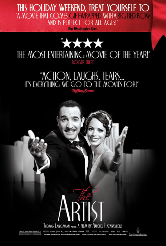
(The Artist film poster)
The use of black and white colours dominates all of the products, using the art style of Chiaroscuro – a style that can be traced back to film noir and early film developments from early film with George Melies.
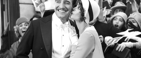
(excerpt from the film The Artist)

(Excerpt from Melies’ Un homme de têtes)
Another convention seen in the products brand is the use of typography. The Artist uses the appropriate font style of “Script”, or “modern” that both were used prolifically to illustrate the early twentieth century – just as the films setting in the 1920’s. Even the spacing between characters is taken into consideration in the poster of the film, directly showing intimacy between the two, and is reflected similarly in the film.


My second brand identity that I had researched before undertaking the task of construction of my own was The film adaptation of the book The Kite Runner filmed by Marc Forster in 2007.
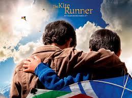
(Alternate film poster for The Kite Runner)
The synergy between the book covers of the film have the least common ground. However, there are still distinguishable features, such as the colour tones and themes such as a clear blue sky that can been seen through all of the versions. The latest edition of the book shows an almost identical setting the that of the film poster, with the exception of the font colouring and the prop of a Kite and the positioning of the main protagonist’s arm over his friend’s neck with the camera positioned behind the boys. This same movement in the film is replicated in the film.
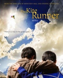
(Film poster for The Kite Runner)
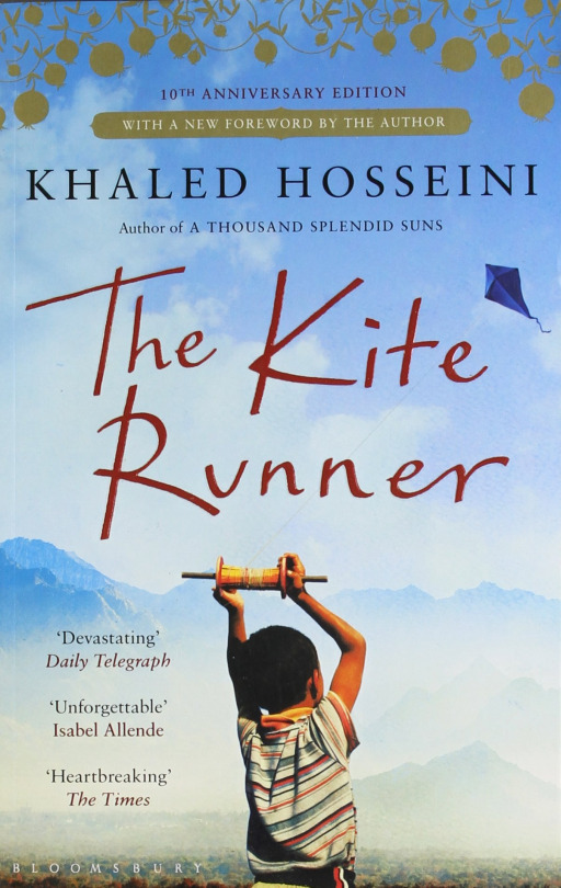
(Book Cover of The Kite Runner)
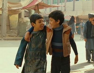
(Extract from the 2007 film production; The Kite Runner)
What I gained from this research was that:
Media products that are successful in generating a brand identity mirror the art style of the other products; including the use of the same colour tones and positioning of texts.
Typography needs to always be matching in order to be successful, and be an appropriate intertextually.
The reoccurrence of themes that are easily identifiable are the most effective.
The use of Props and Mise en scene is an important element to generating a brand image, and the positioning of characters with regards to mannerisms and gesticulations. As they help illustrate to the audience through Barthes codes meaning and therefore genre to the audience.
How I have used this information to develop my media products brand Identity:
As seen above, I have used the aforementioned techniques in my short film, film poster and magazine review page.
These same techniques can be seen across all of my media products. The use of the chiaroscuro art style I have adopted before my research in brand identities and drew influence form the renaissance period, with the Caravaggio paintings, especially of the one shown below:
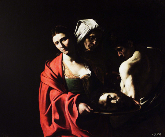
I have taken what I had learned from the use of typography in media in the creation of my own, I had used across all of my products the De Valencia type kit. The reason why I had chosen a sans serif styled font was that the font was clean and followed in the convention of my genre, but is distinct enough to be established as its own.

I paid close attention to my main protagonists positioning in mannerisms and gesticulation in composing the shots on my DSLR for my magazine review page and my short film. I had used actions that directly correlated from the choreographed actions from my short film. Poses such as the enigmatic covering of the face and standing defiantly while opening a book. Additionally, the use of the ring on his hand enacts as another eye-catching feature that contributes to my brand identity.
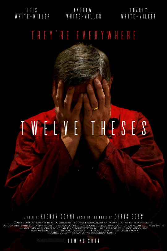
Moreover, I had used the prop of a red boiler suit in order to make my products collectively stand out and enacts as the key characteristic of my identity for my “brand”.

Is my product effective in demonstrating and delivering a brand image?
I have used several focus groups in both a summative and formative manner when constructing my short film and ancillary tasks. There were several times that demonstrated the effectiveness of my synergy ,as when presented with each of my products, the tone/genre was interpreted as well as being able to identify each product form each other.
Informal feedback:

(informal formative feedback from Beth Hodges in relation to my film poster)

(Shara Milton; commenting on the colour scheme for my first draft of my magazine review page in relation to my short film)

(Lewis Smith suggesting that there should be a dark colour scheme for my magazine review page, as it would follow my films aesthetic and would coincide the most with my brand identity, that I later would use).
Formal Feedback:

(Mrs Berry Formal feedback)
http://kierancoynea2.tumblr.com/post/154718814389/film-poster-ideas-1
0 notes
Text
“In what ways your media product use, develop or challenge forms and conventions of real media products”
When I decided to create my media package, consisting of a short film, magazine review page and a film poster, I had two main concerns: firstly, using my influences to create a distinctive, strong brand image that has clear synergy between them and secondly, to ensure all three products looked professional . I needed to balance this realism, using conventional signifiers, with enough originality to distinguish my work and display artistic merit.. I therefore had to ensure some conventions were subverted. My overarching theme was a ‘Dystopian society’
My first task was to research into the genre of dystopia, analysing the conventions within the narrative between each novel, film, short films.
Nineteen-Eighty-Four
One of my main influences for the choice of my genre, and very much the main model for all of modern dystopia is George Orwell’s novel, and visualised in film in the year 1984. As Orwell himself had given a narrative, though heavily criticised for being an unrealistic representation of the lower class, presents in archetypes a dystopian world. The Director Radford in the film adaptation of 1984 embodies this and in turn generates a strong, visually powerful product. This is where I had drawn the main inspiration of elements in my narrative such as “The Party”, a key convention in totalitarian regimes. My product both uses and develops from Orwell’s key concept in many ways, in that I follow some visual aesthetics and emotional elements being:
Chiaroscuro and muted colours:
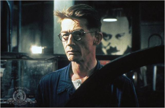

One of the ways I had created a more realistic product was to follow the key first wave dystopian aesthetics. In my film I had achieved this via the reduction of the saturation in post-production, in order to bring out the same colour tone for which Radford had painted.


Above we can see my short film poster where I have incorporated the similar idea that was illustrated from Both Radford and Caravaggio, a Renaissance painting titled Salome which uses the technique of Chiaroscuro. Taking inspiration from both the immense contrast between colours, and using them to further my professionalism with encoding the colour red to symbolise danger. The main reasoning for using the Chiaroscuro art style was that the the image is aesthetically pleasing and gives as little away as possible to the audience of my demographic with the reductionist aesthetic and covering of the face, which encapsulates the main crux of my film being full of enigma.
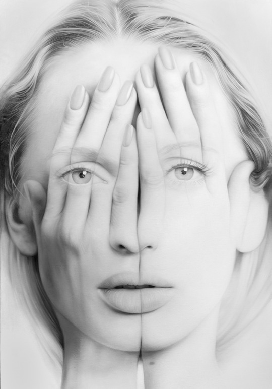
Tigran Tsitoghdzyan has been a great influence for the development of my film poster. As a real media product,
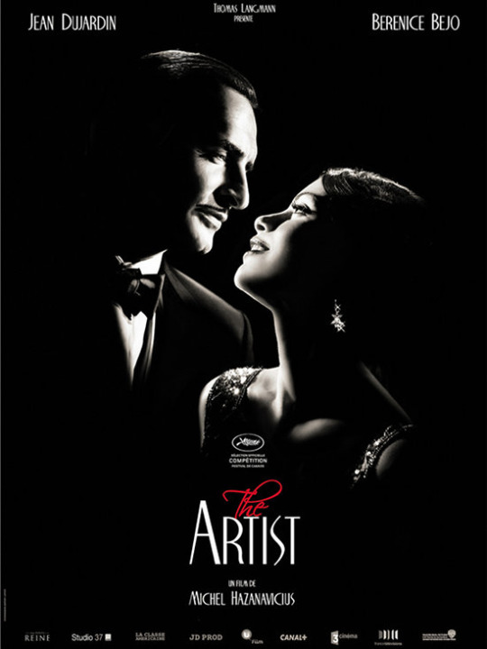
One of the film posters for which I compared as a real media product to construct my product theme was The Artist.
Both the typography and colour scheme has influenced the way I have constructed my film poster. The use of both eloquent script style fonts made me think of the conventions associated with my genre, rather than simply using ones which seem fitting.
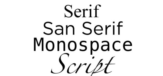
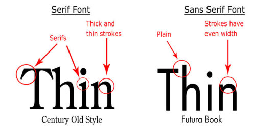
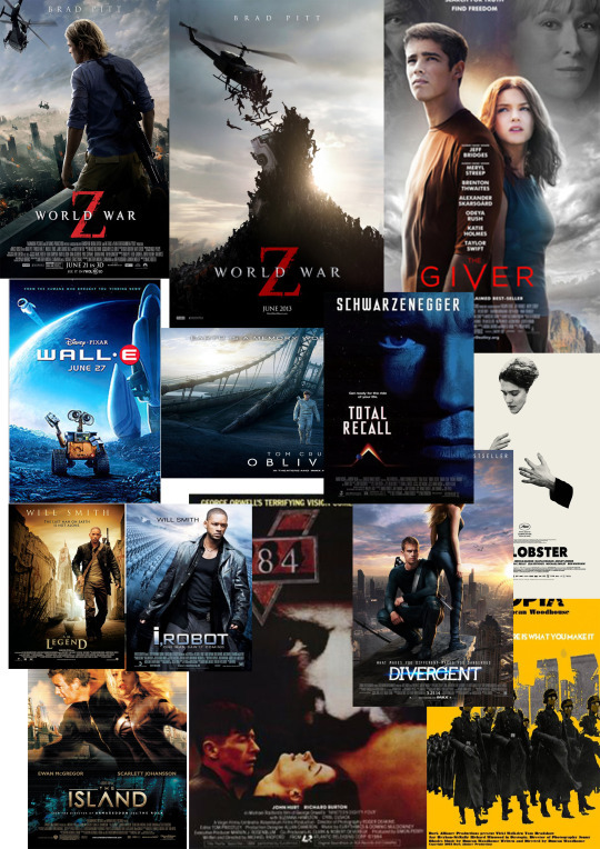
Within my research of the different conventions of dystopian film I found that using a consistent typography, either sans serif or serif, depending on the time period.
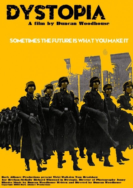
The Short film I had researched “Dystopia” I found greatly contrasted with regards to my own dystopian film. Though there are elements for which the two products share, the emphasis of context to the World Wars certainly is vocalised more than my own film that uses the Renaissance as an art style. In addition to this, the film Dystopia hyperbolises from the heavily masked crop and eroded style typography the visual theme of decay and decrepitness.
My Media products, in particular my
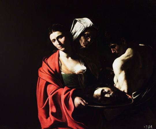
The Caravaggio paintings showed to me the importance of colour when creating my product, and what was influenced me to use the colour red for my main character, as the ancient stories of St John the Baptist really capture the essence of brutality that I convey in my short film as an intertextual reference. This itself stays true to the convention of the genre as seen in the novel and newly released T.V show The Handmaids Tale, a second wave dystopian narrative that takes inspiration from the Bible in Genesis 1: 1-3, placing heavy satire onto theocratic dictatorships, just as my own film aims similarly to satire more recent totalitarian regimes such as Nazism, communism and so on of WWII and the Cold War.
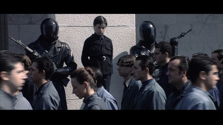
youtube
Moreover the colour red also is seen as yet another reference to the genre as seen in The Handmaids Tale above. In terms of Narrative, there are clear similarities in the first person writing style to my discourse in the form of a intimate voice-over in my film. Examples of this can be found from Neologisms such as: product, Particicution and the Eyes. Where my short film uses “The Party” and other proper nouns to establish the society to the audience. Additionally, both Handmaids Tale and Twelve Theses adopt the key theories of Binary opposites proposed by Levi Strauss and Barthes Codes. In The Handmaids Tale there are strong juxtapositions both in narrative form and characters, as the plot bases around the plight of a woman during a theocratic takeover of the USA. Meanwhile, My short film draws from this the division from protagonist and antagonist with colours: My main protagonist in red, and Kate my antagonist in blue. Twelve Theses develops from this in that my product only shows conflict of the two main characters, generating a more distinct division that isolates the protagonist Lewis, and separates itself from almost all other dystopian fiction.

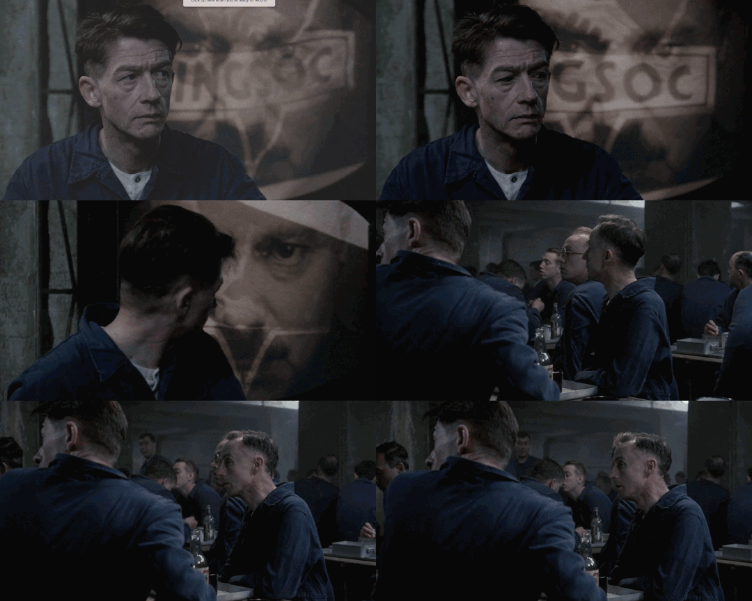

The ending of my film employs a strong closure which applies to both the convention of short films and the dystopian genre. Pam Cook (1985) stated:
The standard Hollywood structure should have:
Linearity of cause and effect within an overall trajectory of enigma resolution
High degree of narrative closure
A fictional world that contains verisimilitude especially governed by spatial and temporal coherence.
Several real media products that I have analysed follow this trend, one of which being the short film “AWAKE”.

Similarly, to the “AWAKE” my short film holds both homage and intertextual references, which are typical to modern dystopian material, though less so in short films.

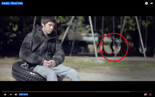
As seen above there is a clear homage seen from the highlighted ominous figure in the background, using a viral phenomenon that circulated the internet called the “Slender Man”. The brief featuring of the figure can be seen comparably to my own homages in the form of the location code/referential code in my short film of Senate House, referenced as the “Ministry of Truth” in Orwell’s 1984, and again when Lewis is searching through his books to see if his daughter has left a note the brief featuring of the novel its self.

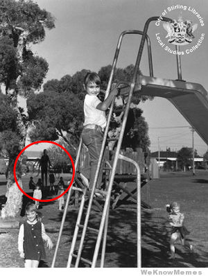

Another element for which my short film follows in convention is the structural technique of foreshadowment, in this case revealing to the audience that the boy via inference before fully doing so at the end of the film.
Similarly, Twelve Theses uses the separation of two shots, one of a knife coming down, then of the first full establishment of the main protagonist to infer his demise; Kate his wife being the blame for his death. Although my interpretation is meant to keep rather enigmatic and unassuming,
“322″


Another influence that persuaded me to follow the convention of foreshadowment was “322″. The title sequence reveals in a montage of several key shots that reveal the narrative of the short film. The film itself hands itself to the dystopian genre in that omniscient protagonists often are able to see their own demise.

Film Noir has been a significant influence in the construction of my film, which has stemmed from the chiaroscuro

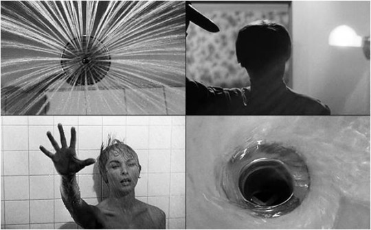
German expressionism has also been an influence in my short film,
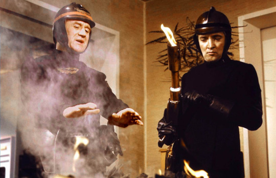
The Dystopian film from the late 1960′s “Fahrenheit 451″ uses the same key concepts in a totalitarian regime for which Twelve Theses adopts. My short film develops this in terms of narrative in that the period of time is in modern day London.
Lewis Smith is a fellow “firefighter” but has a daughter and eventually is killed by “The Party”, rather than being hunted by a mechanical hound, as Français Truffaut depicts.
In terms of cinematography, my film borrows only from one shot shown above in that the use of an incinerator with fire-fighters looming over. My film develops this with the use of enigma codes, using the costume codes of a red boiler suit and covering the face to establish class and status in uniformity.

Equilibrium (2002)
The 2002 film “equilibrium” satirises the function of the nuclear family in a totalitarian regime. The use of an all black uniform signifies the militarisation of private family life. Likewise my film does the same in the indoctrination of Kate Smith.
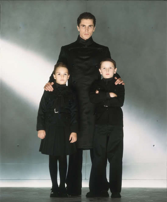


Elements such as a ruling elite can be seen across the whole dystopian genre, and senate house (which features in my short film) has been a model for government buildings in totalitarian regimes since described in George Orwell’s Nineteen-Eighty-Four, though is not shown in the film adaptation. All of which my short film is conventional of through both the choice of colour in the mise en scene and location/referential codes.

(Equilibrium (2002), dystopian-action film, directed by Kurt Wimmer)

(Senate House, described in 1984 under the title “The Ministry of Truth”)
Conclusion:
In my short film, I have used many intertextual references,
Cinematography
Nineteen-Eighty-Four, The Handmaids Tale, Equilibrium, Film Noir
1984 Illustrates the dystopian fiction in a rather abstract light, rather than filming literal excerpts from the novel the film substitutes this with muted tones and very much a unpleasant apocalyptic setting. Twelve Theses aligns itself with 1984 in that the shots taken on the train are in fact desaturated in post production, in order to portray the same bland aesthetics that Radford presents.
The handmaids Tale and 1984 both place referential codes in the original novel extensively, whether directly or indirectly. In 1984 the main totalitarian building is modelled off of Senate House - which is currently a library for a university (UCL). Handmaids achieves this from the indirect setting of Harvard University and is depicted several times in the form of the gymnasium and events, that can be seen from the film (which is directed poorly) in 1990. What can be seen is that there is a clear convention in the use established buildings and architecture in generating a believable dystopian society. The use of several referential and establishing codes that show the location in my film further this -in that I systematically show each element that creates a dystopia: enforcement, surveillance, power and so on.
0 notes
Text
Feedback on my Magazine Review Page: first draft

Formal feedback: Mr Coleman
Overall, the feedback from Sir was positive. However, there were some things that I can revise in order to improve the quality of the product:
-fill out the page:
One of the main problems with the pages so far is that there isn’t enough content, making the page seem vacant and therefore not professional.
-need to justify the art style:
In order to have a black and white page split, I need to be able to show that it is necessary. One of the examples would be to match the art style of the short film, but this needs to be signposted that could be seen from my next point.
-keep the font style consistent:
The two conflicting fonts of “TWELVE THESES” seen on the two pages need to be consistent in order to be conventional of an art style and be conventional of both the magazine and the film/poster.
-remove hyphens in text:
One of the pressing gripes with my magazine was with the amount of hyphenated words sprawled down the magazine review make the film seem disorganised.
However!

Sir had shown me from my word document that I could centre the text into a block, that is much more aesthetically pleasing and professional.

Informal Feedback
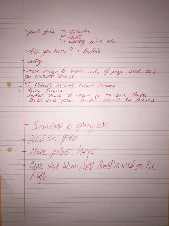
Amongst asking my main focus group on their thoughts on my review page, there was an emphasis on some areas for which I could improve. The main area of concern seemed be both the amount of content and the colour scheme of the review page. Beth suggested either a fact file, director and cast information and so on.
Holly thought that the poster was not as effective with the picture in the centre of the second page and should be positioned on the very right.
Sam stated that the posters on the page were highly effective in the synergy of my product but are too small to stand out on the page.

0 notes
Text
second draft on my introductory voiceover


Here is the reworked version of my film where I have taken the criticisms of my previous voiceover, introducing more hook style passages and enigmas.
0 notes
Text
Feedback on my film and progress so far...
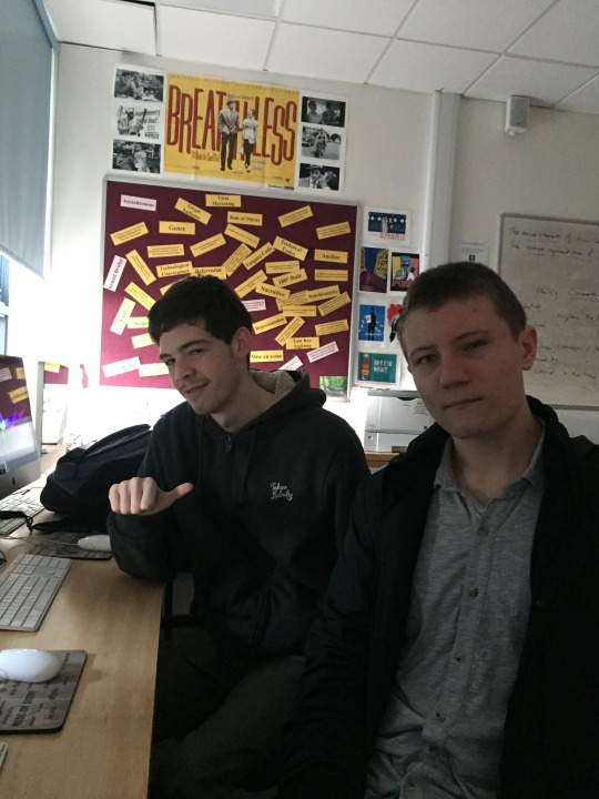
(More members of my focus group)
Mostly, there was positive feedback on my current progress. However, there are still some small nuances in my film that are not completely agreed upon.
Areas where I can improve in my film:
Focus, Focus, Focus!
when filming, mostly I would be using manual focus as I believe it is a great way to direct the audiences eyes, and can highlight things that otherwise wouldn't be noticed if shooting with auto-focus.
Unfortunately...
sometimes there are times when I cannot focus at all, but when focusing on a train it is rather hard due to other factors such as wobble, other people and the lack of time and space. However, one of the techniques I have learned from this is “Spot metering” in this situation using a single focus point on the DSLR will allow me to get the ideal focus as the subject is in center-frame.

Too many focus pulls...

One of my favourite techniques of forcing the eye in focus pulls I have used too much and I believe. One of the reasons for this is most likely as I prefer to shoot when I'm filming in manual focus and manual in video on my DSLR.
One of the ways I can counteract this will be to just re-film the sequence, or find a reasonable substitute in my other shots that have not made it into the film so far.
So why is having too many techniques a bad thing?
repetitiveness will cause the audience to loose interest and will lower the overall quality of the film.
Verisimilitude and building tension in my piece:
one of the main problems with my short film currently is that there isn't such a sense of climax that I’d anticipated. One of the main weak points in this can be seen from the final couple of shots in the scene where there are shot-reverse shots of my main protagonist and the protagonist. The problem with the shot is that there is not enough genuine emotion that can be received from the shots. Personally, this isn't the actors fault (though this could be a contributing factor), and could easily be remedied with re-filming, reconstructing the directions/script in order to make the audience empathise with Lewis more.
Building a strong narrative:
so far I’d argue that there is an established narrative, enforced by the narrative BUT I need to be able to allow my film to be easily interpreted and becomes a problem when using voice overs and having a narratological centralised genre does not help this. I would say there is a discernible narrative that is evident without the backing of the narrative but still some nuances that present themselves. One of which being why are books illegal? who are The Party.
One counter argument to this is that the dystopian genre has a strong convention of placing information to be common knowledge in order to further immersion. It can be seen everywhere from the use of proper nouns in order to convey understanding and distinction in The Handmaids Tale, Nineteen-Eighty-four, Do Androids Dream Of Electric Sheep and so on. So I believe some of these can be left to enigmas as speculative fiction I find to be very much in my vision of my film, as a lot can be said in inference in my film that generates more depth and meaning to the film, rather than the cinematography that is visible on the surface.
When am I planning to do this?
-Tuesday 3rd February I will re-film with my actors and hopefully construct more tension to the narrative, and re-film shots which distance the audience to the narrative,
-I will sculpt my voice over to cover more of the “grey-areas” (Will.D) to construct a more cogent narrative.
“Your first 10,000 photographs are your worst.” ― Henri Cartier-Bresson
What I can take from this, is that re-filming only necessary when you don’t film enough the first time in respect to film. So when I film in the future I know that there will always be problems that I should anticipate.
0 notes
Text
Feedback on my poster and my progress so far...
After presenting to my target audience my poster I asked for some comments on how I could improve on the poster, what it made them think, and some constructive criticism.
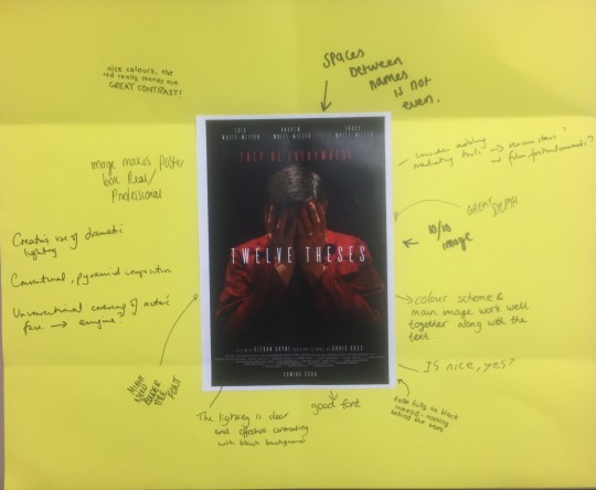
What have I learned from the feedback:
Mrs. Berry stated that though she liked the overall aesthetic. However, she stated that there could be some space for academy awards and film festival symbols.
Beth stated that the main character titles at the top of the posters are slightly off-centre, so will need to be corrected. And said it was “10/10.”

So far here are some of the conventions of my poster that I have added so far, following the style for which I had researched in dystopian film posters and short film posters.
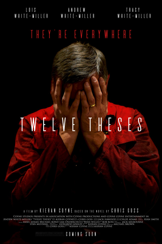
What I will need to do next for my film poster will be adding some commendations and awards, which I am planning to place on the left and right hand side of Andrew. Secondly, I will be replacing the BBFC classification symbol for a more modern and easily identifiable certification. Moreover I shall change some of the names for the names in my crediting block that may seem inappropriate for my final draft, to ensure a more professional aesthetic.
0 notes
Text
The Future... (short film plan)

Over the next two weeks, I will be planning to finish all of my main tasks for my short film. The main areas for which I would like to finish is my short film and my poster, as the both will be required in order to complete my magazine review page in the way that I have envisioned and planned.
Progress so far:
0 notes
Text
Introductory Monologue
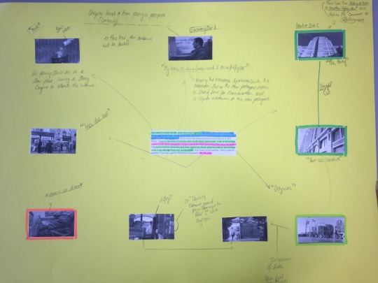
The monologue I have made for my character Lewis Smith, and will be the main introduction for the character and the audience to the Dystopian world. The importance for this monologue/voiceover to be both informative, cogent and unique is incredibly important as it is the first impression of the characterisation that will be encoded for the audience. The engineering of the aforementioned needs to both divulge enough information on the situation of the main protagonist Lewis and his hell, as well as the strong enigma that I wanted my short film to encapsulate.

My Voiceover addresses the key themes that are in convention with dystopia, written specifically to be read aloud rather than rhetoric that you would see from a novel. Some of the conventions include: social class and status, surveillance, relationships and totalitarianism.
youtube
Will and Dillion stated in feedback :
- They loved the synchronicity of the shots.
-Enjoyed the catchy hook at the end of the voice over
-Will stated that he found the introduction of the protagonists name unnecessary and “cliche”.
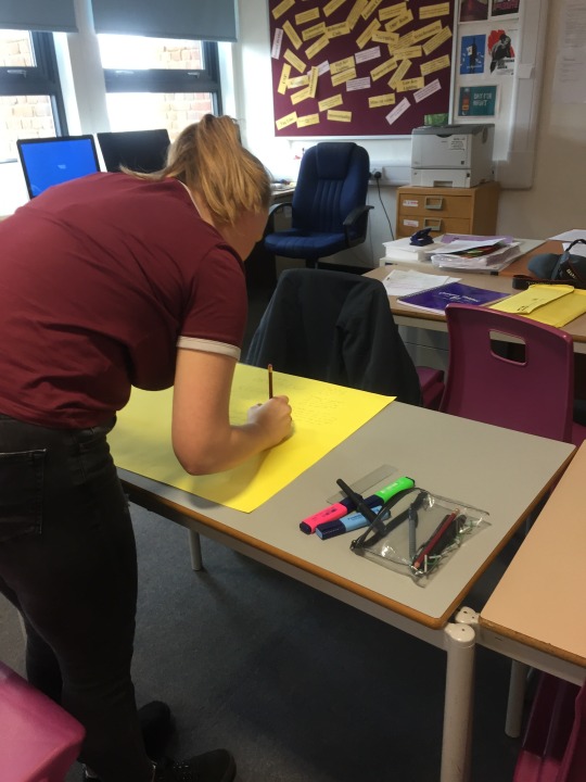
Beth stated:
“I really love how your film has synergy between both your poster and review page, as they’re easily identifiable”
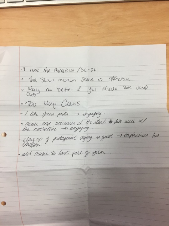
“I really love the way the voiceover flows through all of the different places and aspects, I really like the emotion and tension at the end”.
Formal feedback: Mr. Coleman
From a discussion after presenting the live voiceover of synchronous with both ambient/diegetic sound and my film music score that is still being constructed.
What was suggested was that I will need to make some changes in reference to the style of the voiceover, emphasizing more on the enigma rather than being informative.
some of the suggestions on the line changes can be seen below:
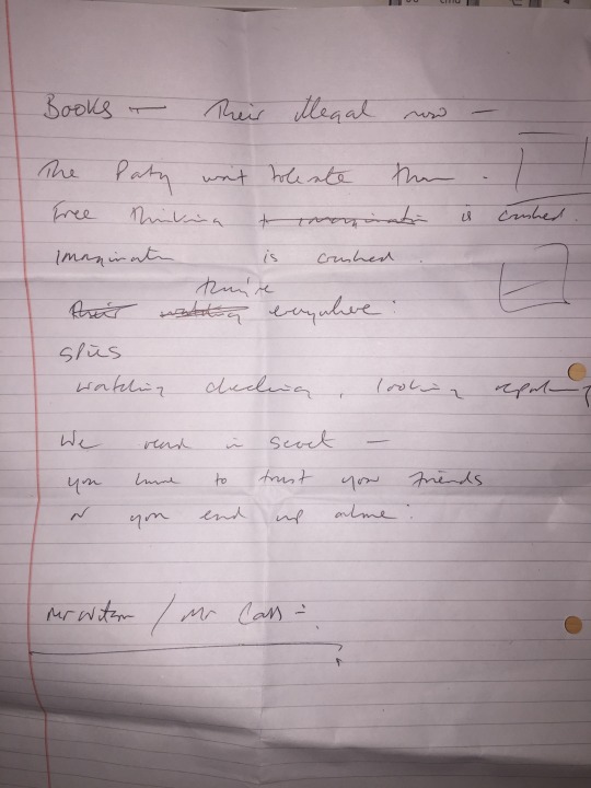
Mr Coleman also stated that a possible change in person for the voiceover may be needed in order to gain the narratological sounding tone that would compliment my film.
After discussing possible candidates, we came to the conclusion that a member of the english department will be an apt choice for my film, alternatively Mr Coleman suggested another teacher: Mr Willis for my narration.
However, I will need to conduct some research and cast each narrator for my role in my film
1 note
·
View note

