Communication Design Studies Reflective journal containing lectures, tutorials, assessment progression & reblog of other students week one week two week three week four week five week six week seven week eight week nine week ten week eleven week twelve week thirteen
Don't wanna be here? Send us removal request.
Text
GOODBYE, but not forever.
What I thought was going to be numerous long walks from Swanston St to RMIT Building 45, turned out to be a 30 second walk from my bed to the dining table. As a first-year student, I wasn’t expecting such a turn in events to online learning. Nonetheless, I still feel like we got to engage in group activities through breakout groups, as if we were splitting off into different tables in the classroom.
I have learnt so much about key design movements and historical events as well as modernism and how conceptual design is the start of helping humanity through Andy and Karen Ann’s lecture series. It is through these assignments over the semester that I have really seen growth in putting this knowledge to action and understanding the roles of different contexts, aesthetics and movements in communication design.
I believe that design fits in anywhere and everywhere. The typeface in my pocket and architexture tutorials really enabled me to see that. I’ve been thankful for the connections I’ve made along this journey in the course and the feedback and guidance I’ve gotten from my tutor Bailey. I hope to see you all at RMIT again someday :)
image source here
10 notes
·
View notes
Link
ASK ME ANYTHING REFLECTION & FINALE
I HAVE STRUGGLED....like really struggled with this task. Working with an aesthetic so unfamiliar to me was something that I didn’t really put into consideration when choosing the infamous Comic Sans as my subject for this assessment. I have no doubt that everyone has been in some sort of design rut trying to replicate their subject’s aesthetic in their zine, but if only I could call Vincent Connare and Comic Sans and ask what do I make my zine look like?
What I’ve learnt throughout this iteration process is that there really is no exact formula and impression. Like beauty, the aesthetic is in the eye in the beholder and this is the way I chose to interpret my subject.
Working right to the crunch time, a few days out from submission has enabled me to make critical design decisions and work to a strict timeline, instead of fiddling around and trying new things.
I wouldn’t look at my zine and say WOW that is really nice, but I think that’s the point. It’s not supposed to be pretty or elegant, but I hope you can see and appreciate the design thinking applied in my iterations.
I have explored with vibrant colours, allocating a certain hue to each of my five questions and paired these with collage knick knacks and scrapbook features to enhance my ugly-childish aesthetic.
I also adopted a sarcastic and witty tone in my Comic Sans responses, in the hope of emphasising the subject as an actual person rather than just a typeface.
Despite the challenges I’ve faced with this assessment, I truly believe that I have grown as a designer and learnt to step out of my comfort zone. Not every client is going to want you to create something that matches your own style and aesthetic, so it’s important to adopt other styles in order to learn and be versatile in the industry!

I’ve really seen my grown in this assessment from the first week of iteration until now and can safely say that I have definitely learnt a few things and taken on feedback from others on this platform, as well as from my tutor!
9 notes
·
View notes
Photo
I really love Emily’s final zine, it’s turned out so nicely! I love how her she has framed her text around her visuals and included some of her own sketches, it adds to her sleek and elegant impression quite effectively! Super nice.
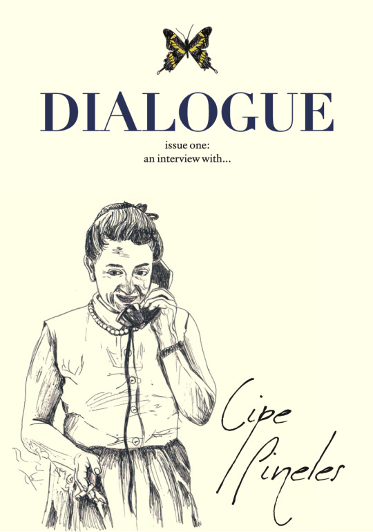


Completed Zine !! Outcome & Reflection
https://issuu.com/emilytian7
/docs/emily_tian_zine_cp
Finally the day has come. I can enjoy the satisfying sensation of hitting the ‘Submit Assignment’ button.
Reflecting upon this assessment, I feel like I’ve learned a lot in regards to publication design and my subject herself. Looking back on what I had for my WIPs, I’m pleasantly surprised to see how much has changed. My initial draft spreads were veryyy straightforward, lacking in experimentation, and just a bit below average. Thankfully, with Ben’s advice, I was able to making many many subtle adjustments such as, pull quotes, font changes, colour, cut outs, hand drawings, collages, and more. Throughout the zine, I used a combination of cut outs of her work, drawings of mine, photographs of her, and photographs of her work.
Briefly mentioning Cipe herself, I’ve really learned as much as possible about her life and I think she’s an incredible deserving yet underrated figure in design history. She truly went through the struggles designing at a time where she hadn’t been considered for jobs because she was a woman. The text in my zine might look like too long of a read, but I swear it’s worthwhile.
Anyways, I’m happy with the way it turned out in the end although it was a bit of a rollercoaster. I think everyone was just feeling a bit burnt out towards the end but I’m glad we’ve all worked our ways out of our slumps to finish. Being my first publication or zine design, I feel as though I still have a lot of space to improve.
4 notes
·
View notes
Text
WRAPPING UP ASK ME ANYTHING + FINAL ZINE!


Boy did I ever see this day coming? Answer is no! This zine has constantly been in the back of my head calling for me to hurry up and finish it but we are finally here!
I severely struggled to stay motivated with the iteration of the zine due the aesthetic that I was trying to produce as apart of Comic Sans’ style, completely different to my own. Nonetheless, I think it paid off. For a while I thought there was this certain impression that I had to give off and felt that I couldn’t deliver that, causing me to spiral and stop working altogether. Despite this, once I had gotten into the groove of things I was motivated to finish the remaining spreads and fine tune where needed.
Above I’ve added some of my favourite spreads from the zine! (Full zine with Issuu link coming soon!) Surprisingly, I used all 16 pages that we were allowed to use. I never thought that I would need so much space but when it came to using collage elements, the composition looked a lot cleaner with negative space so I critically chose to use 2 pages per question (on average).
Each page has its own monochromatic colour scheme, playing along with the childish use and impression of Comic Sans. Although it is quite overwhelming to look at, I felt that acquiring a rainbow of colours for each spread would have been even more overwhelming for the reader. This application of colour also allowed me to focus more of my layout more than anything else.
I think my favourite part of this was consistently using the font Comic Sans and making it somewhat design-friendly! When I was writing my own responses to my questions, I also chose to write them in this font to see what the subject would look like when saying it - which I thought was kind of funny.
I hope that my critical design thinking can be seen through this midst of ugly childishness!
2 notes
·
View notes
Photo
I’ve been waiting for this to be posted!!! I’ve loved seeing the progression from the onset of Katie’s collages to the finished product today. Her choice to stick to a limited colour palette makes her zine more cohesive and allows focus on the hierarchy of her collage on each page. I laughed a little when looking at the image references!
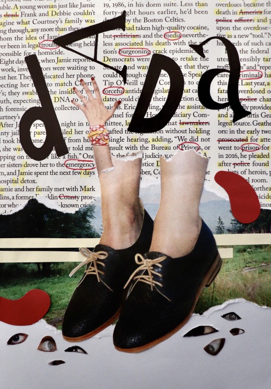
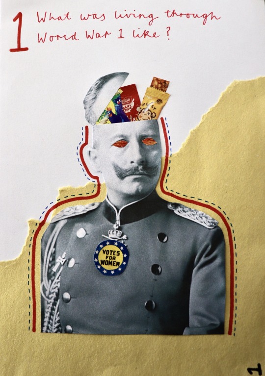
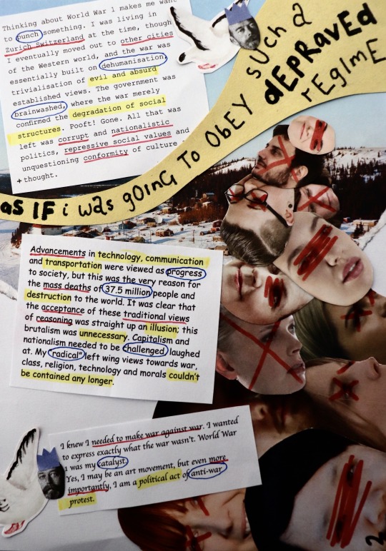
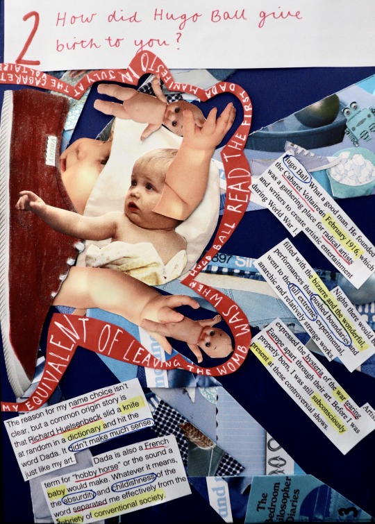
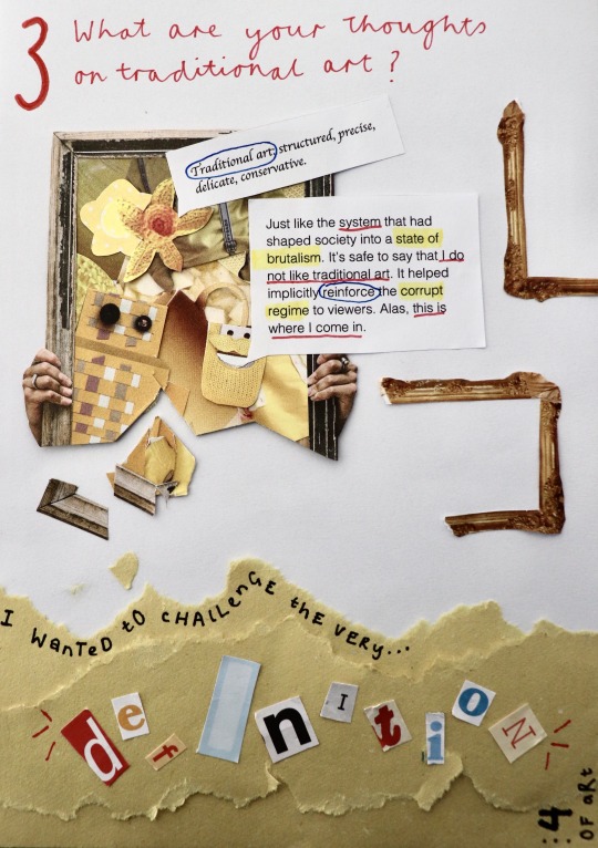
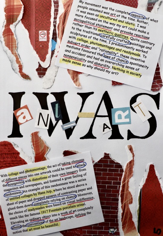
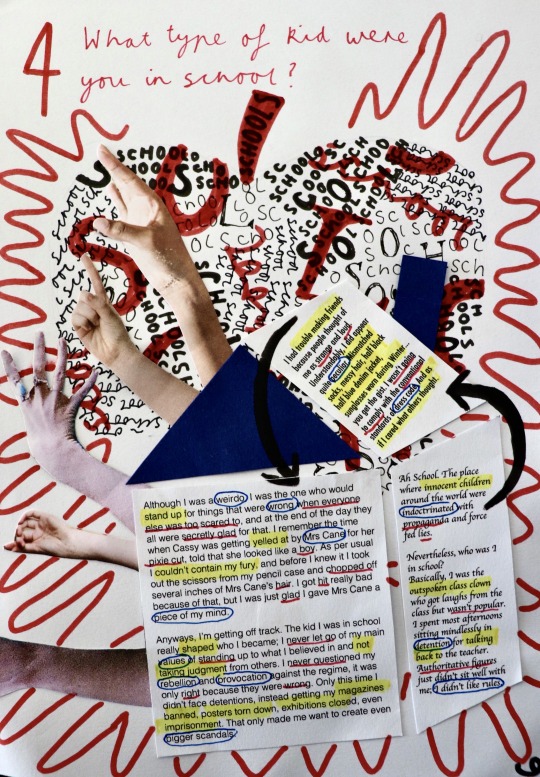
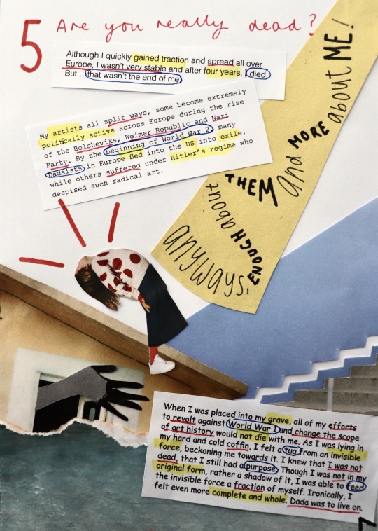
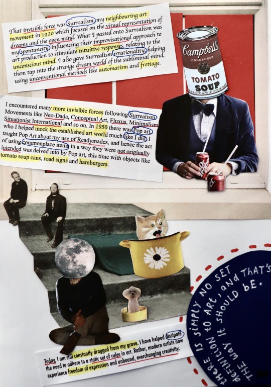
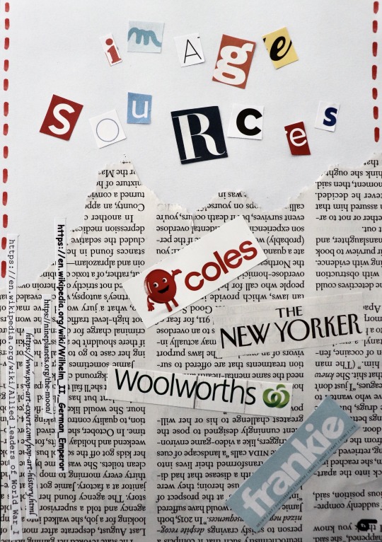
Finished Zine!!
I can’t believe I actually managed to finish! This zine, though fun, literally has consumed my life for the past few weeks, always at the back of my head. This has definitely been the most time I’ve spent on an assignment and it was the best feeling finally getting to vacuum all the tiny bits of paper on my floor and clear away my magazines haha.
There’s quite a bit I’ve changed since last time I uploaded. After receiving feedback from Bailey that my text was quite un-Dada, looking more like a magazine, I spiced it up by using random (and some ugly) alternating typefaces for each paragraph, to make them look as if they were different bits of text cut from a newspaper, a method used by many Dadaists. I also highlighted/underlined/circled important words with my primary colour scheme, giving the words more personality.
I decided to stick to a red, cursive type for my interview questions to give it more contrast from the rest of the pages with its elegant appearance, and enlarged my question numbers to give them more hierarchy.
Making the rest of my zine pages was challenging. Having to adhere to the nonsensical/humorous/weird/chaotic aesthetic of Dada, as well as relating my collages to my questions, as well as creating layouts that still had some structure and thoughtful design choices, was a lot to juggle. I had to think about each element of my designs extremely carefully. After a while, I started to stray from Dada and forgot to fully emulate its style, instead kind of just making collages with no style. I also started to lose creativity and found it hard to come up with ideas from my magazines. There were times where I spent hours doing things that would usually take 15 minutes. With all these slumps, I found that detaching myself from the zine and looking at other existing designs, whether that be Dada art, general designs, or zine designs, proved to be really beneficial in re-inspiring me with new ideas and a fresh perspective. Taking a break away from the zine and coming back to it another a day was also useful.
After learning all about the importance of colour in my colour & info class, I decided to stick to primary colours. Limiting my colour palette was a really good choice, where my pages altogether have a sense of harmony. As my pages have quite a lot going on, limiting my colours helped make them more digestible to view. It was however quite hard having to find specific things to collage with the added limitation of colour. Most of the time I overcame this by looking deep into my magazines, but other times I physically coloured in objects, like the red shoe on question two, or added in coloured paper, like the windows on the second last page.
Once I had all my draft pages ready, I spent yesterday sticking everything permanently down and fixing things I was wanting to change to the pages, such as rearranging layouts, adding more hand drawn aspects, changing my interviewer typeface, using the same yellow coloured paper etc. It was much easier to refine and improve my pages when I already had their general appearances figured out, where I found it a lot harder to start my pages from nothing, as more ideation was required.
Overall, I’m glad that I was able to push through any obstacles and make my first ever zine. It is such a completely different style to what I usually produce, and although difficult, it was really good to push myself out of my comfort zone and explore another style of design. This was also the first time I really delved into collaging and it was very interesting to both explore the endless ways to approach collaging and to have to somewhat rely on chance and spontaneity when flicking through a magazine. Some of my favourite aspects of my collages were non-intentional (e.g. accidentally dropping something on my page) and that’s why I love collaging: it has no rules. I’m really happy with how my zine turned out and I’m definitely going to do more collaging in the future!
31 notes
·
View notes
Text
WEEK 12 LECTURE - WHAT JUST HAPPENED? WHAT DID WE LEARN?
This lecture was bitter-sweet to watch. Karen and Andy reviewed the lecture series in a quick 30 minute summary of some of the concepts and history of design they had covered.
One of my highlights was from the first tutorial, the typeface in my pocket task, providing the message that we already have everything we need to design and on a lighter note stated by Karen, we never really know what fellow designers are carrying with them on hand! I also really liked learning about ancient script writing and the tools that we use to communicate. No matter what medium and inscription we use, they both shape each other to create a purpose and message!
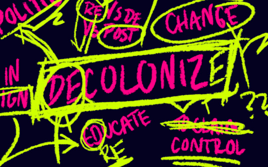
DECOLONISING DESIGN
Karen touched on the the idea that we should open up our perspectives and cite the other half of designers. For a long time it’s been clear that like most industries, design is another that has been male dominated, however, we should not acknowledge just one side but see that all voices should be heard. This goes way beyond gender, citing designers of all races, cultures and creatives. Karen shared with us a few females in the industry, encouraging us to cite them and celebrate them!
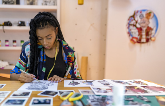
Tolu Coker | Fashion designer
Tolu Coker is one of the female creatives on Karen’s list to check out and cite! I was so attracted to her fashion pieces in the lecture that I had to find out more about her and her work. Originally from Nigeria now London based, the young Fashion Designer, Textile Designer and Illustrator graduated from the Central Saint Martin's Design school in June 2017 with First Class Honours.
She has taken off her fashion career quite quickly post graduating and already has a Spring/Summer collection out (2019)! It is known for her unisex fashion brand centred around inclusivity, diversity and social responsibility.
This collection features reworked and recycled fabrics, such as denims, leathers and plastic paired with striking and daring silhouettes to showcase a collection based on a documentary following the lives of 4 people in London and Paris. The collection was about their identities, their childhood, their vulnerable, untold stories and black heritage young people growing up in a Western world.
It is evident that her fashion designs are striking and unique but it’s also great to see how they have a special meaning beyond current fashion trends, she has a clear connection to her work.
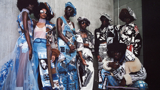
Tolu Coker, Spring/Summer 2019 Collection
OBJECTIVES OF THE COURSE
On a final note, Andy highlighted the three objectives apart of this Communication Design Studies course. What stuck with me the most (along with how much we had learnt in such a short period of time) was that we should always be creating a fourth objective... or even more than that!
I think my fourth objective for this course would be taking risks and learning to stick with one idea. In a feedback class that Andy popped in to, he stated that it’s always better to have finished the project then perfecting it and submitting something incomplete. I’ve learnt particularly with our last assessment, Ask Me Anything, that as much as zines can create such experimentation for the designer, in such a short amount of time alongside other workloads, it’s okay to scrap the other ideas and focus on one! Believe in that idea!
I’ve also explored beyond my own style in this assignment which has been quite challenging, but has helped me to grow as a designer and broaden my aesthetics!
SOURCES
https://www.hungertv.com/editorial/emerging-british-nigerian-designer-tolu-coker-is-one-to-watch-this-season/
IMAGES
https://eyeondesign.aiga.org/what-does-it-mean-to-decolonize-design/
https://pmcwwd.files.wordpress.com/2019/01/tolu_coker_designer.jpg?w=640&h=415&crop=1
https://www.hungertv.com/wp-content/uploads/2019/02/tolu-main.jpg
1 note
·
View note
Photo
It’s so cool to see everyone’s progression with this task week after week with feedback from tutors and fellow students! I haven’t seen two out of three of these spreads of Chloe’s zine before this post, but I have to say I think they’re my favourite! She’s really replicated Vignelli’s New York City subway well and has created a point of difference in this vibrant colour palette compared to the rich red and dark navy in previous spreads! Well done!!!


Zine Wrap-up
I thought that I pretty much finish my zine and it’s good to go as it is due in 2 days from now! However, the more I look at it the more wrong it gets. I forgot to mention in my last zine wip post, Bailey ask me to be aware of the page layout between the two pages as the final zine is going to be two pages facing another (it’s like when you’re reading a book you look at the layout on both of the pages). So I’ve been playing around with that since last week. I went into my last drop-in class today with Bailey to get my final feedback on my zine. And there are a few minor things that I need to change before I submit it.
Firstly, I tried to match Question 3 and Question 4 in a red background, but it just seems a bit too overwhelmed and a bit too much. [refer to the first image above] Bailey and I had a discussion about these two pages and we both agree that the red background works really well in Question 4 with it’s balance of the white rectangular graphics. However, it doesn’t work as well in Question 3. We talked about different options that I could do but sometimes if a layout doesn’t seem right or seem to work as you wish, then maybe I should just start a new page and explore a totally new layout option. Play around with it, explore different options and if I still can’t find a layout that suit this page, then I could always come back to this and make minor changes, such as size of the number, colour and lines if I need to.
Secondly, last week I added a new page to my zine cause I thought that Question 5 seems a little crammed with having the questions and answers on the same page. But when I move the number and the interview question to the seperate page, it seems like the second page is not balanced and too heavy at the bottom with all that text. [refer to the second image above] Bailey and I both really like the new page that I added, so i decided to just leave it as a blank page after Question 5 and see it as a page break before my image references.
It’s week 13 and the assignment is due in 2 days. All the feedback I received are all minor changes so I’m not too stress about the due date. But I do have to come up with a new layout option for Question 3.
20 notes
·
View notes
Text
I really like Liv’s current zine iteration and can see the progression from her last iteration in a previous post to this one! I can totally relate to the perfectionism and just having to force yourself to stick to an idea, especially with only a few short days until submission! I didn’t know of Mirka Mora’s art before seeing this zine but have since googled her work and can see the aesthetic of her compositions in your zine, specifically the use of colour and typefaces!

ASK ME ANYTHING WIP
This week I finally feel like I have progressed with my Zine. You can see how it has transformed since I last checked in. It was crucial that I incorporated a contrast of her material and photographs of the actual artist, Mirka. You can also see a change in the colour palette. Looking through Mirka’s colour palette I decided it needed to be more vibrant, to represent her personality. The font type for the title has changed from a Serif font, to a playful, child like drawn font to depict a hand written style.
For the layout of the Zine, it is still very chaotic but I think this captures her style of paintings. They are very busy and full of life, however I do need to change the alignment of the text and the spacing between the words, it still doesn’t sit right.
Based on Ben’s feedback I have a lot to change but for the better. I’m still getting used to InDesign so it’s great to get advice wherever I can. The main changes he suggested was to change the larger words at the start of each paragraph to have their own character styles. I will also need a new cover photo, whether I find another version or I edit the design myself to suit the overall theme. I must also ensure to have a consistent body text and to have a clear pink-white motif throughout the piece. Also super happy about the second extension!
6 notes
·
View notes
Text
WEEK 12 TUTORIAL

In our final formal class, we experimented with a Photoshop file that Bailey shared with us, allowing the class to get out of our comfort zone using different Adobe programs, consider our own layouts in our zine submissions and also focus on hierarchy.
We were given three different briefs
hierarchy being text
hierarchy being image
distort the layout, collage and go wild!
The catch was that we only had 5 minutes for each task. This proved to be quite difficult for me as I’m not one who works well under pressure. I also only use Photoshop for image manipulation and editing, so having to adjust to playing with both text and image was something I wasn’t used to. Despite this, the task helped us to really think about iteration and uncover how very minor adjustments can impact the overall focal point in a composition.
Above is my final for the emphasis on text, I focused on boldness, line separation and grid structure, however the word for didn’t seem to pull through when it came to my grids and sticks out like a sore thumb...
It was interesting to see how everyone else interpreted the task. In particular, it was cool to see the students that chose to show their distortion layouts, some added photo filters and stylized effects that changed the composition entirely - I couldn’t recognise it!
1 note
·
View note
Text
WEEK 11 LECTURE - WHAT’S NEXT FOR DESIGN?
This week’s lecture asked the question what's next for design, particularly how communication design is transforming through emerging technologies (artificial intelligence).
Andy and Karen also touched on how can design help humanity, which is a valueable asset to our practice, looking beyond building a business and just simply doing good for another person/people !
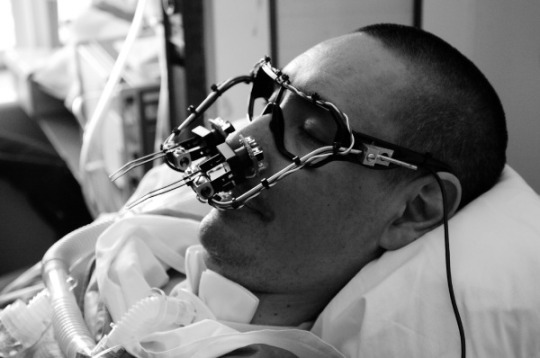
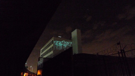
Temptone testing the EyeWriter
The EyeWriter by Free Art and Technology (FAT) is a solution to a problem with ALS patients who are unable to perform and express their creative passions. FAT has collaborated with OpenFrameworks, the Graffiti Research Lab, and The Ebeling Group communities to create a low-cost eye-tracking system for those diagnosed with ALS, so that they can draw with their eye movements.
It was quite sad to see the vimeo short on TEMPTONE (LA graffiti writer, publisher and activist) trialling the EyeWriter, yet it was empowering to see how with such limitations, he can still create. I reflected on the idea that we have no excuses and no more waiting! We shouldn’t let minor inconveniences stop us from completing our creative projects, because if ALS patients can do it with JUST THEIR EYES, then we can too.
I’ve struggled with fulfilling past and current passions due to fear on top of small excuses including lack of time but this product and paired video has inspired me to really engage more with my side work and build a name for myself during the time we have on break!
Movie Barcodes
Another aspect of the lecture that I found incredibly interesting was the use of colour, shown in much detail in these Movie barcodes, a composition depicting every frame reduced to its average colour in a film.
The example that Andy and Karen showed us was from Kung Fu Panda 3, showcasing a use of greens and purples, potentially reflective of the architecture in the film? (I haven’t actually seen it) I looked at some more online and found this Entourage movie barcode. This whole concept started to make more sense to me when seeing this code as this film is framed around the idea of lots of people and a group of men trying to take off their careers, more specifically Vince, establishing a film career in Los Angeles, California.
The vast amount of neutral tones in the code evidently represent the frames of the people in the film!
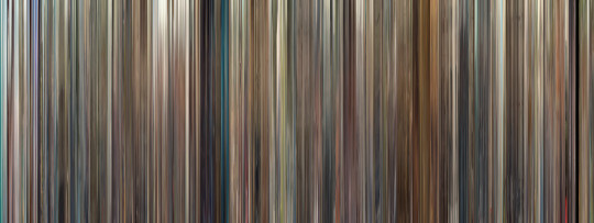
Movie barcode - Entourage (2015)
SOURCES
http://www.eyewriter.org/
https://moviebarcode.tumblr.com/
IMAGE SOURCES
http://www.eyewriter.org/siteImg/p1060131.JPG
http://eyewriter.org/images/data/P1060726.JPG
https://66.media.tumblr.com/678ae73890b9bcbe353b115d124f55d5/tumblr_o26fliSk4l1qhtovio1_1280.JPG
0 notes
Text
WEEK 10 LECTURE - WHY DESIGN?
In this lecture, Andy and Karen proposed a lot of questions framing around our practice, including why we design and who decides design. Despite this being one of the longest lectures in the series, I feel like I was most engaged with this one. Immediately it made me question the meaning behind my work and if I’m ever creating it for someone beyond my client and/or assessor. Could my work make a difference in the future?
In regards to who decides design, Karen made a valid point about if it REALLY is us who decides, or the products and softwares we use within our practice. Items such as Apple Macbooks, Adobe Software and more. Do the particular artefacts we use in our own practice impact the decisions we make on OUR OWN work?
This reflection opened up the discussion on conceptual art, as Karen put it
“The art that I would make, if I were to make an artwork”
Looking beyond the ‘physicals’ and aesthetic of the composition to dig deeper into the idea, the idea that drives the whole process and final outcome. One particular conceptual piece that was acknowledged was the How to Work Better mural. I had seen this mural briefly appropriated before and had my Studio Arts teacher numerously insert it at the back of our booklets throughout VCE, seeing the concept beyond the aesthetics which I believe was Peter Fischli and David Weiss’ vision!
Its aesthetic is quite minimal, purely a gleaming white brick ball to draw attention from a far but also show emphasis on the advice they give.
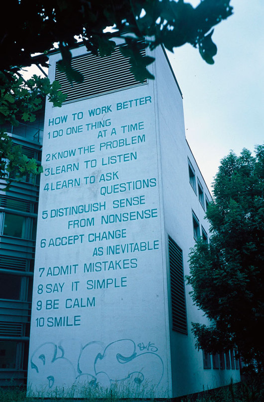
Peter Fischli David Weiss, How To Work Better, 1991, on view at Binzmuehlestrasse 14, Zurich-Oerlikon, Switzerland. (Original mural)
Andy and Karen continued on to say that conceptualism could be (and is) the foundation for art and design activism. Becoming more independent from traditional practice, a conceptual turn is happening.
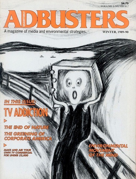
We were shown many publications that were surprisingly great inspiration for my zine for Ask Me Anything. I was particularly drawn to Adbusters Media Foundation not only for their outrageous and satirical appeal but because they are a non-for-profit collective that highlight issues hiding underneath.
I thought that this 1989 Winter issue below was a bit numerous in visually displaying TV addiction through ‘shoving’ a television box on Edvard Munch’s scream face from The Scream. I can’t help but always chuckle to myself whenever I see the scream’s face despite it’s deeper meaning of Munch’s inner trouble and anxieties.
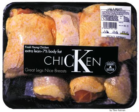
The Tibor Kalman for Adbusters Calvin Klein mockery was also a composition I found interesting and also very thought provoking. The idea of objectifying the human body whether it is to sell, promote etc, is still an issue that we are dealing with today, especially with the impact of social media.
Much like the Adbusters impression, Kalman pokes fun at Calvin Klein’s marketing scheme during that period with the inclusion of meat packaging, phrasing such as ‘great legs, nice breasts’, ‘extra lean’ and chicken with the CK logo.
It reminds me of a similar campaign I saw on Behance by the Australian Human Rights Commission taking the same approach with a more visual impact of including actuals women’s bodies in the composition.
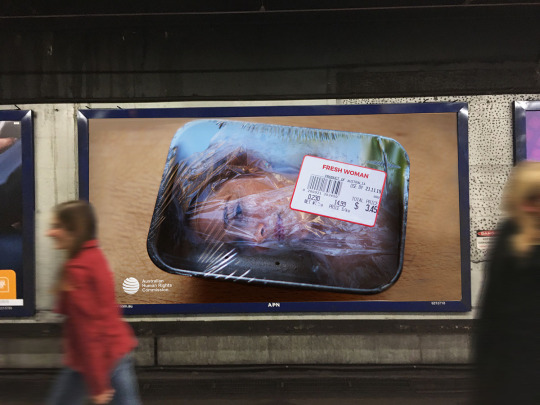
IMAGE SOURCES:
https://i0.wp.com/www.guggenheim.org/wp-content/uploads/2016/02/gen-blog-how-to-work-better-mural-2.jpg?w=980
https://i.pinimg.com/originals/bf/07/c6/bf07c67f3874ee66d490e86879346c95.jpg
https://www.litkicks.com/sites/default/files/adbustersmunch.jpg
https://mir-s3-cdn-cf.behance.net/project_modules/max_1200/a9418342187075.57c44b0a8e7f9.jpg
2 notes
·
View notes
Text
THE NEW ‘UGLY’ DESIGN
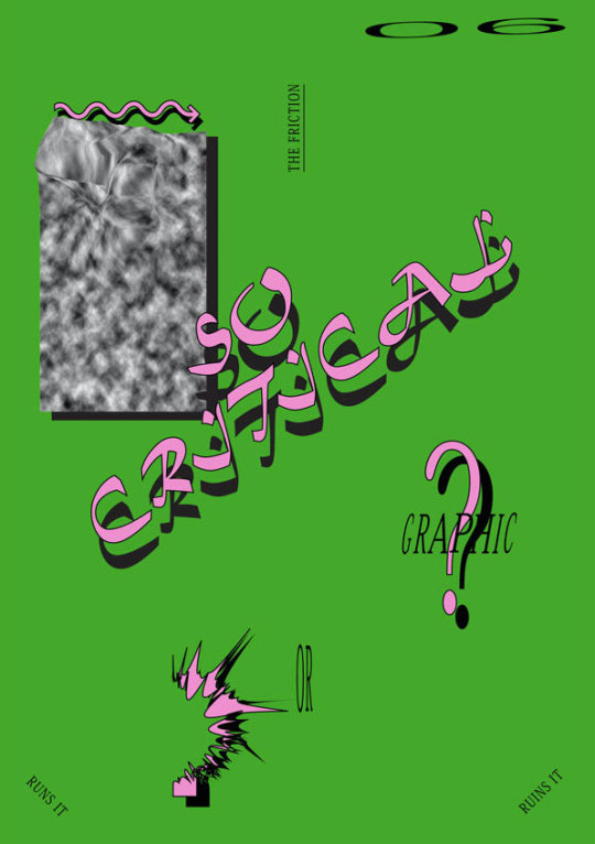
Poster 01 | Ou's favourite poster from Autotypography
A note that Bailey had for my zine layout was to emphasise the ‘ugly-childish’ aesthetic a bit more, so I researched some contemporary ugly design in practice for some composition inspiration.
Autotypography.
Singaporean graphic designer Darius Ou began his Autotypography project seven years ago whilst bored at design school, and has since produced a collection of 365 posters. They are now showing as part of the Dissolving Margins exhibition at Lasalle’s Institute of Contemporary Arts Singapore. Ou has experimented with breaking the principles of “good design” from stretching typefaces to blending amorphous forms adding to contemporary ugly design.
“I see a lot of graphic design rules very loosely now and I don’t follow them like a bible,” he says. “To me, I’d rather people say I hate your work than to not get any comments at all.” - Darius Ou
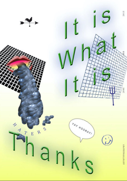
Poster 12 | A poster from Autotypography paying homage to a reddit comment on his work
“If we always follow the rules set by designers who lived in the 20th century—but we live in the 21st century—then what are we blindly following?”
Ou began to see his works as questioning the rules that he was taught in design school, rather than seeing it as ugly design, the meaning had changed for him. He realised that pushing boundaries is contextual and comes in many forms, it doesn’t have to be ugly but needs to be different to be able to be remembered.
He added on to this appeal, stating that design can only progress if we as designers look for unconventional methods to approach a brief and challenge current aesthetics. “If you stay true to always asking ‘Why?’ and ‘Why not?’, you will always stay ahead,” he said. “It is always change that will evoke change.”
Looking into Ou’s work has asked me to question my own design aesthetic. I knew that choosing a subject like Comic Sans for this brief was already going to break me out of my minimalistic style but I never realised how challenging it REALLY would be. Looking at your work and saying ‘this looks ugly’ makes it rather hard to continue working if you don’t know what your true intent is.
I think I now have a good understanding of ugly design, it’s not just ugly, but it’s breaking design rules and creating conversation. It’s eye catching!
From looking at Ou’s posters, I’m hoping to experiment with blending shapes with a gradient and consider the form of my type, such as stretching it or using type on a path in Adobe Illustrator. There is much to be explored!
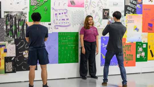
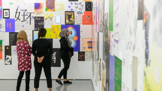
Captured images at Dissolving Margins exhibition
SOURCES
https://eyeondesign.aiga.org/schooled-in-the-new-ugly-lessons-from-darius-ous-autotypography/
http://dariusou.work/autotypography.html
IMAGE SOURCES
http://dariusou.work/images/works/autotypography/2.jpg
http://dariusou.work/images/works/autotypography/4.jpg
http://dariusou.work/images/works/autotypography/at3.jpg
http://dariusou.work/images/works/autotypography/at5.jpg
2 notes
·
View notes
Text
COMIC SANS IN DESIGN
Another source for helping me reformat my current zine on topic, Comic Sans, was to find designers that had used the typeface in their practice. I turned to Behance to find some projects and hopefully a description to go along with their design process.
“I'm Comic Sans, asshole.” August 13th 2018 by Mike Lacher, Paula Cruz
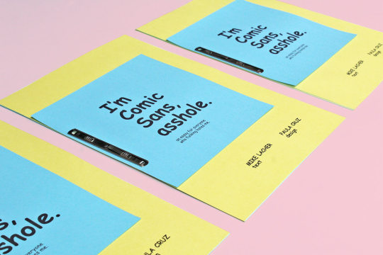
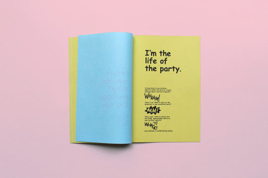
I think this project not only helped me to establish a better composition for pages of my zine, but also to create a voice for ‘Comic Sans’. Not being afraid to adopt a tone and attitude in my responses is something that I want to be apart of the content of my zine, I think it would be fun to read it as if Comic Sans were a real person. I was particularly drawn to these phrases:
“Listen up. I know the sh*t you’ve been saying behind my back”
“People love me. Why? Because I’m fun”
“Enough of this bullsh*t. I’m gonna go get hammered with Papyrus”
This additional research has encourage me to go back and edit my responses to my 5 questions and play around with my subject’s voice and give it some pronouns, adding to the interview effect of this assignment.
“In Defence of Comic Sans�� April 29th 2015 by Julia Ivanszky
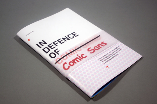
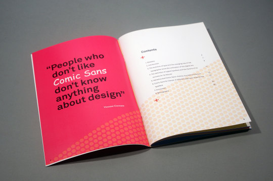
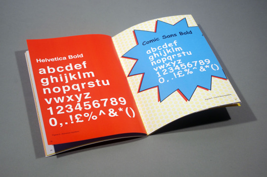
I found that this dissertation’s format on the typeface was most helpful for the layout of my zine. The design collaborates on using neutral tones with vibrant colours such as a fire engine red and a colour wheel cyan blue along with vector graphics such as exploding bubbles and repetition - mirroring a comic aesthetic. I also liked how some pages were focused on minimal text to create art within the booklet, including the quote pages.
SOURCES
https://www.behance.net/gallery/68973161/Im-Comic-Sans-asshole?tracking_source=for_you_activity
https://www.behance.net/gallery/25771887/In-Defence-of-Comic-Sans?tracking_source=search_projects_recommended%7Ccomic%20sans
IMAGERY
https://mir-s3-cdn-cf.behance.net/project_modules/1400_opt_1/ccef4f68973161.5b70619339664.jpg
https://mir-s3-cdn-cf.behance.net/project_modules/1400_opt_1/76a75468973161.5b7061933a554.jpg
https://mir-s3-cdn-cf.behance.net/project_modules/max_1200/7e44f525771887.5634a7fbaaaa5.JPG
https://mir-s3-cdn-cf.behance.net/project_modules/max_1200/9335e425771887.5634a7fc512bf.JPG
https://mir-s3-cdn-cf.behance.net/project_modules/max_1200/e3007725771887.5634a7fbf1b8e.JPG
2 notes
·
View notes
Photo
I really wish I had the patience to do something like this! Katie this is so good, love what I’m seeing so far. I totally understand the issue with being a perfectionist and using a collage method and I think that using blu tack as a semi-permanent finish is smart, allowing for minor changes if needed! I love how the collages reflect your questions for the dada movement, showing your critical thinking and depth of thought.
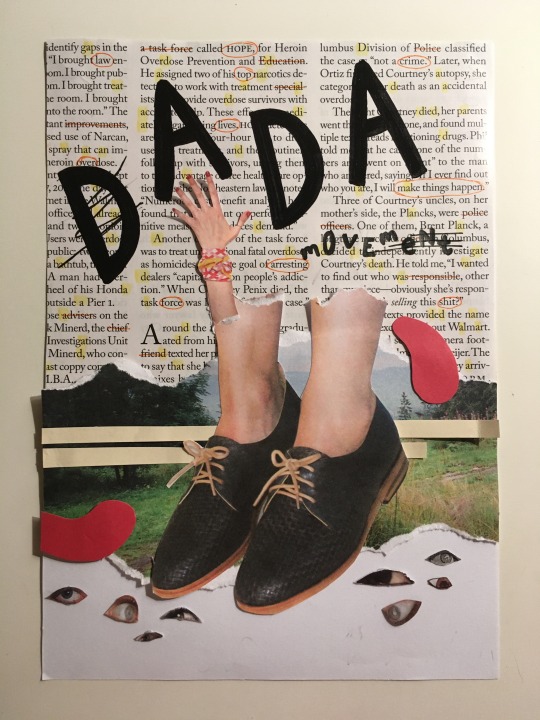
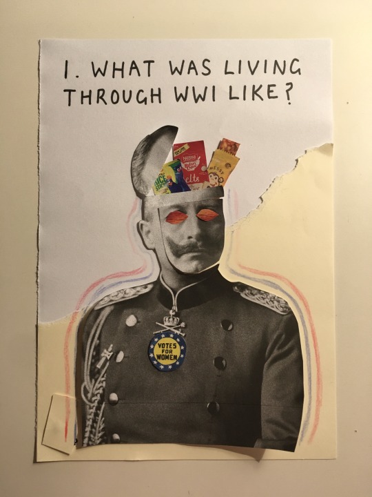
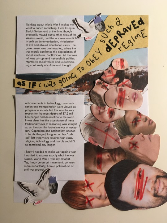
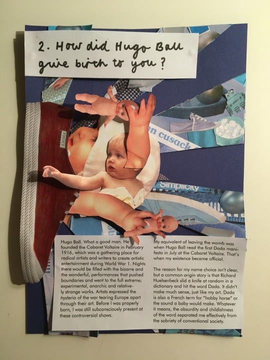
WIP Draft Zine Pages
Boy have I underestimated the time and effort that goes into making a zine. Even though the four pages I’ve managed to do so far look quite simple with sole collaging and text, they have been challenging to do. This is because it has been hard finding a balance between not being a perfectionist & trying to keep that rough and quick aesthetic of a zine, and the need to make sure my designs are reflecting the rebellious, random and playful aesthetic of the Dada movement. Having constraints on the zine due to the brief has meant I have had to rearrange layouts again and again and restart pages.
What I have decided to do is to attach my collages and text onto the page with blu tack, as I found that even if I thought a page was all done, later I would likely rearrange it again. This has given me more flexibility that would usually be offered if I were to do it digitally.
I have made some changes to my cover design from my last post, as I received feedback from my teacher that it wasn’t fully reflective of Dada with its softer aesthetic, and that I should try position it to appear more rebellious and limit pushing.
I’m planning to stick my designs onto new fresh pages a few days before submission as the final zine, as this will also allow me to make some refinements.
Some refinements I’ve already got in mind are:
Front cover:
Changing the title type to look more unconventional, some letters could side at 90 degrees, each letter typeface could be different
Changing the underlined colour on the text behind the title to either be blue or red, as over time I have established a primary coloured palette to the zine which the orange doesn’t adhere to
Page 1:
Changing the interview question typeface to be like the cursive one on page 4, as I found that having a stylistic contrast between the interviewer voice and interviewee voice was more effective in separating them
Changing the outline around the man to be with markers as that will look more neat. Perhaps I could changing it to zigzagging lines to make the composition more playful
Essentially, developing this zine has reinforced the notion that design is very time consuming and requires constant refinement and changing. Although it has been kind of mentally taxing to do this zine, also as I have been cutting out little things from magazines late at night, I have enjoyed doing this assignment so far. I really love being creative and it has been fun making a zine for the first time, and pushing myself to embody a different style to my own.
11 notes
·
View notes
Text
This collage reminds me of the surrealism artists we looked at during our week 10 tutorial when fellow students were sharing some collage artists they liked. I want to be able to produce some simple but effective collage designs like this, hopefully once the semester is over and I have a little more time on my hands!
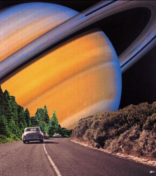
saturn
10K notes
·
View notes
Photo
Emily never fails to amaze me with her multi-talent! I love how she opted to sketch out her subject, Cipe Pineles, it really creates a soft impression and reminds me of an actual zine that I would see at The Sticky Institute. Can’t wait to see what she does with her question pages of the spread!

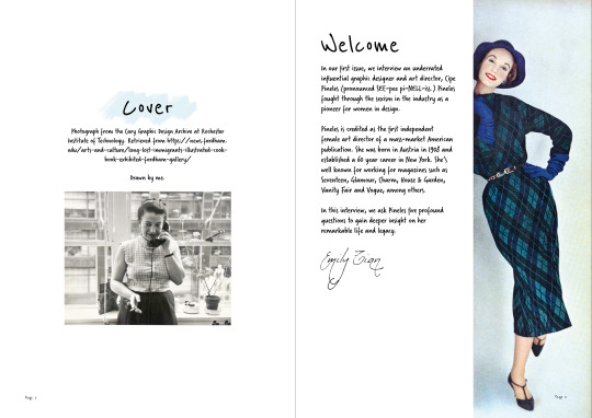
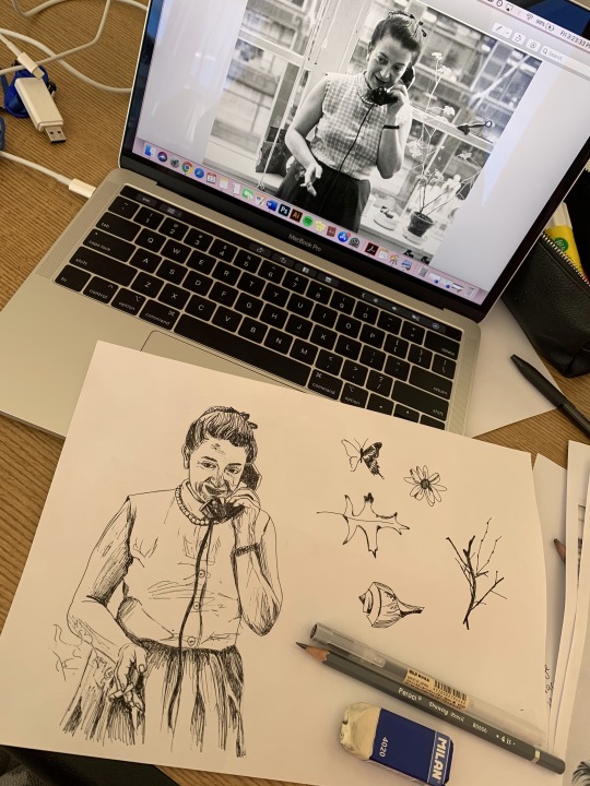

Ask Me Anything Assessment Work in Progress
These are the first few draft pages of my digital publication I showed Ben in class today. I got some helpful feedback from him and other classmates about my body text font. I do agree that it’s a bit too decorative for body text but I like the playful feel it has. I’m now trialling out serif fonts which look a bit more readable and clean.
I initially started designing the zine in a more standard ‘Vogue’ editorial style but I decided that I couldn’t get that to the level I wanted and it wasn’t really resonating with me. Since Pineles liked to illustrate her magazine spreads and advocated for fine arts in magazine editorials, I did a quick pen sketch of her as well as other elements in some of her magazine spreads. I liked the look of that in the cover.
Moving forward, I want to continue building up my zine design. I want it to be cohesive and consistent in terms of style. I’m trying to achieve a playful, personal, and minimal tone.
10 notes
·
View notes
Photo
I saw Chloe’s zine spread in week 11 but wasn’t able to see her progress from week 11 to week 12 after splitting off into breakout groups :( Not disappointed at what I’m seeing now! She’s refined some pages really nicely such as the incorporation of the New York Subway design by Vignelli himself for question 4. I also love how she’s continued to keep the style of her zine right through to the references at the end.


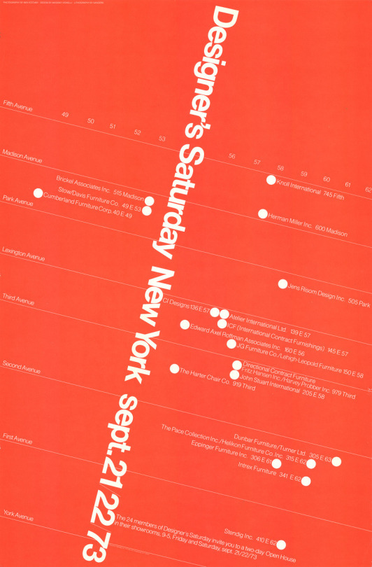
Zine WIP!!
I’ve changed a few things since last week (week 11) including the adjustments in Question 1 and the introduction page.
Introduction page: I’ve divided the background into half white and red. I also added a photo of Vignelli’s signature at the end of the page so it seems like a real interview.
Question 1: I’ve made slight adjustment for this page. I’ve changed the colour of the interview question and the number to white and the scale of the number. I added the white dot (the full stop) at the end of the sentence to make it stand out. Based on the feedback I recieved this week in my tutorial, this page is the strongest due to the scale of the texts and positions of the layout. *there’s a slash in the question that needs to be fixed
Question 4: I’ve used one of Vignelli’s draft design for the New York Subway Map as my background for this page. I’ve used pen tool to draw a shape next to the subway lines and insert the interview answers in the text box. The interview question is in red so the reader can tell that it is a seperate text.
Question 5: I did the graphic of the M letter on Adobe Illustrator. This graphic presents both negative and positive space. The whole letter shows the letter M - stands out Massimo. The black V in the letter stands for Vignelli. And again, I’ve chosen a different colour for the interview question.
Image Reference Page: Since I’m doing a seperate page for my references, I wanted it to make sure it is well designed and fit with the rest of the zine. Therefore, I replicated one of this poster from ‘Designer’s Saturday New York sept 21/22/73′ in Adobe Illustrator.
7 notes
·
View notes