Don't wanna be here? Send us removal request.
Text
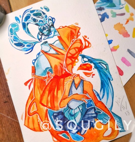
- this piece was a redraw of an older work from 2016 and was done as a way to gauge my improvement over the years as well as to update the idea to fit my current style. The concept I was going for in the original piece was a personification of the ideas of fate and coincidence - with fate represented by the "older" and hence taller person with a simpler design drawing on traditional Japanese wear, and coincidence represented by the more childlike figure. The colour scheme was also chosen to reflect this idea, with orange and blue being complimentary colours. The posing and composition in the new piece is drastically different from the older one; in this one I made sure that the two figures were intertwined but still distinct from one another to further reflect my intentions for the piece.
0 notes
Text
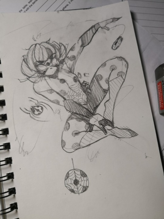
notes:
- concept sketch of a fusion between spider-man and Zagtoon's Miraculous Ladybug
0 notes
Text
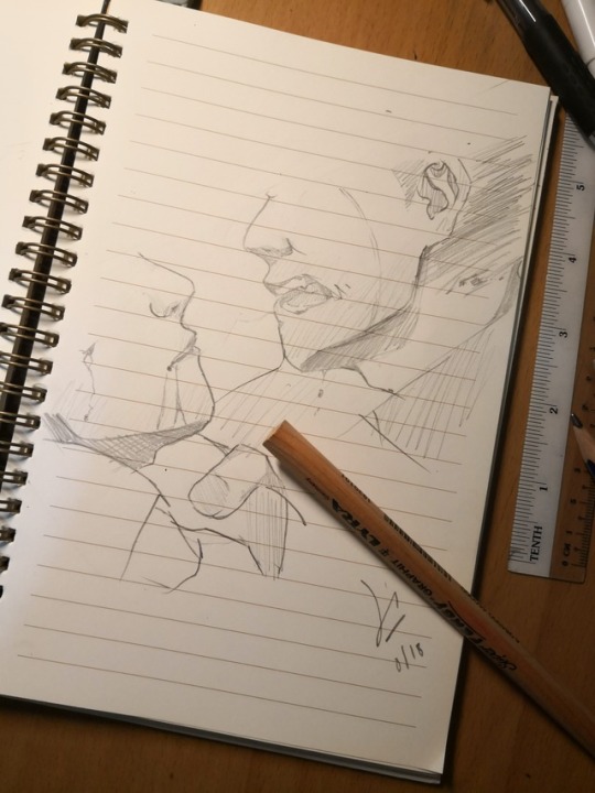
notes:
- practice of interaction between characters
0 notes
Text
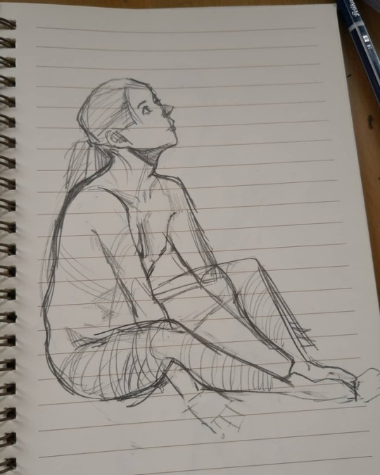
notes:
- photo study
0 notes
Text
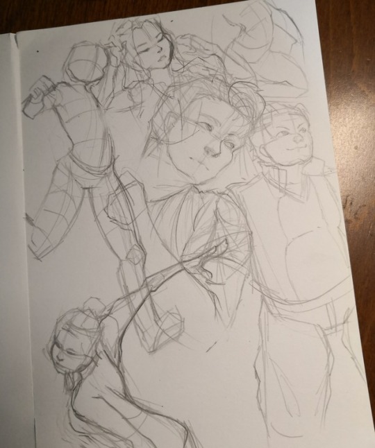
notes:
- observational sketches + trial for a perspective technique
0 notes
Text
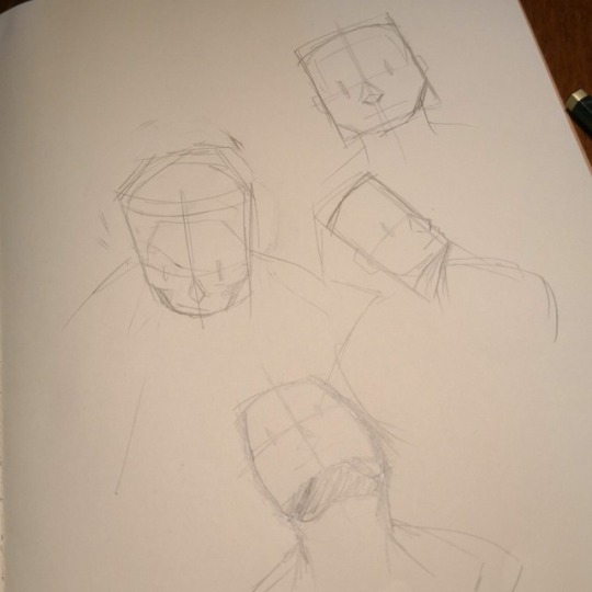
notes:
- exploration of a new way to draw faces I found online
0 notes
Video
tumblr
Workshop conducted at Ngee Ann Polytechnic(Part 1)
0 notes
Video
tumblr
Workshop conducted at Ngee Ann Polytechnic(Part 2)
0 notes
Photo
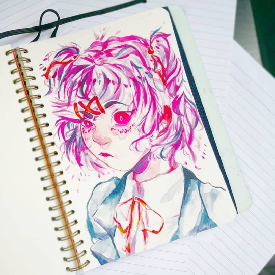
notes:
- in many of my paintings, the characters depicted often have vacant, blank expressions. More often than not, their faces are fully or partially hidden by masks, hair and other objects. So, this drawing was done as a way for me to explore more intense expressions and to make an emotion one of the main focal points of the painting, instead of choosing to place focus on other elements of the drawing like I usually do. As with most of my work, this piece was done as a challenge to myself and also a way to step out of my comfort zone a little more.
0 notes
Photo
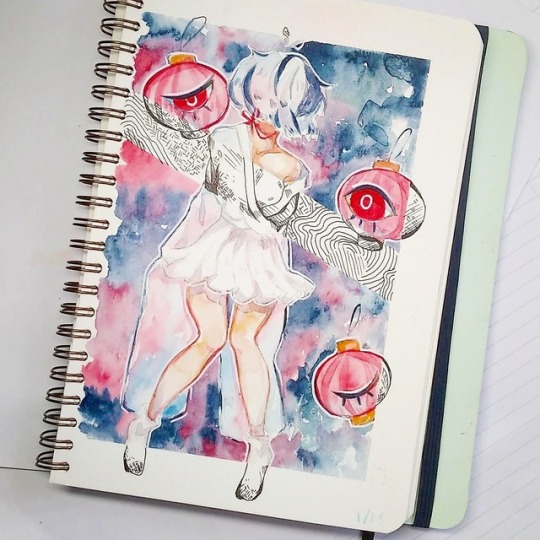
notes:
- at the time of making this piece, I’d been very drawn to the concept of someone being able to exist in two different, yet similar realities at the same time. By using two different mediums and textures, I made an attempt to depict a contrast between two different planes of existence, while simultaneously finding a way to have them coexist in harmony. Part of the reason for the black-and-white pattern was in order to shift focus away from the partial nudity depicted. In a previous version of this piece I had posted on social media, many people felt that it was a little too eye-catching and distracted them from the main idea I was trying to bring across in the piece. I became annoyed, so the shifts in texture and techniques used were used to both properly elevate and communicate my intentions, as well as to better focus the piece for its viewers.
colours used: indigo alizarin crimson red gamboge hue
0 notes
Photo
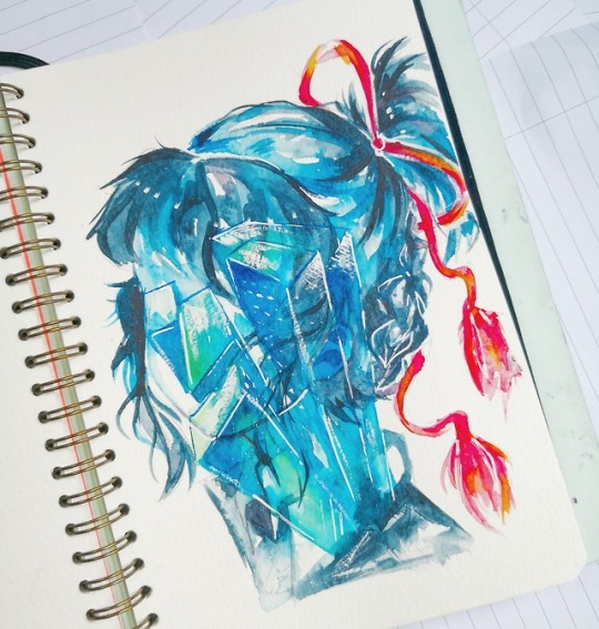
notes:
- this was a way for me to practice 3-point perspective + the use of gouache as a texture in my art. Character was based off of Mitsuha Miyamizu from Makoto Shinkai’s Kimi no Na Wa(2016). In the film, Mitsuha, who lives in a rural part of Japan, periodically switches bodies with Taki, a boy from metropolitan Tokyo. Over the course of time, Mitsuha becomes more familiar with city life and learns to adjust to it. Eventually, the city of Tokyo(along with Taki) becomes a significant part of her life. With this piece, I wanted to convey the concept of a modern city becoming ingrained in someone raised in an otherwise traditional environment(Mitsuha was raised as a shrine maiden.) Therefore, I wanted to contrast the cooler, translucent qualities of the “city” portion with the more opaque, warm-coloured tie in her hair so as to show that although the two parts of her life are inherently different, they are just as striking and important as each other.
colours used: phthalo. blue cadmium red deep hue gamboge hue
0 notes
Photo
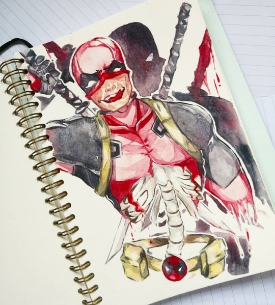
finished work for deadpool
prep work
notes:
- this drawing was started as a way for me to practice drawing bulkier figures and a part of the torso i struggle with figuring out. It was also inspired by a piece done by @Monkeymakoko on Tumblr. By studying and understanding the bone structure of this particular region in greater detail, I wanted to be able to more accurately depict torso anatomy and gain better insight into body structure. Additionally, I wanted to challenge myself by avoiding the use of blue in a painting while also maintaining the focus and tone, since I felt I was becoming too reliant on blue as an accent and “spotlight” in my drawings. Thus, I tried to shift the focus of the drawing on his facial expression by adding more detail around that area in the form of his scars, and also to the ribcage area by leaving that area largely white.
colours used: raw sienna alizarin crimson red payne's grey
0 notes
Photo
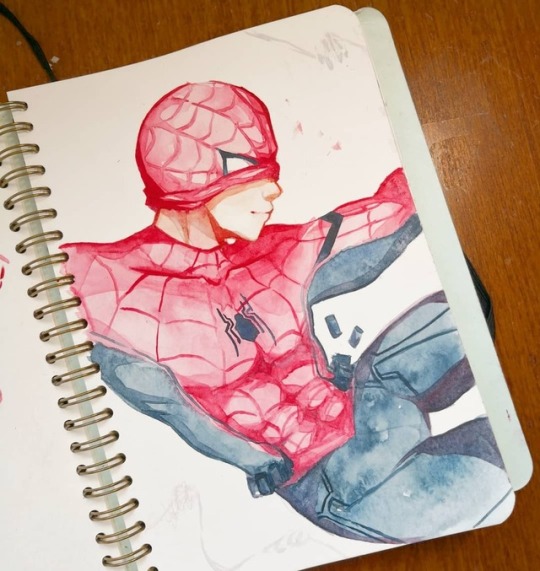
finished work for spider-man
prep work
notes:
- this painting was started as a way for me to practice more male anatomy and for me to try more dynamic posing in my art. Throughout this process, Michalengelo’s Sistine Chapel was used as a point of reference for posing and anatomy. I also focused on achieving a clear line of motion and a sense of flow in this one.
I found the Spider-man suit a particularly difficult obstacle for me, because of its more complex pattern and use of two colours in the same region. As a result, I had to both think about how the pattern would warp around the different lines of the body and figuring out lighting and shadows.
The piece was posted as a memorial to the late Steve Ditko.
colours used: prussian blue raw sienna alizarin crimson red
0 notes
Photo
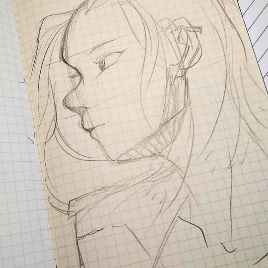
ref; samuel youn
0 notes


