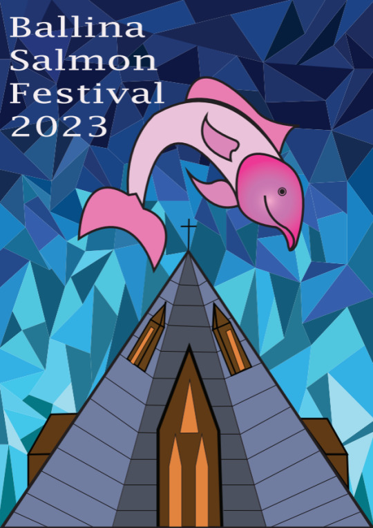
Text
Types of Fonts
Circus World by Noah Type

American Western by Woodcutter

Young Heart by Alit Design

2 notes
·
View notes
Text
Primary Research
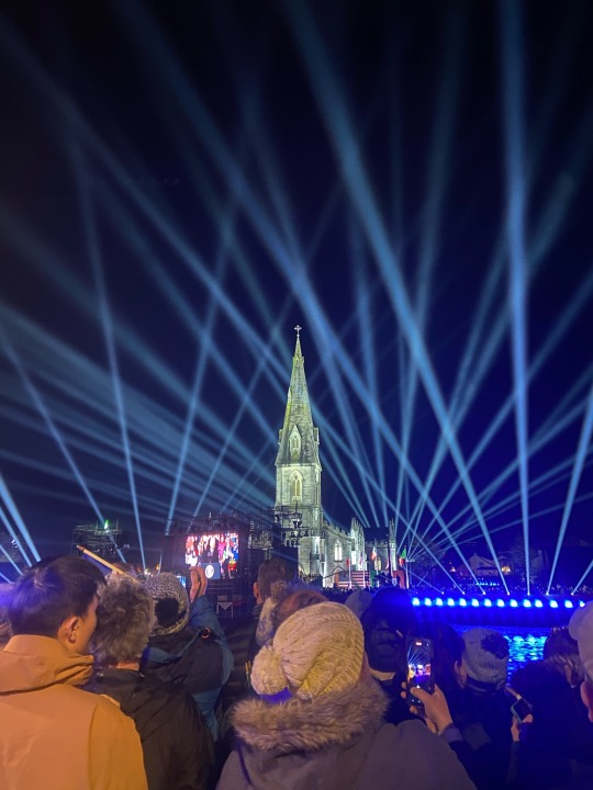
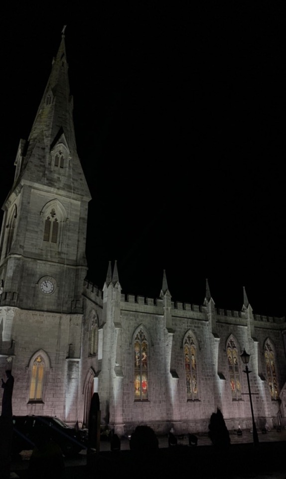
I took some photos of the cathedral from different angles to use as my primary research.

0 notes
Text
Thumbnail ideas
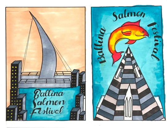
Below are my final thumbnail sketches of what my poster will look like. I experiment with different colours and layouts of the cathedral and the salmon
I am choosing to complete the second thumbnail sketch of the triangular cathedral with a salmon wrapped around on top with a ocean blue background.
From my pervious critiques I was told the black sky made the festival come across as if it looks place in winter rather than mid July so I experimented with lighter colours such as beige, orange, purple and blue. I chose to go with the blue as this can also symbolize the river which passes through my town which is famous for its salmon fishing.
I also experimented with the positioning and fonts of the lettering to which I choose the circular one.

2 notes
·
View notes
Text
Final Anthropocene Icon
First Image: Original Icon from the Anthony Burrill XYZ exhibition
Second Image: My take on the icon to the left. I changed the angle to a downward view on the figure.
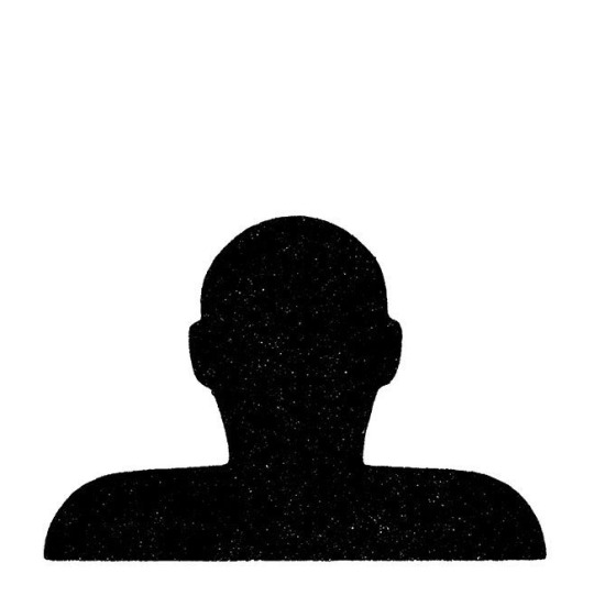
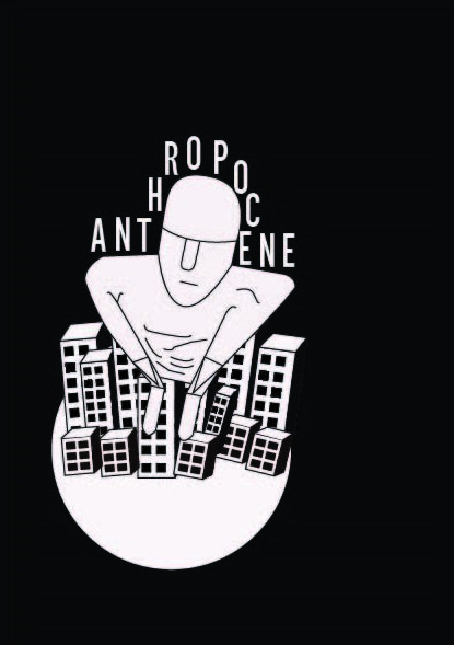
2 notes
·
View notes
Text
Final Prototypes
These are my two favorite proto types which i slightly changed. The first prototype is my favorite and the one which i will create a digital version of to present to Anthony Burrill.
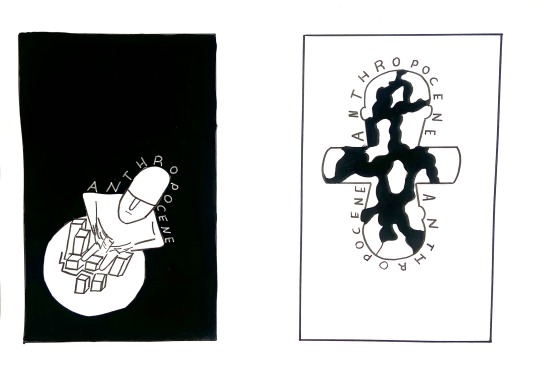
4 notes
·
View notes
Text
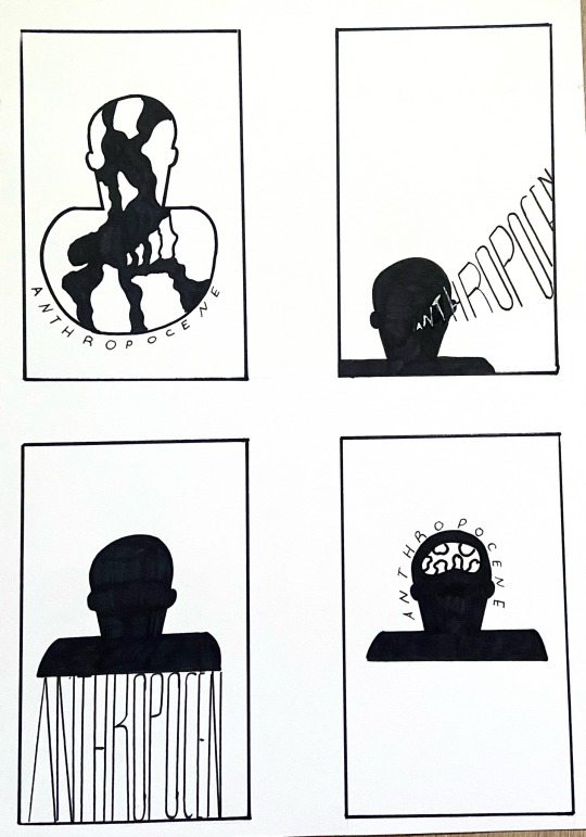

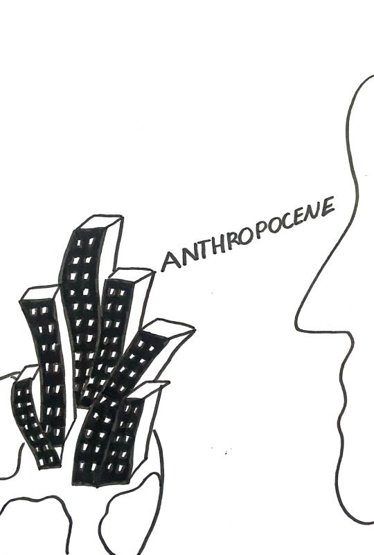
For the next part of the brief we had to thumbnail tow pages of sketches with 4 portrait sketches on each page. They must be kept in black and white only. I chose to sketch the front of the figure and an angle looking down on the figure with the word Anthropocene in each sketch. my top three favorites are
2nd page top right
1st page top left
1st page bottom right
0 notes
Text
Anthropocene
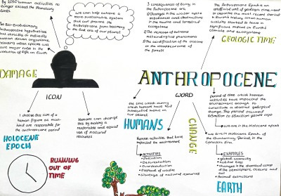
Anthropocene: The time during which humans have had a substantial impact on our planet.
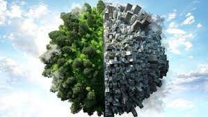
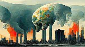
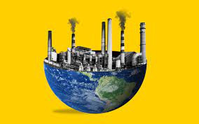
I complete a research page with the icon and word Anthropocene
1 note
·
View note
Text
These are a few of my a5 designs of 3 different observations fo the icon all including the word Anthropocene.


1 note
·
View note
Text
Anthony Burrill
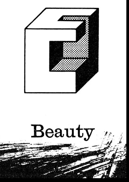
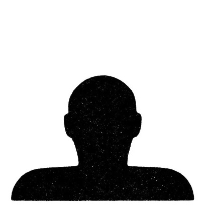
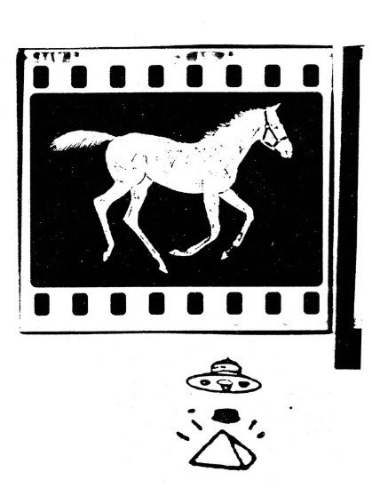
Above is my 3 favourite icons. Choosing an icon from the 100s Burrill has collected in the XYZ foundry. I decided to choose the figure. Below is the many angles this object can be seen from.
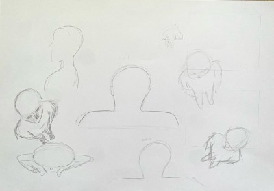
I decided to look at the figure from above, below, the side and from the front and back.
For this brief we are meant to use an icon from one of the ones Anthony Burrill collected in his XYZ foundry. I choose the above icon pf the figure. The following assignments are;
○ use the icon and observe it from many angles as possible
○design an A5 sheet with the icon and word Anthropocene
○research the word Anthropocene do a deep dive using mind maps and word association with both the word and the icon
○thumbnail two pages of illustrations (4 portrait each page)
○choose the best two to bring forward
○choose one to create two mid-end prototypes of your sketch
○choose one to create a final digital piece in high end a5 prototype
○print and put into a book given to Burrill 20th April
0 notes
Text
Christoph Niemann
Link to the documentary - Abstract: The Art of Design | Christoph Niemann: Illustration | FULL EPISODE | Netflix - YouTube
Everything that happens between 9 and 6 is about work. he works mostly by himself and would sit at his desk and draw and design by himself.
For Niemann abstraction is the most important concept of art. He starts with 1000 different drawings through to which he one by one throws them out and then picks the two or three that he likes the most. Abstraction for Niemann is the idea of getting rid of everything that's not essentially making a point.
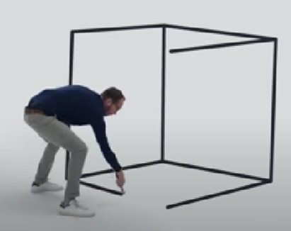

Another idea Christoph came up with is that he takes one shape such as a flat iron and makes various shapes from these such as men, women, a bathroom, a nuclear power plant and sports .This is similar to our Lego piece task and the bringing of the discipline.

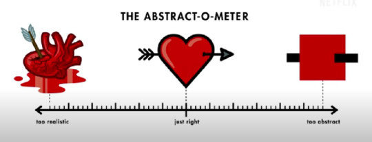
Niemann also goes into detail to discuss how to create a heart which I found was very informative. The pumping heart with blood is too realistic and "disgusting" says Niemann and couldn't possibly represent love. The square cannot be identified as a heart as its too simple and therefore falls flat. Whereas if you meet both of these shapes in the middle you get a nice heart shape which can be identifiable and not too realistic.
Making and icon out of an icon. Making the butterfly simply a blue square.
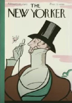
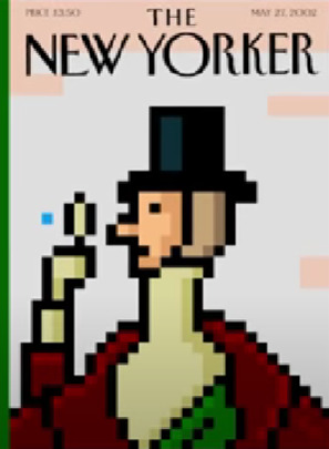
Other inspiring works created by Niemann.
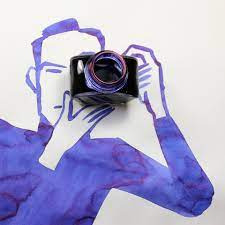
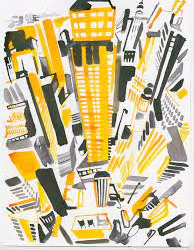
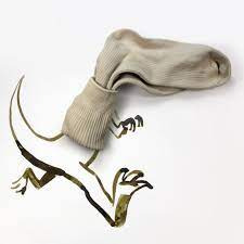
2 notes
·
View notes
Text
Cocktail Brief
For this brief we were asked to create a mood board on a cocktail that we blindly choose. I got Pisco Punch.
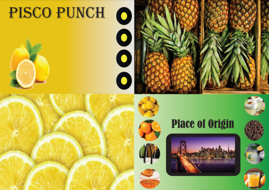
0 notes
Text
Cultural Festival Poster
For our brief of poster making for a festival I choose to do it on a cultural festival which takes place in my town called Ballina Salmon Festival.
Page1: Mind map of the main aspects of the festival under the subheadings Sound, Colour, Location and smell.
Page2: Word page including everything that reminds me of the festival.
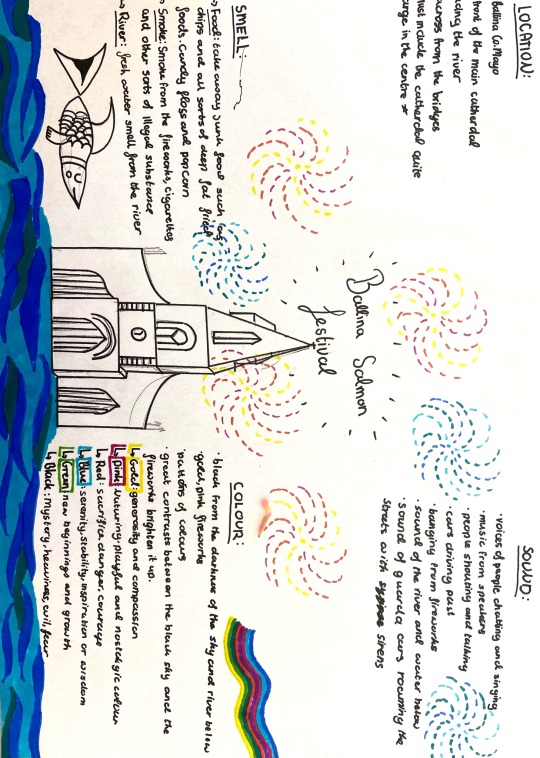
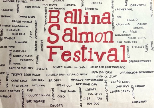
Secondary research
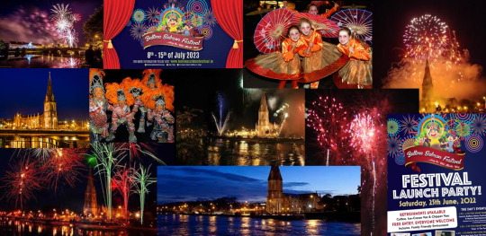
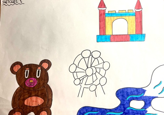
Below are my 3 pages of sketches that relate to the festival that i may include on the poster.


2 notes
·
View notes
Text
Graphic Design Discipline
Day 1: we all blindly choose a piece of Lego to which we photographed from different angles and sketched out our favorite 4 images.


With those 4 images we sketched we then created everyday objects from these angles.
Front of a car
Road with bridge over head
Crown
Desk


From my first image you can see my original block of Lego in the center. As a group we all choose our favorite design of each person. Which for me was design 2. I then created another two different sketches from this piece and came up with my final piece of cars on a road under a bridge.
6 notes
·
View notes
Text
Pattern Creation
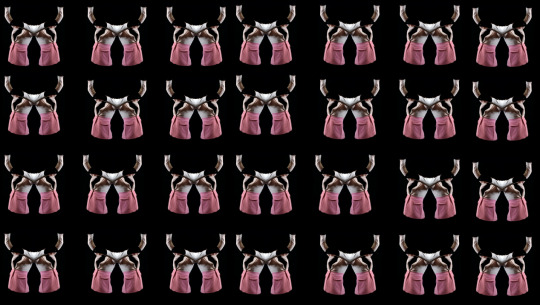
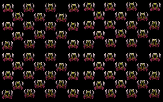
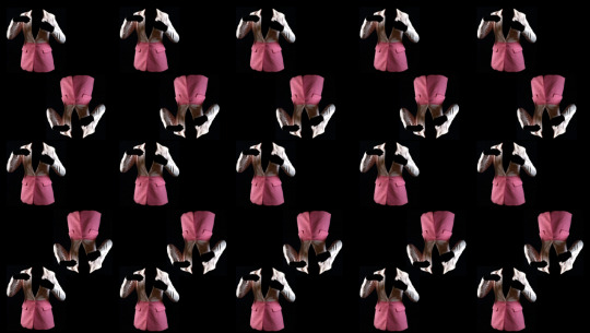
To link Graphics with Photography I decided to create patterns in different formats and layouts against a black screen.
0 notes
Text
Finished Pieces
I edited my final images to create a series in photography as Deborah was explaining to us in lensed based media workshop.
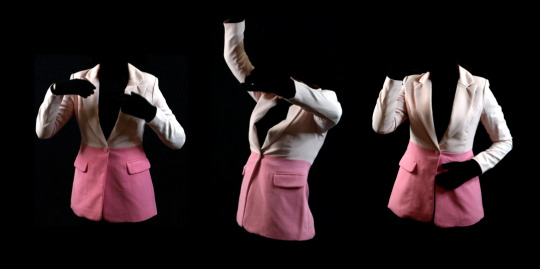
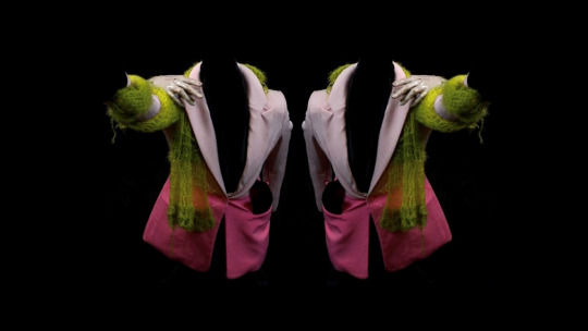
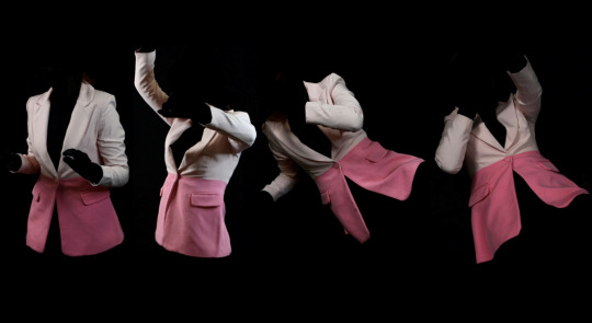
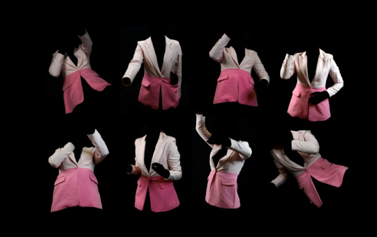
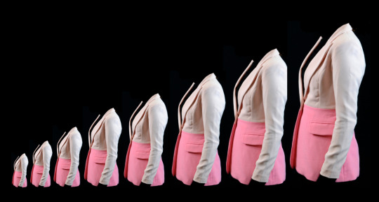
A series of dancing figures
A hallucinations due to double vision from the consumption of drugs, the scarf represents the drugs slowly making its way around the body and taking over. The hand over the shoulder represents danger.
Series photography showing the figure calm and collected to dancing to falling and confusion.
Another series of dancing figures
This repeated pattern reveals addiction and how it grows bigger and bigger with time.
2 notes
·
View notes
