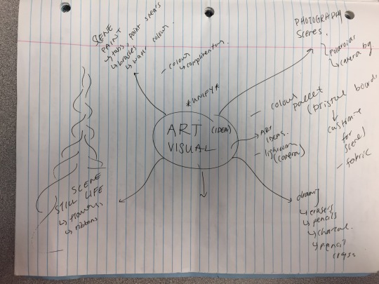
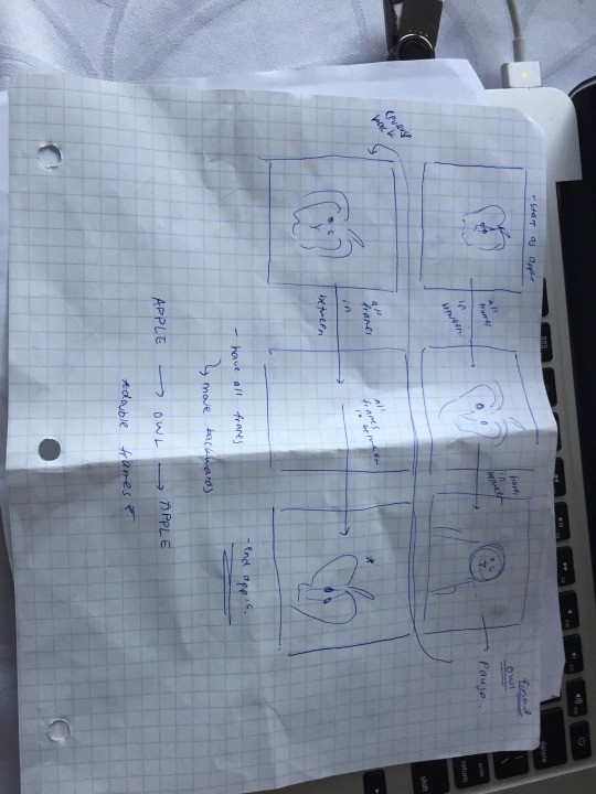
Text
VIDEO -FINAL PRODUCT AND ATRIST STATEMENT
Julia Iarusci.
Life and Death.
2017.
Digital Video.
1 Minute and 25 seconds long
Mississauga, Ontario.
Premier Video Artist Statement
The purpose of this assignment was to take from 1 of the 3 options and create a video on Premier using clips from youtube or movies.. etc. I chose option two, which was playing with time. This required me to have two visual concepts for the audience or viewer to interrupt themselves throughout the video. My two concepts were life and death. It was tricky not to make this cliche, so in order to convey my idea effectively, I had to chose clips that were binary opposites but had some sort of correlation to each other in terms of my visual concept.
I got my idea from these youtube videos giving nature a voice. I though it was very different as it showed nature and life in a very different way. I found this assignment very challenging because it was one of those projects that you just had to start, it required minimal planning and required lots of experimentation. Also, learned how to use a new Adobe program is challenging as well. However, all that put aside, I started gathering all my clips from Youtube and I made sure to have two video clips for each object that was introduced. For example the baby sea turtle. For the life portion of the clips it shows them breaking from the sand and moving to the ocean however the death clip shows a bird unfortunately eating him before he reached the ocean.
Once all my life and death clips were in, I started playing with the effects that revolve around Option two which is “Playing with Time”. I overlapped clips, sped them up, slowed them down, used key frames when switching from scene to scene and I reversed clips. This was quite frustrating and time consuming. Next was the creation of the audio soundscape. I created mine from scratch using Garageband. I picked sound clips that fit my theme. I overlapped and adjusted the intensity of the sounds to create my desired sound scape to match up with my video.
Some elements and principles used were colour and unity. Colour was shown in the clips that expressed life and death. Clips tat expressed life had light and vibrant colours like reds, greens, and yellows. However clips that represented death were more dark and eerie. I also exaggerated this on Premier using the curves and colour section to edit. Unity was used to justify if my composition flowed smoothy and to show that my two visual concepts were present but not cliche.
In conclusion, I did like this assignment and I was proud of my work. However looking back, if I could change something it would be some of my transitions from clip to clip. I found it a but choppy. All in all, it was a great learning experience with a new Adobe software.
3 notes
·
View notes
Text
VIDEO PROGRESS WORK
1- I first started by separating all my youtube clips into my folder categories. One being life and the other being death (my two visual concepts)
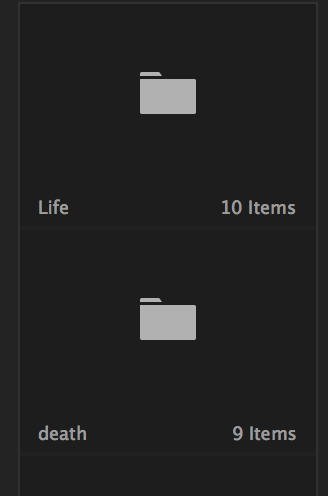
2- After that I started importing my clips and playing around with effects like reverse, slow motion, fast motion and key frames with transitioning between clips
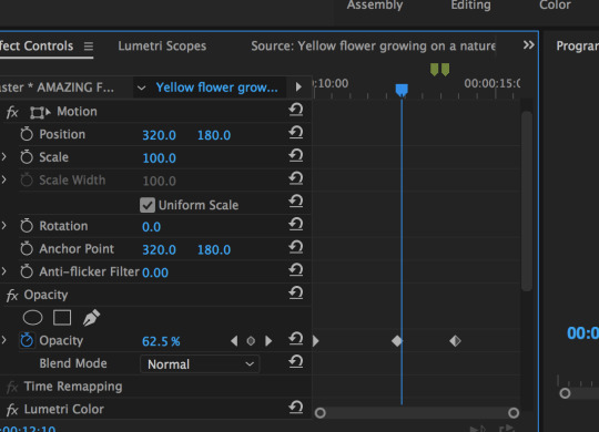


3- Once I was happy with the placement of all my clips, I started adjusting the contrast and colour with the curves to either brighten or darken clips to give the mood of either life or death

4- Once my video was completed, I then started to make my audio from scratch. I used Garageband and picked sound clips that fit my theme. I overlapped and adjusted the intensity of the sounds to create my desired sound scape to match up with my video
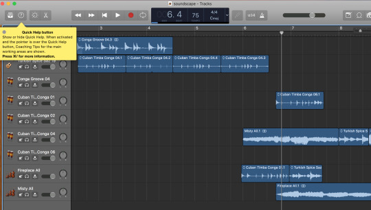
5- All that was left was adding in the audio to Premier and my video was complete
0 notes
Text
VIDEO TWO VISUAL CONCEPTS
My two visual concepts are life and death... I know I am definitely goiNg to have to try my best to not make it cliche .. but I know the video is going to start with a sun rise and end with a sunset and then a sunrise again.. saying that even though we die and we have hardships, the sun will always rise the next day and we always have something to live for,,, a fresh start every day
Here are some sample clips that i will most likely use for my Primer video.
youtube
youtube
youtube
youtube
0 notes
Text
CPT -REVISED WORK
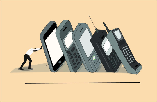
^THIS IS MY REVISED WORK
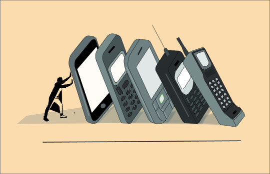
THIS IS MY OLD WORK ^
1 note
·
View note
Text
CPT- ARTIST STATEMENT
Julia Iarusci.
Stop Motion Photography- Visual Arts
2017
Digital Media–Adobe Illustrator- Adobe Photoshop
45 Second Long Video
Mississauga, Ontario.
Personal Work Artist Statement
The purpose of this assignment was to allow the students to take tips and knowledge from the semester and apply them in their own creative way using two of the Adobe softwares. As this assignment did give creative freedom, it required the same pre production in coming up with a solid idea and theme.
From the beginning of this assignment I knew I wanted to do some sort of photography series. Then, my teacher introduced me to flat lay photography. This type of photography is very relevant and popular in advertising for products on social media and its ideal for companies as it looks very clean. I liked the play on colour and objets to tell a story. After looking at flat lay photography images I came across video examples of stop motion photography. This got my video inspiration of using flat lay photography and incorporating it into a stop motion animation. In order to actually use two programs for the CPT, I know I wanted to do photography but I also wanted to animate something within it.
I used Photoshop and After Effects. I used photoshop after shooting for my video. There were multiple images that needed to be lightened and adjusted in contrast to match the other images. Also, some pictures needed to be deleted because there were minor flaws like my hand being in a shot. Once that was finished I imported all my files into After Effects and started organizing all the images into their own folders by scene. For example- flowers, bag and paint.. etc. Each folder had approx. 60-100 pictures since my video is a stop motion photography. There is really no editing in terms of effects with this kind of video so therefore it was jut adjusting the time of each image and playing around with the compositions scenes. I tried to do it as if it hand unity.
Some elements and principles of design i used were colour, unity, pattern, and balance. Colour was shown multiple times within the photographsI took. For example, I played with warm colours with a bright colour for emphasis in the flowers scene. A lot of the flowers were light pinks and pastel yellows with the bright red berries as the emphasis. Colour so shown in the pencil crayons and marker scene as well. I categorized them into warm and cool colours for both. Unity is shown throughout my whole animation. Pattern was used in the placement of objects to have the cause and effects type look. Balance was used in in arranging the objects from scene to scene. For example, the scene with the pencil crayons have radial balance. Also, symmetrical balance was used in the first scene with the flowers and the overlapping vine.
I believe I was successful in executing my original idea, however there are always areas of weakness. I struggled with getting the lighting to not cast any shadows as well as trying to avoid shots not being in focus. Also, I believe that My video would have been better if I did have more time, as the process of stop motion is very tedious and time consuming. More time would have allowed me to make more scenes and edit small texts and effects in After Effects. Some areas that I am proud of are the arrangement of the flowers and the markers scene. I feel that those were really well done.
In conclusion, having all the creative freedom can be overwhelming but with the creative process it really helps in narrowing the idea and planning on how to execute it. I did surprise myself with this assignment and the video turned out a lot better than I expected. Great things happen when I step outside my comfort zone.
1 note
·
View note
Text
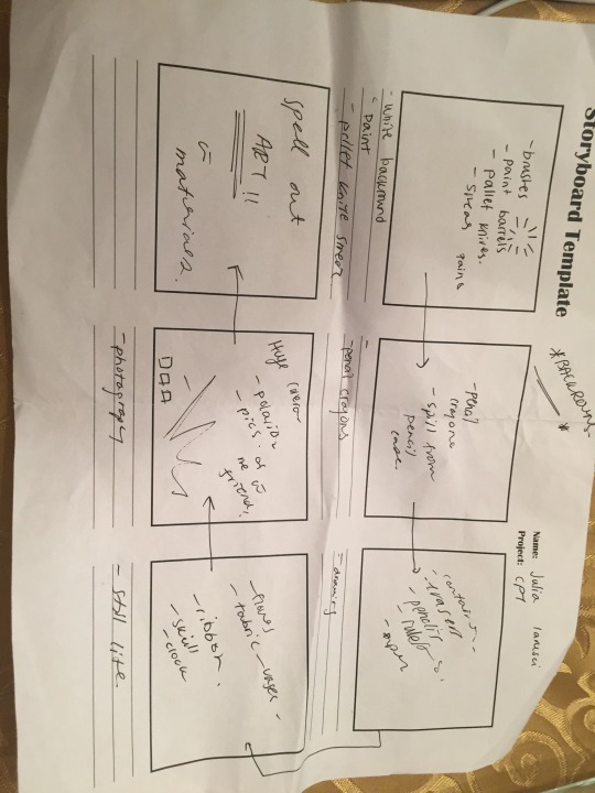
CPT-STORY BOARD + SKETCHES
This is my story board. The frames are loose because part of my animation is improvisation when playing with the objects.
0 notes
Text
CPT- VISUAL RESEARCH
youtube
youtube
-After looking at flat lay photography images I came across video examples of stop motion photography
-This got my video inspiration of using flat lay photography and incorporating it into a stop motion animation
-In order to actually use two programs for the CPT , I know I wanted to do photography but I also wanted to animate something within it.
THEREFORE THE TWO PROGRAMS USED ARE
- After Effects - putting in all the images and making the video
- Photoshop for editing the pictures
1 note
·
View note
Text
GIF - ARTIST STATEMENT
Julia Iarusci.
Apple Owl Gif
2017
Digital Media–Adobe Illustrator- Adobe Photoshop
10.3 MB Gif
Mississauga, Ontario.
Gif Artist Statement
The purpose of this assignment was to create a gif that is seamlessly looped and clever. It needed to be created in after effects or photoshop and the gif needed to be 10 frames or more. In the beginning I was very conflicted on what I was going to do. I was first going to do something funny and related to dogs but I was quickly running out of time. I found a image on google of an owl that looks like an apple and that sparked my idea to morph those two objects into each other.
I wasn't really sure how I was going to approach this in photo shop, so I started making each individual frame on Illustrator.I started with taking a image of a apple and making a copy of it through stroke and filling of shapes. Then I found a image of a barn owl and did the same thing, so basically recreated the owl in Illustrator with shapes and stroke fills.
After this, I started slowly taking apart the apple. Each layer on Illustrator changed from the previous one. It was a cause and effect type of animation. So I started with the seeds (as the owl eyes) then the apple core (as the owl beak) and then the shape solely grew into the an owl and colours changed. So at that point I had approx. 20 frames as 20 different layers, however if I wanted my animation to seamlessly loop it had to start and end at the same point. Therefore since I started with he apple I had to duplicate all 20 layers and reverse it. So it went from apple-owl-apple. Next I had all my Illustrator layers I have to save each layer as its own project and then give it a number and save as a jpeg. From there I imported the jpegs each as their own layer on photoshop and made a timeline. I had to play around with how much time was spent on each frame, and once I was happy with that, the gif was finished.
Some elements and principles used were colour, shape, and unity. Colour was shown in the shades and hues of green I used for the apple, then the smooth transition into the browns then the cool tone greys and slight purples for the owl. Shape was shown in the apple and owl's themselves. It is composed of geometric and natural shapes. Also the highlights and dark areas of the two objects. Unity was present though out the entire gif because if I didn't seamlessly transition the correct frames in between from the apple to the owl then my composition would have lacked unity.
Several challenges occurred throughout creation of the gif. A lot of the struggle was mental. Taking on this idea was going way out of my comfort zone and I was very nervous to start. I almost wanted to change my idea because it was very difficult. I also had some areas of weakness in some of the in between frames. Yet, in conclusion, I believe I was successful in having the gif seamlessly loop and executing my idea well. I was very proud of myself for toughening out through the doubt of the assignment and it really payed off in the finished piece.
0 notes
Text
CPT PROCESS WORK
1- I first started to gather all the materials for my stop motion flat lay photography video. All these objects are in connection to visual arts
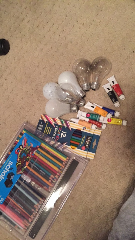
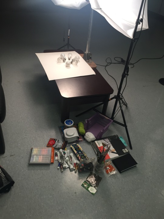
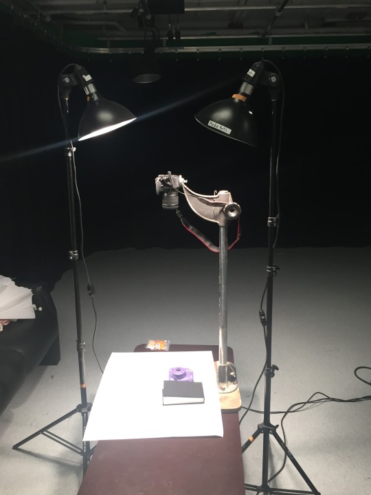
2- Once the camera was set up. We played around with the lighting and white balance to ensure no shadow
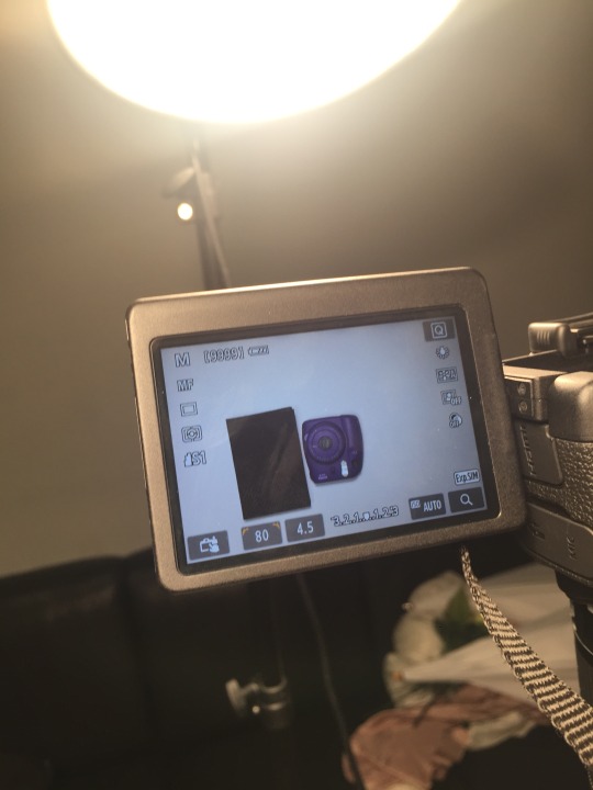
2- After taking all the pictures, I went through them all to check for any photos that my hand may have been in or there was a fault in the lighting, or camera shake . Below are some examples of this.
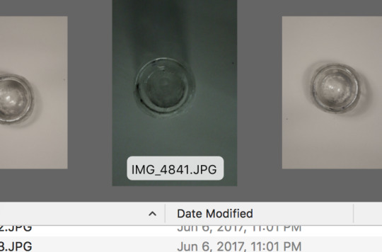
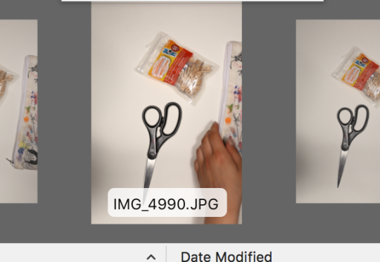
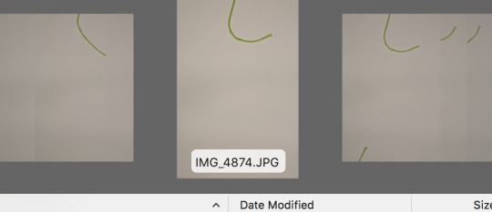
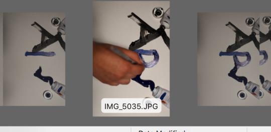
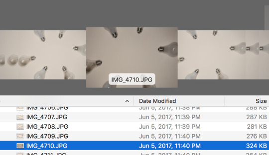
-After this was done all images were imported into After Effects to play with the composition timing and scenes to compose the final video with sound.
0 notes
Text
CPT VISUAL INSPIRATION
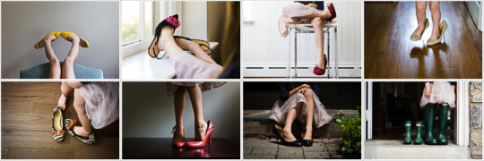
^Makes you think about the meaning behind the pictures..
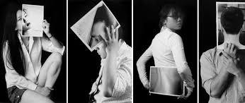
^ERIE FEELING...
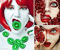
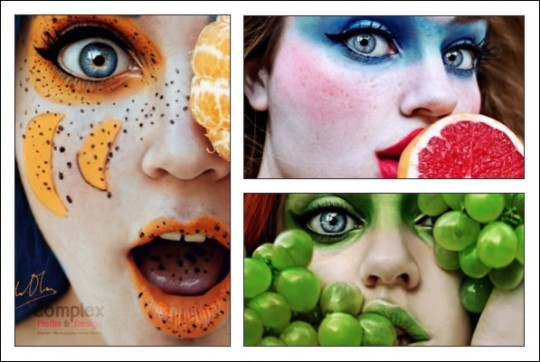
- I first wanted to do a photography series with multiple pictures side by side to do convey a message about society.
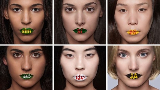
^ I like these because they all play on colour and they are portrait series up for interpretation of the viewer
These are all examples of flat lay photography
-this type of photography is very relevent and popular in adversiting for products on social media and its ideal for companies
-looks are very clean and i like the play on colour and objets to tell a story
0 notes
Text
VIDEO VISUAL INSPIRATION
youtube
-shows beauty and destruction
-dependance of nature
-Your actions will deermine your faith
-no matter what happens to humans, natures moves on and evolves
youtube
-natures gives we take
-if nature isn't kept healthy then humans wont survive
youtube
**GIVING NATURE A VOICE**
0 notes
Text
GIF- PRINCIPLES OF ANIMATION
Secondary Action
-It is a extra action- For my gif the secondary action was the next frame that had a direct cause and effect previous frame. If one shape changed in one layer than the next would have to follow. This is present throughout my entire gif. By having this secondary action it gave life to the animation and unified the concept of morphing two objects into each other.
Exaggeration
This was relevant in the middle of my gif. I had to exaggerate certain shapes inside the apple and really stretch and morph them into shapes from the owl’s face. I exaggerating the apple core into the bear and feathers of the owl. Also I exaggerated the apple seeds into the owl’s eyes. These were crucial moments in the gif that executed the final clip.
Ease In, Ease out
Ease in and ease out is essentially my whole gif. Ease in and ease out is basically creates all the in-between frames in a action. My whole gif is the in between frames between object 1 (apple) and object 2 (owl).
1 note
·
View note
Text
GIF -PROCESS WORK
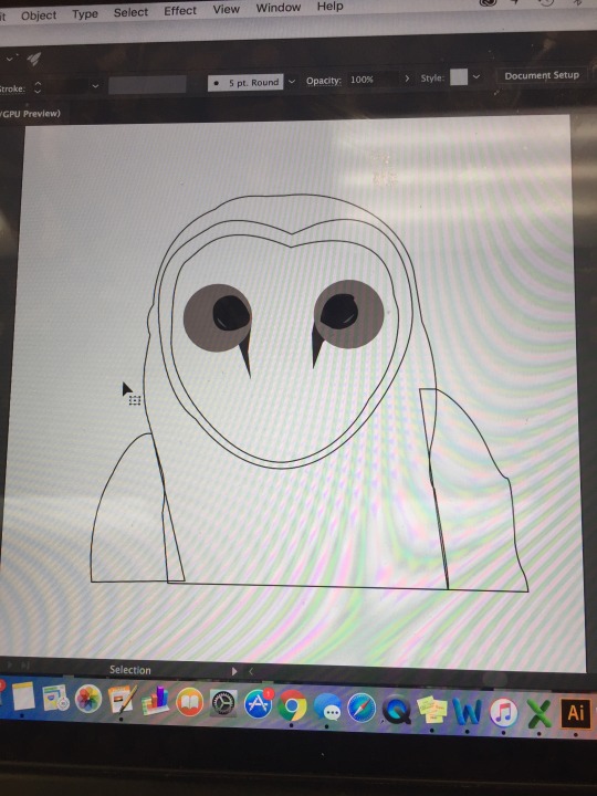
^This was the first early stage of creating the owl! I took a image from google and used the pen tool to get the basic outline.
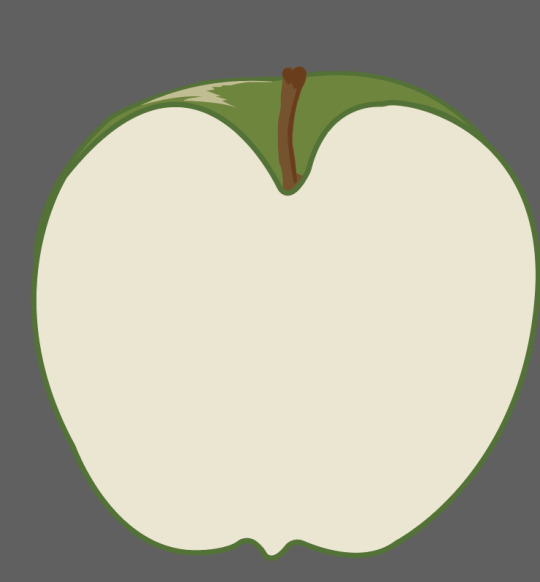
^-Again this was the second object I was morphing and I used the same process as before with the owl for the apple. Used the pen tool and filled it with solid colours. I has to consciously when making these, pick what parts i can change and use to connect the two objects
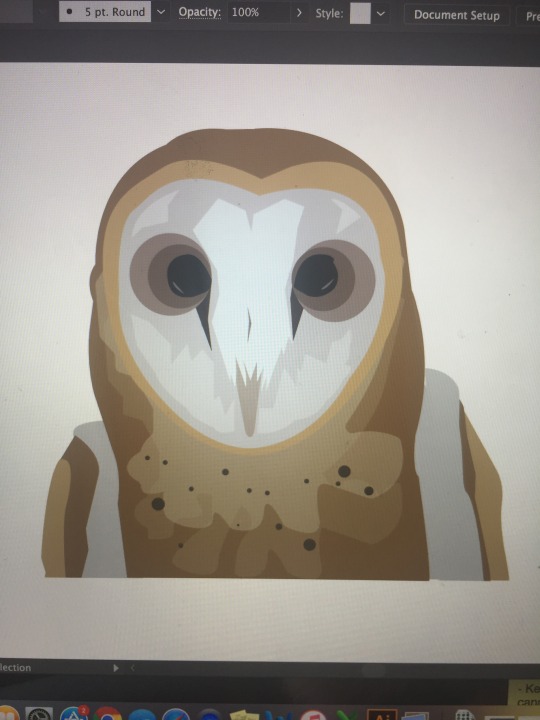
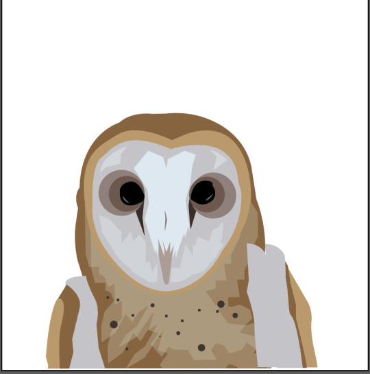
^From there I picked apart the image of the owl and I say the shadows and highlights as their own shape. Adding the highlights and dark areas (value) but with no stroke, it really brought the owl to life.
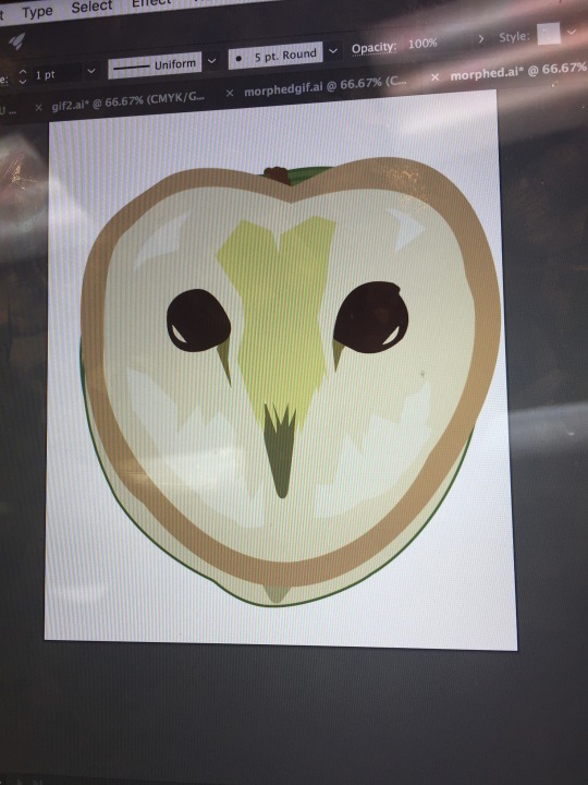
^-This is a progress layer where I was in the middle of morphing the apple into the owl. I picked parks from the apple core to link to parts of the owls face
0 notes

