
An altar dedicated sharing a daily offering inspired by Johnny Joestar, the main protagonist from JoJo’s Bizarre Adventure Part 7, Steel Ball Run, in the year 2025. Come back each day to see whatever offering has been made!Run by @mightysen (art blog/side blog) //@doorintosummer (personal/main blog)
Last active 60 minutes ago
Don't wanna be here? Send us removal request.
Statistics
We looked inside some of the posts by johnnyshrine and here's what we found interesting.
Average Info
Notes Per Post
3K
Likes Per Post
2K
Reblog Per Post
580
Reply Per Post
6
Time Between Posts
12 hours
Number of Posts By Type
Text
16
Note
1
Last Seen Tumblr Blogs


Fun Fact
The “We are the 99%” Tumblr blog became the slogan for the Occupy Wall Street movement.
Text
★ 110 // “'Gyro' by Sen Johnnyshrine”

// Gyro - @chongoblog
// Johnny, artwork - me
Based off the comic "Sonic" by Mike Tirehaus and this video rendition.
#jjba#jojo's bizarre adventure#steel ball run#sbr#johnny joestar#gyro zeppeli#offerings#tools used:#clip studio paint#You don't know how long I've waited to pull this idea off. I'm so glad the day is finally here.#I wish I had time to redo my “Really?” to be sillier but posting this on 4:20 is crucial.#I hope y'all have a happy Easter or 4/20 or whatever you celebrate today!!!
152 notes
·
View notes
Text

★ 109 // “Bunny Suit”
#jjba#jojo's bizarre adventure#steel ball run#sbr#johnny joestar#easter#offerings#tools used:#clip sudio paint#I posted this one late enough to be able to say HAPPY EASTER!!!#I had a few iterations of this I went through before I landed on this.#I had Gyro in one of the ideas but it just wasn't panning out for me.#I like this end result though!#The next offering will hopefully make a few of you laugh
148 notes
·
View notes
Text

★ 108 // “Easter Eggs”
#jjba#jojo's bizarre adventure#steel ball run#sbr#johnny joestar#gyro zeppeli#diego brando#hot pants#offerings#tools used:#eggs...#crayons#Sharpie#googly eyes#Johnny Yolkstar... Gyro Zeggppeli... Dieggo Brando... Egg Pants...#ummm anyways HAPPY GOOD FRIDAY!!!#I'm trying to get something out for Easter a bit early since I won't be posting anything Easter related on the day of.#Oh nono no. There's a much more important holiday that falls on that day we must celebrate instead. See you on 110!
109 notes
·
View notes
Text


SBR ANIME REAL!!!‼️‼️
Hot Pants I drew for @johnnyshrine’s sbr anime summoning circle! And also the Gyjo kiss I doodled in celebration with their new anime color palettes
#other's offerings#101#summoning circle#I loved your contribution!! The spray letters are soooo cool!#Very nice linework overall!#(The Gyjo is great too hehe)#Thanks for helping make the anime real with your contribution! :D
74 notes
·
View notes
Text

★ 107 // “Paint Brush Pen”
#jjba#jojo's bizarre adventure#steel ball run#sbr#johnny joestar#offerings#tools used:#crayola washable paint brush pens#I bought these at the store today because I was very curious to try them.#I actually messed up the first piece I had made but in a way I was glad.#The old sketch itself was great but I don't think it was good for this medium specifically.#So I'll probably resuse it in a better suited medium another time. ^_^#Anyways these pens are very fun and I reccomend. The caps are hard to take off though. Probably childproofing? Who knows.
117 notes
·
View notes
Text

★ 106 // “Emoji”
#jjba#jojo's bizzare adventure#steel ball run#sbr#gyjo#johnny joestar#gyro zeppeli#tools used:#clip studio paint#These are all added to my Discord server. Link to join in pinned!#I'm surprised I was able to compile 6 of these because tbh I had a pretty awful day mentally. But I persevered!#The hand one is actually an old one I had made up because the idea wouldn't leave me alone. But I figured I'd include it.#I might do more of these at a later date since I had a few good suggestions from Discord members I'd like to try.#I'm far too drained from today to make further attempts though. This is plenty for an offering in my eyes!#offerings
504 notes
·
View notes
Text
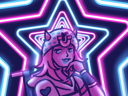
★ 105 // “Star of the Show”
#jjba#jojo's bizarre adventure#steel ball run#sbr#johnny joestar#tools used:#clip studio paint#ezgif#I kinda struggled today picking what offering to work on. Ultimately I decided what was best was to do something I wanted.#I've been really into drawing things like neon signs. and just using neon signs in my art in general.#So I thought it would be fun to do something neon!#Nostalgic for the part 3 Jojo prints I was working on that involved neon signs but I lost the files. I really wanna restart them!!#I didn't initially plan to animate this. but I'm so glad I did because holy shit does it elevate this.#It's kinda hypnotic. It's hypnotizing you to love Johnny Joestar. Is it working?#Shoutouts to Ly in my Discord for giving me a tarot reading earlier. I got The Star card. So that somewhat inspired this!!#offerings
81 notes
·
View notes
Text

★ 104 // “Well? Why aren’t you scrolling?”
Inspo:

#jjba#jojo's bizarre adventure#steel ball run#sbr#gyjo#johnny joestar#gyro zeppeli#tools used:#MSPaint#MY FIRST ATTEMPT AT FULL COLOR ANIME JOHNNY AND GYRO WOOOO!!#I was trying to draw last night in CSP but I was struggling so hard.#I decided to open up MSPaint and just fuck around and the art was coming a lot easier.#Many hours later and you have this lol.#I went a little extra on this one but I had fun and the end result rocks!!!#I mentioned in the last ask I answered I really like how anime Johnny and Gyro's palettes form a rainbow. That inspired me here!#Really just wanted to play with bright rainbow colors and see what works. This ended up looking like candy to me. mmmm YUMMY!!#offerings
657 notes
·
View notes
Note
What’s ur opinions on the Gyro and Johnny designs?
Once I wiped away the happy tears from my eyes and got a good look at them, I had a moment very similar to when you get a new prescription for glasses; y'know, when you put those bad boys on your face and suddenly your perception on reality feels VERY different than it was previously. I saw these anime boys and being so used to their manga counterparts, I needed a second to calibrate myself!! I think the adjustment period might take a bit of time overall for everyone; it varies from person to person. But as it stands now, I'd say I feel adjusted enough to form an opinion that isn't 100% reactionary. I'm a bit of an optimist and prone to being a hype beast, so there's a part of me that is just so fucking happy these guys exist in anime form, and doesn't care for introspection. But there's another part of me that has mulled things over, so why not give my thoughts?
Stay tuned for the end of this, because I compare their designs as a duo, and I've had people say this helped soften their opinion on the redesigns overall. But first, let's look at each .png boy separately.

// JOHNNY
The pros:
His overall head is gorgeous!!! Beautiful blue eyes and a round face!! I can't stop staring at him!!!!
His hair!! It's longer than it usually is but I really dig it!! I love the lil bits sticking out by his bangs too!! Blonde is the most Johnnycore color imo!!
BLUE LIPSTICK. VERY IMPORTANT!!!
STARS ON HAT, ALSO IMPORTANT!!!
This man is serving SO much cunt, as he should!!!!!
The caveats:
I really like the overall color palette of red/white/blue, but I feel like there should be some tweaks to the colors just a smidge. He's wearing a few different shades of blue and red for no reason, for example. I like limited color palettes with better cohesion!
The cons:
The pants... I completely understand that having stars on them would be an animator's worst nightmare, but I wish there was at least something of visual interest going on even if it's different than the manga. Probably not the end of the world ultimately, but it's a major adjustment.
Overall thoughts: Bro it's fucking Johnny, I'll love him in every universe no matter what. <3

// GYRO
The pros:
gyro i could stare at your beautiful soulful face and eyes all day long. i think I will. please marry me.
GREEN LIPSTICK!!! VERY IMPORTANT!!!
The hair slays. Also seems longer than in the manga!
I fw the hat, mostly true to form
You know what? I'll say it: I like the green cape!! Adds more visual interest and breaks up the brown that's overly prevalent.
The caveats:
Similar to Johnny: the main color palette is great overall for the most part, but I'd want some tweaks. There's a few odd choices.
I always thought his shirt buttons or whatever they are were a little much (at least when it comes to drawing them LOL) but I'm not sure how I feel about this new arrangement either... still pondering... same with the singular arm band.
The cons:
A couple of weird color changes I don't quite agree with. BLUE EYES??? Silver belt buckle?? Blue gloves?? Some of these things are iconic to him that it feels almost wrong to recolor them.
brother watch out with those ankles, they look like they could snap like a twig at any moment
Overall thoughts: Bro it's fucking Gyro, I'll love him in every universe no matter what. <3

// AS A DUO... A PAIR IF YOU WILL....
It's easy to fall into the trap of "WHAT WERE THEY THNKING???" when it comes to redesigning a beloved franchise in ways that aren't anticipated, but I take everything in good faith when I can, and this is no exception.
I like to think these artists are smart. I also don't think these changes happened for no reason whatsoever, they were likely very thought out with consideration. While I can't know exactly WHY certain changes were implemented, I can at east come to a few conclusions based of universal design principles and symbolism. Since Johnny and Gyro will share a lot of screen time together, it might be of value to compare them side by side.
Johnny is mostly comprised of primary colors (red, blue, yellow), while Gyro's design is mainly composed of secondary colors (orange, green, purple). This creates both a contrast and a harmony between the two which is very fitting to their dynamic, and their designs together make a rainbow. 🌈
Johnny's color palette is brighter and more bold, while Gyro's is more subdued and earthy. This could just be chalked up to their "occupations": Jockeys tend to have very colorful outfits, while cowboys (and people pretending to be them) tend to be a bit earthier. You could also compare the feeling of their colors to their personalities and motivations as well: Johnny is more intense and bold with his determination, while Gyro has a very stable and more "safe and conforming" set of colors, related to his upbringing.
The simplification of their designs is obviously to help the animators. I personally find it a bit fascinating to think of it like chiseling a statue: how much can you get away with taking away before it becomes unrecognizable? If you had the same task to simplify these men for animation, how would you go about it, what would you omit? Food for thought. I think for what it's worth, these two still look like Johnny and Gyro and they kept the important bits in tact.
Closing thoughts:
I'm very curious to see how they'll look in an animated setting, I always think still frame keyart like this never does a good job of selling you on the concept of it being an anime. I bet they'll mesh a lot better on a moving screen!
Having to stare at these .pngs to form my analysis, Imma be real: the more I look at these two the more I fall in love. They're growing on more and more! I could just be a flaming homosexual though.
#asks#jjba#jojo's bizarre adventure#sbr#steel ball run#johnny joestar#gyro zeppeli#Thank you for the ask!! It was fun to try and put my thoughts down in writing. :D#I'm curious to know other people's thoughts#So feel free to leave a reply!
41 notes
·
View notes
Text
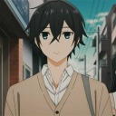
★ 103 // “The New Anime Boy In Town”
#jjba#jojo's bizarre adventure#steel ball run#sbr#johnny joestar#offerings#tools used:#clip studio paint#This is my first drawing attempt at anime Johnny!!! I usually like to doll things up excessively but I really like this sketch as is!#I drew this shortly after the announcement yesterday and liked it enough to make it an offering!#I love you sir I love you I LOVE!!!!!!!!!!#I forget how much I adore using pencil brushes!!! They're so fun!!!#I'm going to give my Thoughts on the anime designs later today! So look out for that!
115 notes
·
View notes
Text
★ 102 // “LET'S FUCKING GOOOOOOOOOOOO”
#loud warning on the audio#jjba#jojos bizarre adventure#steel ball run#sbr#johnny joestar#offerings#tools used:#clip studio paint#OBS#MY HONEST TO GOD REACTION TO TODAY'S NEWS#BROTHER I CRIIIIED WHEN I SAW THAT 1890 SHOW UP.#WHAT AN INCREDIBLE DAY!!!! THE SUMMONING CIRCLE WORKED!!!!!!!!!!!!!!!!#SHOUTOUTS TO EVERYONE IN MY SERVER WHO WATCHED THE STREAM LIVE WITH ME <3#Speaking of Discord: I will be adding this as an emote/sticker to my server!#Anyways AAAAAAAAAAAAAAAAAAAA#I dunno if anyone wants my Opinions on today's news and the new designs but hit up my inbox if you do and I'll share!
109 notes
·
View notes
Text
youtube
Hey guys, we've got another WOF x JJBA speedpaint, featuring the men of the hour---Johnny Joestar and Gyro Zeppeli!
The writing was on the wall for SBR announcement at the recent JOJOWORLD event, so I through myself into coming up with dragon designs and composition for the big day (plus @johnnyshrine's eponymous shrine for the SBR reveal). And I just wanted to share a bit of my process and all that stuff with y'all!
First was Johnny, who wasn't too hard. I decided to incorporate horseshoes into both the top of his frill and along the bioluminescent scales on his arms and face. I decided to have him paralyzed from waist down, so he does have a wheelchair design and a similar flying chair concept for flying (since tail is crucial for steering).
Next was Gyro, who is, like, the second HiveWing I've ever done a full body for, so I was excited to get to his design. While drawing his wings I had to make sure they weren't too SilkWing-like, and so I made use of the How to Draw book for that (that's also how I got Johnny's wings). Making sure his palette worked well in black and white as well as in vibrant colors was a challenge, but I think I made it work. But then came his accessories, which after finishing left me with a greater appreciation for artists who work with complex designs like that all the time. And lastly, I modified the little half circle segments on a normal HiveWing's body to be full green circle, reminiscent of Gyro's steel balls.
Then came the time for scene comp, in which I desperately wanted to utilize the golden spiral since it's literally the spin and everything, so I tried sketching on top of a few of them, making sure that both spirals looked well together, but when I redid my sketch for the lineart, the spiral got a bit flubbed for both of them. However, I did my best to coil Gyro's tail exactly like the spiral, because even if the protege can't get it exactly right, the master should. Johnny's pose is loosely based off of his key art from All Star Battle, and I had Gyro do a similar pose next to him, but with a cheeky, golden toothed grin because that's a classic Gyro thing. I wanted to put them on an even ground as to not let Gyro and overshadow Johnny as the focal point, so a redder background to standout against Johnny's baby blue is what I ended up doing (plus it was like the only color I hadn't used yet and wouldn't get muddled with any of their other scales/clothes).
All of that together, plus a stretched-out canvas to fit both dragons on, got me this finished piece:

Beautiful, chef's kiss, certainly 8+ hours of my life.
For the johnnyshrine, I had to make a B&W version, and really wanted to play with halftones, and this is when I found out FireAlpaca actually has a feature for that!? Thanks to Soda Party Network for the tutorial, because otherwise I would have either done it by hand or use the polka dot brush to oblivion. I think I'd use it in more pieces tbh, but we'll see. I wanted a cool black and white patterned background, but it ended up clashing with the lineart too much for that, so I just made it solid black (although in retrospect, a white outline around them could have fixed it, but oh well).
I also had to space the two of them apart because in color it's easy not to get the lineart confused, but in B&W it was not working, so I separated them a smidge and hid them away in a seperate folder to make this:

I think Johnny's screentones worked better than Gyro's, which is just because he had way more details to keep track of, so a bit of him gets muddled in the lineart. Still, turned out really well in my opinion.
And lastly, I want to talk about their names. I wanted Johnny's name to be similar to Jonathan's (Flameback) as to show their relation, and according to the WingsofFireNames Wiki (which I've used for basically all my JJBA x WOF creations), Flameback is also the name of a sea slug (see below, left), so I decided that should be Johnny's name, with "Flame/Flamer" being a nickname. It's also silly how "flamer" can refer to a very homosexual man, so the name works on multiple levels. Click comes from this little guy (below, right), who's common name is "queen's executioner beetle", just like Gyro's job, apparently. However, I decided he should also have an embarrassing real name, so I took from the executioner beetle's taxonomic name---
Megapenthes lugens
---and named him "Lugens".


(Also, just looked it up and this beetle's name apparently translates to "great sorrow mourning", which is crazy lore I suppose).
Anyway, that's all from me as of now. Uh, please commission me if you want cool dragon art like this, and see you around?
#other's offerings#101#summoning circle#Wow!! You put so much thought into their designs!! I can really appreciate that!! These designs RULE.#This was definitely one of the more unique entries we had. I love seeing people's creativity in all sorts of ways!#Thanks so much for helping make the SBR anime REAL with your awesome dragons!! :D
9 notes
·
View notes
Text

my artwork of johnny for @johnnyshrine 's summoning circle. totally late to posting this due to work.
but happy sbr anime confirmation day!
#other's offerings#101#summoning circle#I always appreciate more Johnny fanart added to the world. I like the hatched shading you did here!!#HAPPY CONFIRMATION DAY!! Thank you for contributing a wonderful Johnny to the cause!!#WE MADE THE ANIME REAL!!! :D
15 notes
·
View notes
Text
Hooray for Steel Ball Run !


My offering for the @johnnyshrine, it turned out so cool! I haven’t read Sbr… YET. But I think this is what happens, right?
Real version and then the version where I toned down so it would actually print better. Is it obvious I’ve never used screen tones before? 🤔
#other's offerings#101#summoning circle#Yeah this is basically what happens in SBR. You hit the nail on the head... or perhaps the hands and feet /crucifixion joke#I really like your entry!! Something really wholesome about Jesus watching over them being silly. Perhaps even joining in you could say.#It printed very nicely! I'm looking at it now hehe. I still have everything hung up!#Thanks so much for contributing to making the anime real!! You helped us!!!!!! Never forget that!!!!!
43 notes
·
View notes
Text
WE DID IT YOU GUYS!!!!!!!!!!! STEEL BALL RUN REAL!!!!!!!!!!!!!!!!!!!!!!!!!!


★ 101 // “Steel Ball Run Anime Summoning Circle” This was a collaborative effort from my community. You can view a gallery of all the offerings and credits here. Massive thanks to everyone who contributed! ♡
226 notes
·
View notes

Text
★ 101 // “Steel Ball Run Anime Summoning Circle” This was a collaborative effort from my community. You can view a gallery of all the offerings and credits here. Massive thanks to everyone who contributed! ♡
#jojo's bizzare adventure#jjba#jojo day#jojo no kimyou na bouken#steel ball run#sbr#johnny joestar#gyro zeppeli#diego brando#hot pants#lucy steel#funny valentine#You guys are amazing. Thank you for making this so cool. <3#OUR EFFORTS WILL HAVE PAID OFF!!! I HOPE YOU ENJOY JOHNNY.PNG WHEN HE'S UNVEILED!!!!#STEEL BALL RUN FOREVERRRRRR!!!!!#I'm off to go watch the livestream now!!!
226 notes
·
View notes