
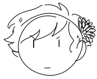
jirdan-does-art
A Simple Art Blog
Jirdan || 20 || Hiatus
326 posts
Don't wanna be here? Send us removal request.
Last Seen Blogs

ursachaotic
URSACHAOTIC ✨
thebenmolina
[ The Thing Itself ]

thebenmolina
[ The Thing Itself ]

agentpeggicarter
my first name is agent
Note
I have two questions! First: have you ever thought of doing a tarot card suit for your characters? I think it'd work really well for them! And two: help me how do I draw legs
@gravitality
Hi!! I’ve absolutely been thinking about that, yeah, in fact I recently talked about that to my boyfriend just recently. It’ll likely happen after october! And to answer your second question! I made a thing on legs that i hope you’ll find useful!!
So. I’ve already explained basics on legs here, but I don’t think it hurts to go through some extra details to help you understand legs some more.
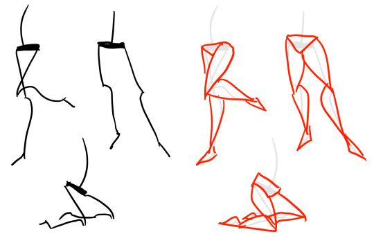
The very basic thing is to imagine legs as teardrops. Again, this has already been covered in said tutorial above, but I figured it’s still good to mention even the most basic thing that I know of. I still highly recommend you check it out to get in more detail and to see some other examples and practices that you do. But basically, think of legs in the shapes of teardrops, when it comes to shape. If you need a simple stick-figure to connect the legs in the first place, make sure that they bend at the knees a bit so that the legs don’t come off as stiff and unnatural.
As you can see, this method works perfectly for realistic legs as it does for stylistic ones. Remember to use these as a guideline, never to be the exact base of the legs you will be drawing. If you draw traditionally, remember not to draw these guides too hard, or they will be hard to erase/do freestyle!
But how do you actually draw out the legs without drawing them perfectly straight, as shown to the left? The trick is to add volume to them, and how you do that can be winged to your own liking. The idea is to think in curves. As no leg is perfectly straight. You may make these curves minimal if you don’t want them to be curvy, but keep in mind, still, that not even your own bones are perfectly straight, so it is highly recommended that you make them bend, at least a little.
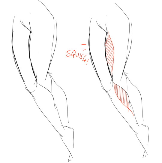
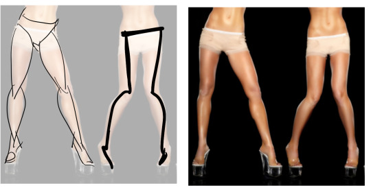
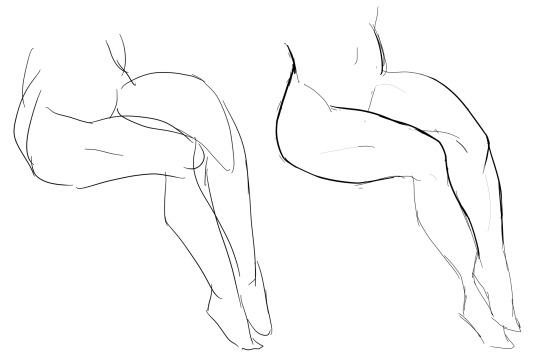
It all depends on how you draw them as well. Say you put your legs together, as shown in this picture, what happens to the fat and muscle? Naturally, they press together, much like how thighs squish on the surface when you sit down (I’m sure most people know what I’m talking about). Make sure this shows in your art! This is very important to keep in mind, because it makes it all look more natural and believable. Try to cross your legs or stand up and sit down again for real-life examples!
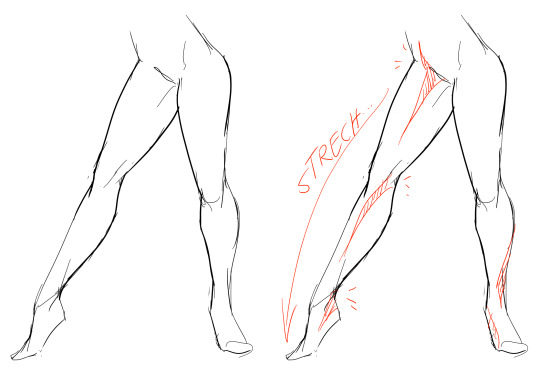
The same applies for stretching your legs, more or less, except they appear to become more ‘hollow’ and slimmer. They become less soft to the touch, too, and might show. Try stretching your legs and feel where the muscles tense and where it feels ‘hollow’. This is very helpful with your art.
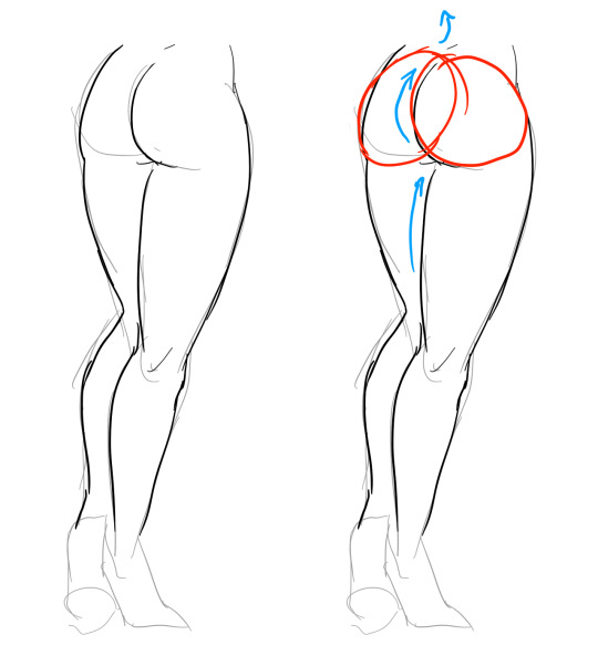
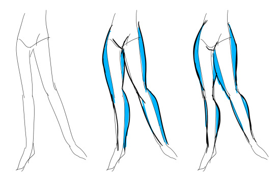
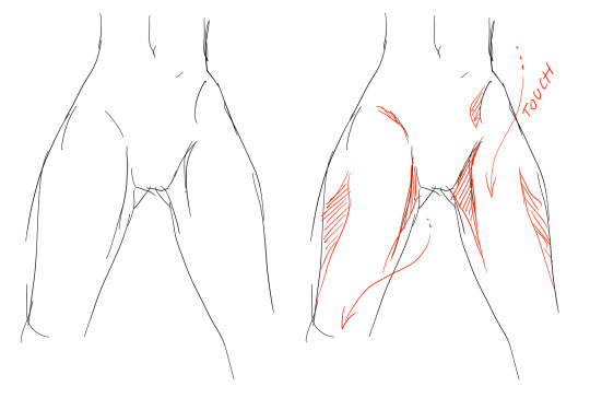
Many leg tutorials talk about legs without mentioning the behind. It requires a tutorial on it’s own, in all honesty, but this is the most simplest way to draw it connecting to the legs. Remember that it comes in many different shapes, and this is just a super basic guide! Two circles overlapping, while following the line and flow of the legs. Remember the muscle/fat as mentioned above!
Okay, so we got the basics of leg shapes figured out? What if you want o draw them in a certain pose, or with a certain silhouette, but perhaps do not have the reference for it? Or you want to blend your style into it? The key is to not shy away from doodling the form. Make mess, draw lightly and don’t care about the anatomy. That way you’ll get everything down without it appearing stiff. You can clean up the sketch later, always, and if you can, use a reference after you have drawn your pose, to correct your drawing.
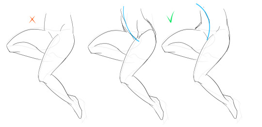
Remember that the hips do a lot to the pose of the legs! Make sure they are in flow with your legs, so that it can look more natural. Remembers that hips ‘rotate’ with the spine.
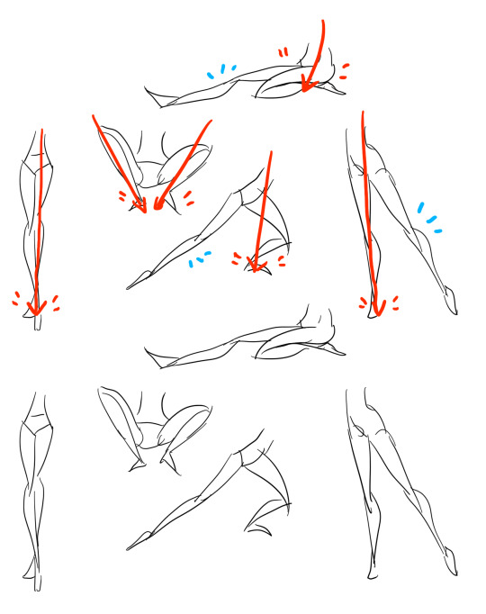
I’ve talked about this method before when it comes to posing, and the same applies for the legs. One way to make legs appear ‘steady’ is to picture them standing in a line, and one of those legs need not to stray from the lines too much, making it steady. If you want a dynamic pose despite the steady pose, you can always have the other leg stray from the line, since it only matters that one leg is steady. This method can create good, casual poses without making them appear boring. (also notice how the teardrop shapes are used here, despite the highly stylized legs)
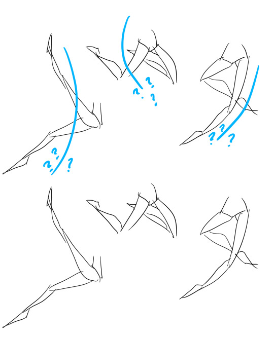
Do you want a highly dynamic pose, or them to appear unsteady, then skip the line entirely and make both legs aim away from it completely. As you can see, the legs appear more moving, in action, as if they’re fighting, falling, or dancing. As you can imagine, this is not a pose that one could stay steady on, suggesting that it’s taken mid-movement. More about posing and this ‘line’ method is talked about in this tutorial.
Hope this helped you, if you have any questions let me know, and if you’d like to check out all my tutorials they can be found here!
28K notes
·
View notes
Note
Hey. I drew a drawing of Alex Fierro and was wondering, if it's not to much of a bother, if you could make a sort of step by step on how you colour Alex's hair in digital and how you do the green with dark roots and stuff because I'm finding it rather difficult. Thank you so much you have suggested inspiration to me.
giving this to you, anon, bc alex fierro will forever be fun to draw :))


3K notes
·
View notes
Photo
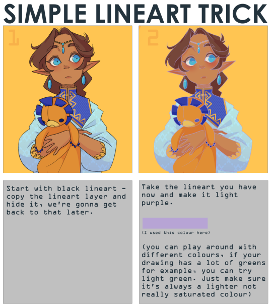

note that it works best with thin lineart
(I used SAI2 for this, but I think you can use any art program with a overlay layer mode)
38K notes
·
View notes
Photo
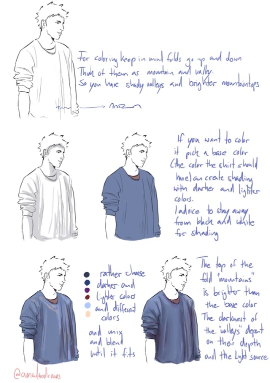

THANK YOU! ANON!
I stopped the coloring of the shirt here cause I guess you get the basic idea. If you wanna see more of the coloring and the brush I use you can look HERE!
Also you can see how not just folds but shading can define a form HERE!
I hope this helps! I’m so bad with words and explaining things (/)//(/)
40K notes
·
View notes
Text
apparently ppl don’t know about waifu2x??? despite its… concerning name it’s literally the most convenient website i’ve ever come across as an artist
it allows you to resize artwork without it becoming pixellated. this is a MASSIVE help if you, for example, make lineart too small or something. it works best with things that 1. have no textures 2. have smooth lines 3. have cel shading, but it still works really damn well for things that don’t fit that profile
here’s an example:
normal size
2x in paint
2x in waifu2x
so like, there’s that. go wild
236K notes
·
View notes
Photo


Hopefully you didn’t mean like eye shapes or something like that, anon, because people are more often to ask me about coloring eyes lmao. But hopefully this tutorial helps a bit in terms of colors!
1K notes
·
View notes
Photo


i have remade my commission post with some terms changed in the cut below. because of some asks that ive gotten (and answered privately) i felt the need to update what i will and will not do, as well as clarify some of my pre-existing terms.
to those that are new (hello!) further examples of art can be seen in the #other art or #just art tags on my blog!
all payments must be DONATED to me through my ko-fi page, my payapl (in USD), cash.me, or GMAIL. it is the only way i will be accepting payments. in order to contact me about commissions, please EMAIL me (do not send me tumblr asks, i will lose them), at [email protected]. this is the email i use for speaking with commissioners!
★ ★ ★ reblogs are VERY appreciated. thank you for taking a look and thanks for supporting me! if you like my art or just me in general, consider dropping me a tip in my ko-fi jar~ (◍•ᴗ•◍)/ ★ ★ ★
TERMS BELOW !!!
Keep reading
186 notes
·
View notes
Photo
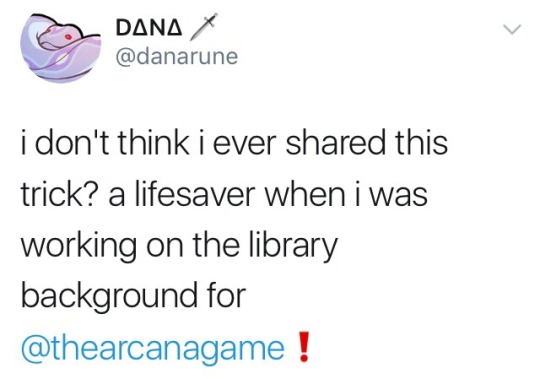
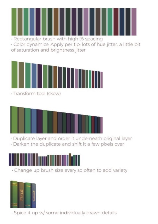
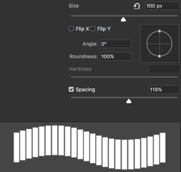
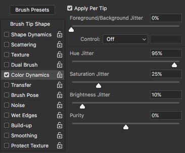

Library books art hack by @danarune on Twitter
132K notes
·
View notes
Photo


since im taking sprite commissions, i figured i should make a post!! i need money to buy food and pay rent and all of those other pesky things
Details below the cut! Reblogs and shares are very much appreciated!
OTHER COMMISSIONS
Keep reading
23 notes
·
View notes
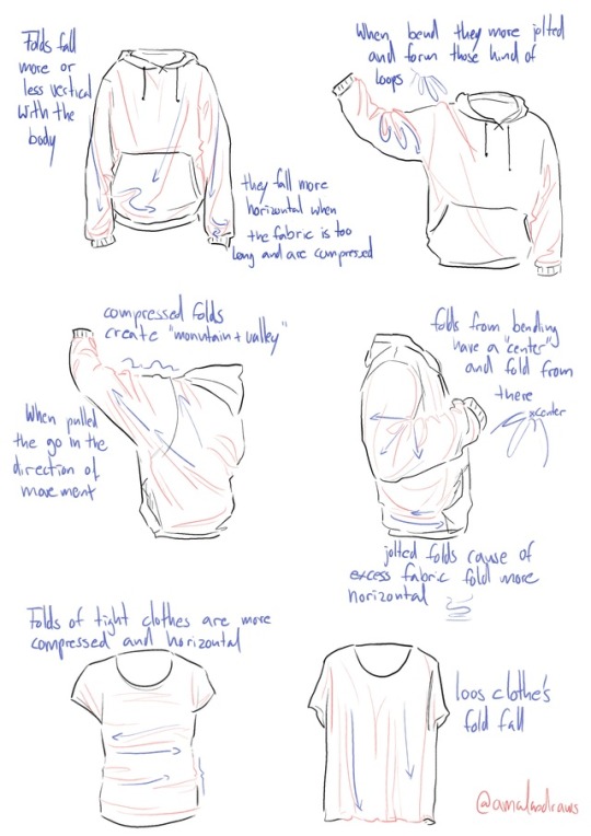
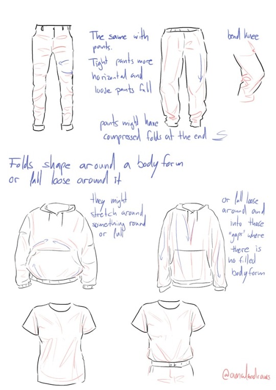
Photo


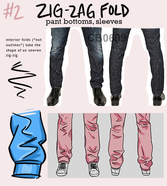


NOTE: one type of fold will rarely appear on its own - they interact with each other quite a bit! for example, spiral folds might define the outline of a pant leg, while the interior folds might be zig-zag folds.
i’m trying to re-learn how to draw clothing, so i made this little guide to the most common shapes of folds that appear. hope it helps someone else too!
64K notes
·
View notes
Photo
THANK YOU! ANON!
I stopped the coloring of the shirt here cause I guess you get the basic idea. If you wanna see more of the coloring and the brush I use you can look HERE!
Also you can see how not just folds but shading can define a form HERE!
I hope this helps! I’m so bad with words and explaining things (/)//(/)
40K notes
·
View notes
Text
The big texturing tutorial
1. Definition
Texturing is a technique that involves adding local shading and details on surfaces to better represent the material of an object.
This technique is of course closely linked to shading in general.
This is usually applied after defining a global shading.
From left to right :
Lineart
Global shading
Completed sprite
One of the big differences between global and local shading is homogeneity.
The very principle of global shading is to give a sufficiently contrasting effect between the shaded and lit areas to bring out volume and depth.
Conversely, a texture must be as homogeneous as possible. It must be able to be applied on large, uniform surfaces, without making it look bad.
2. Applying a texture
A texture being homogeneous in terms of its luminosity/contrast, if it is applied to an object without taking into account the global shading, we will lose any effect of volume and depth.
A texture applied to a sphere without shading.
Only the deformation of the texture can give us a clue on the shape of the object, but it is still difficult to discern.
Homogeneous contrast
When applying a texture to an object, shadows must also be taken into account.
It is therefore important to maintain a uniform contrast between colours. A dark line separating a light zone from a dark zone should not keep the same colour between these two zones.

The color of the line will be lighter on the lighter side and darker on the darker side to preserve its contrast with the background.
In the same way it is possible to apply a texture or pattern on a shaded object, by proceeding to a simple color shifting in our palette.

Combination of a texture (left) and an object that is not textured but shaded (middle).
3. Local shading
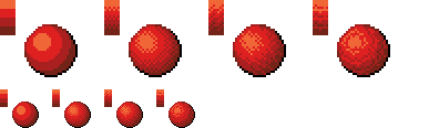
Since shading is used to highlight the bumps, there are generally two possible cases:
A groove
A bump
Each of these cases can be more or less accentuated by playing on the colors, the intensity of shadows and lights.

On the upper line, troughs ranging from the weakest to the strongest bumps.
On the second line, these are bumps that stand out.
The mastery of these light bumps is very important, it is the basis of the textures, and will make it possible to manage all the simple cases, such as wood or matte plastic.
Example of application on a simple object:

4. Reflections
The application of a reflection is done in a simple way, by applying diagonal strips of light of varying thicknesses, and following a few rules.

A trough or bump will create an offset at the reflection level (proportional to the height change).
As for the shadows, there is no absolute, depending on the palette or the material represented, it is possible to lighten or not the area at the reflection level.
It is also important not to have parallel light bands on faces that are not oriented in the same direction, as on this cube:

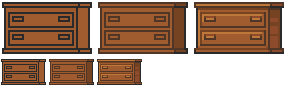
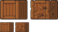
Concrete example of the application of a gold texture on our drawers:

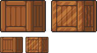
Or, added reflections on our previous crate:
5. Dithering and granularity
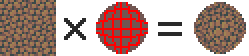
Dithering consists in creating a new false color from a checkerboard or other regular pattern of two colors close enough to give an illusion of mixing.
The closer the colours are, the stronger the illusion will be. The more the colours are contrasted, the stronger the granularity effect will be.

Dithering is basically used to obtain fake intermediate shades on limited palettes, but it is also very useful for making complex and rough textures.

Example of complex dithering separating 3 colors over a wide area.
The nature of the pattern totally changes the roughness aspect.
Example of the application of a sandy rock on our drawers:

Or add grain to our crate:

6. The art of destruction
The more complex a texture is, the more it will combine fundamental techniques such as bumpiness, reflections or granularity.
However, some materials need to go further, by cutting, slash or breaking the base support.
Cuts
It works much like bump, but on a much finer surface.
We are subject to the same rules, of which here is a summary image:

From the finest to the most pronounced, on the first line of the cuts, and on the second of the bumps.
A concrete example on our crate:
Exercises
Since nothing beats practice to learn, here is a series of examples from the simplest to the most complicated.
For each exercise resolved, post your results.
Mastering tools
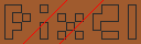
Add a strong bump on the text of this image, except the ‘x’ which must be a groove (the center must be dug more strongly than the rest of the ‘x’):

Palette:

Add reflections on the image obtained between the two red lines shown below:
Now cut and break the letter 'e’ as well as possible.
Add grain to the letter 'l’.
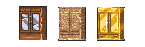
Finalize a sprite
Texturize/colorize this sprite:

Palette:
Add reflections on the inside of the doors to give the impression that there are windows.
Add damage (cuts etc) on the right side of the wardrobe.
Make a variant of this cabinet by redoing it in gold using the palette of the gold drawers example in the tutorial.
Palette:

Do the same with the sandy rock.
Palette:

Sample solutions
Here are some solutions by a talented friend :
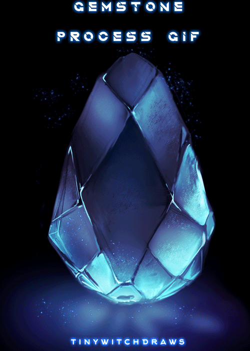
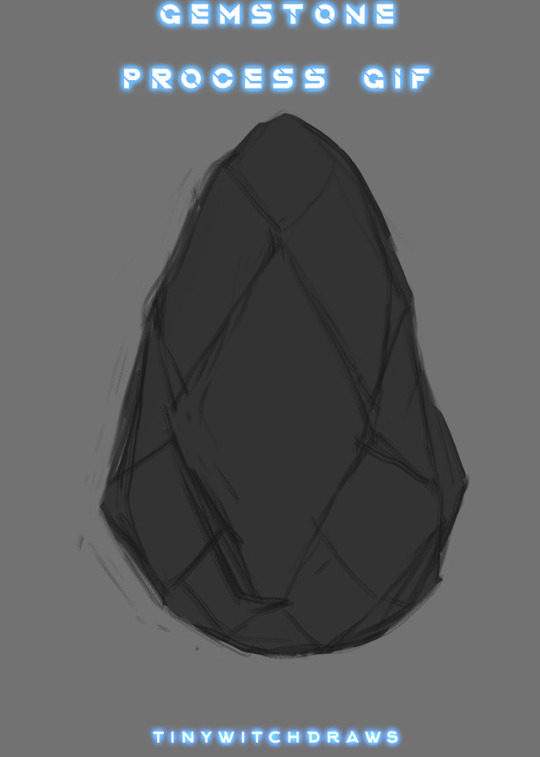
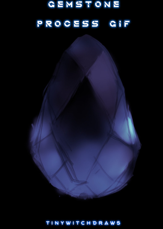
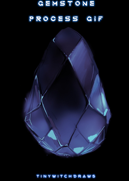
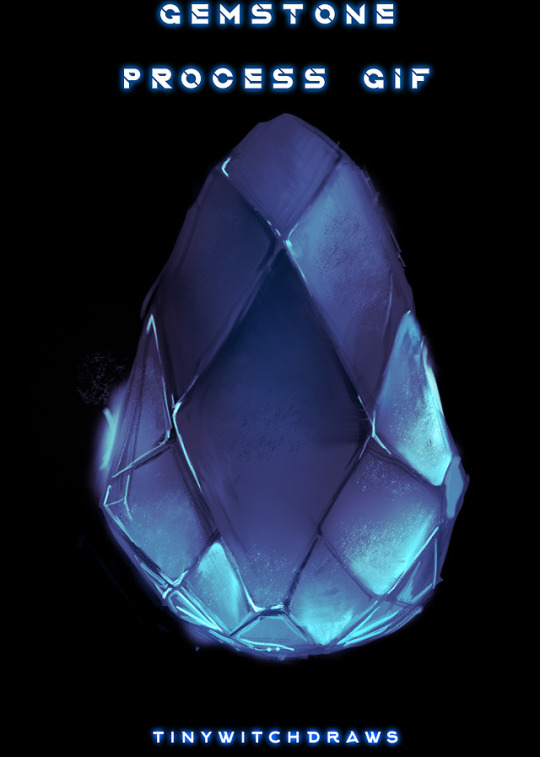
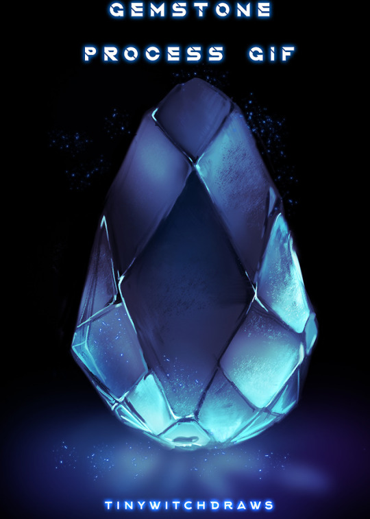
Gif process
The end.
30K notes
·
View notes
Photo

a sprite commission i did recently!
if you’re interested in a danganronpa / fanganronpa sprite, let me know. theyre 35 euro each!! you get the .psd / .sai2 file too if you want. i can also do alt outfits and poses!!
(character belongs to sweetstuff6789)
33 notes
·
View notes
Photo


some peoples ocs from twitter
original twitter thread // commissions
12 notes
·
View notes
Text
do you ever just

“no that’s not dramatic and cheesy enough”
“getting warmer”
“t HERE IT IS”
206K notes
·
View notes
Photo

Say hello to Sango Tsuchida, my SHSL Cellphone Novelist!! She’s kind of a live wire and doesn’t let anything get her down! She does a lot of running and actually writes her stories when she jogs. It’s great, she’s great, I love her
19 notes
·
View notes