Don't wanna be here? Send us removal request.
Text
Week 9 - 12, November 1 - 29
I wrote this out earlier tonight, left to make food, came back and the site stoped being able to save/recognize my post and so I reloaded and the draft disappeared. This site sucks mega balls.
I was really proactive during November, I just found documenting a lot of my work was tedious and let my lizard brain get the best of me and avoided posting until now.
I started out at the beginning of the month with creating the landscape the first scene would take place in. After that I started learning SpeedTree to create some 3D trees. SpeedTree is pretty complex but I was able to work through a lot of the basic tutorials and got a good understanding of the basic node based tree generation system. This was good because I wasn’t looking for anything particularly complex.
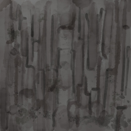
So here are the trees I created along with the textures I painted for each type. I'm using screencaps from blender because I was having trouble getting my SpeedTree files to run as they might be too big/broken right now, but it is fine as I have everything I need from them.
Birch Tree

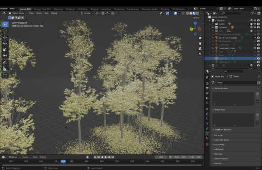


Oak Tree


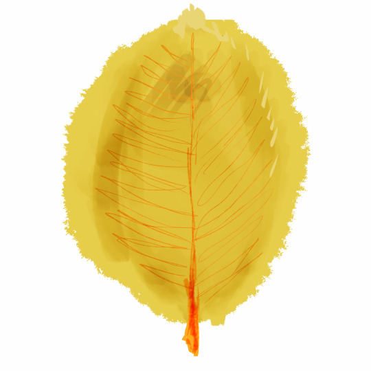
Old Decrepit Oak Tree



I used Blender for this project for a few reasons which I will touch on as later, but one reason was its texture painting work flow, which I found to much friendlier then C4D's. After using the landscape model to generate fallen leaves below the trees I imported everything into blender and painted the ground mesh.
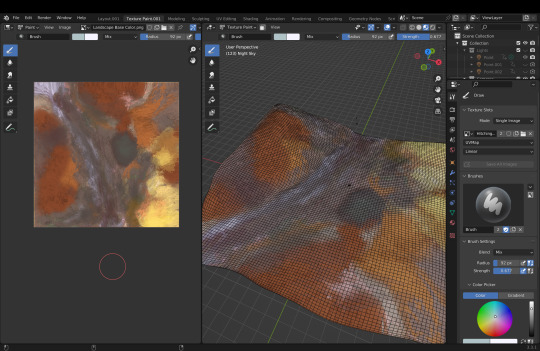
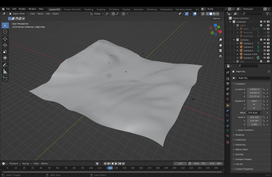
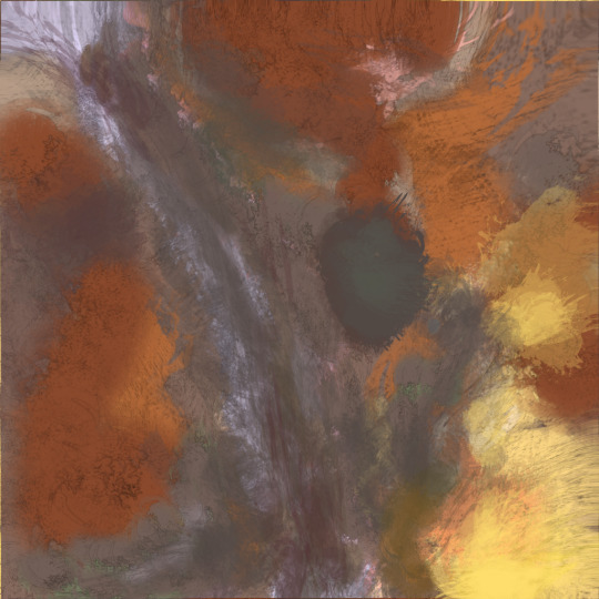
I then went in and found some camera angles for the first few scenes that would take place in this location.
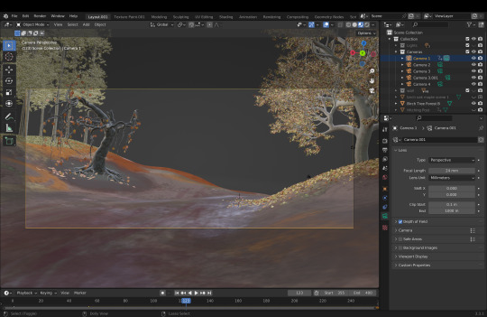
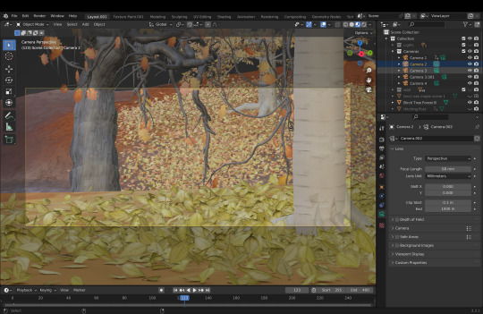
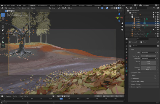
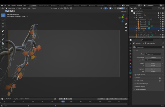
All together my project was looking like the following image and it was about midway through November.

I started working on the 2D character animation portion of the first scene next. I initially did some dirty rough animation but found I was having a lot of trouble so I scrapped it and spent the weekend of the 19th doing it again and came out with some pretty good results. This is the rough animation, done in a shorthand to capture the movement of the character quickly.
youtube
After this I did a cleaner version of the line-work, adhering to the character sheet I created for Ichabod, and then colored it. There are still in-betweens missing in this sequence, but seeing as that sort of thing takes more time then might be apparent, I decided to save that for final improvements and focus on getting more of the whole short done before returning to the in-betweens. I still have the in-between charts I drew in the 'final' frames I have here so I will not forget later this year when I return to it. I also added in some camera animation, I thought it would help build a bit of tension with the camera slowly creeping up on the isolated Ichabod, but also as a way of bringing attention to the 3D nature of the scene. This was easy to accomplish as the way the Grease Pencil works is by creating a plane that its in space for 2D drawings to exist on, so when pushing the camera in the scale adjusts accordingly with the scene. Another element of this sequence is the animation on the light, where after fading in it moves with Ichabod to mimic the movement of the lantern.
youtube
After this I created a hitching post for the horse to be tied to. I painted the post in Blender and added some detail like an outline and latch with the Grease Pencil. I also reanimated the reigns a bit to actually span the distance from the horse to the post in hopes of helping a bit with any perspective changes from the camera animation.
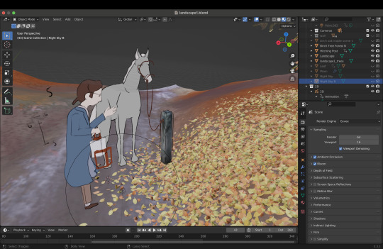

After this I worked to create the moon and passing clouds animation that would sit behind the character in nearly all the scenes in this location. I used the Grease Pencil to detail a sphere with an emitting texture. I then made a 2 long strips of cloud designs and had them animate slowly, on 2s, across the x axis in front of the moon. After the feedback I received at the crit I am considering remaking the cloud elements of this scene in order to capture more light from the moon. It will be fundamentally the same system, only the clouds will be created through geometry or fog volumes instead of Grease Pencil objects.
youtube
I then used the same system, only with a different brush, to create fog moving along the ground at Ichabod's feet.
This I also had some trouble with lighting, and I will be considering using a different method for this element as well.
youtube
After that I went and filled in birch forest a bit to help make the scene seem more full. Here I used Grease Pencil objects but to my defense the engine I was initially using, Cycles, lit them in a much more appealing way then which is shown in the video. I will go over why I had to switch over to Eevee shortly.
youtube
After this I animated the second scene, which is made up of a leaf being blown from the crooked oak tree in the center of the scene as the moon sits all cold in the background.
youtube
This was a fun scene to animate, as working in 3D is different than 2D and getting that change of scenery in what I was dealing with was nice.
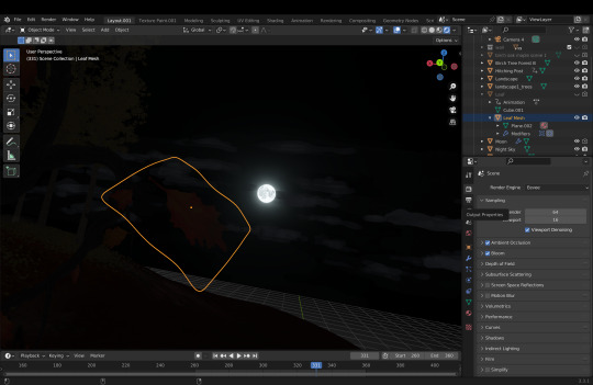
However it was at this point that I realizes I needed to switch to Eevee. I learned that Cycles, a physically based render engine, would not render Grease Pencil Objects seen through opacity textures. It was a weird issue that required a lot of trouble shooting but the only solution I found was to abandon Cycles and work in Eevee, Blender's real time engine. Here is the comparison of the leaf with the clouds scene through its opacity. It was too much of a problem to ignore as not only did the leaf I was animating feature an opacity layer in its texture, but all the leaves in the trees made in SpeedTree did as well. (Right is Cycles | Left is Eevee)

After this I began work on a final short sequence to round out what I would be showing for the critique. This sequence follows the moon/leaf shot and is the set up for a close up on the lantern and candle. I decided to change the staging for this shot from what I had initially drawn in the boards to help set up the cut to close up better by showing the lantern bouncing around as Ichabod moved. This sequence is also not in-betweened.
youtube
I ended up changing the camera angle a bit, which caused some issues with the parallax from the perspective shift, but nothing too rough. I also spent a bit of time animating the plane the drawings animate on (shown at the end of the clip below) to have it actually move back and forth as he walks, helping to perpetuate the illusion of Ichabod moving within a 3D space.
youtube
After this I decided to create some small stone walls to help populate the scene more and take away from the smoothness of the terrain object. I painted these and used that painted texture as a bump map. I also went in with the Grease Pencil and drew in some moss to detail the stones.


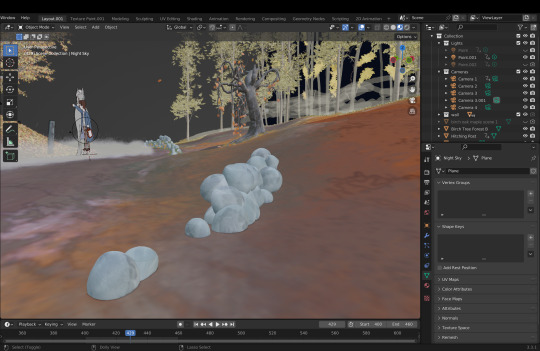
All together, along with some rendering adjustments like depth of field and glow, here is the final sequence.
Overall it was a very productive month, and the crit went really well. My main take away was that I need to work more with the lighting of the 3D scene to try and take advantage of it. I have a few changes to this scene, but before I return to it I will be creating the next location's set to try and further practice and perfect the workflow.
1 note
·
View note
Text
Week 8, October 25
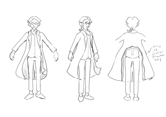
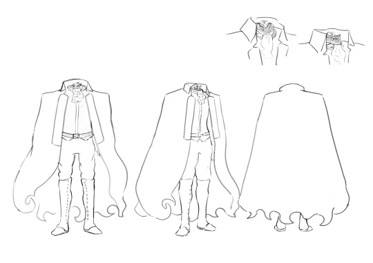
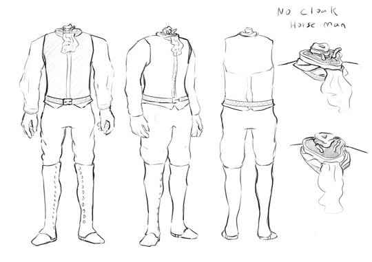


This week I finalized the designs for Ichabod and the Horseman. I spent a lot of time trying to polish Ichabods look and expressions. I was worried about that, as facial expressions are a corner stone of animation and especially from what I can glean off of the American, story board heavy, industry. For the horseman I spent a lot of time researching the uniforms of Hessian and Colonist soldiers in the Revolution. For next week I started on working out a way of texturing 3D bgs to make them more painterly, as the realistic angle I was thinking of at first feels unnatural and amateur.
2 notes
·
View notes
Text
Week 6 and 7, October 11 and 18
I went under. Really deep. Last Tuesday (October 18th) was our Fall midterm critique and the week before that (11-18) I beat my head with a rod over and over again until I bumbled my way through showing off an ugly incoherent animatic. I didn't really get much criticism outside of everyone telling me to make sure I stick to a deadline because animation is hard and I know that.
I then got tired for like 4 days but I'm back in it.
After the 3-4 day animatic sprint and the critique I did some research and emailed the historical society because I couldn't find any good historical books. I read a chapter out of Tony White's Animation from Pencils to Pixels and found a good site from the FIT on the history of fashion which I used for making character designs (both the book and site), but I want to work shop them a bit more. I made the story board and liked the first half a good amount. (this was week 5/6 I think, I remember meaning to post it as like proof of time but I didn't)

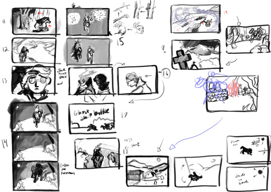
I like the balance shift, everything starts out focused on the left until the transitional period which ends in Ichabod framed center which gets followed a sequence with the horseman appearing on his left. I want to try and find more thematic framings like that, but as I approached the crit I rushed through the final sequences and found that they didn't come to me in the same way the earlier half did and I feel like they might be wrong because of that.
I was a fan of how texture affect the imagery, and it had me reflecting on why I hate my coffee animation from last semester so much. I remade the final seen after watching some calarts films (specifically this one). I think of the points in this animatic I will be keeping are the following: - opening sequence (just really felt right) - fear of images in the night (chance to demonstrate acting) - final sequence (why make it animation? type deal) As some creative research I watched a lot of things after the critique because my body craved procrastination. Some stand outs where Big Trouble in Little China, Over the Garden Wall (I rewatch it every October but still really influential on me), The Shining The Shining was pretty great, but I wasn't as impressed as I was hoping I would be. I still think his technique for characters chasing/stalking was really inspiring, I like how much we got to sit with Jack as he approached, it wasn't like a typical "hes gaining on me" type deal of seeing the adversary within the context of the victim, it was a lot more of Jack alone in frame with his wife or son presumably off in front of him, and the tension was almost in the assumed distance, where you have no way of telling if Jack is right there behind them, especially in the final maze scene.
0 notes
Text
Week 5, October 4 New Sources Link
Please try this new link to access the sources spreadsheet! Sources.xlsx
0 notes
Text
Week 5, October 4 The Illusion of Life
I made an appointment to speak with the Stevens library about researching ghosts and animation, so until then (Tuesday October 11) I satiated the hard research of this week with the Disney tome The Illusion of Life by Frank Thomas and Ollie Johnston. It is a really long book, and there is a lot of meaningless waxing about the heart and soul of animation. However after about 40 pages I found an interesting chapter about the habits of early animation. cycles: looping actions repeat action: sequences of animation that where reused throughout the animation cross-over: repeating cycles in different locations on the same frames during the inking process indicated by marks left on the frames, effectively duplicating characters while only animating one cycle, offsetting and flipping the drawings allowed for further manipulation (think like a precomp in ae) no written title but lets call it a back-and-forth: a technique where, for example, a character approaches the screen while opening his mouth then returns back to his original pose by using the frames from the approach backwards. A lot of these techniques are said to be both popular with audiences but also based around short cuts that helped lighten the work load. This also then leads into the description of rubber hose animation, where in the old animators didn't really get motion that well and relied on the trick where they imagined the arms and legs of characters as hoses, as to avoid thoughts about volumes of mass and bones/musculature within the cartoon bodies. Apparently Walt was not into this, which lead to the development (in a way) of the principles of animation which get outlined next and which I will save for another post.
0 notes
Text
Week 4, September 27 The Flanagan Pill and Mad God
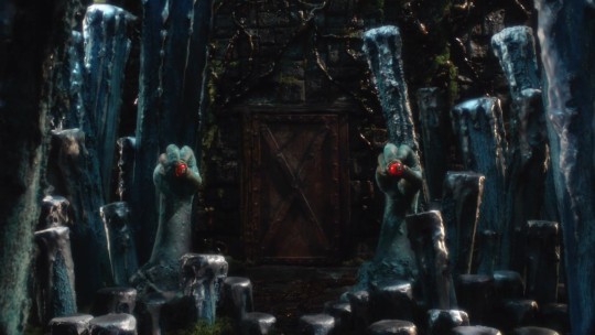
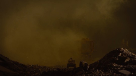
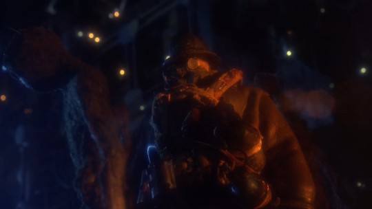
Last semester I watched Haunting of Hill House and liked a lot about it. So I started working through all of the director's work. He does horror adaptions, and this week I watched two of them, Ouija: Origin of Evil and Oculus. I don't know if animation can be scary. I kinda don't think it can in the traditional way scary films are. I think it can instill fear through the uncanny valley and more meta methods, but I just presenting scary subject matter, I think it might fall short. It's weird because a lot of what makes films scary is all in the use of tension which can be conveyed really easily through filming techniques that are replicable in animation. I don't think it has anything to do with the believability of characters or violence. It might just be because animation has such a cultural weight as a medium for children and/or light-hearted things. So I also watched Mad God, a stop-motion film that I realized pretty quickly would not give me the answers I need, as the movie really relies on disturbing imagery to convey its tone. So as of now I still haven't found a good fear-inducing animated film. But Mad God had a lot of great filmmaking in it that made it worthwhile. Most of the narrative surrounds a traveler wandering through a series of atrocities and the way this is composed was really beautiful. The sort of system in place of a figure moving through a path and passing by objects and events of visual interest is something I want to replicate.



0 notes
Text
Week 4, September 27 Ghost Ships
I had this specific image of the horseman (either) emerging from dense forestry to reveal ships locked in combat upon the water for a moment before plunging back into the forest. I did a quick thing to try and capture it for memory in the future. The subtle parallax on the ships, along with the camera focus change I think is important for selling the scene. Edit: Im not sure the compression on tumblr is able to show the focus effects I put on this, so I'll reupload a vimeo link later
1 note
·
View note
Text
Week 4, September 27 AI Nightmare
I've been thinking about what the purpose of my project is. I want to say that I am interested in using unorthodox techniques of blending technology and traditional animation to make a final product.
Either way, I started looking into animation technology articles, because even though I am very familiar with a lot of the subject matter, it is though osmosis and I need some kind of concrete paper and writing to support and demonstrate what I am thinking of and working with. Unfortunately AI is dominating the news for recent modern tech in animation. There is the mess that is image generation programs, but now I read about a system that generates videos (https://www.technologyreview.com/2022/10/03/1060561/get-ready-for-the-next-generation-of-ai/). I have little to no interest in the latter as it not only looks awful and is really morally ambiguous, it isn't close to what I need, and there is not enough control in text-based generation.
There is something I am interested in surrounding AI, which would be using it to generate textures for 3D models, as it would save a lot of time and makes sense with what sort of work ai can generate. Just thinking about this sort of thing is getting me really frustrated, but I will save my rant for some other place. As for sources, it's a really straightforward technique, and there is no scholarly research or even clickbait news articles, it's mainly just tutorials online. I haven't gotten any ai going on my computer yet, most you have to get accepted into or pay money for, and the popular free one Stable Diffusion is really morally wrong, but I'll consider biting the villain bullet soon just to play around with the ideas of generating textures for 3D models
0 notes
Text
Week 4, September 27 Lore
I read through The Hudson, Its Legends and Its Lore by Marjorie F Potter, which is wild that I have read two sources by different people with the first name Marjorie. This was pretty good. Unfortunately, it didn't seem very scholarly, but it referenced a lot of legends and lore that seemed really cool. It talked quite a bit about haunted ships and boats that roamed the Hudson, including one "Flying Dutchman". I became interested in a line where they reference "one of the whaleboats of the old Water Guard, sunk by the British ships during the war, but now permitted to haunt its old cruising grounds." (28)
This put it in my head to visualize a scene involving the backdrop of ghost ships fighting. Spectacle and appeal are the same in my mind, especially when looking at a lot of modern animation. I'm sure better animators would throw me in a fire, but when you watch a lot of modern animated media, scenes of high spectacle overtake character animation often. There is the nightmare that is 'sakuga' culture, where good character animation and draftsmanship are thrown miles from the window for the sake of bombastic effects work, but also think things like Spiderverse, were really cool (for lack of a better word) scenes act as important moments of character growth (think like when Miles leaps off the building near the end after gaining confidence in being able to help). Obviously, this involves traditional appeal in the character animation, but a lot of that scene and many of the others is the sort of big comic book moments. Idk, this is a tangent. The point is, I have been thinking about using the descriptive and unique details of these old tales as powerful imagery to backdrop and mark moments of the sequence. There was also some cool details surrounding Native folklore about a spirit up past Poughkeepsie that "cut [old moons] into stars as soon as she hung new ones in the sky, and she was often seen perched on Round Top and North Mountain spinning clouds and flinging them into the winds." (29) This too is a really great image. The idea of the spirit making the weather and clouds, and the moon thing, but the moon thing seems a lot harder to incorporate along side a tense horse chase.
0 notes
Text
Week 4, September 27, Sources Spreadsheet
Book.xlsx go at it
0 notes
Text
Week 3, Sept 20: Storyboard ideas


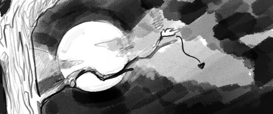


I started composing some shots for a storyboard last night. I like the idea of cutting between ambient scenes of like the moon rising, candle flickering, wind blowing etc. In the past those sorts of scenes have not been very labor intensive and really help with boosting a scenes atmosphere
0 notes
Text
Week 3, Sept 20: Passive Research
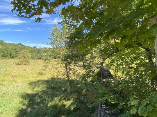
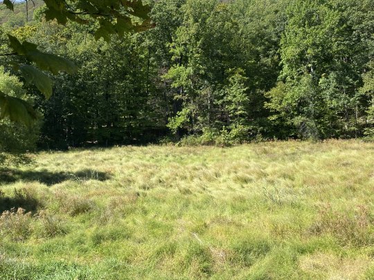
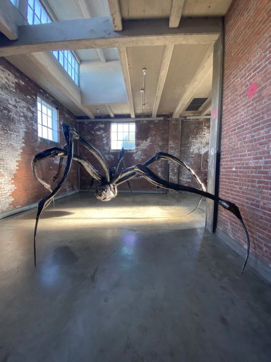
This week I didn't get to watch to many things, but Arianna and I went on a hike by Cold Spring and photographed some of the ruins, along with visiting Dia Beacon for like 30 minutes before the very politely kicked us out.
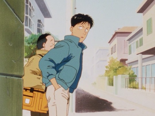
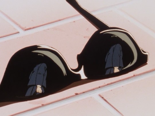
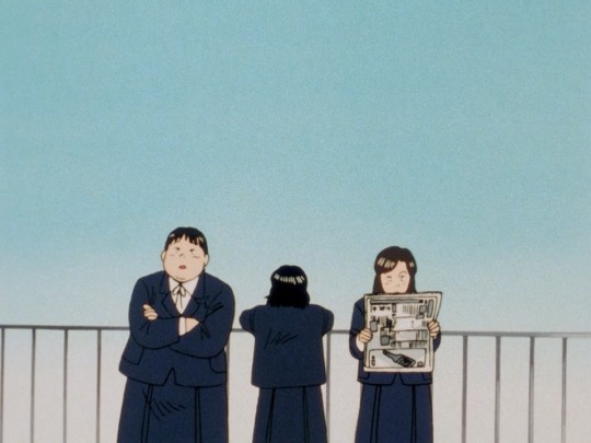
To clarify for this week and last week. I think that for setting and BGs the woodlands around the Hudson is a great reference, so although hiking is very refreshing and fun, the reason I am talking about it here is that gathering photos will hopefully be useful in the winter Its-cold-and-dead-and-looking-for-photo-reference-is-hard era of the project. Also the art in Dia Beacon was cool. Louise Bourgeois' distorted figures and warped anatomy was really inspiring. (photo credit for the Dia Beacon photos to Arianna Parisi) I was oddly busy this week but I still managed to waste time on Japanese cartoons and this week I started on the 1989 Madhouse adaption of Yawara!. From a narrative standpoint, I do think the original author, Naoki Urasawa, is a really talented writer, with monster and 20th century boys being really compelling long form narratives, but Yawara is a lot more simple and at most is a good example of how to right short episodic narratives, but even then its not ideal. His art, which is sort of carried over into the character designs of the anime, is pretty simplistic, which is great for animation, but not like the peak of designing for animation or anything (my thoughts on this are sort of complex so I won't touch on it here). I do think though that the Yawara! anime is good for both demonstrating simple compelling character animation on a tv scale, and on good direct framing. A lot of the narrative requires clear understandings of the characters and their interactions, so the use of clear, simple, framing in the storyboards is great, all while still carrying a really clear image of bubble era japan aesthetic in its BGs.





0 notes
Text
WEEK 3, Sept 20: Initial Scholarly Research
I read The Legend of Sleepy Hollow: A Mythological Parody by Marjorie W. Bruner (https://www.jstor.org/stable/373574) and it was not very useful. The main premise here was that the author outlined a bunch of parallels between Hercules wrestling with Achelous with Brom and Ichabod competing over Katrina. I also listened to an audio book of The Legend of Sleepy Hollow to refresh myself, so this time around I was a lot more familiar with the text. It was a lame article that didn't really do much outside of make some connections to Greek myth (Hercules = Brom, Achelous = Ichabod, Katrina = Demeter, etc.) and didn't really make any conclusions as to why this was useful to the tail or if it had any correspondence with literary technique of the time. The conclusion was basically that it helped make it a better comedy by parodying Greek myth. To jump back to listening to the text again, I was really stuck on the parts where the narrator talks about Ichabod fearing the night. There is a few mentions at the beginning of this, but at the end when nearing the climax there is a sequence where he speaks of getting scared of things he sees as he rode home. "As Ichabod approached this fearful tree, he began to whistle; he thought his whistle was answered—it was but a blast sweeping sharply through the dry branches. As he approached a little nearer, he thought he saw something white, hanging in the midst of the tree he paused and ceased whistling; but on looking more narrowly, perceived that it was a place where the tree had been scathed by lightning, and the white wood laid bare. Suddenly he heard a groan his teeth chattered and his knees smote against the saddle; it was but the rubbing of one huge bough upon another, as they were swayed about by the breeze." This imagery was really good and really relatable for a story written over 200 years ago. The idea of mundane nightly objects transforming into ghosts and ghouls is some great visual ideas (all the more inspiration to beat myself into doing the storyboard instead of wasting time).
0 notes
Text
WEEK 2, Sept 13 : 7 Days of Iteration
I kind of didn't really do iteration as much as just built up a more detailed scene in steps, I apologize for the fraud, but I wanted to try and develop an entire bg/ scene look.
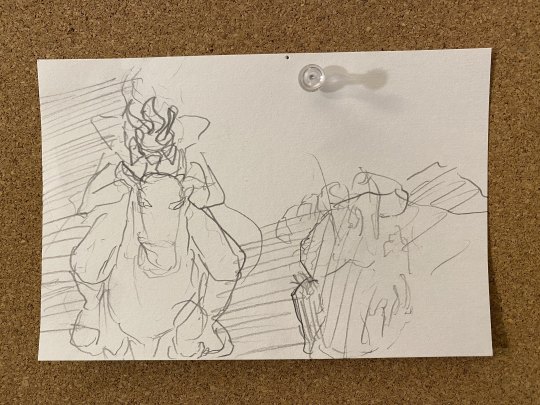

On the first day, I sketched out an idea I had for a scene and began blocking it out in 3D. Most of the work here was just thinking about potential chase scenes and lighting and procrastinating. On the second day, I journeyed to Sleepy Hollow and spent the day there taking photos and hiking, which although didn't directly iterate/progress the scene, was useful for understanding the foliage and setting of the legend, even though I had already sort of mapped it out for this particular scene.

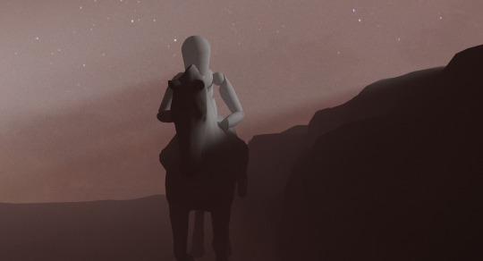
On the third day I found a model horse and imported my rigged drawing model guy to further detail the scene. The set up there was actually pretty quick, what I spent most of the time on was dialing in the lighting and enviroment volume as to get that sort of god ray look without blowing out the image.
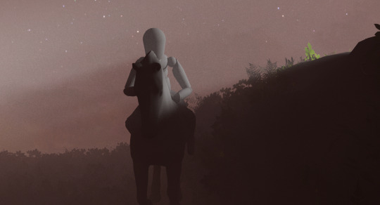
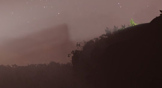
On the fourth day, I added a lot of leafy green shrubbery inspired by my Wednesday trip. Although it's subtle this actually took like 2 hours. The main issue here is how tedious it is to set up redshift proxies. Over the summer I got a small library of realistic north American forest foliage models, but I had never actually used it. So I spent some time converting about half of the items into redshift proxies which I then imported into the scene and scattered about the ground and sort of hill wall thing the horse is riding beside. It definitely can use some work but right off the bat, I was a fan of the detail it brought to the floor, with the foggy layers of plants and leaves.
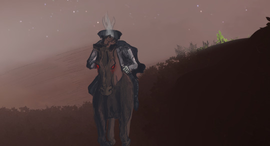
On day five I did an initial drawing based on the renders from the day before. Although I think it turned out pretty cool, it is not really feasible to animate and could use some further compositing.

On day six I tried doing a more simple drawing, but it looked a bit bland. I decided I would focus on proper designs and colors next week and just try and get the compositing down



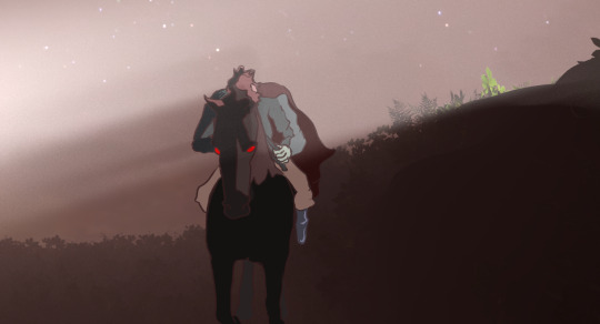

On day seven I rendered out a few (I only stuck with the two shown here) versions of the isolated fog. I tried for a bit to understand redshift AOVs but after seeing most of the tutorial workflows going straight to real compositing software and not Clips Studio Paint or any other simple layered drawing software (which makes sense) I decided to just do what felt correct and isolate lighting elements and the environment to create the fog images. I then overlayed them with a few different blend modes and combinations to produce the above images, which make the character feel within the fog as opposed to on top of it, which I think helps the look a great deal. This week wasn't particularly rough or anything, but I am still settling into a finalized schedule for the semester, so I am hoping to be more productive next week now that I am aware of when I can work on this and when. I also won't be taking any full-day trips until the 27th when I plan to go up to the Hudson Valley/Highlands again.
0 notes
Text
WEEK 2, Sept 13 : 1st Sleepy Hollow Visit

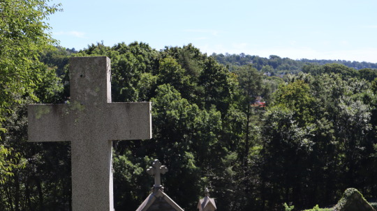


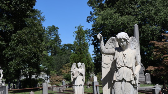
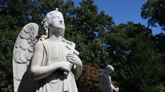


I visited Sleepy Hollow, went hiking, and saw the grave yard where the legend takes place. I took lots of photos, here are some stand outs, but I was not happy with much of the scenery in the hike, I'm going to visit again soon when the leaves start turning. There is also more locations and potential settings to visit, so I will see those as well. I saw and photographed Irving's grave, along with a lot of other interesting graves, and the creek which the story ends. The original bridge is no longer there though. Overall it was very inspiring, but I would like to return to continue researching and documenting the area.
0 notes
Text
WEEK 1, Sept ? : Ichabod Crane as a Highschool Jock
I read an essay called Irving's Use of American Folklore in "The Legend of Sleepy Hollow" by Daniel G. Hoffman. It is pretty outdated (and offensive in a few parts) and brings in a lot of references that I wasn't aware of, but I did take away an interesting theme I didn't really pick up on when I read The Legend of Sleepy Hollow. Hoffman basically frames the narrative as Brom Bones, the rough simple farming man, vs. Ichabod Crane, the ingenuine yankee intellectual. In the narrative, they fight over a girl, but Hoffman puts this in the context of the greater American folklore, in which he claims it is common for the true Frontiersman to best or be apposed with the sort of city slicker character. Ichabod is shown to be an echo of European culture, a shallow being obsessed with reading and possessions. A man void of spirit and the rugged individualism that makes up Americans, the exact opposite of Brom. His dichotomy with Brom reminded me of like Weird Science, where the cool party boy jocks are bested by the nerds, except replacing a simple rugged can-do attitude of a frontiersman with like computer programming and replacing the ghost of a dead hessian soldier with Kelly LeBrock. It's funny because without the context of the story is literally the opposite of Weird Science. Ichabod would be a nerd, he would be getting his pants pulled down in front of his gym class. But this story was written at a time when America wasn't super cool and dominating. Throughout the tale we hear about ghosts and legends of the Revolutionary War, the country is still young and so far its only true accomplishment has been a demonstration that the rugged simple-minded farmers of the new world can bring down the influence of an ancient empire. This is the high school jock before it was cool, back when it was a self-defense story, and before he went to Europe and made a name for himself. America hasn't reigned supreme in its own eyes yet and therefore the true American character is the underdog, only able to get the girl because his enemy in love was defeated by a dullahan, which he was able to defeat through good old American bravery. So here Icabod is the Jock, the overdog I guess, the one who would, under normal circumstances, not unlike great Brittain, get his way through convoluted things like knowing how to dance and being well read, but he is defeated because he lacks a certain American spirit and also thanks to vaguely uncontrollable supernatural interference. I don't really agree with this take, or at least it's not how the story initially resonated with me. I do think though that it brings up an interesting perspective on American folklore/legend that I didn't really consider, that being that the U.S wasn't always this global presence, and at the time of its founding myths had a nearly inverted image of itself to what we see today.
1 note
·
View note
Text


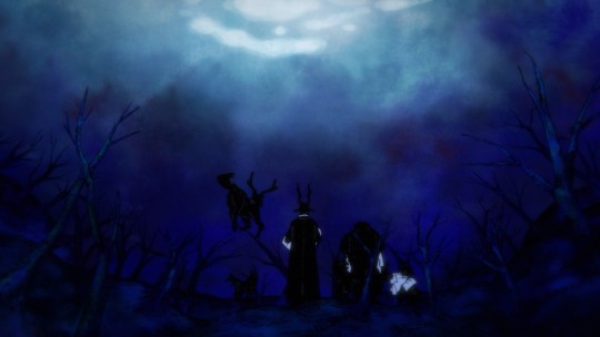

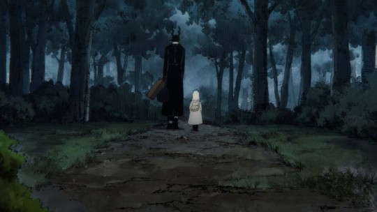
I re-watched The Girl From The Other Side because I haven't seen it in full HD yet or with subtitles. The movie has an incredibly strong atmosphere and a beautifully painted animation technique. The actual narrative covers some spooky concepts and scenarios but isn't scary in the traditional way. I was writing out my proposal statements and suddenly I am having a lot of trouble deciding, and I know I need to do it within this week for my own sanity. I keep thinking that horror is cool but I don't want to make anything horror-centric, mainly because I rarely get scared by animated media and have zero confidence in conveying horror myself. I think animation is best suited for conveying eerie and unsettling things that do not put you in a state of uncomfortable suspense but provide a more indirect scare.
0 notes