A first year Combined Commerce/Design(Hons) student. This blog showcases my experiments, activities and idea's related to Studio Gateway ADAD1002
Don't wanna be here? Send us removal request.
Text
Book Burning art
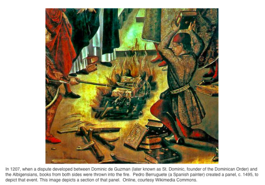
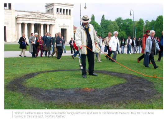
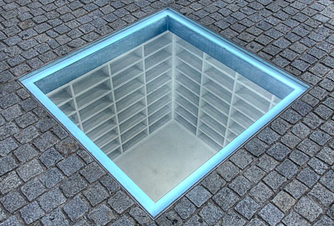
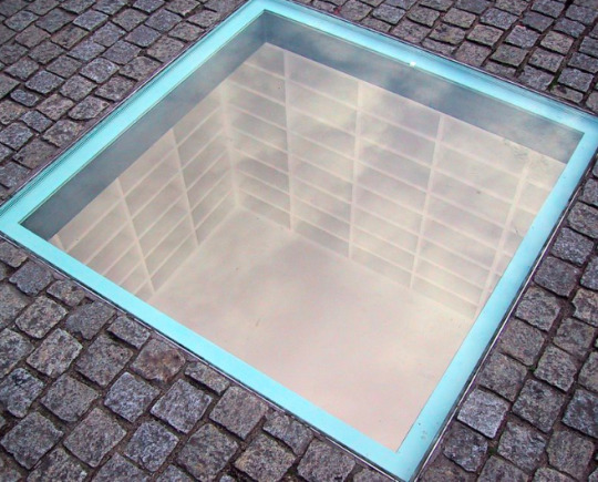
Memorial in Bebelplatz Germany, Micha Ullman
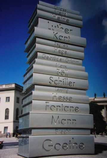
Burned Books Monument Berlin
0 notes
Photo


Experimenting for assessment three
Using stencils to create words on book pages
Worked fairly well was messy in some case, screen printing would be better medium to complete
0 notes
Text


The Hope is in the Cloud, 2014, William Kentridge
The Over Determined Branch, 2013, William Kentridge
Desire to change, show a story, change the words. Inspired by this work for assessment three

First Class Marksman, 1946, Sidney Nolan
Desire for the familiar, for identity,

Joie de vivre, 1958, Mary Webb
Desire for movement, colour

(unknown who completed this work, at Gallery of NSW)
Desire for childlike wonder, for exploration, creativity

Blossom Gatherers II, 2009-11, Raqib Shaw
Desire for beauty, for home like symbols,

The sisters (family group), 1939, Ralph Balson
Desire for family, relationships

Through the Gum Trees, Toongabbie, c1920, Hilda Rix Nicholas
Desire for home, the portrayal, nature


Australian Beach Pattern, 1940, Charles Meere
Desire for the iconic, for summer, relaxation, conformity, repetition
0 notes
Photo


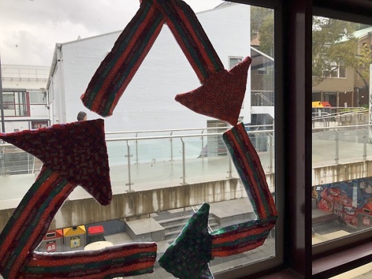

Final Work - Cycled
Made from recycled festival entry bands and cotton
Assessment Two Major Work
Following my work in Assessment Task One where I researched design and sustainability and came to the conclusion that currently the textile industry was wasteful, and created a poster that evokes one to consider their impact, I wanted to create a work that demonstrated sustainable practices. Through initial research I discovered the most harmful aspects of the textile industry currently are harmful dyes, single use textiles and fast fashion. (1)
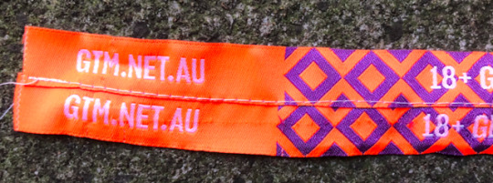
I experimented first with natural dyeing and had a failed outcome that lead me to look at other options for a major work. I came across some single use textiles from a 2018 festival that was now industry waste. Thin strips of synthetic woven yarns in bright colours that allowed one entry to the festival Grooving the Moo, and once the festival was over was useless.
I experimented with these strips in various ways of joining them together to create a flat fabric that I could then use to create a work or textile art, and in experimenting I found that they were fairly difficult to utilise. I struggled to join them together neatly and together they often looked messy due to the clashing colours and bright tones, however once I established a stitch that could connect them it was interesting to play with They could not create curves at all so I was very limited to straight lines and boxy forms. Once I had stitched and woven various ways I was stuck in considering what my work utilising the waste could actually be.
I found a designer Laura Heine (2) who made quilting patterns utilising small strips of colour and patterns and really liked her work. They were very intricate designs that held a simple picture but held must deeper technique beyond first view. I attempted to create a few sketches with her as inspiration but she often uses subdues colours various whites, and trying to stay true to my project, I wanted to attempt to only use the bands. I took her work of combining segments of colour but unfortunately realised I would be unlikely to create an image. After reflecting both on my research, experimentation and inspiration, I struggled to create a design that would satisfy my own brief of completing the textile waste cycle – re-use.
Finally, a breakthrough occurred after discussions with my tutor and peers, I could create a sample or prototype work that could be implemented on a wider scale by those running the festival. I wanted to avoid creating a work that was heavily branded or linked strongly to Grooving the Moo in particular, so focused on in general single use textile waste by events. Thus, my work proposes a hypothetic solution for event planners on how to re-use the single use textiles (beyond no longer utilises single use textiles). My work is a textile art piece with three arrows that create a cycle – a symbol synonymous with recycling. This symbol (if recreated bigger) can be utilised at the festivals as signs to inform about sustainable practices. The work was creating with a combination of weaving and zig-zag stitching the bands together and sewing these with a backing of white cotton to hold their shape. The works can be hung or places together but must always be arranged to create the cycle.
My experiments lead me to understand how all individuals can experiment with their textile waste to find a solution to how to reuse it and further lead me to believe that all producers could consider a possibility for a new life after its first use has been fulfilled.
My work provides a positive viewpoint to the discussions of textile waste, and although currently the industry is wasteful there are opportunities for all levels of consumers and producers to reconsider their usage and change their habits so that they are ensuring all the textile products they use are able to be recycled and reduce environmental harm.
(1) Wallander, M. (2018). Why Textile Waste Should be Banned From Landfills. Retrieved from https://www.triplepundit.com/2012/01/textile-waste-be-banned-landfills/
(2) https://www.fiberworks-heine.com/
1 note
·
View note
Photo


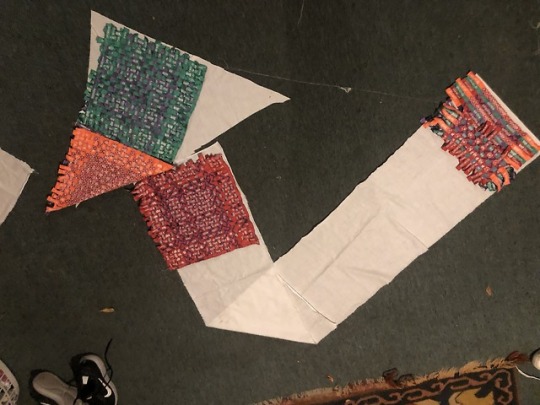

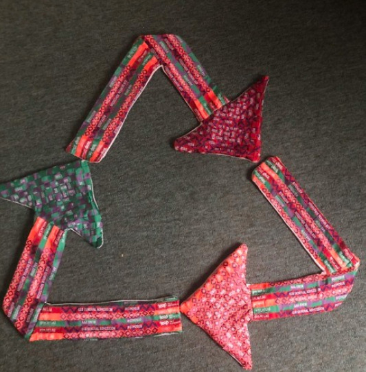
Creating Final Work - Choosing Scale
When first creating the idea I was wanting to create a large work (Image 1), perhaps just using a triangle shape with no arrow heads. I figured I did not have enough bands to be able complete a work that large.
I then considered just creating one arrow of the three at the size (Image 2), but placing the designs on the backing it looked very cluttered and messy and I was stuck trying to balance the design with one very bright orange, a red and green. (Image 3).
I decided I needed to minimise the work. (Image 4) I liked the thickness of 6 or seven bands going across and I could complete the cycle with three arrows at this size. I liked the look of one colour weaving rather than multi colours and coordinating this with the colour strip of the border on the horizontal part.
Overall the smaller scale works well as a hypothesised work and I was able to balance the designs within each arrow and across the three of them really well. (Final sizing and pattern in Image 5)
0 notes
Photo


Process of Final Work
Images Above:
1 - straight stitch settings
2 - zig zag stitch settings
3 - Process of stitching strips together
4 - First attempt at weaving (was very very time consuming this way, hand stitching each row as I completed it)
5 - Second attempt at weaving (Pinning as I went and machine stitching at end - result not as tight but still effective and way faster)
6 - Cutting triangles out of weave
7 - Backing of triangle cut outs
8 - Arrow backing shape pinned
9 - front side of arrows whilst pinned
10 - Sewing the backing and front together
(After stitching had to cut the edges as small as possible, fold in the right way and stitch closed the gap left with clear thread)
0 notes
Photo


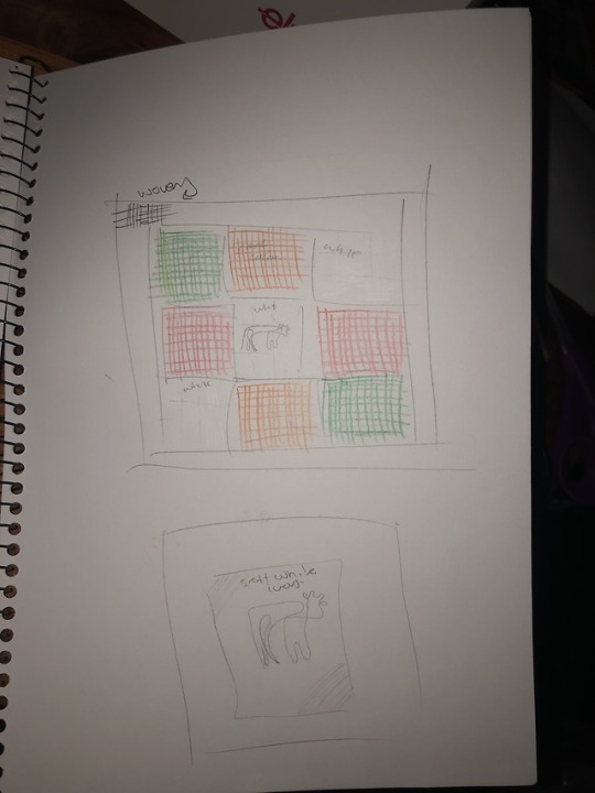


After experimenting with the material I was very lost for what to create with them. I had been given them by someone and I knew they expected something I could show the I had transformed them into, so during Week 8 I discussed some options with Matthew. I considered the reason behind my work, completing the cycle that the modern textile industry has discarded. Matthew considered speculative design which could be cool. Perhaps looking at possible uses that the festival organisers could have rather than random students who get given them. I worked through a few designs and sketches.
I figured after a few days of complete zero creativity that I could create a prototype or hypothesised work that the festival could actually implement to complete the cycle of recycling. After all that was the question I was addressing, why don’t we recycle our textiles anymore? Working on from my last assessment seemed the most logical way to continue my questioning. From my changed triangle of arrows that pointed outward I knew I could do something related to the recycling symbol in a semi small way and hypothesise that the festival could also produce a piece of work but on a much larger scale.
0 notes
Photo


Experimentation - Plaiting
Using my interest in rag rugs in my initial inspiration I wanted to experiment with knots or plaiting of some sort. I create a layered mixture of all three coloured bands and plaited them together. I began slowly and only completed the first 5 rows before stretching them out and looking at the result.
I did not really like how they looked and the gapes that were between them, knowing I wanted to make a flat piece of some kind this would leave gaps in my work which means I would definitely not be able to line it.
I felt it started looking very messy which I did not want to create. I want a way to make wasted fabrics see a new life which was still very aesthetically pleasing.
0 notes
Photo
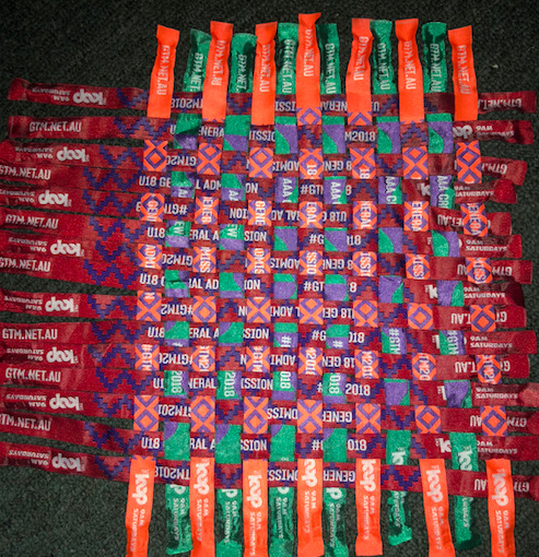
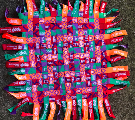
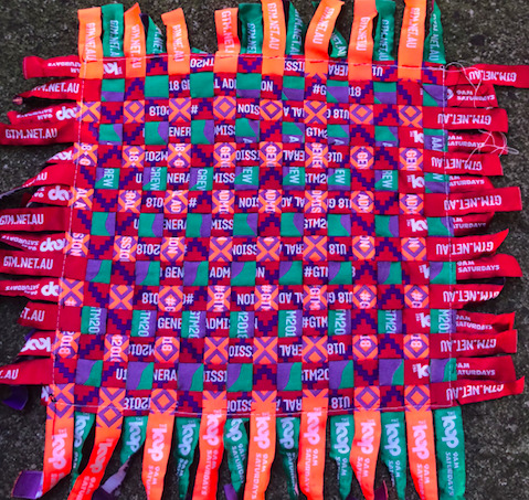
Experimentation - Weaving
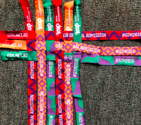
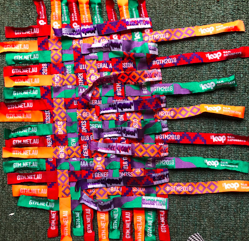
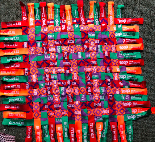
I wanted to see if I could weave the strips together. I originally started weaving with 15 across and down and all three colours in both the vertical and horizontal positions (process seen in Images 1, 2 & 3, Ren Result in Image 5).
I think the process worked really well although was very time consuming. The three colours running both ways meant that were were regions that had three squares of the same colour when they interlocked each other. I don’t think it was bad but it did feel a little messy and unresolved.
i then tried running just red horizontally and green and orange vertically (process in Image 4 and end result in Image 6). I think the result is much more cleaner as each colour only interacts with other colours. think the combination of the colours int his way also do not let the neon orange take over, and the red does not seem to fill all the space as it is more subdued.
overall weaving is a successful technique and I really like the end result of it, but choosing the colour bands running vertically and horizontally needs to be a conscious decision.
0 notes
Photo
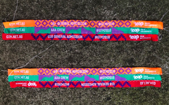
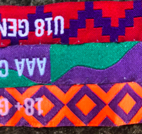
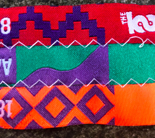
Experimentation - thread Choice
Picture 1 - comparison of clear vs white thread choice
Once I knew zig zag would be most effective, I wanted to experiment to see how the colours would look with the thread chosen as the stitch was very noticeable. I compared combining all three coloured bands together using a clear thread (Picture 2) and a white cotton thread (Picture 3).
The clear thread doesn’t run though my machine as well as cotton does but it’s not the wort, it just sometimes jams by bobbin which can be frustrating especially in the middle of a line. When combined the bands look like they have just been placed side by side, and the small gaps between each strip is pretty noticeable which is a disadvantage.
The white thread creates another design element which I thin works well with the white text already on the bands and actually helps balance the combination of colours and patterns on the bands. The small gaps between are less obvious. The cotton also runs through my machine a lot smoother.
I think unless I’m trying to create a design using just the colours, the white cotton is the best option
0 notes
Photo
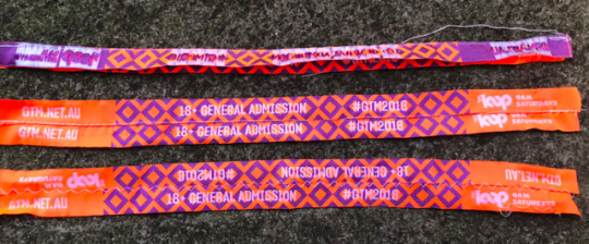
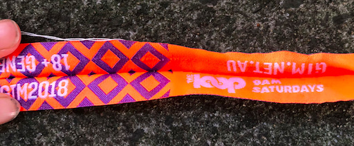
Experimentation - Joining strips together
Picture 1 -all three methods
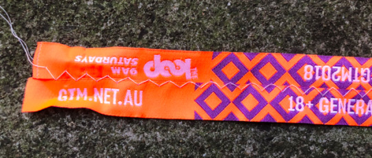
My first experimentation with the wrist band was to see if I could stitch them together and what way would be most effective. I tried to seam them together (Picture 2), overlapping them and straight stitching (Picture 3) and laying them next to each other and utilising a zig zag stitch (Picture 4).
The seam was really ineffective, not only did it cut some width off (and they are already very small), it also could not lay flat by itself. The way to generally stop this is to sew a wider seam but space is very limited so seams would not be effective.
The straight stitch worked but again stole some width from the bands and also was very obvious if the stitching was not perfectly straight. Not only that but also a whole where I veered off track is very noticeable.
the zig zag stitch unexpectedly was the best option, it did not take away any space from the band and it was hardly noticeable that the stitching was not all straight and on track (which can be a very useful advantage). I also liked the balance the stitch gave across both strips.
Overall the zig zag stitch is most effective at combining
0 notes
Text
Inspiration and Research
Based on the thinness of the strips I knew that I could combine them in a number of ways so I looked into some designs and how I could create something.
Of course there is simple stitching and weaving techniques but I was looking into some more interesting designs.
I came across a few options such as
1. Rag rugs
These are made from offcuts of yarns and fabric and essentially weaved and tied in different places using a number of different colours and fabrics. They look really interesting and are seemingly pretty easy. This technique can also be used to create bowls and baskets
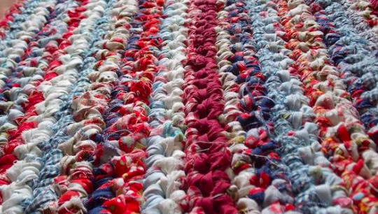
Photo Above from: https://www.selvedge.org/blogs/selvedge/the-rag-rug-revival
2. Tapestry weaving
This is really complex weaving and i’m unsure as to whether the strips would be very effective at creating an image but I still thought the way of combining is really beautiful and is often done with wasted leftovers from other works. It is generally done with yarns or wool
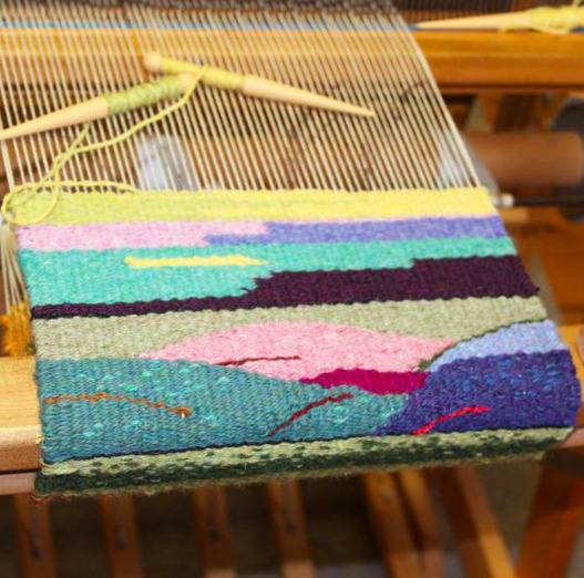
Above image from: https://harrisville.com/products/tapestry-weaving-class
Artist - Laura Heine
I wanted to look into an artist to get some inspiration as to how I could take the project and I was looking at woven patterns as I think I’m likely to take that course and I found Laura Heine, who is a fairly small time designer who creates and sells pattens for quilting featuring small strips/patches of colour. I originally found her cow one (because grooving the moo) and then looked at some of her other works and thought they were really cool, I don’t know how the strips I have with text and multiple colours would do in the same style of work but I thought her work and designs were really interesting.
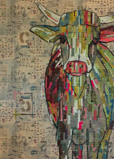
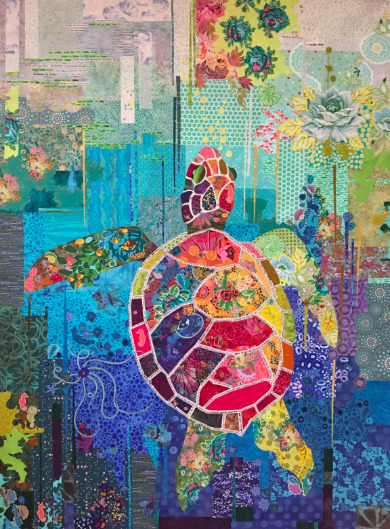
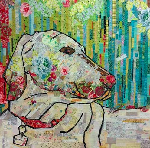
Images found at: https://www.fiberworks-heine.com/
Material - Grooving the Moo Entry Bands
I knew with the bands I would want to design something that had something to do with the festival to complete the cycle. They tend to use a lot of screens as backgrounds or non-woven fabrics for signage that features a lot of branding. Non-wovens are generally made synthetically (because these certainly don’t look like felt, the only other alternative is synthetic) ad can take a while to break down. Not only this but because they are branded, each year requires totally new signs and productions.
Grooving the Moo recently started a Green The Moo initiative focusing on plastic waste at their festivals left by festival goers but so far it seems no practices of the festival itself are incredibly environmentally friendly.

Above Image from: http://musicfeeds.com.au/news/groovin-the-moo-2015-set-times-unveiled/
0 notes
Text
Assessment Task 2 Working
I attempted some natural dyeing and the results were not as great as I had planned, I was thinking of continuing down this road of the kind of waste that the textile industry as a whole could have on the environment and an alternative would be natural and slow textiles, however a visit to my home city uncovered something really exciting.
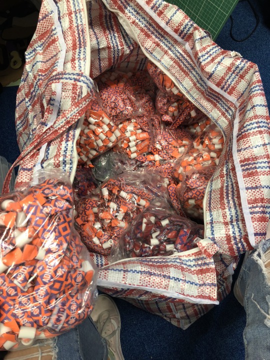
I found myself in possession of actual industry waste. I was given literally 1000 wasted textile wrist bands from a local 2018 festival - Grooving the Moo. The bands were three colours with text and a pattern and I was very interesting to see how I could combine these in a way to create something with them. Although I’m still interested in working and looking at different and more environmentally friendly processes - i didn’t want to pass up the offer of such a cool material. And textile waste related perfectly to my research in Assessment 1.


0 notes
Photo


Natural Dyeing
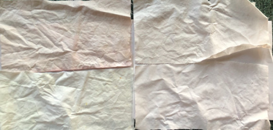
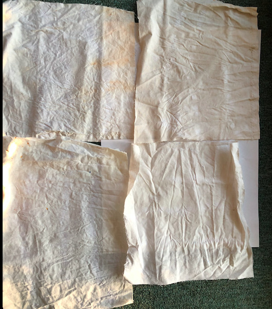
After seeing the exhibition at the UNSW galleries I wanted to attempt some dyeing with natural ingredients. I researched some interesting ways to go about this and utilising dyes that I already had available in my kitchen.
http://www.allnaturaldyeing.com/natural-dye-colors/
https://www.designsponge.com/2014/08/printable-freebie-natural-dyes-chart.html
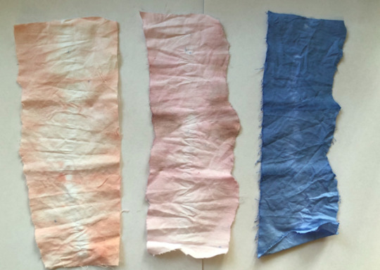
I utilised silverbeet, citric peels, paprika and beetroot from my kitchen and utilised store bought natural dyes in the form of madder, cochineal and an indigo powder. Just attempting to dye a plain simple cotton weave.
With the natural foods I attempted two ways as I had read about moth methods, one was boiling the food in water and letting the fabric sit in it and the other was sitting it in hot water and let it stand until it cools. I tried both methods and just followed the directions for the store bought dyes (sit in hot water for a few hours).
The results of the natural foods was really disappointing to be honest, especially with the beetroot as it usually creates such a vivid stain. I think I may have over-boiled them as all the colours are very faint from the pots (hardly visible at all in any images I take). The letting sit ones were better but only for the beetroot and paprika. If I wanted to continue trying to dye I could reattempt these with possibly more food/dye and less water but I would have to experiment a lot with the amounts used.
The store bought dyes unsurprisingly worked really well, the colour isn’t very vibrant from the bugs or root but the powder worked really well, could experiment further by crushing up the first two possibly.
Overall I think the process of slow textiles is important and much more rewarding than mass produced and large dye vats, what comes out can be very individualised and pretty.
0 notes
Photo


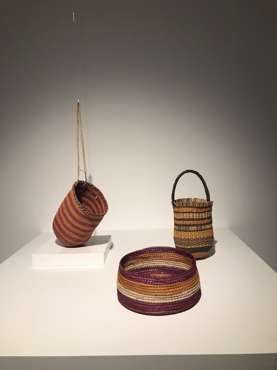


The exhibition at UNSW Galleries Local Colour : Experiments in nature was really interesting. The emphasis on ‘slow textiles’ fits really well into the area of interest in the assessments. I was very intrigued by the wool disk of segments that had been dyed utilising eucalyptus trees and I loved the outcome that resulted especially up close. The process of natural dyeing can be so slow but the results are incredible, nothing that synthetic dyeing could attempt to replicate.
The wound bowls and bags were interesting and actually used a similar technique that we had been taught in high school, reminding me so much of our major works. The process is tedious but again the outcome is so unique and interesting.
Definitely keen to explore more into this aspect of sustainable textiles.
The bottom two images were pieces I was interested in at the MCA. I thought the torn together red one was amazingly clever, and the sustainable artists utilising branches and drift wood were upstanding.
0 notes
Photo
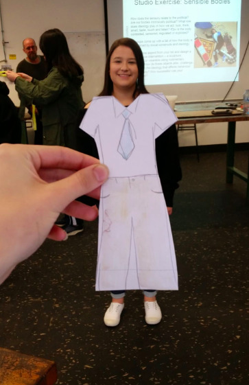
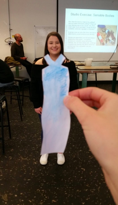
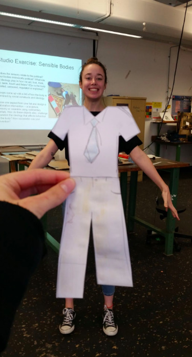
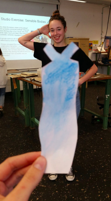
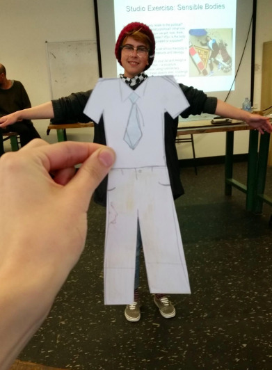
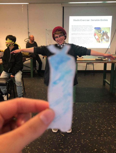
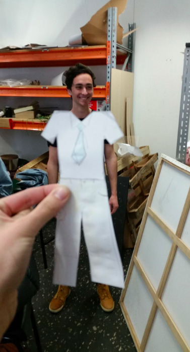
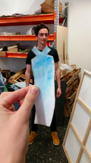
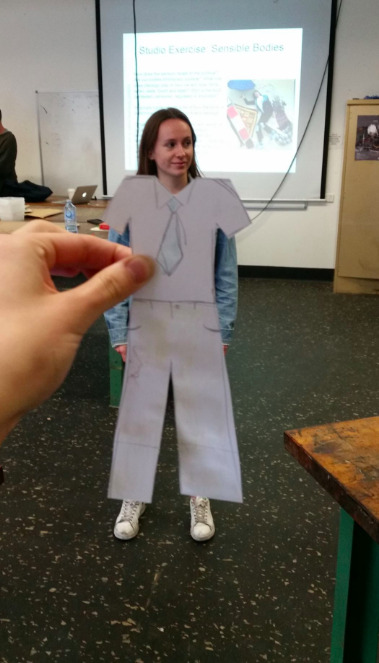
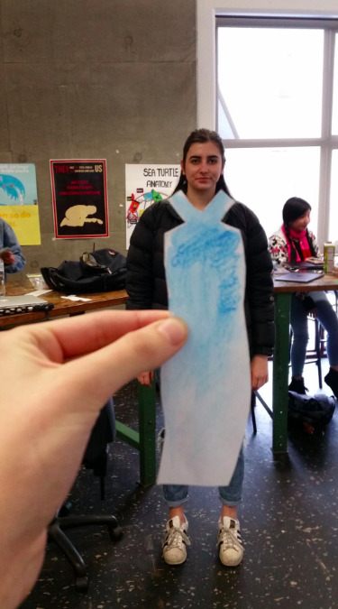
perceptions and clothes
how easily a ‘uniform’ or a ‘norm’ can be changed
0 notes
Photo


Assessment 1 Final Work - Circular
My final work is a wearable poster that demonstrates the lifecycle of a piece of clothing. It can be shown in a variety of ways including as a poster on the wall, among other clothing or worn (as shown above).
Question “Art and Design often explores relationships between humans and non-humans, the environment and ecology. How can contemporary art and design propose new possibilities for imagining the ‘human’ and the environment?”
Statement
When posed the question to consider the interaction between humans and the environment the first word I thought of was wasteful. Our use of the environment is wasteful, not only utilising resources inefficiently but wasting the opportunity we were given to respect and value our beautiful surroundings. I wanted to create a poster that showcased this wastefulness. I focused on the waste created through the fashion industry and researched around this. The facts were shocking but I was most surprised by the statistic that 95% of textiles in landfill is still reusable. (1) Knowing this I wanted to create a poster that made viewers question their use of their clothing. Through some investigation in successful environmental campaigns (2) I knew that short statements that evoked questioning were best. My concept was to reutilise the green arrow cycle (Reduce, Reuse, Recycle) and change the form to represent the truth behind a piece of clothing’s life cycle. The form of a symbol so commonly used and known in a new context would spark a viewer to question what was wrong with the newly presented cycle, and furthermore their use of textiles. My poster/wearable art belongs in any context where consumers for fashion could see it, be that hanging in clothing stores, being worn by individuals or even being displayed as a plain poster on the wall. My research into designers working with sustainable practices particularly those using recycled materials such as Anny Duff (3) and the ‘Y Waste’ campaign (4) shaped how my work was formed. It was integral to avoid ‘greenwashing’ (5) where unsustainable practices are used to create campaigns promoting environmental friendliness, so I focused on utilising recycled materials. My work demonstrates how design can question the relationship that currently stands between humans and the environment and offers a path of designing and creating that is less wasteful.
(1) Spring, A. (2018). Landfill becomes the latest fashion victim in Australia's throwaway clothes culture.
(2) Environmental Awareness Posters & Advertisements | UPrinting. (2018).
(3) Campbell, C. (2018). Clothing designers turning offcuts into offbeat fashion.
(4) Redress - On a mission to promote sustainability. (2015).
(5) About Greenwashing | Greenwashing Index. (2018).
1 note
·
View note