
Don't wanna be here? Send us removal request.
Statistics
We looked inside some of the posts by jessicahaydonblog-blog and here's what we found interesting.
Average Info
Notes Per Post
0
Likes Per Post
0
Reblog Per Post
0
Reply Per Post
0
Time Between Posts
2 days
Number of Posts By Type
Photo
11
Text
6
Last Seen Tumblr Blogs


Fun Fact
US Tumblr user growth rate is estimated to slow down to 4.1%.
Photo
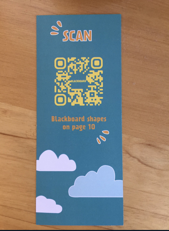
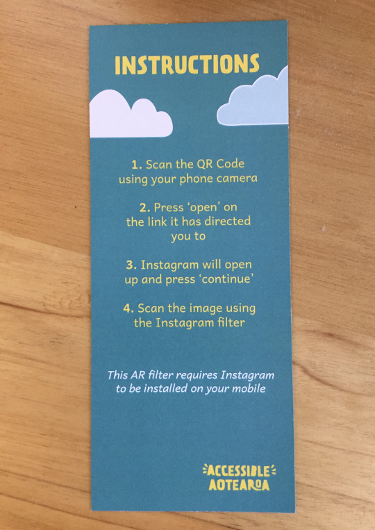
Sophia created a bookmark which goes with the book, to instruct on the process of augmenting the classroom page. The bookmark is fun and playful to be in keeping with the book.
0 notes
Photo
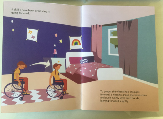
From feedback I received I decided to break up the text and have it in two seperate paragraphs instead of one, which I previously had as it will be easier for the child to read.
From this prototype I received feedback regarding the text in terms of having widows and to work on the rag.
0 notes
Photo

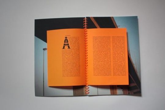

Research - binding
I looked into different bonding options for my book such as saddle stitch and spiral bound. I have looked into these binding options as they lay flat when the book is open which is needed for my book. Between the two options, I have selected the option of saddle stitch binding which has a spine as shown in the first image. This is because I believe spiral bound wont be as suitable for my book as I have illustrations running across both pages and I don’t want the binding to interrupt the reading of the book.
0 notes
Photo
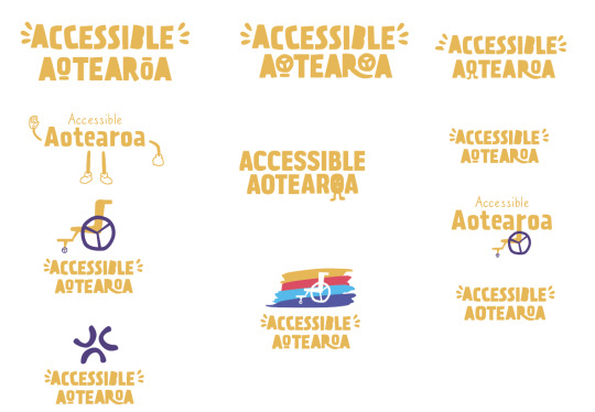
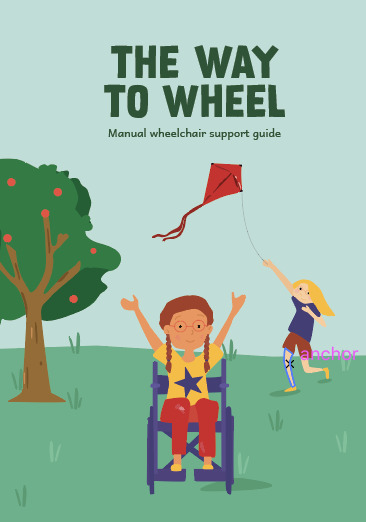
Group project - logo development
As a group we decided to change the existing logo as we felt it did not reflect our brand personality of being playful. Our final chosen logo represents more of a fun and playful tone, through the use of slanted letters and different sizes.
0 notes
Text
Speaking to an Occupational Therapist, I came to the conclusion that the most suitable option for my book is going to be a soft cover format compared to a hard cover. This is as it is more financially viable and is more easily transportable for the child. I will look into binding options for the soft cover book.
0 notes
Photo
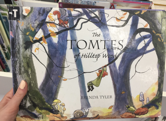
Research
I went to the library and looked at some children books to get some inspiration for the front inside pages, layout of text on the cover page and layout for the back page. What I noticed was that most children's books have a repeated title page in the first few pages of the book, this is something I might look into doing as it is also a place to put my name. I also noticed that most children’s books are hard cover which is something I might look into.
0 notes
Photo
Prototype testing
I printed my second prototype, to test the point size and layout of text. I believe the larger point size is working more effectively and the integration of text within the images, allows for more flow.
Through group feedback, I received feedback that I could incorporate pages with more negative space within the book, to help give the readers eyes room to rest and provide dominance to key points.
I also received positive feedback that the book could be a really helpful and positive tool for children in a wheelchair and the visual elements are effectively targeting the specified target audience.
0 notes
Text
I have decided to also produce a digital interactive book, as I believe it will cater to those who are more visually inclined and prefer reading in a digital space. The book will feature sounds, objects that move, and characters that appear.
0 notes
Photo
Layout of text
I tested a few options for the layout of text on the front cover. I found the second option of stacking the text, to be the most effective as it has a stronger hierarchy and has more negative space around it.
0 notes
Photo
Testing fonts
I tested a range of fonts, to see which is the most suitable and legible for a children’s book. I found the second option to be the preferred one, as it still has a child like quality to it, yet it is legible and adds a bit of character.
0 notes
Photo
Testing placement of text
I tested three layout options for the placement of text. Through feedback, the preferred option is the the middle one. This option is the most effective out of the three, as the text is integrated into the scene, which creates a sense of connection as it isn’t disjointed form the imagery.
0 notes
Text
I did some research by looking at the point size that should be used for children's books, and found that point size 14-16 is most suitable.
0 notes
Photo
Prototype
I printed my first prototype, to check the point size and how it works in a physical format. Through feedback, I found that the point size is too small for children. I also received feedback, that there is too much text as well as the text being at the bottom of the page, feels disjointed form the imagery. These are things I will consider and refine.
0 notes
Photo
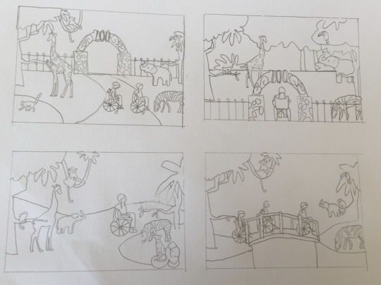
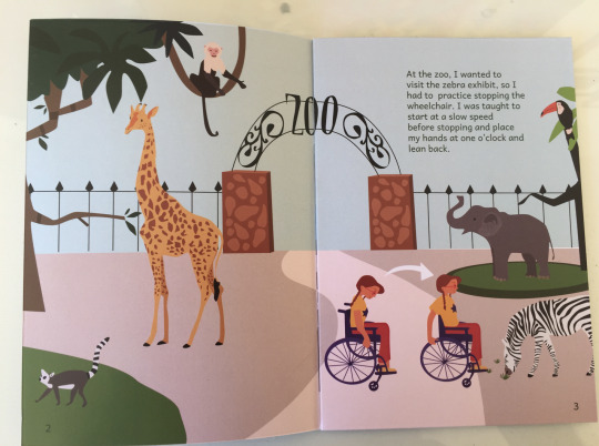
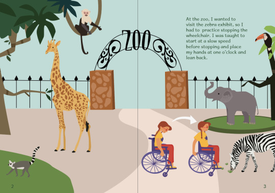
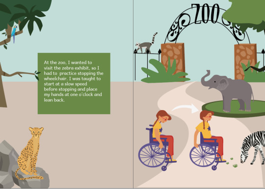
Layout testing
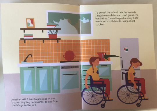
I did some testing of different layouts for the first scene. Through feedback I received, I have decided to go with the first option, with the character stopping the wheelchair to see the zebra. We decided on this layout, as it feels more balanced and we liked that we can see the girl in the wheelchair, opposed to only seeing the back of her.
0 notes
Text
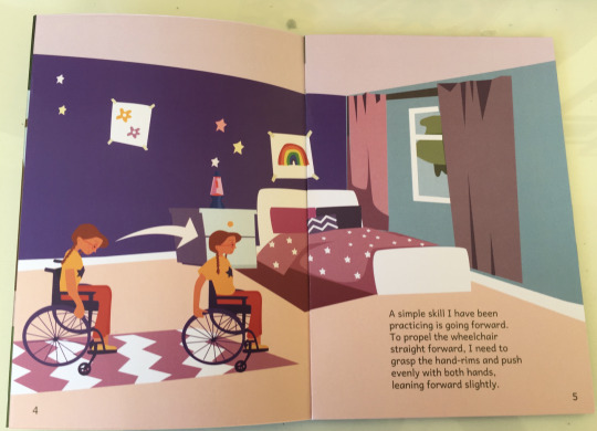
Plan
Stopping the wheelchair - zoo
Going forward/backward- home
Moving turns- school
Going through hinged doors-movie theatre
Going up/down a ramp-park
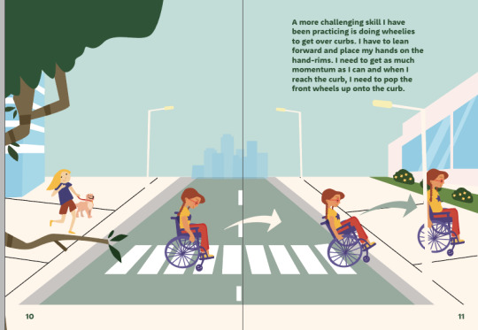
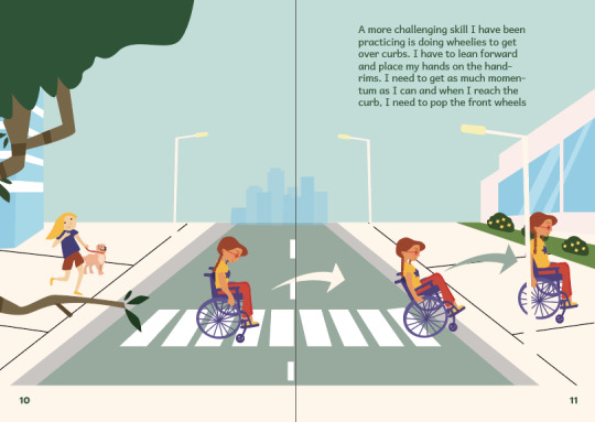
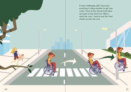
Going up/down a curb-road
Going over a threshold lip-cafe
Going around objects-supermarket
Going through manuals and online sources, I narrowed down the most important wheelchair skills and the location the skill will take place.
0 notes
Text
I did some research by speaking with an Occupational Therapist. I found this very insightful as it made it clear to me that there is a lack of easy to read guides for children in a wheelchair, with there only being large manuals, which are hard to read.
0 notes
Text
Through discussions, Sophia and I have decided to work collaboratively as we believe together we can produce a stronger end outcome, that covers many platforms. In particular, I am illustrating scenes which Sophia is then going to animate, to bring it to life and add another dimension.
0 notes