A research blog documenting a range of critical material, visual examples relating to themes, critical perspectives and notes on academic material.
Don't wanna be here? Send us removal request.
Text
Will Gompertz - What Are You Looking At
This chapter begins by saying that postmodernism can be defined as anything you want it to be defined by. Gompertz explains that modernism is generally thought to have ended in the 1960s with minimalism.
The definition of modernism was simply a quest to find one all encompassing solution to all of humanity’s problems, whereas post modernism came in with the belief that this was a naive way of thinking. He gives examples of the creations that encompass both modernism and post modernism elements as the transition between eras was happening.
I think that the point that this chapter is trying to make is that it can be hard to define modernism and post modernism. It is almost impossible to define their time spans. But generally modernism was about very specific and definite ideas and post modernism is more about the subtlety. It’s the difference between a book saying “he looked sad” and “once the first tear got away, the rest followed and there was no sign of them stopping. His lungs rummaged for oxygen, and his sobbing had the same force of someone drowning.”
But often post modernist art is even more cryptic. Gompertz explains that although many pieces can be appreciated in their own right, many make reference to other pieces of art or even other events that could give even more meaning to the the art. He says that the viewer is rewarded for their knowledge. He makes the bold statement “there is always more to postmodernism than meets the eye”.
0 notes
Text
Glossary
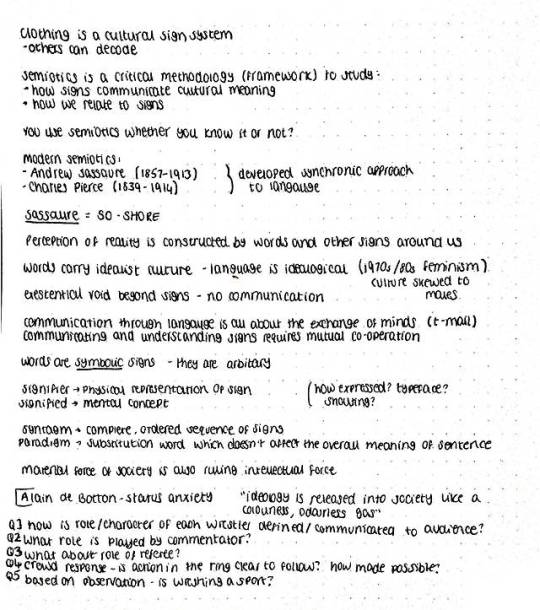
Anchorage - Describes the relay between words and images
Arbritrary - No connections to anything else
Codes - Signs that are organised into groups
Connotations - Ideas that stem from a sign
Diachronic - Evolution of linguistic signs through time
Iconic Sign - Where the signifier resembles the referent sign
Indexical - A sound/thing that gains attention and alerts presence to a sign e.g. smoke to a fire
Intermediality - The emphasis of an image
Langue - The whole system of a language
Metaphor - One signifier seeming similar to a different signified
Metonymy - Replacing one signified with another
Myth - Thinking about things which are structured to send particular messages
Paradigms - Different choices of words when constructing a sentence (vertical lists)
Referents - Actual things that signs refer to
Syntagm - complete ordered set of signs
0 notes
Text
Chris Weedon - History, Nation and Identity
This starts off with a racist quote “No matter what colour you are, if you’re not white, you’re not British”. This is just inaccurate as anyone who was born in Britain, anyone who was raised in Britain, anyone who holds a British passport can fairly be considered to be British. People’s race and the colour of their skin have nothing to do with their nationality.
Weedon goes on to examine the culturally diverse Britain which exists in today’s society. It is a society where everything is designed to be inclusive of everyone, no matter their nationality or their religion. Even the Queen’s golden jubilee celebrations were designed to include everyone whereas in the past it would have been a christian focused event.
Identity is closely tied to nationality and tradition, and Britain as a multicultural society tries to celebrate that instead of discouraging it. It is a society where people feel close to each other, even though the majority of people in the country will never meet.
I think that Weedon’s intention was to make the point that heritage and history matter and should be acknowledged and represented accurately, even if we as a society have moved on from previous beliefs.
0 notes
Text
Dick Hebdige - Subcultures & Style
Hebdige starts off this book by explaining that a main purpose of subcultures is to distract society from their natural order. They are meant to disrupt the way that things are usually done.
He makes it clear that the people making up these subcultures are stronger as a group, and it is harder for them to get their ideas across as individuals. He also comments on how subcultures adopt their own rules and traditions, within those that society expects of them.
He ends with the point that the success of a few in the punk subculture encouraged an uprising of others wanting to join so they may also get to fly to the USA and partake in other parts of a showbiz lifestyle.
0 notes
Text
Definition of Subculture
A subculture is a group that exists within a larger culture that have interests or beliefs that may be different to those of the larger culture. According to Jenks (2004) subculture does not necessarily lead to the abandonment of all fo society’s rules and beliefs.
0 notes
Text
Paul Gravett - Comic Art
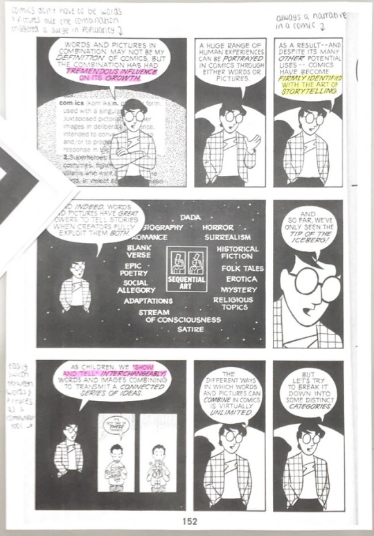
This piece starts by defining the birth of the comic which had previously been under debate. 1896 was decided to be the official birth with ‘The Yellow Kid’
This was largely due to one of the first uses of speech bubbles. They weren’t quite the standard speech bubbles that we know today, as the character was seen wearing them as if they were clothes.
The speech bubble was seen to give a level of animation to drawn figures that had never been seen before. Speech bubbles began to get more mainstream around 1930.
Gravett goes on to talk about panel sizings, and readers’ initial objection to reading comics with varying panel sizes. Of course, today it would be rare to find a comic where every panel is of an identical shape and size.
This was an interesting piece as it shows that it took some time for 2 of the most common features of comic books to be accepted as such.
0 notes
Text
Research - Tom Gauld
My chosen comic book artist is Tom Gauld, who is best known for his Mooncop comic.
He studied at Edinburgh College of Art and the Royal College of Art.

0 notes
Text
Scott McCloud - Closure and Transition Table
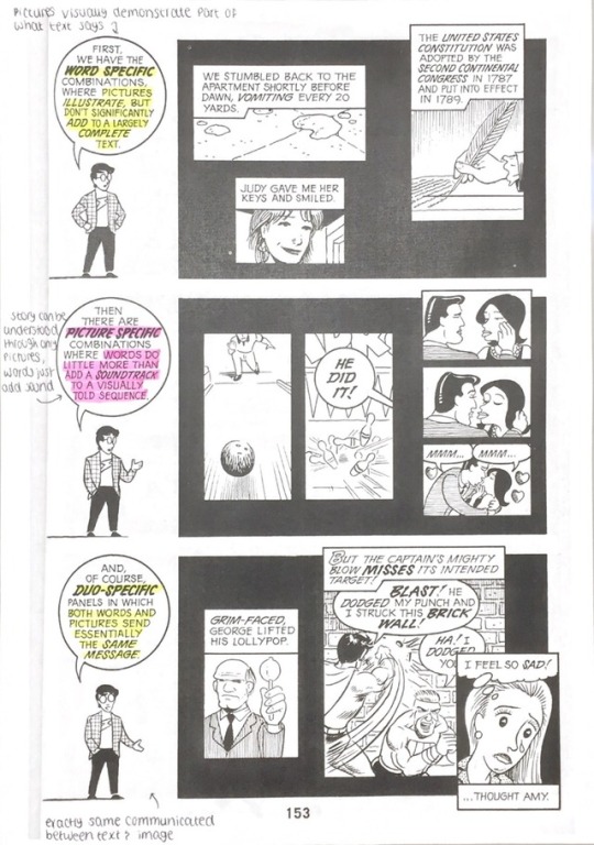
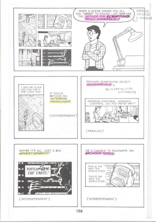
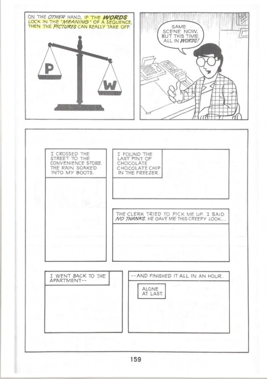
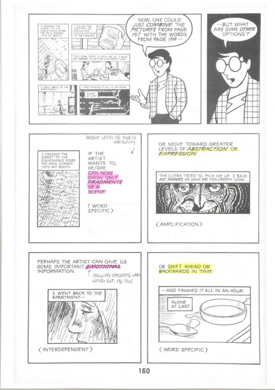
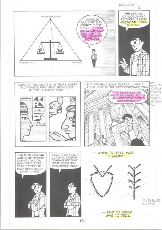
I think that one of the most important points made in this piece is that the reader can play an artistic role in a comic’s interpretation that can be just as important as the artist’s role.
The artist can deliberately leave out details, knowing that readers will fill in their own gaps in different and creative ways. The understanding of different panel transitions would be essential to accomplishing this effectively.
Moment to Moment
Doesn’t leave much to the imagination, short time passing and shows the same subject.
Action to Action
Skips all the boring parts of the scene where nothing happens and each panel displays the action. Leaves a little more to interpretation.
Subject to Subject
Each panel can display a different subject - needs the reader’s involvement to make the transition meaningful
Scene to Scene
Large jumps in time - up to reader to determine the specifics of what happened within the time jumps
Aspect to Aspect
Time and subject change - really requires the reader to be paying attention
Non Sequiter
No relationship between panels, completely open for the reader to interpret
0 notes
Text
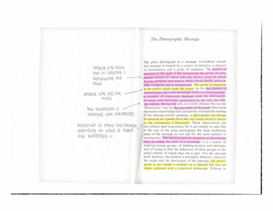
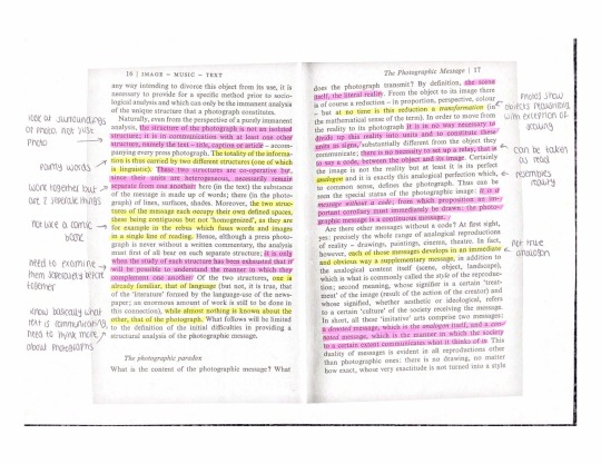
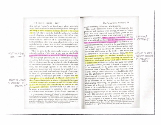
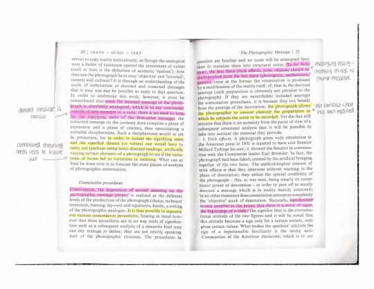
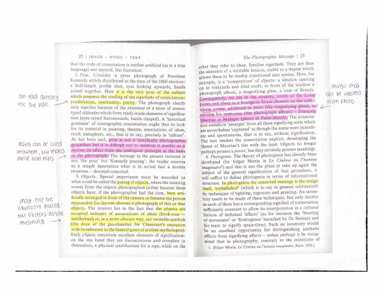
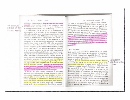
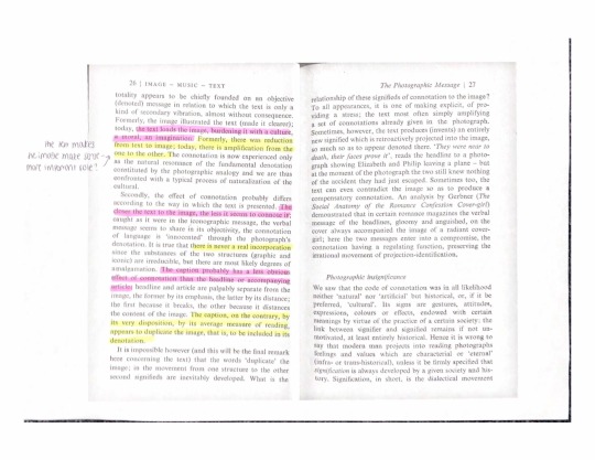
Roland Barthes - Rhetoric of the lmage
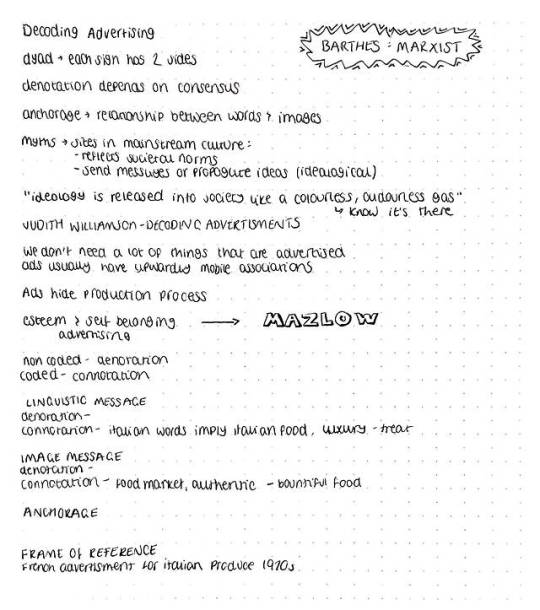
Barthes introduces this piece with the idea that every form of communication is a form of language, whether verbal or image based. He analyses the Panzini ad that we studied in our lecture. He separates the text from the image to analyse both individually.
After having analysed the image and the text, he moves on to both the denotations and the connotations. He breaks down the advert into many minuscule signs which are combined to create meaning.
My take on this is that the intended meaning of the ad can be reasonably understood by anyone, no matter their culture.
0 notes
Text
Jonathan Bignall - Deconstructing Advertising: Media Semiotics
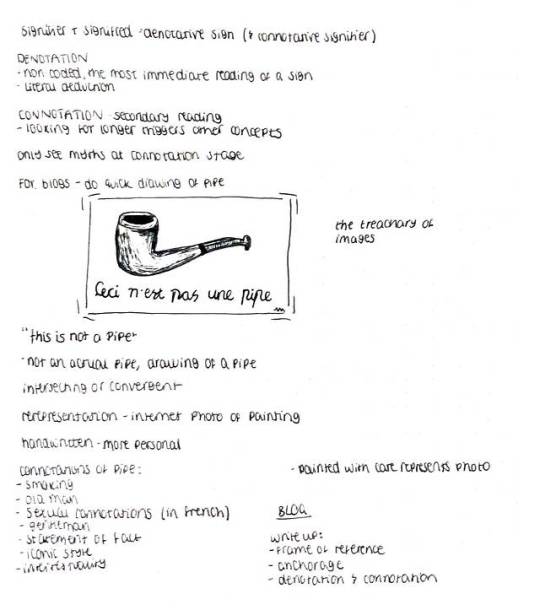
This was an interesting read, which placed a heavy focus on analysing the images used in advertising, particularly in magazine advertising. Bignell also makes a point of noticing how differently advertisements can be interpreted based on their placement, i.e. an advert in a bus stop could be received differently to an advert in a newspaper.
He emphasises the importance of professionals understanding semiotics before designing adverts for any purpose. He points out that ads can be criticised once broken down into their signs and signifiers for creating a mythic meaning. He claims that not only are ads meant to sell to the public, but also to create meanings.
There are factors which make creating a meaning in an advert a more challenging task, and these are the ambiguity in the meaning of signs, and differences in peoples’ interpretations of the signs.
Bignall claims that it is very rare that signs in ads only denote something - they often have many connotations also. He shows that positioning of signs within an ad can create huge differences in meaning.
I think that the idea Bignall was trying to convey in this chapter was the importance of signs and the fact that any advertising designer needs to have a strong awareness of how to use them effectively. If they don’t, not only may their ad be less successful, but they might also be unintentionally connoting things which could have a negative impact on the brand they are promoting.
0 notes
Text
Semiotic Analysis of Modern Magazine Ad

I will be conducting a semiotic analysis of the above ad for Nike.
To start with, the lighting is very dark which makes the advert seem ominous. The face that the shoe itself is lit up instantly draws the viewer’s attention to the shoe. The text is also light in colour which makes it stand out against the ad’s dark background.
The figure behind the text is not instantly observable to most viewers, but once seen it cannot be unseen. The figure is unmistakeable the Marvel superhero, Iron Man. The shoe is also coloured in traditional Iron Man colours, which strengthen the subtle connotations - as Iron Man himself isn’t even seen in his trademark red and gold.
Using a ‘hardcore’ superhero to promote a shoe brand provides obvious associations with the shoes being tough, and perhaps giving the wearer some of the special abilities of the Iron Man suit.
The Nike logo at the bottom of the ad, and the Nike logo on the shoe mean that the brand is still the main focus of the advert.
The text ‘The Sneaker Makes The Man’ signifies that the advert is definitely aimed at men. The associations with the bold, masculine font also support this implication.
The advert would be run in magazines aimed at men. All of the signifiers combined imply that the shoe will provide the male wearer with superhero abilities, and make them more of a man.
0 notes


