Don't wanna be here? Send us removal request.
Text
Eboy
I really like Eboy's city scenes I especially like that they are done in a planometric drawing style which adds depth to his piece. He also uses a lot of vibrant. but as with Paul Robinsons work they base there work on a scene and a much larger scale and they are mainly scenes and mine was based mainly around items and weapons.
0 notes
Text
Paul Robertson
Personally I am not a fan of Paul Robertson's work although the piece is done technically well I don't like his final outcomes. Even though the pieces I created are to a much larger scale, the process of creating the outcomes are exactly the same. The main difference between my work and Paul Robinson's is the theme and colour palate, he uses a more vibrant colours than I did. My piece were more based on individual items than a full scenario or scene.
0 notes
Text
My review of Brazil
Brazil is an extremely weird Sci-fi film from 1985 directed by Terry Gilliam. I wasn't able to follow the story being told in this film as I found that my interest would fade in and out during the film. I found that the plot wasn't clear, the story didn't make sense, and the one thing I did like about the film were the props because in 1984 when they were making the film it was still heavily based around physical props being made for the film which I personally prefer over CGI as I feel that with practical props it makes it more realistic for the viewers one of my most favourite uses of practical props is in the original film for "The thing".
0 notes
Text
Animation project
Evaluation.
I liked this project even tho I found it hard to get into it started with planning what I was going to animate and I chose to animate a robot walking across an apocalyptic city landscape were the robot trips and his head falls off.
At the start I drew a few different designs for what my robot will look like I ended up choosing one that had quite a skeletal look about it and had a basic look I chose this one because I hated to animate walk cycle that was similar to a human.
To animate the whole cycle I drew out 31 frames onto acetate using a sharpe and tip ex to fill in the pieces that I wanted to stand out I also cut out a destroyed city skyline from black cardayd little fires dotted around the skyline.
To edit the final piece I used Photoshop and used all the frames to make the animation.
If I was to do this project again I would try and make something more exciting and something that would catch the viewer eye.
0 notes
Text
Trailer project
Evaluation.
For this project I massively over complicated it by setting an impossible target to achieve by animating a three legged mech into a panning shot of the river Orwell.
At the start of the project we started by story boarding. What I originally wanted to do was for my trailer have two characters having a stand off using a different camera shots and i made a gun prop but it broke during transportation so that kind of ruined my original plan when filming at the night shoot. As my plans were ruined for what i wanted i decided the i would focus my work on creating a scene where there is something moving. So thats what i decided to do.
To create my mech I used google sketch up and used a variety of tools in the program. To start making my mech I knew that I wanted it to have three legs so i focused on making the legs were i made one and duplicated it three times and positioned them with one at the back and two at the front. Once I had them in the right position I started by finding a ball on the items library and using that as the main point that all the legs will join at and built up from there on my main body it has two rocket launcher turrets, one on each side, and one main large turret on top.

To prep the footage that i wanted to use I put it into AfterEffects and applied the 3D camera tracker which tracks the footage and shows points that you can build from and place objects so that they are fixed to the footage.
To create the walking animation I exported my original sketch up file to cinema 4D so that I can make and animation that would run smoothly, also with cinema 4D you can import the footage into cinema 4D so you can position it and it will update the footage as you move it in cinema 4D into AfterEffects.
My final piece ended being a 12 second clip of 5 mechs and one of which was animated and was an extremely difficult thing to achieve in four sessions, but I am happy with how it turned out and learnt a lot of new processes from this project.
If I was to do this project again I would set a target that can be achieved and have more of a story to it, and actually have it as a trailer instead of a short clip.
0 notes
Text
Layered project
Evaluation.
For this project I had fun with the design process as I used multiple programs to create different perspectives of what my final piece will look like. For my final piece I chose to create a image depicting a person looking over a city with certain buildings standing out.
I originally started by using AutoCAD to draw out my individual layers I further went on to draw the box around the layered pieces. To make the layered pieces I started working on it in a 2D layout and once I had finished all the layers I converted it to 3D I mainly used the line tool and the circle tool for the buildings. For one of the more complicated buildings I used the offset tool and repeated the pattern on each side then I strategically deleted certain lines to create a curved checkered pattern.Then i converted my piece into a 3D format where i drew out the box it would be put in and sorted out the distances needed in-between each layer and used it as a wire frame model.

For my other interpretation I used google sketch up to make a solid colour 3D drawing of the original AutoCAD drawing I did two versions one in full colour and the other I only coloured only the box. To create this piece I mainly used the pencil tool and the rectangle tool for the box, and to make the buildings I drew them out flat and then rotated and connected it to the layer it is interpreted with.

If I was to do this project again I would make the scene more dramatic and detailed ass i feel i could have done more with the scenario in the scene.
0 notes
Text
Mask project
Evaluation.
With this project I enjoyed the designing and making of this to start with I had to design the mask i chose to make a tribal style mask in the shape of a skull with horns. To make this I used 6mm MDF as my main material and started to draw on the main shapes I wanted.
To make the main skull piece I started by cutting out the main shape once I had done that I drew on where i wanted the eye sockets and nose hole to go I also drew on where I wanted the battle damage to go and inserts to put the horns. Once I had drawn it out I drilled holes into the eyes and nose holes, once the holes were drilled I got a coping saw and remover the saw blade and placed it through a hole and had sawed out the holes for the eyes and nose. Once I had the eyes and nose cut out I started to add the the damage and scars using the saw and files.
To make the jaw I started by drawing it out on another piece on 6mm MDF and cut it out with a coping saw and and used a disc sander to refine the shaped then I just sanded by hand to round out the edges.once it was cut out i added the damage and scars using files and saws. then I glued it to the main piece with a hot glue gun.
Finally to make the horns I used 6mm MDF and cut out the pieces with a coping saw once they were cut outI used the disc sander to clean it up and neaten the edges, and then I added in the damage using files and saws once I had done that I attached it to my main mask piece using a hot glue gun.
I painted the whole mask white and once that had dried, I went over the skull except the horns, I used a black paint and some paper to give it a more worn effect so I would apply a small amount of black paint and i would dab the paper over it to thin it out and to lift of some of the paint. For the horns I used brown paint and used the same technique as I did for the main skull part.
After i had painted it I hammered some nails into it and made some barbed wire which wrapped around each of the horns.
If i was going to do this project again i wouldn’t do much different apart from more detail and possibly made it bit bigger.
0 notes
Text
Land Scape project
Evaluation.
I had fun with coming up with designs and the overall making progress for this project. When making this final piece I was happy with the outcome as it resembled my initial drawings. When I was coming up with an idea I was thinking of going with a medieval type of landscape and scenario so for the landscape I went with a rocky, mountainous terrain which I also added a flat spot on one of the peaks so that i could place a castle there.
To make my castle I started with a piece of 6mm plywood which was roughly 25mm by 25mm and on top of that I drilled four holes roughly 6mm wide each so that i could add four towers which I sharpened on the disc sander. I glued all of that together with a hot glue gun and painted it grey with red roofs on the towers.
Next I had to make a dragon out of super sculpy and to do so you start of by making a basic wire skeleton. Once I had done that I wrapped the wire in foil making sure to have the wire skeleton keep its original shape. After that i make the skin for the wings by using tissue paper and PVA mixed with water to stick it together. Next I covered my foil base for my dragon in super sculpy and started to make the skin and use different modelling tools to make the head, then I painted it I went with green for the colour of the dragon.
To put this all together I had my main landscape and i placed my castle on the flat space i made for it and glued it in place. Next I had to figure out a way to fix the dragon in to my scenario and and have it in a flying menacing pose and to do this chose to use steel wire it fix it into the back and to the main body of the dragon and have it look like it is swooping in to the village at the bottom of the valley.
If I was to do this project again I would spend more time on the dragon and the castle I would also make it bigger so that I could get more detail in the castle and dragon.
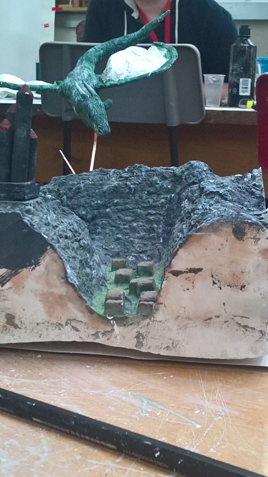
0 notes
Text
12/9/17
My review of Scott Pilgrim VS the world.
To start I personally really enjoyed the film and I especially liked the continuous comic book feel with the text going with the noises of the drums or from people crashing through walls. This film was quite special effects orientated especially during fight scenes, my favourite of the fight scenes was the fight against the twins as the fight was based around the special effects and the music playing in the background.
One thing I especially like about the directing style of Edgar Wright is the transitions between scenes which he doesn't only do in this film but many others of his. Although I liked the film I feel the ending was rushed and the film ended very quickly.
Overall I really liked the film and thoroughly enjoyed the how the film was put together and although I think the end was rushed it didn't ruin the film and I would recommend the film to anyone who enjoys comedies.
0 notes
Text
5/9/17
My review of Thor the dark world.
In my opinion the film had a continuous dark aesthetic throughout the film. In the film I liked the was the prop and costume design especially the costume and armour for Volstagg I also really like his battle axe. I also like the special effects especially the rock monster as afterwards I watched through the behind the scenes and the making of, which really helped me understand how they create creatures and monsters.
I feel the main downfall of the film is story and scripting and the overall darkness throughout the film but the special effects, costumes and prop design which helped the characters stand out in there own way. For example Thor has his hammer and Loki has his helmet and staff.
0 notes
Text
13/9/17
in todays session we planned out what scene/scenario we wanted to make out of plaster.
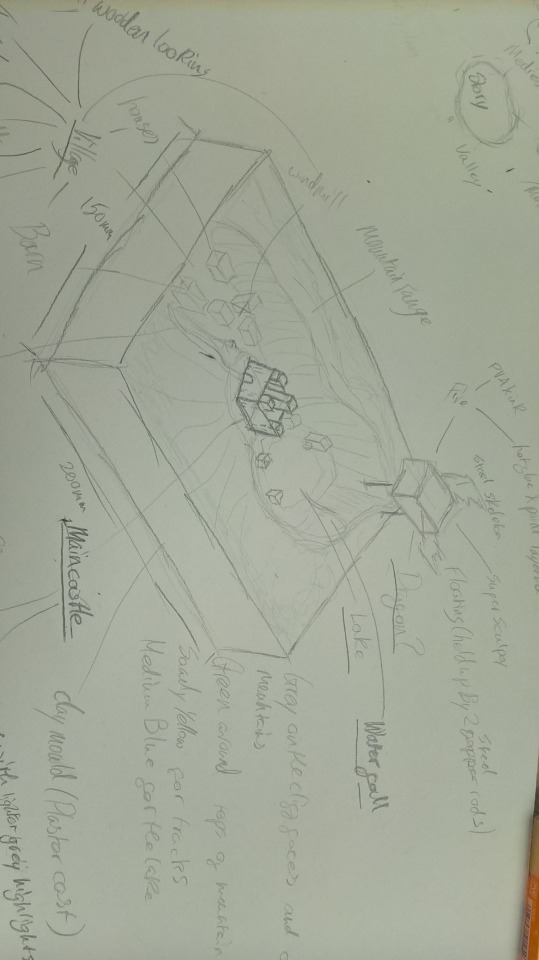
This is a drawing of my initial plan for what scene I want to make my design includes a mountainous scene with a medieval village in in the valley and a castle upon one of the ridges. In the end of the valley there is a small lake and above that I am going to make a dragon flying in to destroy the village.
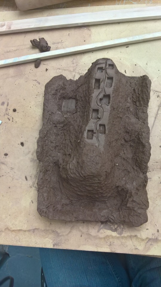
This is my clay mould for my scene.
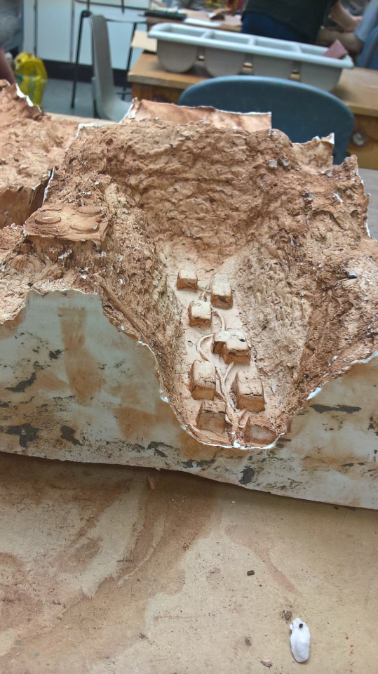
This is my final cast I still need to paint it and make little wooden houses and the castle.
0 notes
Text
12/9/17
in todays session we started to make our wooden 3D masks.
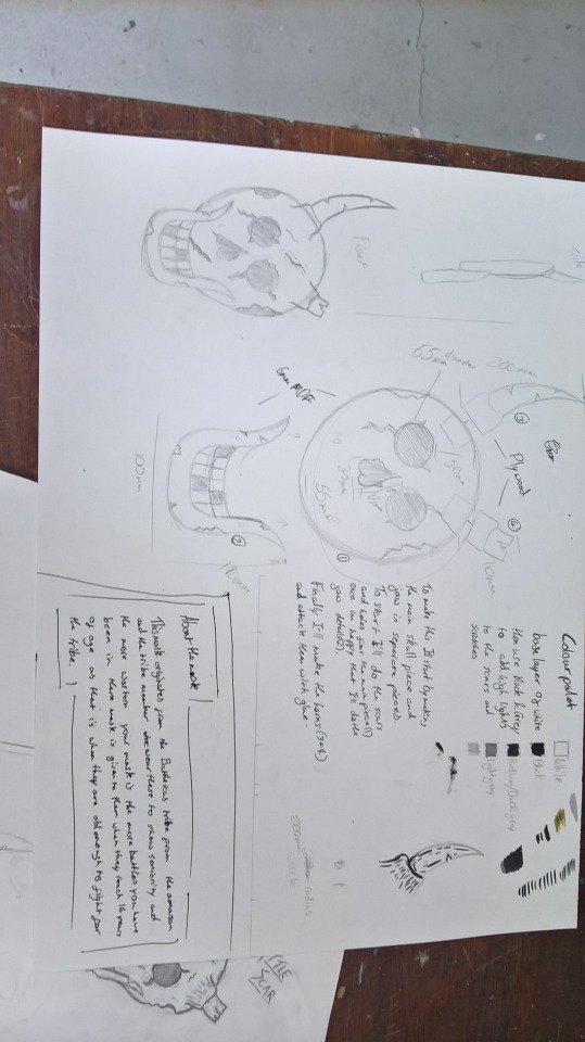
This is a picture of my work sheet and planning of how ill make my mask and how it will all come together.
0 notes
Text
11/9/17
In todays session we were in the mac room and we continued with pixel art but we took it a step further by making them into GIFs (Graphics Interchange Format).

This is one of the GIFs I made and it is of a helicopter coming into land.

this was the first GIF that I made of an infinitely bouncing ball I also did one of a ball bouncing from one side to the other.

We also had to make a landscape GIF and for that I made a spaceship flying past a sci-fi skyline.

An animated GIF (Graphics Interchange Format) file is a graphic image on a Web page that moves - for example, a twirling icon or a banner with a hand that waves or letters that magically get larger. In particular, an animated GIF is a file in the Graphics Interchange Format specified as GIF89a that contains within the single file a set of images that are presented in a specified order. An animated GIF can loop endlessly (and it appears as though your document never finishes arriving) or it can present one or a few sequences and then stop the animation.
0 notes
Text
6/9/17
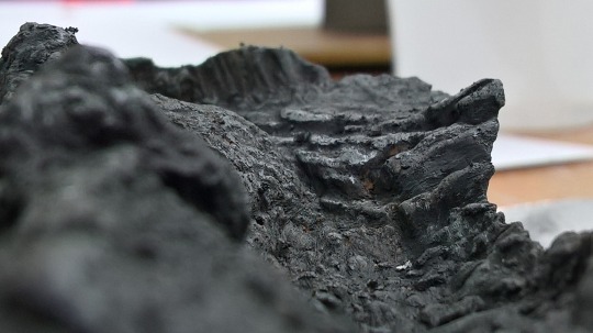
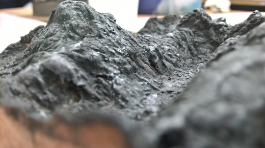
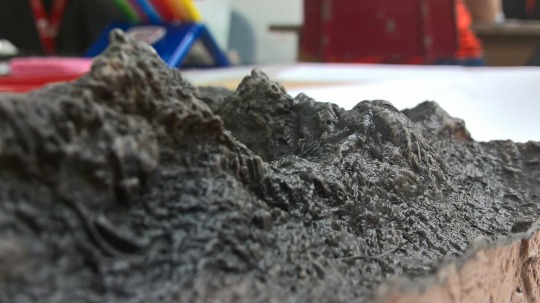
in todays session we where in the ceramics workshop where we poured plaster into our clay moulds which we made on the 31/8/17 on our induction day.
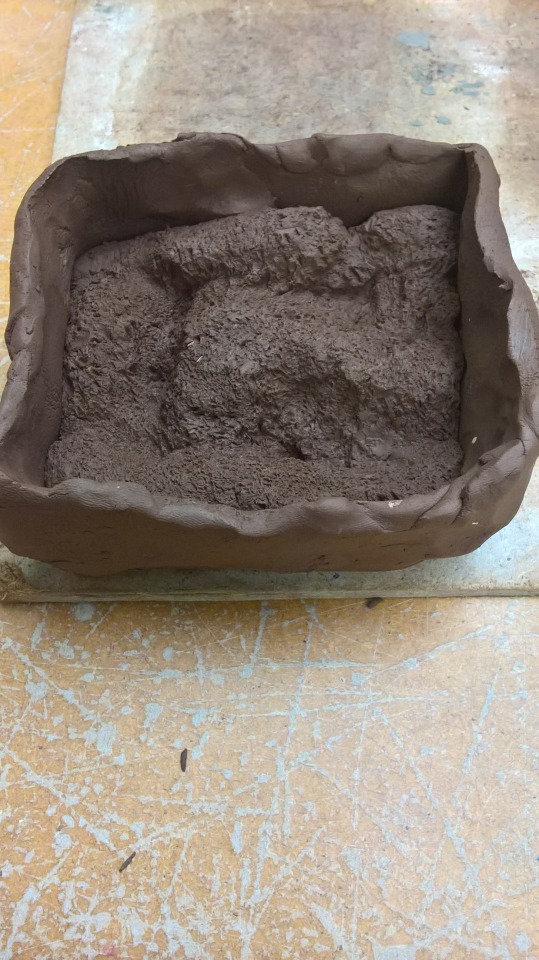
For my clay mould my initial thought was to to create a mountainous terrain with a valley or lake inside. But I later decided to make it a dark mountainous scene.
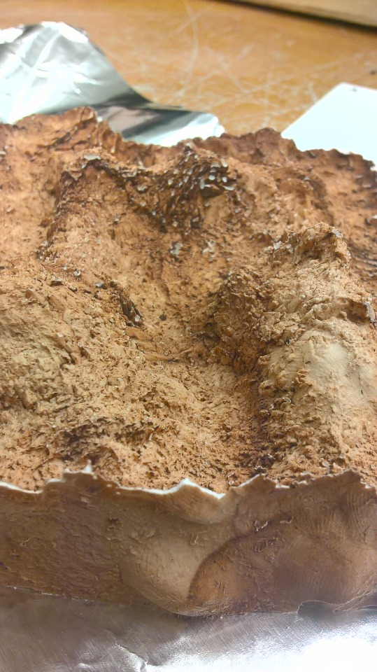
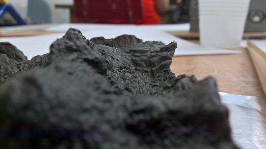
This is a photo of my piece once I had removed the clay mould. At first I wanted to keep it how it was because I liked the colour it came out as but I decided to paint it with an initial coat of a dark grey water colour and then added acrylic paint to show of the features.
0 notes
Text
5/9/17
In this session we had 3D workshop were we started to design our own 3D masks.
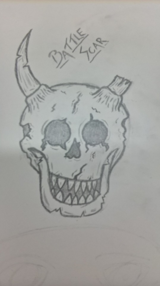
This is the mask that I want to make and the shaded parts I am going to have as gaps I am happy with the initial drawing and to make it I am going to try to make it in four pieces one piece the jaw and another piece the main skull piece and I am going to make the horns individually and piece them together at the end.
0 notes
Text
5/9/17
Today we had 3D workshop where we went through and learnt how to use the machines and what materials were aloud on each machine.
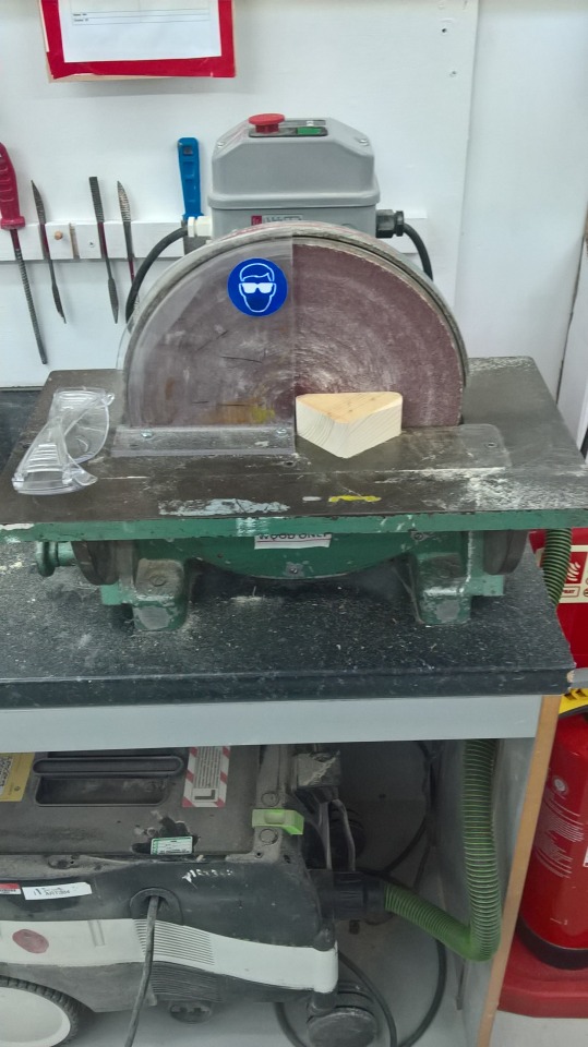
This is a disc sander which you can only use wood on.
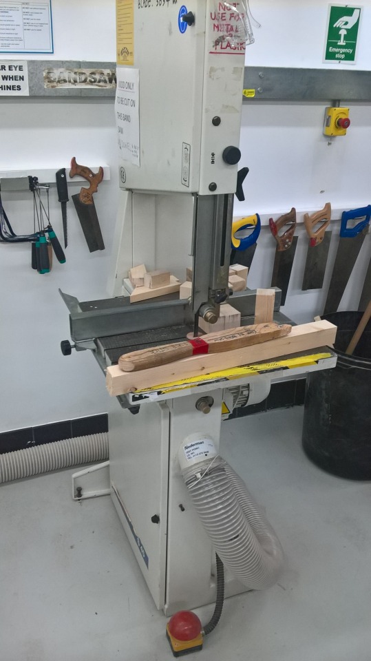
This is a bandsaw there are two large bandsaws in the workshop one for wood and the other is for plastics and acrylics there is also a smaller bandsaw which is also for plastics.
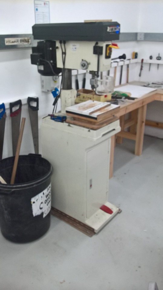
This is a pillar drill and you can use to drill pieces of wood.
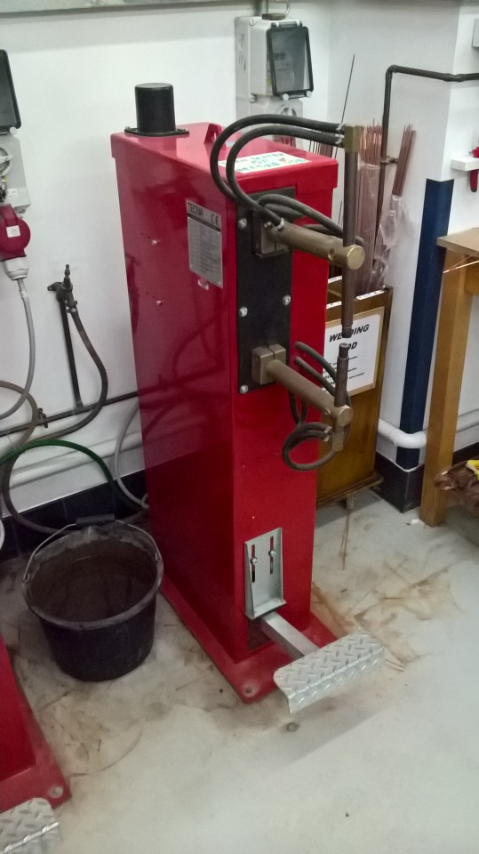
This is a spot welder where you can weld steel plates and rods.
0 notes
Text
for my next piece i created a pixelated strange landscape and these are the steps i took to make my end piece.


for my final piece i decided to go for foreign buildings which look strange I also included space ships in the mid-ground and for the back ground i chose to have a mixture of planets coming up around the horizon. i also added a yellow to red gradient which give a sense of other planets and stars rising.
0 notes