
Statistics
We looked inside some of the posts by jaleeanimation and here's what we found interesting.
Average Info
Notes Per Post
0
Likes Per Post
0
Reblog Per Post
0
Reply Per Post
0
Time Between Posts
16 seconds ago
Number of Posts By Type
Text
17
Last Seen Tumblr Blogs


Fun Fact
Tumblr Inc. is using 66 technologies for its website.
Text
Evaluation
I have really enjoyed working on this project and feel that I have learnt many areas and aspects of animation that I did not know before, providing me with a larger understanding of this subject area I one day hope to have a career in.
Initially when I first read the brief for this project, I wasn’t as keen to begin with. This was because I felt like there wasn’t a lot of freedom for creativity, with much of it already Planned out. However, this thought quickly changed after I began doing some research and creating a narrative and concept art. This change of feeling was because I realised that although there was more of a direct task set, there was still room for creativity, such as choosing and designing the characters, environment and also producing a creative and compelling narrative. I also think that doing an assignment like this has helped me to gage how the industry will be, with many projects already having specific requirements that need to be followed, therefore I believe it has helped me for my future career.
During this project I feel I have experimented with different skills and areas of design within this field rather well. For example, I used a variety of different software’s such as, Zbrush, Maya, Photoshop, with some highlighting more of my strengths and others my weaknesses. A clear strength of mine, is within my modelling in Zbrush, as I was able to design high quality character replicants of my concept art. However, this was met with some difficulties when trying to lower the poly count in the retopology process so that the character could be easily animated. These difficulties were things like, taking a long time to make, but also trying to maintain detail around my characters body, such as the hair and facial features. After learning about this process though, I think it is something I could work on and improve in the future.
I definitely found it harder using the software Maya to model in as it was more difficult to sculpt. Therefore, I made most of my environment in it, as it had less detail and was a lot more geometric, thus making it quicker to produce as it was already in the software that I was using to animate and set up the scene. When using Maya to animate, I do feel like I struggled a bit and this can be evidenced within the animation itself. I found it hard remembering to select each limb for a keyframe so that it didn’t do large skips in the movements, however some mistakes can be seen in the animation where I missed some keyframes, and so the movements don’t flow as well. Another thing I struggled with was the timing between each keyframe and this caused some of the movements of the camera and characters to be a bit too quick as I made the keyframes too close to each other. This is something I could improve on for further animations by running more tests before finalising the animation. That way I would be able to see if the movements are too quick and change the keyframes to slow it down.
Overall I found the whole project interesting and I think it has challenged me in many ways, as well as helping me to understand and learn some of the important areas that make up the whole animation process. A key thing I have come away learning is the importance of retopology and how it is needed to create easy working rigged characters for animation. I think the message I was trying to communicate within my animation can be seen and with some more definition and frames spent around the characters interactions with each other, a stronger message could’ve come out. I am pleased with the aesthetics of my animation, as I believe it matches well with the references of environment and characters I used. The animation itself could be improved by spending more time and focus on positioning of limbs of characters and key framing, however the use of animation principles can be seen, with effort of Anticipation, Arcs when characters are jumping and Staging, as well as many others. I feel like I have done a good job in trying to create something compelling, where the audience can lose themselves in for a minute, causing the suspension of disbelief. I feel this was aided by the camera animations I made by following the characters and capturing them from different angles to enhance the effects and actions made by the characters.
0 notes
Text
Final Animation
vimeo
In my animation I applied most of the principles, as well as the ones I talked about previously. In the examples below you can see how I used some of these:
ANTICIPATION- This is shown before he does his jumps, as he leans backwards and brings his arms back to prepare himself for the action.
STAGING- I will use this to send a clear message of action, interaction, and use camera angles to make the movements have more impact.
ARCS- As my character is doing jumps, arcs principle will show the realistic outcome, with the jump following an arc shape in the movement.
SECONDARY ACTION- This will probably happen in the majority of the movements as the arms and legs may be moving at different times and ways whilst the body is moving. This is as there are some quick action movements to get across he’s fighting nature.
EXAGGERATION- This is shown in the large steps and arm motions the character does so that the audience can clearly see what is happening.
In this final animation I am happy with how it looks. I think that the re-rendered second part of the animation works a lot better being brighter than how the original render looked in the first test. Even though I altered the brightness, I still made sure to keep the scene darker in the second part, to represent dusk and to convey a sad emotion across to the viewers, through the difference in lighting and texture compared to the first seen where the Orangutan is running, jumping through the wild.
0 notes
Text
Editing Video

As I rendered the animation out in two scenes and wanted to play around with the speed a little bit, due to the keyframes in Maya being a bit too fast. I used Premiere Pro to edit the videos together. I also added sound and text into the video using this software.
vimeo
Above is a video of the first test I did, However after seeing it back I re-rendered the second scene again as I felt it was a bit too dark.
I used a variety of different jungle sounds to add emotion and a sense of realism to the animation, as well as some traditional sad Chinese music when the Orangutan meets the panda. This is because china is where most of the worlds population of panda’s live and the second part of the video is meant to be more emotional, showing the sad side to the characters stories.
0 notes
Text
Rendering
Below you can see the rendering process which took a while to do, but turned out really well using the Arnold renderer.


Here is a preview of one of the frames from the Arnold renderer viewer.
0 notes
Text
Tests
Using the animation tools I ran a quick test to see how the animation would look through the camera perspective before I rendered the complete animation.


0 notes
Text
Camera Animations
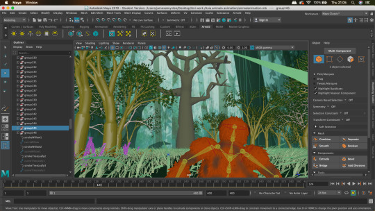
As well as animating the characters, I also animated the camera movements using keyframes to create good staging. When animating the cameras, I wanted to make it seem like the camera was following the characters, also using it as a way to show the speed the characters are moving. For example to show fast movements when the Orangutan is running, I made the camera seem a bit behind the characters, as though it was struggling to keep up.


When doing this process, I set up one of the viewers to be see- through perspective so that I could see exactly what the camera was seeing.

0 notes
Text
Animating
I found animating rather challenging as I it took a lot of time and patience, but also knowledge to understanding the right amount of movements and positioning for each keyframe, as if this was not done right it could effect the whole animation.
After a few attempts I started to get a feel for what to do with the keyframes, but as my animation was long, it took a while to animate.
As well as showing the narrative, something I wanted to explore through my animation was different ways I could create movement for this character. I explored this in a few ways which can be seen in the final animation, looking at jumping, running on all fours and walking on two legs. This helped me to learn the kind of movement that goes into all character animation as I came to realise that each movement actually involved moving different areas of the body in different ways. For example when the Orangutan was walking on the legs, I needed to move both legs in different directions with the hips moving forward in each step. Whereas when the character is moving on all fours, both the back to legs move together and the front two in unison as well, both the pairs moving in opposite directions.
Principles of Animation Research:
youtube
The 12 principles of animation are key techniques used in animating in order to create a realistic, compelling motion for your characters that make sense to the audience.
The 12 Principles are:
1. SQUASH AND STRETCH
This action gives the illusion of weight and volume to a character as it moves. Also squash and stretch is useful in animating dialogue and doing facial expressions.
2. ANTICIPATION
This movement prepares the audience for a major action the character is about to perform, such as, starting to run, jump or change expression. A dancer does not just leap off the floor. A backwards motion occurs before the forward action is executed. The backward motion is the anticipation.
3. STAGING
A pose or action should clearly communicate to the audience the attitude, mood, reaction or idea of the character as it relates to the story and continuity of the story line. The effective use of long, medium, or close up shots, as well as camera angles also helps in telling the story. There is a limited amount of time in a film, so each sequence, scene and frame of film must relate to the overall story.
4. STRAIGHT AHEAD AND POSE TO POSE ANIMATION
Straight ahead animation starts at the first drawing and works drawing to drawing to the end of a scene. You can lose size, volume, and proportions with this method, but it does have spontaneity and freshness. Fast, wild action scenes are done this way. Pose to Pose is more planned out and charted with key drawings done at intervals throughout the scene.
5. FOLLOW THROUGH AND OVERLAPPING ACTION
When the main body of the character stops all other parts continue to catch up to the main mass of the character, such as arms, long hair, clothing, coat tails or a dress, floppy ears or a long tail (these follow the path of action). Nothing stops all at once. This is follow through. Overlapping action is when the character changes direction while his clothes or hair continues forward.
6. SLOW-OUT AND SLOW-IN
As action starts, we have more drawings near the starting pose, one or two in the middle, and more drawings near the next pose. Fewer drawings make the action faster and more drawings make the action slower. Slow-ins and slow-outs soften the action, making it more life-like.
7. ARCS
All actions, with few exceptions (such as the animation of a mechanical device), follow an arc or slightly circular path. This is especially true of the human figure and the action of animals. Arcs give animation a more natural action and better flow.
8. SECONDARY ACTION
This action adds to and enriches the main action and adds more dimension to the character animation, supplementing and/or re-enforcing the main action. Example: A character is angrily walking toward another character. The walk is forceful, aggressive, and forward leaning. The leg action is just short of a stomping walk. The secondary action is a few strong gestures of the arms working with the walk.
9. TIMING
Expertise in timing comes best with experience and personal experimentation, using the trial and error method in refining technique. The basics are: more drawings between poses slow and smooth the action. Fewer drawings make the action faster and crisper. A variety of slow and fast timing within a scene adds texture and interest to the movement.
10. EXAGGERATION
Exaggeration is not extreme distortion of a drawing or extremely broad, violent action all the time. Its like a caricature of facial features, expressions, poses, attitudes and actions. Action traced from live action film can be accurate, but stiff and mechanical. In feature animation, a character must move more broadly to look natural.
11. SOLID DRAWING
The basic principles of drawing form, weight, volume solidity and the illusion of three dimension apply to animation as it does to academic drawing. The way you draw cartoons, you draw in the classical sense, using pencil sketches and drawings for reproduction of life.
12. APPEAL
A live performer has charisma. An animated character has appeal. Appealing animation does not mean just being cute and cuddly. All characters have to have appeal whether they are heroic, villainous, comic or cute. Appeal, as you will use it, includes an easy to read design, clear drawing, and personality development that will capture and involve the audience’s interest.
My Thoughts
From viewing these different principles, I feel that I will be applying quite a few of them. The ones that I think I will really need to use to make my animation have reality attributes and help the scene look professional are;
ANTICIPATION- This is because the orangutan is a agile, quick animal that will be moving fast through the wild and will therefore be doing intense movements, meaning anticipation will be shown before the movement to prepare the audience. It can be created by doing a movement that sets up for the main action.
STAGING- I will use this to send a clear message of action, and quick movement through the use camera angles to make the movements have more impact.
ARCS- As my character may be jumping in the scene, arcs principle will show the realistic outcome.
SECONDARY ACTION- This will probably happen in the majority of the movements as the arms and legs may be moving at different times and ways whilst the body is moving. This is as there could be some quick action movements to get across whilst the Orangutan is running through nature.
EXAGGERATION- When doing the different movements, exaggeration will highlight each one making it clear to the audience and helping them to not miss it due to the speed.
0 notes


Text
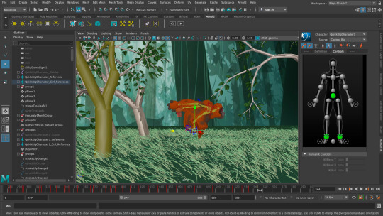
Character Rigging
Before animating an important part that needs to be done, is the rigging of the characters so that they are able to move fluidly and without and problems. Because of this rigging can take some time, as it is a fundamental roll in making the animation good. I defiantly experienced this when I was rigging my characters as although I was able to use the quick-rig tool in maya to initially set up the rig, the skinning part of this tool didn’t work so well. Due to this I spent a lot of time weight- painting so that the movements would look fluid and natural, not pulling any unnecessary limbs when each keyframe was made.


0 notes


Text
Environment Research
For the animation I done some research into what the characters environment would look like. Both animals live within rainforests in different parts of Asia. Below are some images of Rainforests I used to inspire my environment.


As you can see it is very green and full of life with many plants and trees touching and overlapping each other. This is something I will need to get across when developing my environment.
I aim to make my environment very green and packed with different plants and trees, with colours that will contrast nicely with blacks, whites, and oranges; the colours of the characters.


When making the bamboo, I will use images like this as a reference to get the right shape and colour as the real thing. I feel like the key feature in a plant like this is the markings/grooves that run down the stalk. This will be an area I will need to highlight to help the viewer understand what plant is is.


Another area I am going to show is deforestation and logging in action. To do this I will need reference images to help me develop the environment. Looking at these pictures, they really highlight the devastation caused by this action.This is a feeling I hope to get across. I want to communicate the same chaotic scenes evidenced in these photos. I will try and do it by not placing cut logs in an order and instead placing them randomly, also making the stumps left with sharp edges to create a more haunting and shocking feeling.
0 notes
Text
Polypaint/ Texturing
To texture the characters I made their polypaint into a texture in zbrush and then applied it to them using the uv map in Maya.


Below is the Hypershade window I used to add the textures in maya, using the Hypershade I was able to change the lighting and shading of these textures.


0 notes
Text
Retopology
After I made my model a lower poly count, I brought it into maya as an OBJ file. Then using the knowledge of Retoplogy I had gained in class from our lecturer, I began re-shaping the character, focusing on the areas that still had a lot of cluster of polys. This will make it easier for animating later on.


0 notes
Text
Zbrush Panda
When modelling my panda I used the same process and tools as I did for the Orangutan, Using the zsphere to create the shape and the snake-hook and move tool to add detail. After that was complete I remeshed it to lower the poly count.


0 notes
Text
Zbrush Orangutan
After being influenced by the character Baymax and his appearance, I wanted to develop my design further and begin modelling it in zbrush.
I started using the Zsphere tool, and making a rough body shape of the character, using Baymax as a reference for creating the right shape and sizes for the different features.


Once I had shaped the body using the move and scale tools, I then began sculpting some detail into the model using a variety of different tools. To create the mass amounts of hair on the arms, head and body I used the snake-hook tool, extracting small sections of the body in a pinch- like manner, creating the impression of hair. I also applied a texture brush to the Orangutan’s body, adding a bit of ageing to the skin and make him seem a lot more rough and tough.


After I had finished modelling, I then remeshed the whole model as the polycount was rather high and would need to be lower for animation to take place.


Above is a screenshot of the Orangutan remeshed. In this picture you can see that the remeshing caused the Orangutan to lose a lot of detail and become less interesting. Because of this, I needed to add more detail by using the snake-hook tool again but this time extracting the lower poly mesh.
Below are the designs of the lower polycount models.


Once I had modelled my character I then merged it into one sub tool and began polypainting a design on to it. The reason I chose to paint rather than texture the character was because, I wanted to make more animation have a sense of youthful cartoons to it, and therefore, played around with block colours more than realistic textures, as I felt that could of made it less interesting for kids.
0 notes


