Hey I'm Jack and this is my uni blog! :) I'll be keeping you up to date with all my projects and work!
Don't wanna be here? Send us removal request.
Text
End of Term - Self Evaluation!
This week marked the final week of the unit, so was largely spent prepping for submission. Proof reading and editing my dissertation, making final changes to work and compiling it into documents that could be PDF’d for hand-in. I won’t write about what I did over the Christmas break either as it was largely spent finishing my research report and no design work or research was made as I was just using the sources I had already compiled.
Self Evaluation
Overall, this has been a great unit which I have thoroughly enjoyed. As I was focusing entirely on my own specialism which was 2D I didn’t have to spend any time messing around with new softwares that weren’t entirely relevant to what I want to do post-uni. I have enjoyed the experimentation throughout the whole course, however at this stage I feel like my time is better spent developing my skills for life after the course. Because the unit was purely 2D work I was able to work efficiently and to a reasonable high quality as I was working with processes that I was familiar with - which allowed me to establish a good workflow throughout the whole unit.
Task Work
I was eager when I first heard what the structure of the unit would be as I felt that it was a fantastic way for us to develop our skills with a design brief that had set criteria, yet simultaneously allowed for an element of creative freedom as the brief’s guidelines were fairly broad which generated a fairly self-directed workflow, although tutor guidance was there when necessary. I feel like the work I made from both tasks 1 and 3 was of a good standard, especially task 3 which was a completely new for me in terms of what the actual design was and the art style in which it was conveyed. I think I have demonstrated the ability to adapt and work within the parameters of different design briefs. I would go back and re-do task 2 if I had the time however. My workflow was decent and I had a worthy idea but the end result just turned out extremely average in my eyes. I feel like if I did it again I could have gone back and tried some different processes and techniques before committing to any finals.
BA3b Pre-Production
Pre-Production was a little skewed at the start of the unit as at first I was pretty clueless on what I wanted to do and where I wanted to go with it. After a lengthy chat with Nigel about the project I established that I wanted it to have a deeper meaning to it - something that was relevant in the world which is why it is based on social interaction issues. It was slow starting at first because although the idea was fairly concrete I still wasn’t all that sure on what sort of work I should have been producing at that time. I had the idea in my head of doing some technical exercises that would increase my foundation skills such as perspective, lighting, colour etc. Instead Nigel suggested that my time would be better off creating things like mood paintings to try and establish an aesthetic - which is what I did in the latter half of the term. I’m satisfied with the final outcome of my pre-production work as I’ve got to a stage that I said I would be at in my learning agreement come the start of new term. I have a series of mood paintings that convey different stages and areas of the IP, complete with cultural influences, composition analysis, real world reference etc. I also created a character design in the last stages of the term. I feel like this is enough work to move forward with the project next term.
Research Report
Research report.. surprisingly it went well! Considering over summer I completely re-did my proposal which was totally irrelevant to the initial idea suggested, although looking back now it was definitely the correct thing to do. The proposal along with my initial research gave me enough content to work towards November’s draft submission - which gave me enough feedback to continue writing the report until completion. The comments made on my draft along with some peer tutorial sessions with Sharon allowed me to complete the research report quicker than expected - which was done over the christmas break. I wanted to have the report finished before the first week back as I knew I’d want the time to make final adjustments to things. Overall I feel like the essay came out good. Structurally I think it makes sense and I feel like all the information I have conveyed is well presented and relevant to the title question - complete with a varied list of reliable and academic sources. I wouldn’t go writing them for fun but I have definitely enjoyed writing the dissertation at times as it often created a much needed diversion from design work.
0 notes
Photo
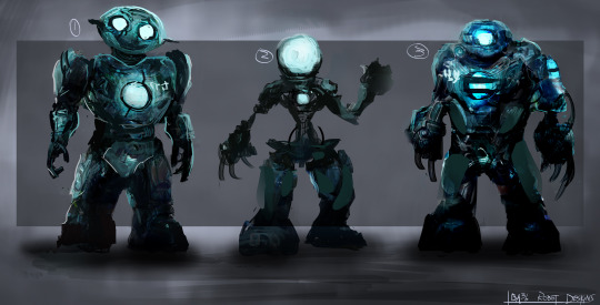
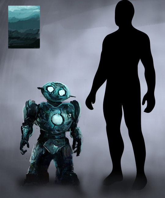
Initial character concepts I created for the character the player controls in my IP. In terms of design language I tried to keep the shapes used largely rounded and soft which is deemed for friendly looking. I tried to make the characters quite goofy looking too convey a sense of innocence.
0 notes
Photo


Initially the character for my project wasn’t a priority as I felt like I could work on it next term - but I had a bit of time towards the end of this project so I thought I’d play around with some designs. I had some rough ideas in my head of creating this small scale, friendly looking robot that would traverse the world. The images above reflect the aesthetic I wanted to go for, with Groot from Guardians of the Galaxy serving as a good example of how design language can convey a sense of friendliness and innocence in a character. This is something I wanted to portray in my designs.
0 notes
Photo
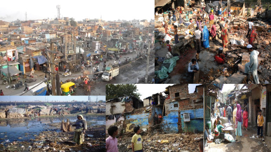
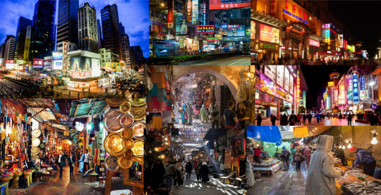
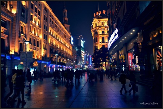
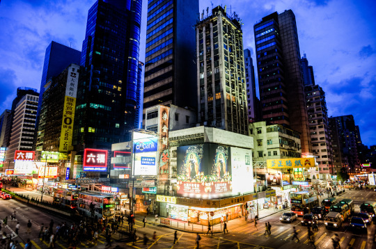
Some of the images I was using as reference for the three pieces below, ranging all the way from the streets of Shang Hai to the slums of Delhi, India. I wanted to merge cultures that wouldn’t necessarily come together to create some interesting new aesthetics.
0 notes
Text
Week 12, 28/11/2016 - 04/12/2016; Iteration
This week marked the last week before the christmas holidays, so I wanted to use the time to polish and finish things before I left for a couple of weeks. Last week gave me a good foundation of work that I could iterate and develop this week. Most of the design work was done in the initial phase so this week was mainly cleanup and polish.
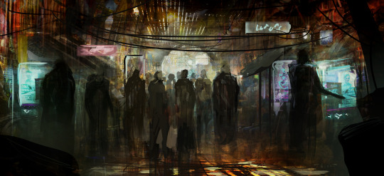
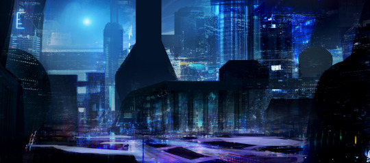
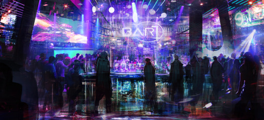
Final outcomes of the three mood paintings I made in an attempt to convey the direction I wanted to head in for ba3b. Generally happy with how they turned out as I feel they reflect the style I initially had planned and also implement the real world references I was looking at. I don’t wan to go too over the top with my project as by creating worlds that are too alienated you risk alienating your audience which makes it harder for them to make an emotional connection with the world. Over christmas I am going to finish my industry report so that when I get back in January I can simply compile all my work into submission format, drafting all the research I have so far into the style guide. Nigel mentioned that the submission guide isn’t really instructive but more of a guideline. This gives me a little bit of freedom in terms of submitting my work.
Task 4 Conclusion
Task 4 was extremely different from the last three production based assignments, as nothing was actually being created apart from an online personality. I built a website using the wix template over a year ago so my website was already pretty well established and at a level I was reasonable happy with. My research into industry standard portfolio’s, coinciding with comments made by tutors did however lead me into changing a few things. I was happy with the overall structure and layout but I did increase accessibility by including my contact info on my title banner. Because my website didn’t need much adjustment it gave me a lot of time to really home in on what I wanted to do for the project next unit, as I had an understanding but before this task I didn’t really have anything visual to show for it other than some basic moodboards. This task gave me the freedom to experiment with designs for ba3B and was therefore a good use of my time. I feel like I managed to meet the criteria for the brief as it was all about creating a professional online presence. During the task I increased the accessibility and professionalism of my website by making things clearer and easy to reach, and also created a linkd in profile that clearly portrays who I am and what I do, listing my skills and abilities along with personal info. For the task I tried to imagine myself as an art director looking at portfolios for someone to hire which offered me a fresh perspective of my work which changed my perception of it - which ultimately allowed me to make the changes I did.
0 notes
Photo
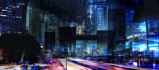
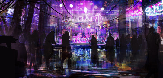
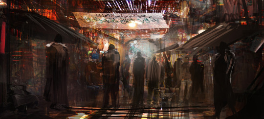
These are the three images I made from the initial sketches. The first two represent interior based shots whereas the third is a much larger scale city scape. I wanted to confine development of these to one week to see how fast I could work and how long it would take me to flesh out multiple designs at once. I changed things up a bit with these by working on all three at once, alternating between the three at any given time. This worked quite well as not only did it keep things refreshing and interesting but also allowed me to identify mistakes easier as I was constantly shifting around, refreshing my perception of the pieces. For initial mood paintings I think they work well and definitely convey the aesthetic and general direction I am heading in with my project. Next week is the last week before the christmas break so I want to finish these and begin compiling my research into the style guide so I can focus on my research report over the break.
I’m essentially done with the online presence task as my website was already in a good position that I was happy with, and my linkd in profile can be found at - https://www.linkedin.com/in/jack-reeves-116588b8?trk=nav_responsive_tab_profile_pic. It’s quite bare at the moment because I’ve never really worked on anything serious so hopefully over time I can fill the profile out making me a more attractive option to employers.
1 note
·
View note
Text
Week 11, 28/11/2016 - 04/12/2016; Website Updates!
This week was spent further toying with my website - changing layouts around and experimenting with different types of banners. I looked at a lot of portfolio websites and found that the lesser known concept artists didn’t tend to have an about page. Reflecting back I can see that is it not something that is really needed as when potential employers visit my website they are not going to want to mess around with different page links.
For that reason I deleted the about page and implemented the necessary contact info into the title banner, also getting rid of the menu. I liked the layout of it but I think moving onto a website that is a simple continually scrolling portfolio is more effective for a body of work like mine.
I didn’t really need to do much with my website after I simplified the banner as I wanted to keep it simple with a single continually scrolling page showing all my work - which I did my best to arrange in order of relevance. (colour, composition, genre etc.)

The new website banner occupying my website. I feel it’s an improvement as it is concise, direct and only displays the information necessary to employers/studios.
My time this week was better spent working on pre-production as this unit is soon coming to an end - and in my learning objective I said that I wanted to have a good level of preproduction done for the unit so I can start creating straight away. I suggested the idea to Nigel of carrying out some tasks to develop my technical skills - such as perspective exercises, line work development etc. He responded by saying that the time would be better spent by doing things like mood paintings to test ideas and practices so that’s where I will focus my time for the remainder of the unit. I looked at a lot of real world influence in places like Delhi and the middle east as I felt they come together to create interesting aesthetics that fit the sci -fi style due to the nature of the locations. (colourful, heavily populated, vertical etc.)

I created some initial sketches with the idea of creating at least 3 mood pieces each representing different stages in the IP - using different cultures and reference for each to make them drastically different from each other, yet still remaining coherent enough to be identifiable in the same world.
0 notes
Text
Week 10, 28/11/2016 - 04/12/2016; Online Presence
Back to normal! This week I had to work on creating an ‘online presence’ through building a website and making a linkd in profile, two things I’d already created over summer when I was doing some casual unpaid work. I’d listened to a lot of concept artists talk about how important it is to be online which is why I made a website - also because I wanted a place to display my work that was fairly professional looking! Mark said if we already had these things we should use the time to reflect and change things. I’d been wanting to update my website for a while as it didn’t have anything on it from year three - which after reading week I felt was good enough to display on my portfolio.
Over summer I had a huge changeup of my website in both the way it was laid out and the work that was included on it. I spent a huge amount of time watching Feng Zhu’s design cinema which is a series in which the artist covers every part of the industry on both a technical and theoretical level, including how to build an online portfolio that is client friendly.
The episode can be accessed at https://www.youtube.com/watch?v=sPESZ3JW2AY.
In design cinema, Feng talks about a few major components. The first is to keep things simple.
Feng states that;
-The site should have clean UI that is easy to navigate and doesn’t overpower work
-No about or contact page
-Work should be instantly visible
-Contact info should be easy to find
-No sound or animation
He also mentions things to avoid on a website;
Fan art
Overly violent work
No sense of design language (every design is random and unrelated)
Lack of project work
I used this information to make my website more professional looking which can be seen at www.jackreevesdesign.com.

This is a screenshot of the top of my site. I wanted something simple that clearly displayed my work in an easily accessible way. This is the page that loads up when you go onto the website so there is no unnecessary clicking to get to the work, accompanied by a social media bar offering alternative methods of contact. In order to keep things clean looking I put my email address on a separate page.

This is the work on display. I have tried to group work together in similar themes, e.g all the medieval looking stuff together, followed by similar colour palettes to give the website a sense of flow.
BA3b Pre Production

I also created some environment mood pieces for BA3b. This image doesn’t really signify much as I all I was doing was toying around with colour schemes and overly sci-fi design language using the research and moodboards I compiled the last couple of weeks. I drew a lot of inspiration from Eastern based cities like Shanghai. This project went through a lot of different iterations as I couldn’t figure out how to make the perspective work on the right hand side of the image as it always felt a little too imposing. This was partly my intention however as I’ve mentioned previously that I want to try and adjust composition to convey emotions and player feelings. As an initial dabble into sci-fi concept art I don’t think this was a bad first attempt as I feel like it laid the foundations for more development. I gave myself a time limit of one week just to try and establish some sort of expectations to see how fast I could realistically work. The top one is more based towards the start of the game where things are quite dark and muddy, whereas the second is a bit more vibrant - conveying a higher class area. Composition wise I kept them the same as I wanted to keep them similar technically to see how I could change the feel of the landscape through design language alone (colour, lighting etc).

0 notes
Photo
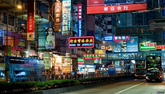
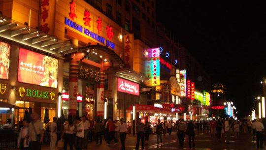
Cultural Reference
In terms of real world influence for my project I was looking at a lot of Eastern cities like Shang Hai and Beijing. I was looking in that part of the world because the cities tend to be extremely dense with both population and architecture. Because space is so limited in these types of places there is a lot of verticality to the cities - meaning a lot of things happen on lots of different levels. This is a cool aesthetic and one that I want to incorporate into my designs.
0 notes
Text
Week 9, 21/11/2016 - 27/11/2016; Reading Week
This week was the first reading week of the term and I wanted to use it to make my studio work from the first tasks better. The work I had already created prior to this week was OK but I didn’t feel like it was portfolio worthy.
Task 1
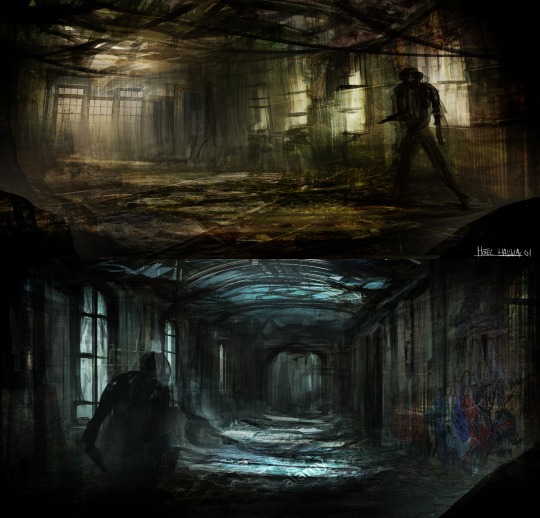
The work from task 1 prior to this week was decent but looking back it was very unfinished. The designs were at a level where they read well and the basics like perspective and lighting were there, I just needed to spend more time rendering out details without altering the general mood of the images.
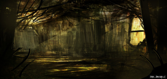
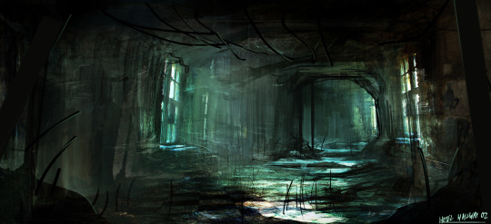
The after shots! Design 02 was the one that once I started felt needed the most work. The perspective was off and the roof of the hallway was pretty rough looking. I thought it’d be pretty quick to clean up but I had to think up some design solutions to make the image read. I found by reducing the amount of natural light seeping through into the hallway allowed me to tweak the lighting which I felt added to the mood of the piece. After altering them I definitely prefer the second design, yet still think making two was a good thing to do.
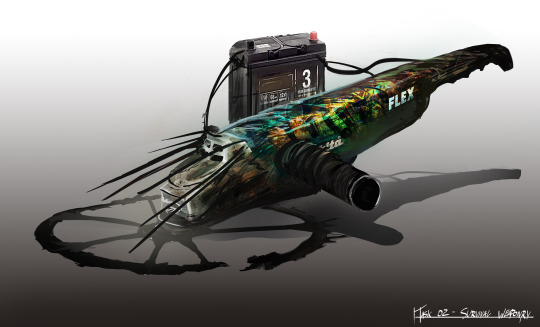
This is what I changed on the model sheet for the survival weapons. I adjusted the lighting a little bit, made the weapon look more metallic and rounded. The first version had a pretty dull colour scheme going on and after seeing it again after a couple of weeks I noticed how skinny the weapon was which gave it a pretty un-intimidating feel. I made the weapon stockier and more chunky looking just to make it look a little more premium and weighted. That and a bit of saturation adjustment on the graffiti.
0 notes
Text
Week 8, 14/11/2016 - 20/11/2016; Adapting to a New Style
I’m extremely happy with the work I’ve been producing for this task but in this week’s workshop session on Tuesday, Nigel pointed out a pretty big issue in that I was following my standard procedure for creating work using usual techniques such as photobashing, but this task was meant to be created in the opposite style to what I usually do which is more directed towards realism, so for this task I had to direct my work in a more cel-shaded direction. I had constantly been aware of this when I was working but I wasn’t sure how I was going to change the style when they were so close to being finished. My original plan was to have a borderlands type design where the textures and lighting are quite realistic still but the line-work is still extremely present and visible creating a pretty cool effect.

This is the sort of effect I wanted to convey. This is a concept piece from borderlands 2 by artist Kevin Duc. (http://kevinduc.com/)
Evidently the line art is still a prominent part of the painting, yet the texture and lighting reflect that of a realistic piece, evidenced when looking at the same image (below) but from a much more zoomed out perspective.

The tutors said I should try and push the style further and really emphasise the change.
By using a photoshop filter I was able to eradicate a lot of the details, but was still left with the really cool textures and colours. From this I was able to paint over it to create something that was much more stylised. To avoid reverting back to how it was before, I completely changed up the way I worked by setting the brush opacity to 100% and leaving the opacity control off so every brush stroke I made was solid.
Following that design philosophy I was able to build up the initial designs from the photoshop filter version. I wanted to eradicate all signs that a filter was used so although it was a major influence I ended up painting most of the original image out. Since use of texture was limited I had to find another way to push the designs to emphasise the tier system of the chests so I was really experimenting with shape design.
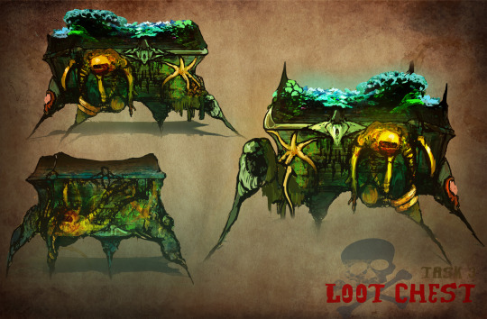
I was taking a lot of inspiration from Peter Jackson’s Lord of the Rings series, particularly Sauron’s tower most prominent in the third film. The tower is supposed to be this figure of darkness that puts fear into people’s minds, reflected in the extremely harsh shapes used in it’s design. With my chests, I was trying to push the idea of them being a reward for some sort of boss fight so I wanted them to be harsh and extremely unfriendly looking as a reflection of the boss you’d fight to access them. This is most prominent in the third design which would be the rare chest. I looked at a lot of work from lion head studios as their work is very similar to the style I was aiming for. Bright contrasting colours, thick line-weight etc. Once I was happy with the designs I took them into individual model sheets to show how they would function etc, also making them clearer. I had a pretty interesting idea for the boss chest in that the chest itself is alive and when the boss is beaten the octopus type creature that inhabits it will die and fall off, hence releasing the tentacles that were binding it shut.
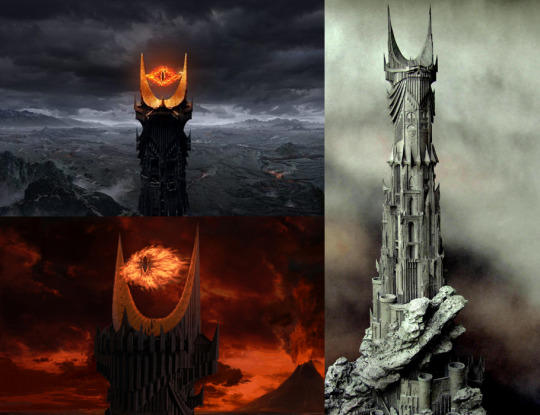
^ saurons tower evidencing shape theory which I used to create the final outcome below.
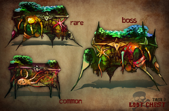
Task 3 Conclusion
This has definitely been the most enjoyable task for me so far. The first two tasks were quite constricted in terms of what we could do with them so it was nice to have a lot of creative freedom with this as the brief was so open. I found it a little intimidating at first as I didn’t really have any idea of what direction I wanted to take with it but after I starting noting ideas down I started generating a lot of ideas in my head. Basing the chests off of a creature I think was a good idea because it gave me a consistent theme I could use as influence for the different designs. I also found that giving the design just a bit of narrative really helped me think of things. I found adapting the designs to a different style quite challenging at first but as Nigel pointed out it was because I was trying to paint in a different style but I was using the exact same techniques and methods I would normally use. This eventually gave me a decent enough foundation to work off of but it was certainly not the most efficient way time wise. Overall the task was a decent learning curve and I learnt a lot of things that can be used in life after uni to make more work in different styles which will make my portfolio more diverse and therefore more attractive to studios.
0 notes
Photo
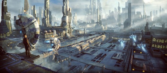
*artwork by Stefan Morell
I’ve included this image because it shows how shifting composition can drastically alter the feeling of an image. In this image the horizon line is over halfway up on the canvas, forcing perspective where everything is pointed in an upwards direction leading towards the vanishing point. I could use this type of perspective later on in the game where everything is cleaner and not as imposing - and the upwards direction of all the images components could be seen as a metaphor for the characters emotions having survived the endeavour.
0 notes
Photo
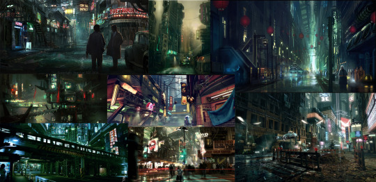
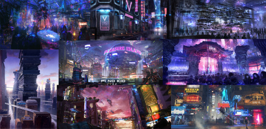
two potential colour palettes - the top being quite murky and dark whereas the bottom is a cleaner, brighter colour scheme which people tend to associate the sci-fi genre with.
0 notes
Photo
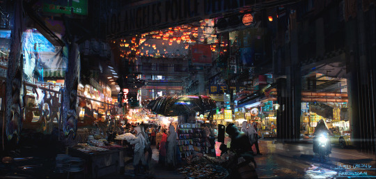
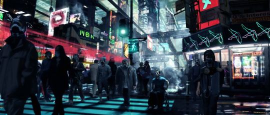
BA3b Composition Analysis
Images -
http://jameschg.deviantart.com/art/Bladerunner-475092302
https://forum.learnnavi.org/avatar-cesky/zajimave-obrazky/
Although I’ve been told to not focus on narrative too much I do want to try and use some painting techniques to try and convey story and emotion. Since my game is played from the perspective of a young robot trying to find his way through this advanced city I want to try and relay the emotions the character/player would be feeling.
For example, the first couple of concepts could be at the start of the game where everything is very overwhelming and confusing to the player, reflected in the overwhelming composition that bares down on the player coinciding with a dark, murky colour palette.
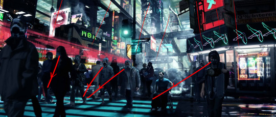
As you can see from overlays above, the image has a very downwards facing composition and the buildings are structured in a manor that makes them very overpowering. This is done by placing the camera low down in the shot creating a low horizon line, and with a fairly central focal point it forces the perspective seen above.
0 notes


