
Don't wanna be here? Send us removal request.
Statistics
We looked inside some of the posts by isaac5417120 and here's what we found interesting.
Average Info
Notes Per Post
32
Likes Per Post
16
Reblog Per Post
0
Reply Per Post
16
Time Between Posts
6 days
Number of Posts By Type
Text
11
Last Seen Tumblr Blogs


Fun Fact
130K people were victims of a chain letter scam that affected Tumblr in May 2011.
Text
Week 10 - Completing the Loop
It's crazy to think that 10 weeks have already gone by so quickly. Through these weeks I have developed my skills greatly. The transitions between the different techniques required of the trade have been insightful, from sketching, technical drawings, concept drawings, sketch modeling and even work in 3Ds Max.
Initially I didn't think I would enjoy this course due to my reluctance to technical drawings. However, through this course forcing me to complete such activities, my skills in this drawing style accelerated greatly. My speed and precision from the first week have increased greatly and now I feel more confident in creating technical drawings and illustrations. I felt a similar way to the format of work submissions in this course, as initially I was reluctant to upload my work in a social media format. However as this too was a necessity for the course, I quickly found my bearings, and was able to successfully upload informative posts.
With other processes such as Photoshop and 3DS Max, I already had some level of knowledge in relation to these tools, and this course helped further develop my preliminary understanding. I found the photoshop tutorial the most engaging, as Rob demonstrated useful techniques which I had never seen before. The later 3DS Max tutorials were also hugely helpful as they pushed me into using the software. I was already familiar with using Blender which made the transitions between software easier, however the tutorial revealed to me the different processes which made 3DS Max stand out. Overall, the tutorial readings were consistently very good through the term. The writing was very concise and condense which made it engaging and useful to reference back to.
My biggest take-away from this course was the importance of progress, and how it can always be constructive and useful. Often I will avoid doing useful things which I see as laborious, but this course has shown how just taking that initial step to get started can cascade into a worthwhile endeavor.
And of course, big thanks Gonz, Rob and Sarah for managing this engaging and worthwhile course.
0 notes
Text
Week 9 - Preparing a 3d scan for printing
This week we familiarized ourselves with using 3DS Max and Rhino as tools to re-mesh 3D scans into usable meshes. Fortunately for this process, we were not require to process pointcloud data into mesh geometry, rather an stl file of the triangulated mesh was provided.
Below: We were expected to Rhino to re-mesh the raw triangulated 3D scan into a usable mesh, however due to issues with my Rhino trial subscription, I opted to use blender. Similarly to Rhino's QuadReMesh tool, Blender's Remesh tool can "Quadify" a triangulate mesh into something more usable. Additionally in Blender, I oriented the bottle correctly so it would be upright when exported to 3DS Max.

Below: After importing the bottle into 3DS Max, I applied a Symmetry and smooth modifier. Reset XForm was also utilized to reset the bounding box of the mesh object; I am not sure if this last step was necessary however.

Below: Utilizing the measure function from the utilities panel showed me that the original mesh was ~93mm tall. Using the Squeeze Modifier in with an "Amount Value" of 0.1 allowed me to stretch the model from 93mm to 98mm , which is inline with "the scenario" outlined in the tutorial exercise, resulting in the model below.

Below: Afterwards I used more modifiers to change the shape and form of the bottle for fun.


To export the model height edited model to Cura, I exported the mesh as a .stl file and brought it into the software and sliced the file into gcode. Through experience with the makerbot 3D printers at my high school, I was already familiarized with the 3D printing process. Due to time constraints and the print being a waste of materials, I chose not to 3D print the remeshed bottle.

Overall I am pleased with the result. I was able to meet the brief requirements and further develop my skills in 3DS Max.
4 notes
·
View notes
Text
Week 8 – Digital Iteration
This week we familiarized ourselves with the program 3DS Max. I already have experience with the 3d software Blender, however, due to the different control systems, placement of buttons and differing workflows, the transitions was still some what difficult.
Below: After getting the document set-up as outlined in the tutorial, I added a sphere and rectangular prism primitives. The sphere was dimension to have a 50mm radius while the cube had equal side lengths of 50mm.

Below: After this i started experimenting with the various deformation modifiers. The squeeze, skew, and twist were stacked to create a spiral effect, then the melt modifier was used to simulate the object being melted into its bounding box. My process for finding the modifiers were to look through the modifier drop-down list and experiment with the modifiers that sounded like they would produced interesting results.

Below: After I saw that I still had the cube in the scene, and wanted to see if it was possible to perform a boolean operation between the modified sphere and cube. Using the "compound objects" menu, I was able to perform a simple boolean operation which would subtract the cube from the modified sphere. creating this abstract jagged mountain looking object.

Below: I wanted to render the object out in a product rendering setting. I created a background using a plane with the "EditPoly" modifier to extrude and bevel the plane change. A primary "quad" light was added next to the abstract object and a HDRI environment map was utilized as a fill light.

Below: Finally, I added a chrome preset material to the abstract object, and edited the colour to be blue. The background utilized a diffused pink shader instead. This process used for this project is similar to that which I would use in blender, and through this process I learnt to a greater extent the workflow and quirks of 3DS Max. That being said, Overall, I am not too pleased with my final rendered results. The image is still quite grainy, the materials are very basic and contrast in lighting is stark to the point where the whites are clipped. However, through more practice I will get better at utilizing this program.

0 notes
Text
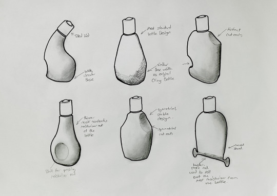
Week 7 – Physical Model Making
This week we had to create a mock-up model of either a Olay moisturizer bottle or perfume bottle out of foam. Through this whole course I have been designing Olay bottles, however as this task coincides with the IDES1212 task of creating a perfume bottle, I opted to create that instead.
Below is the sketch that was used to base the foam design off. I intentionally made the design very squat as to experiment with bottle shapes that do not follow the design trend of tall slender bottles.

Additionally, a quick 3D mock-up was made to define general dimensions and experiment further with shape. I am not sure whether this technique was allowed or not, however I used it to rapidly prototype shapes without having to construct them physically.

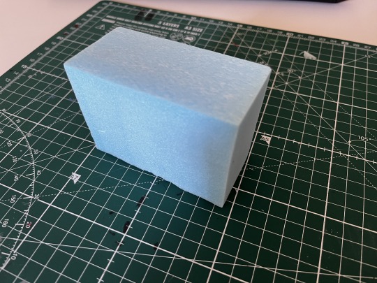
Below is the first step I took to create the perfume bottle. Using the hot wire cutter I cut a block of foam in the precise bounding dimensions of the desired bottle.
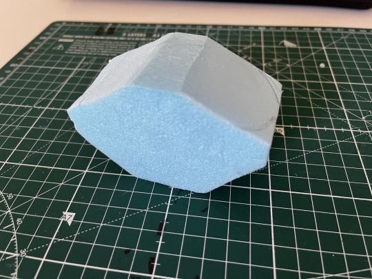
Below I marked out and cut the general shape of the bottle using a box-cutter. This process could have been greatly optimized through using a hot wire cutter to remove the larger volumes instead. At the time however, this idea did not cross my mind.
Below is the final result of the carving of the perfume bottle.
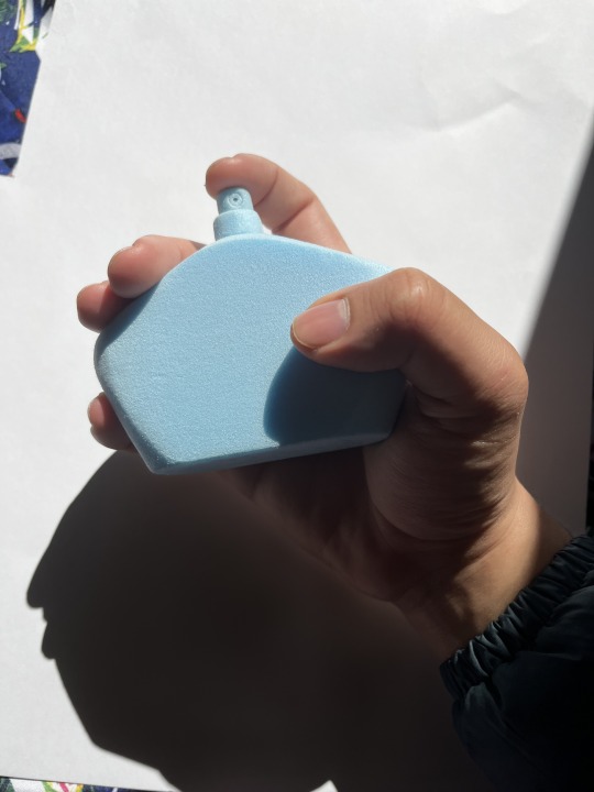
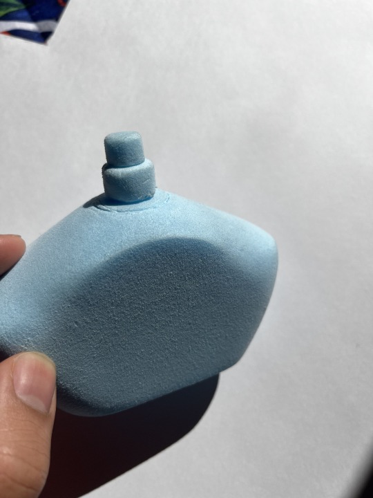
Below is the final result of the foam carved perfume bottle. Overall I was very happy with how it turned out. Majority of the form was created through carving with a box cutter and scalpel. To create the surface finish, 200 grit sand paper was used. This grit was the perfect balance between removing a significant yet controllable amount of material while still providing a smooth surface finish.
4 notes
·
View notes
Text
Week 6 – Digital Sketching
This non-teaching week were were introduced to digital sketching through Rob's tutorials on moodle.
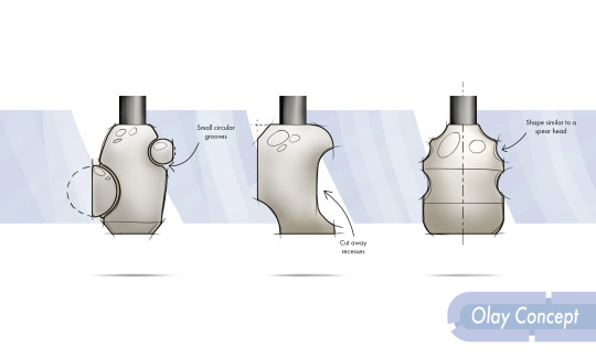
First step was to make the base shape of the bottles before adding shading and other elements. Typically I would have just created a rectangle, duplicated it and then erase part of the silhouette that were unneeded, however utilizing Rob's non-destructive methods was much more efficient as I could make changes more efficiently. Additionally, I made the base for the bottles a brownish-orange grey colour as opposed to just grey as I found it make the bottle look more appealing.
After establishing the silhouette I added shading using a clipping mask layer and the soft round brush. Again, the shadows were tinted brown to look more appealing.
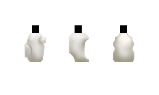
The highlights of the lid were then added using a hard brush and Gaussian blur. The sketch lines were also added which provided more information about the design.
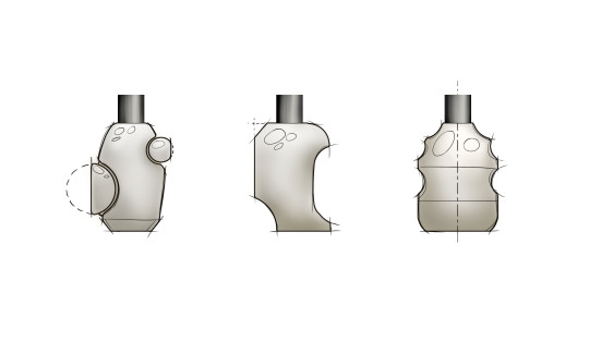
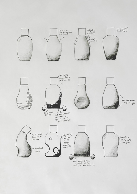
Below are the final concepts I created for Olay moisturizer bottles. Overall, I believe I made decent digital concepts. I think I limited myself by copying Rob's layout of the bottle and should have experimented with my own layout. Additionally, I should have used an even more unsaturated brown for the bottle as the colour does not closely enough resemble the colour of the orignal Olay bottle.
5 notes
·
View notes
Text
Week 5 – Sketching
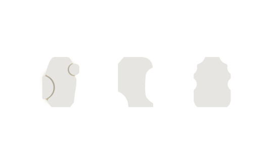
The week we were familiarized with more free hand concept and perspective sketching. The prompt for this week was to redesign the Olay moisturizer bottle while retaining the general volume and lid shape.
Part 1:
Initially we were tasked with creating orthogonal front view sketches of potential Olay bottle designs. As the bottle is to be squeezed to release the moisturizer, I focused on concepting geometries which looked interesting without affecting the amount of moisturizer that can be dispensed. Faces which change between concavities and convex forms and sharp edges general results in more rigid surfaces and therefore they were avoided. I experimented with alternative lid positions and even rigid plastic extrude which could be rolled with the use of the container in order to squeeze out all the moisturizer.
Below: Concept sketches without shading
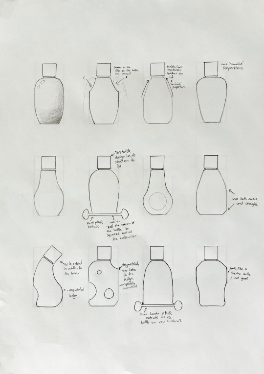
Below: Concept sketching with shading. I experimented with using graphite, charcoal, and a thick felt tip pen. I found the charcoal to be the most appealing.
Part 2:
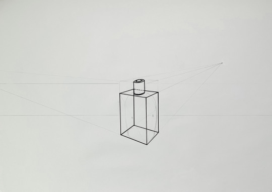
The second part of this task was to create perspective sketches of a few of your original concept sketches.
Below: The base sketch of the moisturizer bottle. Through incorrectly reading the instructions, I set the bottle is 3-point perspective as opposed to 2-point perspective.
Below: Perspective sketches of the bottle concepts. I set the perspective base underneath another paper which allowed me to more easily create these several perspective sketches. For shading I used mostly charcoal again and experimented with using pen for cross hatching. The hatching was messy due to the semi-random line directions, making it look not too appealing. I had more success with the charcoal however, as it created more subtle gradients.
2 notes
·
View notes
Text
Week 4 – Perspective Drawing
This week tasks consisted of familiarizing with key principles of perspective drawing. The methodologies utilized were strenuous, where geometric relationships and careful measurements were needed in order to create a convincing perspective drawing.
Part 1
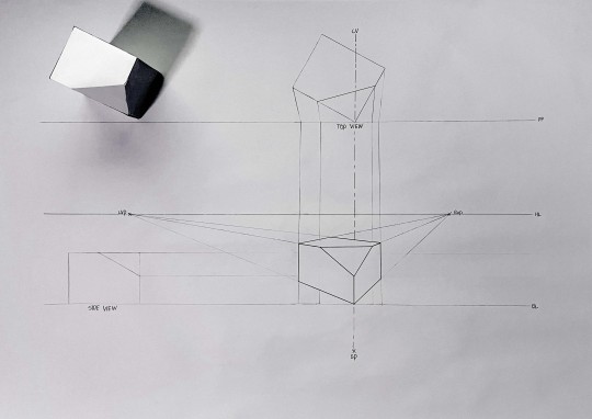
The first part of this weeks work consisted of drawing a chamfered box in perspective. The top view was oriented at 30 degrees to the PP line. Due to the relatively close positioning of the Left Vanishing Point (LVP), Right Vanishing Point (RVP) and the Stationary Point (SP), the perspective drawing shows a fairly dramatic perspective, where the back edges are dramatically foreshortened.
Part 2
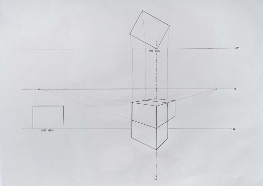
This part had us drawing a box in a similar fashion to part 1, where the boxes were extended in multiple axis.
While cleaning the drawing, I accidentally erased many of the construction line used to created the illustration. As in the moodle readings, these constructions consisted of crosses on the faces of the prisms which were used to find the midpoints of the individual faces, which then could be used to determine the extents of the other faces.
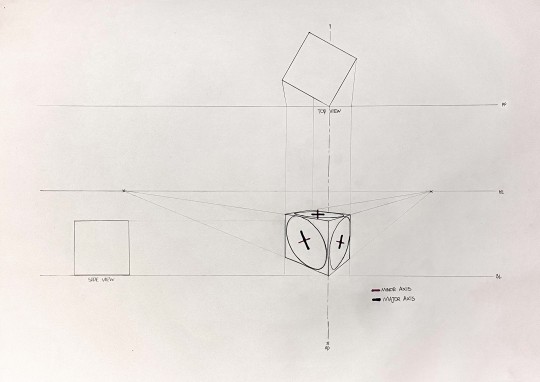
Part 3
This part had us creating circles in perspective. A similar construction method to part one was used to create the base cube. Using midpoints and the opposite facing vanishing points, the minor axis of the ellipse (circle in perspective) were found. To draw the actual ellipse was difficult for me however as maintaining contact between the ellipses and the edges of the cube was difficult.
Before these tasks, I already have had experience with loose, approximated perspective drawings; however, overall, the moodle material and exercises assigned helped me understanding the actual principles of true perspective drawings to a greater extent.
4 notes
·
View notes
Text
Week 3 Studio Tutorial – Section and Auxiliary Views
This week was an introduction to both Section and Auxiliary Views, as well as further practice for orthogonal technical drawings. While I have some experience in section views from last terms BENV1010 assignment, auxiliary views was a concept I was completely unfamiliar with. Initially it took me some time to wrap my head around how these projections were formed, but eventually I figured out Auxiliary Views conceptually through revising the material on moodle.
Week 3 Task: Orthogonal, Sectional and Auxiliary Views of a Tapered Block.
This week we were tasked with creating a technical drawing of a tapered block using novel views. This block was presented in an isometric view with the dimensions present.
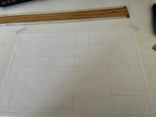
Similarly to last Week 2, I started the technical drawing with a general block out. This was done by observing the overall dimensions of each view of the Tapered Block, and representing each view with a rectangle. Due to the auxiliary projection, the spacing between the different views were relatively tight.
Below is the final illustration of the Tapered Block. I rectified some of the mistakes made in week 2's technical drawing, such as writing everything capitalized and with a more consistent font. Additionally, I had a more comprehensive use of dimensioning in this week's Illustration.

Overall, I am happy with my technical drawings of the week. Some improvements could be made to the drawing however. The inconsistencies of the arrows is still prevalent in this week's work. Additionally, the placement of the title block breaks conventions as they are typically placed in the bottom right hand side of the illustration.
6 notes
·
View notes
Text
Week 2 Studio Tutorial – Orthogonal Projection & AS1100 Standards
This weeks tasks related to honing our skills in orthogonal projection drawings and developing an understanding of the AS1100 technical drawing standards. Multiple tasks were set this week which included:
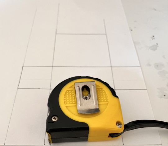
Task 1: Creating a 5 sided box to fit an interesting "hand sized" object.
I chose a Tape Measure as the object as seen below.
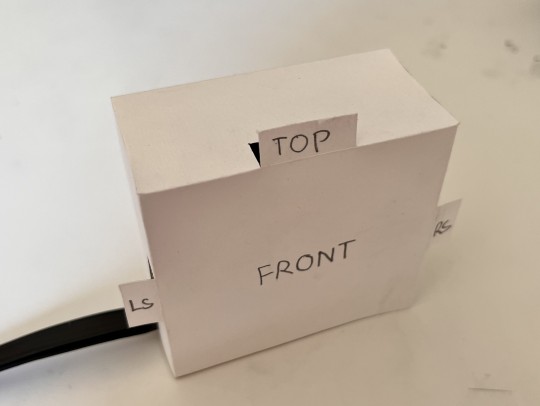
Each rectangle had a 10mm offset to each face's height and width, give the final box a liberal fit around the object. To cut the box I primarily utilized scissors as they were easy to use, while a scalpel was used to cut-out the label tabs.
Below, is an image of the Tape Measure Inside of the box. An extra tab was cut in order to make clearance for the black silicone strap at the back of the Tape Measure.
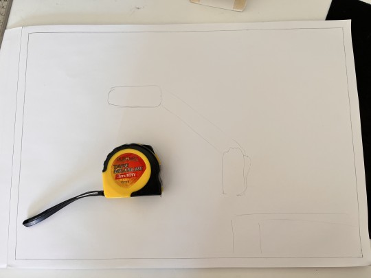
Task 2: Creating a Orthogonal technical drawing of the Tape Measure.
I chose the Tape Measure of the technical drawing as it presents an interesting shape with a multitude of details.
As show below, I initially started the project creating a "block-out" of the general layout of the technical drawing. This was achieve by laying the Tape Measure in its multiple view and tracing the silhouette. Additionally a rectangle was sketched in the bottom right corner to show the general placement of the title-block.
Below is further development of the tape measure technical drawing. At this stage the silhouettes have been refined into accurate, measured sketches. I chose not to use another page to create the final drawing as the initial block-out was made with HB pencil, and was easily erasable.
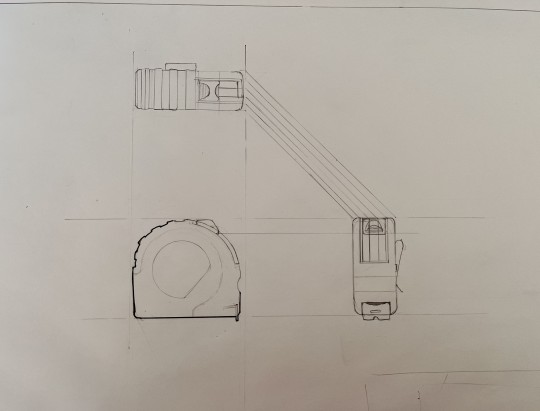
Below is the final Tape Measure orthogonal projection drawing.
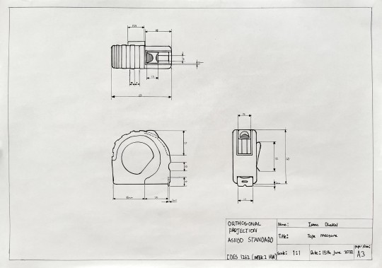
Overall, I am fairly happy with the results, however there could always be improvements. The main issue with the drawing is the amount of empty space which causes the illustration to look empty and incomplete. To fix this in the future, I could make the scale of the objects appropriately larger to fill more space. Additional issues were the lack of capitalization in the text of the title block, lack of labeling for the different views and the inconsistencies of arrow sizes.
2 notes
·
View notes
Text
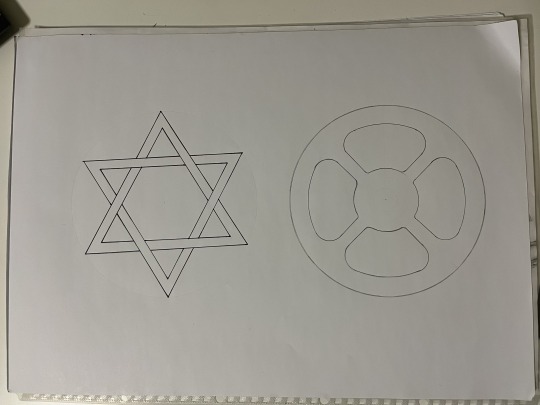
Week 1 – Drawing Instrument Exercises
This week was about warming up and getting familiar with the tools and techniques that will be used through this subject.
Below are the engineering drawings exercises needed to be completed as homework for this week.

The star was constructed using a pencil, compass, protractor, ruler and pen. Each outer vertex of the star was offset 60 degrees from each-other, and this was measured out using the protractor. After the dimensions were established using pencil, a felt tipped pen was used to outline the star.
The wheel was constructed using a pencil, compass and circle guide. The compass was used to establish the inner and outer circle, as well as the various dimensions. The circle guide was used to add fillets to the “spokes” of the wheel to create the rounded shapes seen in the drawing.
Overall, I did not have too many issues with this project as the methods to make the drawings were fairly straight forwards.
Below I will explain my post processing process for the drawing:
Below is the original photograph of my sketch, which was then altered in Photoshop.
As you can see, the lighting is very flat, the perspective is slightly skewed, the table can be seen, the star is wonky and the imperfections of the paper can be seen. As long as you have even lighting across the page, you can use post-processing to achieve a much cleaner final image; when taking photos, try not to cast shadows onto the paper with your arms.
1. To fix the perspective, use the perspective warp tool. This can be found in the top menu bar under “Edit”>”Perspective warp”.
Another method to fix the perspective can be found on moodle in Robert’s tutorial where he shows you the “camera raw filter” method of “perspective Warping” an image.
Below: is the drawings after the perspective warping.

2. Next I rotated the star so that it aligns with the page. This was achieved by using the “lasso” tool to roughly the element; then the free transform tool was used to rotates and correctly align the star.
Often what happens when doing this step is that the layers below the active layer can create jarring “holes” as seen below. To stop this from happening you can duplicate the layer prior the lasso tool selection, so that the layers underneath hides the “holes” of the upper layer(s).
Below: You can see the white and grey checkered “holes” created by rotating the star isolated using the “lasso” tool.

Below: The duplicated, base image patches holes created by the rotation of the star. Note; after you rotate the image, merge the upper edited layer with the lower unedited layer.

3. Use the “spot healing brush” tool and “patch” tool to remove imperfections from the paper.

Below: The red circles highlight the imperfections in the page which I wanted to remove before color correcting the image. The main imperfections include the white corner found on the top right of the image, and the dot created by the compass as seen in the middle of the star and wheel.

Below: The drawing below was mostly edited with the “Spot healing brush” tool. The “Patch” tool was only used in the top-right to remove the white corner.

4. Finally, the level adjustment was used to purify the “white” of the paper while intensifying the pen and pencil lines.
Below: The levels adjustment increases the contrast between the blacks/dark greys and the white of the paper, resulting in a cleaner looking image. A color balance adjustment could be used to further alter the look of the “white” background paper.
Below: is the general arrangement of the levels adjustment. Experiment with the black, grey and white handles to create a desired result.

This post is not very detailed. If you want further clarification on how to use the tools and adjustments outlined in this post, search them up on YouTube for more in-depth tutorials.
4 notes
·
View notes
Text
Hey I’m Isaac, a first year Industrial design student. I like mountain biking, 3D modeling and sleeping.
1 note
·
View note