Don't wanna be here? Send us removal request.
Text
Rationale
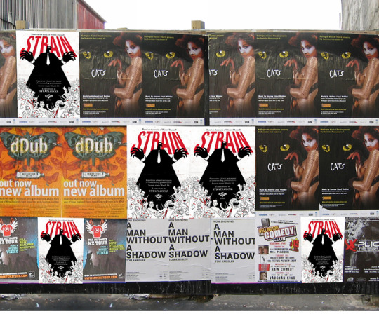
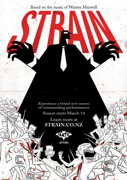
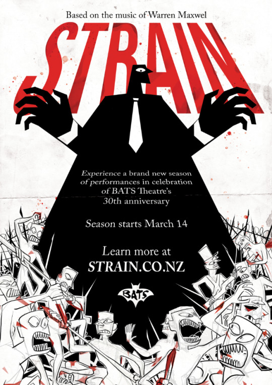
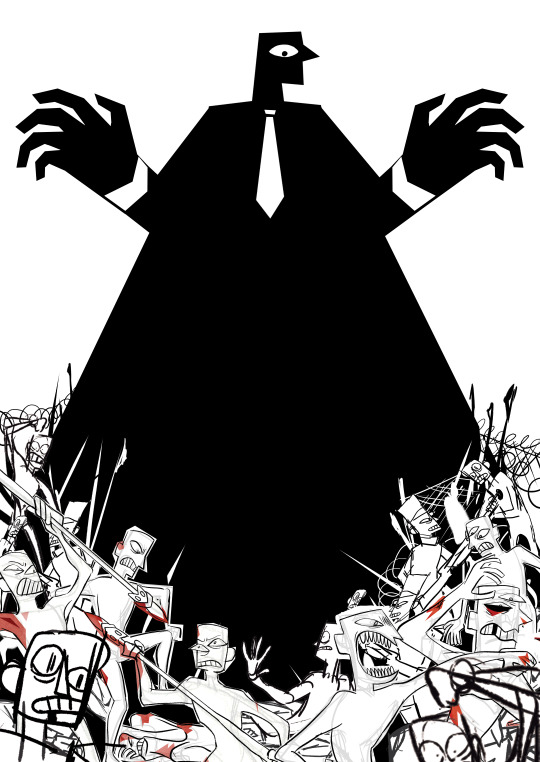
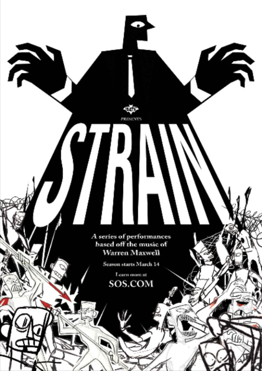
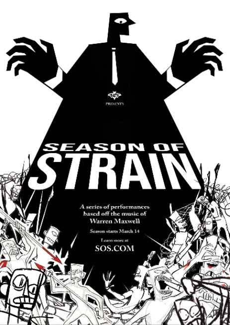
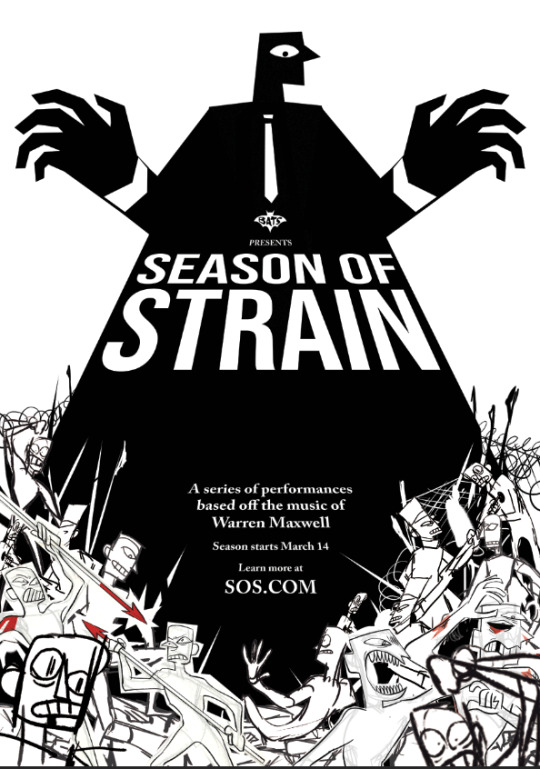
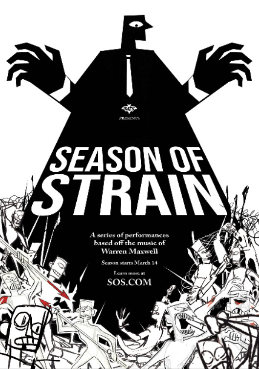
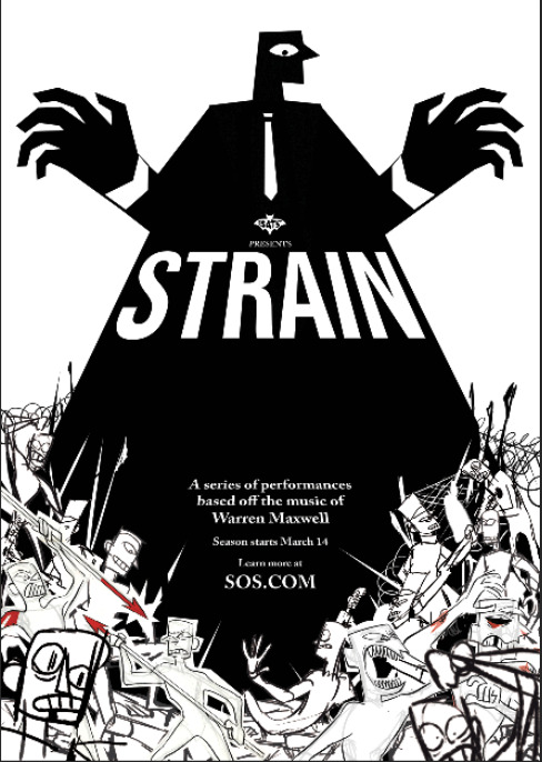
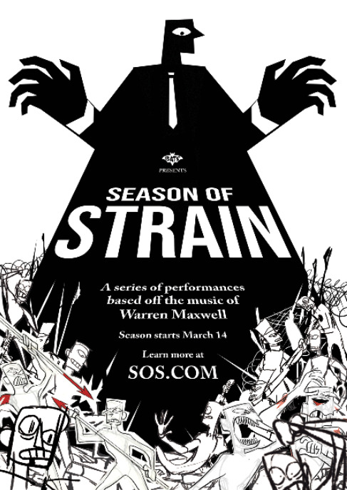
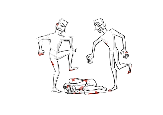
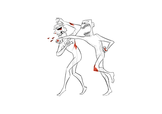
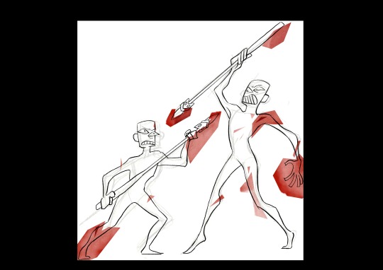
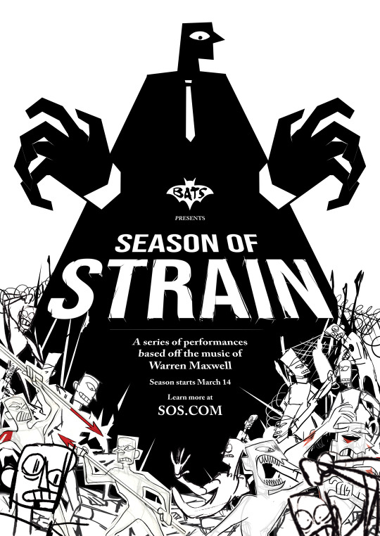
For this project we picked three songs: “Nature of Man”, “Home, Land, and Sea”, and “Little Things” These songs share common elements of injustice and collective toil, and so we used these elements to influence the visual style of the project. The art style is aggressive, sketchy, and rough, imitating the look and colour schemes of grunge and protest art. White, black, and red colours supply punchy colour scheme, and the worn paper texture, expressive line art, and blood-stained colours communicate aggression and pain.
The figures’ silhouettes are sharp and misaligned, communicating frustration and tension, while the antagonist - “The Man”, as we dubbed him - contrast contrasts with blocky and controlled edges, showing power and strength.
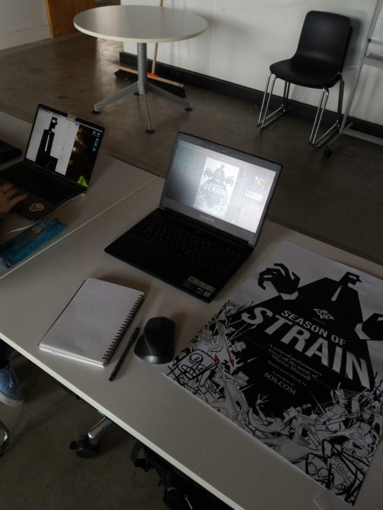
Both the poster and the motion graphic show the simultaneous struggle of the masses through montage and continuous tracking shots respectively. In all the media we portrayed the power imbalance between ‘The Man’ and the crowds through a strong contrast in scale, value, and art style.
The transmedia campaign has both the poster and the motion graphic lead the user toward the website, where they can then learn more and book tickets. Our target audience is younger adults and teens, as the edgey visuals appeal to them more.
In reflection, we may have bitten off more than we could chew, with a few scenes of the motion graphic having to be cut in order to have enough time for the level of quality we wanted. The workload was distributed fairly well: Tom in charge of the poster and animation and Ira in charge of the assets and the website.
Ira Nevshupova & Tom Starbuck
0 notes
Text
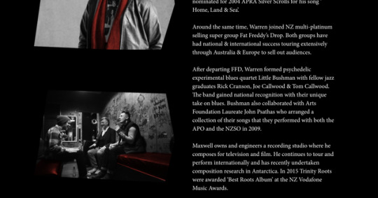
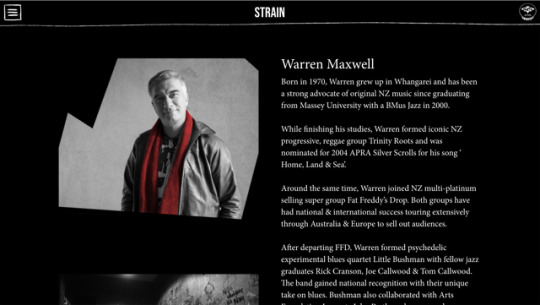
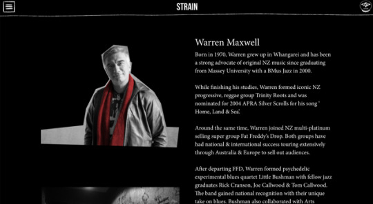
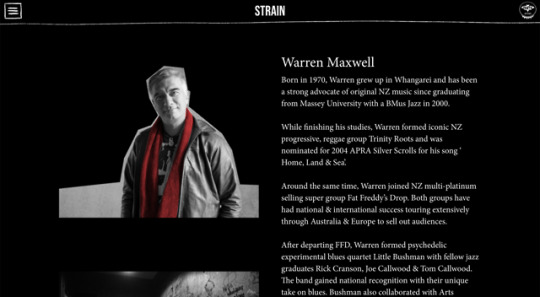
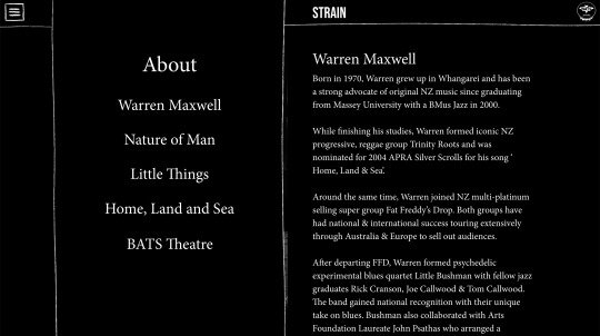
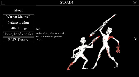
website progress v3 - using drawn borders and burger menu to add aesthetic, tweaking fonts.
0 notes
Text
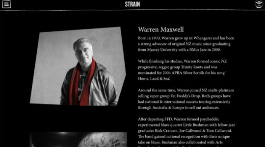
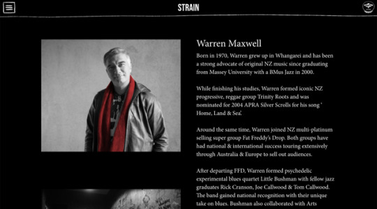
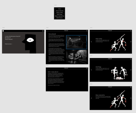
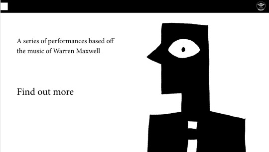
website progress v2- a definite improvement, still needs work. will replace rectangles with assets
0 notes
Video
tumblr
5.1
First revision of the first cut-down variant of the motion graphic
0 notes
