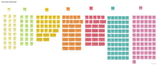
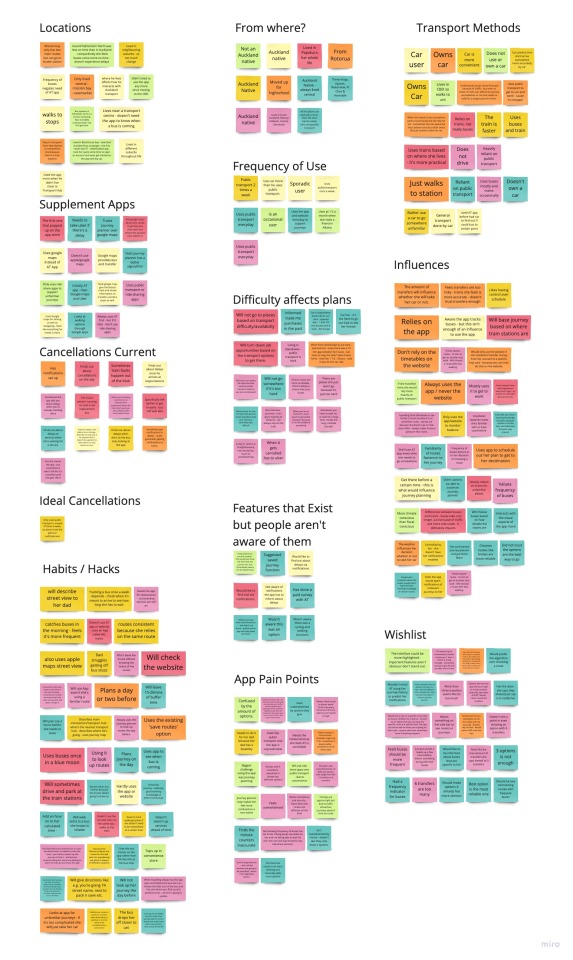
IMPORTANT! Some posts have been clipped to make the blog less visually overwhelming! Click "Keep Reading" to read full posts!
Don't wanna be here? Send us removal request.
Text
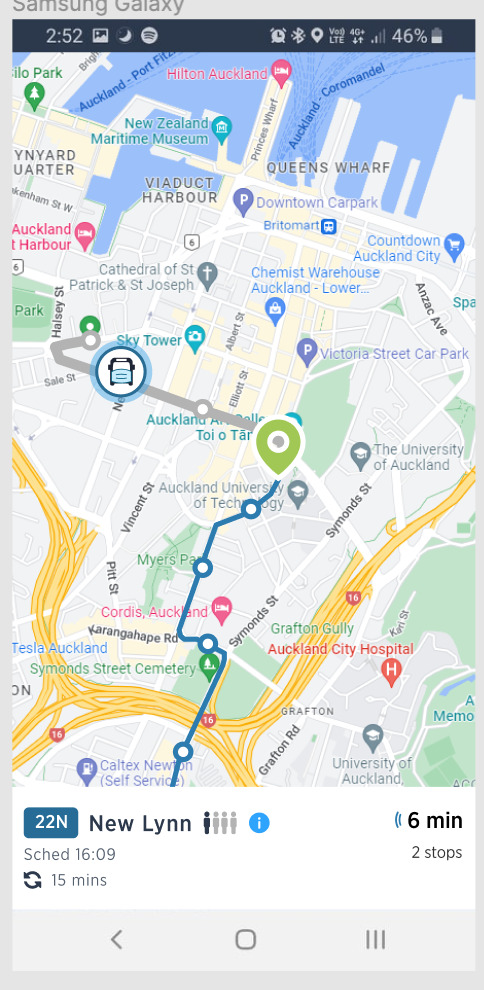
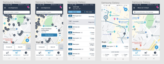
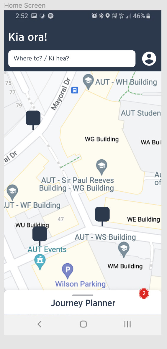
First iteration of being able to click on a bus stop and seeing a streetview option.
REASON:
In one of my user interviews - a participant mentioned she uses AT app to journey plan for their dad who is partially blind. She said she need to etc.
0 notes
Text

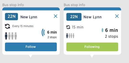
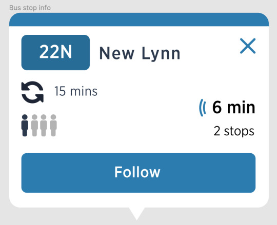
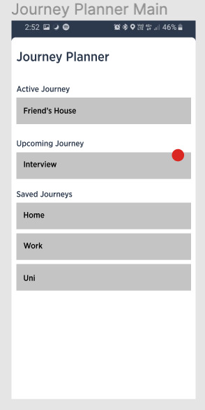
I did some user testing for these designs here - overall the consensus was that the middle design worked better for people.
0 notes
Text
Week 9
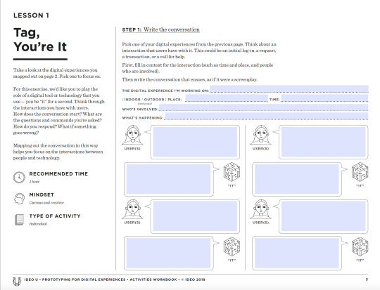
Your experience is a conversation
User and experience is part of that dialogue - achieve a goal and complete a task/
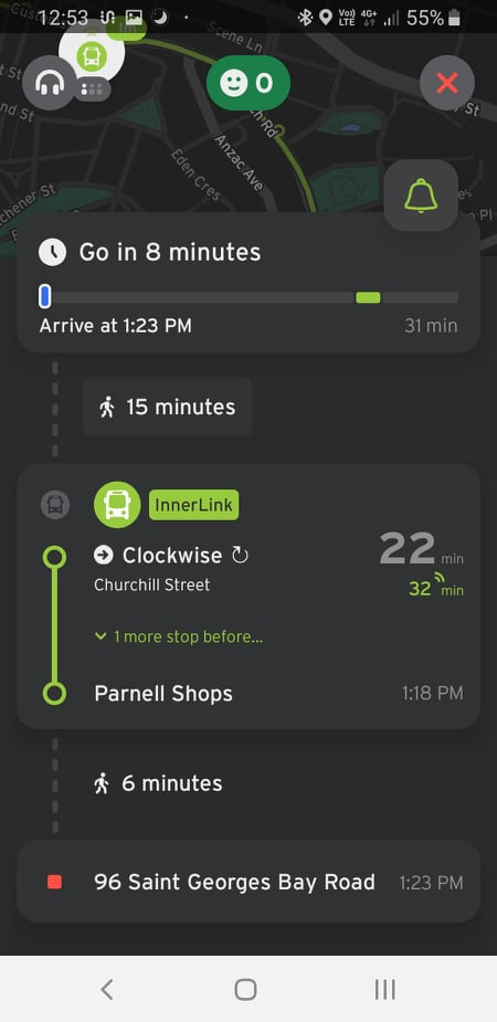
IN the journey planner mode - have an NX2 or NX1 to see what comes regularly looks up in advanced = issue is to get a regular timetable - can only see journey then and there - and then
Molly plans in advanced
Is there somewhere
Some pop up at the same time
Live bus - linked in to hop card
0 notes
Text
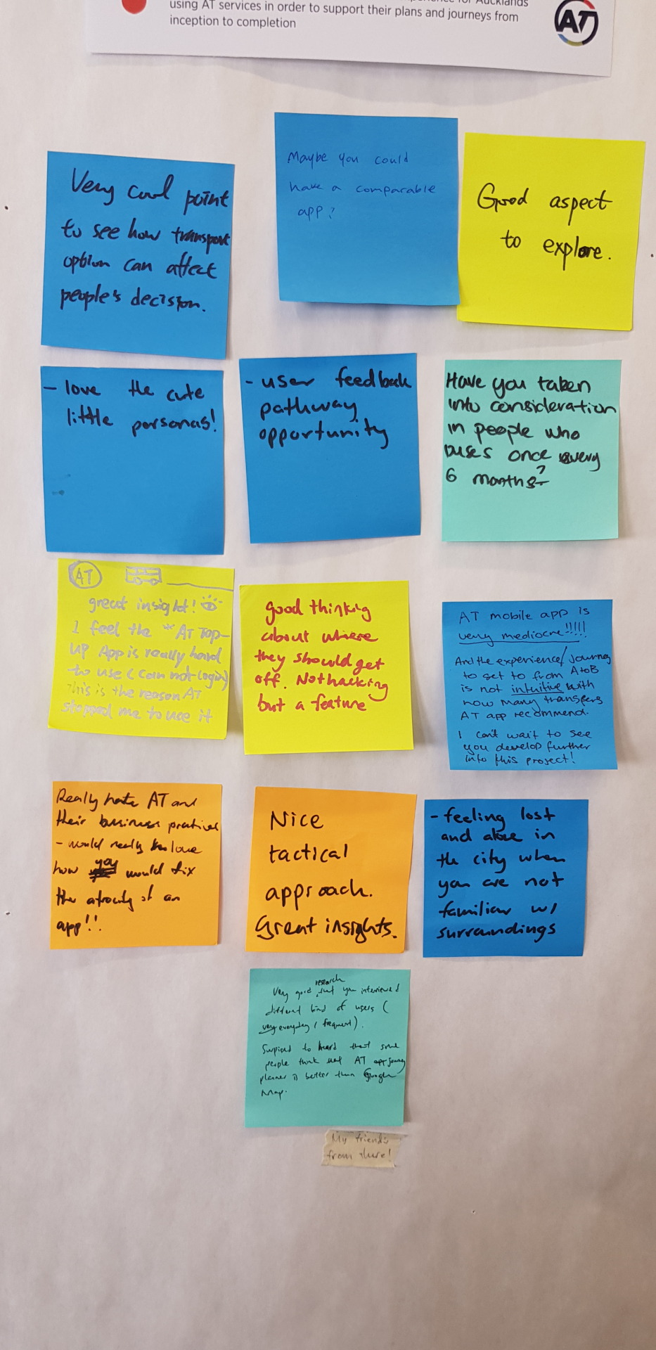
Peer feedback
Very cool point to see how transport options can affect people’s decisions
Maybe you could have a comparable app?
Good aspect to explore
Love the cute little personas
User Feedback pathway opportunity
Have you taken into consideration people who bus once every 6 months?
Great insight! I feel the “AT Top-upApp is really hard to use (cannot log in) this is the reason AT stopped me to use it.
Good thinking about where they should get off. Not hacking but a feature.
AT movile app is very mediocre!!!!! And the experience/journey to get from A to B is not intuitive with how many transfers AT app recommends. I can’t wait to see you develop further into this project!
Really hate AT and their business practices - would really love how you would fix the atrocity of an app!!
Nice tactical approach - great insights.
Feeling lost and alone in the city when you are not familiar w/your surroundings
Very good research that you interviewed different kind of users (everyday I frequent) Surprised to hear that some people think that AT app Journey Planner is better than Google Maps.
0 notes
Text
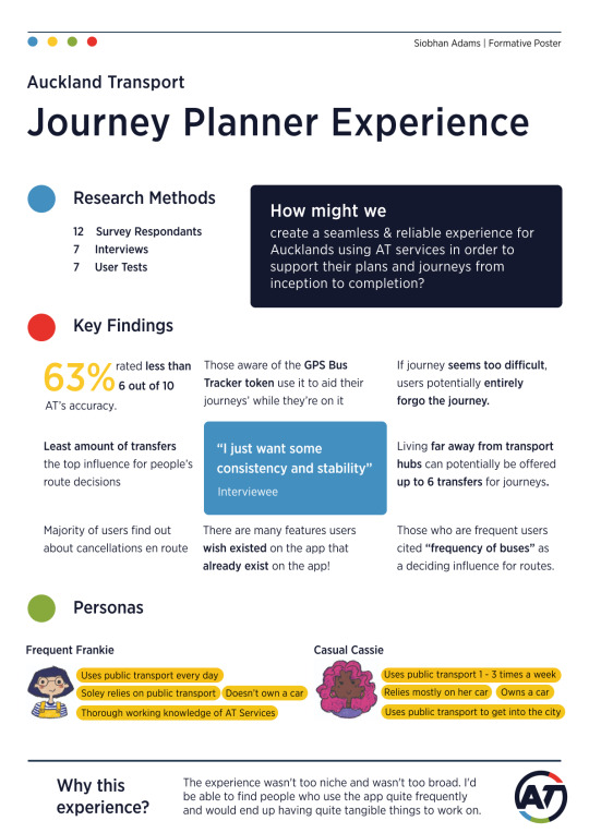
Meet our Personas

Frequent Frankie


Casual Cassie

Note: Still need refinement to accurately reflect a Persona - i.e. user needs, motivations, habits, etc.
0 notes
Text
Week 6
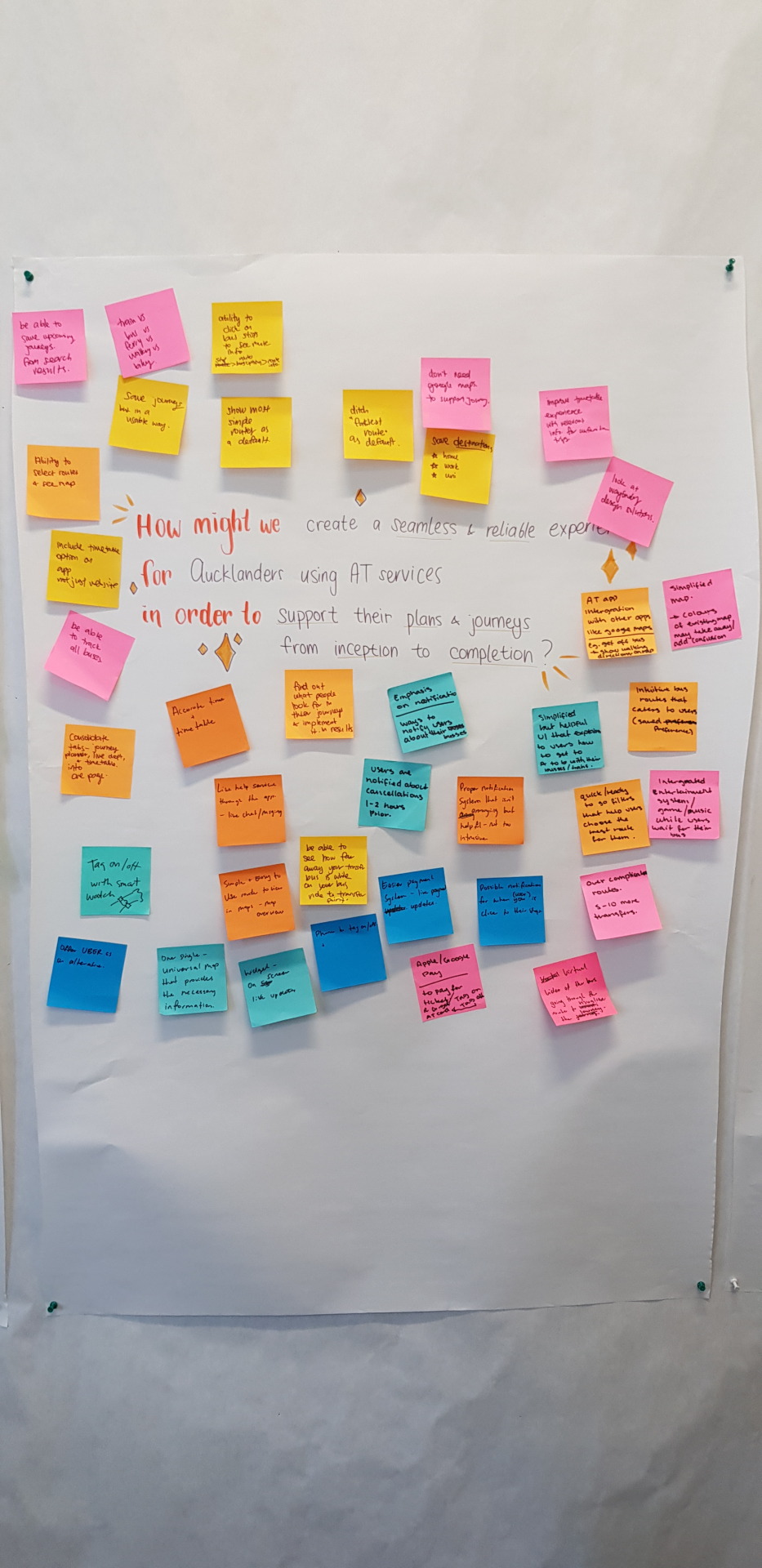
How might we create a seamless & reliable experience for Aucklands using AT services in order to support their plans & journeys from inception to completion
+ Brainstorming
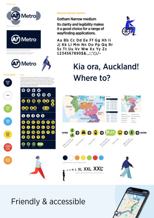
Auckland Transports Signage and Wayfinding Design Guide
Found Auckland Transport's Wayfinding Guidlines
Found Brand Guidlines as well - but didn't give information about what's expected - only gave examples of campaigns so have disregarded
https://at.govt.nz/media/1980688/wayfinding-and-signage-design-guide.pdf
0 notes
