
Don't wanna be here? Send us removal request.
Statistics
We looked inside some of the posts by innovationproj and here's what we found interesting.
Average Info
Notes Per Post
0
Likes Per Post
0
Reblog Per Post
0
Reply Per Post
0
Time Between Posts
4 days
Number of Posts By Type
Text
17
Last Seen Tumblr Blogs


Fun Fact
There are dozens of funny blogs to kill time on Tumblr.
Text
Authentication Form
UAL L3 Extended Diploma in Art & Design
Final Major Project - Innovation
Unit 13
I confirm that the attached assessment is all my own work and does not include any work completed by anyone other than myself and sources have been appropriately referenced.
Digital Signature:

Date Submitted: 14/05/2021
0 notes
Text
Final Evaluation
For my final major project set on February 24th 2021 and completed on May 14th 2021, I was assigned to research one object of choice between 50 and 100 years ago linked to innovation in my lifetime. I started off by developing a wide variety of moodboards of objects and items that interested me. The objects I chose to research were badges/enamel pins, kettles and airplanes. Airplanes eventually became the idea for my final major project.
To develop my proposal for this project, I had initially wanted to do screen printing at college, as it was a new method I wanted to try. Even though I managed to make a few sample test pieces, due to the pandemic I was unable to attend college to do this final process. I evidenced changes by keeping a daily blog and on a regular basis evaluated changes through annotation and reflection. I also kept to doing my design ideas by hand rather on a digital format. My action plan consisted of keeping to a structured routine of objectives and deadlines. I researched heavily via Google and Pinterest on pictures of airplanes to use as drawing references for my design ideas and I bought airplane books from Amazon to find extra external resources for further information on how planes worked, and how far technology and engineering have come over the past 100 years. For the artists research, I looked up six different artists who specialize in illustration and screen printing, as this was originally going to be my final piece method.
EH Shepard, Beatrix Potter, Oliver Jeffers, Jörg Saupe, Pintachan and David Shrigley were my chosen illustrators I wanted to look closely at for inspiration because all of them had a similar drawing style to mine and I liked the colours and media used. I also found lots of information and movement throughout their illustrations. Upon reflection I decided that it was best to incorporate three illustration artists; EH Shepard, Beatrix Potter, Oliver Jeffers and three engineers; Joe Sutter, RJ Mitchell, Henri Farman so I could look closer at innovation and design technology development to gain knowledge and information that can help me with my project.
The artists informed my practice because initially, I looked at stories aimed at children as this was a possible final outcome due to the fact they focussed on doing realistic hand illustrations rather than digital outcomes. This was a really important factor for my project as I had wanted to focus on my own hand drawn designs rather than digital ones. The research into airplane engineers specifically helped inform my project by looking at the shapes and structures of how planes were built over the years. Further research carried out included looking at merchandise to inform my final ideas. The important factors I found about this included styles of illustrations and patterns, colours and what person and gender this product aims for.
Problem solving was done throughout this project, as I reflected on what worked well and what didn’t go well through my blog. I also asked for feedback from family, friends, teachers and classmates by doing a survey on background colours to use for potential screen print designs. Technical skills used for this project were Photoshop, open screen printing, and illustration. These skills were used because during my academic year I’ve been working mostly on digital outcomes and less hand drawn outcomes. As I aim to develop my illustration skills to further use I wanted to produce more hand designs and less digital designs. In planning, even though I produced two open screen printed samples, I wanted to do more but couldn’t due to unforeseen circumstances. However, I resolved the problem by doing my illustrations on a digital platform at home. Writing up the project proposal wasn’t easy, because I found it difficult to put my thoughts into words. Even though it was easy to start with I eventually found following this and my action plan difficult due to making some unforeseen changes. Seeing these changes I made, I couldn’t keep a track of my action plan and didn’t find very accurate
The strengths displayed were updating my blog on a regular basis and keeping track of my time management, which was done by completing each task on the brief for certain deadlines. Although next time in order for me to organize my time more effectively I could’ve broken each task down and made checklists to tick off each task completed. Based on my proposal and final piece the target audience for what I’ve produced is specifically aimed at children and teenagers. The practical skills I demonstrated were drawing, use of lightbox, working on photoshop and originally screen printing, which I was unable to do due to the pandemic.
I have been successful in developing my practical skills over the period of this project because my hand drawing skills have improved greatly as can be seen on my post about my initial drawings and sample designs. These drawings have become technically better as they are realistic and 3d which makes them stand out. In terms of my digital skills, there have been some strengths and difficulties. When producing my t-shirt designs I found them easier to generate however, the bed linen transfers were more difficult and challenging. However, I was able to solve the problems I faced and completed this part of the project as well. Looking at the problem of the detailed design for the double bed linen I decided that within the framework of this project it was more efficient to concentrate on single bed linen, leaving the double bed linen to something I would work on if I had time.
On reflection, I believe the project has gone really well because I like to think a lot about my target audience. This can be seen in the blog under the title Research And Visual Concept Of Merchandising where I talk about unisex designs for young people of varying ages. I am pleased with my project as a whole, although if I had more opportunity I would’ve extended the project to screen printing a t-shirt with one of my designs on it. This project has been a good opportunity for me to develop ideas for the next generation of merchandise such as clothing, socks and stationery.
0 notes
Text
Final Outcomes
Below are a collection of a variety of items, specifically clothing and bed linen all using the theme of planes

Plane T-Shirt Lineup 1

Plane T-Shirt Lineup 2

Plane Pattern Bed Linen And Pillowcases

Plane Beanie Hats

Spitfire War Plane T-Shirt Lineup

Spitfire War Plane Socks

Spitfire Plane Bed Linen And Pillowcase
0 notes
Text
Research And Visual Concept Of Merchandising

Above is a large sized moodboard which I produced, showing bed linen/duvet covers for children and teenagers

Looking at these 12 selected bed linen/duvet cover designs, I have chosen to focus on two out of the 12 featured on this grid. The first is the space themed design and the second, the unicorn design. Firstly my observations about the space themed design. It appeals to me because I like the way it has been laid out in an open composition and has used a variety of motifs including planets, rockets and stars. The use of a dark coloured background allows each of the motifs to stand out. This particular duvet cover would suit both genders (male and female) aged between 4 ½-10 years of age.
Meanwhile the unicorn design has appealed to me because I like how this has been formatted in a one point perspective facing in front, almost as if the unicorn was waiting for my chosen audience of 11-15 1/2 year old females to get into bed and dream about the unicorn featured. By looking at this design there is a deliberate play on single point perspective that invites people in, which plays a similar visual trick to the book cover of Beatrix Potters The Tales Of Peter Rabbit (see Beatrix Potter artists research for a visual image). Compared to the image below the space bed cover is almost the complete opposite of the unicorn one having a dreamy effect. This particular one, having the theme of popart is very bright and loud.

Moodboard on wallpapers for children and teenagers

I have chosen to look at these specific images more closely, in particular the first image of the wallpaper featuring the kite and three balloons (red, blue and lightish white) and the wallpaper with a pattern of dinosaurs, all different types and colours. These two gender neutral wallpapers show repeating patterns with different colour schemes, arrangements and levels of activity. The kite and balloons one has a soothing effect while the dinosaur one is more active. I like how both these patterns have a variety of arrangements, the first pattern on the top left has a more drift like element to it as if the baby is drifting off to sleep while the dinosaur wallpaper has a continual line effect showing movement within each of the designs, in particular the t-rex, stegosaurus seem to be walking towards the viewer.
0 notes
Text
Final Outcomes: A4 Paper & Cardstock Samples
Beginning Development

Above is a photographic diagram of my lightbox, along with all the materials needed for this process.

P 1.A: The first piece I created consisted of three planes, all of the same design overlapping one another. The colours have been chosen because they compliment each other and stand out well on the white background. Looking at the shapes this image produces as a whole, if I was to draw straight lines from wing tip to wing tip I would have a series of triangles which would also be overlapping. I had some issues producing this design, particularly with the yellow plane because I didn't get the angle completely the way I wanted it. My aim was to produce a more symmetrical and balanced image. This would’ve been achieved if I had been able to line up the engines of the yellow plane with the red and blue planes so that they matched the lining up between the reddish-pink and blue planes. The original printout of my design was too big, hence why the yellow plane is in a position that is too high and needs to be brought down a little bit. That way all of them would be connected together to form a shape. However, the process was impossible on the limited equipment I had. Overall I am pleased at the potential of this design. If I made the alterations that I have mentioned then this would be a classic design to use on a t-shirt. Putting my design on a digital format, then printing off and going over it on my lightbox would be a complicated process because when going over my design on my lightbox I wouldn't be able to see what plane I would be drawing.

P2.B: The second piece I created, I carried on with the method of the number 3 (3 planes) and the same colours as used in P1.A. As seen here I have used the same image as before for the yellow aircraft while the other two are new images of passenger aircrafts being of similar shape but have different wing components with the blue rudder being thicker and larger than the reddish-pink planes rudder being thinner and of medium size. I’ve also used the same coloured pens for the outlines but afterwards decided to colour each of the planes in using some Winsor and Newton Pro Markers.
I used pro markers for this piece because I found using these to be the most efficient and practical way of covering the darker outlines of each design. The blue plane in the middle of this piece stands out the most compared to the other two because the two blues I have used on certain elements of the plane compliment each other and have a contrasting effect. I however, am not so keen on the yellow and reddish pink planes as I feel that those two aren’t very clear and seem to blending in with the colour of the outline.
Overall I like this design because I like how all the planes show movement and different proportions with one moving towards the viewer, another going diagonally and the last one is descending.

P 3.C: In development

As seen above the original design didn't come out to plan because I wasn't intending on colouring in the engine part of the plane and wanted to leave it white so that it wouldn't blend in with the bottom component that was coloured in.

P 3.C Black And White Sketch
To recreate my design again I resolved the situation by going over the original design using paper and a black fineliner pen on my lightbox. Seeing as I was using cardstock paper for this particular piece, creating a sketch on paper to start off with was easier for me so that way after finishing off my paper sketch I could see what section of the plane I was going to go over again using the same coloured pens as before.

P 3.C Finished Outcomes 3.1 and 3.2
Personally I am very pleased with the outcome on both of these designs because I like how all the colours of reddish pinks, yellows and blues are in harmony with one another. This design collection has lots movement in it, which I achieved by placing all the planes in different angles and ways, even though it is a repetitive pattern and all the planes are the same size which I created by using a small sketch of the original design, traced over on my lightbox.


Design 4.D
For my final design seeing as I produced planes with a similar style and shape I decided to produce a design using the iconic spitfire plane. Yet again, I started off by drawing a sketch of my design on white paper then traced it over on my lightbox using card. I also used the same colour scheme chosen for my previous three designs however, when colouring in the foreground I decided to use coloured pencils instead of pens. This is because I felt using pens again to colour in the foreground would repetitive and ongoing. By using pencils I have achieved different tones to highlight specific areas of the plane for example, colouring in the targets on the wings of the plane with a darker toned pencil and a lighter toned pencil for the body of the plane.
I have had problems with this design particularly when using lighter pencils for the reddish-pink and yellow planes. Even though I am pleased with my final outcome I felt that the yellow plane doesn't particularly stand compared to the other two. With the yellow design I feel that the colours I have used are two muted and that there isn't any definitions of the different tones.
I like this design because it shows lots of movement of different stages of flight. Where the blue looks as if its on the runway, the yellow one is about to take off while the reddish-pink is ascending to higher heights.
0 notes
Text
Aircraft Designers & Engineers
Joe Sutter

Joe Sutter was born on March 21st 1921 and is most notable for creating the Boeing 747 airplane, which was dubbed as the worlds first Jumbo Jet. He studied Aeronautical Engineering at the University Of Washington graduating in 1943.

Above is one example of a Boeing 747-400 plane, as part of a series designed by Sutter. This plane revolutionised air travel because at the time it was the biggest passenger aircraft, where it meant that there were many design problems which needed to be overcome. The main problem was the weight to power ratio. What interests me most however, are the shapes that go together to solve these design problems. For example the interesting shape on the front of the airplane is the same throughout the series although, these vary in size with one being smaller and another being bigger. This doesn't necessarily change the shape used in the design, therefore these are kept within the same ratios made smaller or bigger. I have looked at this particular designer because the 7x7 series is one of the most iconic of planes built in the century and has probably moved more passengers around the world than any other airplane. This is also relevant to me and my work because I am interested in how designers of aircraft need to interact with the environment probably in more ways than any other groups of designers. However, the most iconic shape is the cross section of the wing which enables the airplane to fly.

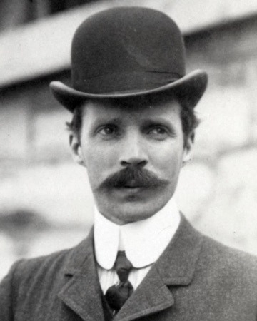
R. J. Mitchell
RJ Mitchell, Reginald Joseph Mitchell, a British aircraft designer was born in Staffordshire on May 20th 1895. He is most well known for designing seaplanes, specifically the Supermarine Spitfire war planes. Other than his series of Spitfire War planes he also designed light aircrafts, fighters and bombers.

Above is an example of the iconic Supermarine Spitfire Warplane, which was nearly called the Shrew but was instead named the Spitfire after Robert McLean's daughter Annie who he described as a little "Spitfire". This aircraft first flew on March 5th 1936 however, during the Battle of Dunkirk, it was shot down and forced to land on May 24th 1940. The Spitfire officially retired in 1961, although according to some extra research I found out that one/two of the Spitfires (Spitfire 9734 Mark 1) was restored in 2015 and sold in auction for £3,106,500.
Spitfires were painted in a specific colour scheme of dark earth and dark green, which were used primarily by these planes at a high altitude as it was to camouflage the plane from an attack from the enemy. Low-level Spitfires were painted pink so these could hide against backgrounds of low clouds, smoke and fire. The roundels on all these signify that they are all from the Royal Airforce UK, to prevent allied forces from shooting down their own planes.
I like this colour scheme the designer has used for camouflaging the spitfire war plane, while it is undertaking its duties because I find this scheme very recognisable and retro. The theme of camouflage has also been used in many different forms of fashion and pattern design, not just for aircraft in general. Other than this style being of a green earthy colour combination, camouflage also comes in a variety of colour combinations such as light and dark blues, dark and light pinks, whites, browns and reds and lots more.
Henri/Henry Farman
Henri Farman was an anglo-french aviator and aircraft designer alongside brother Maurice Farman. He was born in Paris, France 1874 to a French mother and British father, who were living France. Before becoming interested in aviation and flight he was a famous sportsman who had won several prizes and set many records. In 1892 he became the French 100km champion in road racing and in 1894 alongside his brother Maurice they became a famous tandem pair, setting a speed record. In 1902 he also became an accomplished automobile racer winning the Paris-Vienna race and in 1904 while recovering from injuries in a car accident he discovered aircraft and aviation, which he thought was safer than automobile racing. From there he worked 2 years building and maintaining cars to save enough money to buy his own airplane from the renowned Vosin brothers. Shortly afterwards he began to engineer and design his own series of Farman aircrafts. At the end of his life he had designed 200 types of airplanes and several engines linked to that.

Above is one of approximately 60 Farman F.60 Goliath’s, which was part of a fleet used as the first ever commercial airline across Europe. This plane had its first flight in January 1919 and was introduced in February of the same year, for flights across Europe that could hold a capacity of 12-14 passengers. The interior design for the Farman F.60 Goliath was extremely basic that it was insulated with mere flying jackets and fug boots. Seeing as back then there weren’t seatbelts passengers of the plane were tossed about dangerously that would’ve caused injuries. All transport including aircraft eventually introduced the use of seatbelts in 1959. The invention of these planes helped pay the way for future developments such as the Boeing 7x7 series. I like this series of Farman aircrafts, specifically the F.60 Goliaths because compared to other aircrafts I have looked at previously such as the Boeing 7x7 series, this design is very simplified and old fashioned.
0 notes
Text
Design Feedback- Which Is Better, A White Background Or Black Background?

Today I produced two visual samples of what my final open screen printed pieces would look like. As seen in the picture above, I started off by folding my paper in half and then illustrated two different overlapped drawings of planes, using crayons, specifically red (reddish-pink), yellow and blue. Next I began to ask family, friends, teachers and classmates on what background they thought was best and the results were that the majority of people said they prefer the white background, while only three people said they preferred the black background.
A reason why one person chose the white background was because they liked the layout of the planes, while another person picked black because they thought it combined well with the chosen colour scheme of the planes and was the one that stood out the most.
I prefer the white background because I also like the layout of the planes and the fact these stand out on this specific background, showing a 3d effect. I'm not too keen on the black background because I felt using the art medium of crayons wasn’t working well with the colours chosen, and felt that one of the planes wasn’t very clear and looked as if it was fading away. If I had used a different medium for the concept of the black background or made a collage of it then it would likely work well.
0 notes
Text
Design Development

Design Sheet 1.A

Design Sheet 1.B
Above is photographic evidence of two different design sheets I developed during the holidays, showing my ideas and plans on what I will be creating for my final pieces of screenprints in the form of an illustrated timeline that shows how my drawing skills have improved in and out of college.
On reflection about my designs, I numbered and categorized each of my screenprint sketches where these were rated out of 10, with 0 being the lowest and 10 being the highest. Ranking and grouping each of these ideas for my final piece helps me to re evaluate which of my sketches will be the best design format for my final pieces.
My next plan for this project is to produce some more complex design samples using the drawings I produced from March 2nd-March 27th 2021 (See posts on drawings parts 1 and 2). With my final six chosen drawings I will start playing around with the idea of overlapping my images and different angles and components of planes e.g. engine, flaps, propellers, doors, windows etc using my sharpie and sign pen to see which method would show better when it comes to the screenprinting development.
So far I havent made any changes in my ideas as I was quite set in my mind on what I was going to produce from the beginning of the project. I wanted to work on screenprinting for my final major project as this is a method I havent used before, and I wanted to try a new art medium as I have experimented with mono and lino printing before but wanted to do something different.
0 notes
Text
Open Screen Printing Development

My task for today was to create a sample screenprint for my final major project. How I did this was I gathered up some of the materials I would be using for this particular piece which were an acrylic paint medium and two different coloured inks which were a reddish pink and black. I chose to use these two colours of ink for my piece because I felt these colours would give me a strong mixed dimensional image, which I thought would be engaging to the audience, which in this case is children.

I started off the first part of my process by selecting one of my eight drawings chosen of choice. For this I decided to choose one my continual line drawings, which was then put underneath the frame.

Next I went over my image using my chosen coloured inks and had to make sure everything was covered. The reason why I had to make sure each section was covered with ink is because this would produce a much better final outcome without any white gaps.


Print 1.A: I am pleased with how this print came out because the chosen colour choices have justified themselves and stand out well giving the whole piece a sense of depth, which reflects the three dimensional nature of these illustrations.

After completing my first screen print, I decided to do a second one using the same methods used for my first. Unlike my previous print where I used two different coloured inks for this one I chose three colours, two of which were the same colours used for my previous print with the addition of a yellow ink. I decided to experiment with three colours for this print because I wanted to see how the contrast between these three strong colours would work.

Print 1.B: This print didn’t come out so well because when using the squeegee usually I would have to do this process slowly in order to achieve the result I want. However, I ended up rushing this process and ended up producing a smudged screenprint. This error had showed me that the colours of this particular piece, work extremely well together because it produces a contrast and texture that is very powerful.
0 notes
Text
Initial Drawings Part 2
I carried on producing some more drawings for my project where I continued with the same task I was set from last week on March 18th 2021 of timed drawings. I continued using the last mediums I used for part one of the task which were pencils (coloured and sketch), white gel pen and black fineliner and gel pens. This time I tried out a new form of art medium which was crayon. I have produced several crayon style drawings before for previous projects but decided to have another try at using these.

P 1.A: 25 minute timed drawing of an airplane wing closeup using black gel pen

P 1.B: 25 minute timed drawing of a plane closeup using graphite/sketch pencil and a multi coloured pencil

P 2.A: Drawing of an Easy Jet plane using pencil

P 2.B: Continual lined drawing of a plane engine using black crayon

P 3.A: Continual line drawings of planes and various compartments e.g door, wing etc using various media of pencil, crayon, coloured pencil, black fineliner/gel pen, blue biro pen and yellow brush pen

P 3.B: Continual line drawings of various plane compartments using dark coloured brush pens

P4.A: For this drawing I used a normal HB pencil at first but then switched to using coloured pastels and charcoal for the outlines to make it look more effective and have a 3d touch to it. This drawing was quite difficult to complete because there were certain elements on the side of the plane, two of which were half of the wing and the engine facing the right.
Overall I am very pleased with how each of my drawings came out because I really like the variety of materials I chose to experiment with for each of my works. The reason why I wanted to experiment with these art media listed above is because I wanted to show variety in mark making, tone and line quality. Each of these will allow me to further experiment when developing my ideas for my screen prints.
Out of these drawings, my best ones have to be P 4.A and my selection of continual line drawings, P's 3.A and 3.B because all of these show a geometric effect which show certain elements of patterns, particularly in Ps 3.A and 3.B.
When comparing both parts 1 and 2 of all my drawings, on this section I have experimented more with each parts of the planes such as the engines and wings in different angles while with part 1 most of my drawings were of the entire planes.
0 notes
Text
Initial Drawings P1
The task I was assessed today, was to explore a wide variety of different drawing techniques, and to complete a selection of observational drawings by eye. I started off by finding many images of planes from the olden times all the way to todays innovations. The resources I have used for my research are Google, Pinterest and other imagining sites such as Shutterstock etc. The media I used for this task were pencil, oil pastel, biro pen, gel pen and charcoal, all of which were used on A4 white, black and coloured papers. The first two drawings I produced are initial sketch designs of ideas for my final piece while the rest were timed between 20-25 minutes.

Piece 1.A: Initial design sketch of a Spitfire plane.

Piece 1.B: Initial design sketch of an airplane.

P 2.A: 20 minute timed drawing completed with eyes closed.

P 2.B: 20 minute timed drawings of two planes using pencil and oil pastel

P 3.A: 20 minute timed drawing of a plane using oil pastels.

P 3.B: 20 minute timed drawing of a plane from Israel using black gel pen

P 4.A: 20 minute timed upside down drawing of an American airline plane

P 4.B: 20 minute drawing of a fighter jet plane using charcoal
Overall I am pleased with how each of my works came out, because I like the attention to detail added onto all of my pieces, and the way every one of these show a 3D format and movement.
Piece 3.A seems to be one of my best works because of the selected colour scheme I chose of light/dark blues and whites, and how these colours stand out well on the black paper.
When developing piece 4.A, I aimed to complete a 20 minute timed drawing upside down, where it changed the perspective and the balance of the picture. This made it quite uncomfortable as I had to think carefully about the proportion and details on each section the plane. I am very pleased with how this drawing came out because each of the elements of the plane have been accurately depicted, the fine detail such as the airplanes windows as well as the bigger detail such as the wheels and engines. Another thing I am pleased about is the angle of the wing, and the suggestion of the other wing on the far side of the plane. I am also pleased with the wing tip which is the right angle for being upside down.
The weakness in P 2.A and P 2.B is based on the lack of experience I have drawing airplanes, as it hasn't become an automotive process because drawing airplanes is a challenge that I have given myself in this project to develop how I see different objects. These two drawings were completed in the evening, and show that I find it difficult to complete a detailed drawing when I am feeling tired and also shows that it isnt the best time for me to work on those style of drawings as the proportions need to be exact so that the balance and weight of the aircraft are represented.
0 notes
Text
Oliver Jeffers
Oliver Jeffers is a well known children���s illustrator and author who works in painting, bookmaking, drawing, collage, performance and sculpture. He is most notable for his illustrations in a variety of children's picture books including his own which were Lost And Found, Up And Down, The Heart And The Bottle and How To Catch A Star. Other than his own books he illustrated Drew Daywalts The Day The Crayons Quit and The Day The Crayons Came Home.

This piece of work is a collaboration between Jeffers and Sam Winston in a book written and illustrated by them both, called "A Child Of Books". Upon looking at this piece of work I have a strong inclination that it has been hand illustrated with a digital format used to enhance the images shown. Even though the colours used are very soft and serene, the actual piece shows great movement of an explosive nature, seeing the man made objects and animals coming out of the globe seems to excite the readers of this particular book. The main sources of inspiration behind their work was their knowledge of children's classic literature, which they included via typography in words and letters on each page, blending these fonts with the illustrated art and shapes. Other than book titles they also included certain elements and quotes from the books chosen to be featured in the story. Reflecting on the image chosen, look closely at the objects coming from the globe as you will see they are all from different children's stories e.g Black Beauty, Little Red Riding Hood, Alice In Wonderland, Moby Dick, Chitty Chitty Bang Bang, Treasure Island etc.
I like this piece of work because they used their illustration skills in a very clever way where they combined drawings, graphic designs and typography to create wonderful pieces for adults and children alike to embrace and enjoy. I like how this piece has an abstract feel to it and the wide variety of colours chosen to be featured.
0 notes
Text
Beatrix Potter
Beatrix Potter was born on July 28th 1866 in London, England. She is one of the most notable children’s author and illustrator of all time, most known for her drawings of nature such as plants, flowers, trees etc and animals in particular one of her most iconic pieces, Peter Rabbit.

This piece of work is of a book cover featuring Peter Rabbit, one of her most notable literature characters in history. The main character, Peter Rabbit is depicted coming out of the scene almost to emerge the reader into the story. The background is slightly blurred and not as clear as the characters, fruit and plants outside the frame of the book. In this particular piece of work perspective is used in a clever way as it starts off with a 3d aspect all the way to a more 2d aspect on the actual cover of the book. The media used in this piece are mainly ink and watercolours with a specific colour palette that identifies each of the characters on the cover.
The inspiration behind her works are her early life and childhood, all the animals that surrounded her and the things she found in her garden and house. During her childhood she was very isolated and homeschooled, and the only company were the various animals and pets she owned. This upbringing changed both her artwork and the content of her books. The pets she owned and woodland creatures such as rabbits, birds etc became her friends where she used those to invent real human beings.
Just like E.H Shepard Potters works, Potters works are aimed for children and appeal to adults for the same reason of her stories, being moralistic. Her works are also highly collectable which have been featured on various products such as baby wear, furniture, stationery, kitchenware and others. I really like Beatrix Potters works because I like how she used animals as the main characters to make them a little bit more human like.
0 notes
Text
E.H Shepard
E.H Shephard was born on December 1st 1879 is a well known children's illustrator most notable for the illustrations of animal characters in A.A Milne's Winnie The Pooh series and Kenneth Grahame's Wind In The Willows.

This piece of work is of an illustration of one of A.A. Milne’s Winnie The Pooh stories featuring pooh and piglet. E.H Shepard’s works are usually done with pencil, tone and shade, but for this piece he seems to have used watercolour paints and ink for the outlines. The size of this piece varies depending on publishing needs as this is an illustration that is meant to be in a book. However, his illustrations were very popular and were exhibited separately and would be of original drawings and publishing mockups varying in size. The inspiration and concept behind his works were observing the slightly absurd aspects of life even in his illustrations depicting war.
In the Winnie The Pooh books the depiction of the animals are based on his sons toys for example Winnie The Pooh was based on Growler, his son’s teddy bear. There are community and environmental considerations within the work because where it is set, in the woods and how the characters interact with this environment shows a desire to conserve those aspects of life. This work appeals to the audience of people all over the world of all ages from young children to adults.
Even though his works are mostly aimed at children, they also appeal to adults because of the moral stories and the values of the characters and also highly collectable and worth large amounts of money. When comparing E.H Shepards works to Jorg Saupes or Quentin Blakes for example we find that their works are more cartoonish and have much more movement within, whereas with the works of E.H Shepard they are more simple, relaxed and calm, almost naïve in some aspects.
His works have given me ideas and inspiration for my final major project because I like the use of prominent outlines of subject that seem to be quite similar to my own style of art. Another reason why I like his works is because I like the way he has shown shade and texture but in a very carefree way.
0 notes
Text
Artists Research
Seeing as my final piece will be an illustrated outcome I have looked into six different illustration artists. The artists I have looked at are the following listed below.

1) E.H Shephard

2) Beatrix Potter

3) Oliver Jeffers

4) Jörg Saupe

5) Pintachan

6) David Shrigley
Update, April 20th 2021: Even though I wanted to look closely into artists 4, 5 and 6- Jorg Saupe, Pintachan and David Shrigley, I decided not to because seeing as my project is all about Innovation, with the main source being about planes I thought that these artists weren’t relevant to what I was focussing on. Instead I made the decision to look into three different aircraft designers, inventors and engineers.
0 notes
Text
Kettles & Teapots Moodboards


These moodboards I produced are of a collection of vintage and modern day kettles and teapots. As mentioned before on my other two moodboards, I carried on with developing this by finding my images on Google, producing it on a Powerpoint then combining all images together into a picture. I found some aspects of these kettles and teapots quite interesting at first, but wasn't too sure of an idea on how I would develop this chosen subject further. The reason why is because in my opinion these wouldn't work visually for me, as they aren't mentally stimulating enough for me to enjoy creating images and designs based on this subject matter.

I like these two images of the kettle and teapot because I like the sharpness of each respective object and also the density of image 2s purple/blue and the shine of the silver body on image 1. I also like the form of globe style shapes on both these images as they look impeccable and interesting.
Even though I find each of these images appealing, I found that kettles and teapots are quite generic as they all have the same forms of shapes which includes a spout, handle and body. These wouldn't work for me as otherwise if looked into this subject further I would find myself repeating the same drawings for my design ideas.
0 notes
Text
Planes & Aircraft Moodboards


These moodboards, created above are of a selection of different types of aircraft, in this aspect vintage and modern day planes. Many of these images I found on Google and Pinterest, which were then copied from each site and then pasted onto a powerpoint. Afterwards I combined all of these at the same time to create a picture. I found this particular subject of creating aviation and aircraft moodboards very fascinating because these allowed me to visualise different types of planes from a variety of eras and different structural concept designs and shapes thus helping me to aim for the two images I have chosen to focus on below. I find this concept fascinating because of its the interactions between shapes and environments, as thats what makes various aircraft fly. The fascination in drawing different aspects of aircraft has expanded my skills in illustrating shapes and three dimensional objects.

P1.A: I chose this image of a modern type aircraft/airplane because I like the way it has been formatted and the fact it has a slight 3d element, which lets the viewer see the left wing at a different visual angle, compared to a typical one dimensional view. I have created a sketch of this image and was very happy with the outcome because it was quite easy to draw based on the fact it was a linear and hard structured image, which reflects on my own personal form of art. See evidence of drawing below.


P1.B: I chose this image of a children’s toy vintage type aircraft/airplane because it has similar characteristics as image 1.a. The characteristics that are similar to this, are that they are both of a 3d angle however, unlike the first which is pointing right, this one is facing the left. I like this image chosen because I find it very unique in its design and structural element. The reason why I find it unique in its design and structural element is because it is propeller driven and is a bi-plane styled design which was the main design of aircraft in the early 20th century. I personally like the way this plane has been structured as it gives me a steampunk feel to it. By looking at these different styles my ideas have been developing, giving me more choices of design.
0 notes