Don't wanna be here? Send us removal request.
Text
So you wanna practice/draw side portraits?
(Obligatory don't take my words or tutorial as a fact, how i do things kinda sucks. Also, while pictures are on this, I'll be explaining what I've done in each part in writing to the best I can.)
Also before we begin, here are a few useful tutorials I have saved that I use quite a bit:
Hands.
Arms/legs.
Furry spines. You'll see what I mean when you read the post.
Ass.
Proportions.
Chub tums.
Expressions.
I actually use(d) these posts quite a lot and you'll see that in my sketches a lot lmao. Now, tutorial time!
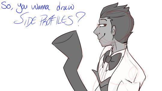
^^ bastard bitch man shows his face again (oc: Dexter). Title card, nothin' special here lmao. You will see this image again if u end up watching my pv video tho NBdjdhdjhdeh
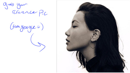
Grab yourself a reference photo
(I,,,,, couldn't find a source for who this picture belonged to nor who they are so,, that information would be amazing lmao). Now, I do want to make it clear, this tutorial is more about grasping side portraits in order to start stylizing and grasping it in your own style. For the first few times, I suggest tracing the references until you feel comfortable with the proportions and common shapes (note: it is okay to trace things in a learning setting as long as you don't try to pass said thing off as your own, yadda yadda, copyright stuff.)
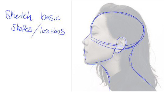
Sketch out your basic shapes.
Think of how skulls are shaped. In the top majority of a skull, there is obviously the cranium, nose bone, eye holes, cheekbones and top jaw. In the bottom majority, there is your lower jaw ofc. Whenever I make my basic shape sketches, I try to picture how a skull would be positioned and roughly copy how I picture it to be. On the sketch, that's the starting oval, nose bridge, ear location (where your jaw bones connect to one another), and general jaw shape.
With your basic head drawn, you can move on to the neck bones, which will then connect to the shoulders and etc.
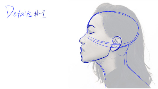
Details #1
This step is pronouncing where exactly everything is, based on the general skull shape you have sketched above. Very important things to note:
Eyes are typically right where the nose bridge ends and connects to the forehead. Ears are right under where the lower jawbone connects to the top and also right under where your temples would be. Eyebrows will typically be right on the edge of the side profile, though you can get creative with it tbh. Adds more expression, when you're not practicing.
Lips suck, sometimes i just don't draw them lmao. However, it should be noted that most of the time, the length from the nostrils to the upper lip is typically equal in distance of the bottom lip to the chin. It's just smack in the middle.
Notice the lines for the chin are not completely straight to the jawline and instead curve to connect to the neck.
Also note: anatomically and within tropes, most female throats have very little to no Adam's Apple being physically shown on the throat, where the male throats have theirs much more visible. That is not to say afab cannot have a prominent Adam's Apple, or amab's Adam's Apple is present at all-- an Adam's Apple is, in fact, a funny little lump of cartilage that grows during puberty. It helps to protect your larynx [voice box]. Another fun little function of it is the assistance of deepening one's voice. It's not useless after all, huzzah!!
You can actually get it surgically reduced, fun factoid of the day. Idk about making it bigger tho. I don't see why not but i dunno.
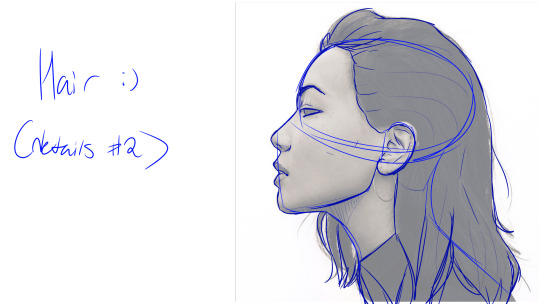
Hair and extra little details
[[ if using an oc ref sheet that is facing at the "camera", imagine the hair as if it were turned 90 degrees ]].
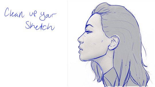
Clean up your practice doodle/your sketch
Mmmmmmm eraser tool go o -> O
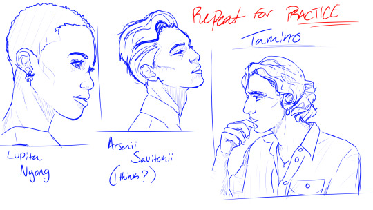
Rinse and repeat
Repeat the practice tracing until you feel okay enough with your basic shapes. Practice makes perfect and I cannot stress that enough. References are amazing; do not be my 6th grade art teacher who said to never use references. He should have lost his art teaching privilege for it.
**note: I tried to find sources for all the reference photos used. While I'm quite certain I got the lady on the left and the man on the right to their proper sources, the middle man was ,,,,, very difficult to pinpoint. When I reverse image searched for the reference photo sources, absolutely nothing came up but a name and MANY Pinterest shit. I looked up the single name (Arsenii Savitckii; model), and he looked the same. So I'm very much hoping that's who the photo belongs to/who's in the photo. If it's not, well shit, I can fix it then once I know who it is.
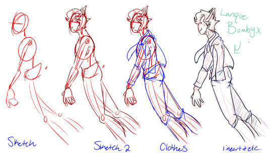
Process sketch ft Lanque
Sketch: made to get a feel of the body proportions and action flow. Idk what he's doin but he is very happy about it.
Sketch 2: basic body shapes. The neck connects to the shoulder blades and collarbone; it is useful for me to find and reference a skeleton chart and imagine it in the same pose. Some things i found through trial and error:
Where the armpits end, the boobs starts.
If you want to move the shoulder, the entire section of the back kind of moves, due to the muscles associated to that area. By moving your arm, your breast muscles, side shoulders, shoulder muscles, lower shoulder muscles, and even parts your ab moves (slightly) along with it. This is simply due to the breast muscles intent in the first place: to support the weight of your arm. That is why some people making winged characters give the character an extra set of boobs and entire muscle sections: to support the wing weight.
The spine will always have a little FroMp curve to it. Again, to reference a skeleton chart.
Neck -> collarbone/shoulder blades/spine -> pelvis -> ass -> legs.
Sketch 3: Electric Boogaloo/Clothes: clothes follow the same action the body is doing. Lanque's doing some sort of little spin,,, dance,,,,,, thing? So, his overcoat and tie is flowing with that action. In the same vein, here are places of clothing articles that will commonly have folds in it:
Elbows, knees, and ankles will have lots of folds since there is typically lots of motion there. Exeptions to this would be the cut of shirt, cut of pants (bell bottoms, tux dress pants, tuxedos in general bc they're typically pretty straight and tidy, dress shirts)
If the character has any sort of boob or ass, the shirt will fall over the boobs and ass and ,,,not really make an imprint? Unless your shirt is tight, the shirt won't hug the shape of your boobs or ass and will instead try to remain relatively straight. This will cause stretch lines.
Baggy clothes have lots of folds. They tend to be very loose fitting (ofc) and flow a touch different than a normal fitting shirt. Quite comfy, kinda feels like a loose hug. Fun fact again: the whole "appear less chubby" ordeal with clothes is basically to just wear stuff that appears to "hide" the chub. Baggy clothes are much better at "hiding chub" than tighter clothes, specifically bc they don't hug the body the same as tighter clothes.
Hoodies or jackets tend to have lots of folds. See baggy clothes, since they kinda sort of follow the same rules. They tend to fold up around any sort of tiny action being done. Stretching to the left, your hoodie will stretch with you. Stretching to the right, your hoodie will stretch with you. Numerous things going on with your arms cause the folds to appear to pull in opposite directions, though this also just depends on what you're doing.
Boots, if they go above your ankles and up your shin, will often have creases at the ankles. This is not an issue in your shoes, they have simply broken in and have loosened. (I think this is actually an issue in factory workplace settings, since you don't really want loose steel-toes if you're messing with machinery?? You could injure yourself or others, basically).
Clothes that don't rly fold a lot without lots of action flow is:
most tight fitting clothes (skinny jeans, tight fitting shirts, spandex, etc)
most suits/tuxedos are very straight and don't have lots of folds due to being neat and tidy. they're meant to be prim and proper, and clothing folds = wear and tear, which in turn means the tux/suit hasn't been taken care of??? Uhh idk man, fashion rules are weird.
Actually, lots of fancier clothes and dress shirts don't have lots of wrinkles or folds. Same prim and proper stuff. However, they probs do have some folds at the elbows bc yknow,,,, ya gotta move your arms.
The tdlr here is to keep an eye out for the action flow. If the wind is blowing a certain direction, the clothes will follow (depending on how strong the wind is) and most certainly will one's hair. Clothing folds can also be illusioned with shading!
Lineart and etc: just as it seems; lineart, coloring, shading, etc. Sometimes you make some goofs. This is the perfect time to fix those goofs, if you want. Ig. I dunno, do what u wanna.
---
Nsndnfndsndnsidn it's almost 5 am, I've been writing for the past two hours??? Doesn't feel like it. Im sleeby. going to bed.
XXX
What the fuck this is so good
80 notes
·
View notes
Photo
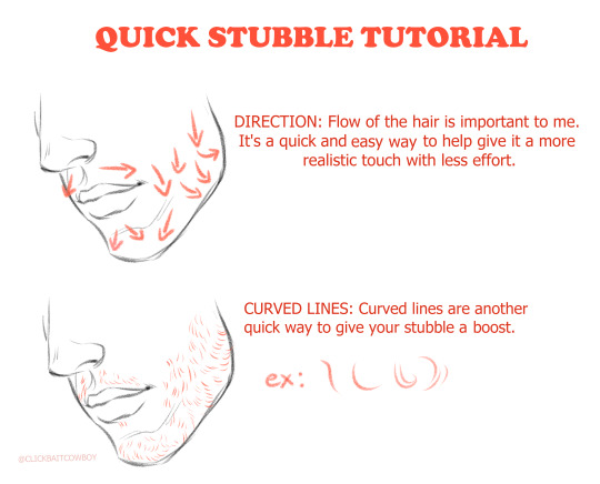
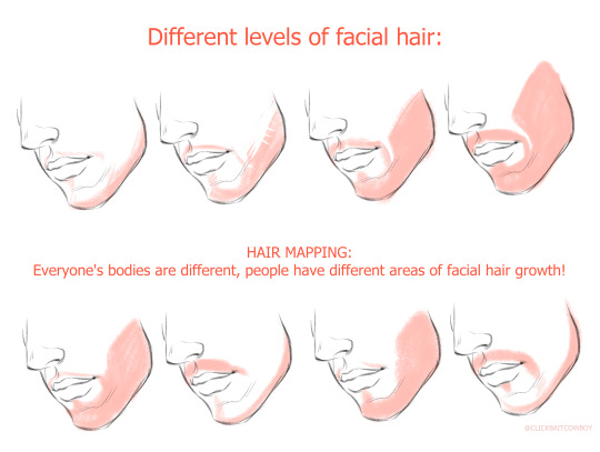
He’s a quick little guide to how I do stubble. My other body hair guide
7K notes
·
View notes
Text
Alright so I got tired of every drawing tutorial for drawing noses only showing how to draw basic Caucasian noses, so.....
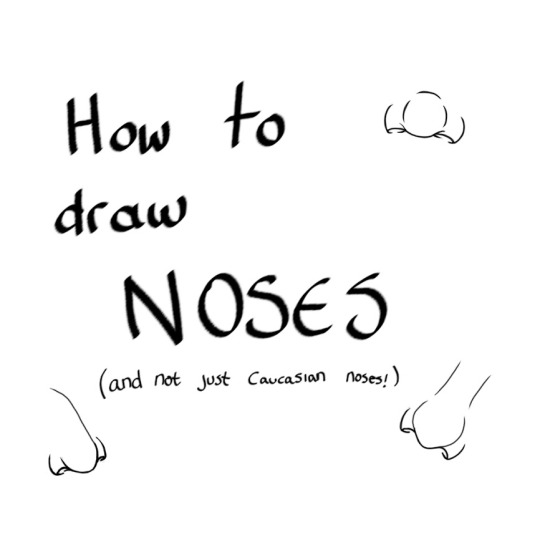
Yes that's right, here's a tutorial!
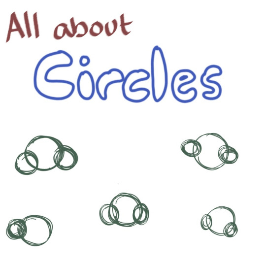
It really is all about circles, all you have to do is draw three circles, almost like an upside-down Mickey Mouse. And for a profile view, you can just draw two circles. For different shaped noses....it's different size circles!
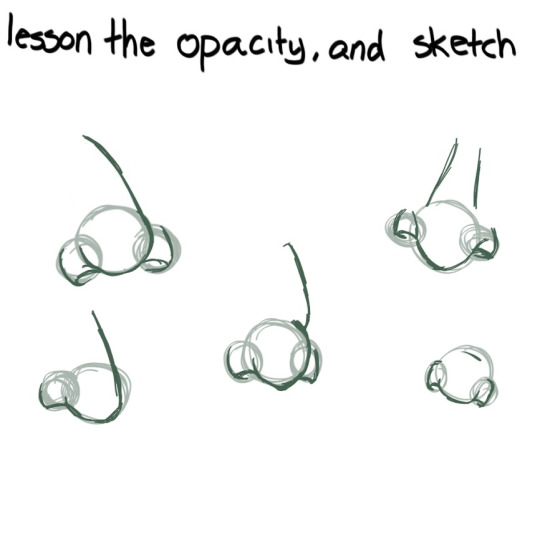
Next you lesson the opacity, or if you're doing traditional art, just erase a bit so the foundation circles aren't so opaque. Then you sketch the different nose shape over on another layer. Noses are just as diverse as humans are! There's wide noses, narrow noses, pointy noses, round noses, bumpy noses.....
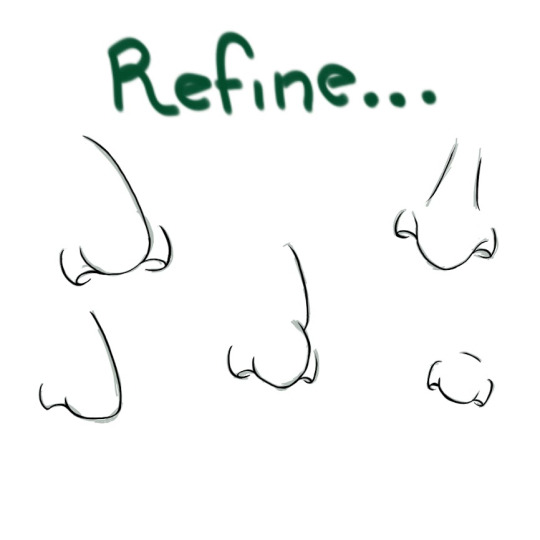
So now is my favourite part...refining the lines. This is where you make it all nice and neat looking, less sketchy-looking, although this step isn't necessary if your style is sketchy.
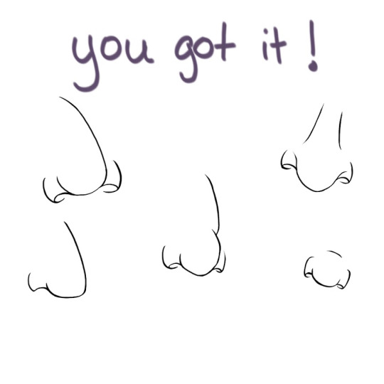
And you got it! I encourage you to practice with different nose shapes and sizes, because the more you practice, the better your skills become.
I hope you enjoyed this quick, very very basic and simple tutorial :)
49 notes
·
View notes
Note
Hey hey hey! 💕 🤠 I am trying to find some references/tutorials of the heads in different angles like left, right, top, from the back etc. If you can please and even if you can't thank you! Love your account.

This one was pretty highly requested and includes drawings that cover chins, jaws, necks, and heads.
Notes & Measurements
Approximately : bottom of eye to the bottom of the chin = chin to collar bone
Do not flatten the back of the head, unless your character has a dent in their head.
It’s easier to draw these angles if you draw a cross that guides the eye line and then the flat vertical ( | )line of the face.
https://artres.xyz/post/a-round-up-of-anatomy-quick-tips/ & https://www.tumblr.com/reblog/160735188527/DYrPmYIp
Putting these images because they are in public domain:
https://issuu.com/vinicius.dinofre/docs/andrew_loomis_-_drawing_the_head_and_hands

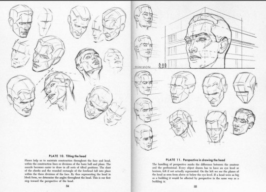


For the back. of head, I think the most important part for a convincing drawing is paying to attention to how the neck/shoulders look from behind and then the ears!
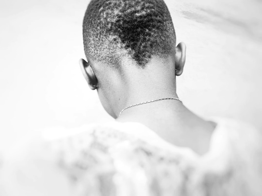
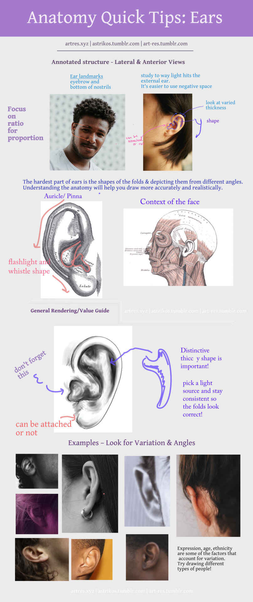
Hope this helps!
Thanks for reading! If this post helped, please consider reblogging it or sharing it with your friends! ❤️
More useful articles and resources / support Art-Res | my art tumblr | Idea Generator | Check out the Art-Res Anatomy Ebook!
2K notes
·
View notes
Note
You know I’ve always been very active on your blog and supported your art but I read that Anon’s message, and I hate to say I see where they’re coming from. Although you may not see it or think you’re doing it, as a Maori person, your clones don’t look like us. When you answered the Anon’s ask you used a specific drawing that looks very different from your other comics. You tend to use very sharp chin and jawline, and although you use a “round” nose, it is still VERY upturned. Also, we tend to have much fuller lips, it’s hard to see characters that are meant to look like me with paper-thin mouths. If you were to merely lighten the skin tone of your clone drawings, they would look like Caucasian men.
Again, I have always supported you and will continue to, but I see exactly where the Anon is coming from, and I’m asking you to please do better. Maori people lack accurate representation as is. You have the power to show us for who we are and what features we are proud to have!
I guess you’re talking about my recent comic. Let me walk you through the process of it. And may I remind you that when I’m drawing the clones, I know I’m representing Maori, but I’m also very much representing Temuera specifically. If I were to represent all the Maori everytime in one drawing it’d become a caricature and I’m pretty sure that’s racist.
Anywho, let’s turn this ask in a tutorial I guess! There’s a few things I always keep in mind. Here’s the side by side I made before as a starting point.

- A round chin. Tem has a bit of a round chin. Cody is the exception in my comic, but that’s simply because he’s looking up. So we’re partially looking at the bottom of his chin.

- Arched eyebrows. Tem has very outspoken eyebrows. But in a drawing I also have to convey expressions with them so the shape changes a little sometimes.

A soft jawline. Which, when Tem turns and in younger pictures does have a little bit of a sharp edge to it.

- Hooded eyelids. This one I cheat a little bit on because in most pictures of Tem he’s already a bit older. It try to keep them to look the same but a little younger. And I have to once again keep expressions in mind. Not adding Fox here, because his eyes are barely visible.

- The nose. Tem has a nice flat nose, that’s a bit wider. But I have to keep angles in mind, which makes a nose look upturned relatively quickly. As is the case with Cody’s.
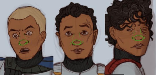
And lastly, the lips. Tem honestly doesn’t have super full lips. So I don’t draw them super full. That’s it.
Now I know there are some older artworks floating around in which I was still very much figuring out how to draw his face and stay true to my style. Because surprise, I’m an artist. Not only do I have to learn to draw things (what?) I also have a semi-stylized style I’d like to stick to.
Anyway. I know this is a sensitive subject, but anon please know that I’m doing my best. That I’m trying to improve with every drawing. And that I have representation very high up my priority list whenever I draw the clones or any other POC.
Maybe, just maybe, try to educate the people who are actually the problem here. Thank you.
33 notes
·
View notes

