
Don't wanna be here? Send us removal request.
Statistics
We looked inside some of the posts by imageandidentityagathazielinski and here's what we found interesting.
Average Info
Notes Per Post
0
Likes Per Post
0
Reblog Per Post
0
Reply Per Post
0
Time Between Posts
2 days ago
Number of Posts By Type
Text
16
Video
1
Last Seen Tumblr Blogs


Fun Fact
The KCSC sent more than 20K requests to delete posts related to prostitution and porn to Tumblr from January to June 2017.
Text
Social Media
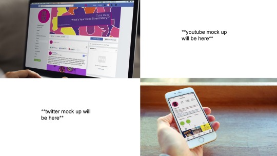
We acknowledge that there are four main social media platforms that cubadupa currently use but we feel the features of instagram and youtube best facilitate our brand essence.
Instagram
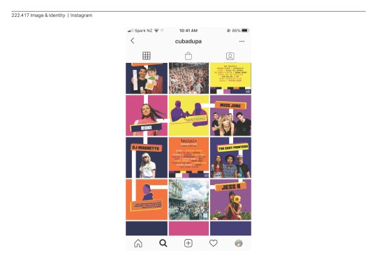
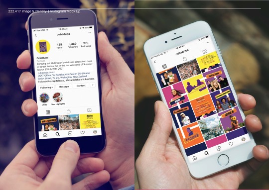
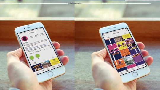
This is what an instagram template might look like. We have used the idea of connection through the white panels that connect adjacent photos and have continued to use the text box as a space to share stories and information.
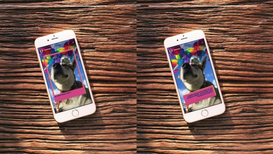
Instagram Stories
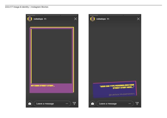
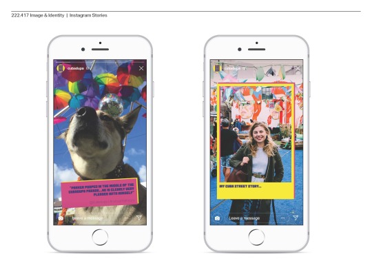
A significant part of our branding strategy is the use of instagram’s story feature. We have made story filters that encourage people to share their Cubadupa stories. the idea is that Cubadupa would then create a highlights reel where the Cuba street story can be viewed collectivley.
Youtube
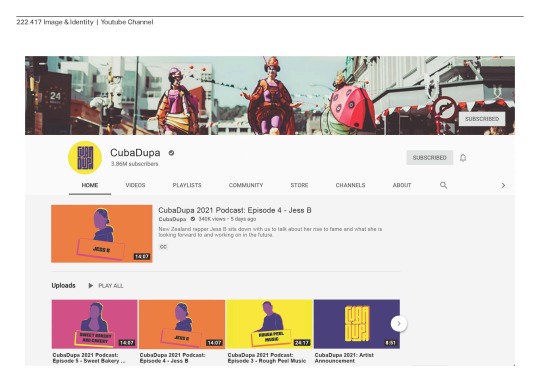
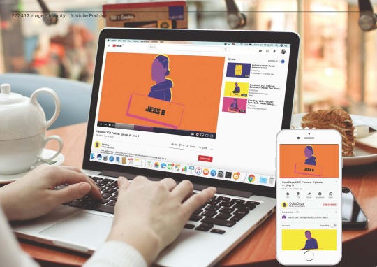
For the youtube channel we want to create a series of podcasts where we have guests who will be performing and facilitating the event to share their insights and personal stories about them and their experience leading up to and at Cubadupa.
This is what it may look like in a desktop and mobile format. We hope that this platform will act as a space Cubadupa can reflect on and share their own Cuba street story.
0 notes
Text
Your Stories
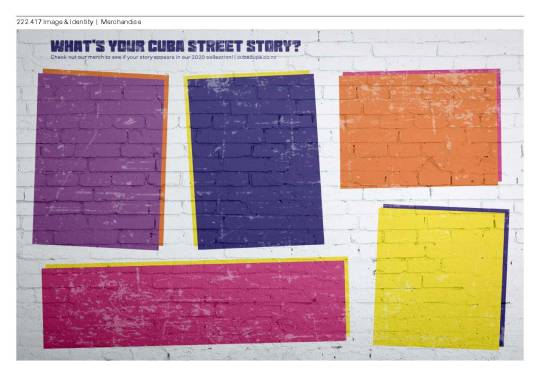
The first aspect is the interactive street art display which acts as space where attendees to the festival can come and share their Cuba street stories. from this the stories that are written on the wall are taken and feature in our merch.
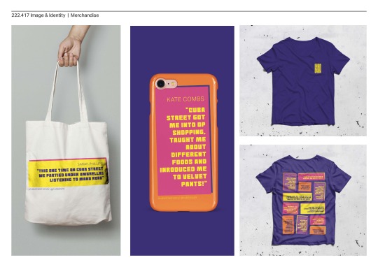
Here are some examples of the merch including a tote bag, phone case and t-shirt that will display some of the Cuba street stories from Cubadupa 2021
0 notes
Text
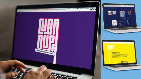
Website
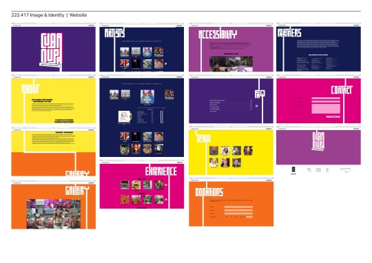
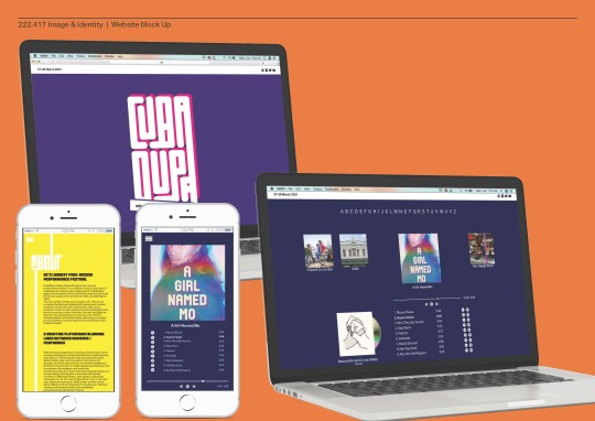
Here you can see the basic layout of the website where we have used our customised font to connect the different aspects of the website and festival together.
One main feature we have added is in the artist section where you are able to listen to the artist’s who will be performing at cubadupa.
0 notes
Text
Poster Series
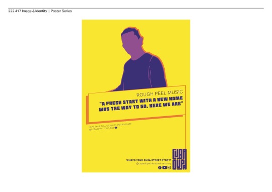
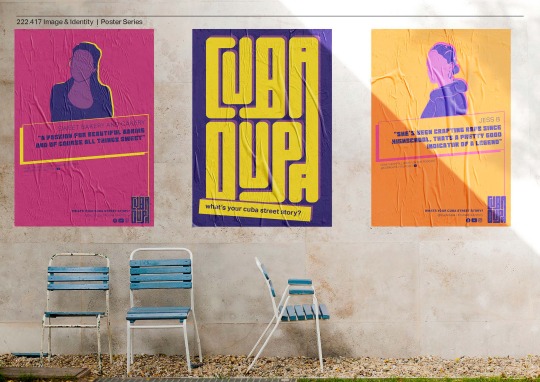
These will include quotes from podcasts that feature the guests on the YouTube channel. This is a way of showcasing what the festival has to offer. We’ve chosen to use bold simple colours and illustrations of these guests, and the text box is representative of a space for stories to be shared.
0 notes
Text
Journey Map
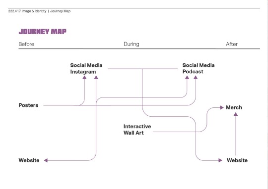
We’ve broken it up into before, during and after. Before the event, we will have posters that share quotes from the podcasts on the youtube channel with our attending artists, vendors and shopkeepers that share their stories. The posters also link to our social media which sends them to the website. During the event, instagram with have a large role to play in terms of the audience and facilitators sharing their cubadupa stories. additionally we will have an interactive street art display where those attending the festival can write their own cubadupa stories. After this, some of these stories will be chosen to feature on the merch.
0 notes
Text
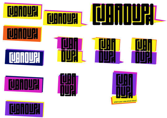
Final Logo Design
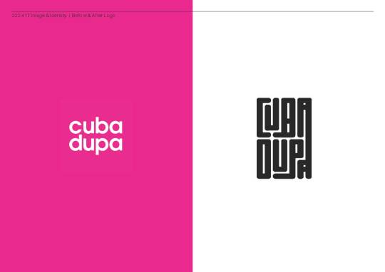
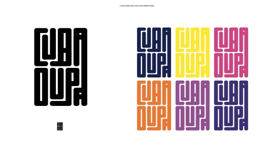
This the before and after CubaDupa logo side by side. The before logo is very simple font and can be used on range on different coloured backgrounds. The after logo is made using a typeface that shows the idea of connection and is aimed to be more playful.
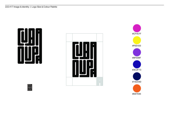
Here is the logo at both a smaller and larger size, and with the minimum space requirements. We have also chosen to stick with the original CubaDupa colour palette because we wanted to keep some existing design elements in order to ensure the brand remains recognisable.
This shows the logo in all of it’s possible colours.
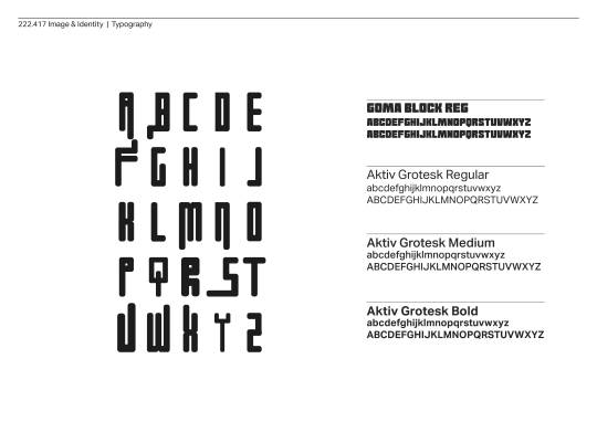
For the logo we have created our own font which can be easily customised to ensure that the theme of connection is consistent. For secondary text and body copy we have chosen to use the Goma Block Regular font because we feel it references our logo. We have also used Aktiv Grotesk in 3 different weights as it is a simple and minimalist font that is easily incorporated into our designs.
0 notes
Text
Final Theme and Brand Essence
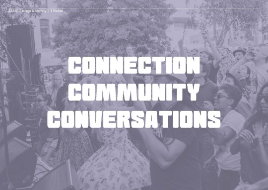
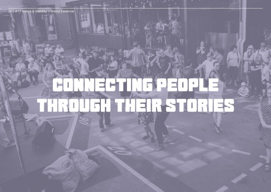
Through our research and audits in CubaDupa, we found that although the theme every year changes, it is the people who stay constant. From this we developed the 3 words - connection, community, and conversations - to shape our project. Using this, we came up with the brand essence of connecting people through their stories. We aim to use the stories and histories of both those who attend and facilitate CubaDupa to bring this diverse community together.
0 notes
Text
Week 11 Presentation and feedback
Consider how we want to style the presentation - careful not to give away/ spoil what the design style will be too early on in the presentation with our title pages
We have returned back to our simpler, more square logo without any speech bubbles or shapes around it
Would like to see a flat lay of the website before seeing the mockup
Again, would like to see all of the social media pages easily on a screen and then followed by the phone/laptop mock ups
0 notes
Text
Week 10 Updated Presentation Slides & Feedback
Feedback from Mark & Connah
the ‘telling stories’ narrative is coming along nicely and is quite strong
the before logo looks stronger than the after - could try changing the colours as they aren’t working together strongly.
the speech bubbles don’t have to be used in the background of the logo - they can just be used as an asset like how you use patterns or colour
try focus more on how the instagram features will be used and what the podcast will look like - don’t need to focus on facebook as much because they already have this and it is fairly straightforward
need to start thinking of our final presentation and what this will look like - e.g. how will we present the social media?? maybe we have 1 page with all of the different aspects we will have and how they work together and then a separate page for each platform


0 notes
Text
Interactive Poster Series


These are concepts for an interactive poster series that could be put up around town to gather insight from the public about CubaDupa and Wellington through their eyes. These could be put up together with the artist/performer posters as well.
0 notes
Text
Instagram story filters


One main way to bring in the interactive aspect to the social media for the event page is to get people using the event filters in their stories and tagging the page and sharing their experiences.
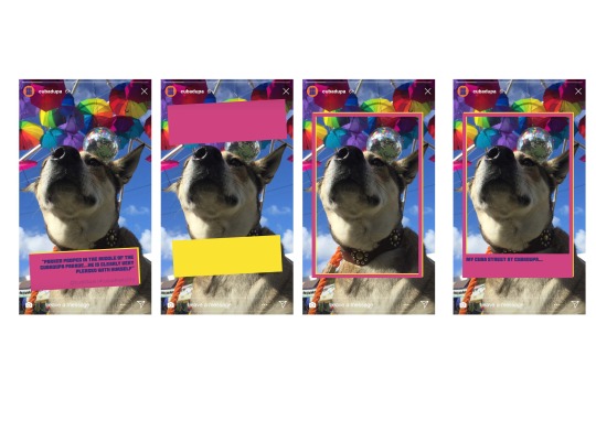
The polaroid frames have handwritten phrases saying ‘my Cuba street experience looks like...’ which allows this filter to be used all year round, not just during the weekend of the event. We were thinking we could incorporate the colour palette into this and have each frame as one of the colours.
The finger frames were another way of showing the user’s experience through their point of view, however we don’t feel as though they look quite right.
There is a lot of potential and things to play around with in regards to these story filters, such as bringing in the speech bubbles (and layering one on top of the other as we have been doing), and maybe even playing around with layering polaroids in this same way.
0 notes
Text
Instagram Layout Concepts


These are a couple of layout concepts for the CubaDupa Instagram page.
The first one is just using the existing colour palette and the speech bubbles to nam the artists. There are also some videos of previous year’s events, as well as quotes from the podcasts and posters.
The second layout incorporates the maze feature that has been used in the website which is a good way of linking the two together and bringing that element of connection in through the social media. However, I’m not too sure how easy it will be to make sure the lines connect through the posts, especially if they are moving across the grid as new posts are added.
0 notes
Text
Logo iterations
Once main piece of feedback Shanae and I received from our peers was to play around with incorporating the speech bubble into the logo.
I feel like by using the speech bubbles in the background keeps a consistent element in the logo, as well as the typeface and this would allow us to use the logo both as one long word, and the more square, 2 lines logo because it is still able to be recognised as part of the same family.
Also with this logo, there are many different colour variations and options to suit different backgrounds and different uses.
0 notes
Text
Week 8 Feedback
Here are the slides that we changed and showed for this weeks feedback and what insight we received..

Really liked the idea of the podcast, think its a great way to bring out our theme of people’s stores. Podcasts are very in at the moment so it would be a very impactful brand strategy.
Social media is a pretty easy way to bring people together and get them to interact, especially through what we play do with Instagram, however we need to make sure that we don’t forget about the stories aspect in the social media.

Keep playing around with the website, maybe bring in the speech bubble aspect? I think the website shows connection well through the physically connected typography.

Play around with connecting the logo to the speech bubble??


0 notes
Text
Logo iterations Week 7
Shanae and I received some feedback about our logo which was quite simple in the beginning about trying out different colours and textures in order to make it more exciting and give it some more character.

We started off with the simple black logo, and were told that it resembled and maze/labyrinth which inspired some of our designs, especially in the website.

We then decided to stretch out the logo horizontally a bit in order to make it more legible as well as fitting into a more square shape which fits better into different pieces of the of the brand identity. We also used the different colours in our colour palette (that we have taken from the 2020 brand identity). However we realised that we need to make sure we are using the exact same colours as we have noticed a slight difference in the different designs we’re doing.

Shanae then also played around with putting all of the text on one baseline with the tagline underneath, as well as incorporating the speech bubble on the bottom that we used in the posters. we got good feedback for that aspect but they still said to keep playing around with the shape and colours.

We also had these concepts with the original logo with a background of faces. However, when we showed these to other in the class, they didn't initially see the faces but rather just blobs of colours, which they actually liked better than the faces. This is because they felt the faces might be too detailed for the logo, especially when we needed to use it at a smaller size.
Shanae has also been working on the posters based on the feedback for those we got. Our original poster concepts were just working with the big cuba dupa type with imagery on people in and around it but we were told that there was too much going on here and it was illegible.

Shanae then made the background to the posters much simpler, just using our colour palette and then creating illustrations of the different artists or vendors. This is where we introduced the speech bubble with the story/quote from the specific artist/vendor which received good feedback, although we were told we could play around with the type for this as this is the main feature of our essence and we could try to make it stand out more. We also provided links to the event’s social media, and to the podcast where the performer is a guest on the show. We could also try to use QR codes to send people to the podcast more easily.


0 notes
Text
Grades/Feedback for assignment 1
We received an A- for our first assignment which is super exciting! Here is a summary of the feedback we received from Mark;
he enjoys reading through our blogs and what our reflections of the class are.
the findings board is good but has too much information - we need to trim this down and edit
the brand essence is to vague - we need to CubaDupa-fy it
the identity and narrative page weave the people/history/diversity aspects into the identity in a subtle way - there is more room for scaling here
how can the digital aspects of the identity extend over time (before, during, after)
is the silhouette and colour direction enough the tell the story of CubaDupa 2021?
there are a lot of opportunities to introduce movement into the designs
Some of these are things Shanae and I have already discussed about doing moving forward, such as adding more movement/motion in the designs. And others are things we touched on in the week 8 class where we spoke to others in the class about our brand essence.
0 notes
Video
tumblr
First attempt at animating the logo using aftereffects. This is done using one of the odder versions of the logo, but just to get an idea of what we could do with it!
0 notes