Text
I revised the ppt of my project 3 (Food Co-op) after receiving feedback last time! I added the progress of this project and takeaway keypoint from my research. The link of completed file is as above.


0 notes
Text
Feedly mobile app
A combination and synthesize platform featured for editing customized categories of news.
Takeaways:
Add online magazine into personal feeds session.
Be able to mark article into read later.

0 notes
Text
Safari mobile interface
Takeaways:
Users are able to view the process of website running.
Simple motion icons (circle, line, brightness)
0 notes
Text
Dia.tv website
Takeaways:
Use colors to distinguish between content and context.
Separated sections.
It’s responsive while moving cursor.
Have a strong brand identity by giving browsers intuition of what’s going on and what the brand is for.
0 notes
Text
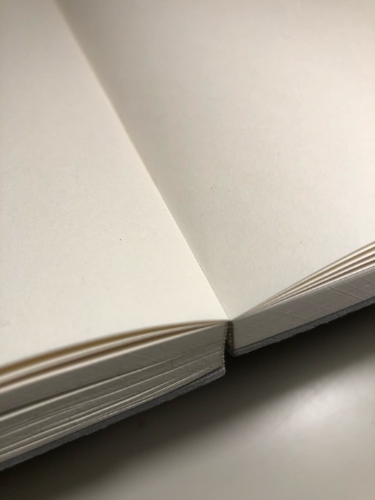
Sanyoshigyo the notebook
Takeaways:
It’s totally flat when it’s open.
Thick (no need to change notebooks), ninety degrees angle and blank paper (no chaos)
The grey surface is paper material with a bit rough, so it’s easy to maintain it clean.

0 notes
Text
Adobe XD
Software from adobe, usually is used for building prototype, but it’s even great for laying out pages.
Takeaways:
Easy to duplicate pages
Have numerical distance while adjusting objects
Don’t need to press command+R to view rulers
Better than Illustrator
0 notes
Text
reading notes-Top 10 IA mistakes
October 17, 2019
Structure mistake
invisible way and visible way
No structure, no organizing principles for individual items. Stand-alone unit without connections to related items. Subsites/microsites poorly integrated with main site.
“Search-dominant behaviors” search and structure not integrated
Online world benefit is that items can live in multiple locations.
Navigation mistake
No navigation and invisible navigation
Uncontrollable (user frustration), inconsistent
“Old words are better”
0 notes
Text
reading notes-The difference between IA and Navigation
October 17, 2019
Website Information Architecture (IA)
Site content, functionality and its relationship
It informs UI
A documented in spreadsheets and diagrams, not in wireframes, comps and prototypes.
Content inventory, content audit, information grouping, taxonomy development, descriptive information creation
Website navigation
Collection of user interface components
Global navigation, local navigation, utility navigation, breadcrumbs, filters, facets, related links, footers, fat footers
Usage priority, placement, pattern
Define the IA before designing navigation
0 notes
Text
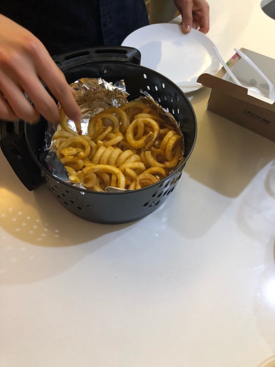
Air fryer
Takeaways:
No cooking odors
Easy to wash, two to three pieces to clean

0 notes
Text
Ovente 1.5L BPA-Free Glass Electric Kettle
Takeaways:
Fast heat up
Blue light for warning of still boiling
Automatically shut off when water is boiled
Clear instruction of how much water it could contain
0 notes
Text
Citizen app
Instant 911 crime and safety alert.
Takeaways:
Every time I open the app or not, it’ll tell me what’s happening around me.
Cases are sorted by location.
Colors of each cases represent the time. (red, yellow and white)
User can upload live video and comment, which are great for emergency situations.
0 notes
Text
Fonts in use website
Search for mixing fonts that are in use.
Takeaways:
Find font easily by clicking the name.
Variety of examples of using specific fonts.
0 notes
Text
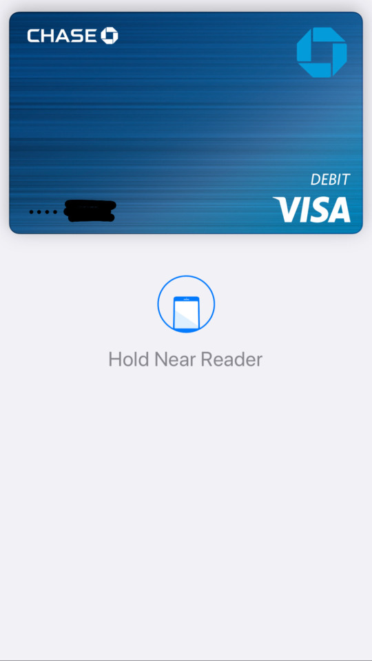
Apple pay
Takeaways:
Double tap home button for payment. (quick)
Don’t need to enter homescreen, look for where the wallet app is and choose the specific card.

0 notes
Text
reading notes-The game of life
October 10, 2019
Track users’ life style and change long term habits through games with features of unlocked challenges, physical benefits and seasonal sections.
0 notes
Text
reading notes-InstaUX_a 6-step guide to using instagram for UX research
October 10, 2019
Customer-based
Exploration
Find pain points, organize data bases into themes (build related groups), see opportunities, and get prototyping
0 notes
Text
reading notes-How to improve iOS for grandma
October 10, 2019
Interaction design is the design of interactions between users and products.
Advanced and diverse gesture used on a phone lead users to struggle with poor discoverability.
Affordance: what action is possible; Signifiers: where the action should take place
0 notes
Text
reading notes-Guerrilla usability testing the new experiences feature on Airbnb’s iOS app
October 10, 2019
Book experiences with similar experiences
Objective: clear goal by asking question
Target users: high-frequency/low-frequency; largest demographic/largest growing segment
Tasks: give contextual scenarios and ask users to think-aloud to complete
Synthesizing notes: group by themes “I notice” “I wonder”
Key findings: “my research revealed 3 key findings” Each findings has a question/conversation with a translation
Ideate and prototype solutions: after highlighting pain points, moving on to wireframing and creating high-res mockup. pain point+solutions; options; current+proposed
Validating solutions
0 notes