Text
When I work, it’s always a performance that I choose to undertake. It’s not a subject or an object; it’s one more human being. I link my body to this figure, because I want to translate its history. I consider my body as a human being, but always belonging to other subjects, to the person who I am in the process of reproducing.
- Samuel Fosso


Learning task:
What are the major differences between these?
How do you think they relate to the quote above?
The Black Pope Series places the artist at the center of the concept, using deliberate staging where every element, costume, props, and setting, serves a purpose. The work carries strong political and performative undertones, blending theatricality with raw, unfiltered photography. Despite its carefully constructed nature, there is an intentional sense of immaturity, preserving the authenticity of the story being told.
Lifestyle series feels fun and energetic, standing in contrast to his more serious later work. It has a playful and uplifting tone, which might suggest he was inspired by the bold fashion and style of the 1970s. Through staged self-portraits, he explores identity and expression, creating images that feel both personal and reflective of the time.
His approach to photography embodies this quote, his work is a direct reflection of it. He draws inspiration from himself, using his own body to connect with the figures he portrays. Through performance and self-representation, he becomes both the subject and storyteller, translating histories and identities through his lens.

More than just what is visible, the image is about identity and presence. The lighting setup plays a crucial role, with bright side and front lights softening shadows, while a central light creates a balanced and focused composition. Mirrors are present but show no reflection, adding a sense of mystery. A white shirt serves as a focal point, drawing attention to the subject. Positioned symmetrically within the frame of the garage door, the composition feels intentional and structured. The cold lighting enhances the formal quality of the scene, while the influence of the Sasa dance adds a sense of cultural depth and performance.
0 notes
Text
Week 12: DIGITAL PORTFOLIO
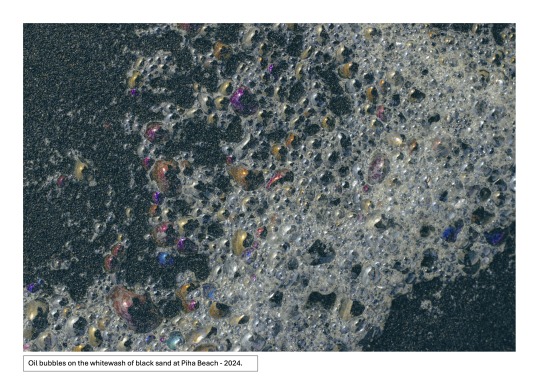
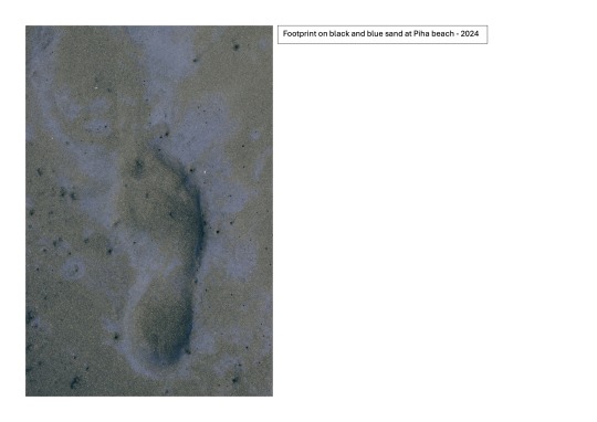
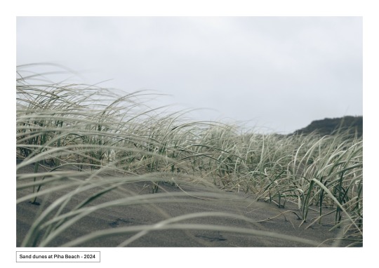
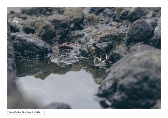
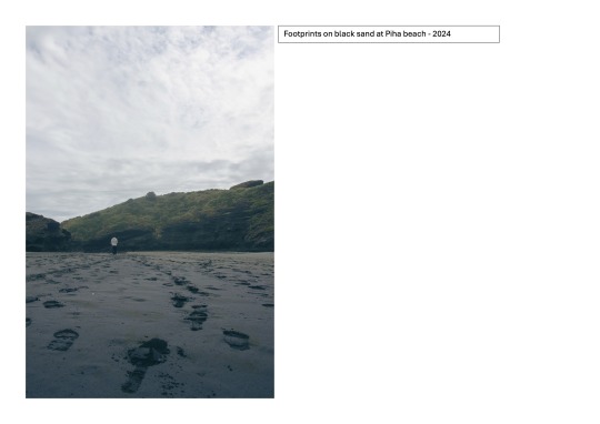
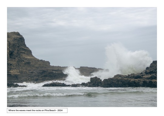
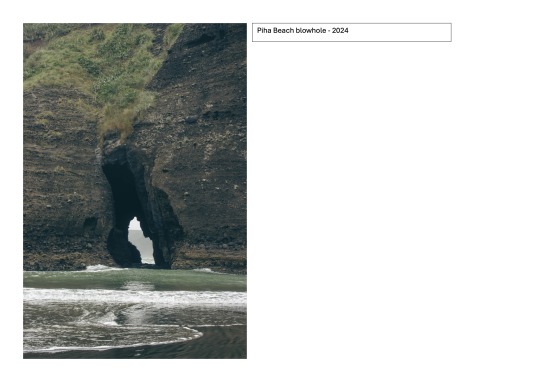
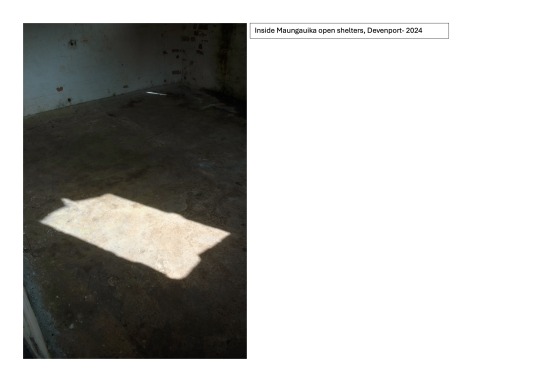
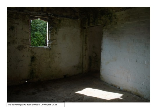
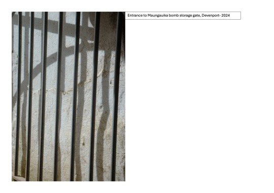
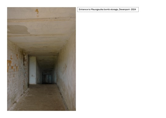
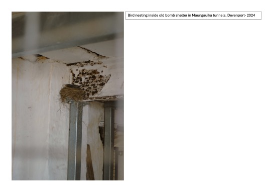
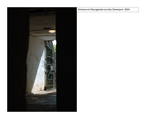
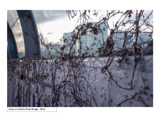
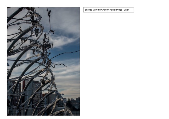
A final collection of my chosen images.
0 notes
Text
Week 11: SDL - The Story Behind Earth’s Most Famous Photo The Bigger Picture with Vincent Brown | PBS
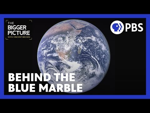
The "Earthrise" photo changed how we see our place in the universe. It showed Earth as a small, fragile home in the vastness of space. This image helped people realize that we are all connected and highlighted the importance of protecting our planet. It encouraged global cooperation and made us more aware of environmental issues. Its just fascinating to see how far we have even come from this photograph :)
0 notes
Text
Semester Break Week two: Exploration
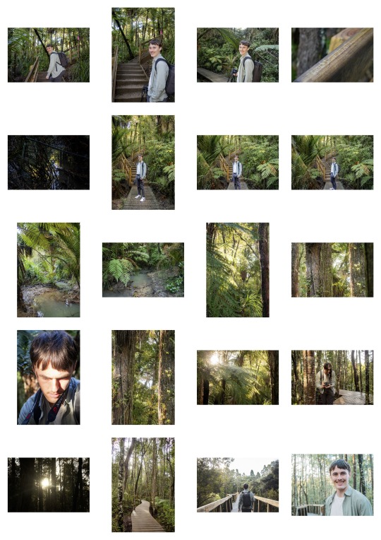
I just remembered these photos too! Unfortunately, I accidentally deleted a few, but I was able to keep some from my exploration of Kauri Forest Park—one of several places I ventured to in Auckland during this course. I was captivated by the way sunlight filtered through the trees, casting beautiful shadows and highlights, and how the wooden path naturally led the eye forward, creating a perfect leading line for my compositions.
0 notes
Text
Week 10: Test sample selection of Editing & sequencing
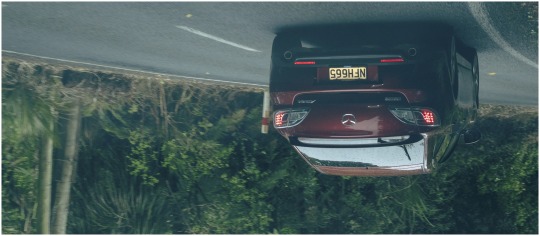
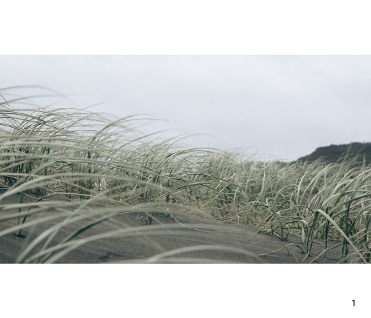
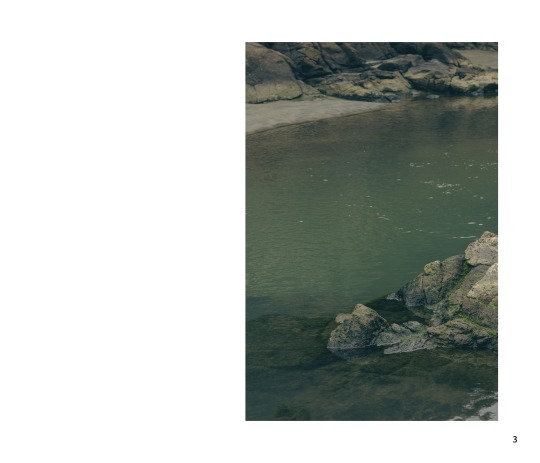
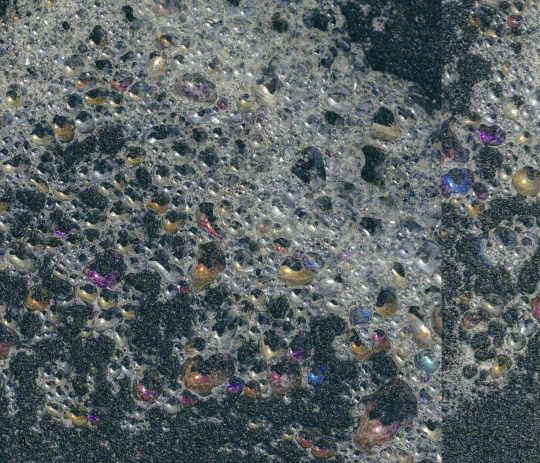
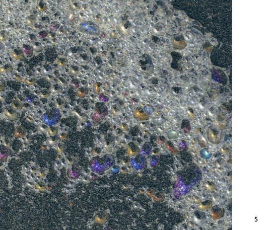
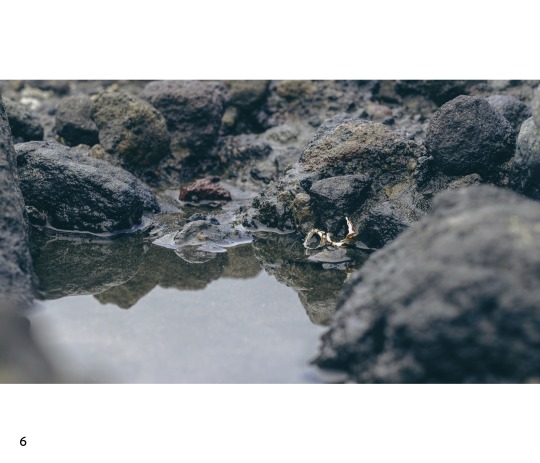
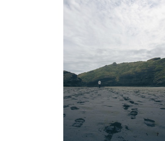
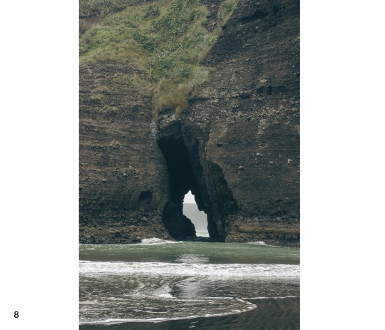
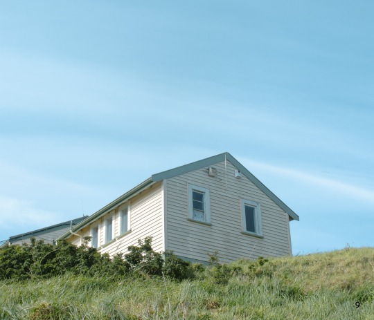
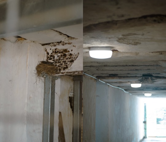
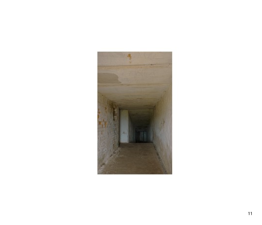
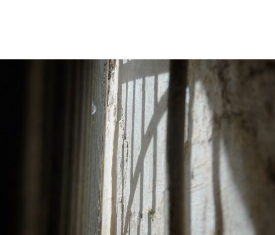
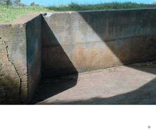
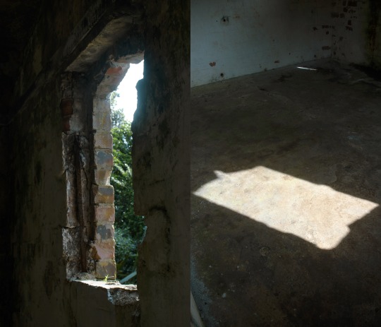
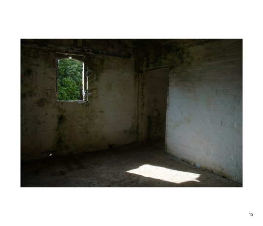
Here is my final version of the photobook, and I’m much more satisfied with the layout this time. I carefully revisited my artist models and incorporated similar elements to achieve a few key goals: 1) create a seamless transition from one photo to the next, 2) keep the design simple, with a clear focus on the images, and 3) tell a cohesive story. The result feels like a journey—through space, time, and light. I’m really happy with how it turned out!
0 notes
Text
Week 10: Aotearoa Photographers of the Week - Bridget Reweti
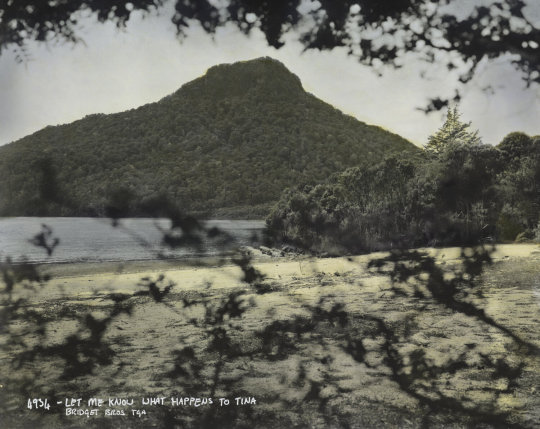
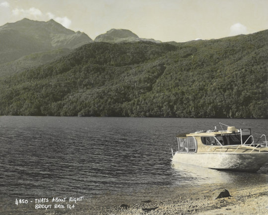
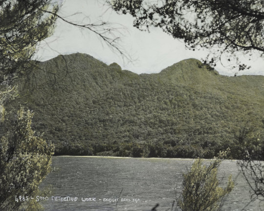
Bridget is another artist I wouldn’t typically explore, but her incredible images are actually developed from film! I’ve always found film photography challenging since you can’t see the final image until after it’s developed. I’m especially impressed by the rich colors and thoughtful composition she manages to achieve with this technique. Her work is not just about capturing any scene—it’s deeply personal, with locations that connect her to her Māori heritage.
Although I’m still more comfortable with digital photography for now, I admire the natural haze effect that appears in Bridget’s work. It adds a sense of age and mystery to her photos, creating a story within the environment. I’d love to experiment with that hazy quality in my own work, even though it naturally occurred in Bridget’s images.
Reweti, Bridget. “Ngāti Ranginui, Ngāi Te Rangi.” He Kapunga Oneone, n.d. https://www.kauaeraro.com/ringatoi/bridget-reweti.
0 notes
Text
Week 10: Aotearoa Photographers of the Week - Caryline Boreham


Caroline’s photography is definitely outside of what I would typically explore, but that’s exactly why I decided to dive into her bizarre and captivating work. Her photos focus on eerie and desolate spaces in New Zealand, featuring locations like dental offices, swimming pool changing rooms, and court waiting rooms. These seemingly otherworldly places give off an uncanny vibe, almost like AI-generated images or film sets from the 1980s. She enhances this feeling with a subtle, non-contrasting filter, emphasising the emptiness and simplicity of the scenes—an element that resonates with the minimalist themes I've noticed in many of the artists I admire.
One technique of hers that stands out is how she makes lights appear to glow, something I’ve recently learned to achieve with a slightly slower shutter speed. I wish I had remembered this technique when I encountered the lights during my Devonport shoot!
Boreham, Caryline. “State Space 08.” Caryline Boreham, n.d. https://www.carylineboreham.com/state-space-08.
0 notes
Text
Week 10: SDL Final Photoshoot
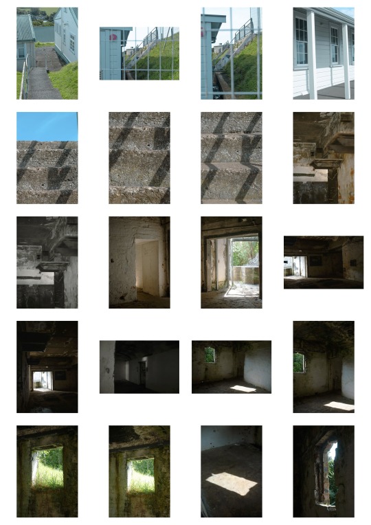
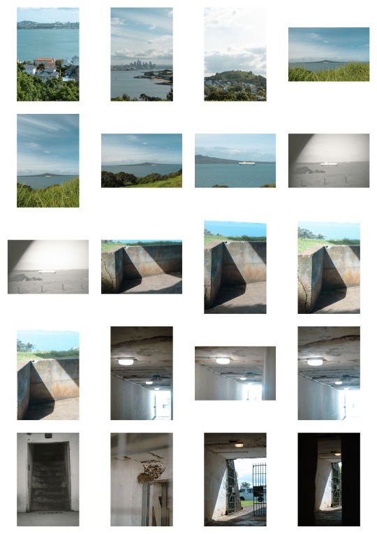
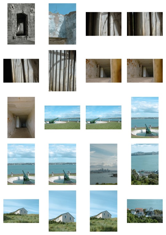
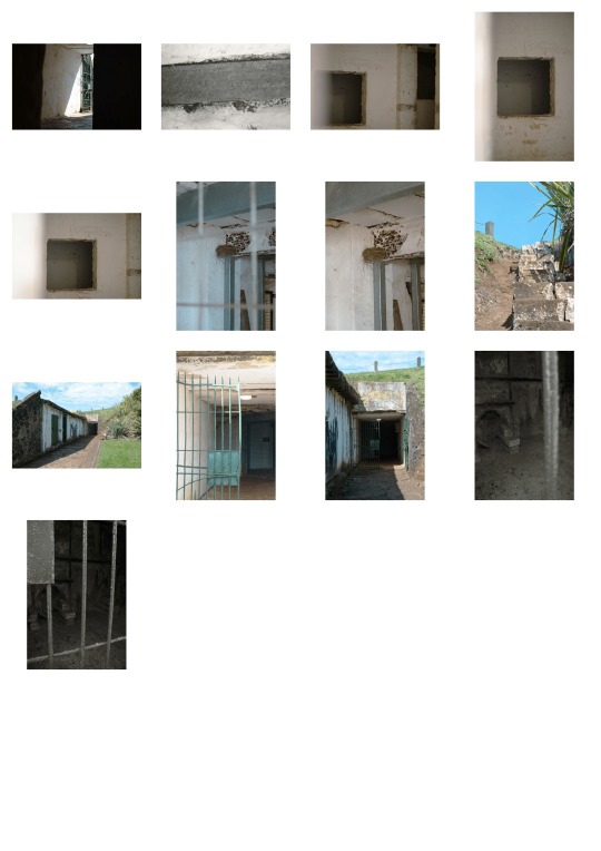
As the semester came to a close, I struggled to keep up with weekly photo shoots, but I managed to complete this final one, combining elements from both Week 9 and Week 10. I drew inspiration from my Week 9 artist models, Arnaud Montagard and Qiane Matata-Sipu. My focus was on using light and shadow to add depth and emphasize the subjects, while also telling a personal story through the photos.
I revisited Devonport (Maungakiekie), a place I’d only remembered with fear from childhood, and explored it with fresh eyes. This experience brought back memories and allowed me to see the location in a new light.
This final shoot captures the essence of everything I’ve learned throughout the course—composition, lighting, and most importantly, meaning. I’m excited to use these photos in my final photo-book and showcase the growth I’ve experienced during this semester.
0 notes
Text
Week 9: Photographer - ARNAUD MONTAGARD


Arnaud has an incredible grasp of light and shadow! While reflecting on how to expand my own work, I realised that since I’ve been playing with both light and dark in my photos, why not try blending them into a sequence? I stumbled upon one of Arnaud’s larger pieces and was instantly captivated by the rich colours and the play of shadows. Diving deeper into his website left me even more inspired.
What stands out in Arnaud's photography is his use of natural light to highlight his subjects—something typically done with stage lighting. His compositions, often at eye level or slightly above, create an eerie, almost unsettling effect, as if there’s no one behind the camera. It’s as if the photos are staged, yet they aren’t, and that subtle tension makes his work feel otherworldly. Maybe it’s the sheer skill in his execution that leaves me awestruck! I’m now eager to experiment with shadow in my final batch of photos, taking a cue from his mastery of light.
Montagard, Arnaud. “Arnaud Montagard.” ARNAUD MONTAGARD, n.d. https://www.arnaudmontagard.com/.
0 notes
Text
Week 9: Aotearoa Photographer of the Week - Qiane Matata-Sipu
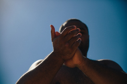
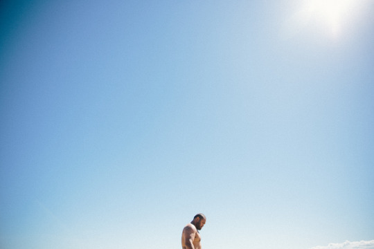
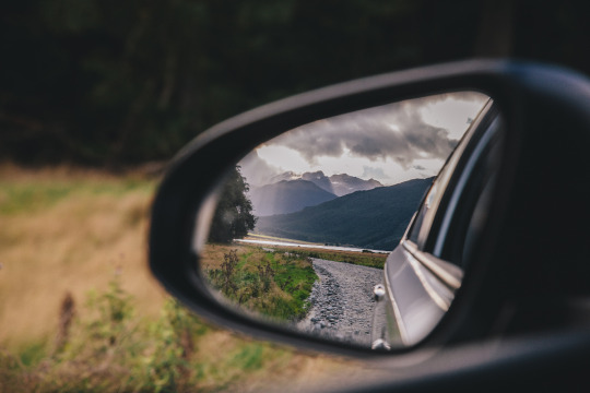
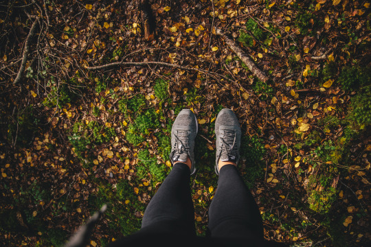
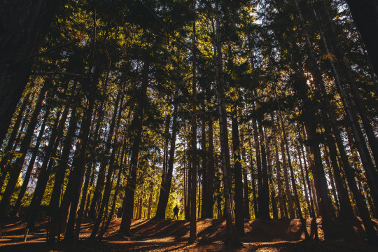
As I was exploring Qiane’s photography, I initially enjoyed her editorial and exhibition galleries, but they didn’t quite resonate with me, as they focused heavily on people and portraits. However, when I discovered her personal gallery, I felt a deeper connection. Some of her photos were strikingly similar to ones I’ve taken, which reassures me that I’m hopefully on the right track.
The colors in Qiane’s work are breathtaking, especially in how she captures the essence of nature and sunlight. Her personal gallery feels truly personal; you can sense her emotional connection to the moments she’s preserving, almost as if she’s capturing memories to hold onto for decades. I admire how this approach makes her photos feel effortless and natural. For my final project, I’d love to evoke a similar vibe — creating images that are both meaningful and timeless.
Matata-Sipu, Qiane. “Personal.” QIANE+co, n.d. http://www.qiane.co.nz/gallery/personal/.
0 notes
Text
Week 9: Take a position - Responsibility as a photographer
My photography reflects the way I choose to see and experience the world. Despite not having many material resources and the daily challenge of making ends meet, I focus on capturing the beauty around me rather than dwelling on my circumstances. Growing up with faith has been a huge support in my life, and it’s the foundation of my hope. I find myself drawn to vibrant, colorful scenes because I want to see the world through the lens of creation, as God intended. My upbringing, in a home with limited resources, has shaped how I think and how I capture moments that I might otherwise overlook.
As someone who didn’t grow up in Auckland, photography has become a way for me to connect with my surroundings and foster a sense of "home." But there are limits — there are places I can't reach, either because of unfamiliarity, fear, or practical challenges. As a woman, exploring certain areas, especially at night, is a risk I can't always take, even though I long to photograph the skyline after dark. My busy schedule, with university, work, and church commitments, means I don't always have the time to explore new locations, leaving Sunday as my only day for rest.
I lean toward capturing candid moments because I thrive on documenting life as it unfolds. I find joy in preserving the feeling of warmth from the sun or the sensation of wind on your face through my images. I see my work fitting in publications like life magazines or design books, perhaps as part of a photobook that serves as a guide to capturing those fleeting, everyday moments. My dream is to create something that teaches others how to feel the moments behind the lens, not just see them.
Ultimately, I want my images to challenge people to see the world from a new perspective — to find beauty and meaning even in things they’ve encountered a hundred times before.
0 notes
Text
Week 9: Test sample selection of Editing & sequencing
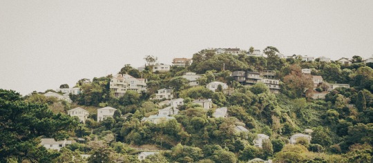
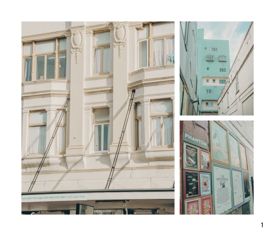
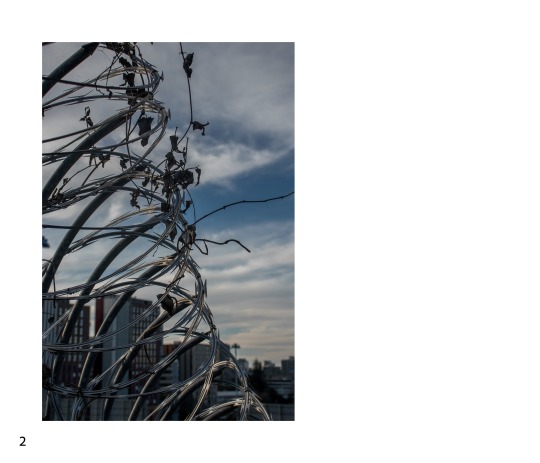
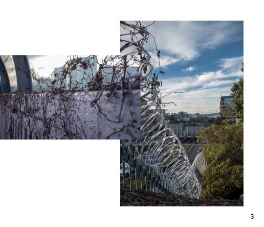
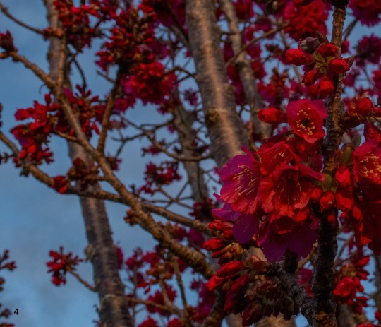
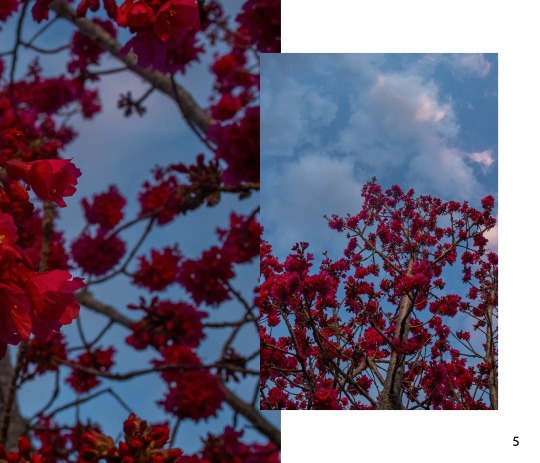
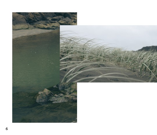
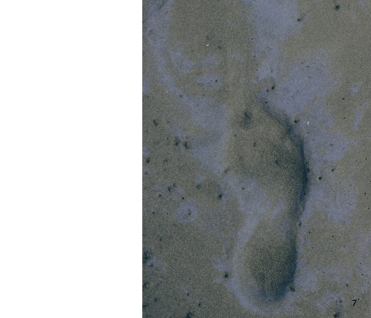
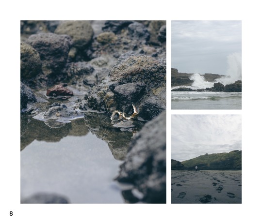
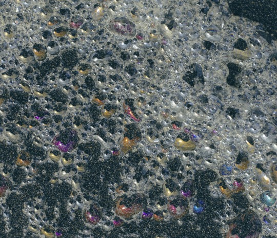
How can I improve my work? This is my first attempt at creating a book in Lightroom Classic, and after discussing it with my classmates, I realised one of the main reasons I feel uncertain is how the tone of the photos shifts from light to darker towards the end. While this could potentially reflect a story, that wasn't my initial goal. My next step for week 10 will be to revisit a location, or try a new one, to better match the mood I’m aiming for in the later parts of my book.
Additionally, I feel my editing skills in Lightroom Classic could use some improvement, and I hope to refine them as I move forward. After looking at the artist models I’ve researched, I noticed their work is often simpler and more focused on single-page layouts. While overlapping photos can look cool, I think in my case it may be distracting from the impact of each individual image.
0 notes
Text
Week 8: Research examples of photobooks
0236 Breno Rotatori, Casulo


I was immediately drawn to the front cover—fantastic use of colors. As I explored the inside layout, I appreciated it even more. The use of white space really enhances the overall look and draws attention to Breno’s photos, which are zoomed out compared to my own work. This approach gives each image room to breathe. While this style might not suit all of my photography, I admire the simplicity and effectiveness of the design.
Rotatori, Breno. YouTube, November 2, 2023. https://www.youtube.com/watch?v=oR-Ml3vffDQ&list=PLAguop9eLMsV_9971fiKMD2fZOrgP8PKc&index=25.
0121 Magnus Terhorst, Definition von Glück


Magnus's work almost seems to be the complete opposite of the last book, this artist focus's on how big they can make their photography. In their work, there is lots of details, so making the photos bigger makes sense. This may be an element I would like to look that, while keeping the cover somewhat simple, but making sure to showcase my work.
Terhorst, Magnus. YouTube, November 2, 2023. https://www.youtube.com/watch?v=0WeHC4IZJBM&list=PLAguop9eLMsV_9971fiKMD2fZOrgP8PKc&index=16.


This week, I focused on David Cook's photography, and I discovered he had also created a photobook. I was particularly drawn to how his work is laid out, as it tells a compelling story about Christchurch in the 1980s and his personal journey meeting people from across the city. Everything from the typography and graphic design to the photographs themselves comes together beautifully. Even on the front cover, he uses a subtle pop of color to add a focal point. His photobook is one of the best examples I've seen so far, and I hope to incorporate similar elements into my own work and feel just as proud of the final result.
Cook, David. “David Cook Photography.” DAVID COOK, 1980. https://www.davidcook.nz/#/meet-me-in-the-square/.
0 notes
Text
Week 8: One metre square class exercise - Part Two
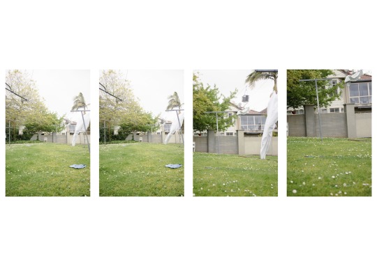
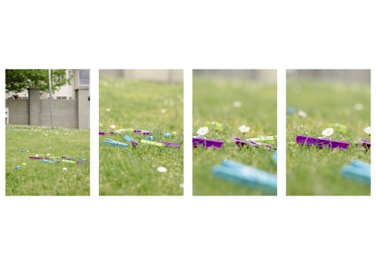
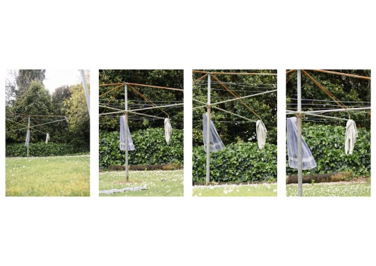
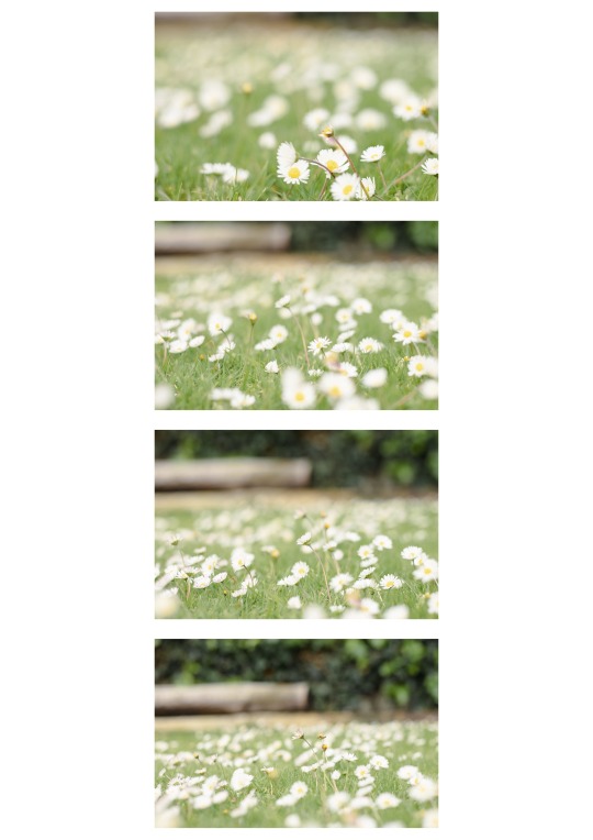
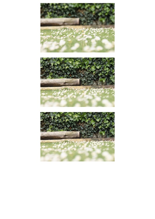
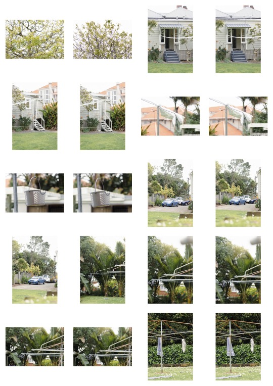
I put together a few sequences for this task. The first two sequences are examples of the hourglass technique I’ve been experimenting with. The last one focuses on playing with depth of field—bringing the foreground into sharp focus while gradually fading the background. For the final two sequences, I worked within a one-meter radius, ensuring I used a variety of angles and points of view to add interest and diversity to the shots.
0 notes
Text
Week 8: One metre square class exercise - Part one
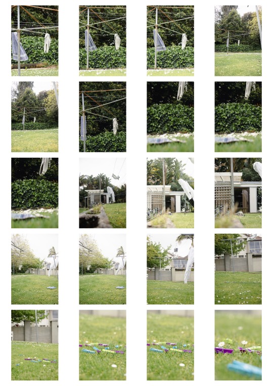
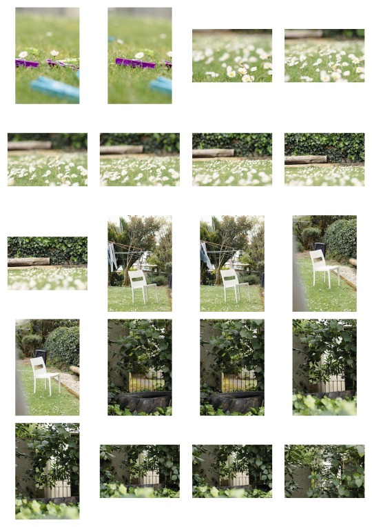
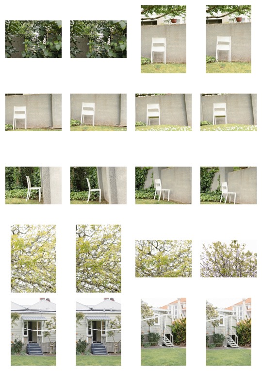
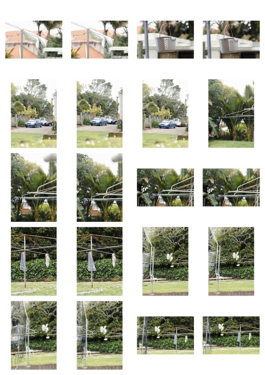

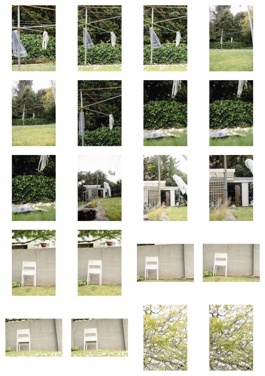
This is a complete compilation of the work I’ve done for this task. It includes a bit more than 24 photos, but in my next post, I’ll narrow them down and create a cohesive sequence. I’m really happy with how some of these turned out. I experimented with taking photos within a square meter, along with continuing my hourglass sequences. Throughout the process, I focused on key elements like lighting, camera-to-subject distance, focal length, and a variety of perspectives—high, low, and mid POVs. These considerations really helped bring out the story within each shot.
I feel these photos align with the work of David Cook, who carefully plans his shots and angles. I made sure to think through every object and subject in each image, aiming to create something that feels like it tells a story. Overall, I’m excited about how this set came together!
0 notes
Text
Week 8: Photographer - Victoria siemer

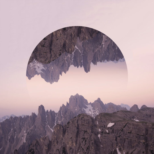
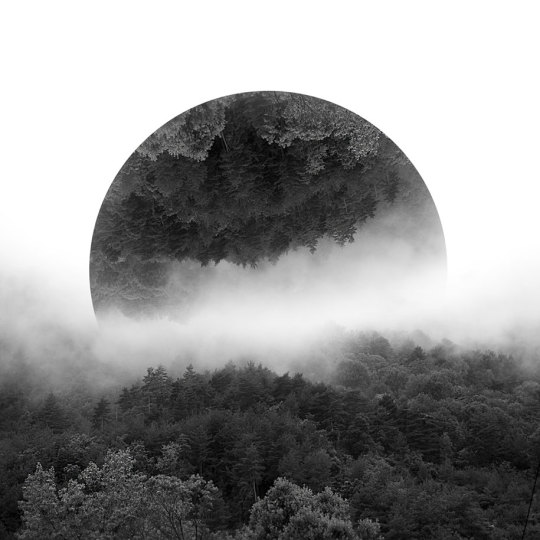
As I was going through Victoria’s work, I realized I had actually seen some of her earlier pieces back in high school. Then I came across her recent photography, and I was blown away. I’m not sure how much editing we're allowed to do with our own work, but I’m eager to experiment with photo manipulation in my projects.
Victoria’s work is incredibly crisp and sharp—something I’m still working on in my own photography. I don’t currently have the lens to recreate shots like hers, but I think adding manipulation to my own work will give it a personal twist. This is definitely an element I’d like to explore as we approach the final weeks of the course!
Siemer, Victoria. “Geometric Reflections.” Witchoria, n.d. https://www.witchoria.com/geometric-reflections.
0 notes
