Text
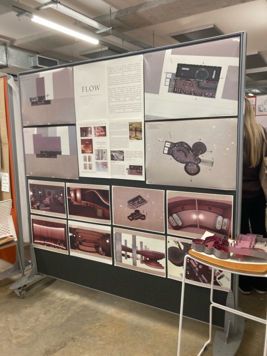
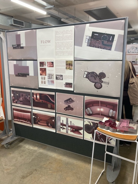
Final Presentation & Submission
Tutors' Feedback
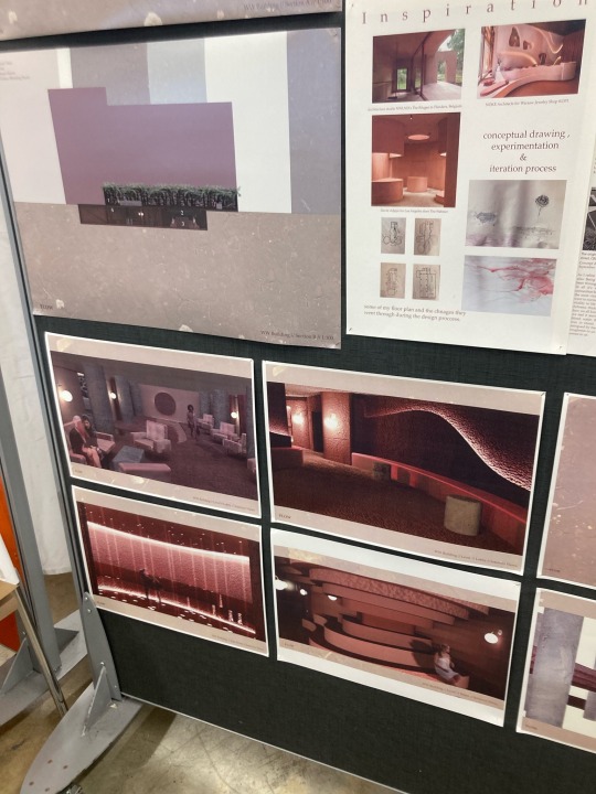
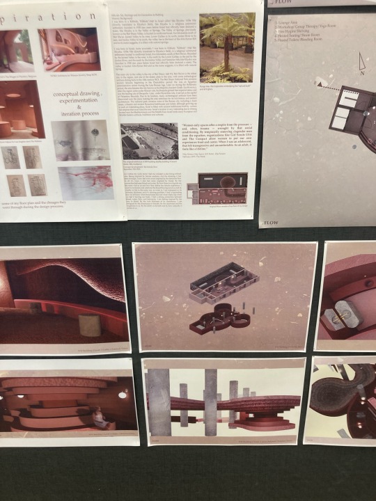
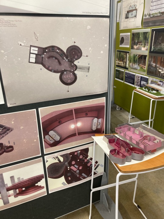
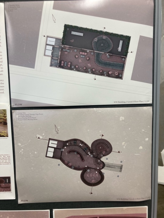
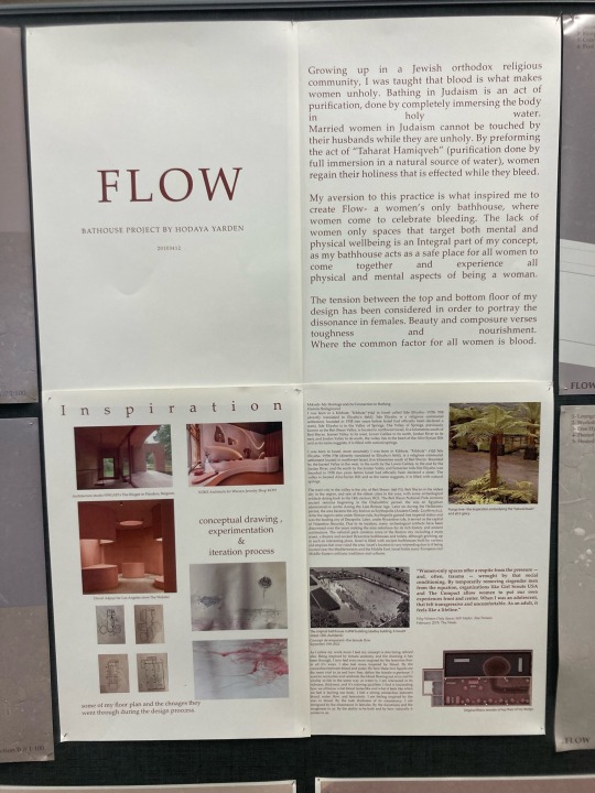
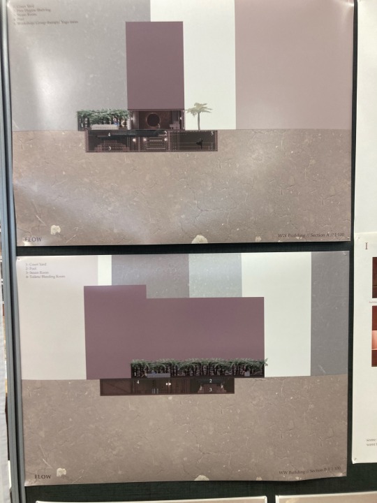
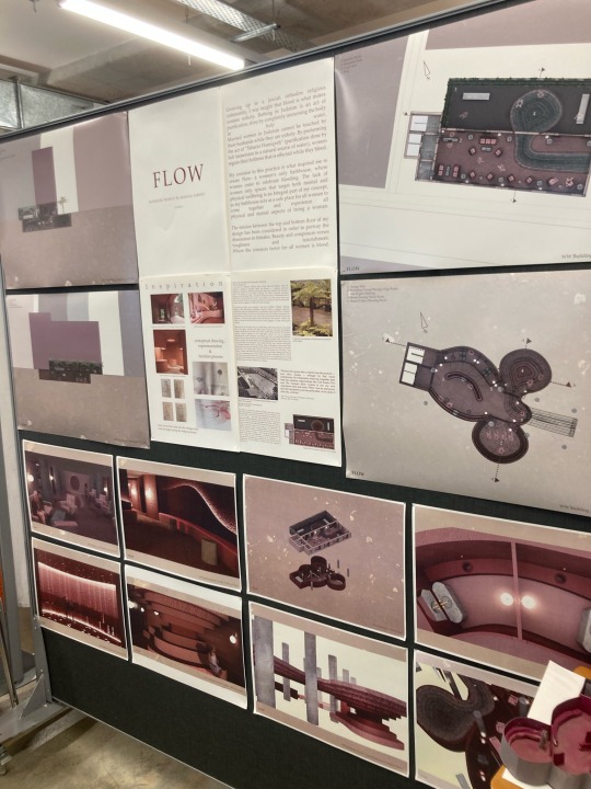
Both Yana and Selena appreciated the background and concept of my design. As my work was done digitally, conveying the organic and raw elements of my design was lacking. This would have been achieved by more raw practices that would be integrated into my final work (they emphasised the early work I undertook in the conceptual development stages (the one I pinned up on my board as process work). I love this point and feel this is a very important lesson I need to learn. Doing my work digitally is a good way for me to be able to bring my design to life in a way I don't feel I am capable of doing by hand, however, it does strip it away from my thumbprint and organic creation that is so vital to both the concept and the final product. another point that was brought up in response to my work was the functionality of the pool while menstruating women bathe in it. Although I have given the functional parts of my design a lot of thought regarding functionality, I see how I should have done a better job at explaining the functional part behind my design and how it is a place for women to menstruate in and bleed freely. however, it is not only designed for that very purpose. elements of my design such as the toilets/bleeding rooms are specifically designed for free bleeding, but the rest of my design is for women to enjoy and use throughout every stage of their menstrual cycle. I would however think of the pool waters cleansing elements and of the more technical parts of hygiene and comfort carried out throughout my design. The last point that was brought up was the lack of context in my sections and floor plans. As this is my first time ever navigating my way through them without proper guidance I felt I didn't quite know how to communicate the surroundings of my design into my floor plans and sections. After seeing other people's work I now see how I could have done that in a way that better communicates what's around the building and how my design responds to its surroundings.
Personal Reflection
firstly, wow! (*large sigh*) I cannot believe I finally reached this moment. I am very proud of myself for the amount of time and effort this project required of me. I worked consecutively every single day from mis-sem until today, sometimes into the very late hours of the night or even early mornings. But I couldn't feel prouder about myself and my work. I am extremely bonded with my project and feel I have managed to communicate myself, my values and my designs throughout the whole thing. I feel I stayed true to myself throughout this semester. doing so allowed me to produce work that truly speaks to me, and that I am happy to work very hard on. this semester taught me so much about every aspect of spatial design. Even though I wished some parts were refined in order to allow better focus and more time to produce the final project, I absolutely loved the brief and cannot wait to see what next year holds for me.
Things I want to point out to myself that i wish to improve going into my second year
Starting the physical process of work earlier on. This is probably the hardest thing for me. I am great at getting inspiration and gathering materials, but when it comes to getting hands-on I procrastinate due to fear of failure to produce good-enough work. this includes anything that isn't done digitally (model making, lab work, physical research and exploration etc).
Get more creative in ways of expressing my creativity. even though I feel uncomfortable expressing myself in ways that are vulnerable to me, I like to try and push myself further and find a better, more holistic approach to expressing my creativity.
Produce more physical work. I really want to utilise my short time at AUT to learn more about ways to create my design. Whenever I use the labs I get so much more inspired and connected to my projects, not to mention how much I learn about the materiality and production process.
Prioritise resting more. no matter how stressed I feel throughout the day, resting allows more recourses and helps me regain perspective about my work and process. I must keep this in mind and try implementing this more.
Re-visit the brief before submission. I forgot to pin up photos of my model on my board. And although my model isn’t as relevant to my final presentation I missed that as I was too caught up on the main points that I completely missed that requirement even though it was right there.
to sum up, I am very proud of myself and the work and process it took to produce it. I cannot wait till year 2!
6 notes
·
View notes
Text


Original Rhino renders i had so many rough renders. producing these took a long time and required me to work a lot on them in photoshop.
3 notes
·
View notes
Text
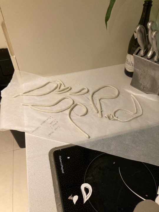
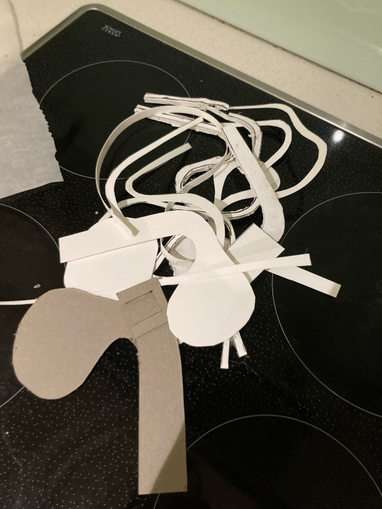
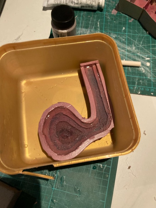
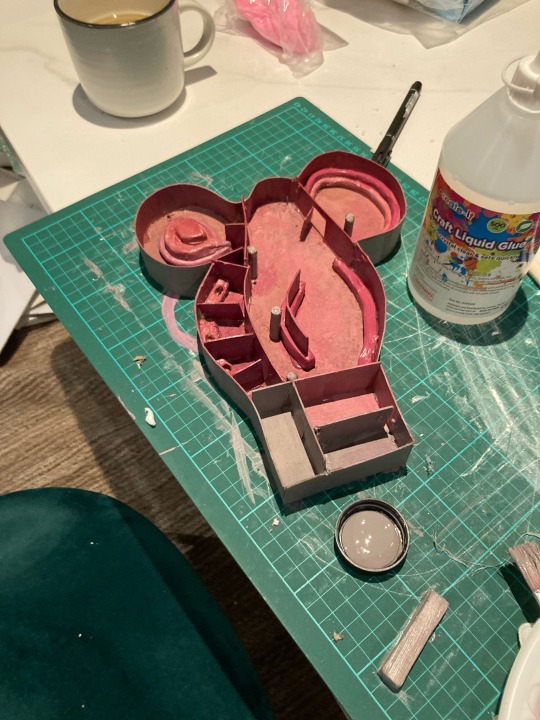
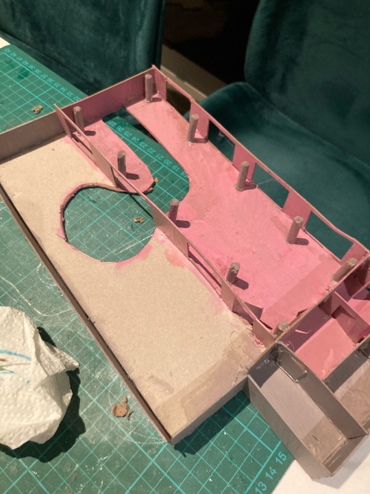
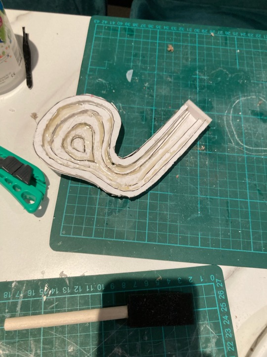
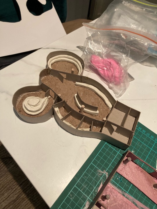
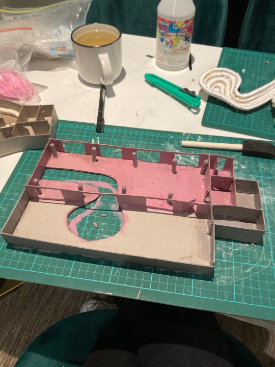
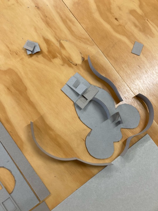
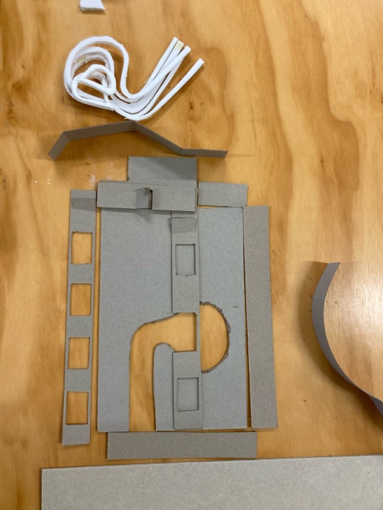
model making-
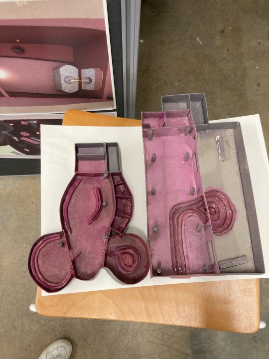
Model-making is extremely challenging for me. the matriculation and precision it requires to bring out a lot of perfectionism and criticism within me. I dreaded this part most and left it till last, which in hindsight I know I should have not done. I always underestimate how hard this is for me and how much iteration it requires. I am not proud of the final result however, this is the best I could have done with the time provided. This is the biggest part of my project that I would want to change.
2 notes
·
View notes
Text
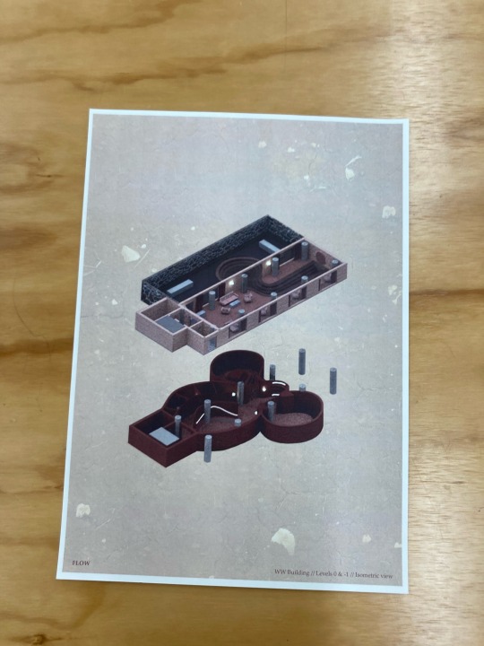
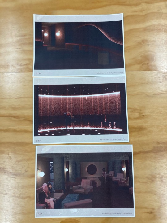
after printing out all my work I saw these 4 prints were way too dark as well as my isometric view being portrait instead of landscape. I lightened the photos on Photoshop and rotated the isometric image which solved these issues (and of course re-printed). I am glad I printed it 5 days before submission. doing so helped me plan out my layout and work even further on refining and portraying my work in a way that works best. In future projects, I would to finish and print out even earlier as I found it is where I could really filter out and further refine my work.
1 note
·
View note
Text
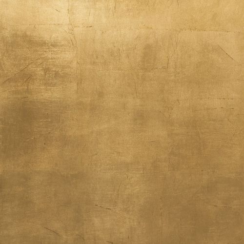

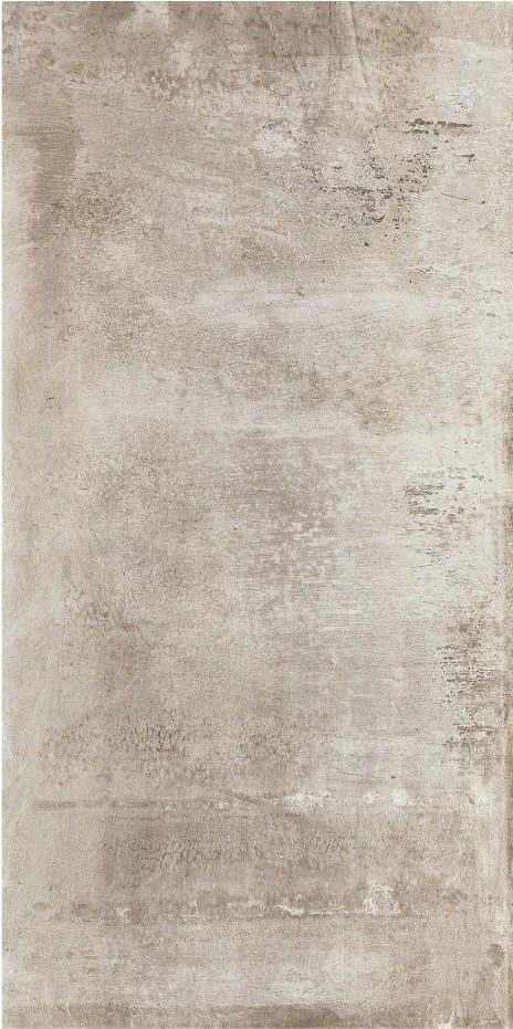
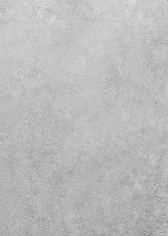
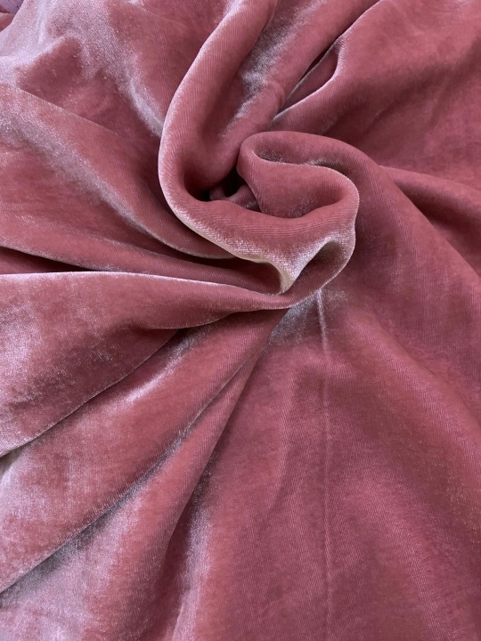
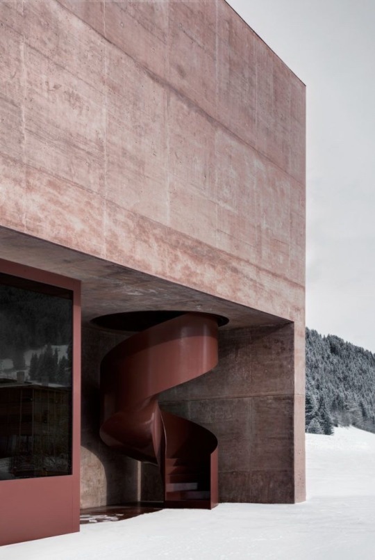
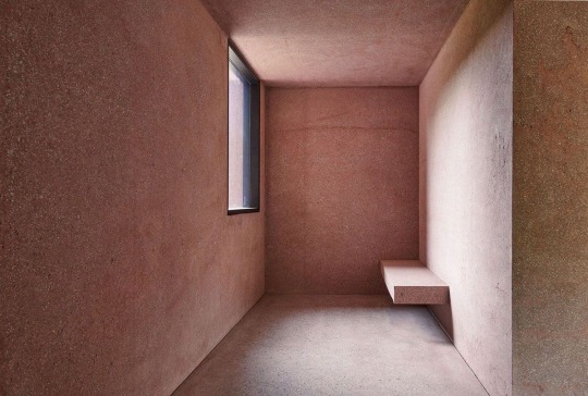
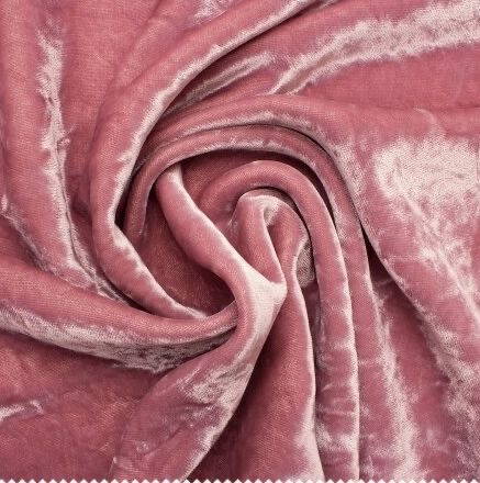
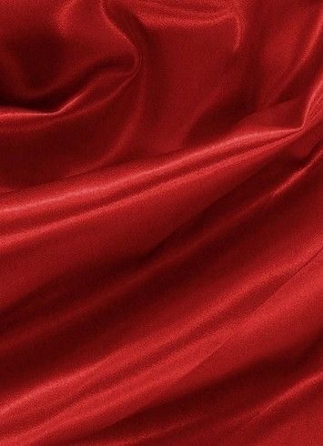

Material inspiration-
Brass
Iron
Blood
Clay
Concrete
Natural flowra (bush)
Warm light
Dark pebbles
Fluted glass
1 note
·
View note
Text
Concept development- female flow
As I refine my work more I feel my concept is also being refined also. Being inspired by female anatomy and the shaming it has been through, I now feel even more inspired by the feminine flow in all it’s ways. I also feel more inspired by blood. By the connection between blood and water. By how these two liquids are the most vital to us and how they define the female experience. I want to normalize and celebrate the blood flowing out of us and its vitality to life in the same way as water is. I am interested in its richness, thickness, and it’s staining qualities. I find it fascinating how we all know what blood tastes like and what it feels like when we feel it leaving our body. I feel a strong connection between blood, water, flow, and femininity. I am feeling inspired by the iron in blood. By the lush thickness of its consistency. I am intrigued by the dissonance in females. By the daintiness and the roughness in us. By the ability to be both and by how naturally it comes to us.
0 notes
Text
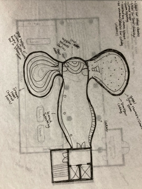
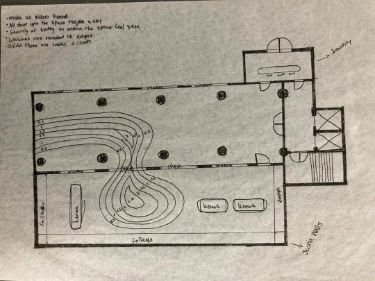
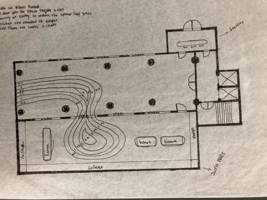
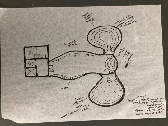
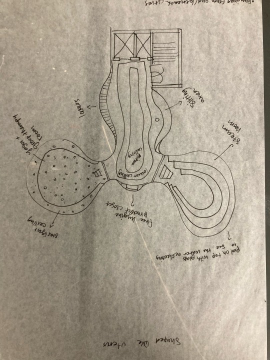
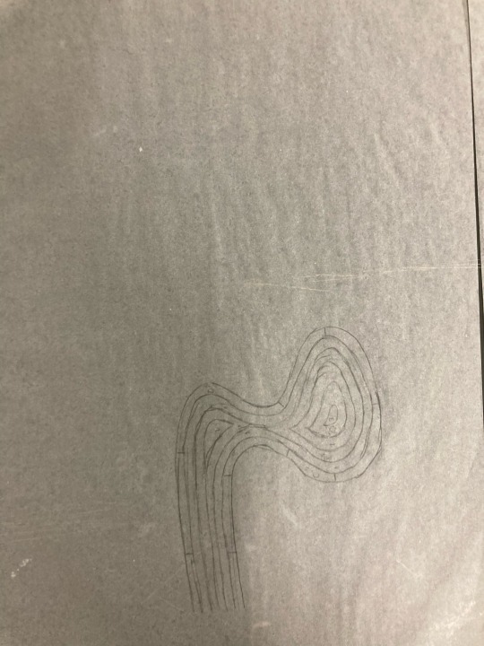
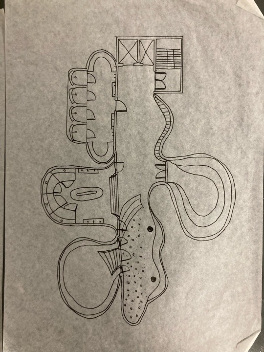
Down sizing in basement level.
After realising I do not have the ability to produce so many room to perfection, I decided to focus on the main two room and a transitional hallways to those room. When making these room I noticed the irony of making my floor plan look like a uterus (THIS WAS UNINTENTIONAL- but I love it).
I also added a security lobby to the top floor and refined the pool design.
I am now thinking of how to maintain the connection between both floors while still making a dramatic atmospheric change.
2 notes
·
View notes
Text
Mid semester break reflection
- Re-think bathroom and toilets. Although essential i would rather focus if the steam room and yoga room.
- Try making the pool less organic shaped.
- Look at how to create moulds for my 1:100 scale model.
- Experiment with clay, concrete and brass.
After working alot on my floor plan and attempting to make models of the existing plan I realised how hard I find it to work at such small scale. I know now i may need to re-consider my priorities as well as dedicated more time to make models.
Reading over the submissions requirements once more I was flustered by the idea of only presenting two interior views. This made me think about what key parts I must portray in my carefully chosen views.
0 notes
Text
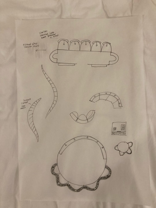
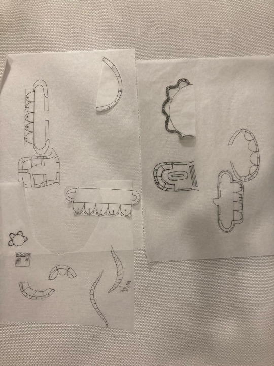
Trying out different layouts and ideas for bathrooms and showers.
0 notes


