Don't wanna be here? Send us removal request.
Text
Bibliography
Saatchi Gallery - London - https://www.saatchigallery.com/
Obsidian Art Gallery - http://www.obsidianart.co.uk/
Wellcome Collection - https://wellcomecollection.org/
The Design Museum - https://designmuseum.org/
Deepti Nair and Harikrishnan Panicker -
http://www.blackbookgallery.com/artists/hari-deepti/
http://thekidshouldseethis.com/post/80264938682
Rob Ryan -
http://robryanstudio.com/
http://robryanstudio.com/about/
http://www.tagfinearts.com/rob-ryan.html
Alexi Francis -
http://www.alexifrancisillustrations.co.uk/
https://twitter.com/alexifrancis?lang=en
Wes Wilson -
http://www.wes-wilson.com/
https://moonaliceposters.com/artists/wes-wilson/
-
https://www.shutterstock.com/image-vector/abstract-isometric-3d-cube-shapes-seamless-285438188
-
https://en.wikipedia.org/wiki/Four_Symbols_(China)
-
https://www.amazon.es/unidades-192-Unicorn-Fantasy-servilletas-desechables/dp/B01F6BUDPY
-
https://plus.google.com/photos/115157803696481929298/album/6237273176657145985/6237273181178621474
-
https://twitter.com/kelleeart/status/738667693805428736
-
https://luckreza8.deviantart.com/art/Mlp-Fim-New-Twilight-Sparkle-happy-vector-664683951
-
http://sfery.wikia.com/wiki/Hipogryf
-
http://pixdaus.com/capra-ibex-by-juza-alps-italy/items/view/266623/
-
https://www.beginnersstart.com/2018/04/narwhal.html
-
https://www.xuehua.us/2018/04/22/%E5%A5%94%E6%B3%A2%E5%9C%A8%E5%A4%96%E8%8B%A6%E5%91%BD%E7%9A%84%E7%94%9F%E8%82%96%E5%A5%B3%EF%BC%8C%E4%B8%BA%E4%BA%86%E5%AE%B6%E5%BA%AD%E5%8F%97%E8%8B%A6%E5%8F%97%E7%B4%AF%E6%97%A0%E4%BA%BA%E5%BF%83/zh-tw/
-
http://qimplink.com/bottlenose-dolphin-pictures/bottlenose-dolphin-pictures-wallpaper-hd-high-quality-for-laptop-winter-the/
-
https://www.ara.cat/opinio/Mes-ones-gravitacionals-menys-orgasmes_0_1933006831.html
-
https://www.ebay.co.uk/p/STUNNING-Angel-Wings-Abstract-Canvas-627-Quality-Home-Decor-A1-Picture-Wall-AR/1588684057
-
http://www.libresrelatos.com/2014/05/el-peso-de-todas-las-palabras-cascos-en.html
-
https://www.dreamstime.com/stock-photo-white-horse-isolated-trots-image9420630
-
https://mymodernmet.com/bird-photographer-of-the-year-2017/
-
Bovey Lee
http://www.boveylee.com/
https://www.artsy.net/artist/bovey-lee?page=1&sort=-partner_updated_at
https://theculturetrip.com/asia/hong-kong/articles/bovey-lee-connecting-history-and-technology-on-paper/
https://www.creativeboom.com/inspiration/cut-paper-by-bovey-lee/
-
Paper Panda
http://www.paperpandacuts.co.uk/
https://www.facebook.com/PaperPandaPapercuts/
https://www.etsy.com/uk/shop/PaperPandaPapercuts
https://www.crafts-beautiful.com/blog/10-papercutting-tips-from-paper-panda
-
London Zoo https://www.zsl.org/zsl-london-zoo
-
https://www.amazon.fr/antaina-Dentelle-Mi-Longue-Victorienne-Volants/dp/B0793MQ17V
-
https://www.lolitashow.com/lolitashow-gothic-lolita-dress-jsk-black-printed-layered-ruffle-slim-fit-cotton-jumper-skirt-p641135.html
-
http://www.animacity.ru/node/127270/photo/1366169
-
http://www.limitimage.com/unicornclipart/
-
https://meredithdillman.com/shop/blue-mermaid-art-print/
-
https://www.pinterest.com/pin/436427020130363045/
-
https://www.visit-matsue.com/discover/outer_matsue/southern_matsue
-
http://powerlisting.wikia.com/wiki/Chimera_Physiology
0 notes
Text
Evaluation
Throughout this project I have had the chance to experiment with creating a variety of different character designs, along with exploring the different characteristics available to these mythical creatures and hybrids.
I feel that I had a rough start to my project, but once I decided to broaden the theme of my project to include all mythical creatures and animal hybrids, rather than my initial idea of exclusively horse hybrids, I was able to keep a steady pace for my work, and have used my time to experiment with different ideas and designs that lead me to create my final pieces. My work was designed to be printed out and cut onto card, however, I still took the chance to experiment with adding various alternate colours into my work, and a few completely alternate designs. This definitely helped to prevent me from limiting myself with my work and encouraged me to have further exploration with variety in my designs.
From the designs I have drawn, I decided to pick what I felt were the three strongest pieces, by comparing aspects of the design such as what environments I felt gave me the most opportunity for depth when layered with each other, and which of my character designs I felt held the most character.
Although each of my final pieces were very time consuming and difficult to make, I am very pleased with how they turned out. I had a lot of trouble with connecting all of the layers with the correct spacing while having them still be able to fit inside of their frames, but I managed to make everything work by experimenting through trial and error. This difficulty lead to a few minor adjustments throughout the work, such as moving some of the layers into slightly different positions, but i am still very pleased with the overall outcome of each piece.
I found my Chimera piece to be the hardest to work with, as although I felt the design worked really well as a 2D piece, when shifted into 3D the character felt as though they were floating rather than standing on the mountain. It was difficult for me to find a fix to this problem as I was limited on space inside of the frame and could only have a certain number of layers fit inside. Eventually I was able to fix the problem by adding another small layer in front of the characters feet, which meant that the design didn't become too overcrowded with objects and the character no longer looked as if they were floating.
Overall I am very pleased with my work for this project and feel that all of my final pieces turned out very well, and I was able to create visually interesting a1 sheets. I am especially happy with how the overall colour schemes worked out in each of my individual final pieces, and that the layers are very effective and greatly improve the work by adding depth. Although i did experiment with alternate work ideas at the start of my project, i feel that these could have been further explored through my sketchbook to help add more variety and overall content into my book.
0 notes
Photo
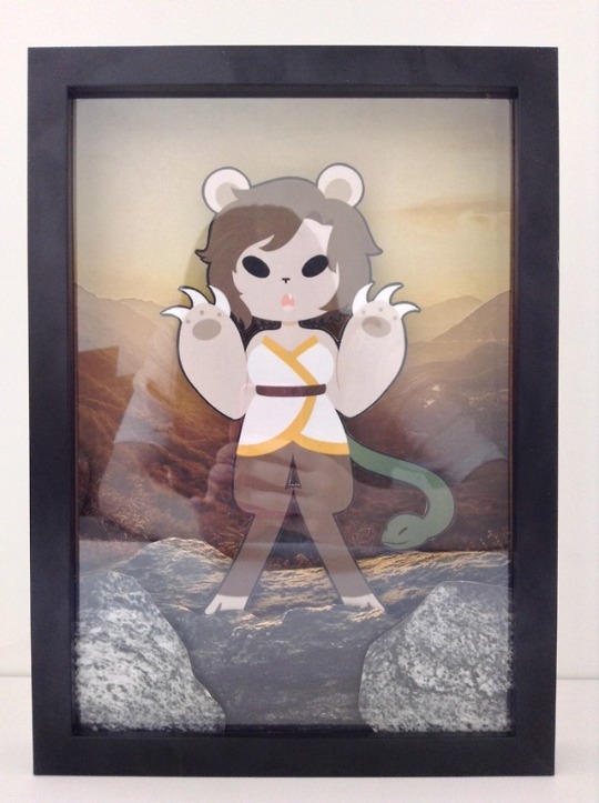
I found my Chimera piece to be the hardest to work with, as although I felt the design worked really well as a 2D piece, when shifted into 3D the character felt as though they were floating rather than standing on the mountain. It was difficult for me to find a fix to this problem as I was limited on space inside of the frame and could only have a certain number of layers fit inside. Eventually I was able to fix the problem by adding another small layer in front of the characters feet, which meant that the design didn��t become too overcrowded with objects and the character no longer looked as if they were floating.
By adding this additional layer in front of the feet i was able to make the character feel more grounded and remove the illusion of them floating.
I am very pleased with how this piece turned out, and i feel that the background i choose really compliments the character design.
0 notes
Photo
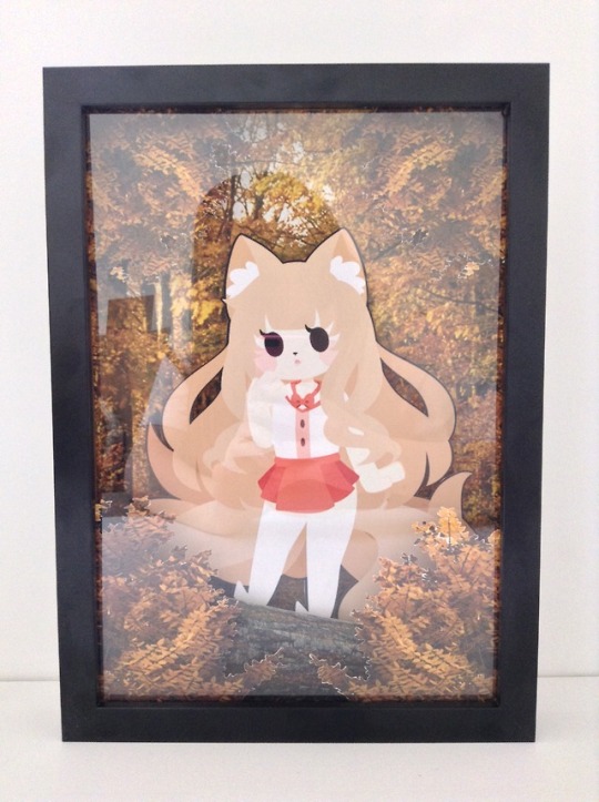
I am very pleased with how my kitsune frame turned out, and i definitely feel that the additional pieces i added greatly improved the overall design and appeal of the piece. I find that the decision to use an autumn forest instead of regular green colours works reall well and compliments the colours of the characters designs.
0 notes
Photo
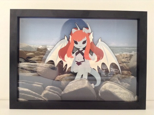
Overall i am happy with how my dragon design turned out, and i feel that it was a good decision to add this piece into my set of three as it helps give the overall set a good sense of variety and i feel that it is one of the more unique and interesting character designs of mine.
0 notes
Photo


I created an additional layer to be placed slightly over the characters hooves, to help make them appear more grounded and part of the environment as they currently feel as if they are floating rather than part of a scene.
0 notes
Photo


I feel that out of my three 3D pieces, this was the strongest out of my first attempts. Even though i am happy with how the piece currently looks, i feel that there is still room for improvement by adding additional layers of rock to make the design more complex and interesting.
0 notes
Photo


Additional layers to be added to my 3D framed piece.
Although i like how the work looks so far, i feel that the top of the frame feels quite empty in comparison to the bottom of the frame that has lots of layers. I also feel that the character looks too floaty against the background, which could be fixed by having parts of her design slightly covered by layers in front.
0 notes
Photo
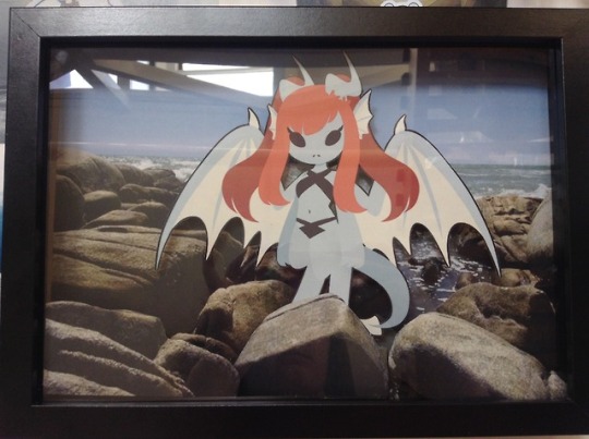
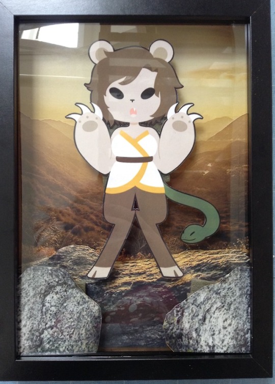
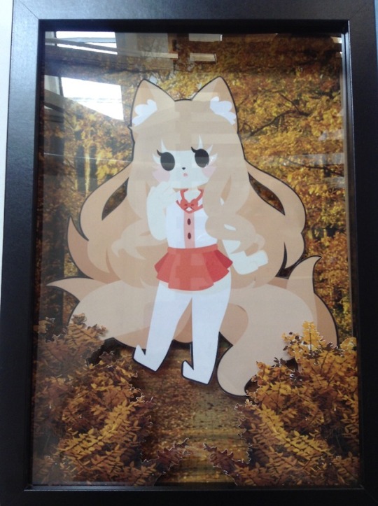
I currently feel that my dragon design is the strongest out of the three, however all of the pieces still need further work. By having her feet covered with a rock it helps the character to feel more flat and in place in her environment. In contrast, the characters in the other two pieces feel as if they are floating and are not a complete piece. I will be experimenting with adding additional layers into each frame to help solve this problem by having partial areas of their designs covered.
0 notes
Photo


Kitsune layered paper frame design. Although the design and layers may change when the piece is being physically worked on, these are the current working layers for my framed piece. Each layer will be backed onto card so they are strong and stand straight in the frame. Each layer will also be separated by pieces of foam to help hold them into the correct position.
0 notes
Photo


For my dragon design i used some of the rocks from the background image to make new layers, adding this depth to the piece will make it much more interesting while making sure everything blends together correctly.
0 notes
Photo
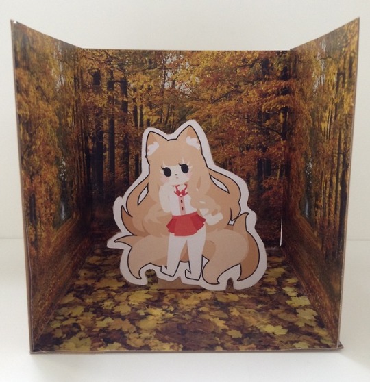
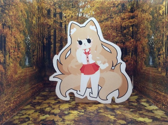
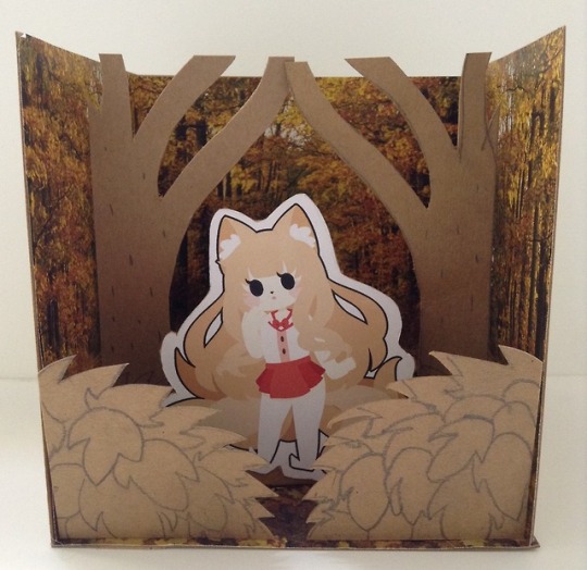
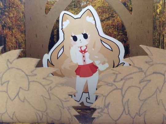
Out of all of my miniature models i picked the 3 strongest to further develop.
I added in flat objects cut from cardboard to mimic the lays that would be used in the final framed piece
0 notes
Photo
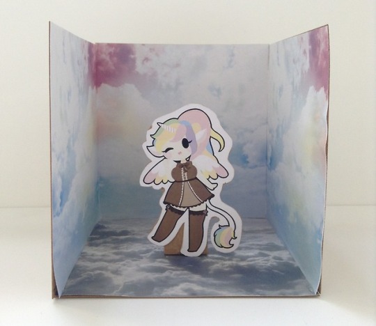
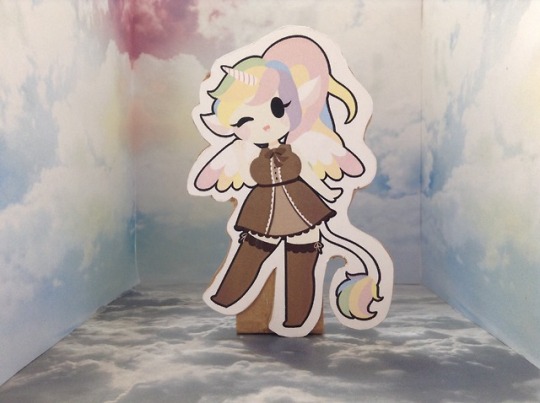
maquette for my unicorn design. I made the tester model using carboard and a printed cutout of my character and a cloud scene.
0 notes


