
Don't wanna be here? Send us removal request.
Statistics
We looked inside some of the posts by hierbamalita and here's what we found interesting.
Average Info
Notes Per Post
2
Likes Per Post
2
Reblog Per Post
0
Reply Per Post
0
Time Between Posts
3 days
Number of Posts By Type
Text
12
Audio
2
Last Seen Tumblr Blogs


Fun Fact
Tumblr’s website traffic is steadily declining.
Text
Scale & Proportion
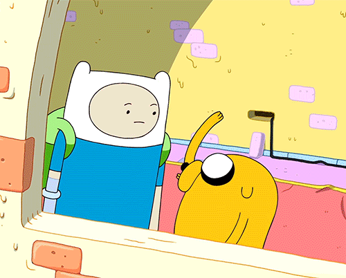
I love this show so much! Adventure Time has always intrigued me growing up and I even dedicated myself to watching it from start to finish my first year of university. No regrets. Watching an episode was an excellent reward after a long night of studying!
Analysis
The geometry of Jake is very district. He has circle eyes and wormy snout. What is special about him is his ability to transform his body into different shapes and d sizes at will (most of the time). For example, he changed his geometry from dog to hat. I’ll state that again: Jake the dog, standing next to Finn the Human, then becomes Finn’s hat. Finn is the human scale which allows us to see how the story has changed from before and after Jake’s transformation. We now know Jake’s new size relative to Finn’s head. We understand what is happening to jake’s scale because of the objects placed in his environment and because of how he is designed.
Scale & Proportiong Glossary
Scale is the size of one object in relation to other objects in a design. — a certain relative or proportionate size or extent (A human is 7.5 heads tall.) — a standard of measurement or estimation (The UFO was as big as a football field.) — point of reference by which to gauge or rate (My puppy is twice as big as your chihuahua.)
Aspect Ratio refers to the proportions of the height and width of an image. It defines its overall shape, and it is usually shown as W:H (W is the width and H is the height).
Geometry - spheres, cubes, cylinders can be used to build more complex objects
Hierarchy - Arranged according to importance or power. What’s bigger or taller is often moreimportant or harder to kill.
Humanscale - sets the stage for the story happening to human-sized characters
Proportions - The size of the parts compared to the whole. Relativity.
Ratio - a ratio tells us what proportions mean to each other. Measuring one thing in terms ofanother. That monster is twice the size of the human. Their ratio is 2 to 1.
Relative - how objects appear in context with each other
0 notes
Text
Emphasis
I feel like music is all about the right placement to create certain emphasis on a certain sound, certain words, or transitions, etc..
Analysis
The song itkanbe[sonice] by Knxwledge and NxWorries is a great example. The song does not get loud/intense until after the intro words (focal point at that moment) were spoken, basically isolating (isolation) the vocal feature to create emphasis before a drop. The transition happened after 2 seconds upon the song starting, to emphasize the message "believe me, it's me and you, till the end." Shortly after that drop, at 0:08, some drums kick in while he raps right before he sings "feels" while at the same time placing (placement) soft vocal layers underneath creating emphasis that same words.
It all happens so fast. I think it is amazing how music is basically juggling various things on different times to emphasize different sounds and ideas via effects, placements, layering, etc... It is the isolation of a certain layers or other emphasis strategies to invoke a create an overall sound for the listener to experience.
Emphasis Glossary
Emphasis- Pow! Something in a scene dominates. In other words, the designer gives visual priority to part of a scene in order to draw the eye there first.
Contrast in size, color, texture can make one thing stand out from the many things around it.
Focal Point - The focal point demands attention, it is accentuated, contrasted -- the star or the most prominent component of a scene.
Isolation- Feature a single element alone, away from other elements to create emphasis.
OneElement - Eliminate everything else in the composition and the thing that’s left will grab the attention such as a bold title or symbol.
Placement- Position your most important design component in a place to grab attention, such as the center of a poster.
Subordination -The focal point has the visual power while other elements of the scene aresubordinate.
Whole over Parts - Sometimes we don’t want the eye to go somewhere specifically such as in an establishing shot at the beginning of a story. We want to show an overview of the environment before we jump into the story. We might look at a map with lots of details. The whole map is the important thing. When we select a place on the map to visit, then that spot becomes the focal point and the Emphasis shifts from the whole to the specific. Another example is that the whole game is more important than its levels.
0 notes
Text
Contrast
I thought of a really common example where musicians use contrast at the beginning of their music. For example, there can be a lone melody, then a "drop" occurs where the bass is tactically placed to make the beat stronger, full instruments in place. So, one can observe that there is a contrast when comparing before a drop and after a drop.
Analysis
An example of a low contrast drop can be found around 30 sec into NXXXXX's remixed $uicideboys song called “Evil Thoughts Be On My Mind.” It can be subtle but it always creates the feeling of being sucked into the music... like you entered another level.
Different genre, same gist but with higher contrast: deadmau5's song “Raise Your Weapon. The beat drops at about 1:30, the bass drops and the tempo increases speed in comparison to how the song started.
One can even say that most songs are asymmetrical.This composiional strategy helps musicians include an introduction and an conclusion to their songs which may be similar or different depending on the chorus and intent of that song. For both of the examples above, I would say it is assymetral, there is a story being a told with an outcome different than the start.
Contrast Glossary
Contrast refers to the arrangement of opposite elements (light vs. dark colors, rough vs. smooth textures, large vs. small shapes, etc.) in a composition so as to create visual interest, excitement and drama.
Contrast creates variety within a unit, draws the eye to a focal point, creates a sense of adventure or mystery. Contrast is a unifier. Value contrast is when a character or object has astrong darks and lights compared to the scene around it. Size contrast is a gigantic space cruiser compared to much smaller fighters.
Asymmetrical balance is a dynamic compositional strategy in which each side of the axis are distinctly different yet belong to the same story.
High Contrast is strong dissimilarity such as black letters on a white background. The high contrast setting is an accessibility feature built into interfaces to assist people with vision impairment. In visual perception of the real world, contrast is determined by the difference in the color and brightness of the object and other objects within the same field of view. Because the human visual system is more sensitive to contrast than absolute luminance, we can perceivethe world similarly regardless of the huge changes in illumination over the day or from place to place.
Low Contrast means a minimum of contrast between light and dark, so that the image is either predominantly dark or predominantly light. The sun sets, dusk sets in and in the gloom there is low contrast in the landscape.
Symmetrical is a form of balance in which both sides of the axis are the same, a mirror imageof each other, creating stability and formality.
In visual storytelling the symmetrical formal balance is often contrasted with the dynamic action of asymmetrical configurations. For example, the formal balance and discipline on the Death Star in Star Wars is contrasted with the diversity of the different rebel cells and militias from across the galaxy. The dynamic contrasting rhythms and visuals of the dark side contrasted with the Jedi and rebel alliance has kept the franchise going for decades.
Contrasting camera angles - Part of your story is how you show as well as how you tell. Thecamera is your audience’s view of your story and should be well planned to reveal the story in the most effective way possible.
0 notes
Audio
Rhythm
I’ve mentioned this album before because it is one of all time favorites. It’s full of genre-bending songs with touching lyrics and soulful harmonic tones alongside experimental beats. Liv.e’s voice is heaven-sent.
Analysis
The song begins with a repeating loop, establishing a bpm norm to expect. However, around 0:30 min, there is a shout and the tempo slows down for about about 15 seconds before returning to the previous tempo and melody. This is alternative rhythm, once presented it can be expected again such as in 1:30 min, where the tempo slows down again. I think this created an interesting narrative if you look at what lyrics are sun when the song is slowed down.
Below are the lyrics to the song. Highlighted are the parts that slow down.
I can't keep breaking my focus Gotta find a way to unplug I'm so wired, I’m troubled At least I'm not alone in this club My eyes doin' me dirty I know this ain't real, how could I even try (Unplug me!)
How am I suppose to tell if I'm here?
(Blink once and wiggle your checkbook)
Losing my money (I can’t keep) Losing my money You niggas always finding a way to keep me broke But is it bout money? Is it really all about money? When you can’t even own your shit, when it’s tangible… It’s funny how they get into my head… How are they playin' with my mind? I'm so wired, I'm troubled… I know this ain't real, how could I even try (UNPLUG ME!)
How the hell am I going to escape this grasp?
(Pick one: machete or handbook…)
Tap out, baby… (I'm really tryna') Tap out, baby… (I'm tryna') Live in the now, what’s it hittin' for? Switch off, baby… We’ve gotta turn off, baby Cause if I want your online attention, then it really ain't pure… Take it off baby… I'm boutta turn it off, baby
Sometimes it's too much for me and I really ain't sure…
Unplug me!
[vocalizations]
Its like when the music slows down, Liv.e is taking the time to think for herself and the situation she has been placed in with decisions she must now take. It is suspenseful and adds to the story of the song. On the final tempo change at 2:55 min, instead of coming back to the pattern we’ve been presented with, progressive rhythm presents itself. The song is evolving, slowing down, losing the melody of the song as her voice ends the song overpowering everything else. Liv.e is such a genius. I hope you liked the message in this song as much as I loved it.
Rhythm Glossary
Rhythm is caused by patterns in movement. What are those footsteps in the dark room? Are they slow or fast? Running or sneaking up on you? Rhythm controls the pace of action in your story. Rhythm can be repeated character types, weapons, or color strategies. We see and hear rhythm throughout nature as well as in our digital environment. Rhythm organizes units into patterns. Rhythm is created through repetition, alternation, and progression.
Alternating - Alternating rhythm is a form of repetition and is predictable. We switch back and forth from one thing to another like a tennis match. Alternating rhythm can create tension, such as switching close up head shots of one character arguing with another.
Audio Rhythm - sounds that create patterns such breathing or shooting rounds of ammo.
Conceptual Rhythm - Intensifies, moves along, or calms the story. Conceptual rhythm coordinates visual and audio rhythm with the pace of your story.
Contrasting Rhythms are two or more sounds or motions at obviously different tempos.
Legato means music in a smooth flowing manner, without breaks between notes or a smooth flowing motion.
Polyrhythmic patterns - use of simultaneous contrasting rhythms. A battle scene has many(poly) rhythms such as big guns, small guns, shouts, rumbles, footsteps, and explosions.
Progressive rhythm is a pattern that changes over time to more or less intensity. Progressive rhythm makes us feel that. something is in an evolving state of change. We can tell when the battle is heating up by the rhythm of the sounds and the actions of the characters running toward or away from the fighting
Repeating- The same thing again and again gives us a feeling of predictability
Rhythm and motion - When a motion repeats, speeds up, slows down it creates a rhythm. The rhythm of tai chi is slow. The rhythm of Kung Fu is fast.
Staccato derives from the Italian verb staccare, meaning "to detach," and can now describe anything - not just sounds - made, done, or happening in an abrupt or disjointed way.
Visual Rhythm - When motifs such as lines or shapes repeat visual rhythm forms.
0 notes
Audio
Unity
Above is an album that was recently released “THE ANGEL YOU DON’T KNOW” (TAYDK) by Amaarae. I literally just found it today thanks to Kari Faux tweeting about it and have not been able to stop listening. I’m probably gonna put a few songs on my radio show on KVRX next week!
Analysis
One of my favorite things about music releases now-a-days is that projects are basing themselves more and more and a whole complete album experience rather than singles with a few other creations on sprinkled in. Musicians use unifying strategies in music to ensure that from song to song there is some sort of alignment pulling it together. For example, without listening to the album yet, you can see visual unity within the titles of the songs. Similar elements such as the spelling and capitalization of letters form a unifying visual structure. Upon listening to the album itself you will notice various repetitions of instrumentations used but maybe in different ways, such as Amaarae’s voice using different words and melodies. However, the audio repetition in that I wanted to do was from the first and last song; they both has a punk genre placed within them that none of the other songs do. I think it really wraps the album up together. If you haven’t I would go give her album some streams!! I was going to try and pick favorite songs out of the album but I can’t! It is just so good! The album cover looks so good too!
Unity Glossary
Unity - is an entity that is a systematic whole. A fusion or union of parts in harmony to create a oneness. A game is a unity based on a fusion of levels. Alignment – a common axis creates relationship, the line up creates meaning. Alignment in games can help you find your way on the map or aim true with your weapon. Alignment of troops or vessels indicates organizational strength. Maps are visually aligned with the edge of the frame. Your stats are aligned in a table.
Beat Boards are used to illustrate major story points before the rest of the storyboard is completed. Beat boards are a series of single drawings that depict key focal points in a scene. Beat Boards can be compared to a children's book illustration because an individual picture shows a complex story. Beat boards can serve in art direction to indicate how the shot is staged and show color strategies, using shapes and colors, but are not detailed sketches. Making sure the beat boards relate to each other creates unity.
Composition - is the arrangement of visual elements within a shot. The three basic shot compositions in filmmaking are long-shot, medium-shot, and close-up.
Conceptual unity – a palm tree, an ocean beach, and a beer unify around the concept of 'vacation'
Contrast – creates variety within a unit, draws the eye to a focal point, creates drama. Contrast is a unifier. Contrast is when a character or object has a strong darks and lights compared to the scene around it. Size contrast is a gigantic space cruiser compared to much smaller fighters.
Proximity– closer distances connect elements and far apart elements create separation and sometimes magnetism
Repetition – things that look alike relate to each other. Shapes or colors that recur in the image create rhythm and recognizable situations.
Unifying Strategies -- Designers manipulate contrast, repetition, alignment and proximity to create visual unity and to pull a story along.
Visual unity – is a group of repeating or similar elements that create balance or form a structure
0 notes
Text
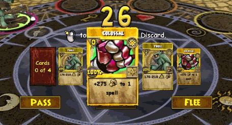
Point
Below is a screen recording of someone playing Wizard101. This used to be one of my favorite games growing up! I remember getting my brother addicted too, and at one point we totally dominated the arena in duos.
I wanted to bring up a game instead of a piece of art or film because, in this unit, point is discussed as more than just something visual.
Analysis
I chose this exact scene type because I wanted to talk about the point of no return. Once you enter combine a colossal card with an attack card (troll), you have entered a PNR because this action irreversible, you will have the new card remain golden and powerful in your deck until it is used and disposed of. Also, when selecting a card, whichever card you hover your mouse over becomes the focal point. It is enlarges and demands attention, especially when clicked on because a white line will surround it. The Point of the game once you enter battle is to select your cards wisely in order to deliver enough powerful attacks against your opponent(s) before they defeat you. This is exactly how I used to introduce my friends to Wizard101, lol. I used to be so cool, full set of diverse leveled up characters on deck. You wish you could pvp next to me!
Point Glossary
You have an idea sparking in your brain. You open a sketchbook or create a new file. You ponder a blank page or layer. You move your pencil or stylus. You land on a point. Your point moves and leaves a trail that evolves into a visible something. Groupings of points can stimulate human imagination to form familiar shapes. Ancient storytellers grouped stars into constellations of mythological beings. We group pixels into characters, animations, and game levels. Point is the smallest visual component. Pixel is a recently invented groovy word. The word "pixel" was first published in 1965 by Frederic C. Billingsley ofJet Propulsion Laboratory to describe the picture elements of video images from space probes to the Moon and Mars. A pixel is the basic unit of programmable color on a computer display. Think of it as a logical - rather than a physical - unit. The physical size of a pixel depends on how you've set the resolution for the display screen. Each visual composition on your screen is made of thousands of illuminated points of hue and value. Focal point is the feature of adesign or work of art that is the most interesting or important or the most strongly emphasized. The Point is what a player will tell a friend about the game if they like it. The point is the mission or a moving target. The point of no return (PNR or PONR) is the point beyond which one must continue on one's current course of action because turning back is dangerous, physically impossible or difficult, or prohibitively expensive. The point of no return can be a calculated point during a continuous action (such as in aviation). A particular irreversible
0 notes
Text
Pattern & Texture
Pedro J Baez is a young artist I found on Twitter. His art work is usually colorful and has playful shapes, but today I wanted to look over this original piece. Baez described it as “a depiction of what body part your astrological sign represents.”

Analysis
I really love this piece, I might even buy it after making this post, if I am honest. I hope the artist likes my post if he sees it! I’ll start by pointing out the method of shading, via straight line work which can be seen on the hill or the edges/shadows of the woman’s body. Focusing on the floor and the layer of earth that can be seen before it reaches the water, I would call this grid work, which is very efficient in adding depth. If you look at her hair, you would be able to see visual texture. The shading and linework looks obviosly like hair, moveable, strands, maybe even braids. This adds to the realism in Baez’ style of art. My favorite part is all of the patterns displayed. The left side matches the right side of the piece. The stairs are a pattern that surround the women. The scales on the fish create a patten. There is even a progressive pattern in the water. Its beautiful and well depicts his intent. He always keeps it playful and creative. Go follow him on twitter! @ PedroBaez89
Pattern & Texture Glossary
Pattern is an arrangement, configuration, array, formation, guide, matrix of repeated forms. Patterns create rhythm and can be used to predict and organize design elements such as using a grid. In Software development patterns are conventions for describing and documenting recurring design decisions within a given context.
Alternating pattern to occur in succession, such as day alternating with night. To pass back and forth from one state, action, or place to another such as alternate between happiness
Chiaroscuro a technique of painting or drawing using a predictable sequence of light and shade to achieve a three-dimensional quality. Chiaruscuro has been digitalized to give depth and dimension in every 3-D video game or animation object.
Collage a technique of an art production, primarily used in the visual arts, where the artwork is made from an assemblage of different forms, thus creating a new whole. Collage is a prototyping process used to assemble colors, textures, silhouettes and other assets to test ideas, colors, size relationships.
Gradient continuous change, darkening, lightening, increasing or decreasing color saturation. A gradient is created when two or more different colors are layered to paint one element while gradually fading between the hues or values.
Grid a rectangular system of coordinates used in locating the principal elements of a plan and depression.
Progressive patterns creates active change, momentum by shifting in a direction, increasing, escalating, or accelerating.
Radial balanced patterns are based on a circle with its design extending from its center. A few examples of radial balance are; a star, the iris in one's eyes, and a wheel with spokes.
Texture of something is the way that it feels when you touch it, how smooth or rough it is. The
Texture of an object depends on the unique structure of its molecules. Fur may feel soft or coarse, metal may be oiled and shiney or rusted and rough.
Tactile tactile textures are physical, touchable textures that you can actually feel on your skin in the real world, like when you pet a cat or dog.
Texture mapping Texture mapping is a process in which a two-dimensional surface, a texture map, is wrapped around a three-dimensional object. When wrapped, the 3-D object acquires a visual surface texture. Texture maps create high frequency detail, surface texture, or color information on a computer-generated graphic or 3D model.
Visual texture an illusion of texture. Pixels or traditional drawing and painting media can be manipulated to give the impression of texture, while the surface actually remains smooth and flat. The texture on an ancient wall, a vehicle, or a creature's scaly or slimy skin increases the immersiveness of a game. Texture artist is a career path. Texture artists are close observers as they collect, organize, and use textures to create believable surfaces.
0 notes
Text
Motion
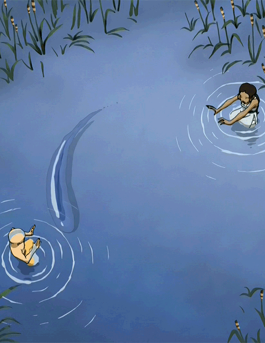
Earlier, I have spoken of my love for Korra: The Last Avatar, but it would not have been possible without the seed that Avatar: The Last Airbender planted. I chose a cute scene where Aang and Katarra are practicing waterbending.
Peaceful, decicated.
Analysis
Freeze the scene at any moment and what will have left is anticipated action, tension will mount as you anticipate where the large drop of water will head given its form and limited space. There is a lot of movement in the water which can be seen via changes in value and the lines surrounding both Aang and Katarra. These lines are lines of action, which captures and matches the character’s movements in the water. Additionally, the movement of the characters and the water is exaggerated when contrasted by the stillness of the plants. If the plants moved, it would distract from the focal point which is the beauty and balance of their training. I really love this show and what it can teach us <3
Motion Glossary
Motion is action, reaction, energy, what’s happening, gestures, dynamics, mobility,exertion, labor, and progress through space. Motion varies with your story. Motionindicators In storyboards are arrows, blurred lines, smears, zooms in and out. Your character is dramatized and embodied as a personality through gestural actions.
180-Degree Rule In filmmaking, the 180-degree rule is a basic guideline regarding the on-screen spatial relationship between a character and another character or object within a scene. By keeping the camera on one side of an imaginary axis between two characters, the first character is always framed right of the second character. Moving the camera over the axis is called jumping the line or crossing the line; breaking the 180-degree rule by shooting on all sides is known as shooting in the round.
Anticipated Action A dramatic action frozen in time, the tension mounts, we feel anticipation. We expect the sword to swing or the finger to pull the trigger or the couple to kiss.
Camera Motion Arrows are standard cues, a simple and recognizable way to show motion or progression in a storyboard.
Kinesthetic Empathy A player’s actual movement when responding to action in a game. Leaning into a curve in a driving game is kinesthetic empathy
Line of Action Line of action is an artistic concept, an invisible line that captures the thrust and vitality of the movement. The line of action can be drawn by artists as the first element to capture or exaggerate the pose. Tip: Create the line of action as layer 1 so that you don’t downplay the pose. When you have the full energy of the drawing delete the action line layer.
Motion Blur When your eyes or objects are in motion, the image will suffer from motion blur, resulting in an inability to resolve details. To cope with this, humans generally alternate between saccades (quick eye movements) and fixation (focusing on a single point). How is this biological situation useful in storyboard drawing? How do storyboard artists use motion blur? How does a smear function in animated motion?
Optical Movement Optical movement is an optical illusion. Although the image is not moving, it appears to move. To see examples search “Op Art
Stillness Stillness is calm, quiet, inaction, and peace. Stillness is the opposite of motion. It can be used to contrast with motion.
0 notes
Text
Space & Depth
I love this show with all my heart. I actually finished watching it this Fall, and now I want to buy the rest of the comics to know what happens!! Below I present to you the comic cover for Legend of Korra: Turf Wars - Part One.

Analysis
There are a lot of diagonal shapes in this composition. You can see it with the water Korra is bending, which matches her arm positions, and even matches the slant of the bridge above them. It makes the space look slanted and fun, which is the goal since all of the characters seem to be giddy. Here, the space is given depth using Foreground, Middleground, & Background. Korra is in the foreground, her friends are in the middleground, and the city behind them is in the background. Another great example on how the makers created depth with this space is by looking at the size relationships. Since Korra’s left arm is behind her, it looks smaller than her right arm. Since her friends are also behind her, they are also smaller in proportion. size relationships help tell how far the animations are from the viewer. Alas, I could go on forever; the animators of this show and makers of the comics were geniuises!!
Space & Depth Glossary
Space is an area, expanse, territory, distance or range. Variable spaces expand or contract as our stories unfold. A closeup has a short range. A wide shot covers a lot of territory.
Atmospheric Perspective Value contrast and color saturation decrease with distance. Brightness increases as objects fade further into the background. In addition, objects such as mountains may appear more blue.
Diagonal Shapes Diagonal shapes pull the eye in a direction to create the illusion of depth. If the diagonal is going back like a railroad track or fence-line the eye will follow it into the perceived distance.
Elliptical Perspective An ellipse is an oval shape. Elliptical perspective provides visual clues to the location of curved surfaces in space. Look straight down on a glass of water. The rim of the glass is a circle. Move the glass to the side, the rim now appears as an ellipse. Line up the rim at your exact eye level, the ellipse now appears as a straight line.
Foreground, Middleground, & Background The 3 treatments of objects in space support design to achieve depth. This template for placing and sizing objects in the picture plane shows variations on the foreground, middleground, background configurations.
Foreshortening Foreshortening is when an object's dimensions appear shorter when angled toward the viewer. At the same time the part coming toward the viewer is enlarged.
Linear Perspective Linear Perspective is a system used by artists in which the relative size, shape, and position of objects are determined by drawn or imagined lines converging at a point on the horizon.
Overlapping Overlap is when part of one object is obscured by another object. The obscuring object appears to be in front.
S-Curve or Winding Path In an image of a landscape, S-curve or winding path will draw the eye of the viewer into a perceived distance.
Size relationships Objects appear smaller as their distance from the observer increases.
Transparency or Opacity Transparency or opacity is when we feel like we can see objects through a glassy, gauzy, smoky, or dusty layer. The transparent/opacity adjustment affects the saturation and color of objects to give a feel of depth.
Vertical Position Vertical position places objects higher up in the composition to appear further away.
Volume Volume is the amount, expanse, extent, magnitude, size, aggregate, bulk, dimensions, or mass of an object. The volume variable indicates the amount of territory needed for each object in a scene.
0 notes
Text
Value
Below I present a show that I just finished watching: KIPO! The third and final season coming out tomorrow so you might catch me watching that this week.

Analysis✨
This poster in itself has many great examples of how value can be used to provide a more clear idea of what is going on. I’ll start with what I consider consumes the whole poster, the stars. They exist above and behind the characters while also reflected in front and below them in the water. I would consider the way they are spread out as value pattern, since they are placed in a predictable manner. Now, notice how the three main human characters are placed in front of the moon. Value as emphasis - The light values of the moon contrasts and creates emphasis onto the main characters: Wolf, Kipo, and Benson. The moon is not reflected in the water, because it would have the same value emphasis on the characters reflections. Since the moon is much lighter than everything else on the poster, it can be considered as a light source. Value and space - the edges of the characters are lighter in value, while slightly darker values that follow the characters shapes are shown in the water in front/below them, creating highlights and shadows to show that the moon is behind them. This gives the poster and the environment more dimension. Overall, 10/10 show, I recommend!
Value Glossary
Value in design is lightness or darkness on a scale of white to black (with white being the highest value and black being the lowest value). Value is widely considered to be one of the most important variables to the success of a design. Chiaroscuro (English: kee-AR-ə-SKOOR-oh, -SKEWR-, Italian:; Italian for "light-dark"), is the use of strong contrasts between light and dark with bold contrasts affecting a whole composition. Chiaroscuro is a technical term for the use of contrasts of light to achieve a sense of volume in modelling three-dimensional objects and figures. Light and dark Every element in your design has a value from 1% black (almost white) to 100% black. Value is relative to everything in the composition. Every color has an underlying value somewhere between white and black. Value as emphasis This happens when a strong contrast in value draws attention to itself such as on this ancient Greek vase illustrating value contrast in the service of visual storytelling. Value and space Designers use dark and light values to create the illusion of light as it falls on objects. Value is used to create the illusion of highlights and shadows. Highlights and shadows combine to create the illusion of a light source. The pattern of light and dark can create dimension, volume, and mass. Value patterns Appears regularly in the world, in human-made design, and even in abstract ideas such as stories. The elements of a pattern repeat in a predictable manner. Night and day is a value pattern common in stories.
0 notes
Text
Color
Below I present to you 3 scenes from one of my favorite movies “Spiderman: Into the Spider-Verse.” I remember being so mesmerized by the colors whenever I first saw this film.

Analysis
It is a pretty well known fact that red and blue are the Spiderman colors. Red is a warm color (ranges yellow to violet) and blue is a cool color (ranges yellow-green to violet). Warm colors usually pop out while cool colors sink into the background. I really enjoyed how the animators displayed that in the background, for example: how the bar is highlighted behind Miles Morales. These scenes have four equilateral hues (red, blue, violet, green) display a Tetrad color strategy. I believe that the colors are used to exemplify what the two characters are feeling. The veteran Spiderman is well acquainted with how his spidey-senses work, they are definitive: red and blue. Miles Morales, new to being Spiderman, is not aware of how his spidey-senses work, so when they flare up they are shown as green and purple: he is confused. Green has a bit of color symbolism here: nausea, confusion, frenzy. You can tell that red and blue are definitive colors because once he realizes what he is looking at (The Spiderman), his background also turns red and blue. The colors in the movie not only looked and worked really well together, but it added more information into the story for the viewer to read into and better understand what was going on and what the characters were feeling.
Color Glossary
Visible light spectrum is the segment of the electromagnetic spectrum that the human eye can view. This range of wavelengths is called visible light. Typically, the human eye can detect wavelengths from 380 to 700 nanometers.
Color Psychology Color psychology is the study of the effect that colors have on emotions, behavior and feelings of people.
Color Systems Color systems classify color and analyze their effects. ● The additive color system is used for colors of light such as light emitted from computers, phone screens, and projectors. Red, green, and blue are the primary colors ●The subtractive color system is used for pigments such as ink, dye, and paint. Cyan, magenta, and yellow are the primary colors.
Color to Show Depth Change in Color is to use color to separate the foreground, midground, and background planes to create the illusion of depth and is commonly used in animation.
Color Wheel The color wheel, or color circle, arranges a pattern of hues around a circle. There are several versions of the color wheel or color circle. The circle connects relationships between hues to illustrate color strategies. (see 12 Chromatic Strategies) Color wheel history goes way back.
Local Color Local color is the natural color of an object unmodified by adding unrealistic light and shadow or any other distortion. The color that the eye observes is altered by lighting conditions such as time of day or the surrounding environment. The local color of a lemon is yellow.
Palettes The definition of a palette is the range of colors used in a particular composition or by any person who uses color such as an artist, house painter or interior decorator. An example of a palette is Vincent Van Gogh’s limited palette of hues in his Starry Night painting. Starry Night’s palette is a variety of blues, greens and yellows. Close up video of Starry Night lets you come closer than you could at the Museum of Modern Art.
Properties of Color Properties of color are hue, saturation, and brightness. The H, S, and B in the Photoshop Color Panel stand for hue, saturation, and brightness. ● Hue is the named color around the color circle such as red, orange, green, yellow, violet, and blue. ● Saturation is the intensity or purity of a hue. Fire engine red is more highly saturated than brick red or the color of red wine. ● Brightness is the perceived intensity of light coming from a source such as a screen. On a color screen, brightness is the average of the red, green and blue pixels on the screen. Brightness is important to both color perception and battery life on mobile devices. Brightness of a screen can be adjusted.
Symbolism of Color Symbolism of color in art and anthropology refers to the use of color as a symbol in various cultures. There is great diversity in the use of colors and their associations. Diversity in color symbolism occurs because color meanings and symbolism occur on an individual, cultural and universal basis. Color symbolism is also context-dependent and changes over time.
Color Strategies
1. Monochromatic means variations of a single hue such as a light blue and a dark blue or a greenish aqua blue and a lavender blue.
2. Achromatic color strategy integrates variations of black, white, gray, and a full range of neutrals.
3. Full Spectrum Strategy represents the full circle of spectral colors by incorporating at least five of the base hues.
4. In the Achromatic/Chromatic Mix strategy Achromatic colors dominate the composition with a chromatic hue accent.
5. Warm/Cool: Contrasting ‘temperatures’ of warm & cool. Cool colors appear on the green/blue/violet side of the color wheel. The colors on the red/orange/yellow side of the color wheel are called warm. Emphasis is on the contrast between warm and cool a chromatics: brown - gold (warm), grays - silver (cool)
6. Saturation Similarities/Saturation Contrast ● Saturation Similarities: Hues may vary in this strategy, but all colors must have the same or very similar saturations. ● Saturation Contrast: Hues may vary but all colors must have significant contrast of saturation. 7. Value Similarities/Value Contrast ● Value Similarities: Hues may vary in this strategy, but all colors have the same or very close values. ● Value Contrast: Black (or dark desaturated hues) contrast with white (or very desaturated tints of hues). The Value Contrast strategy demonstrates strong distinction of value with the strongest example being between black and white. 8. Complementary Dyad creates a strong hue contrast. Complementary hues are located directly opposite each other on the color circle 4
9. Split Complementary strategies are based on two complements. To create a split complementary color strategy select one hue and contrast it with the hues on either side of its complement, such as Red & Yellow Green / Blue Green.
10. A Tetrad strategy uses four equilateral hues from the color circle, such as Red, Orange, Green, Blue. 11. A Triad strategy uses three equilaterally balanced hues from the color circle, such as primary, secondary, or tertiary. 12. Analogous strategies collect 2 or 3 neighboring hues on the color circle.
1 note
·
View note
Text
Shapes
Below the a wallpaper displaying the location of Clancy’s home. Clancy is the protagonist of the Netflix original show: “The Midnight Gospel.” I love the show’s content, and even more it’s style of animation (If you like this, Adventure Time and Over The Garden Wall is also right up your alley.)

Analysis
I wanted to talk about this animation style because I believe it uses a vast variety of shapes. The landscape itself follows a ribbon like shape, as can be seen in the background; curvilinear shapes that bend and curve around. The However, you look at the building structures, almost always using rectilinear shapes (box-like). I think this is a nice strategy, for it makes the structures stand out when everything else is softer and curvier. A lot of the objects have some form of distortion. For example, the slant in the barn house strays from reality as it would not be structurally sound. I mean, the landscape itself distorts from reality in the way the curves are exaggerated and ignore our knowledge of planets and gravity. You should see the characters, very biomorphic, but not displayed in this picture. I definitely recommend watching this show. Can you identify the types of shapes the illustrators use in The Midnight Gospel?
Shape Glossary
Shape is the external form or appearance characteristic of someone or something; the outline of an area or figure. As a verb, to shape is to give a particular form. As artists, we shape our characters outward appearance by using shapes.
Abstract Shapes and Abstraction (see Non-objective Shapes)
Abstract means no recognizable objects. Abstraction is a sliding scale from realism to completely non representational. Abstract shapes can be used in backgrounds and textures. The background pattern in this Minecraft image is abstract. The character is still recognizable as a human, but the doctor’s human form is abstracted in the game of Minecraft to conform to the blocks of the game world.
Biomorphic
Biomorphic is a free-form pattern or design with a shape suggestive of a living organism, especially an amoeba or protozoan.
Curvilinear Shapes
Curvilinear shapes are s-curves. Curvilinear shapes inform Jessica Rabbit’s character design and can represent a winding river vanishing into the distance.
Distortion
Distortion is exaggeration, contortion, reform, slant, twist, or warp in ways that depart from reality. Look at the Minecraft Human body example. The figure of the Minecraft doctor is distorted by the shape of the blocks.
Idealism
Idealism asserts that the physical world is less important than the mind or the spirit which shapes and animates it. Idealists choose the soul, the mind, or the psyche over the body, the material, and the historical. When ideals (of appearance, or proportion for example) regulate the way an artist represents the world, her work can be described as Idealistic. The leading artists of the High Renaissance - Leonardo, Raphael and Michelangelo - are all associated with varying forms of Idealism, as were ancient Greek sculptors. How do you think idealism affects avatar customization?
Non-objective Shapes (see Abstract Shapes)
Non-objective shapes have no object as a reference and no recognizable subject matter. Non-objective shapes are often used to simplify design shapes. Geometric shapes such as a triangle, square, and circle are abstract until you put them together to represent a house or a smiley face. One Minecraft block, away from the game, is anon-objective shape. Inside the game that same block, depending on it’s color and texture could represent a part of a landscape, sheep, or sword. The block as part of a character or environment inside the game would no longer be abstract.
Positive and Negative Shapes
Positive space is the subject, focal point, or areas of high interest in any composition. Negative space is the area around the areas of interest. All compositions balance positive and negative space. Yes, stuff in the negative space can point to the focal point to make it most obvious. Positive and negative create a whole. Every composition is a combination of positive and negative space. Wield the positive and negative spaces with control and story-telling magic to become a design master.
Realism or Naturalism
Realism, or naturalism, attempts to represent subject matter truthfully, without artificiality or exotic or supernatural elements. In the visual arts, illusionistic realism strives for the accurate depiction of lifeforms, perspective, and the details of light and color.
Rectilinear Shapes
Rectilinear is a boxy shape made with straight lines. For example, the screen you are looking at is a rectilinear shape filled with little square pixels, and pixels are also rectilinear. A storyboard is a series of drawings in a linear set of rectilinear frames.
Representational
Representational means objects that players can name. The object represents something from the real world, or something that has the verisimilitude of realism. A cartoon bunny can represent a rabbit without being realistic. Representational is a sliding scale from realism to almost abstract. 2 dots and a curve can be arranged into an abstract pattern or they can be arranged into an emoji that represents a smiley face.
Silhouette
Silhouette is a profile or shape that is easy to identify.
Squash and Stretch
Squash and stretch are shapes profiles that emphasize motion. The stretched position shows the form in an extended condition. When you do a sit up your belly squashes and your back stretches.
0 notes
Text
Lines
Presented below is the cover for Liv.e’s album “Couldn’t Wait to Tell You...” - this is one of my albums ever! I thought it would be a great idea to use her album cover to talk about lines a little bit.

I would like to begin my analysis by pointing out the lines on top of the saturated image. They are square-like, and vary in quality in regards to color - here black and orange. These are good examples of line quality. It allows for the image to look more 3-dimensional now that a texture has been added to the picture. These lines sometimes vanish and reconnect, which we could call lost and found lines. Notice also how there isn’t a strong contour line of her features, sometimes they vanish and come back on another part of her face or body. I really love how there is a black vertical line on her sunglasses that vanishes and then reappears as the edge of her inner arm and then down the phone line. I would call that a psychic line since there truly isn’t a line that reached from the top to the bottom, it’s just insinuated that you should follow the where the model is looking.
Line Glossary
Lines have both a direction and a length. Line means a mark, streak, stroke, slash, path, stripe, border, contour, striation, course, route, and track. Curved, bent, thick, wide, broken, vertical, horizontal, burred, or freehand, lines delineate shapes, forms, and spaces, volumes, edges, movement and patterns. Not only that -- lines create both2D and 3D objects and figures. Lines are awesome and powerful.
Contour Lines
Contour lines indicate the edge around an object or the changes in volume within an object. Contour lines dramatize changes of plane within the form. The curve of a belt around the waist is a contour line.
Diagonal Lines
Diagonal Lines are useful to draw the eye into a composition such as toward the vanishing points. Three common types of diagonals are 1) actual diagonal lines 2)objects placed diagonally in a scene 3) a diagonal line created by the viewpoint such as the Dutch tilt.
Dutch Tilt
Dutch Tilt (known as a Dutch angle, canted angle, or oblique angle) is a type of camera shot that has a noticeable tilt on the camera’s “x-axis.” The Dutch tilt camera technique was introduced by German Expressionists in the 1920s — so it's not actually Dutch. Directors often use a Dutch angle to signal to the viewer that something is wrong, disorienting, or unsettling. https://billbreneisen.tumblr.com/post/139255443058/quick-post-on-dutch-angles2
Explicit Lines
Explicit means clear, direct, and obvious. If a drawing is easy to read it may be that the lines are explicit, clean, with efficient use of variety. There are explicit lines around the frame of the Dutch Tilt illustration.
Gesture Lines
Gesture Lines capture motion, such as in an action pose when gesture drawings are used in storyboards.
Implied Lines
Implied lines in 3-D scenes a line in a scene that is not physically there but is suggested by points in the art. Implied lines suggest the edges of an object or planes within an object. The line may be broken such as a dotted line, it may be defined by value, color, or texture, or it may not be visible at all. With implied lines, our brain interprets that a line exists.
Line as Value
Line As Value has a long history. Artists have used line drawings to create value, or shading, and to achieve the impression of volume. In this quick sketch of a live elephant Rembrandt used outline contour lines around the edges of the elephant and curved contour lines around the big legs and belly. Most of the lines are at the lower part of the elephant to show that the light source was from above.
Line of Action
(Also see motion) Line of action is an imaginary line that extends through the main action of the figure. When you draw an action figure you can capture the line of action on one layer then draw the figure drawing on another layer. https://art103robatkinson.files.wordpress.com/2014/04/line-of-action-1.jpeg
Line Quality
Line quality is the expressive essence of lines. Varying the line quality makes objects appear more 3-dimensional and exciting. Range in line quality heightens descriptive and3suggestive potential. A single line can change in darkness and width, can vanish all together to mentally reconnect later on an edge.
Line Weight
Line weight refers to the thickness or thinness of a line.
Lost and Found Lines
We don’t really need a strong contour line around every part of an object because our brain will fill in the blank where the edge disappears. When a line fades out and then restarts further along the edge it is called a lost and found line. There is a lost and found line at the top of Rembrandt’s elephant behind the head. There is a strong contour line of the skull of the elephant and a strong bulge of the back, but between the 2 curved shapes the line fades out, yet we still know that the elephant shape continues.
Psychic Lines
Psychic lines are invisible. Psychic lines form between characters or between a gun and a target, or a hand pointing in a direction. There is no real line yet we feel a line. Eyes looking in a direction, especially characters looking at each other create a psychic line.
0 notes
Text
Introduction
Hello everyone! This is Ale Moreno introducing my new blog! This blog will be designed strictly for my Foundations of Design class in the Arts and Entertainment Technologies department of UT Austin. Super exciting stuff :)
1 note
·
View note